ReBrand | Tagline | Swag Mockups
Brooklyn Nuclear
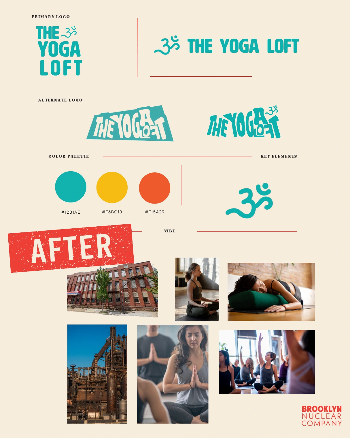
Original Branding:
The existing logo featured a tall, condensed typeface with playful proportions, set in bright teal against a solid yellow circle. The letter “Y” subtly suggested a human figure in a yoga pose—an approachable, symbolic gesture. Overall, the design leaned cheerful and casual, though it felt more like a fun sticker or flyer header than a flexible, scalable identity system.
⸻
CASE STUDY: THE YOGA LOFT REBRAND (Passion Project*)
A bold, serene brand system designed to stretch and breathe with its space—an old, industrial building with a hardware store below and a yoga studio above.
We created an alternate logo molded into the shape of the building itself—each letter curving like a flexible body in motion. Because in branding, form follows function—and story.
🧘 Taglines:
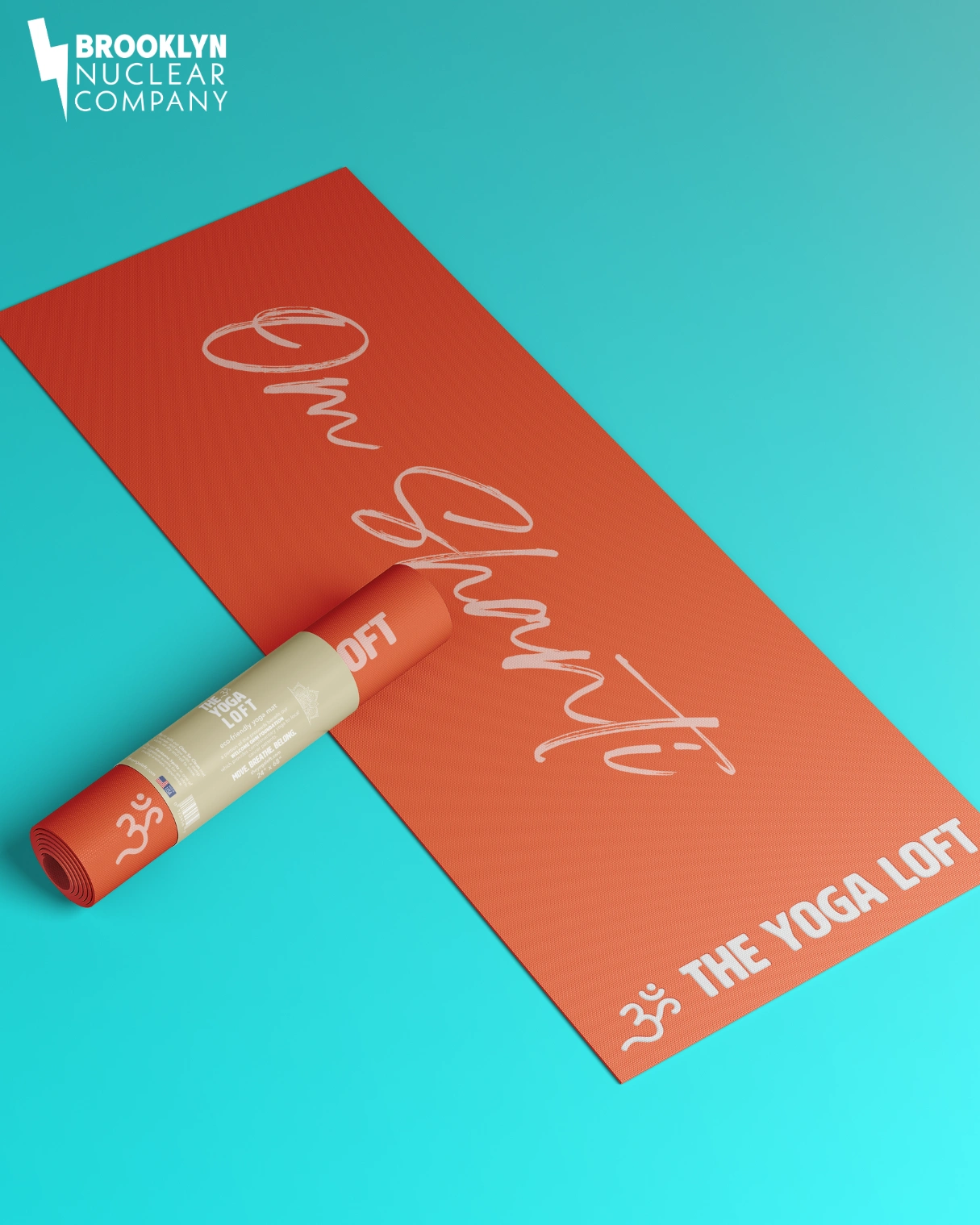
→ “Welcome Om” – a warm, playful greeting
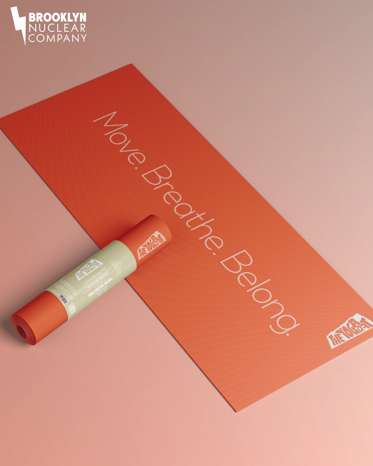
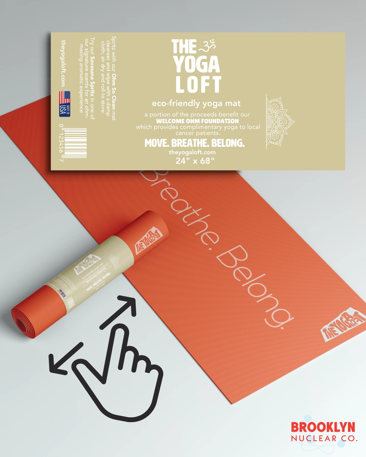
→ “Move. Breathe. Belong.” – because wellness is communal, even when it’s complicated
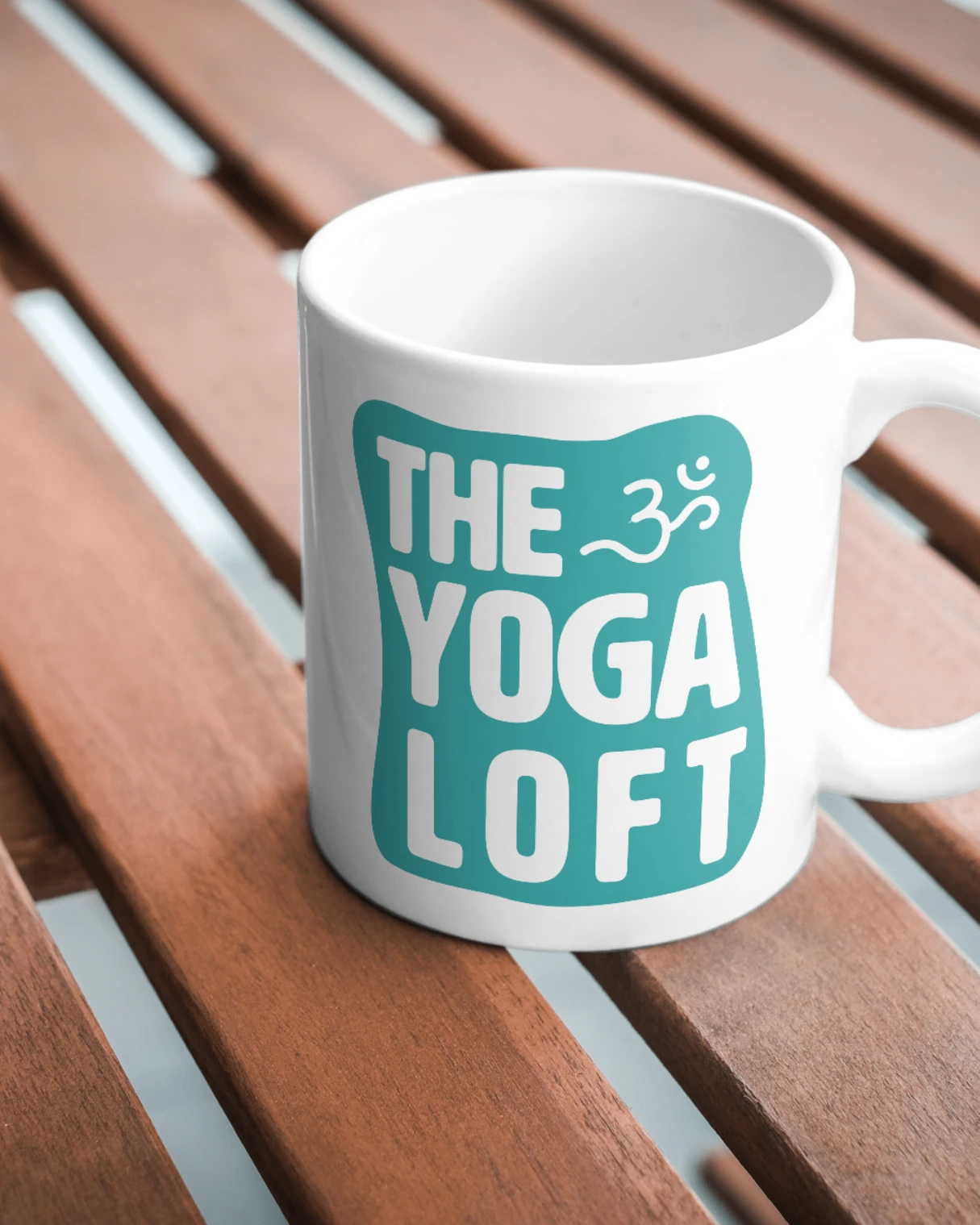
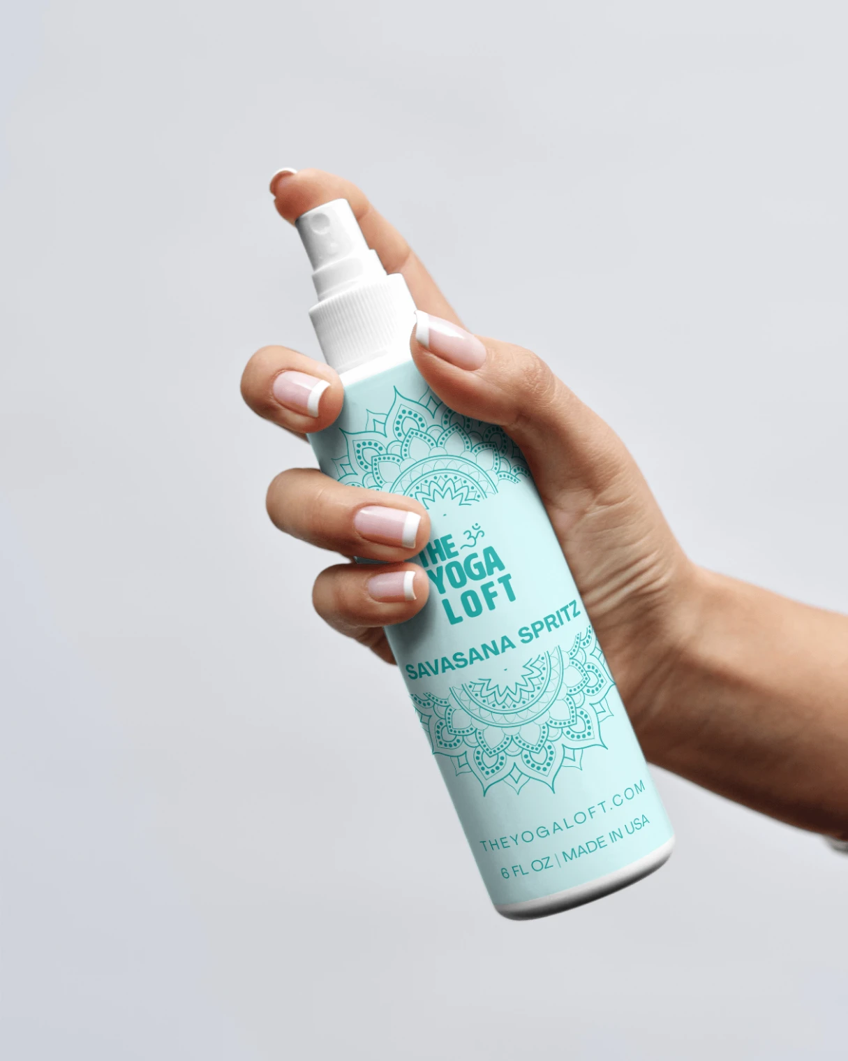
Mockups explore brand extensions in swag + merch—yoga mats, sprays (yes, you want it), mugs, and more—opening potential extra income streams while reinforcing brand identity at every touchpoint. We even dreamed up a fictional nonprofit foundation rooted in accessible movement.
This project wasn’t requested. But it was called for.
Sometimes you design because you can. Other times because, when the muse sings, you listen.
*Caught wind earlier this spring that a local business was seeking a rebrand.
It’s the kind of work we live for—visual storytelling, strategic soul.
Though we weren't invited to bid, the brief felt like it was made for us.
(To be clear: this wasn’t about skills. It wasn’t about the quality of our work. It was about… well, other things.)
Still, the muse sang.
And we listened.
Like this project
Posted Jun 9, 2025
Rebrand for a yoga studio above a hardware store—flexible identity, serene merch, and soulful storytelling. When the muse called, we showed up.