CRUMB: Brand Identity, Packaging
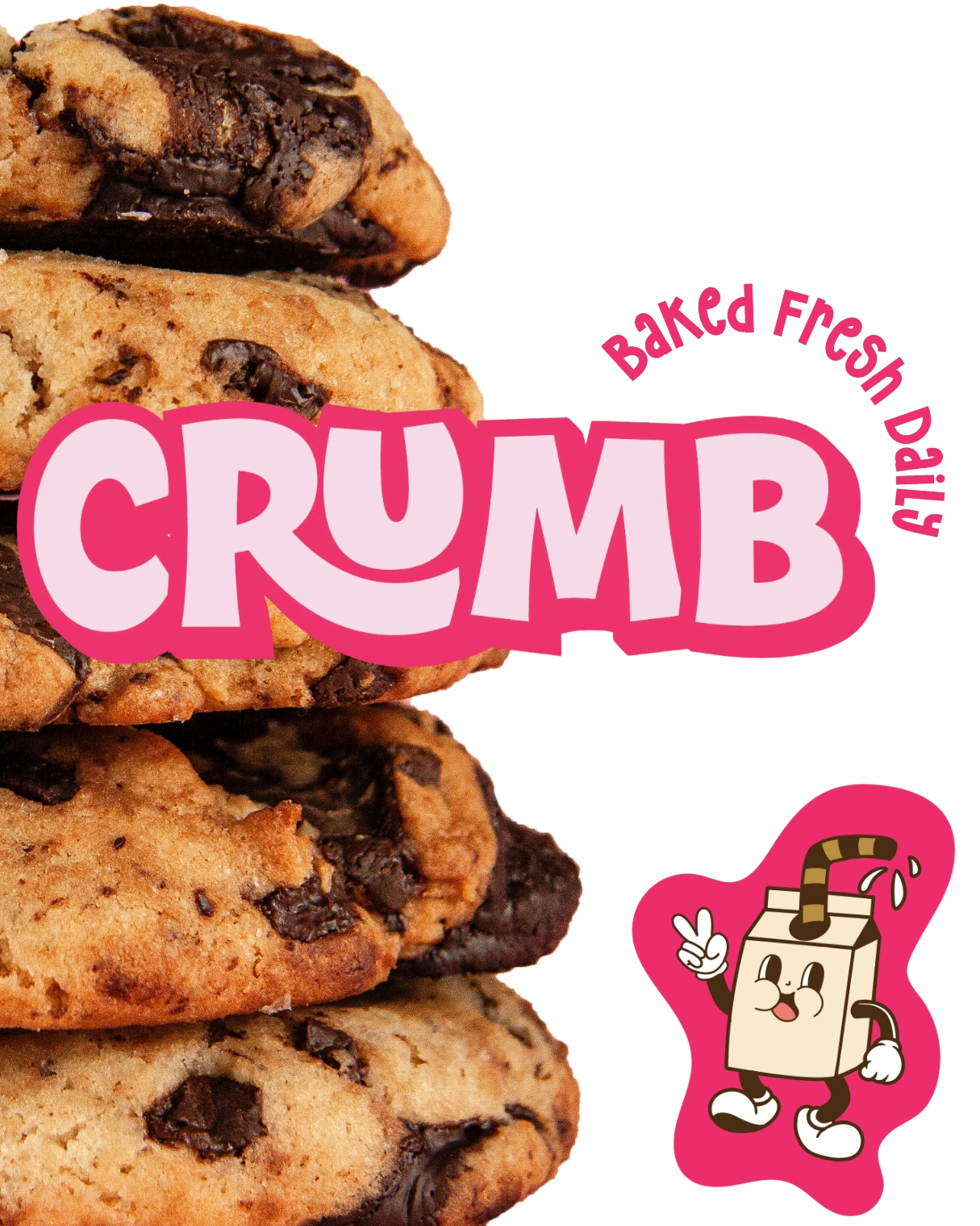
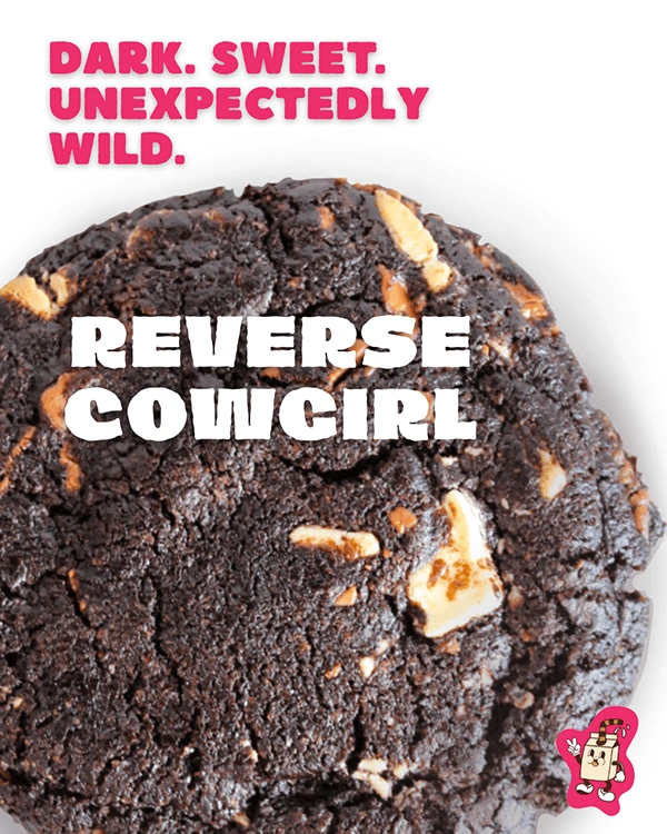
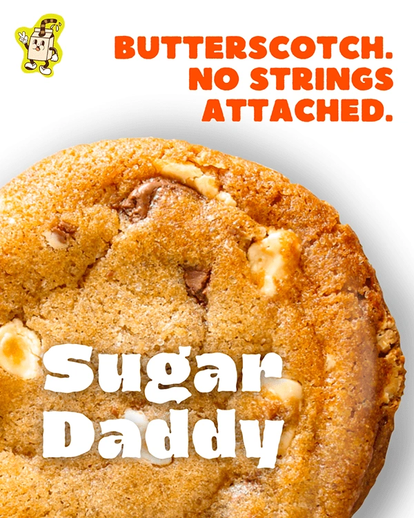
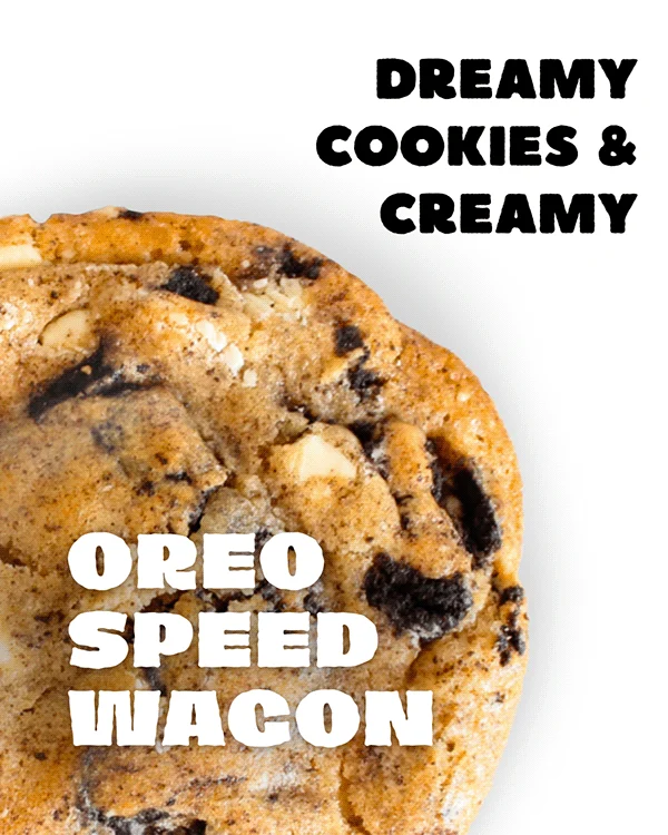
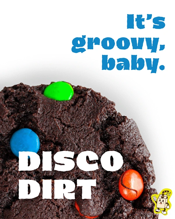
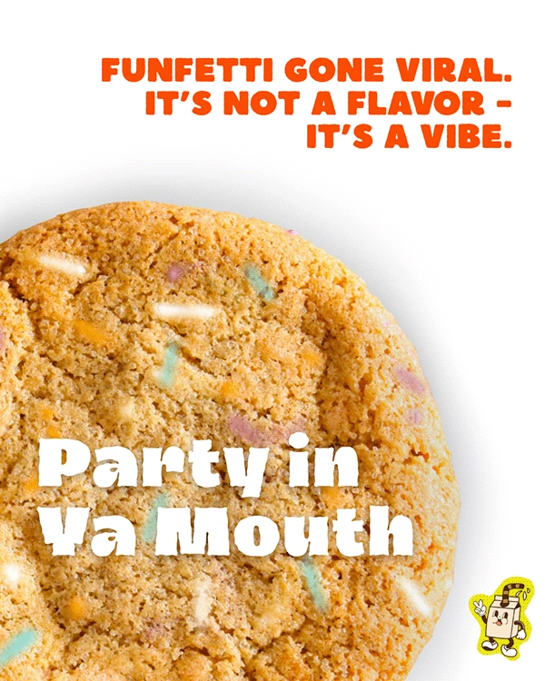
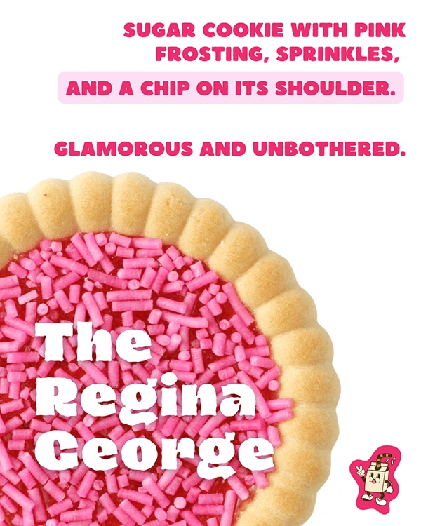
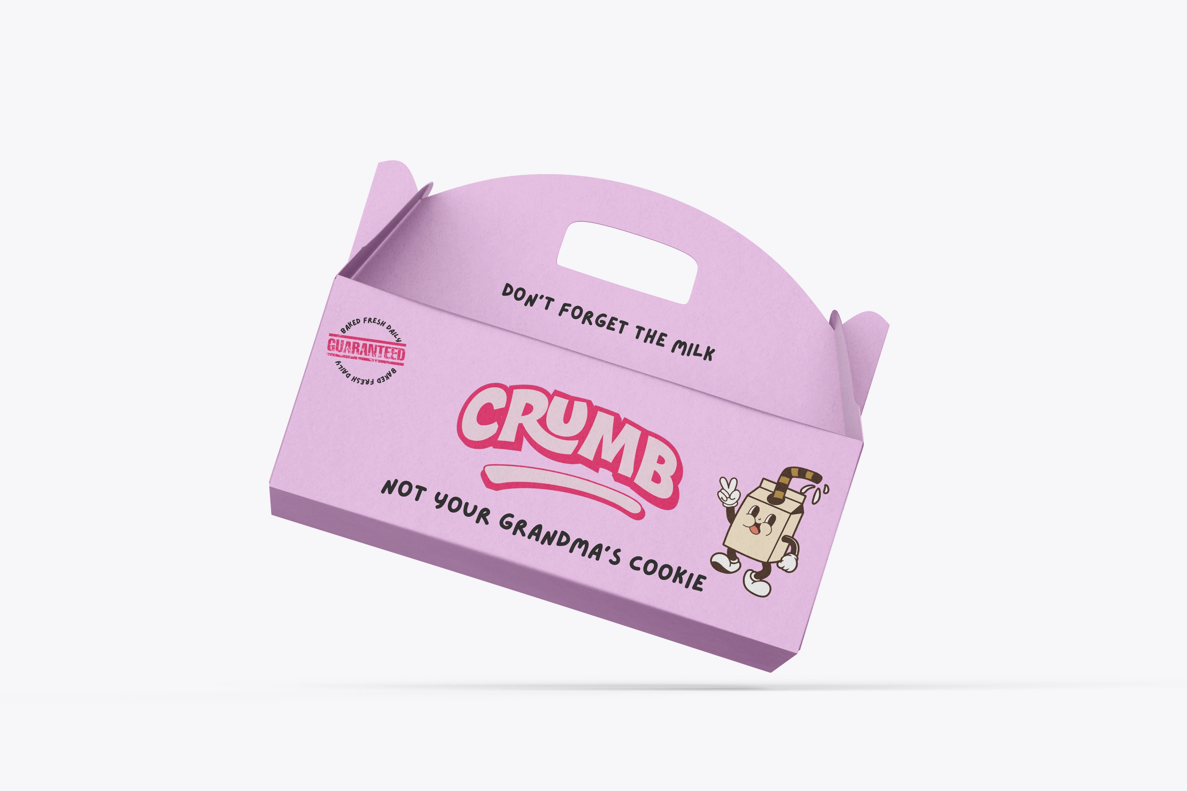
CRUMB is more than a cookie — it’s a culture. This bold brand was developed as a punchy, irreverent response to cookie traditionalism. Designed for a new wave of snackers who want indulgence with edge, CRUMB leans into maximalism, nostalgia, and street-style attitude. From the saturated palette to the graffiti-adjacent flair, this brand is made to scroll-stop — and stick.
Design Strategy
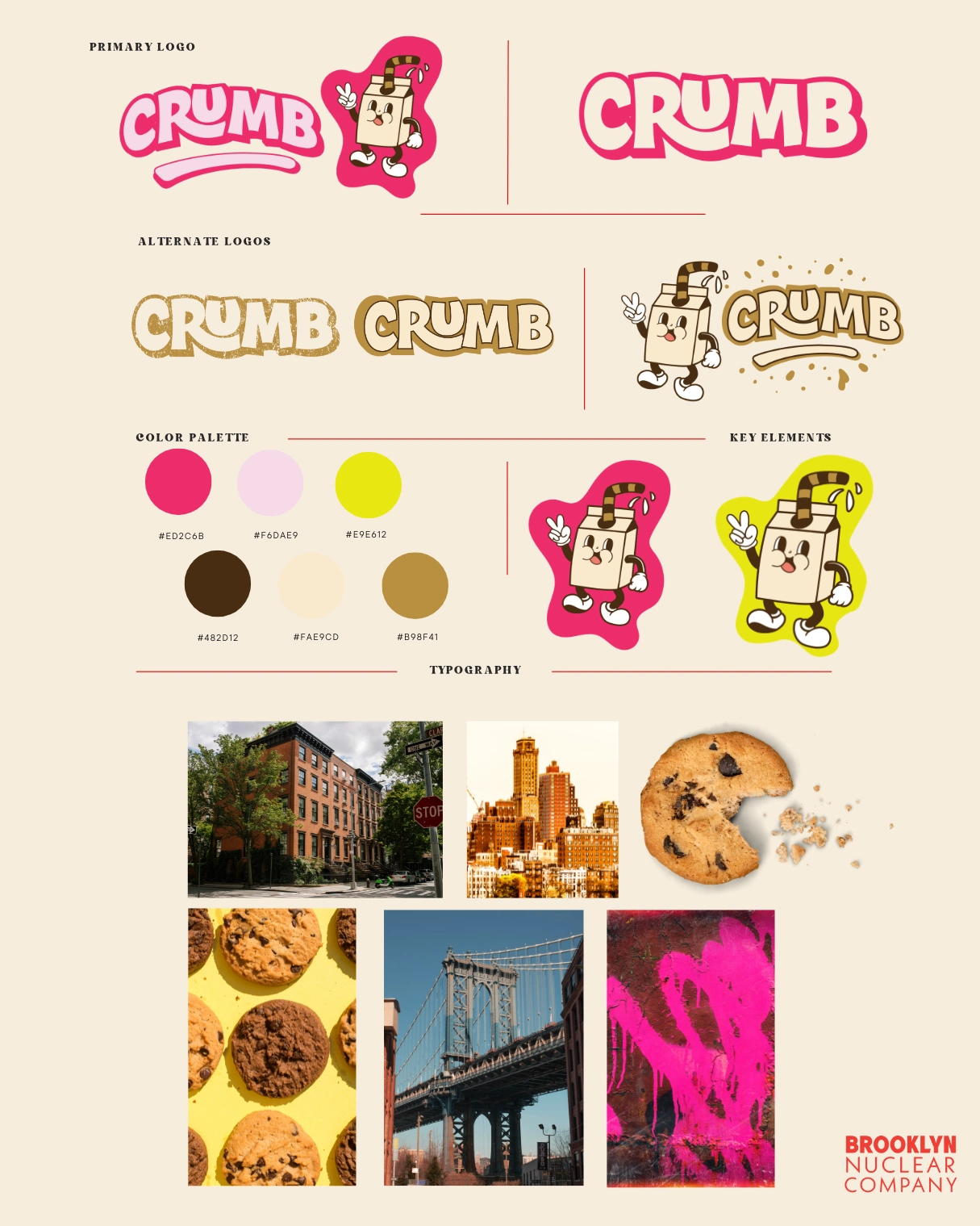
Primary Logo
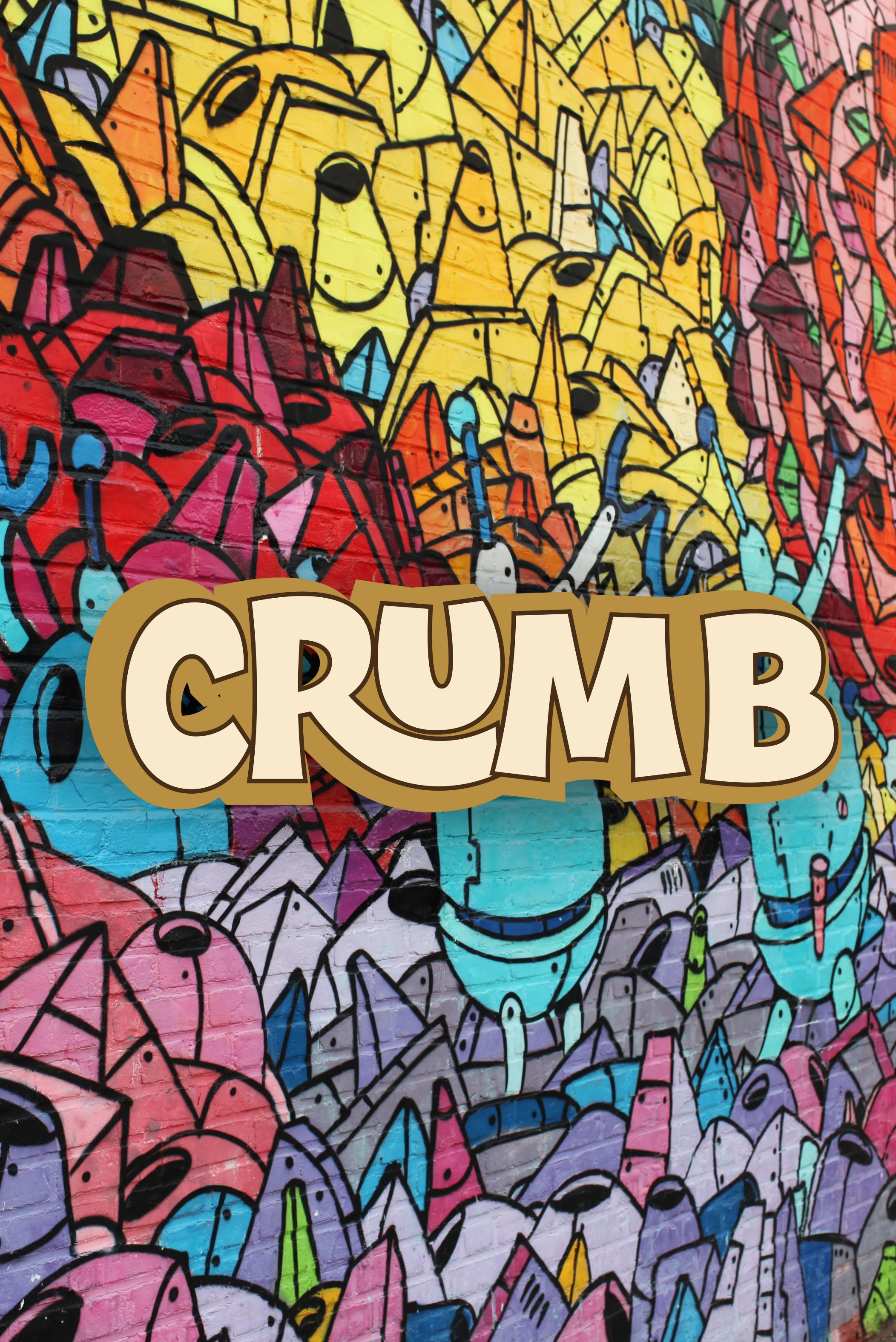
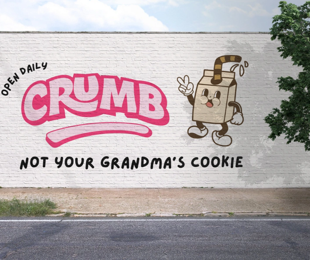
The logotype is chunky, loud, and built to live big on packaging, merch, and social. The exaggerated curve beneath echoes frosting drips or a cookie bite, giving the brand motion and flavor.
Alternate Logos
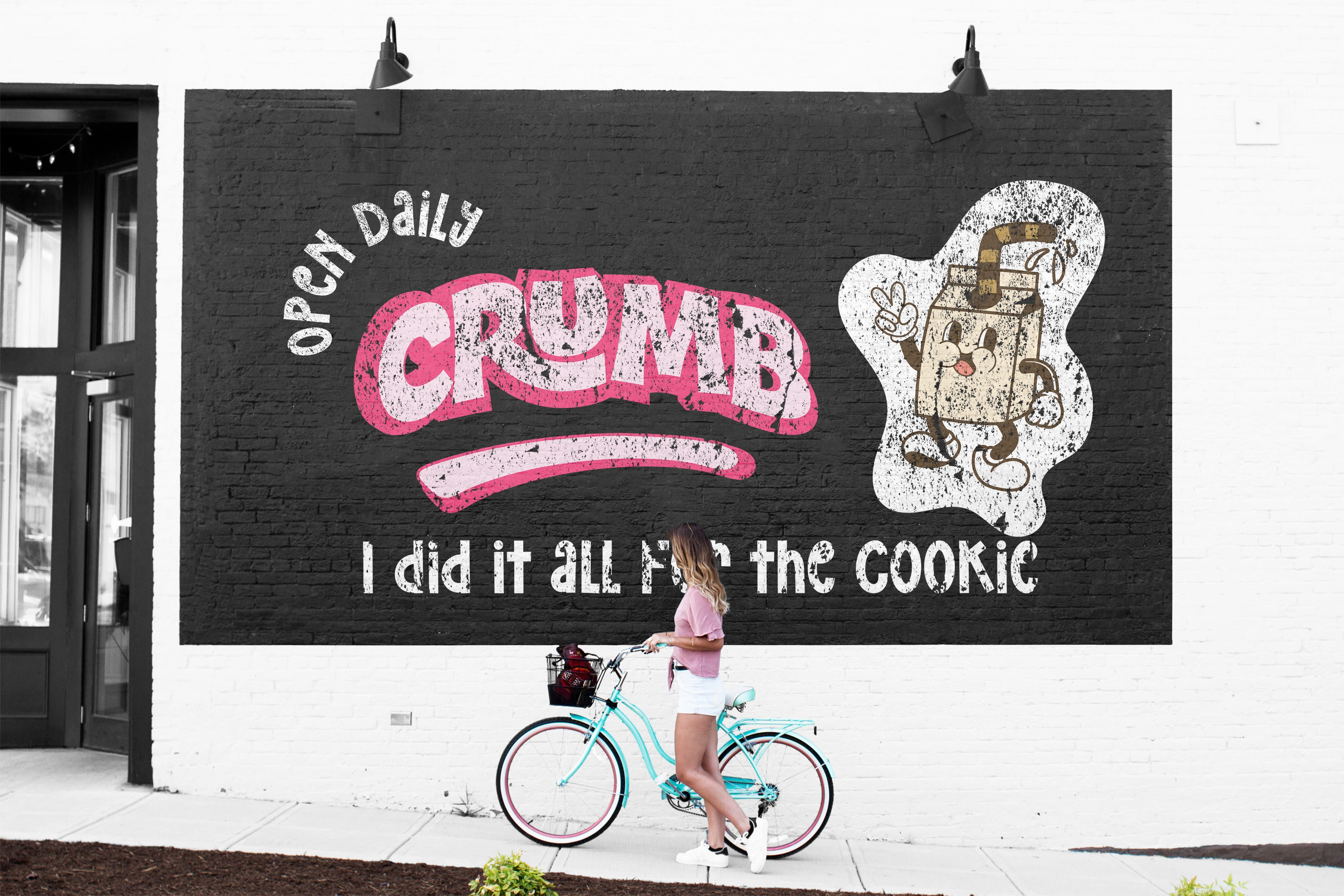
Playful variants add versatility: a retro brown-on-tan treatment gives old-school diner energy, while the graphic mascot version ties into sticker culture, collectibles, and streetwear branding.
Mascot Design
A walking milk carton (with a striped straw) introduces a nostalgic-but-modern character designed for Instagram Reels, packaging inserts, or animated content. It adds personality and ownability.
Typography
Custom-modified, graffiti-adjacent letterforms give the mark weight and personality — they're unpolished in the best way. Paired with clean retro sans for versatility.
Target Audience Alignment
This brand directly appeals to:
Young foodies and trend-savvy snackers
People who buy treats because of the vibe as much as the flavor
Social-first customers who value personality, design, and humor
Color Palette
The colors are unapologetic and high-contrast:
ED2C6B — Loud pink for attention-grabbing impact
FAE9CD — Soft vanilla beige for balance
4B2D12 — Deep chocolate for warmth and richness
E9E612 — Neon yellow for flavor-forward flair
Golden crumb tones used as texture elements
Visual System
The design system pulls from:
Summary
CRUMB reimagines cookies as statement snacks. The identity is scroll-stopping, indulgent, and deliberately extra — a perfect match for a brand that wants to stand out on-shelf, on-feed, and in-hand.
Like this project
Posted Jun 9, 2025
Bold identity for CRUMB bakery—pairing nostalgic grit with modern charm. Branding, packaging & tone baked to perfection for a standout NYC sweet shop.

