Creating a Brand Identity for Ameer Al Sahara
Role
I was the designer responsible for the creative direction
Project goal
Ameer Al Sahara is an international general trading company headquartered in Dubai, United Arab Emirates. They provide import, export, and trade services for a wide variety of goods and products. They have a global network of suppliers and customers, and specialize in sourcing and distributing products that are not readily available in a given market.The company's goal was to establish credibility for themselves so that they could build relationships with potential clients and partners and lead more people to become aware of the company and its offerings.
Solution
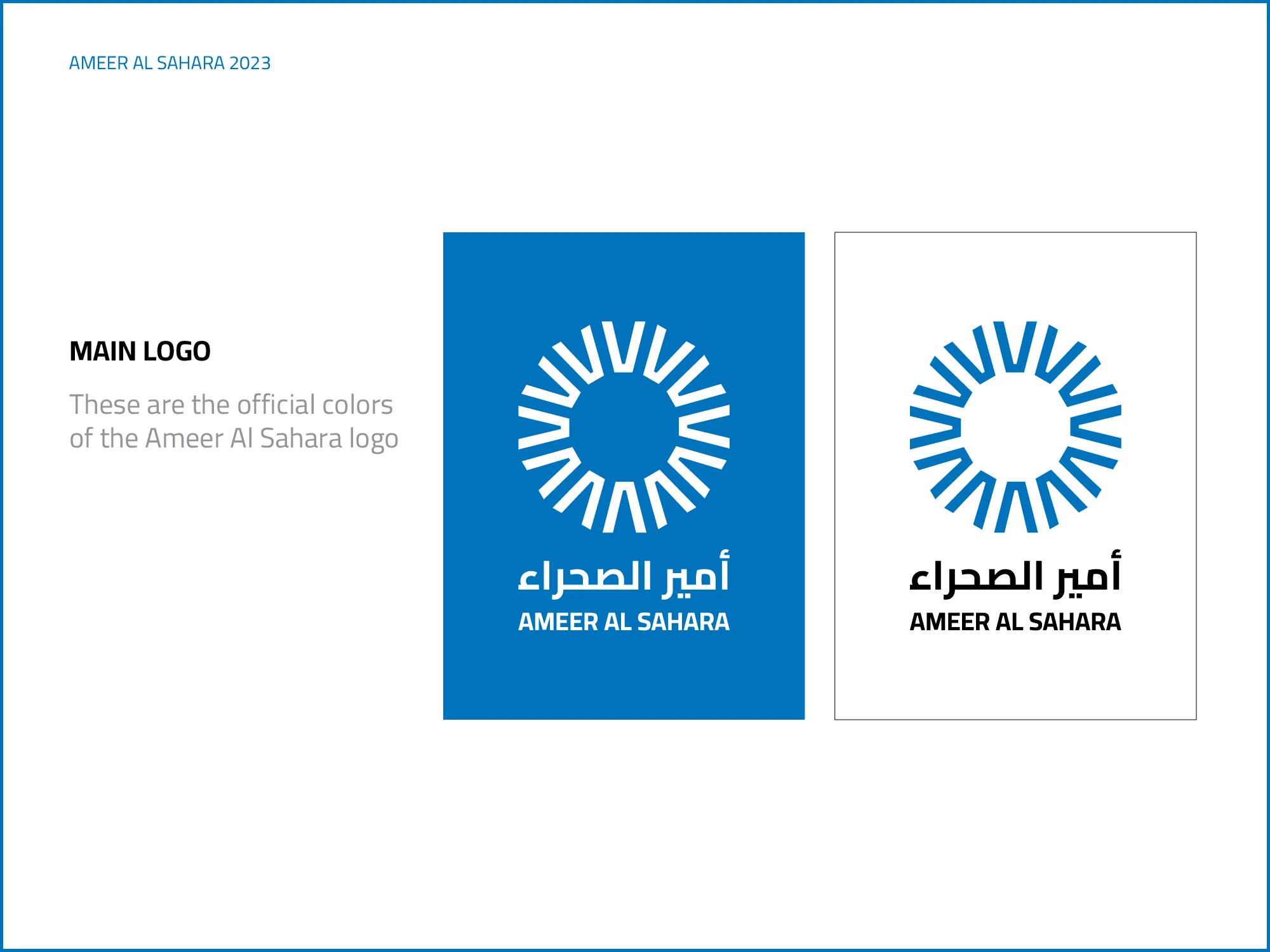
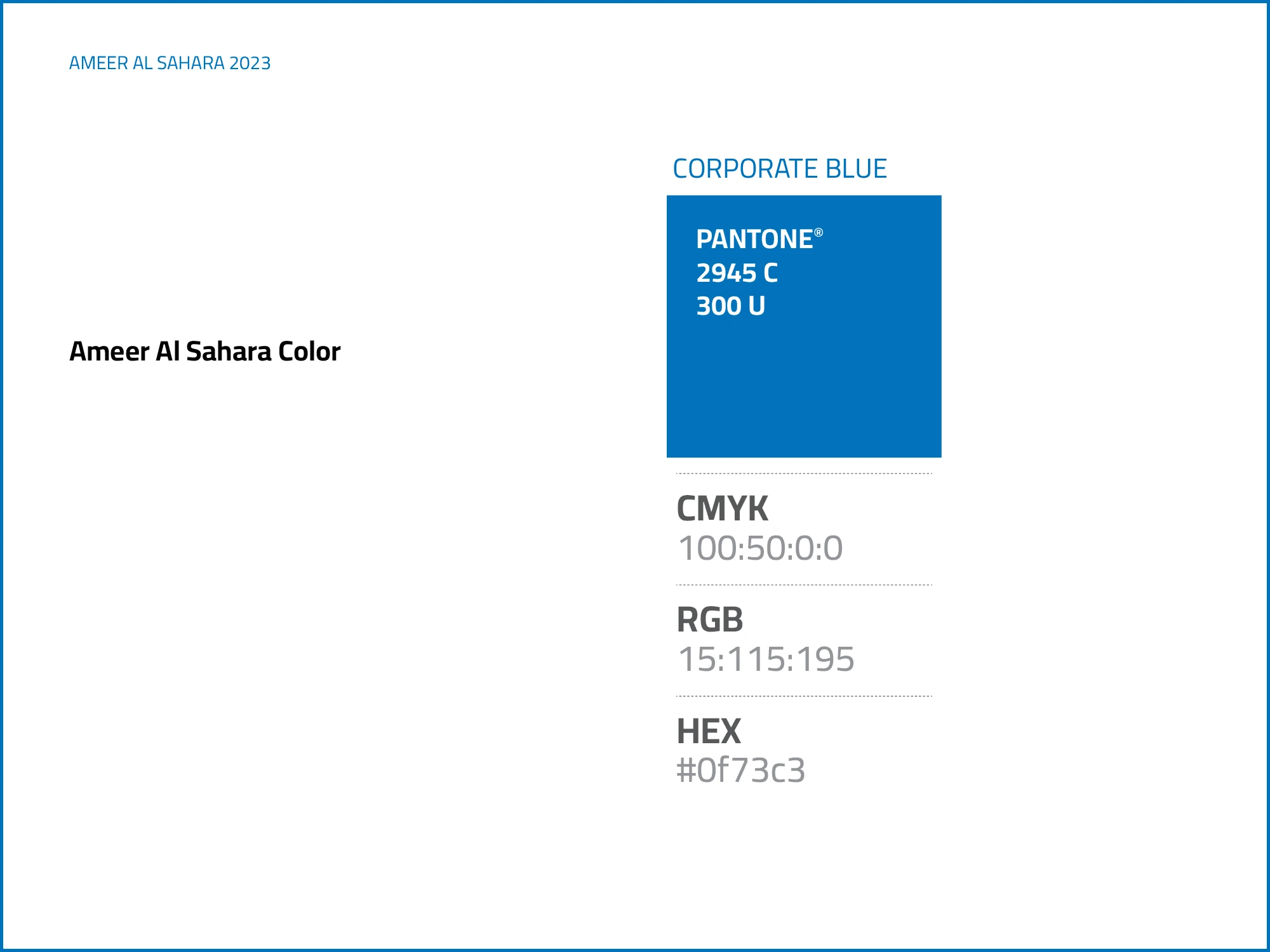
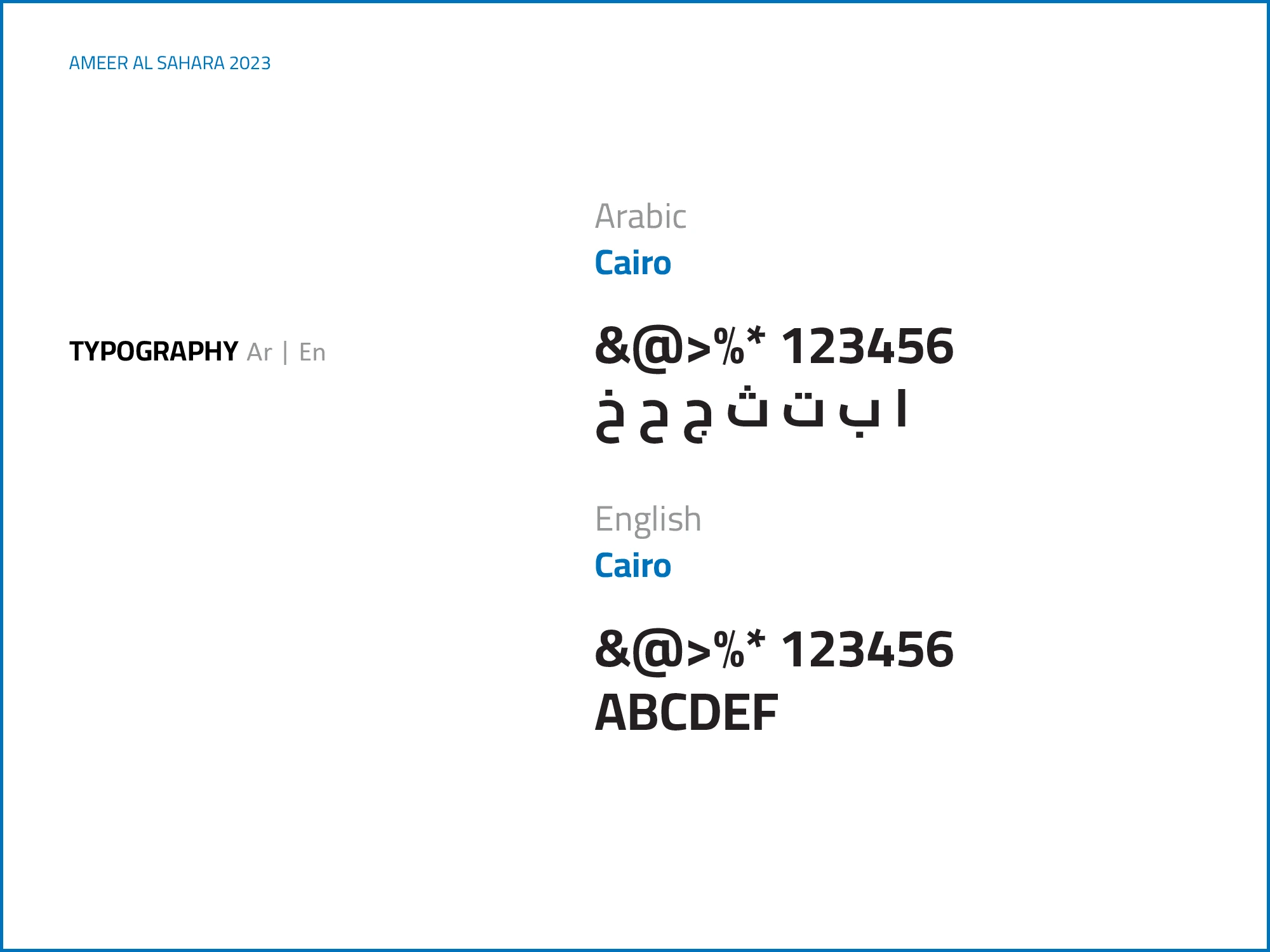
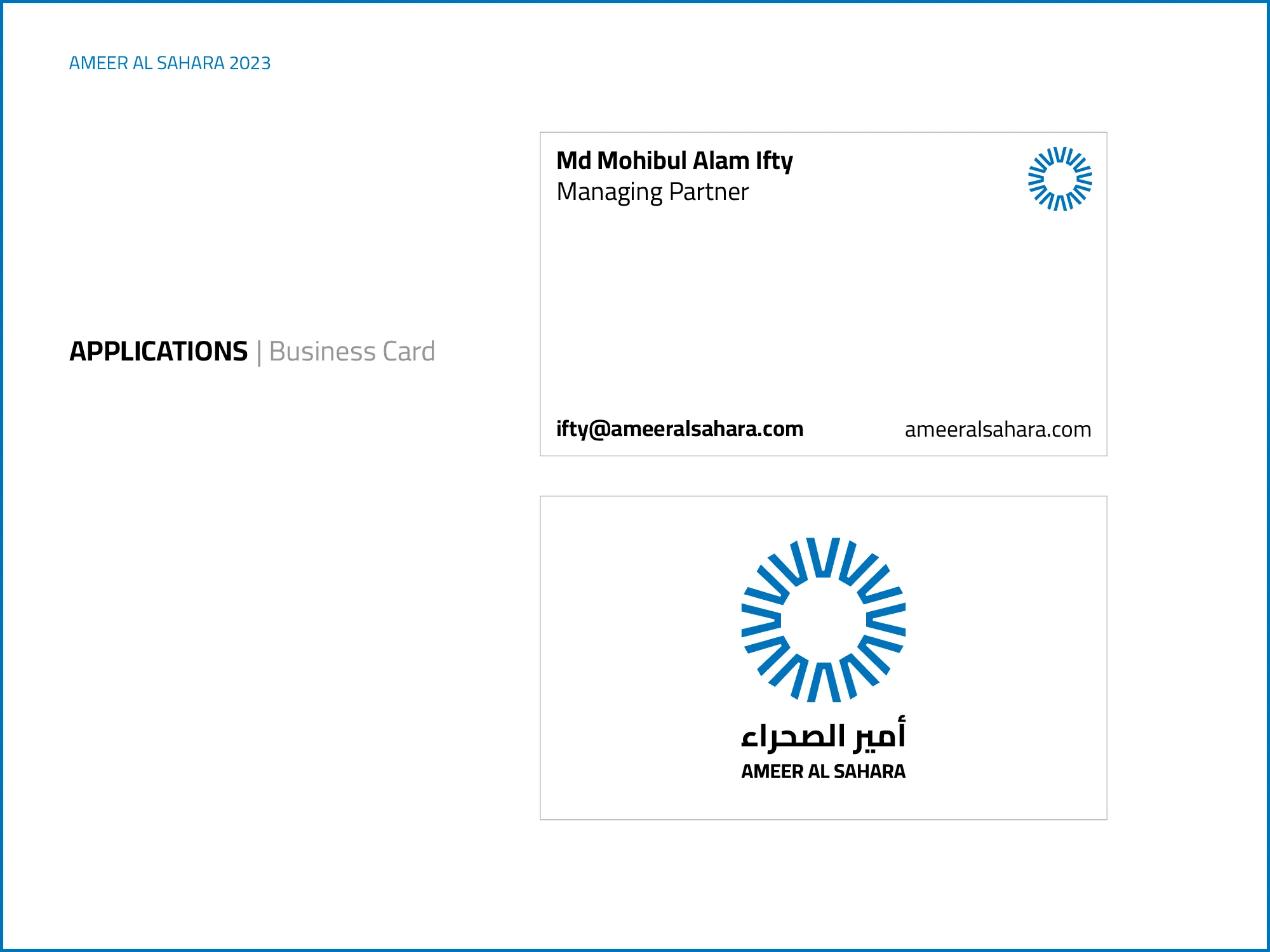
To establish credibility, we created a brand identity that includes a logo, brand color, and applications. The circle in the logo represents the globe, and the letter "A" represents Ameer Al Sahara. The combination of these two elements creates a simple and effective symbol. We used the typeface Cairo by Mohamed Gaber for the company name in English and Arabic letters. This allows the company to communicate with its customers in both languages. We chose corporate blue for the color palette. The color is associated with trust, reliability, and stability, which are all important qualities for a company to project. We designed a business card with clear and concise contact information to make a positive impact on potential customers. We then created a brand guide that provides basic guidelines on the elements of the brand identity.
Like this project
Posted Aug 24, 2023
To establish credibility, we created a brand identity that includes a logo, brand color, and applications.


