AI Mental Health App UI/UX Design

Cansaas Agency

Overview
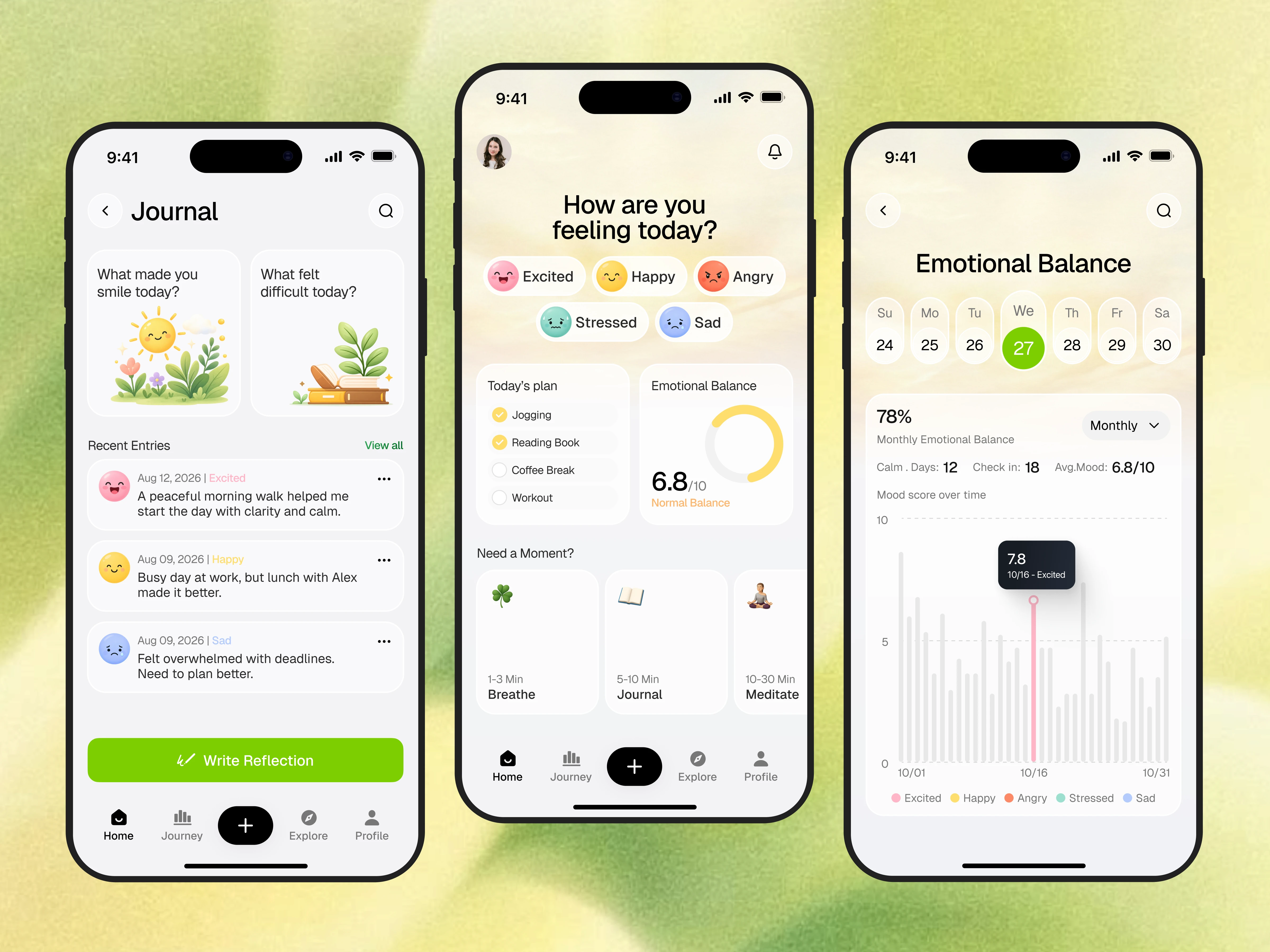
This project explores an AI mental health mobile app designed to make emotional self-awareness feel more approachable, supportive, and human. Instead of presenting mental wellness as something clinical or overwhelming, the app focuses on a softer daily experience through mood check-ins, emotional balance tracking, guided journaling, and small self-care moments. The goal was to create a mental health app UI design that feels calm, friendly, and easy to return to every day.
The Challenge
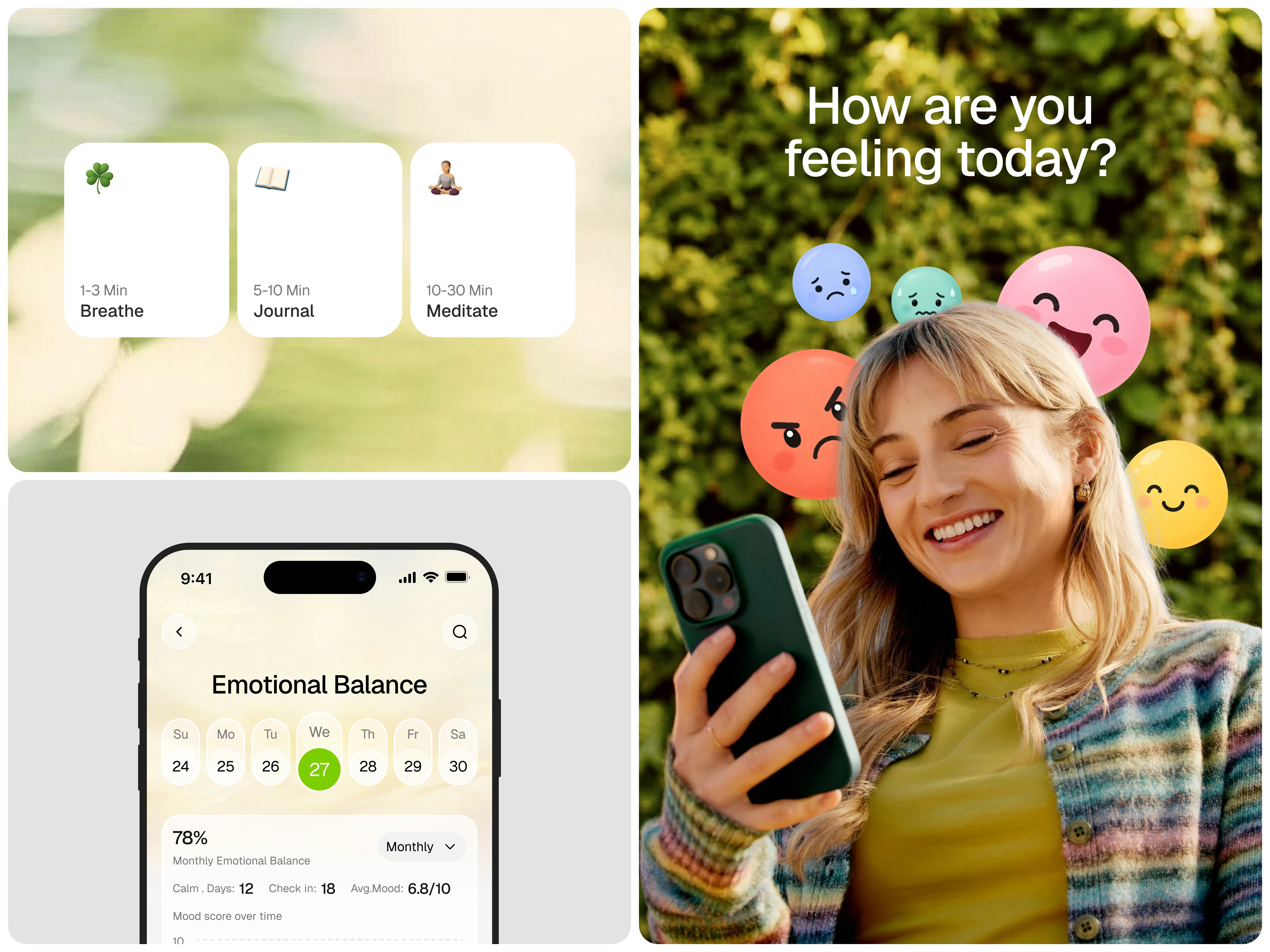
Many mental wellness apps feel too medical, too data-heavy, or emotionally distant. Users often want support that feels simple and gentle, not like filling out a formal assessment. The challenge in this mobile app design was to build a system that helps users reflect on their mood, understand emotional patterns, and build healthier habits—while keeping the interface visually light, intuitive, and emotionally safe.
The Solutions
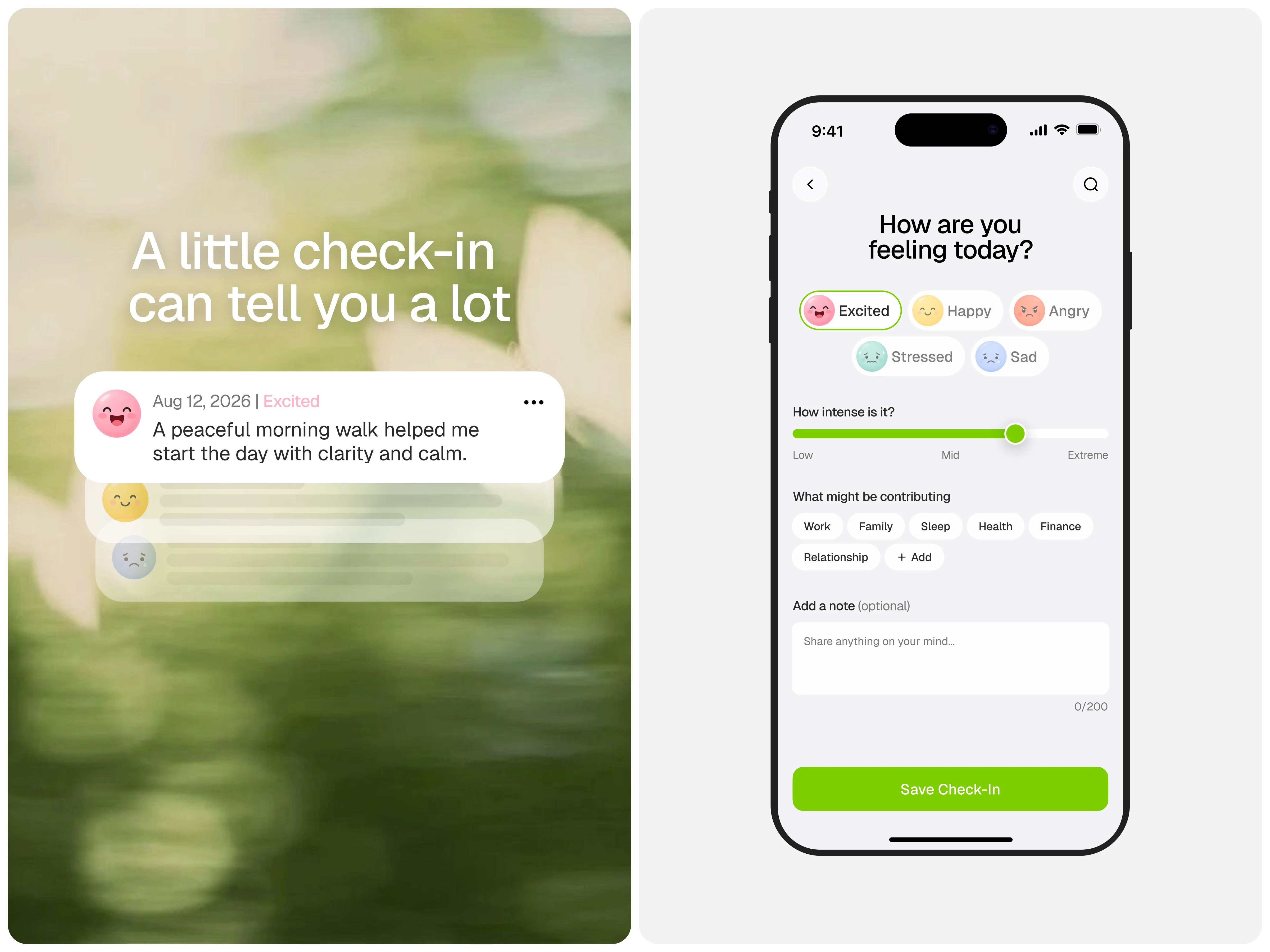
The solution was a clean mobile UI/UX design centered around short daily interactions. The app introduces a welcoming mood check-in flow, a visual emotional balance dashboard, and a journaling experience that encourages reflection without pressure. By combining AI-assisted wellness support, habit-friendly interactions, and calm visual storytelling, the product helps users better understand how they feel and what may be influencing their emotional state.
Key Features
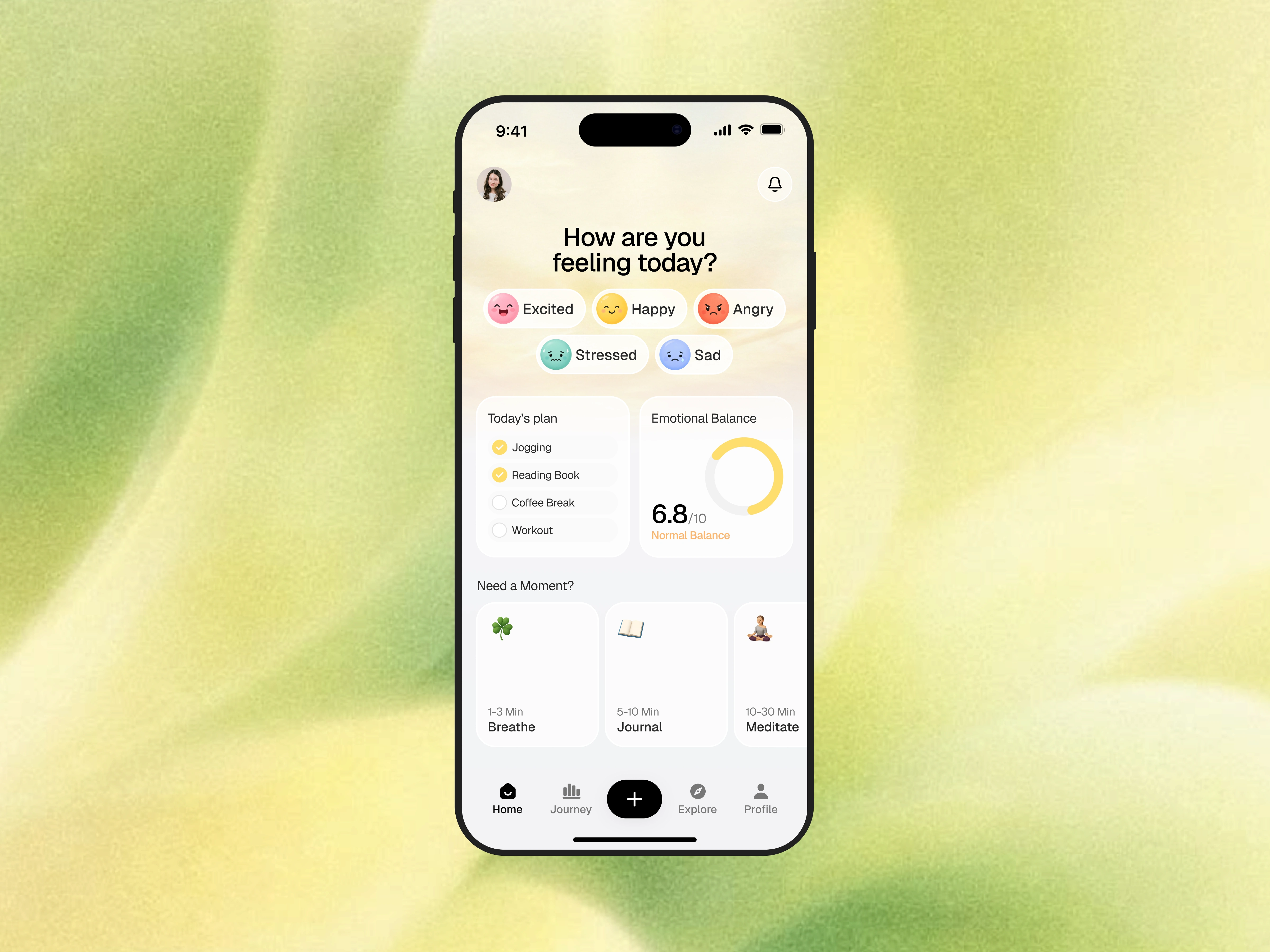
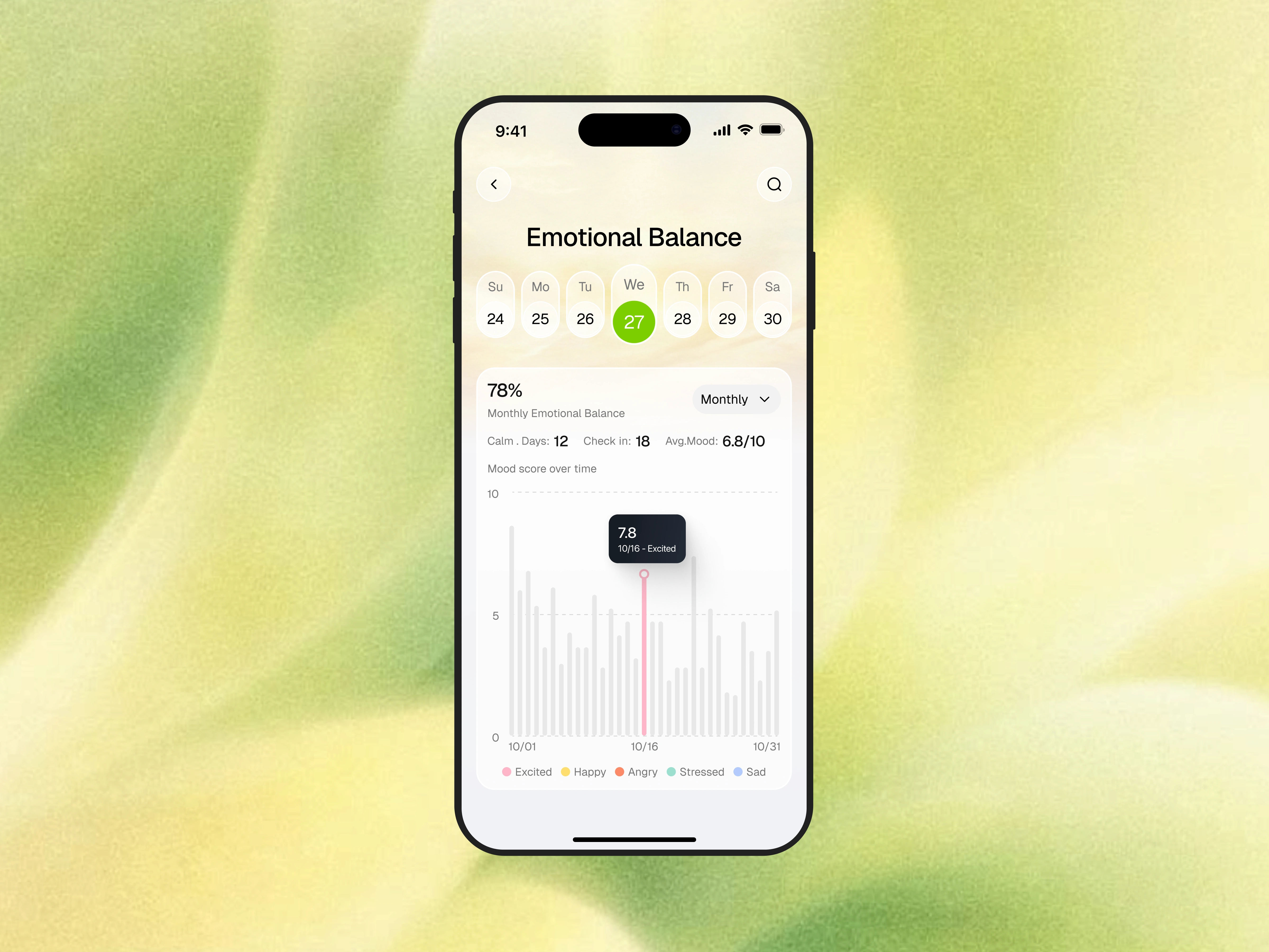
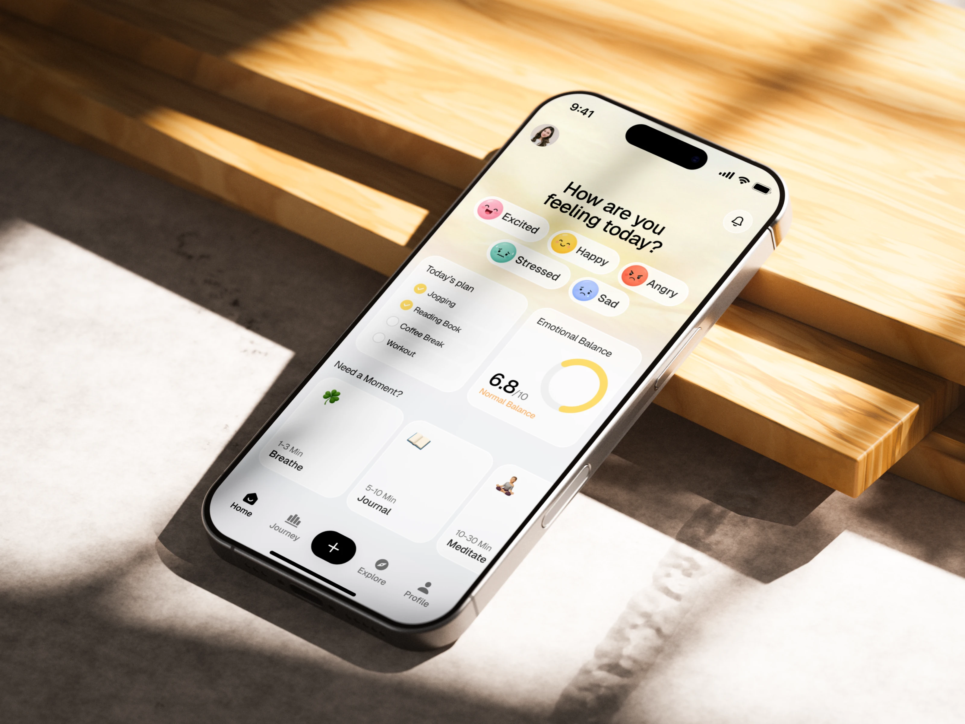
This AI mental health app includes several core features that support everyday emotional care. Users can quickly select how they feel through expressive mood states such as happy, excited, stressed, sad, or angry. The app also offers an emotional balance tracker with simple analytics, a journal screen for reflection, and small wellness activities like breathing, journaling, and meditation. These features work together to create a more holistic and engaging self-care mobile app experience.
Design Approach
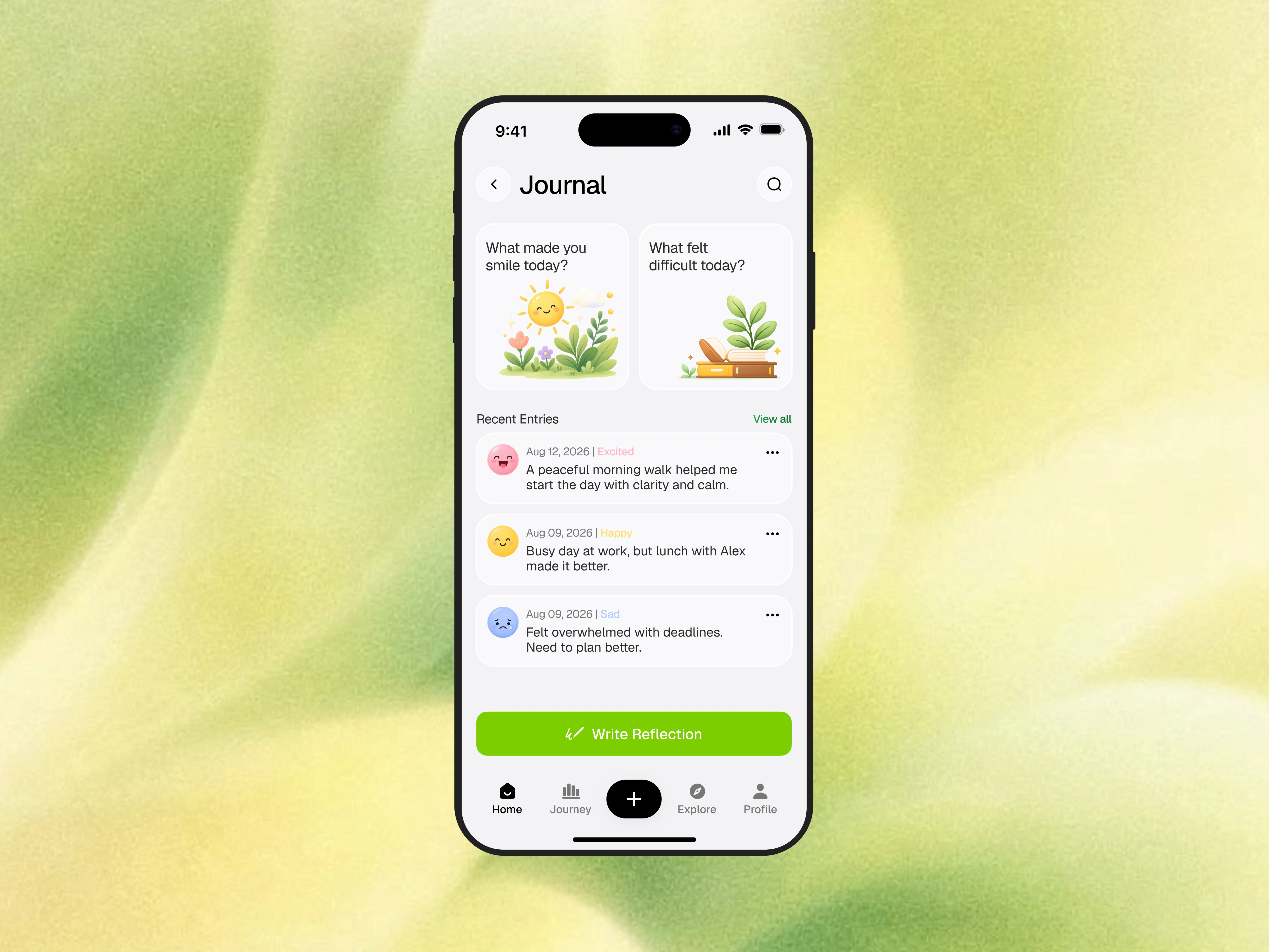
Visually, the interface was designed to feel soft, warm, and reassuring. The use of light neutral surfaces, gentle green tones, rounded cards, and friendly mood illustrations helps reduce emotional friction and makes the app feel more welcoming. Each screen was built with a strong focus on clarity, spacing, and readability, ensuring the mobile app UI remains clean while still feeling expressive and emotionally engaging.
User Experience
From a UX design perspective, the experience is intentionally simple and habit-driven. Users are guided through natural steps: checking in with their mood, understanding their emotional patterns, and reflecting through journal entries or short wellness actions. The interaction flow is designed to feel effortless, helping users build a healthier relationship with emotional tracking over time. This makes the product not just functional, but supportive in a meaningful way.
Outcome
The final result is a modern AI mental health mobile app design that blends emotional intelligence, accessibility, and everyday usability into one cohesive product experience. It demonstrates how mental health app design, wellness dashboard UI, and mobile product design can work together to create a digital space that feels calm, personal, and genuinely helpful. This concept is ideal for startups, founders, and product teams looking to build a more human-centered mental wellness platform.
Like this project
Posted Aug 25, 2026
Designed a friendly AI mental health app for emotional self-awareness and daily self-care.
Likes
1
Views
30