BFT Sales Deck Design Project
Deborah B

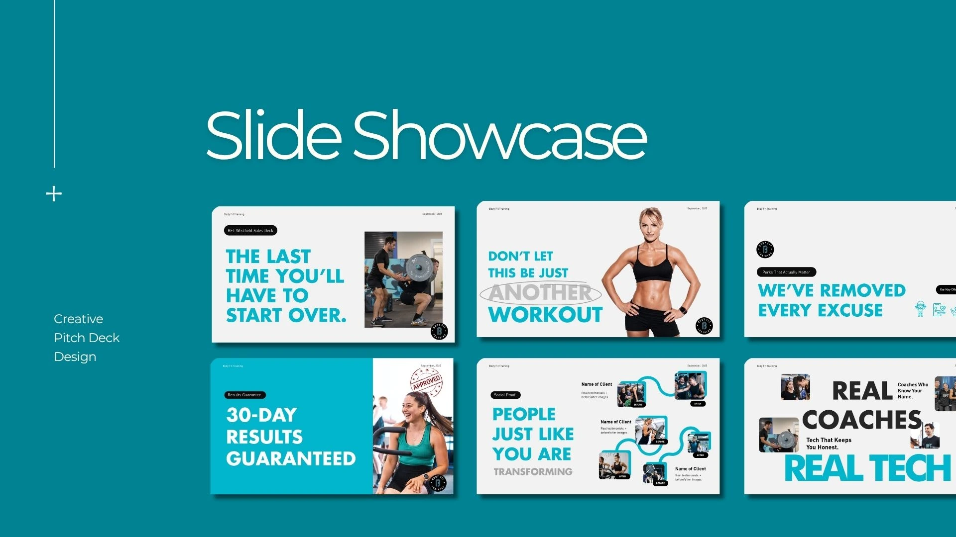
BFT Westfield Sales Deck Design
BFT already had a strong idea; it’s not just about working out, it’s about staying consistent.
The challenge was turning that idea into a sales deck people could actually follow without feeling overwhelmed or lost.

I kept asking one question while designing:
“Does this feel easy to understand?”
Instead of adding more, I focused on removing anything that didn’t help the message.
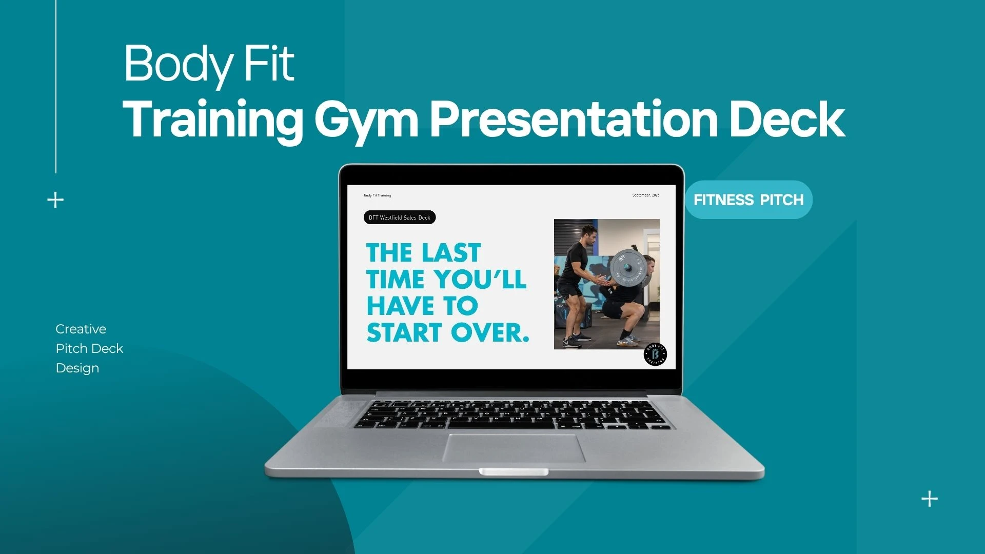
Each section flows into the next, starting from the problem, introducing the system, and then backing it up with real results.
Nothing complicated, just clear and intentional.
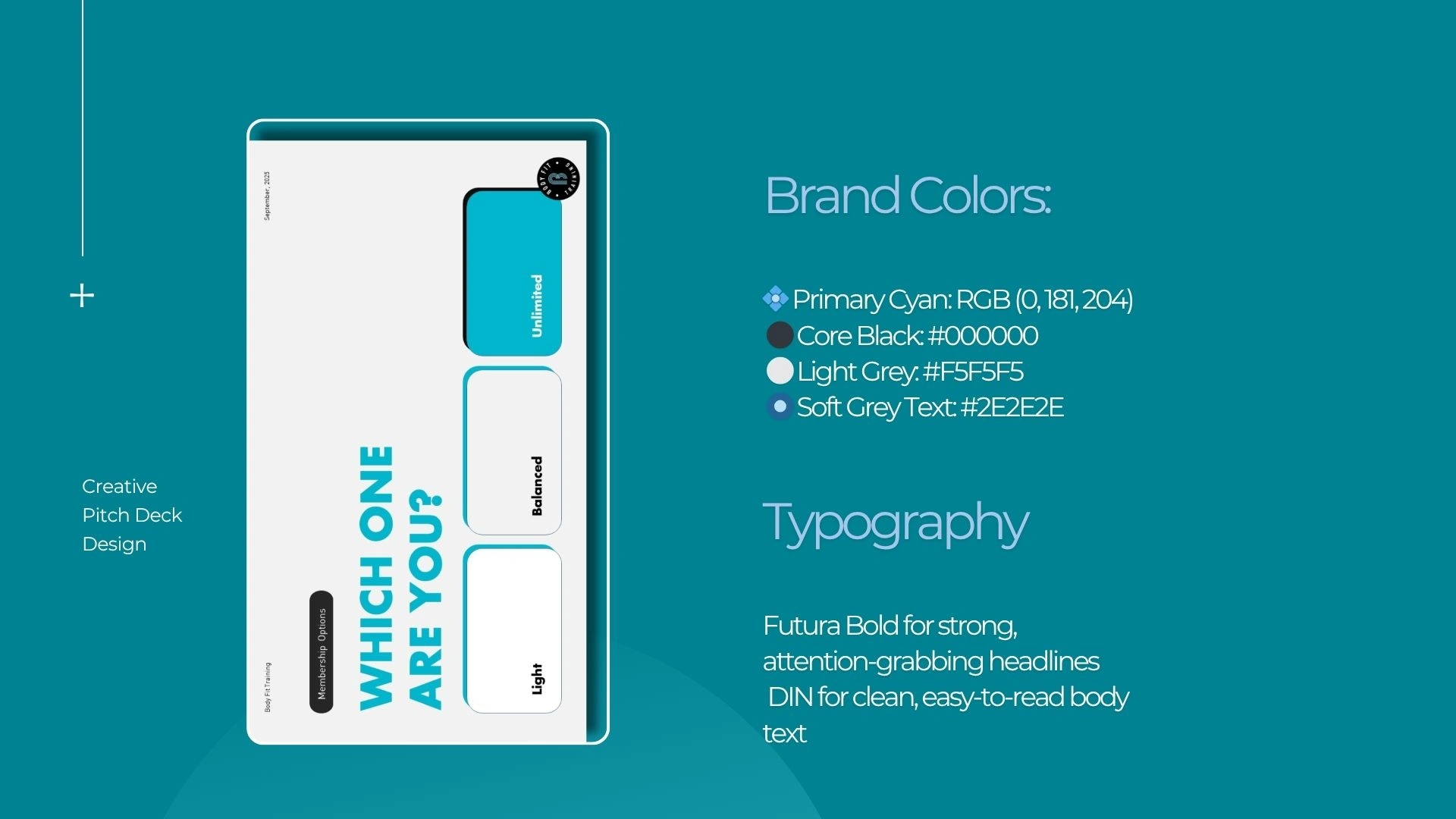
Design Direction
I kept the look simple so the message could stand out.
Colours:
💠 Primary Cyan: RGB (0, 181, 204)
⚫ Core Black: #000000
⚪ Light Grey: #F5F5F5
🔘 Soft Grey Text: #2E2E2E
Typography:
Futura Bold for headings
DIN for everything else

What this project really shows:
I know how to take an idea and make it clear.
Not by over-designing it, but by organizing it in a way that just makes sense.
A good deck shouldn’t feel like work to go through. It should feel natural, almost effortless.
Like this project
Posted Apr 9, 2026
I designed a clear and organized sales deck for BFT with a simple visual style.