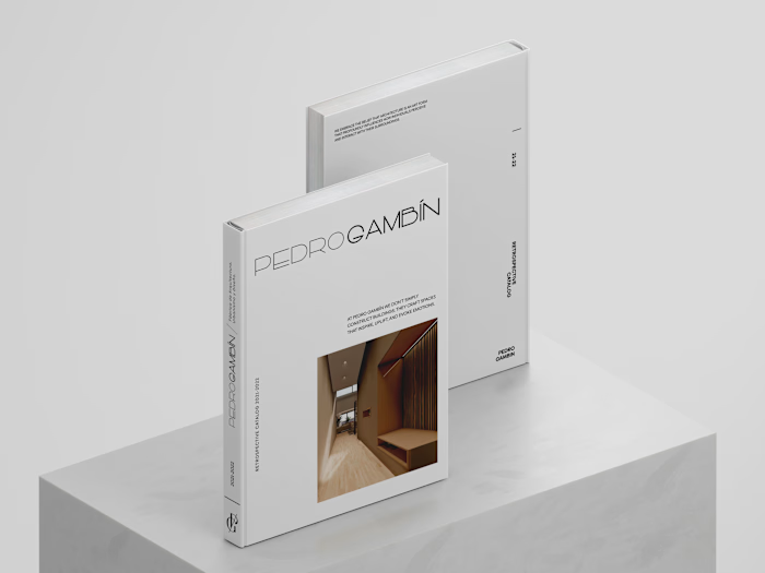
Visual identity & Web Design for architecture studio.
Overview
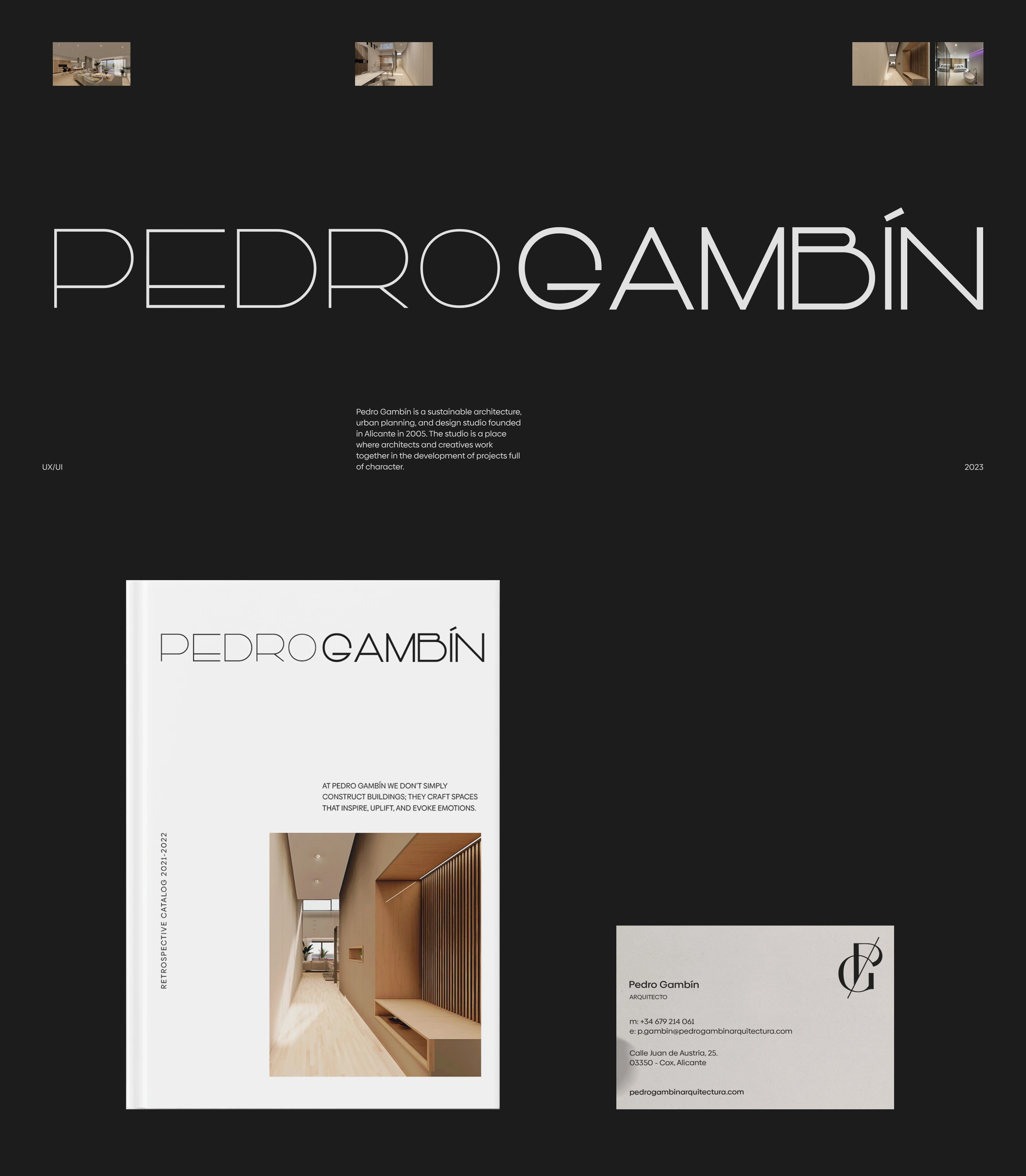
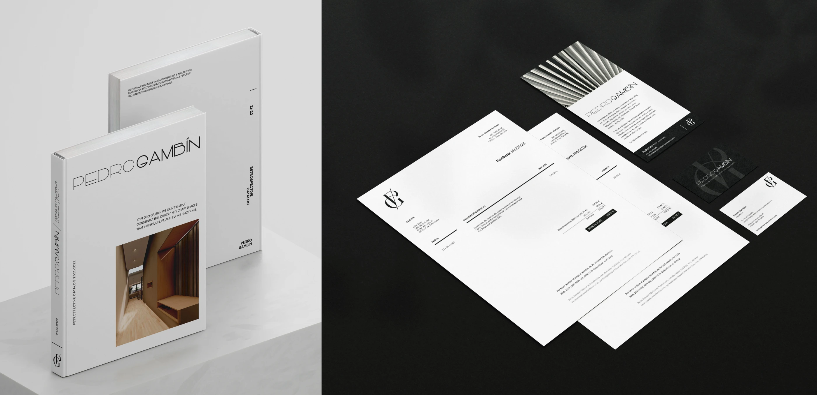
The project involved designing a full website and brand identity for an architecture studio, building a digital presence that reflects their refined aesthetic and architectural vision. The goal was to balance clean, modern design with elegance, giving their architecture work the right space to shine.
Project Details
Role: Brand & Web Designer (UI/UX + Identity)
Tools: Figma (UI design, layout, responsive planning), brand identity assets (logo, typography, color palette)
Scope: Full website design + brand identity integration + responsive layout for project galleries and content pages
Focus: Visual storytelling, clean layout, brand cohesion, responsive experience

Challenges
Conveying architectural sensibility online
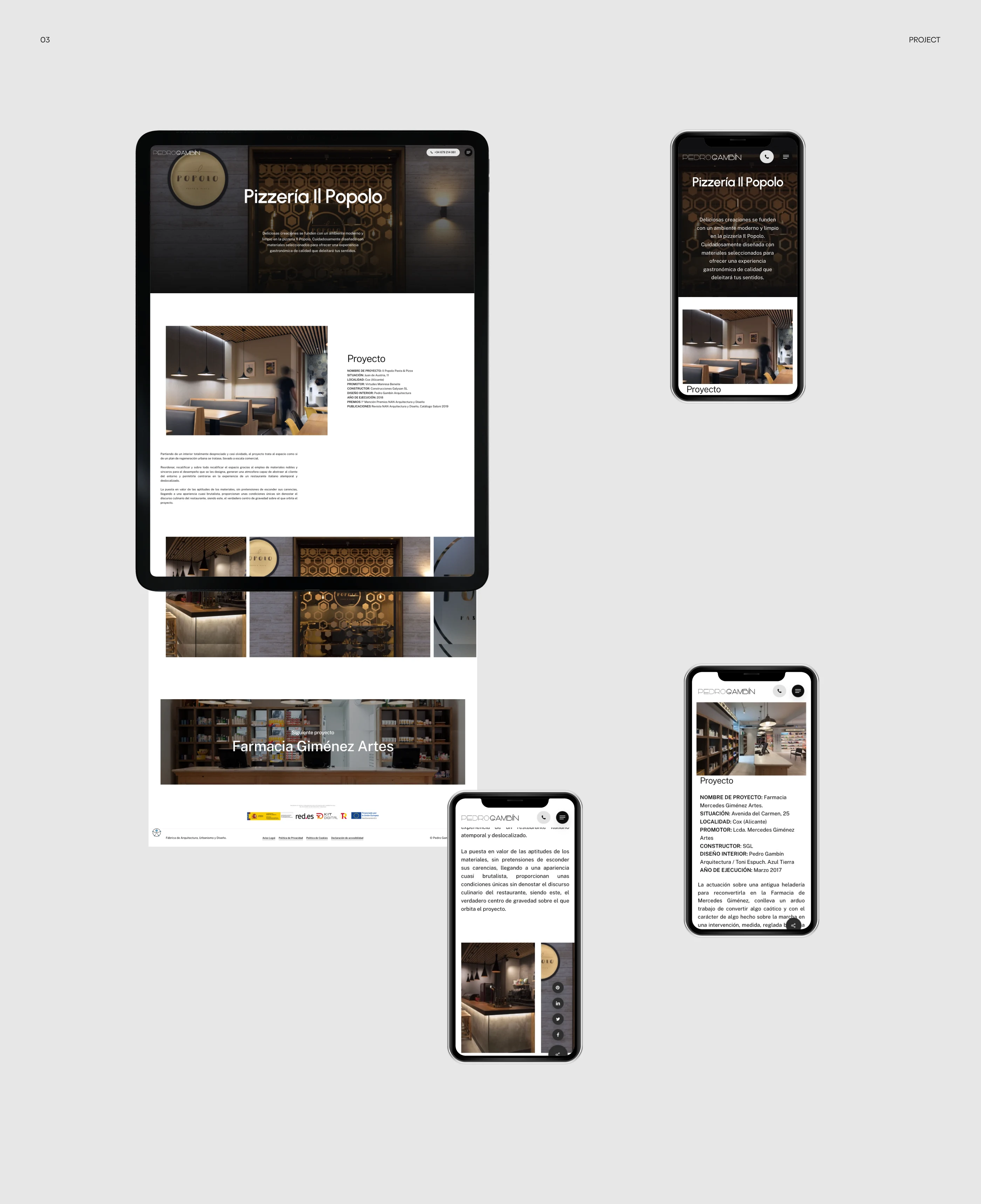
As an architecture studio, they needed the website to feel like a visual gallery, letting projects speak for themselves. The challenge was creating a layout that presents heavy visual content (photos, renders, project descriptions) without clutter, while maintaining a sense of sophisticated minimalism.
Integrating brand identity and web UI seamlessly
The brand identity (typography, logo, spacing, colors) needed to carry over into the website design cleanly. The challenge was to make sure the transition between brand elements and digital UI felt natural, cohesive, and professional, and not disjointed.
Responsive design for complex content
With architecture projects often involving large images, project galleries, and detailed descriptions, the website needed to adapt gracefully across devices without losing layout integrity or aesthetic impact.
Solutions
Clean, grid-based layout emphasizing project visuals
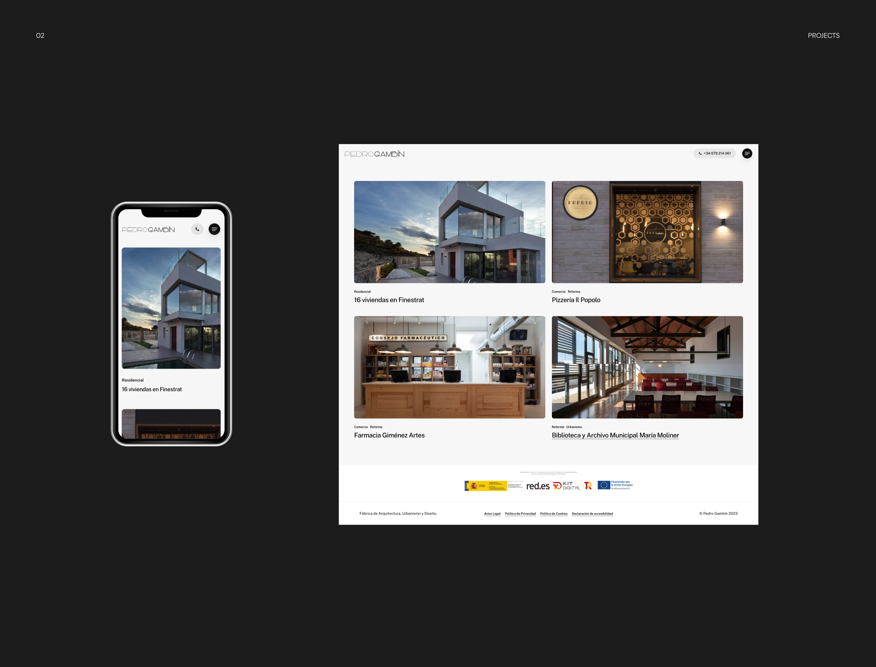
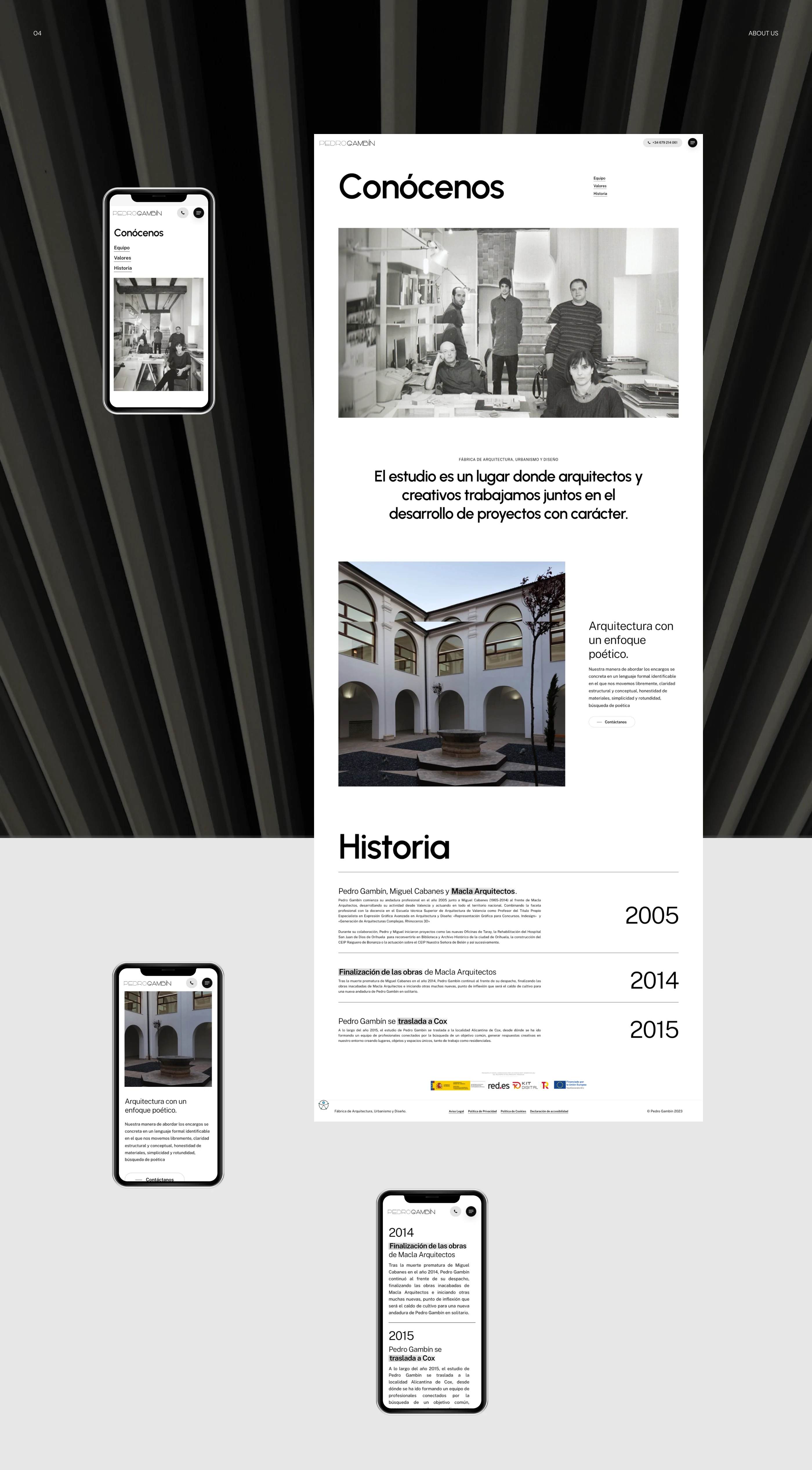
I created a structured grid layout allowing large project images to dominate the page, with subtle spacing and clean typography. This approach highlights the architecture work itself, treating each project like a visual case study rather than a mere listing.
Unified brand system applied across UI
The brand’s logo, color palette, typography style, and spacing rules were integrated directly into the web UI design. Each page, section, and component follows the same visual language, giving the site a calm, consistent identity that feels intentional and premium.
Responsive galleries and adaptive content blocks
The website is designed with flexibility: galleries, project previews, text blocks and navigation adapt fluidly across screen sizes. On mobile the layout preserves readability and clarity; on desktop it provides immersive visuals, offering a consistent user experience on any device.
User Benefits
Clear portfolio showcase: Visitors immediately see high-impact visuals of architecture projects, giving a strong sense of quality and craftsmanship.
Elegant, professional first impression: The minimal, well-designed UI builds trust in the studio’s brand identity, giving credibility to their work.
Smooth navigation and readability: Clean layout and consistent design make it easy for users to browse projects, read descriptions, and move between pages.
Mobile-friendly access: Responsive design ensures the website remains functional and visually appealing on any device, broadening reach and accessibility.
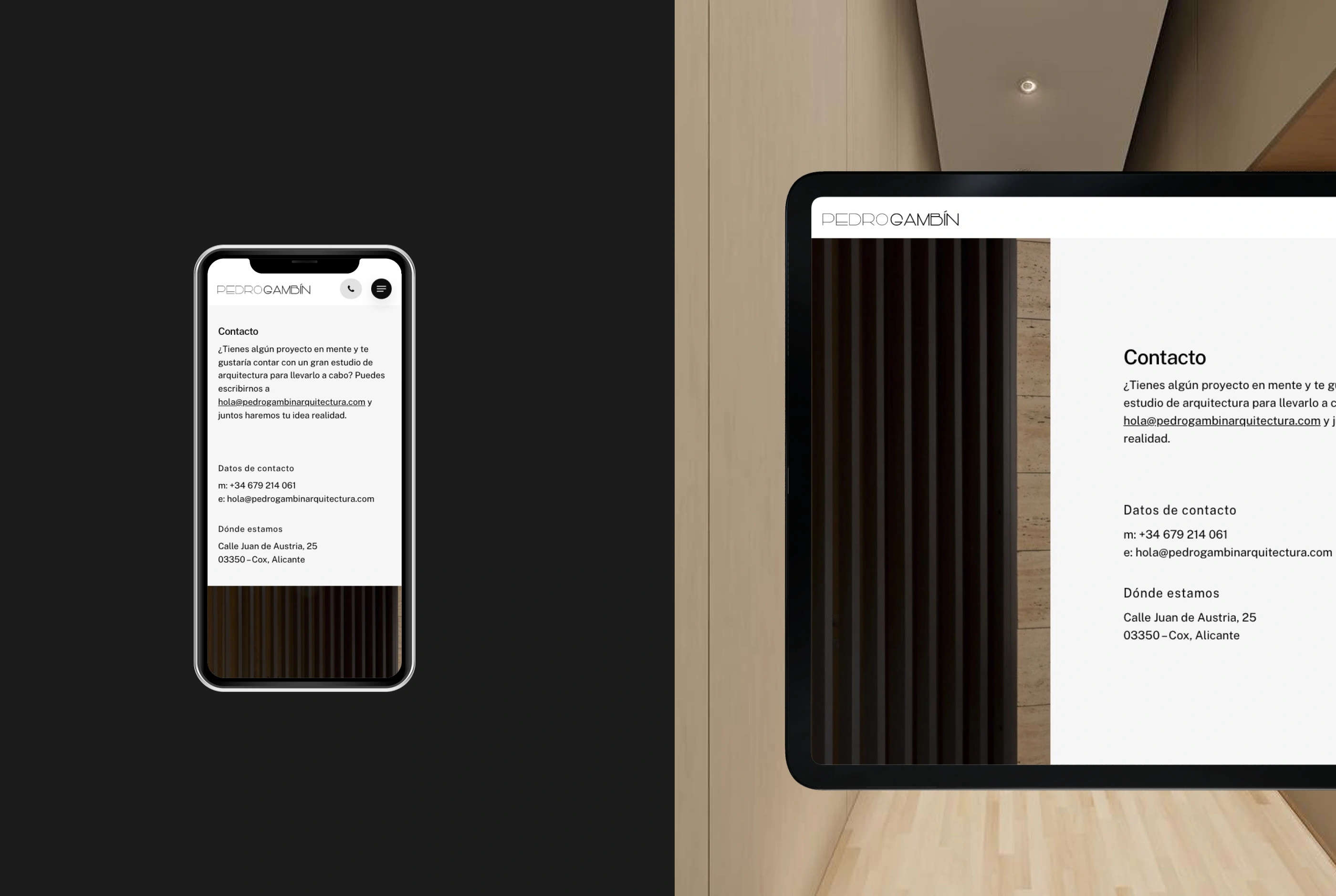
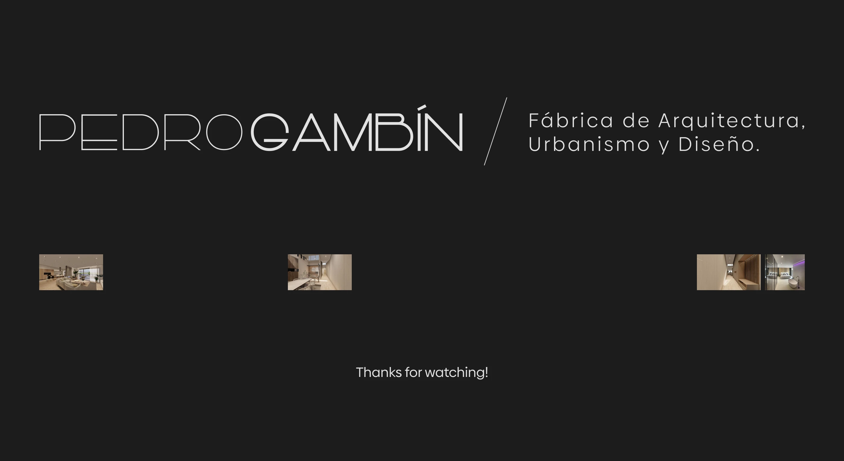
This project demonstrates how to fuse brand design with web UI in a way that respects the core identity of brans while delivering strong usability. Architecture websites often struggle between heavy visuals and functional navigation; this design finds a balance, giving the imagery room to breathe without sacrificing clarity or responsiveness.
Like this project
Posted Nov 30, 2025
Visual identity and website design for Pedro Gambín, creating a refined brand system and a clean digital experience that highlights their architecture work.


