360º Architecture studio Branding.
Juan Riccardini
Overview
The goal was to build a complete brand identity for PG Architecture Studio — an identity that feels professional, timeless, and suitable for an architecture practice. This meant defining logo, typography, colors, layout rules and overall visual personality that could be applied consistently across stationery, printed materials, digital presence, and client communications. The result is a refined brand system that reflects the studio’s architectural values and quality standards.
Project Details
Role: Brand Designer
Tools: Figma (logo, typography, layout), Adobe Suite for mockups & print-ready assets
Scope: Full identity. Logo, typography, color system, stationery, brand guidelines, mockups for print and digital usage
Focus: Timeless visual identity, clarity, consistency across media, professional tone
Challenges
Conveying sophistication and timelessness in a crowded space
Architecture studios often compete visually. The challenge was creating a distinctive identity that feels elevated but not trendy, something classic and professional that will age well.
Designing for multiple applications from day one
The brand needed to work across business cards, stationery, print materials, digital portfolios and future websites. The challenge was to design a system flexible enough for all formats yet cohesive and consistent.
Balancing minimalism with character
A minimalist design runs the risk of feeling empty or unremarkable. The task was to maintain minimal restraint while injecting subtle personality, enough to stand out, but not at the cost of elegance or clarity.
Solutions
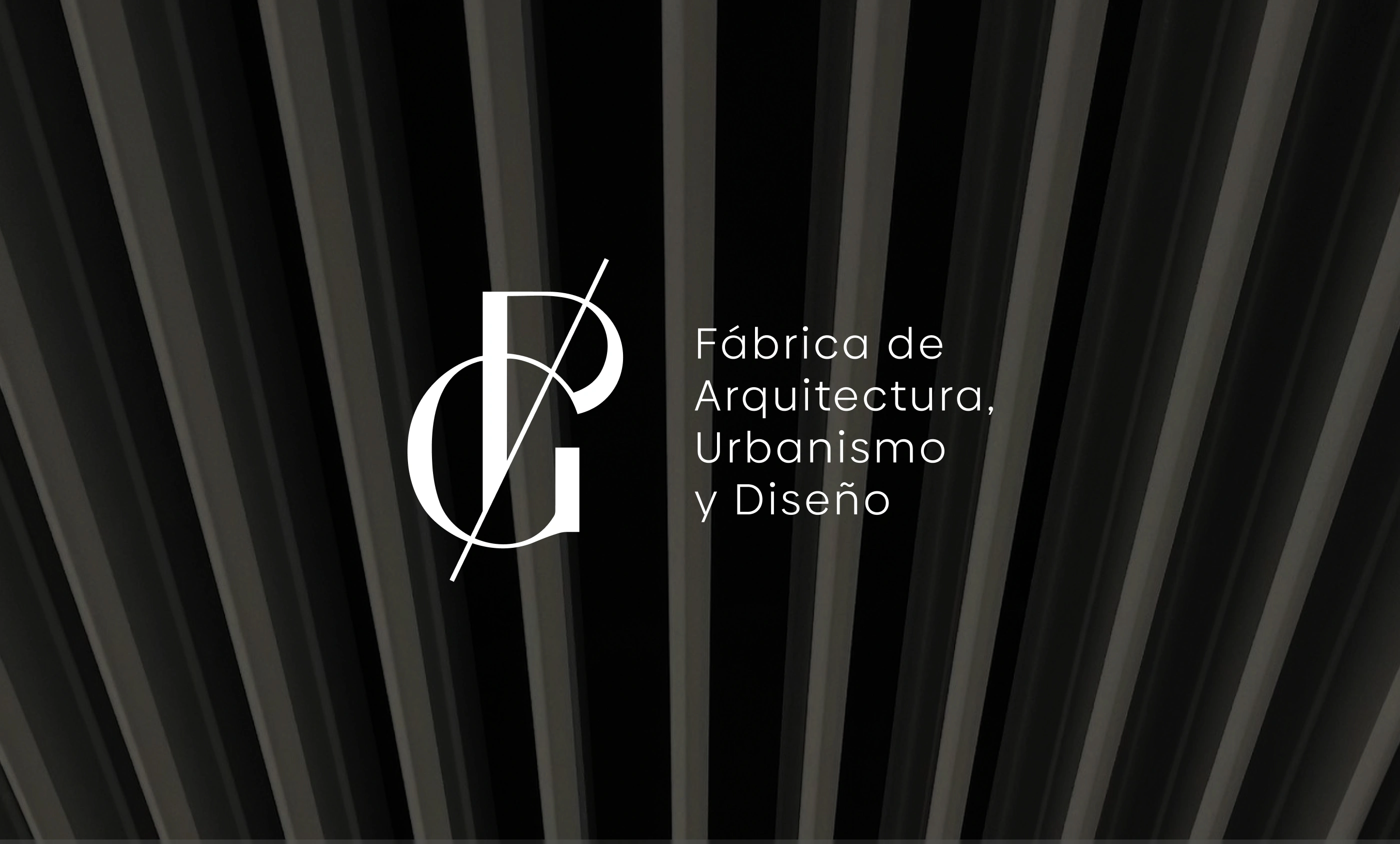
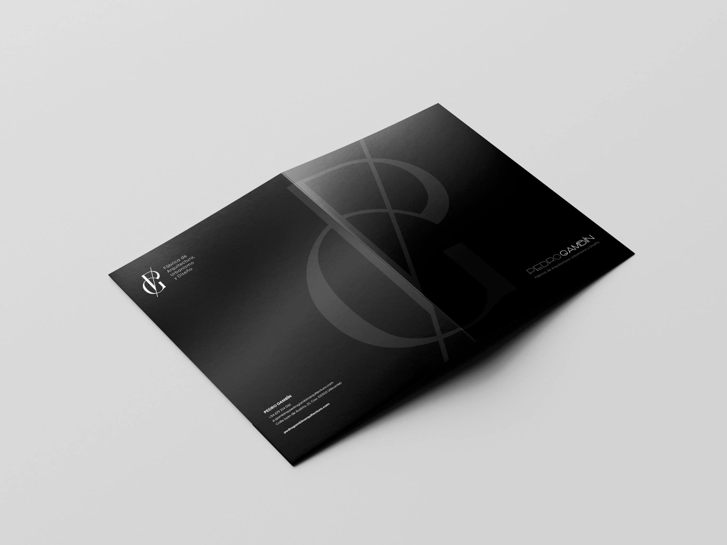
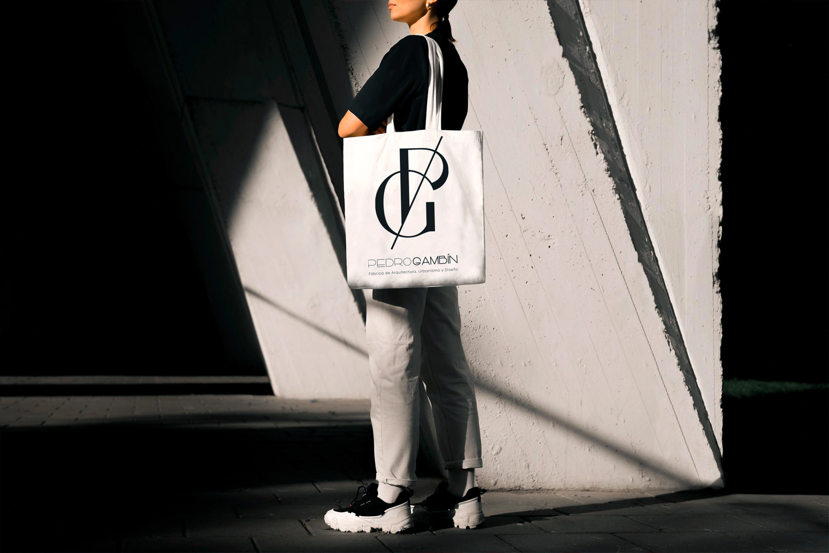
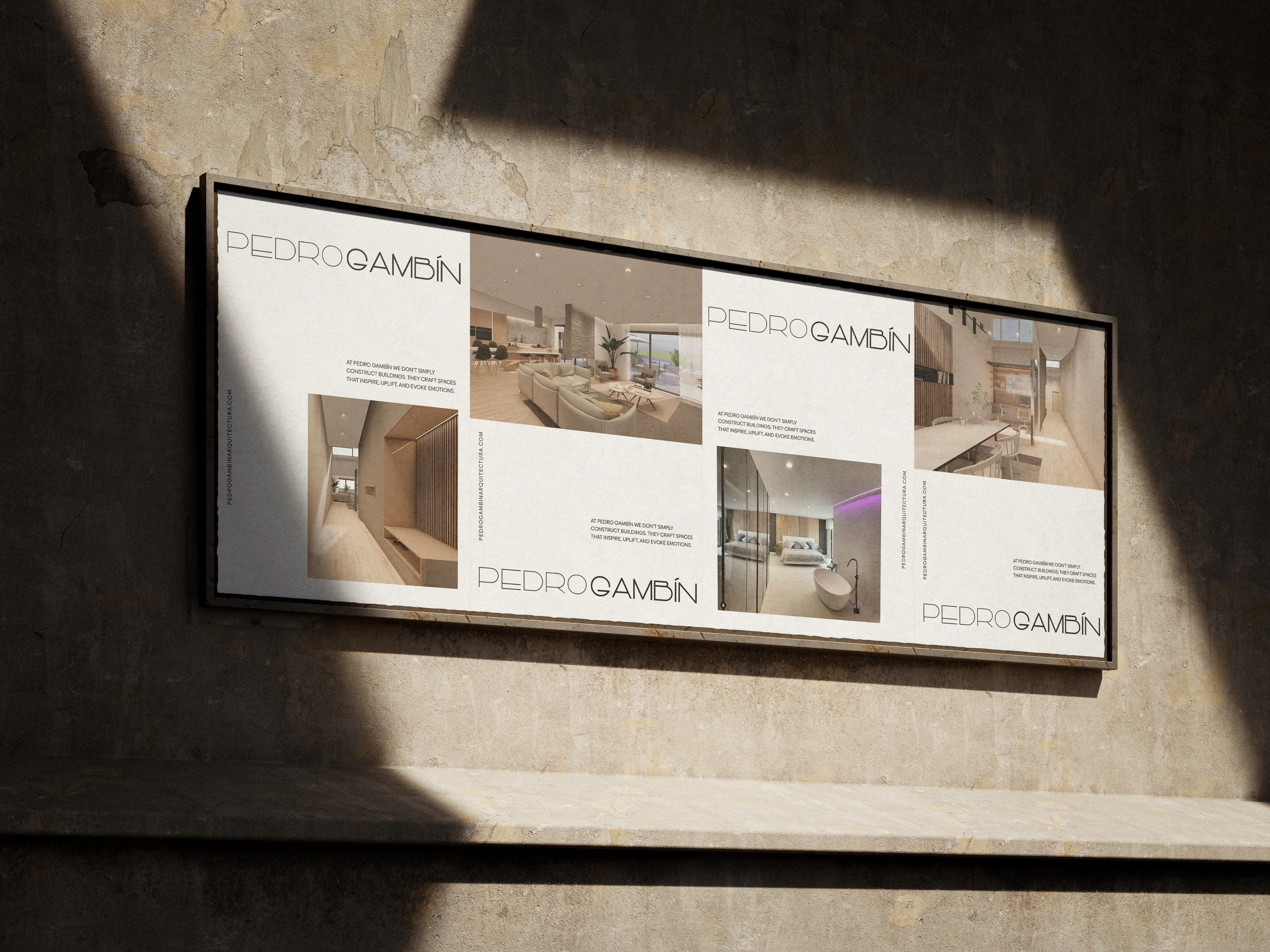
Elegant, minimal logo with structural geometry
I created a logo based on clean lines and geometric balance, reflecting architectural precision and giving a timeless feel. The geometry and spacing make it versatile and scalable across different sizes and media.
Thoughtful typography and color system
I chose a refined typeface with clear hierarchy and readability. The color palette is restrained but distinctive, a neutral base for flexibility, with subtle accents for identity strength. This combination keeps communication clear and gives the brand a quiet confidence.
A modular brand system with guidelines
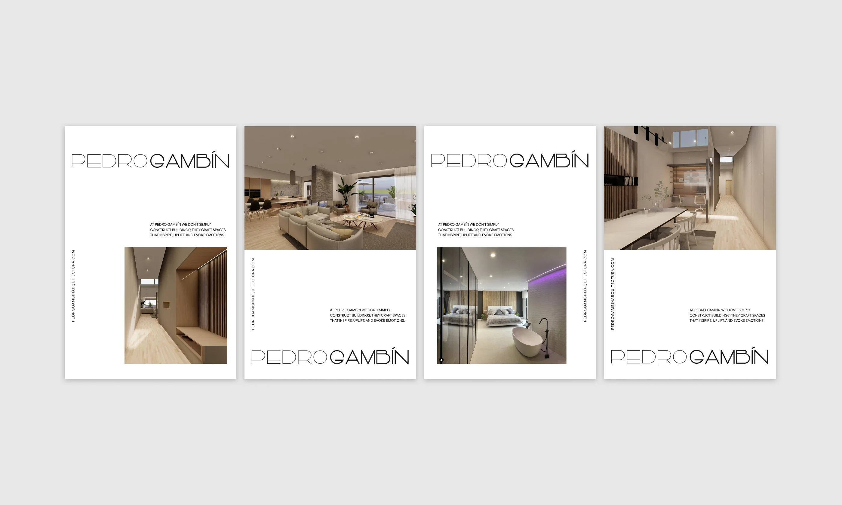
I developed a brand guide that outlines how to use the logo, colors, typography and layout across different media: print, digital, stationery, presentations. This ensures brand consistency from day one and makes future expansions easier.
Adaptation-ready visual assets and mockups
To help the studio visualize the brand in real world contexts, I created mockups: business cards, letterheads, presentation materials. This helps stakeholders understand how the brand works in practice, not just in theory.
Client / User Benefits
Professional and trustworthy brand presence: The refined identity conveys confidence and quality, ideal for an architecture studio pitching to clients who value sophistication.
Consistency across formats: Because the system covers print and digital from the start, the brand always looks coherent, whether it’s a business card, a proposal PDF, or a future website.
Ease of expansion: The modular design lets the studio apply the brand easily to new materials like websites, portfolios or marketing collateral.
Timelessness and longevity: The restrained, elegant design won’t feel outdated quickly, offering value over years.

This project shows how to build a clean, professional, and scalable identity that is flexible enough for multiple formats. It illustrates how minimal design, when done with care and precision, can carry strong emotional and professional weight. The brand is understated, but consistently communicates quality and clarity, a rare balance in many identity designs.
Like this project
Posted Nov 30, 2025
Brand identity and web design for Pedro Gambín Studio, creating a modern and refined visual system that highlights their architecture and interior projects.