Ecommerce Design Audit — SKIMS.com

Rich Tong

Before redesigning skims.com, I audited it. This is that deck.
SKIMS had become a $5B brand doing 9.2M monthly visits on a site that hadn't kept pace. Instead of opening Figma, I opened with evidence — a teardown of the category and of SKIMS' own surface — so the redesign brief came out of findings rather than taste.
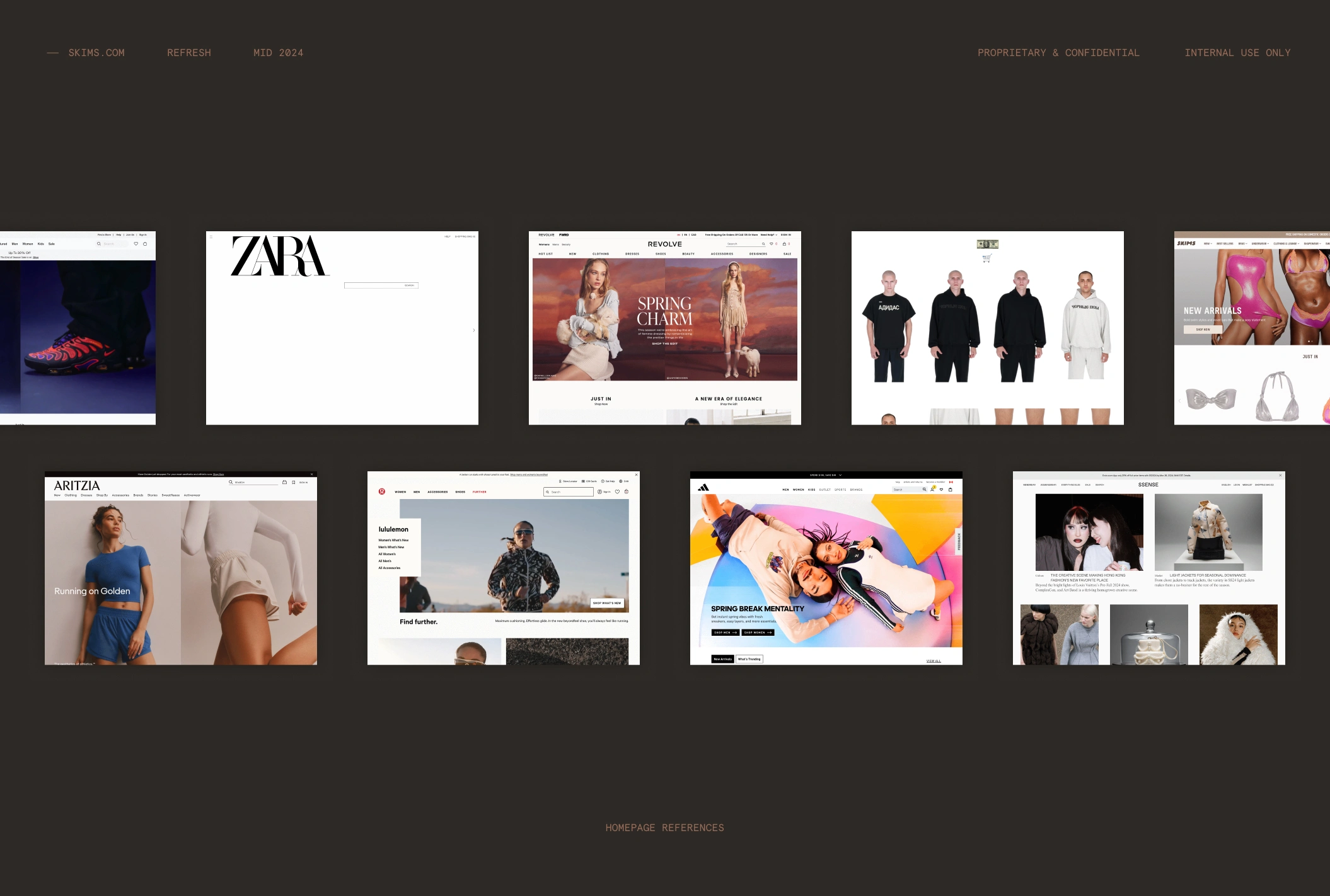
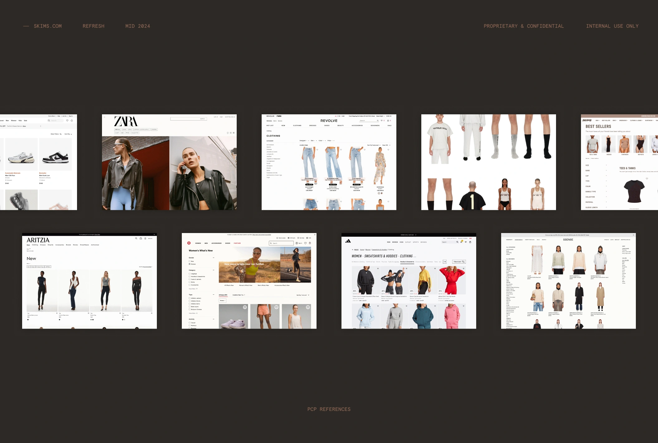
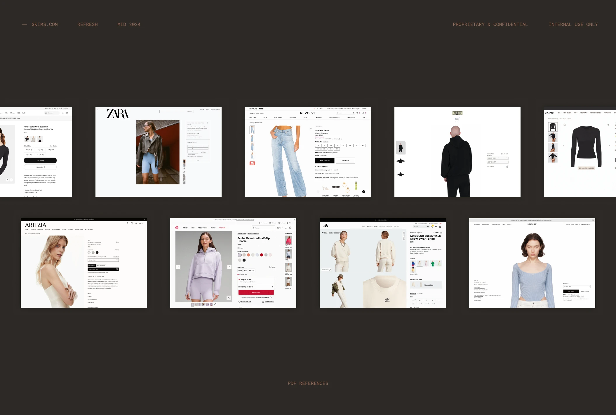
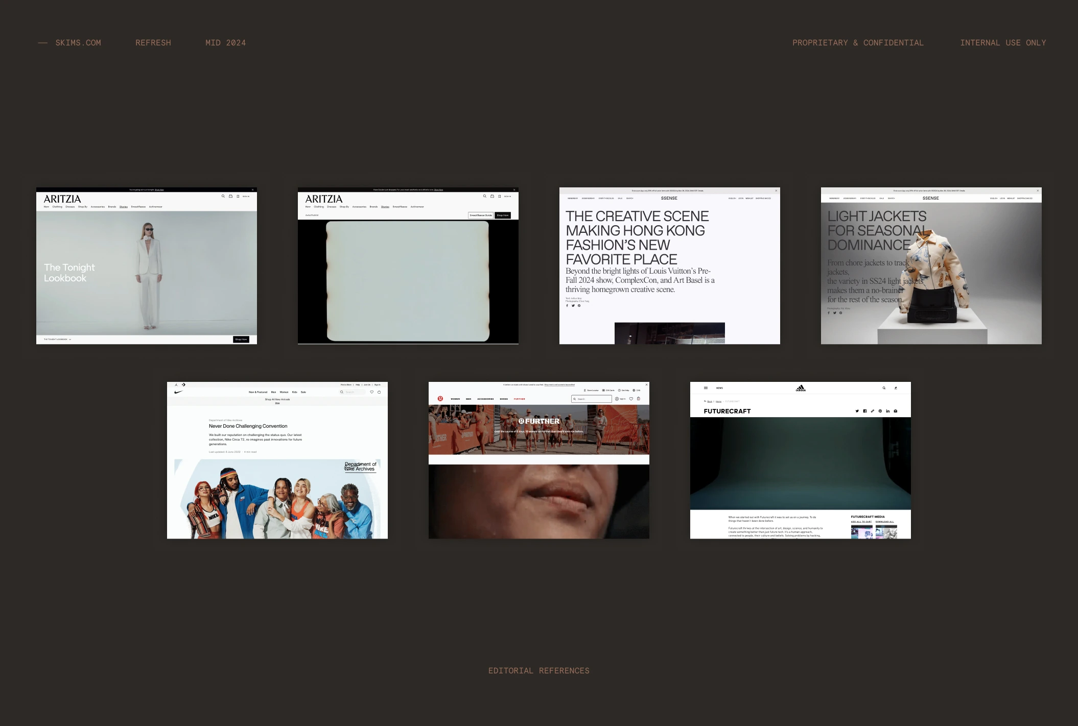
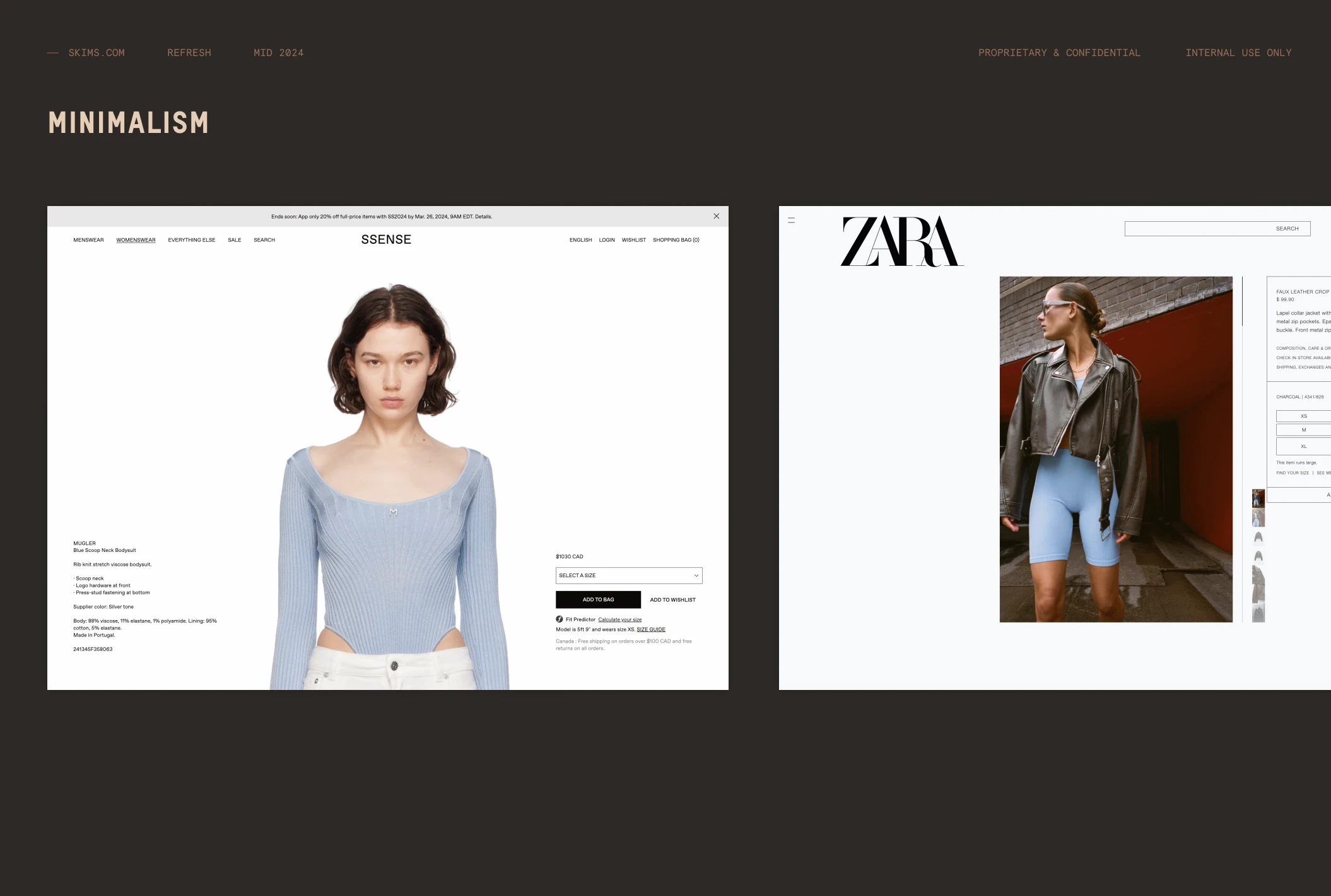
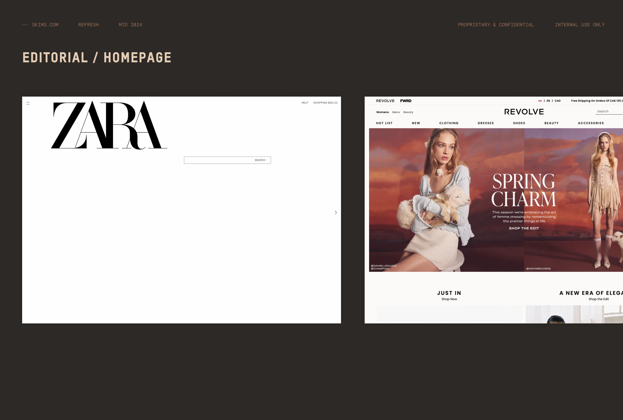
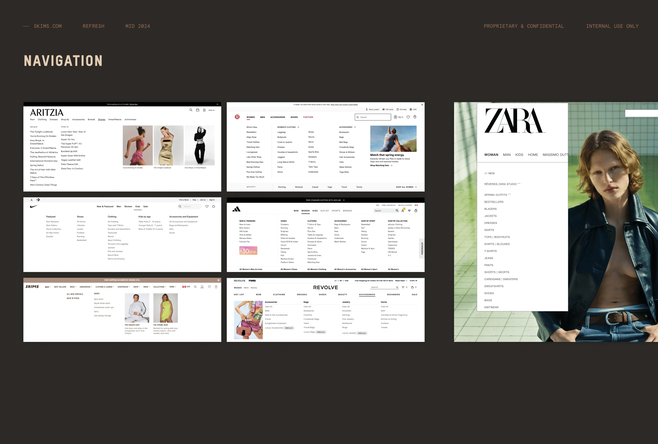
Competitive research. Zara, Aritzia, Revolve, Lululemon, Nike, Adidas and Essense, pulled apart page type by page type rather than screenshotted whole.
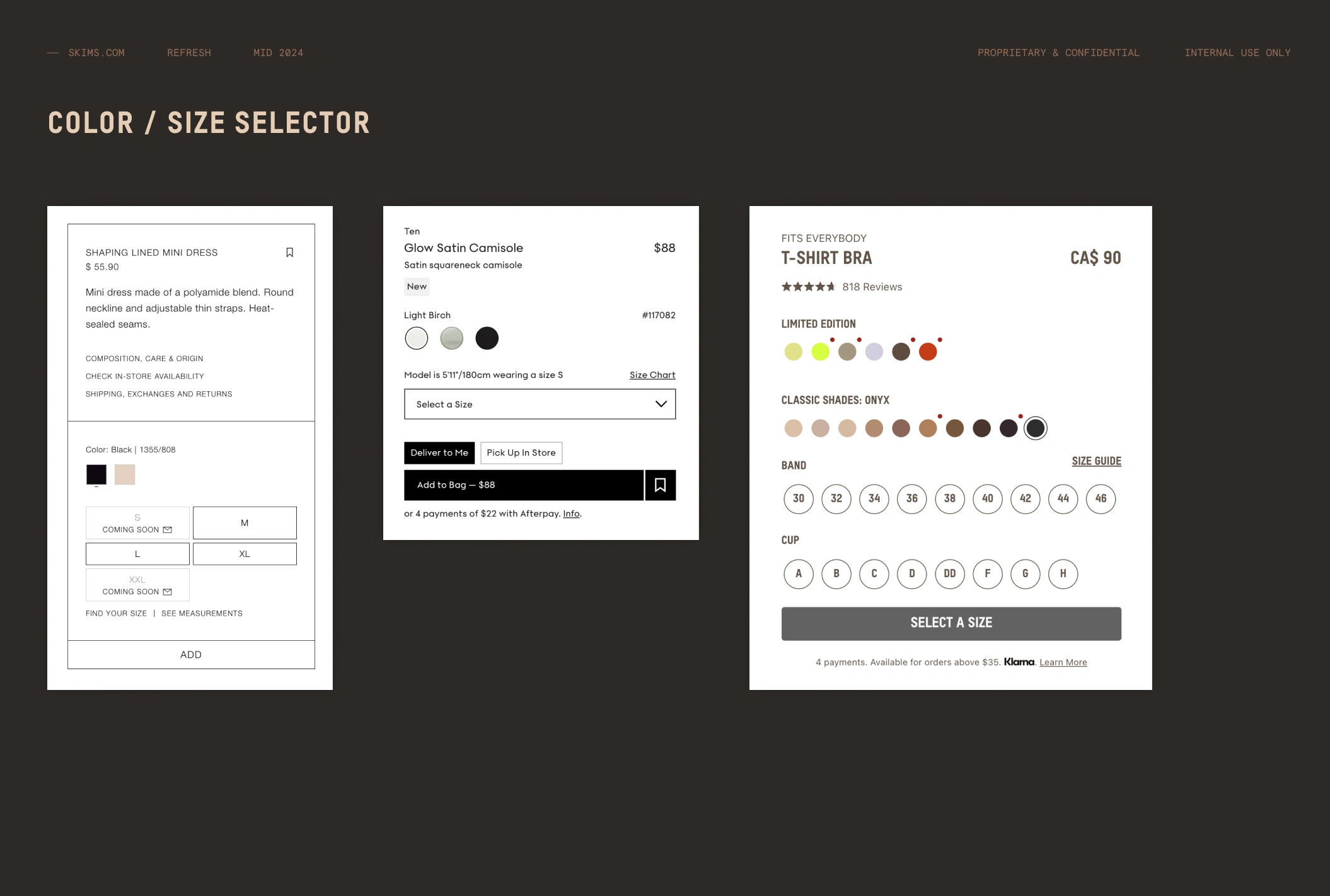
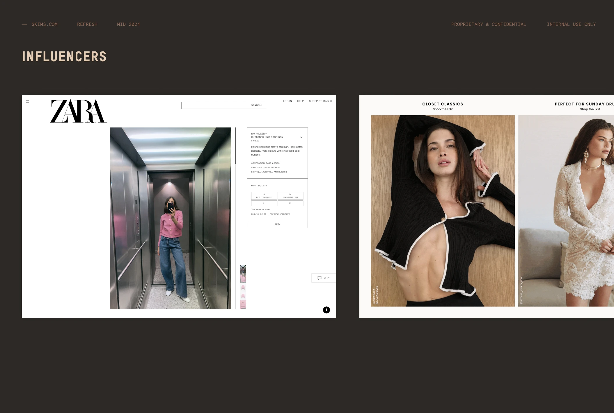
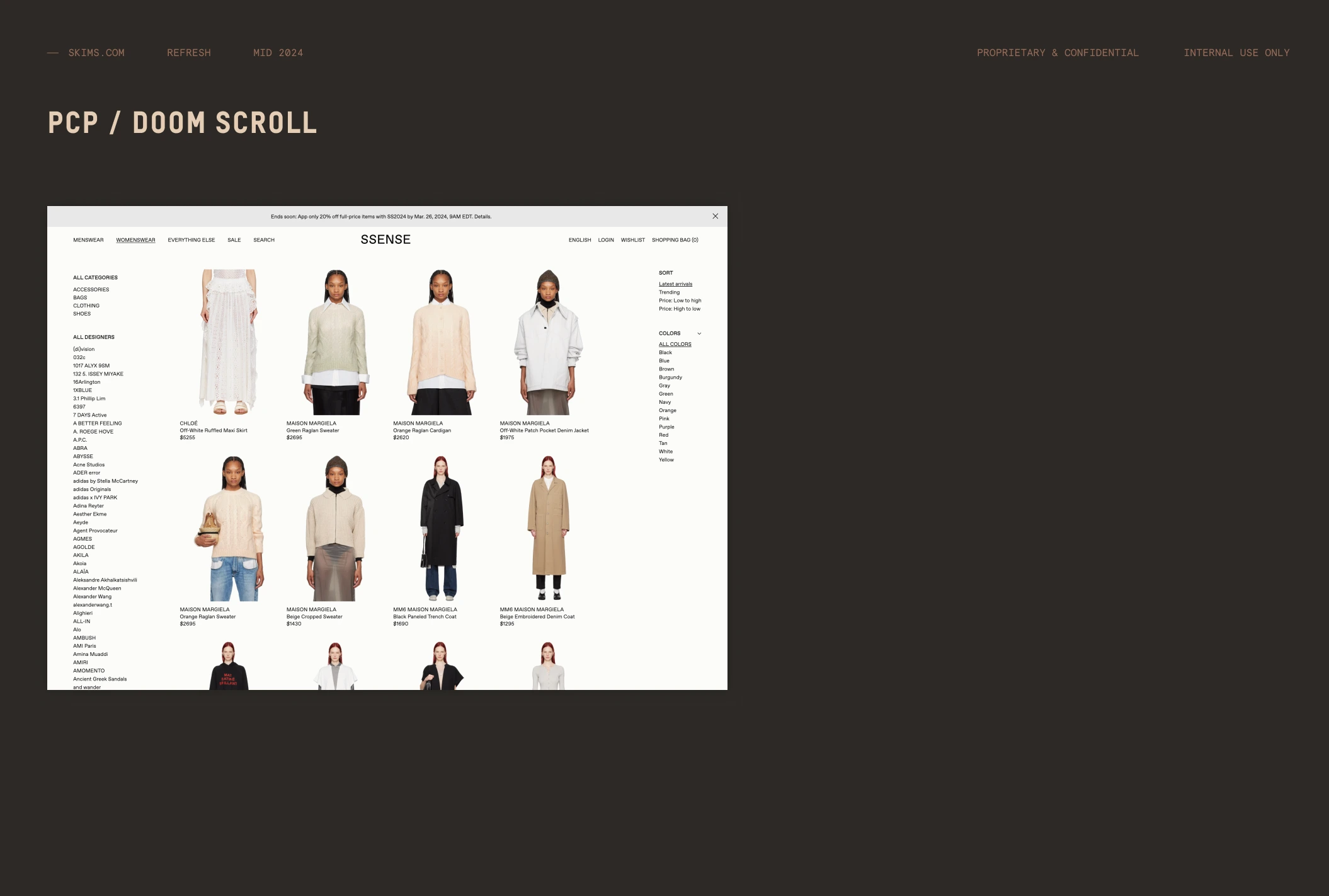
Viewpoints. Six positions the redesign had to take, each argued against real comparisons: minimalism, the editorial homepage, colour and size selectors, influencer merchandising, the product grid and the doom scroll, and navigation. The nav study put SKIMS' own menu beside seven competitors' and showed how much shallower it was.
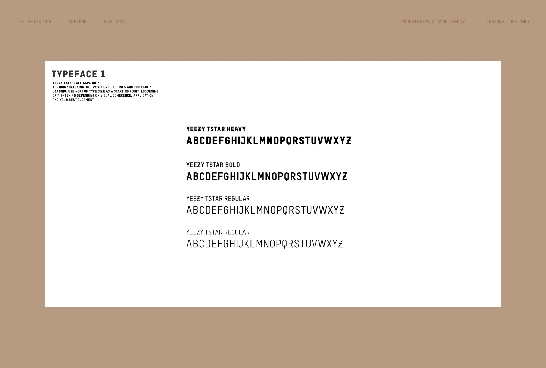
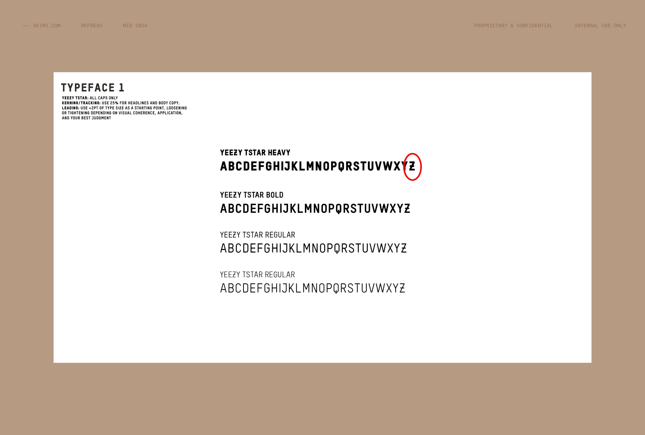
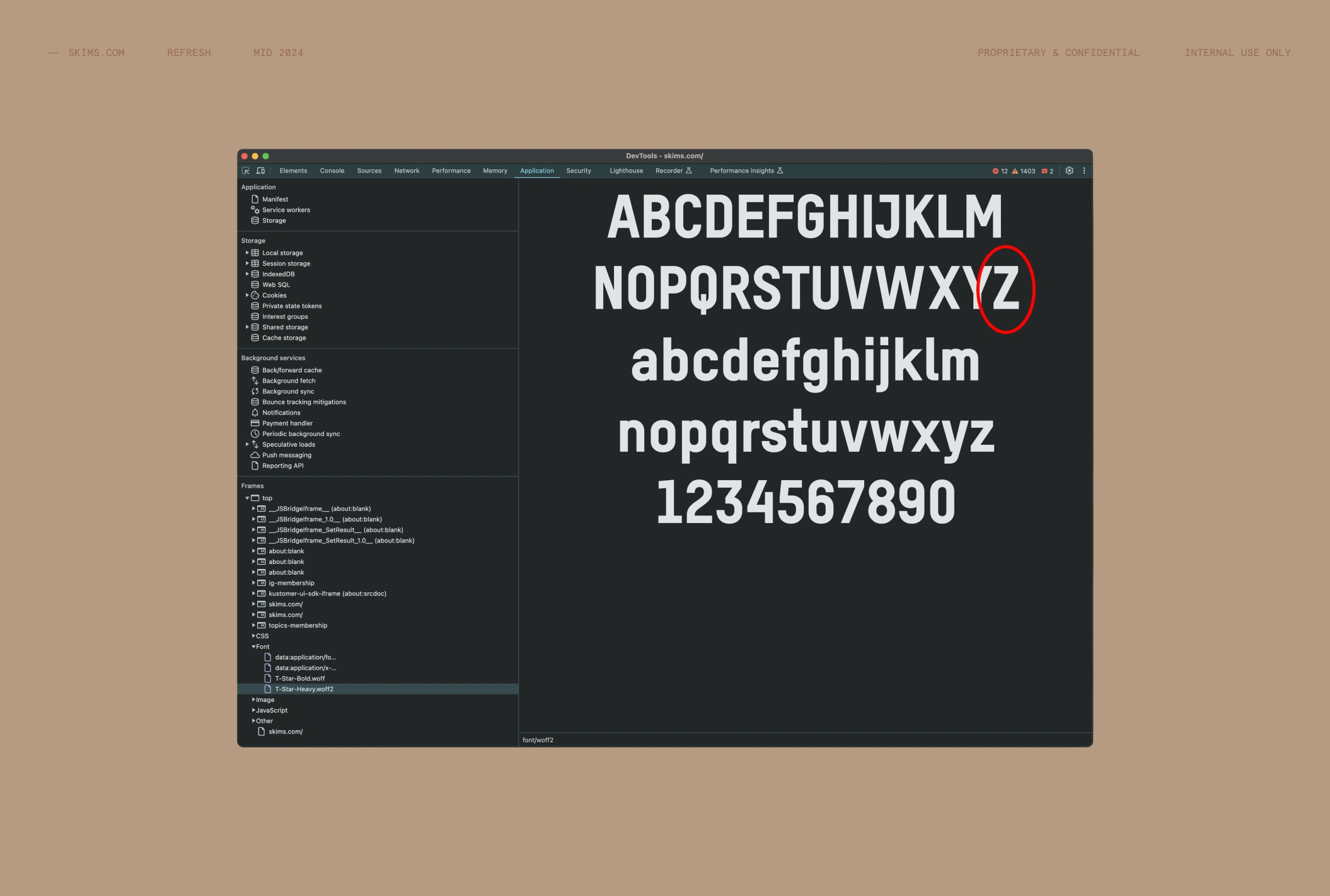
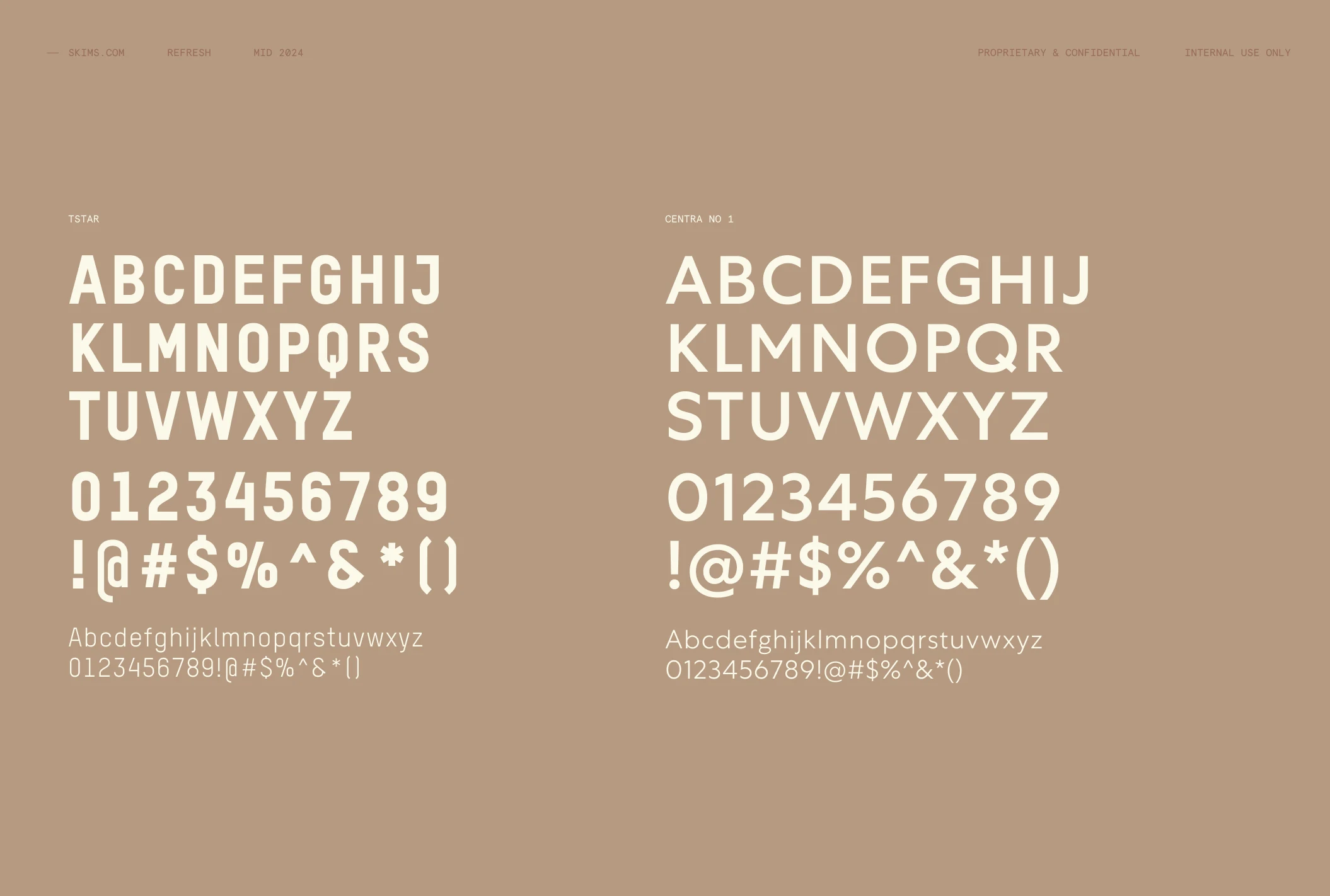
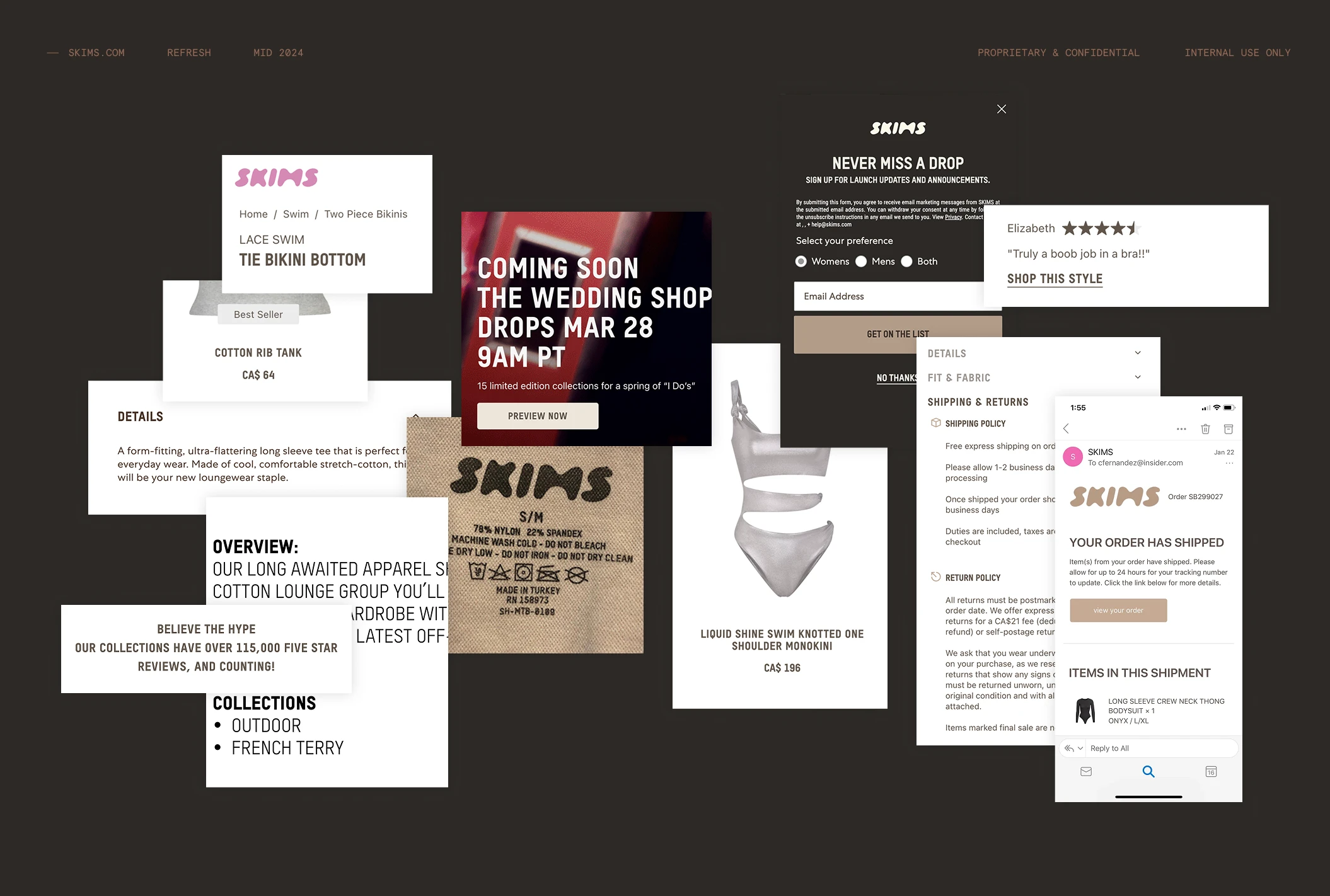
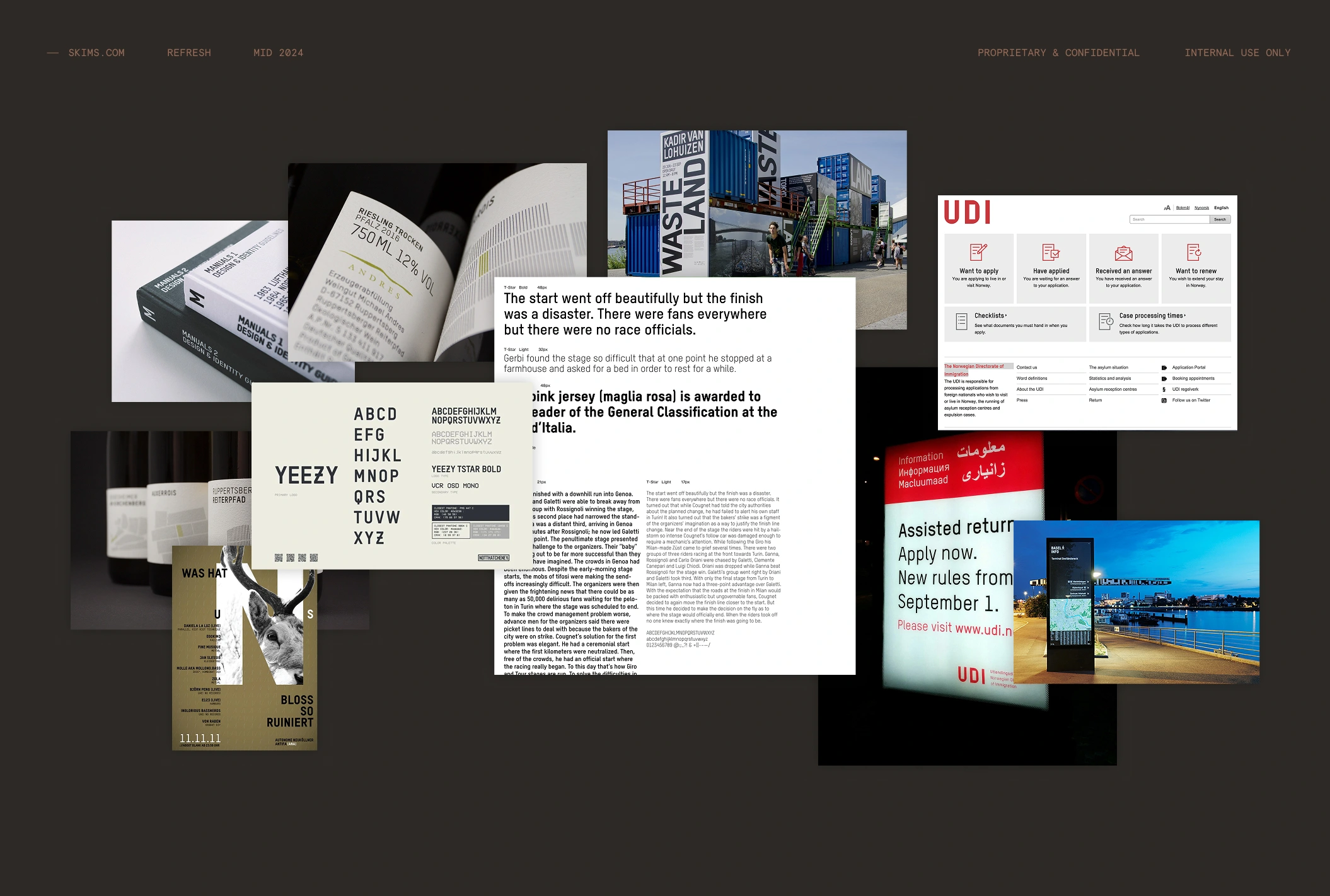
Typography. A specimen audit of the brand face down to the glyph — including the slashed Z that was shipping in every headline and every line of product copy on the site.
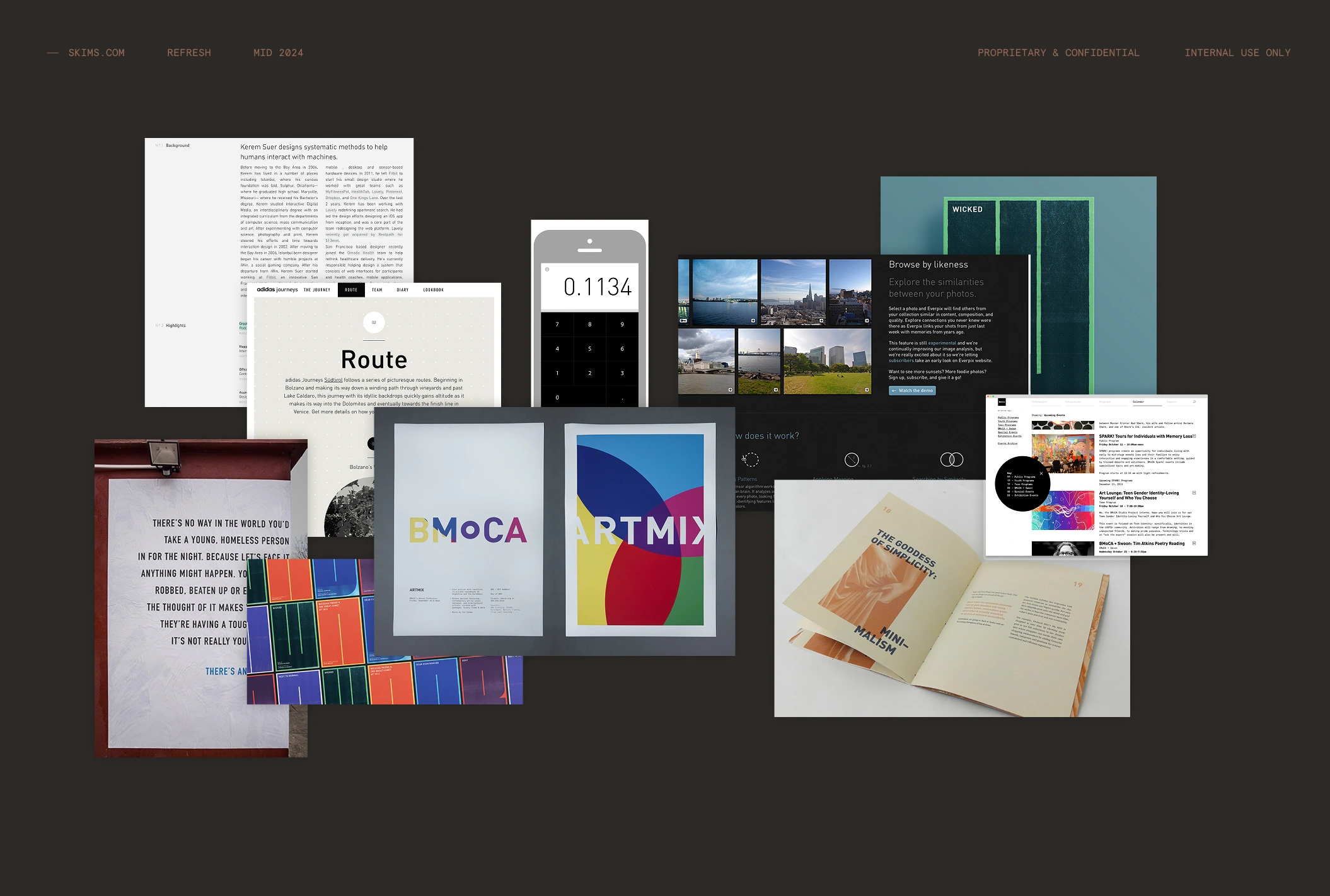
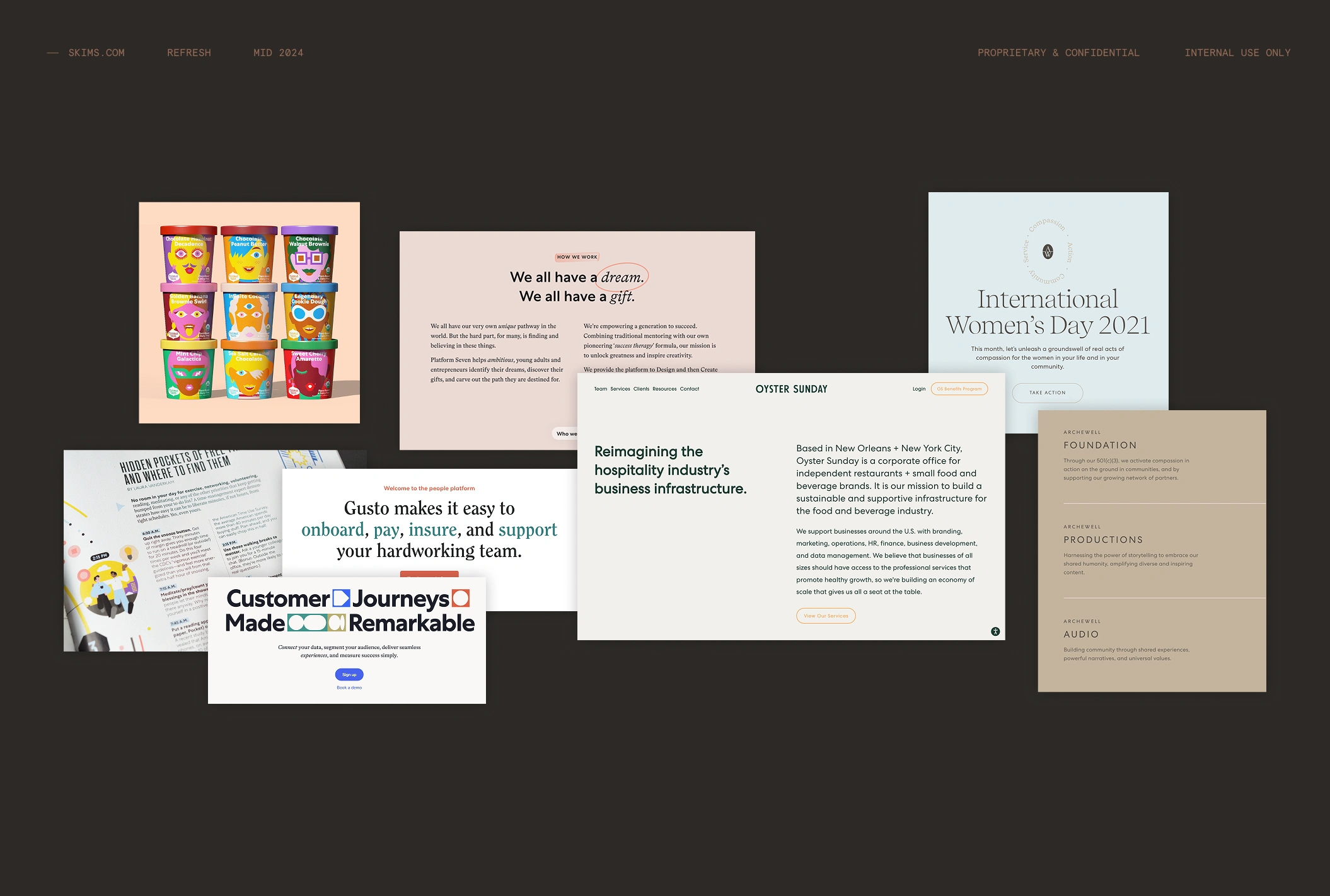
Reference. A visual library of editorial, print and DTC collateral to set the ambition level before a single layout existed.
This deck is what the three-month redesign was built from: homepage, category navigation, PLPs, filters, PDPs and checkout, desktop and mobile.
An audit like this is how I start most engagements. It is scoped and priced on its own, and it works whether or not I build what comes next.
Like this project
Posted Sep 15, 2026
The audit behind the skims.com redesign. Seven competitors torn down page type by page type, six design positions, and a typography review.
Likes
0
Views
3