Perle — Rebrand for an AI Data-Labeling Platform

Rich Tong



Introduction
Perle didn't come to us as Perle. They came as Kiva.ai — smart team, powerful tech, fuzzy brand. Their product was doing important work in AI and unstructured data, but it wasn't breaking through. They needed clarity. They needed direction. They needed a story.
Perle is an AI platform for high-quality, scalable data labeling, annotation and RLHF. What sets it apart is people: human expertise blended with technology to produce better outcomes for AI models.
Role
As Head of Design at Lighthouse Creative, I led design on the Perle rebrand — the identity, the brand system, and how it came to life across social and the new perle.ai website — working alongside Lighthouse's strategy, content and social teams.

Brief
Stand out. Most competitors shared the same color palettes, voice and tone.
Be approachable. The category spoke in jargon to data scientists and machine learning engineers. Perle needed to be understood by anyone.
Become well-recognized and beloved — the first choice for top talent and for teams building specialized AI.

Name & Brand System
So we dug in, got strategic, and built something that connects. The new name, Perle, captures the essence of the company: elegant, memorable, and metaphorically spot-on — something valuable, surfaced from complexity.
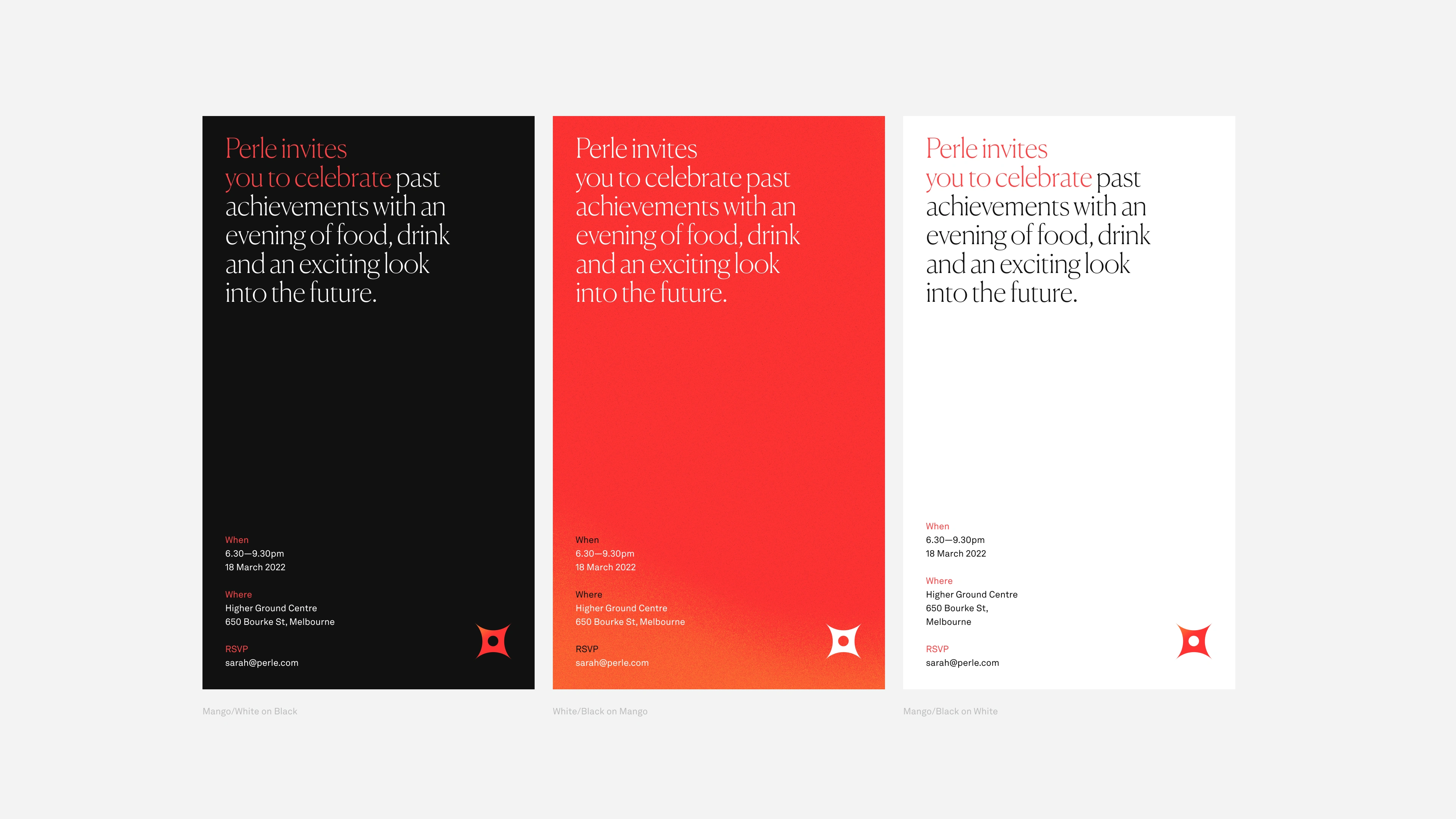
From there, we built the rest of the brand: messaging frameworks, voice and tone, iconography and motion, set in Canela with Akkurat and Akkurat Mono. Every detail was designed to feel intelligent, accessible and human.

"Rich and Lighthouse helped us stand out in a sea of sameness by putting humans at the center of our AI brand. We get constant compliments on our design and social presence."
Kate Rechenmacher, Head of Marketing, Perle
Outcome
The rebrand carried across social, content and the new perle.ai website. Lighthouse stayed on as Perle's agency of record, driving the brand forward day to day.
Like this project
Posted Oct 13, 2025
Rebranded Kiva.ai as Perle — a new name, identity, voice and motion system that made an AI data-labeling platform feel human, clear and easy to trust.