Built with Webflow
Luxury Website Design for Audio Integrations
Designing a modern, high-end website that elevates Audio Integrations’ bespoke home automation brand.
Challenge
Audio Integrations needed a new website that better reflected their brand. Their existing online presence didn’t communicate the luxury, high-end feel of their bespoke home automation and theater services. Another challenge was the lack of available photography from past projects, which meant that new imagery would need to be curated in order to establish the right visual direction.
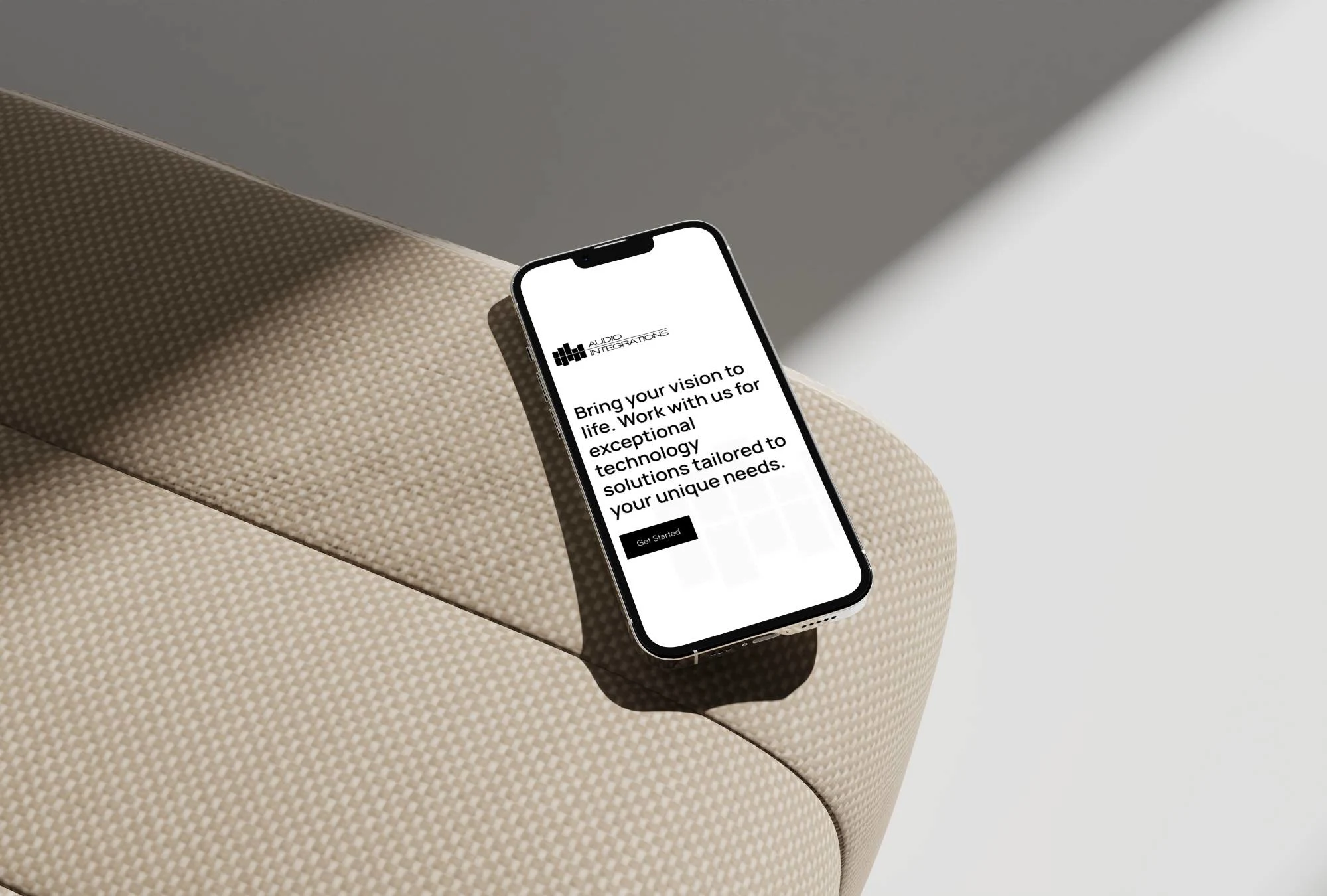
Mobile Mockup
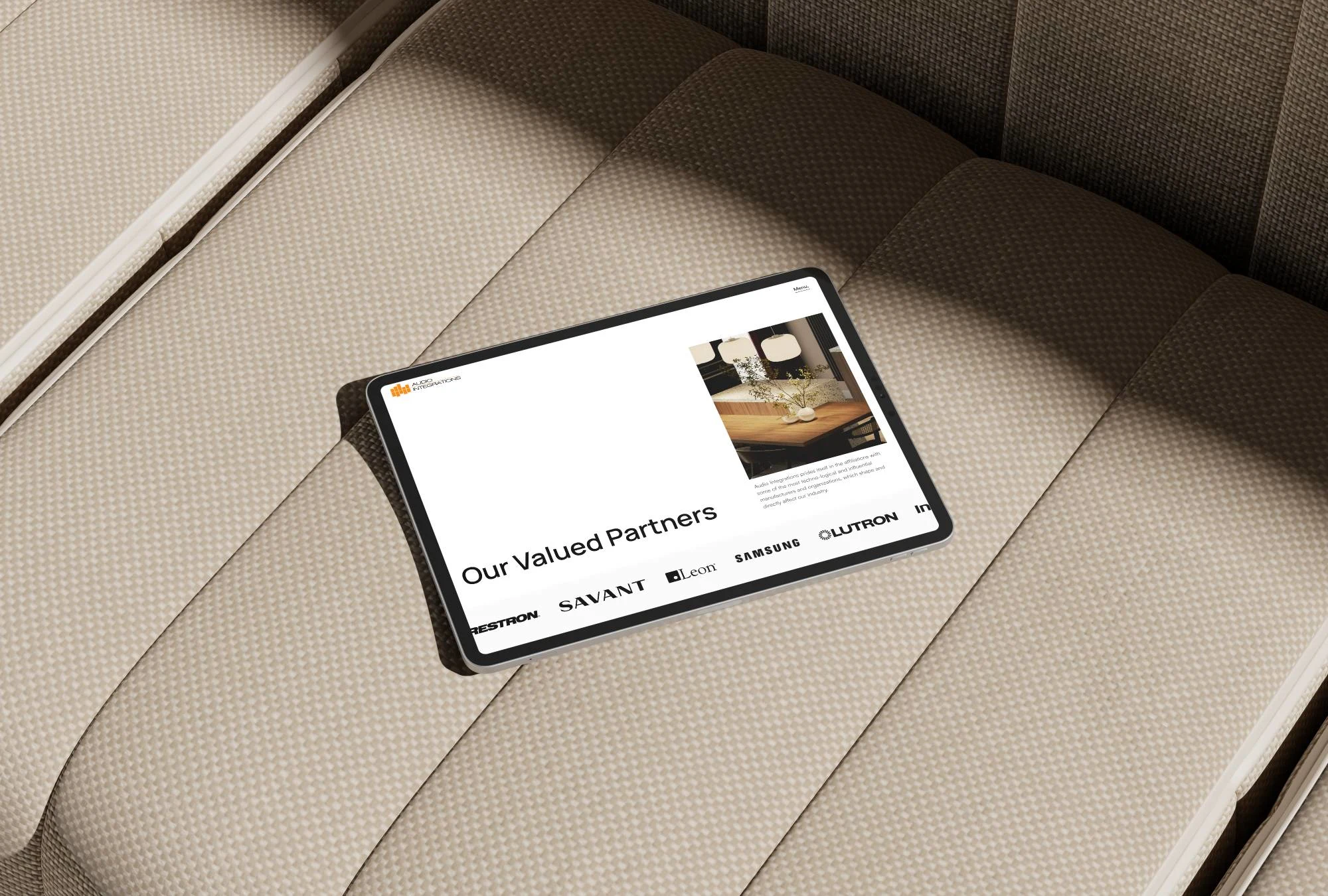
Tablet Mockup
Process
To tackle this, I began with a discovery session to understand the company’s goals, audience, design aesthetic, and imagery direction. From there, I developed and presented two design concepts, each with a strong focus on typography and minimal design principles, to give the team clear options for establishing a visual direction. Once a direction was chosen, I built out a sitemap and wireframes to structure the content, ensuring the site could scale effectively. With limited project photos available, I curated on-brand stock imagery to capture the high-end look and feel the brand needed. While the photo direction changed several times during the project, the ultimate direction was meant to look refined, minimal and inviting.
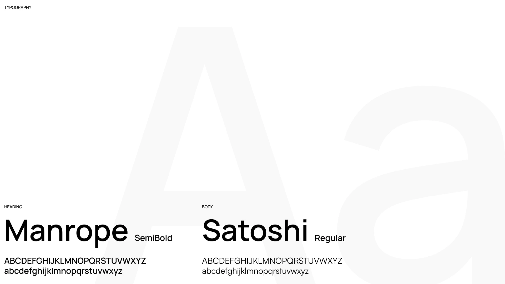
Typography
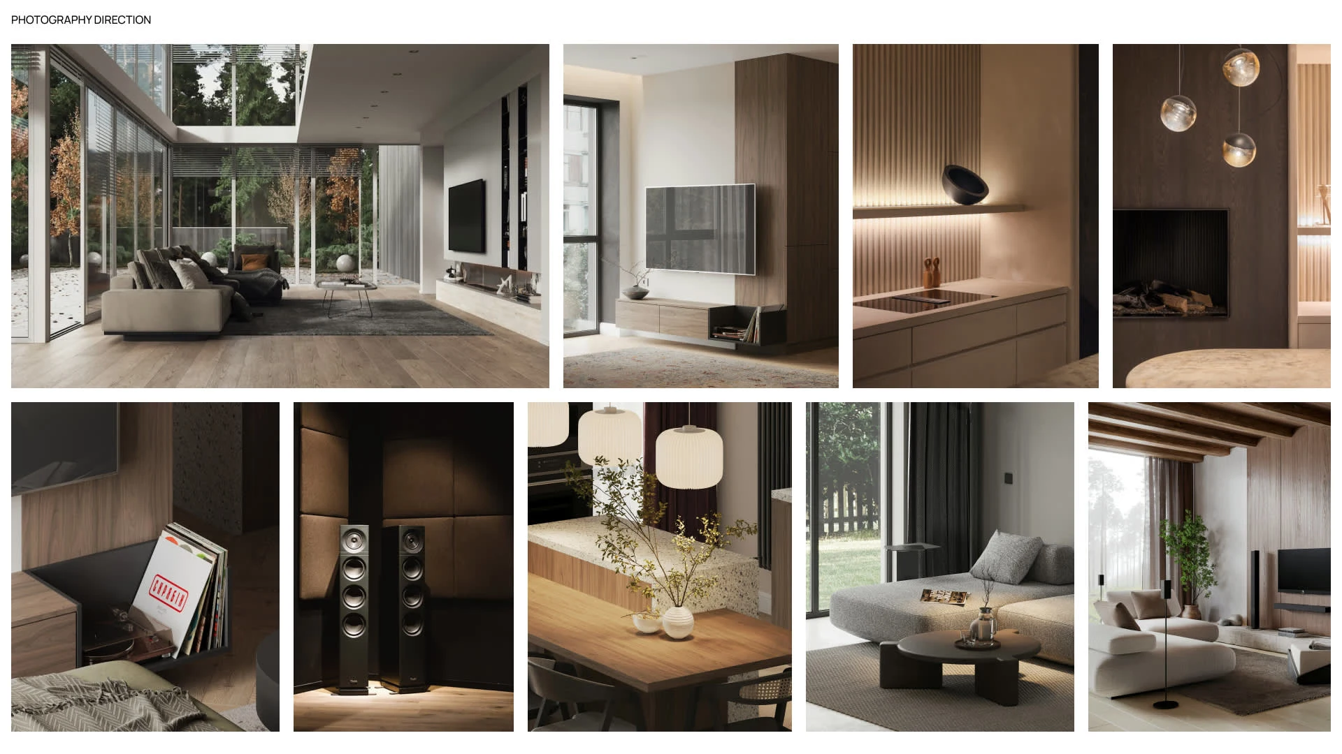
Image Direction
Outcome
The final product was a modern, scalable website build in Webflow that positions Audio Integrations as a luxury, high-end brand. The site uses curated stock visuals to deliver an elegant, cohesive look while filling the gap left by limited past project photography. Subtle animations and clean layouts reinforce the high-end nature of the brand, while a simple but streamlined inquiry form makes it easy for potential clients to take the next step. The result is a website that elevates their online presence and provides a strong foundation for future growth.
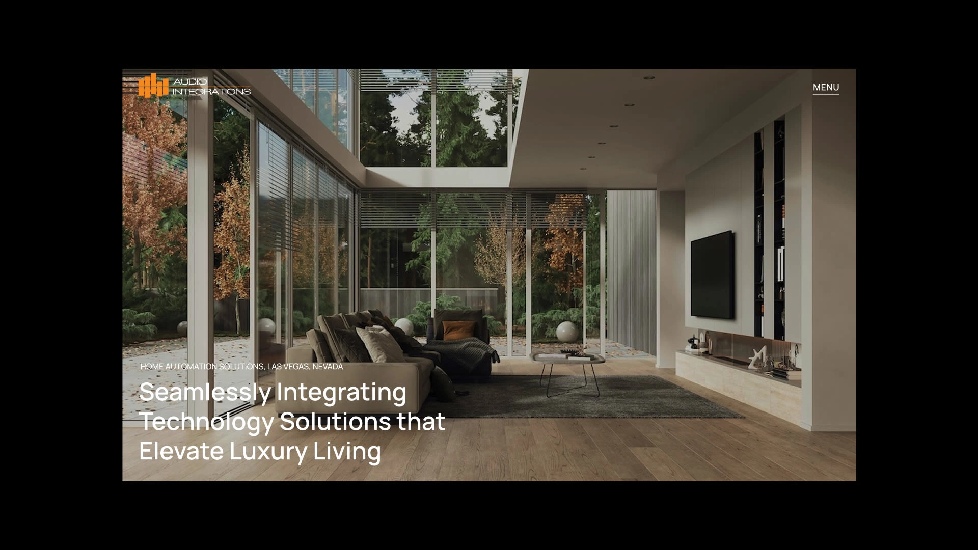
Home Hero
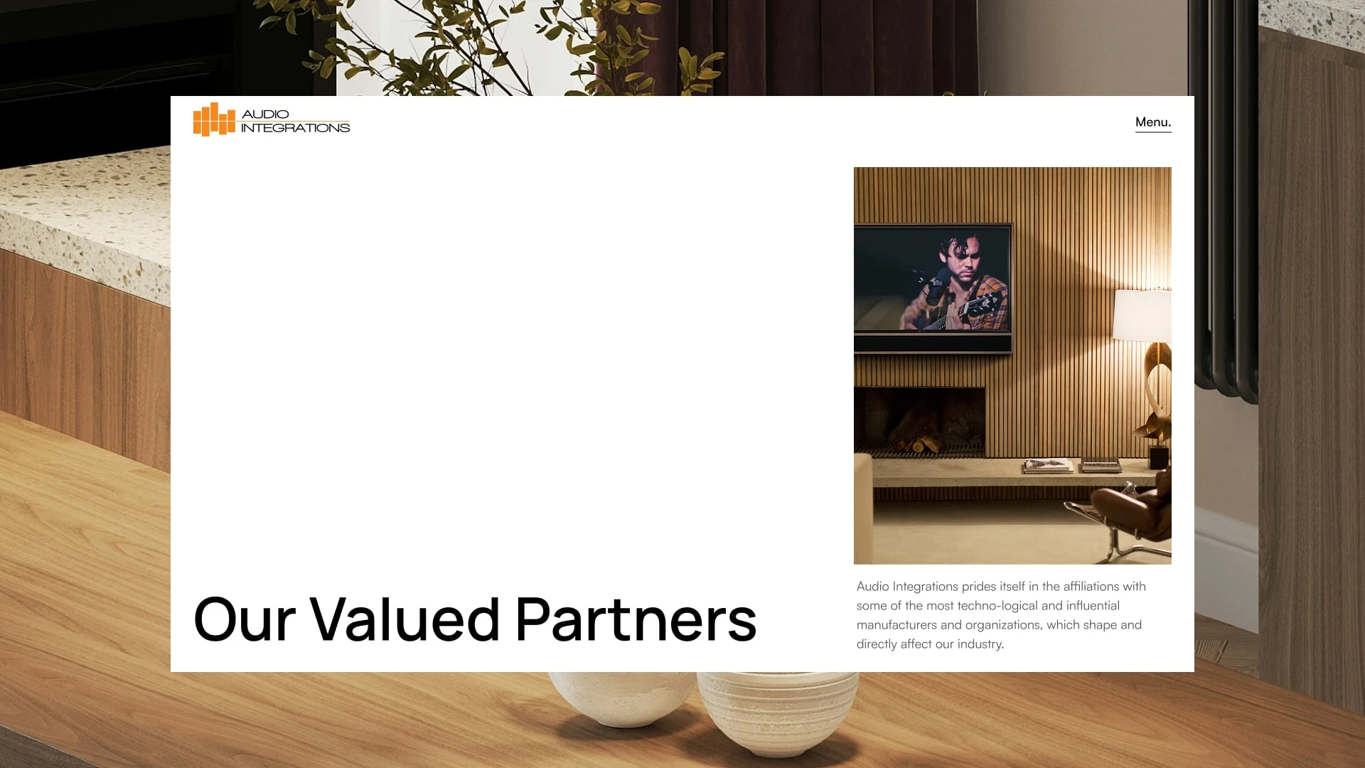
Partners Hero
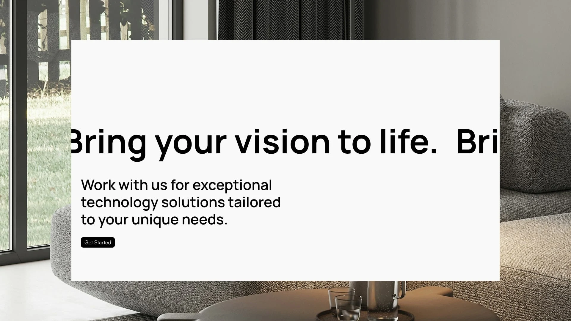
Marquee Call to Action
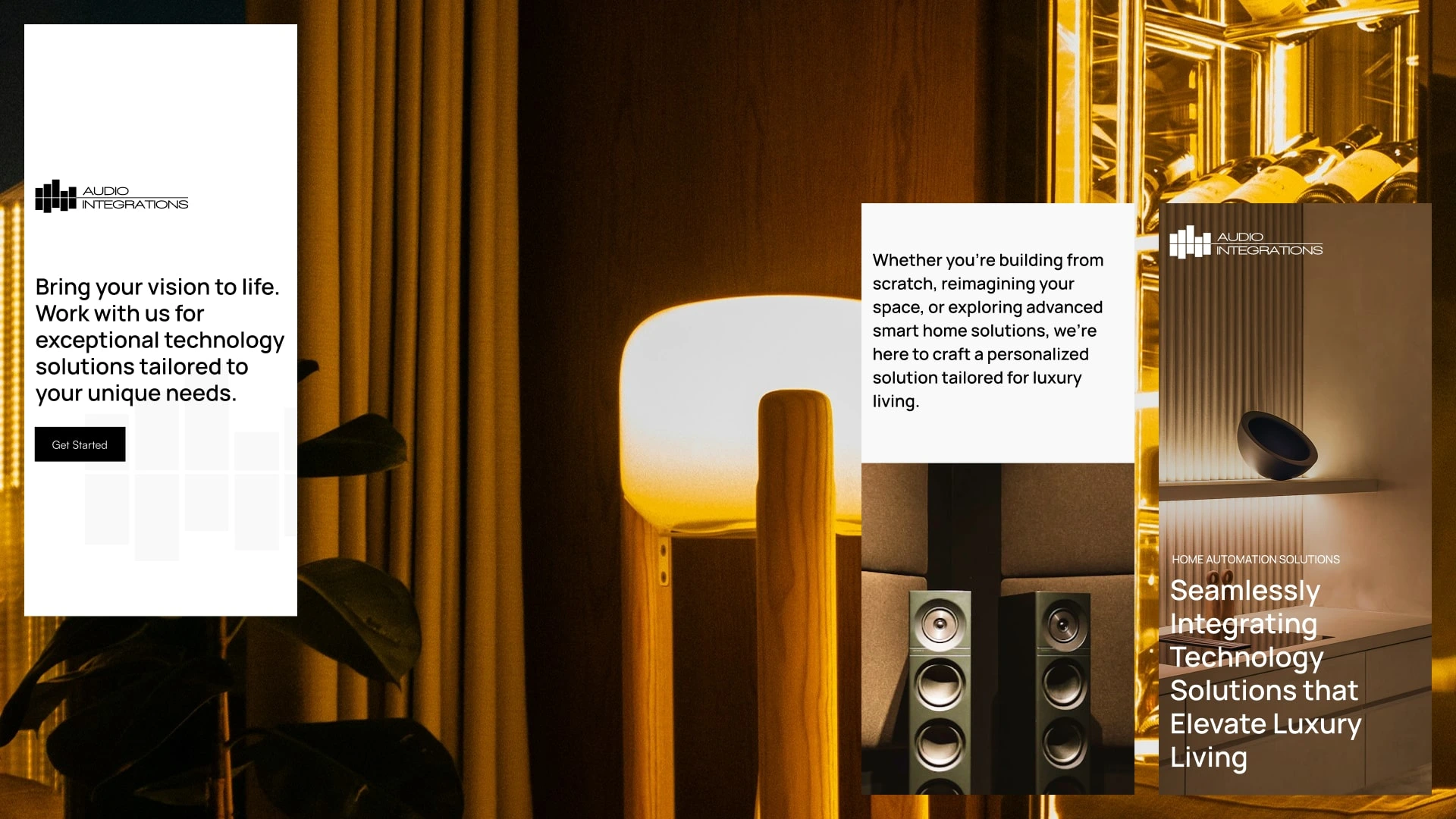
Mobile layouts
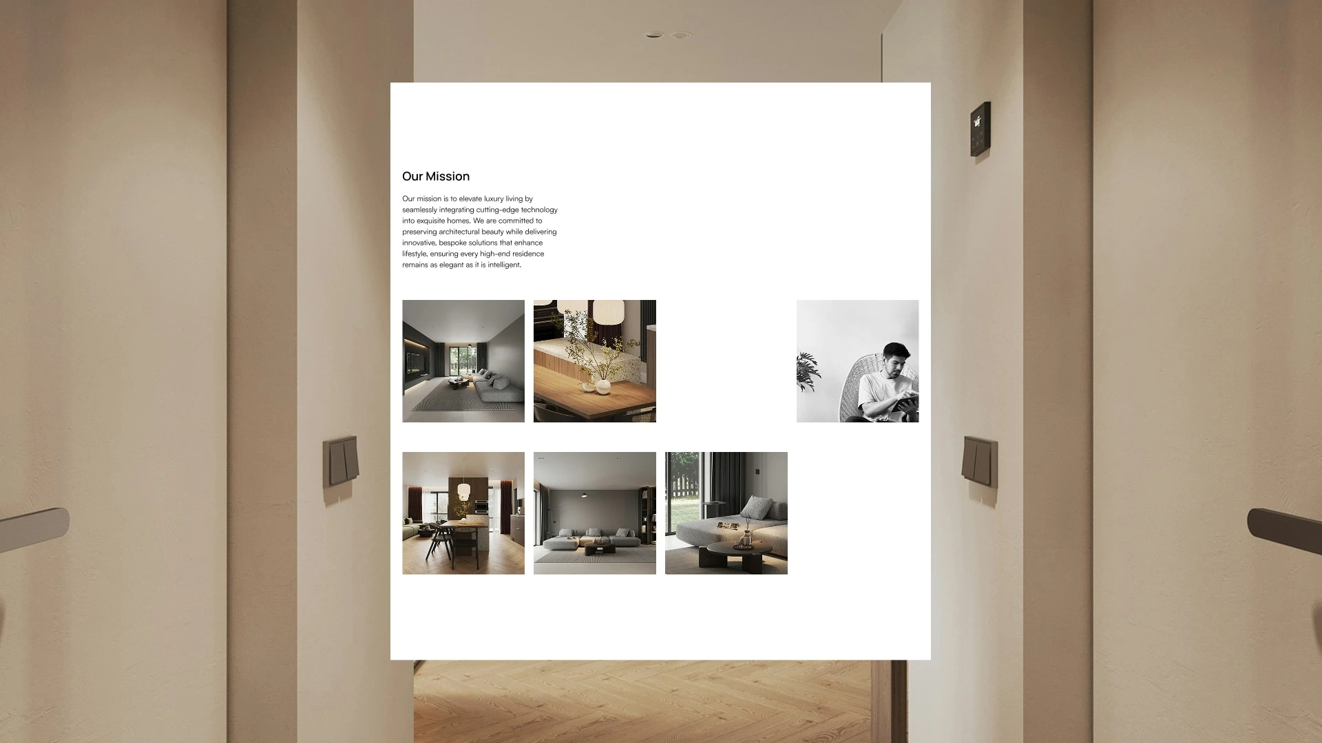
Gallery Layout
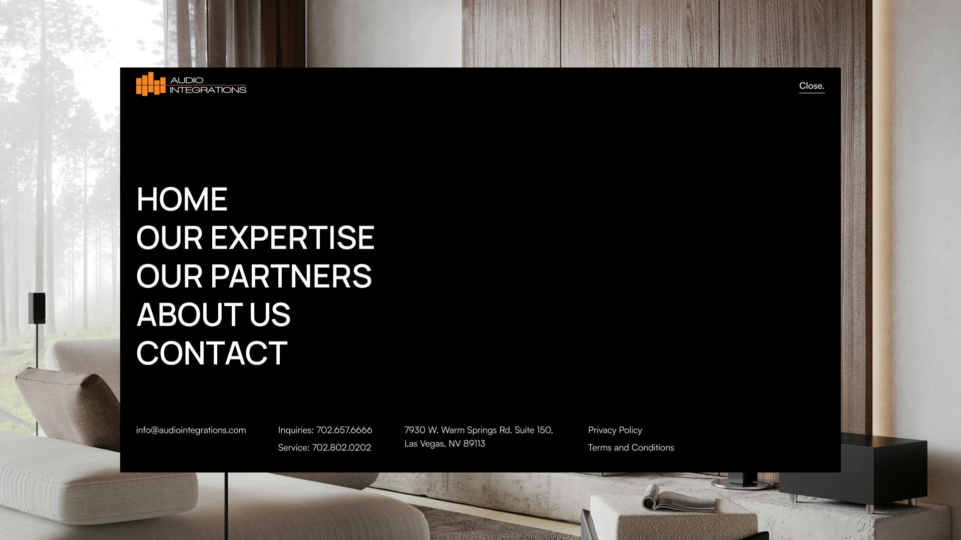
Audio Integrations Navigation Menu
Impact
The new website gives Audio Integrations a digital presence that matches the quality of their services. By solving the challenge of limited project photography with carefully curated visuals, the site communicates the luxury and sophistication of their brand while remaining flexible for future growth.
Like this project
Posted Sep 23, 2025
Designing a modern, high-end website that elevates Audio Integrations’ bespoke home automation brand.
Likes
0
Views
35
Timeline
Mar 1, 2025 - Apr 1, 2025
Clients
Audio Integrations

