Company Profile Deck | AI based Remote Management SaaS

Anush N
Brand Designer
Graphic Designer
Presentation Designer
Adobe Illustrator


Adobe Photoshop

Microsoft PowerPoint

Case Study: Revamping the Optick Company Profile Deck
Introduction
Optick aimed to enhance its company profile deck to better communicate its value propositions and solutions. The previous deck faced several challenges, including a lack of visual hierarchy, repetitive information, and limited user-centric messaging. This case study explores the issues with the old deck, compares it with the new sitemap, and illustrates how the revamped deck resolves these issues, focusing on user-centric improvements.
Existing Deck Sitemap & Design
The previous deck was organized as follows:
1. Introduction:
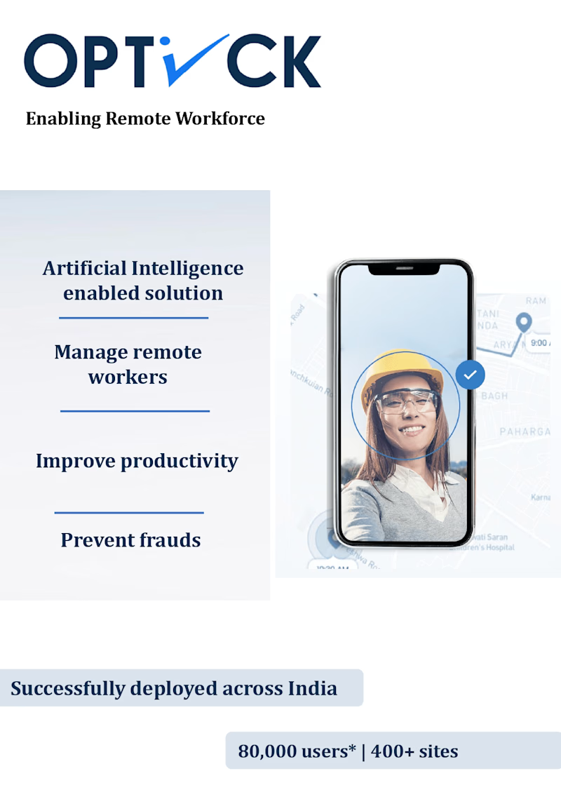
- Overview of Optick's AI-powered solutions.
- Statistics: 80,000 users, 400+ sites.
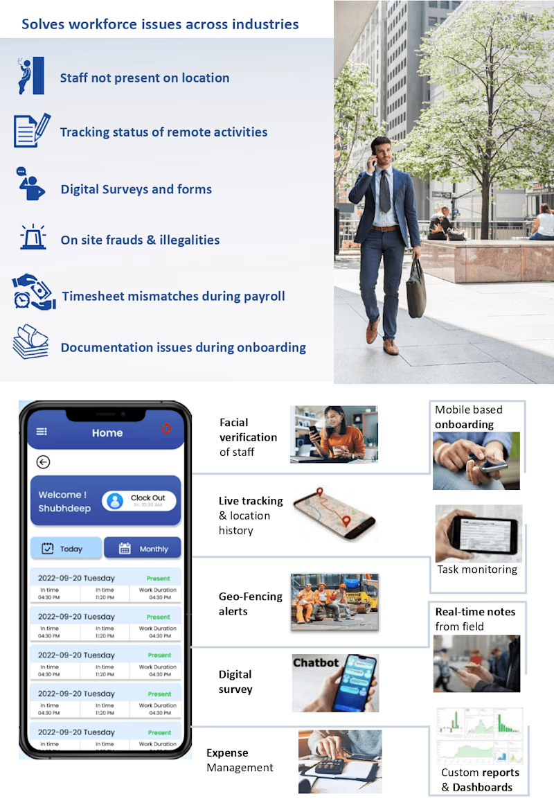
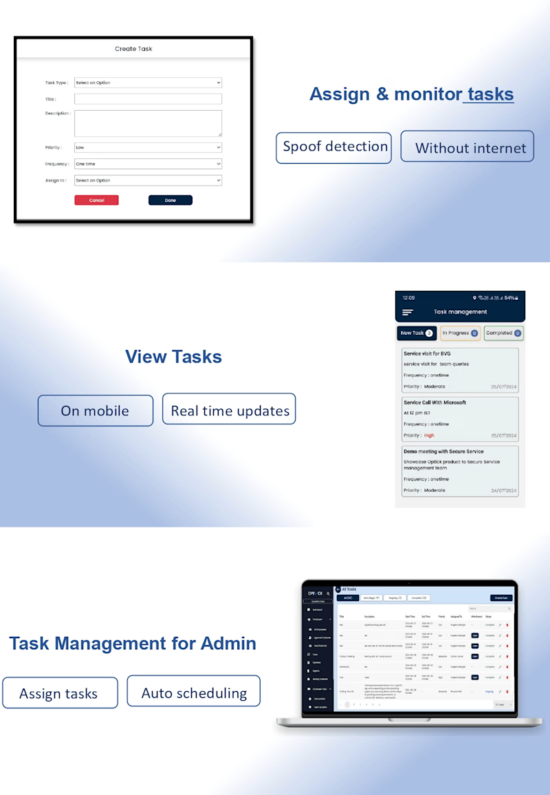
2. Core Features:
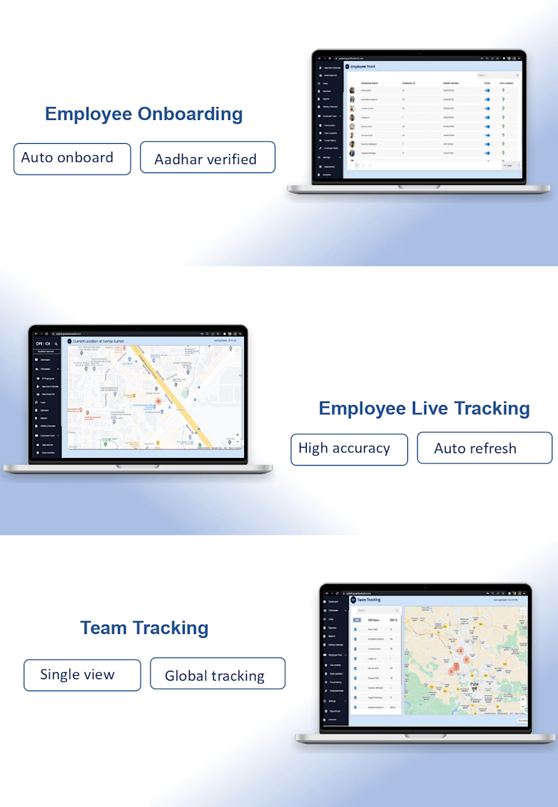
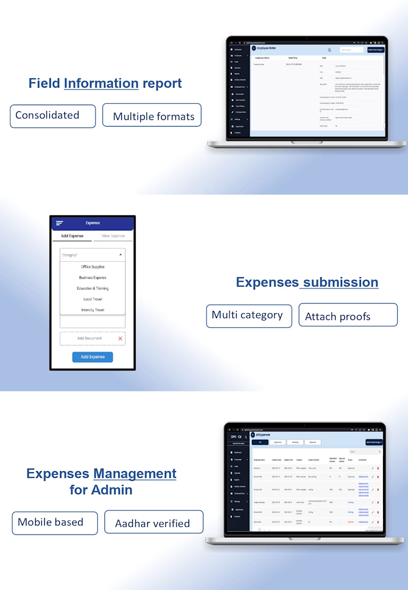
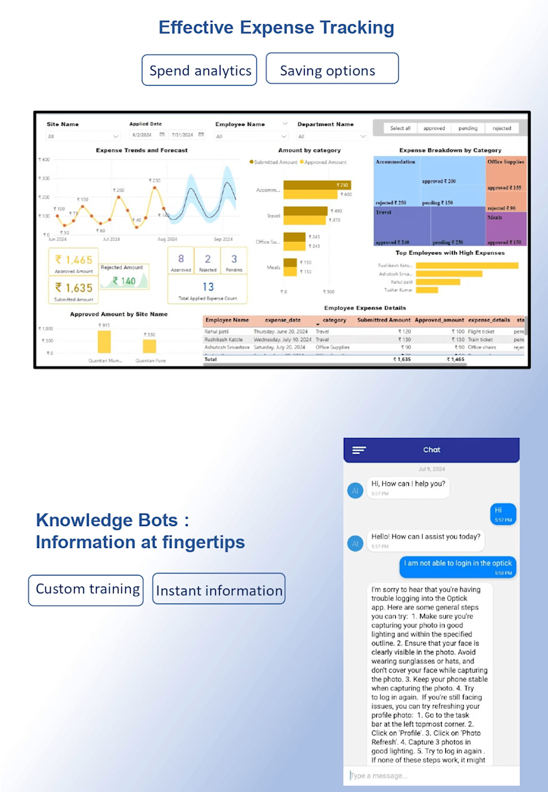
- Mobile onboarding, facial verification, task monitoring, live tracking, geo-fencing, custom reports, digital surveys, expense management.
3. Detailed Features Breakdown:
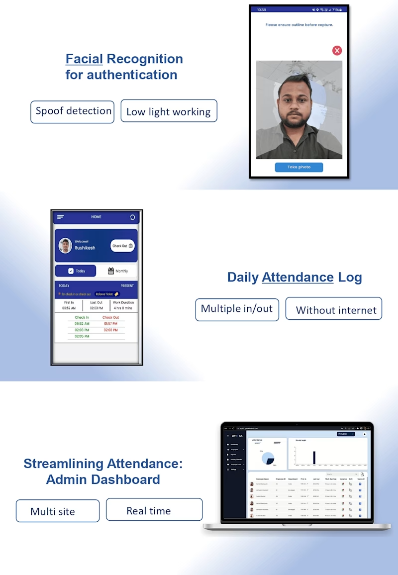
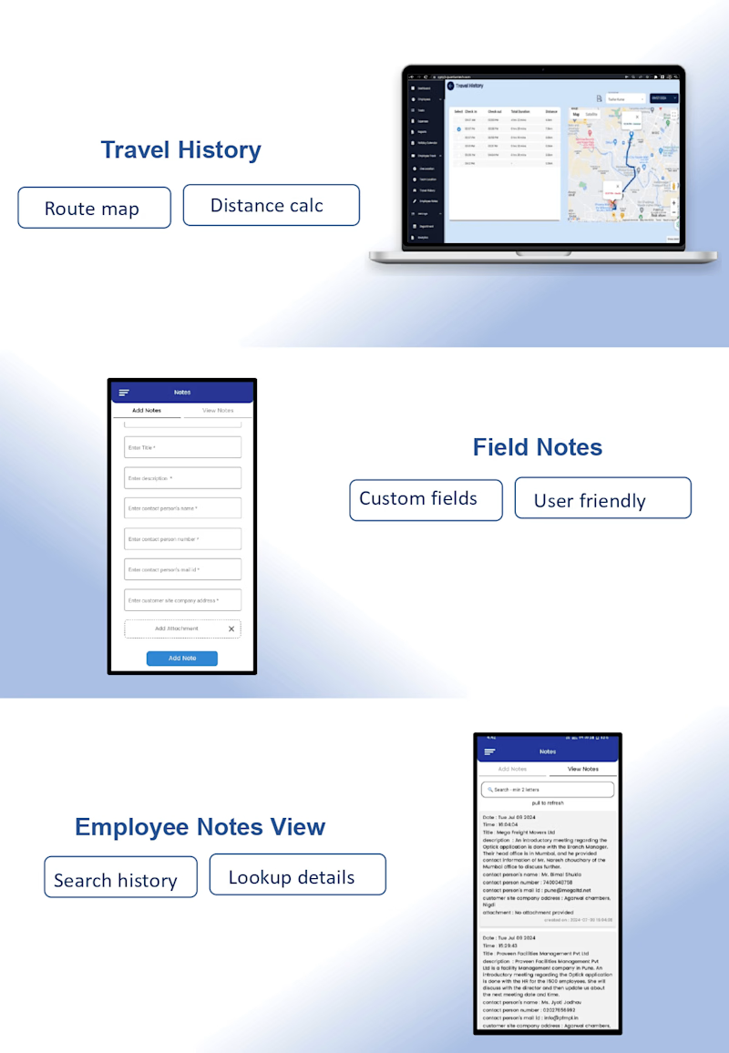
- Facial recognition, task management, employee onboarding, travel history, expense management.
4. Additional Functionalities:
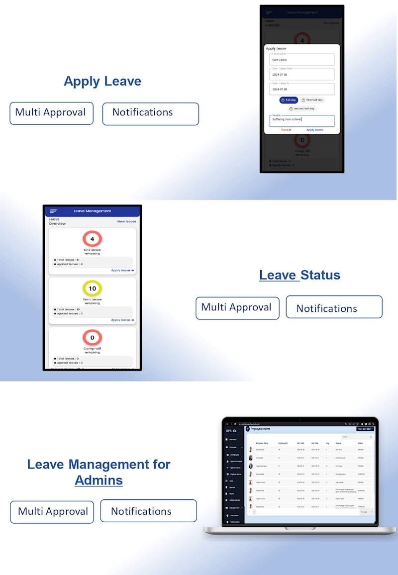
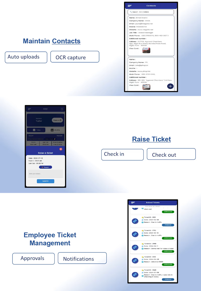
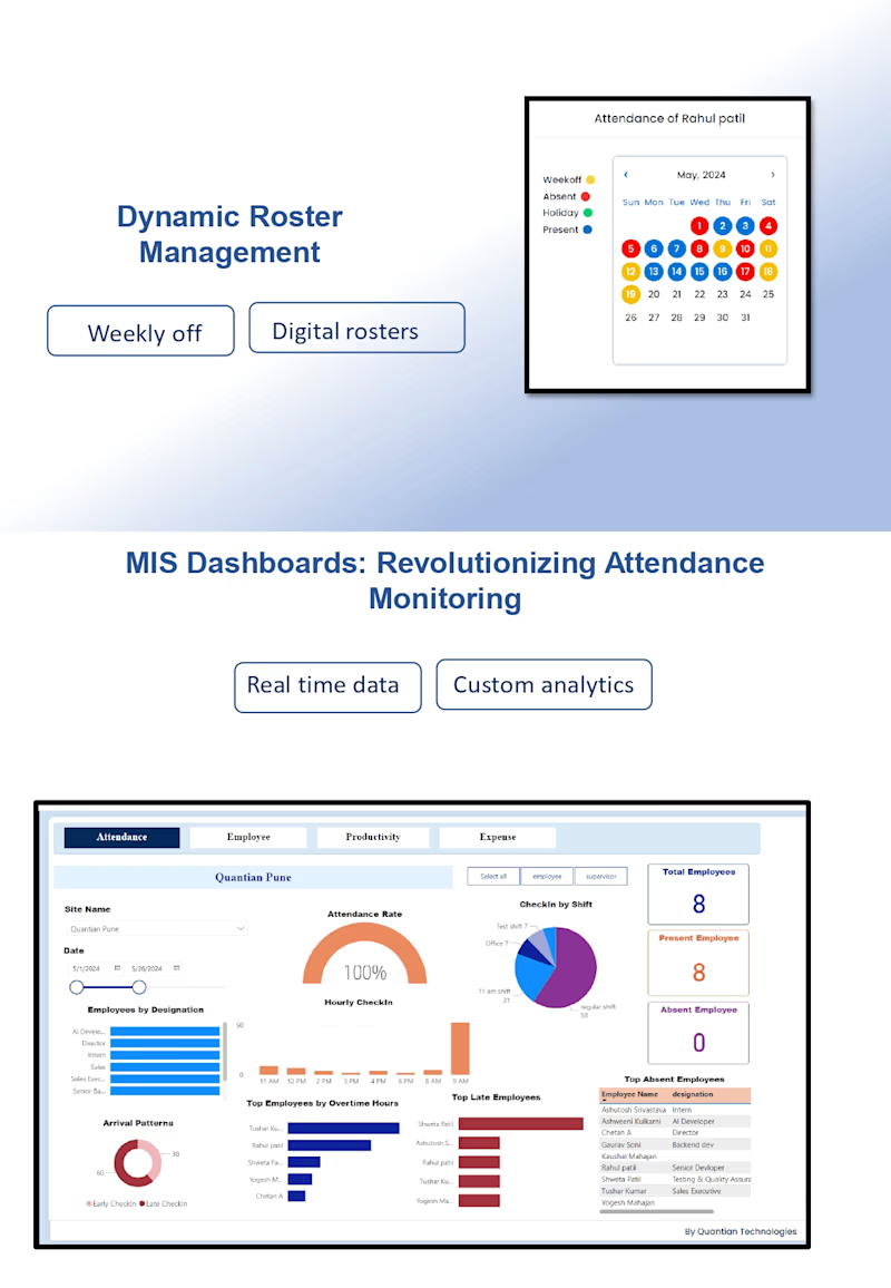
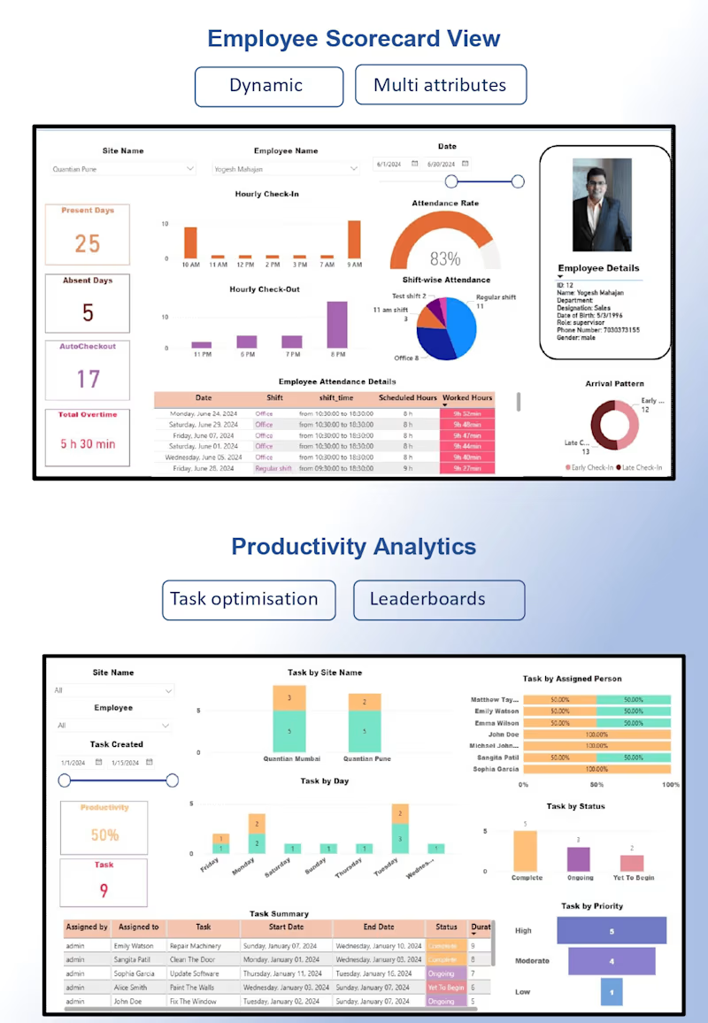
- Leave management, ticket and contact management, dynamic roster management, productivity analytics, scorecards, knowledge bots.
5. USPs:
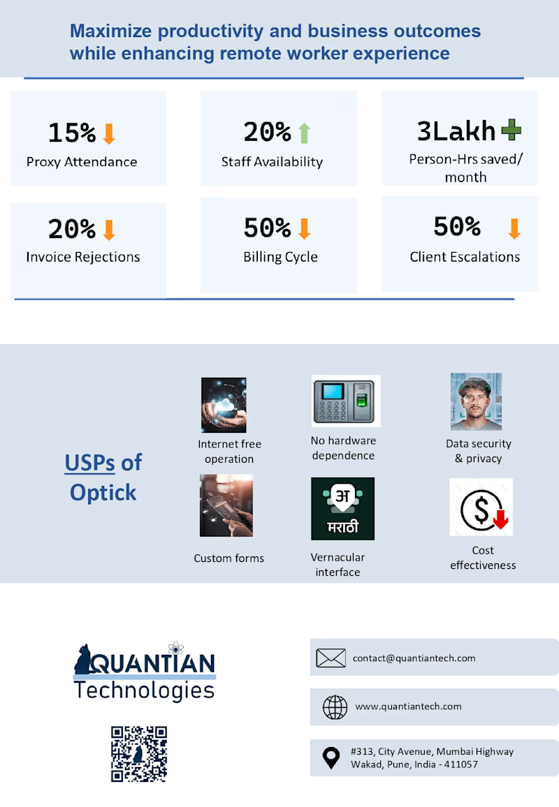
- Internet-free operation, no hardware dependence, data security, cost-effectiveness.
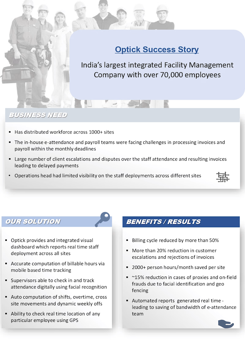
6. Success Story:
- Case study of a facility management company with specific results.
7. Contact Information:
- Company address and contact details.
Existing Deck Design
Issues with Existing Deck
1. Lack of Clear Visual Hierarchy: The deck was busy and overwhelmed the audience with information.
2. Repetitive Information: Some features were mentioned multiple times, leading to redundancy.
3. Limited User-Centric Messaging: Focused heavily on technical details rather than user benefits.
4. Unclear Segmentation of Benefits: Benefits were not clearly segmented for different user groups.
5. Visual Layout and Presentation Flow: The deck lacked a distinct structure and logical flow.
6. Absence of Visual Illustration & Mockup: Lack of visual representations of dashboards and screens
New Deck Sitemap
The revamped sitemap is organized as follows:
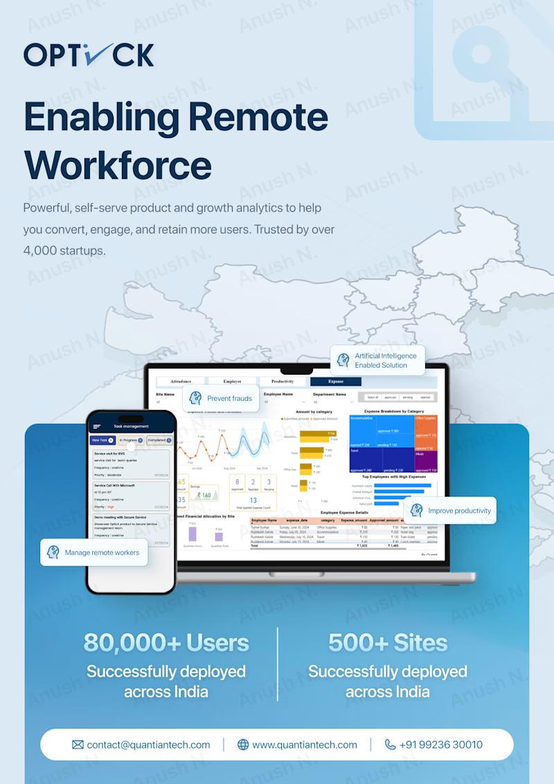
1. Introduction:
- Title: Optick product for enabling remote workforce management.
- High-level statistics.
2. Core Features:
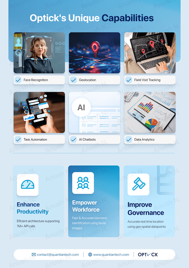
- Part I Features: Face Recognition, Geolocation, Field Visit Tracking, Task Automation, AI Chatbots, Data Analytics.
- Part II: Product Objectives (Enhance Productivity, Empower Workforce, Improve Governance).
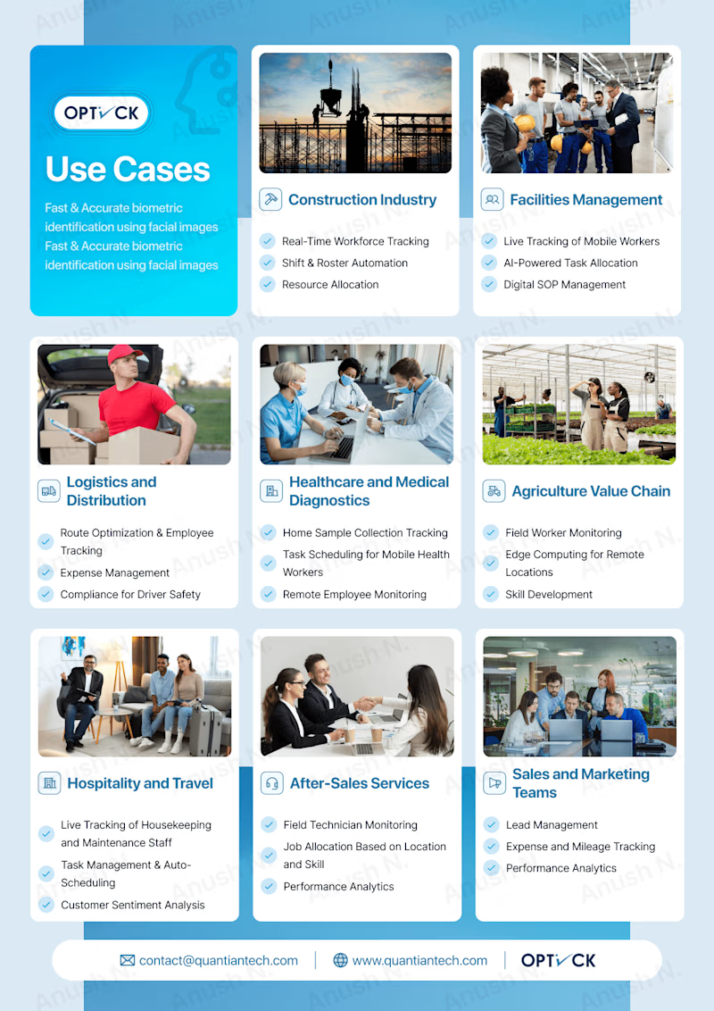
3. Use Cases:
- Construction, Facilities Management, Logistics, Healthcare, Agriculture, Hospitality, After-Sales Services, Sales, Retail, Security, Education.
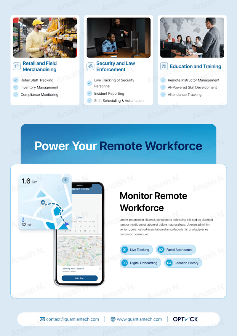
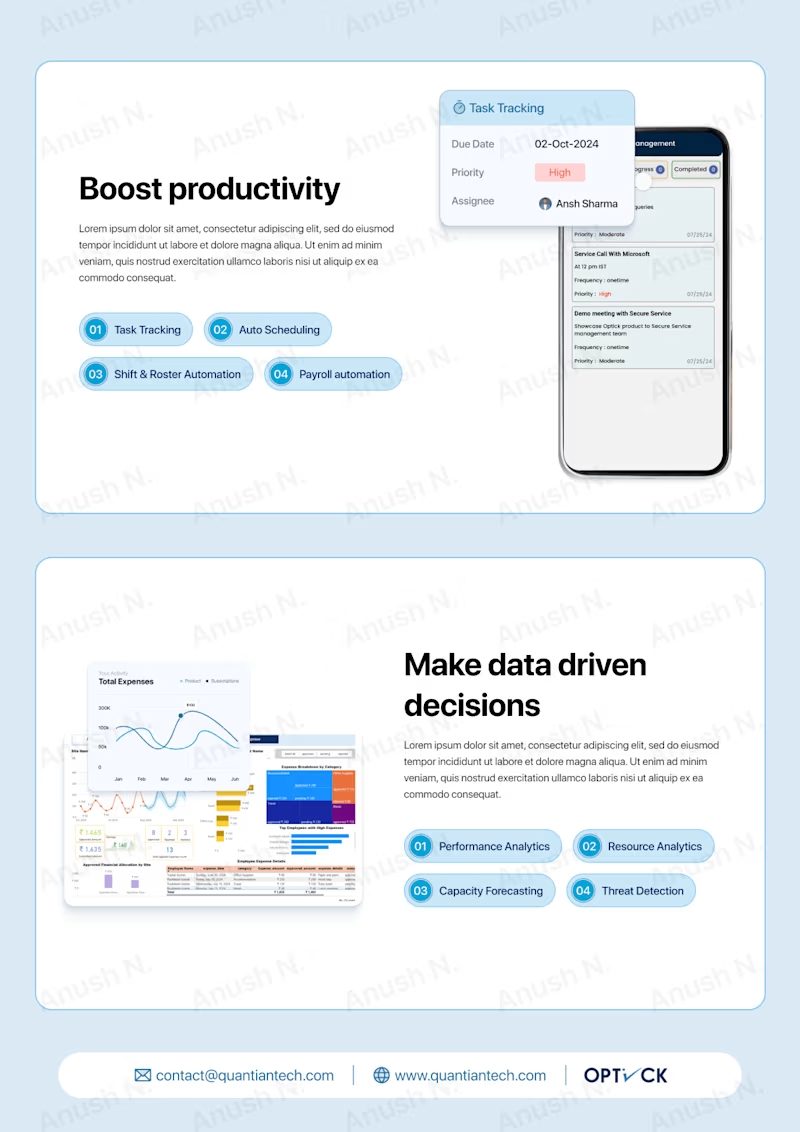
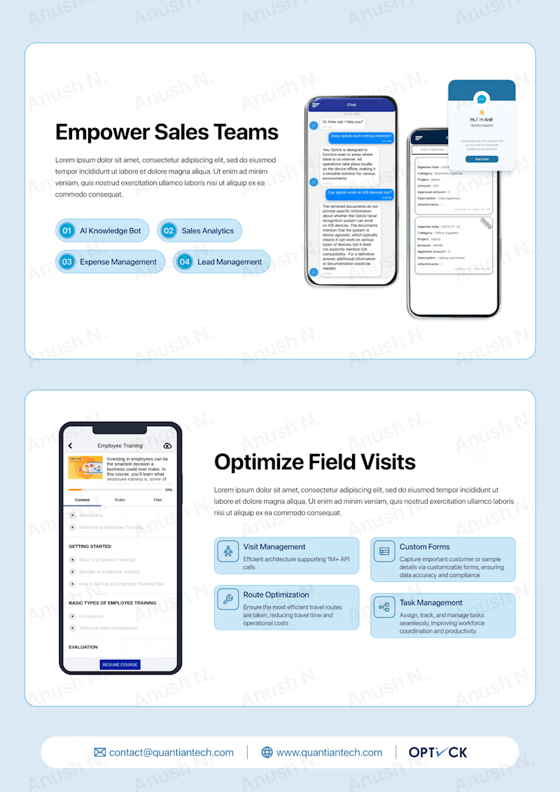
4. Monitor Remote Workforce - Boost Productivity: Focus on how Optick improves productivity.
5. Make Data-Driven Decisions - Empower Sales Teams: Emphasis on data-driven decision-making.
6. Optimize Field Visits: Focus on optimizing field operations.
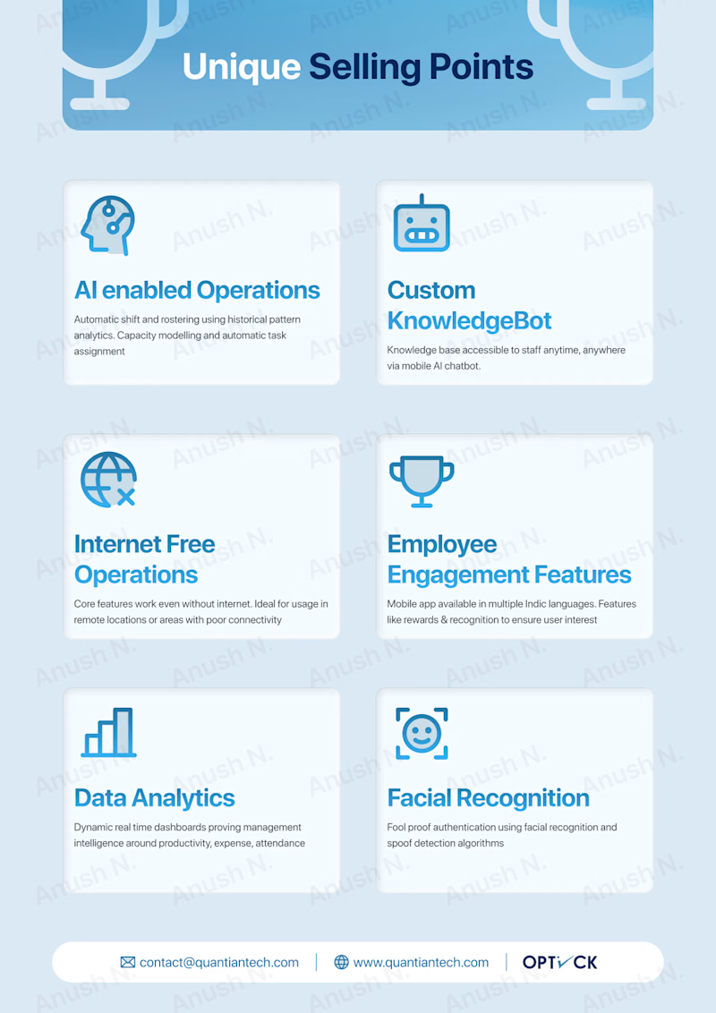
7. Unique Selling Propositions (USPs): Internet-free operation, no hardware dependence, data security, cost-effectiveness.
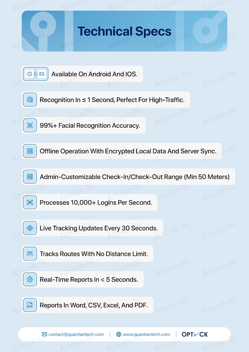
8. Technical Specifications: Android & iOS compatibility, high accuracy, offline operations.
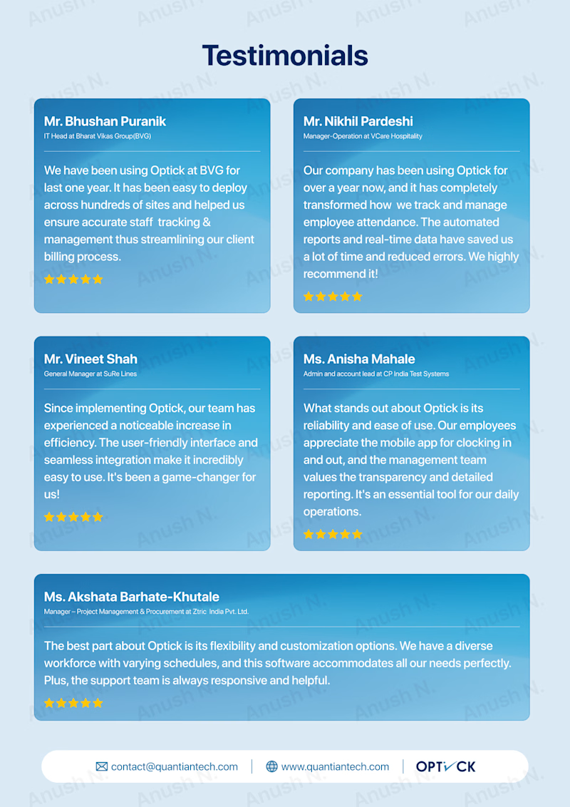
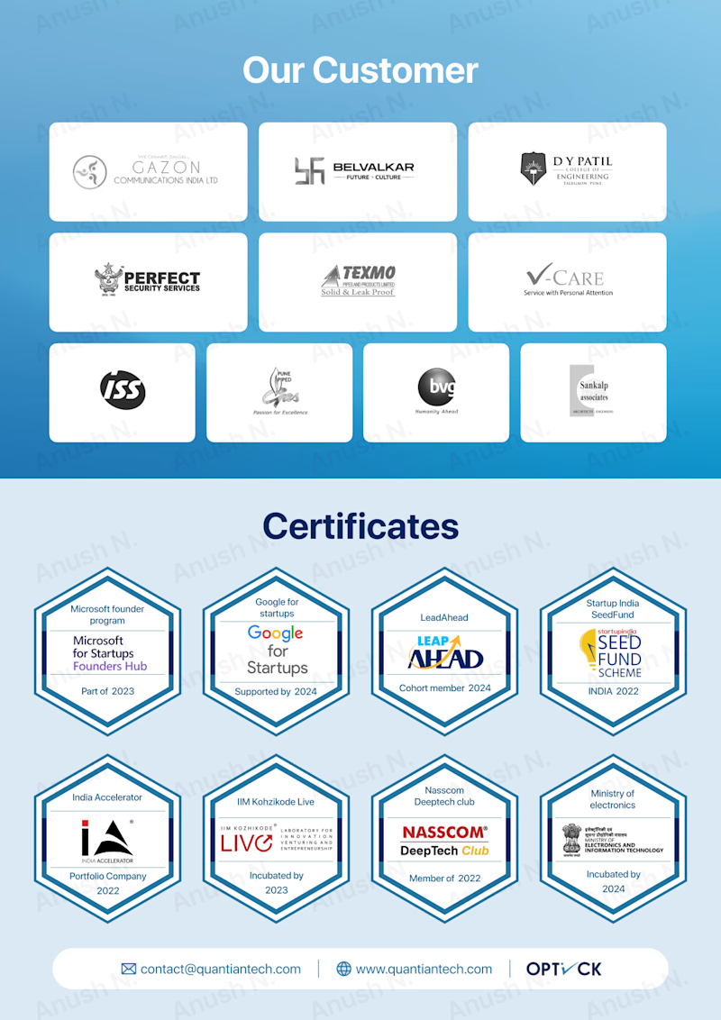
9. Testimonials, Customer Logos, Certifications: Showcasing credibility and success stories.
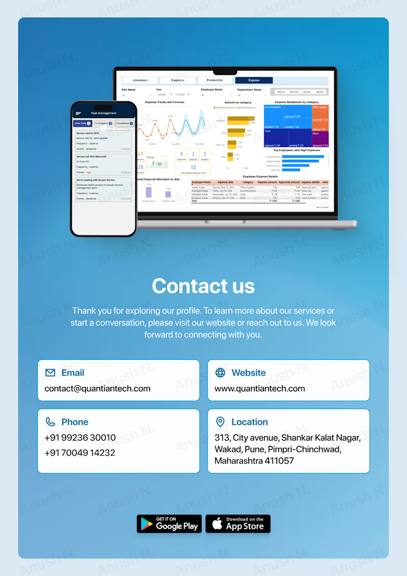
10. Contact Us: Contact details for further inquiries.
New Deck Design (In Progress)
Conclusion
There are several key differences between the old and new outlines for the Optick product documentation:
1. Structure & Flow:
- Old Outline: Focuses on features first (e.g., mobile onboarding, facial verification, task management) before diving into issues solved, feature breakdowns, USPs, and a single success story.
- New Outline: Begins with a clear division between two parts in the core features: technological aspects (facial recognition, geolocation, etc.) and high-level product objectives (productivity, governance, workforce empowerment).
- More focus is placed on use cases across different industries.
2. Content Emphasis:
- Old Outline:
- Lists detailed features and functionalities without industry-specific examples.
- Focuses more on the granular breakdown of features like task management, expense management, employee tracking, etc.
- New Outline:
- Adds industry-specific use cases (e.g., construction, healthcare, logistics), making the application of Optick more concrete and relatable for different sectors.
- Objective-oriented approach: Emphasizes enhancing productivity, workforce empowerment, and governance improvement early in the deck.
3. Presentation of Key Information:
- Old Outline:
- Features are broken into sections without clear alignment to user benefits or goals.
- Success stories and testimonials are limited to one example.
- New Outline:
- Streamlined flow: Key pages like "Boost Productivity," "Make Data-Driven Decisions," and "Optimize Field Visits" are clearly marked and purpose-driven.
- Testimonials and customer logos now occupy their own page, building credibility through multiple success stories.
4. Visual & Technical Layout:
- Old Outline:
- Focused heavily on features, which could feel overwhelming due to the amount of technical details listed upfront.
- New Outline:
- The technical specifications (page 8) are isolated from the use cases and objectives, keeping the flow simpler and more digestible.
5. Product Positioning:
- Old Outline:
- Heavily feature-driven, with technical and functional details dominating the slides.
- New Outline:
- Balances **features with objectives and industry applications**, making it more relatable and goal-oriented for different types of stakeholders.
In summary, the new outline is more user-focused, highlights practical applications through industry-specific use cases, and is better structured with a clear, logical flow. The old outline, while detailed, is more technical and less industry-focused, potentially overwhelming for some audiences.