All My Parts: an IFS journal, its brand and its design system

View completed workallmyparts.me
The iPhone app on a demo account: Today, the weekly read, the parts library and one part's detail page.
An IFS journal designed, branded, built and shipped by one person, with one visual language across web and iOS. In paid beta.
Client: Studio Maya, my own product
Role: Founder, product and brand designer, builder. Solo, end to end.
Timeline: 2025 to present. In paid beta.
Platforms: Web at allmyparts.me and a native iOS app
Stack: Next.js, React and TypeScript on Vercel. Postgres via Prisma, Clerk for sign-in, the Vercel AI SDK with Anthropic and OpenAI, Stripe. iOS in Expo and React Native with RevenueCat. Tailwind on web, NativeWind on iOS. Built in Cursor.
All My Parts is an AI journal for people in Internal Family Systems therapy. It tracks the parts that show up between sessions and reads across entries for patterns. I designed the product, the brand and the design system, built it for web and iOS, and shipped it solo. It's in paid beta.
Internal Family Systems treats the mind as a system of parts (managers, firefighters, exiles), each with its own job. Therapists routinely ask IFS clients to track those parts between sessions, and most people do it on paper or in a Notes app. Both work, but neither shows patterns across weeks of entries, and general journaling apps are built around one self writing alone. To do this properly, the data model has to know about parts.
The look had its own problem. Mental health products tend to reach for the same visuals: wellness blue, watercolor flowers, teal gradients, meditating silhouettes. I wanted something an IFS therapist would feel fine recommending, something that could sit next to No Bad Parts on a nightstand without being mistaken for a wellness funnel.
The product: parts as first-class records
Each entry is a conversation. You write or speak, and the app notices which parts are talking and gives each one a card: its role, its traits, when it tends to show up. In the data model a part is its own record, not a tag on an entry, with a role, triggers and beliefs, and links to the parts it protects or sets off. It keeps a part's earlier names, so renaming one never creates a duplicate. Once a week an AI read covers which parts were most active, what triggered them and where Self-energy came through. Entries, AI replies and parts are encrypted before they're stored, never sold, and never used to train AI.
The hard part wasn't the AI. It was the data model and the language. Calling a manager a manager and a firefighter a firefighter without sounding clinical took several rewrites.
The brand: warm, but serious enough for a therapist's shelf
The research looked at literary publishers, therapy books and quiet productivity tools before any color was picked. Three moodboard directions followed, a garden, a notebook and a library, and the shipped direction, Garden Notebook, takes something from each: the garden's cream palette and petal mark, the notebook's handwritten margin notes, the library's loose pen-and-watercolor illustration.
The mark is five soft petals around a center dot: parts around a Self. The research said to drop the flower for a type-only wordmark, since flowers drift toward wellness. I kept a petal mark anyway, because it's the IFS model in one shape, and let it carry the warmth while the type carries the discipline. It's the favicon, the web logo and the iOS app icon.
The palette is cream paper and near-black ink, with sage and rose as accents and ochre and oxblood held back for margin notes and role colors. The first pass looked washed out, so I deepened every accent in a contrast pass, which is why the logo petals are softer than the interface colors. Newsreader, a serif built for long-form reading, sets the headlines and wordmark. Inter runs the interface. Caveat writes the taglines and Kalam the margin notes. The rule: the chrome stays editorial, and warmth shows up in three places only, the crayon-shaped part dots, the handwritten subtitles and the margin notes. The illustrations were generated with an image model from one prompt family so the set stays consistent.
The design system: one token set, two platforms
The web app uses Tailwind with shadcn-style named tokens (background, card, primary, muted, border and the rest) plus the brand colors sage, rose, ochre and oxblood, each with a light and a dark value. The iOS app mirrors the same set in NativeWind, hex for hex, and the corner radii match too. On top sit the shared pieces: the petal mark, ported to React Native from the same drawing, and a role badge that colors each IFS role the same way on web and iOS (sage for managers, ochre for protectors, oxblood for firefighters, rose for exiles). Web adds shadcn and Radix building blocks; iOS adds the paywall's plan tiles and loading cards.
The tokens are mirrored by hand, not generated from a shared package. The iOS config opens by pointing at the web stylesheet it copies, and every color token iOS carries matches web exactly in both themes. The iOS app ships light and dark and follows the phone's setting by default. I locked the website to dark while its light theme was still uneven, rather than ship both half-finished.
The goal isn't to replace the therapist, it's to give the client a clearer hand-off into the next session.
Humayun Khan, Studio Maya
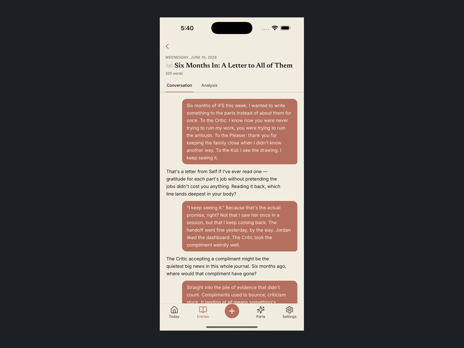
Journaling in conversation, writing to the parts, not just about the day.
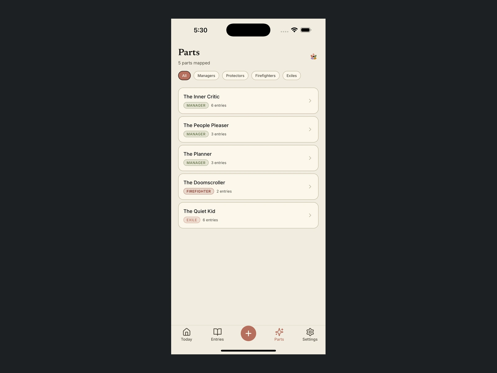
The parts library, each part sorted by its IFS role and marked in that role's color.
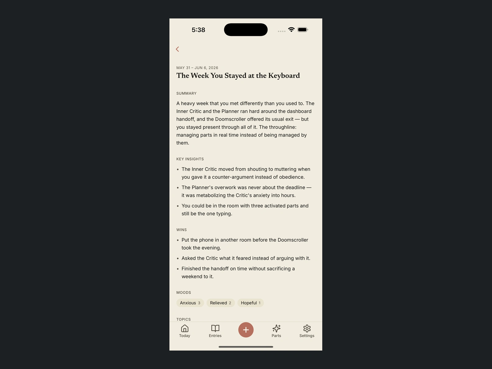
The weekly AI read, a plain-language summary of the week with insights, wins, moods and topics.
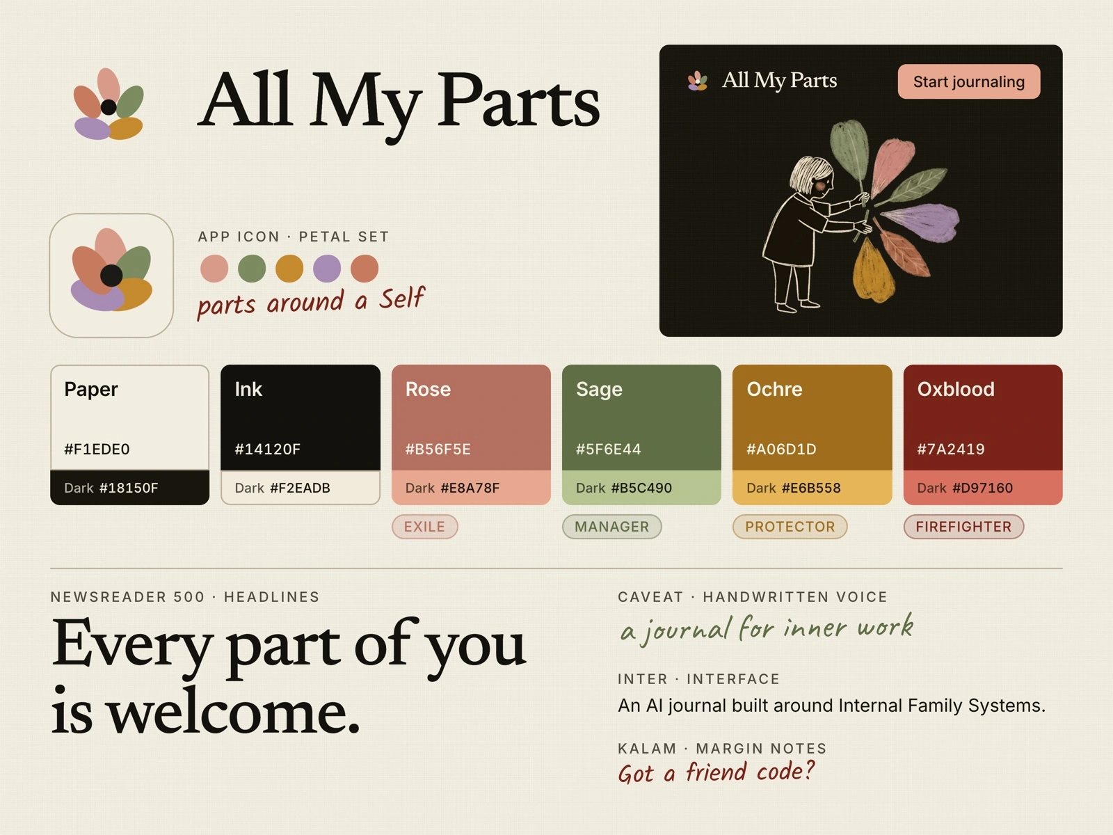
The brand: a five-petal mark for parts around a Self, warm paper colors, and an editorial serif with handwritten accents.
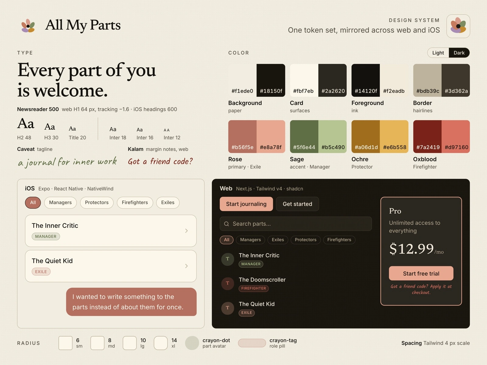
The design system: one set of light and dark color tokens, mirrored across the web and iOS apps, with each platform's components built on it. iOS shown in light, web in dark.
All My Parts is live at allmyparts.me and on the App Store as a native iOS app, $12.99 a month or $99 a year, in paid beta. Early users skew toward people already in IFS therapy who use it between sessions, plus IFS-curious people building a self-practice.
The brand carries across both apps from one source: the same petal mark on the favicon, the web logo and the app icon, and the same tokens coloring both apps.
Next is credibility, therapist endorsements and a small Reddit and Substack presence, before paid acquisition.
Full case study: https://studiomaya.io/work/all-my-parts.html
0 likes · 0 views · Nov 10, 2026
An AI journal for people in IFS therapy. I designed the product, brand and design system, then built and shipped it solo for web and iOS.