MOTI | Rebranding

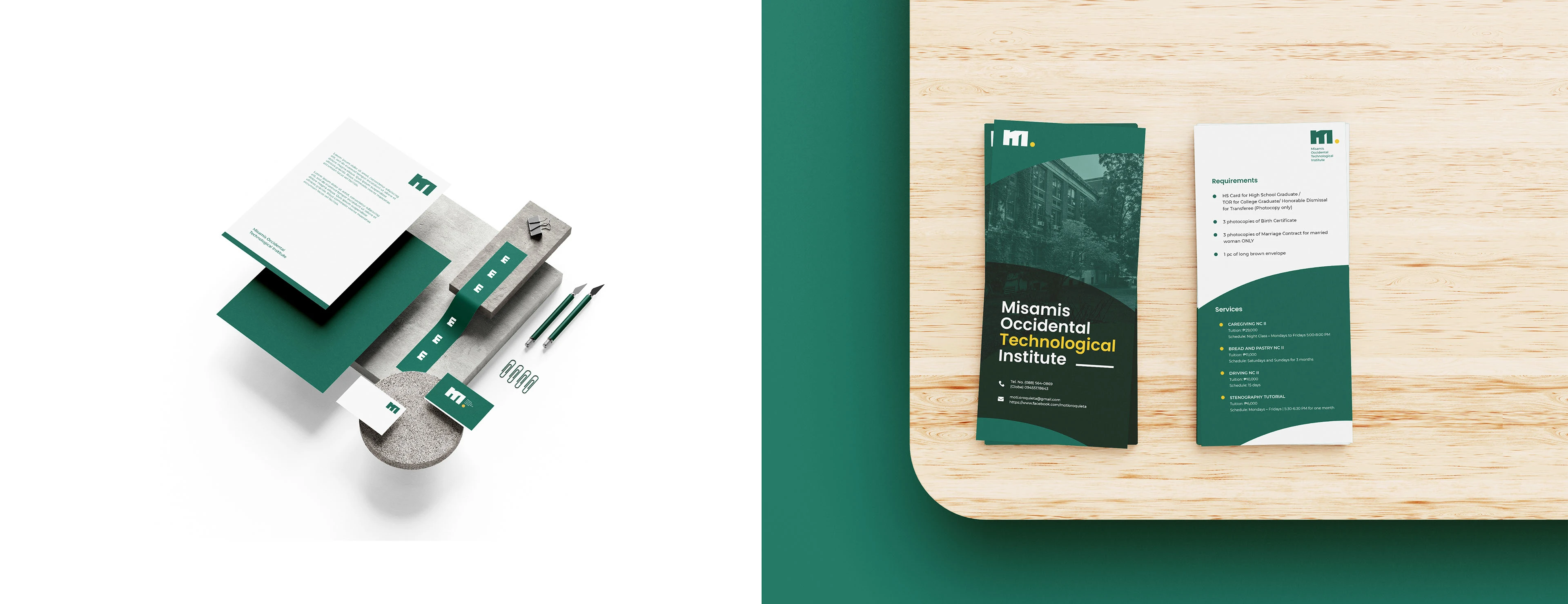
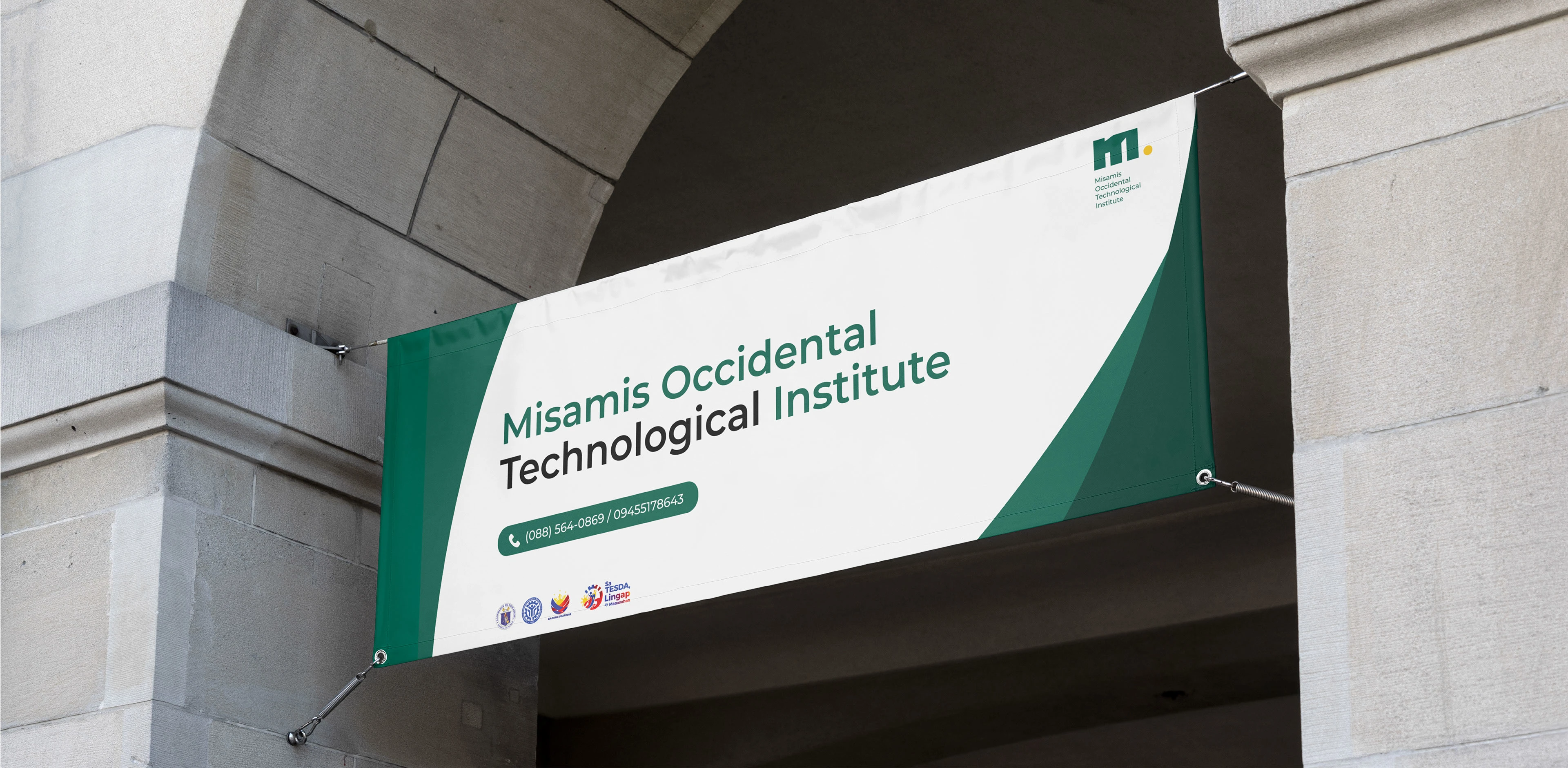
The rebranding of Misamis Occidental Technological Institute introduces a captivating fusion of modernity and tradition, symbolizing its evolution and commitment to excellence. At the core of the logo redesign lies the letter "M," dynamically crafted to embody strength and innovation.
Incorporating buildings within the letter "M" of the logo serves a dual purpose: it symbolizes the physical infrastructure of the school while also representing the foundational pillars of education and community.
The interplay of the letter and architectural elements conveys a harmonious blend of academia and aspiration, while the subtle use of the green color infuses vibrancy and vitality into the design. Overall, the revamped logo encapsulates MOTI's ethos of embracing change, building futures, and shaping tomorrow's leaders.







Like this project
Posted Mar 17, 2024
As MOTI School progresses into new frontiers of education and innovation, it became essential for the logo to reflect this forward momentum and modern outlook.


