
Bitezon_Brand Identity & Packaging
© February 2026
Bitezon — Food Branding & Packaging Design
THE DESIGN CHALLENGE
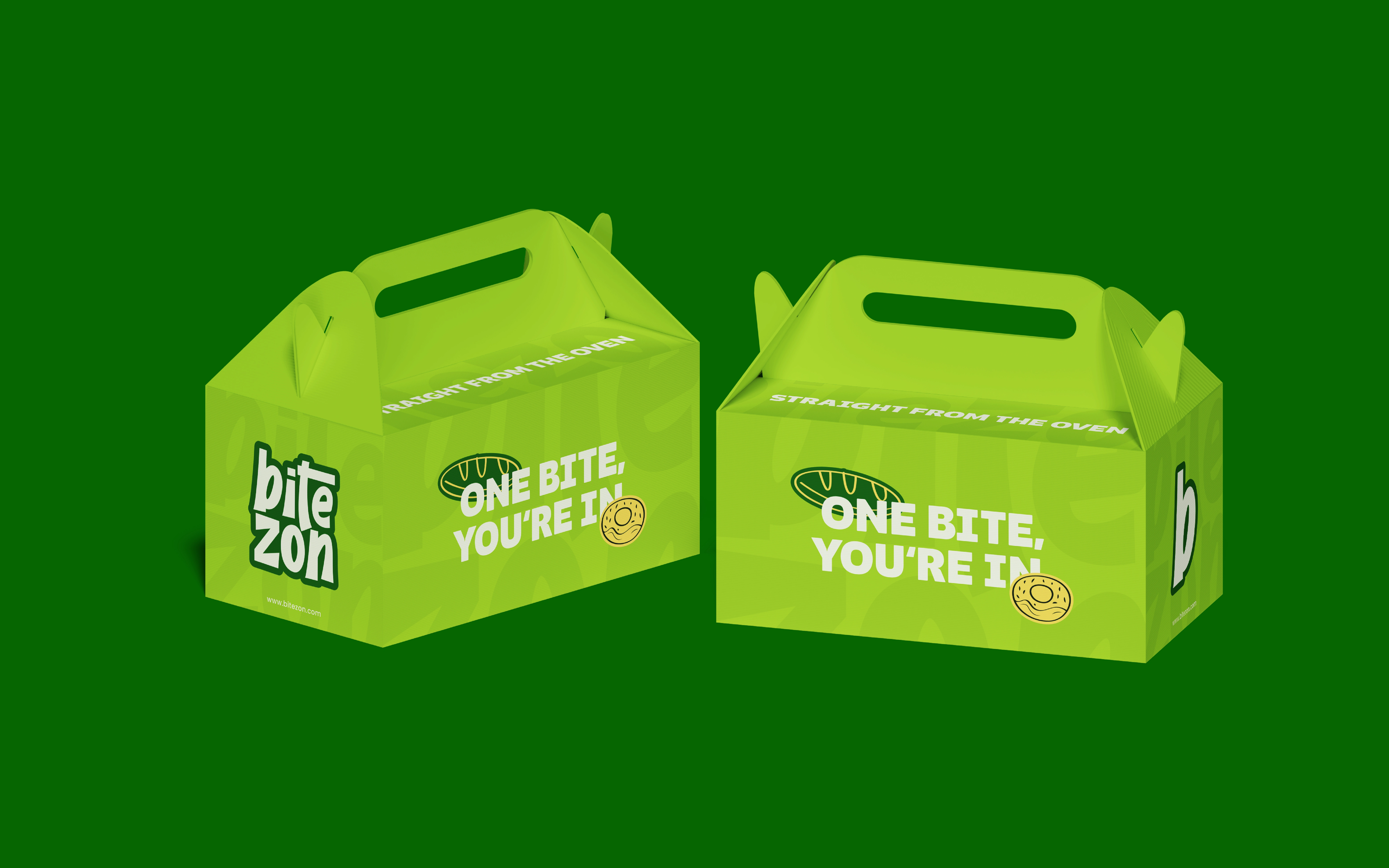
A food brand needs to carry its name and personality on compact takeaway surfaces and in moving content. The challenge is to create a signature that fits a narrow format without losing impact.
THE DESIGN SOLUTION
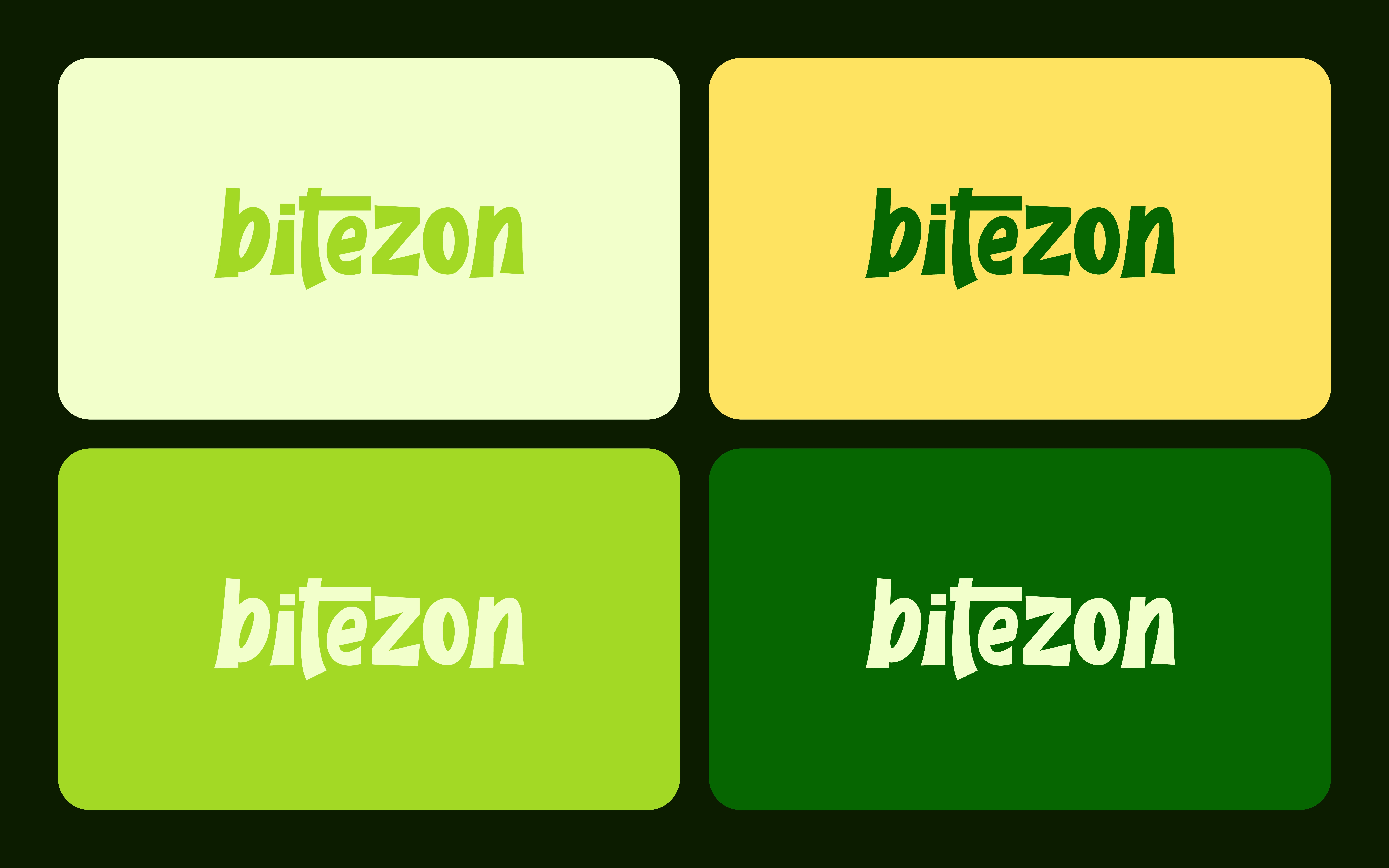
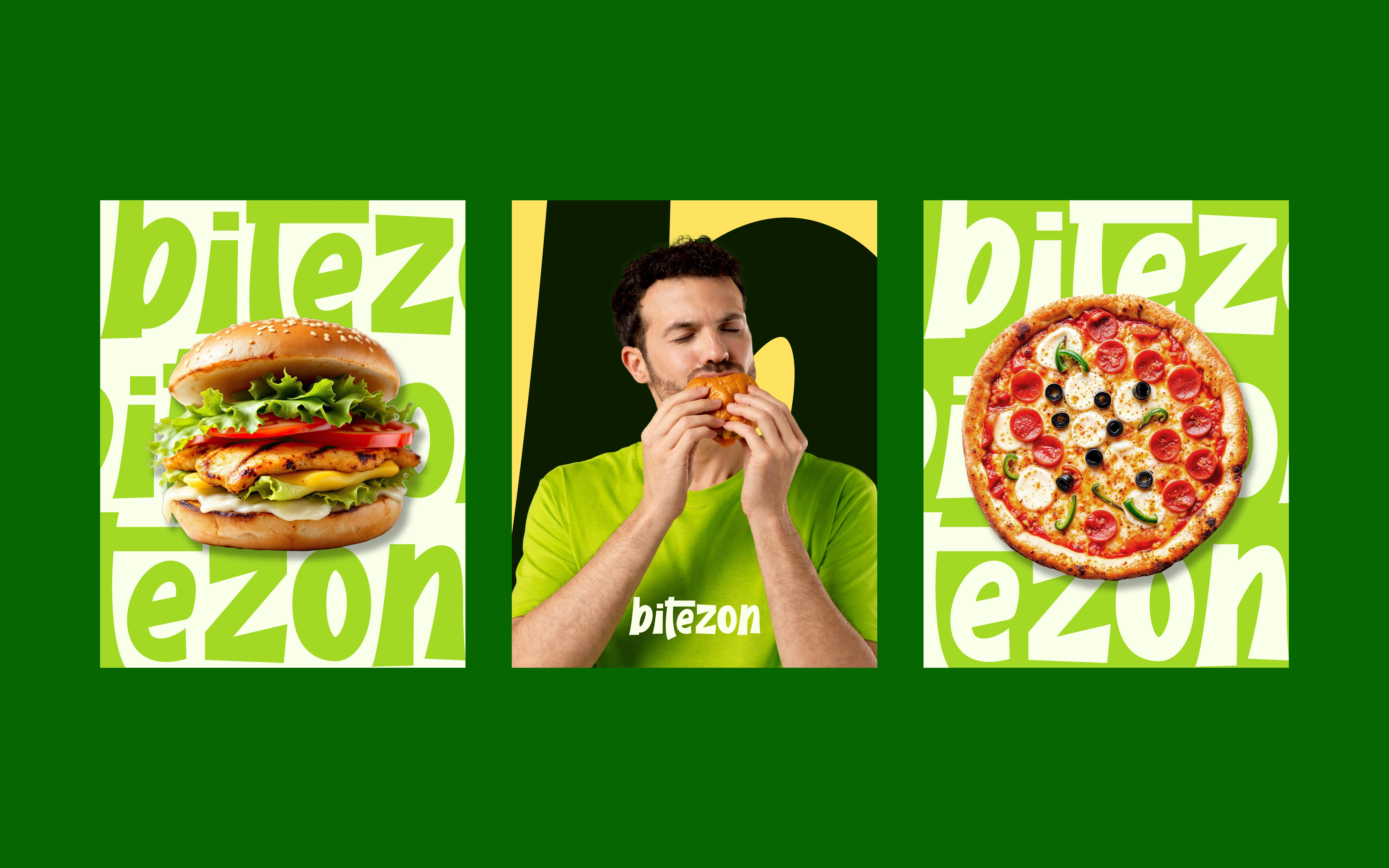
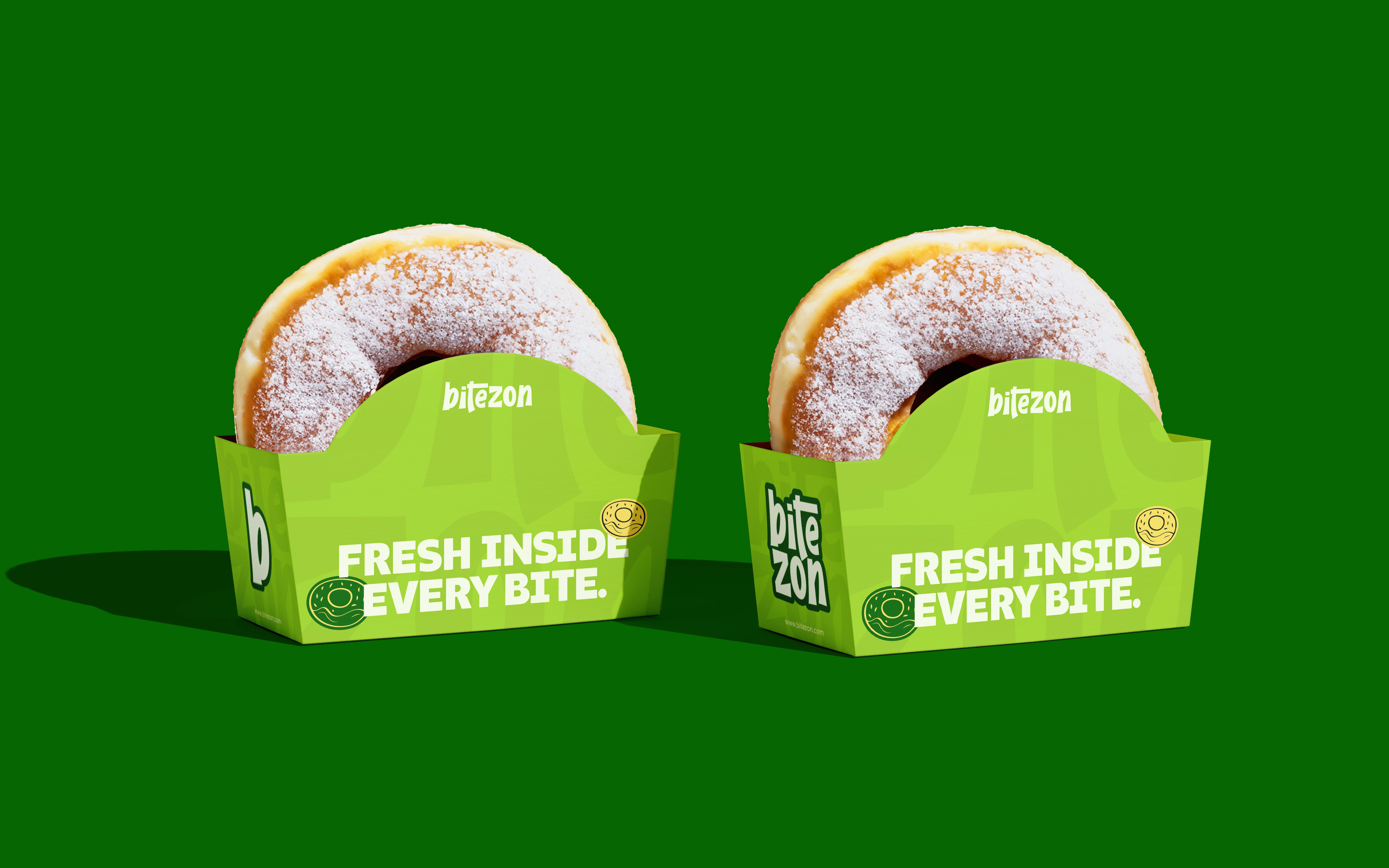
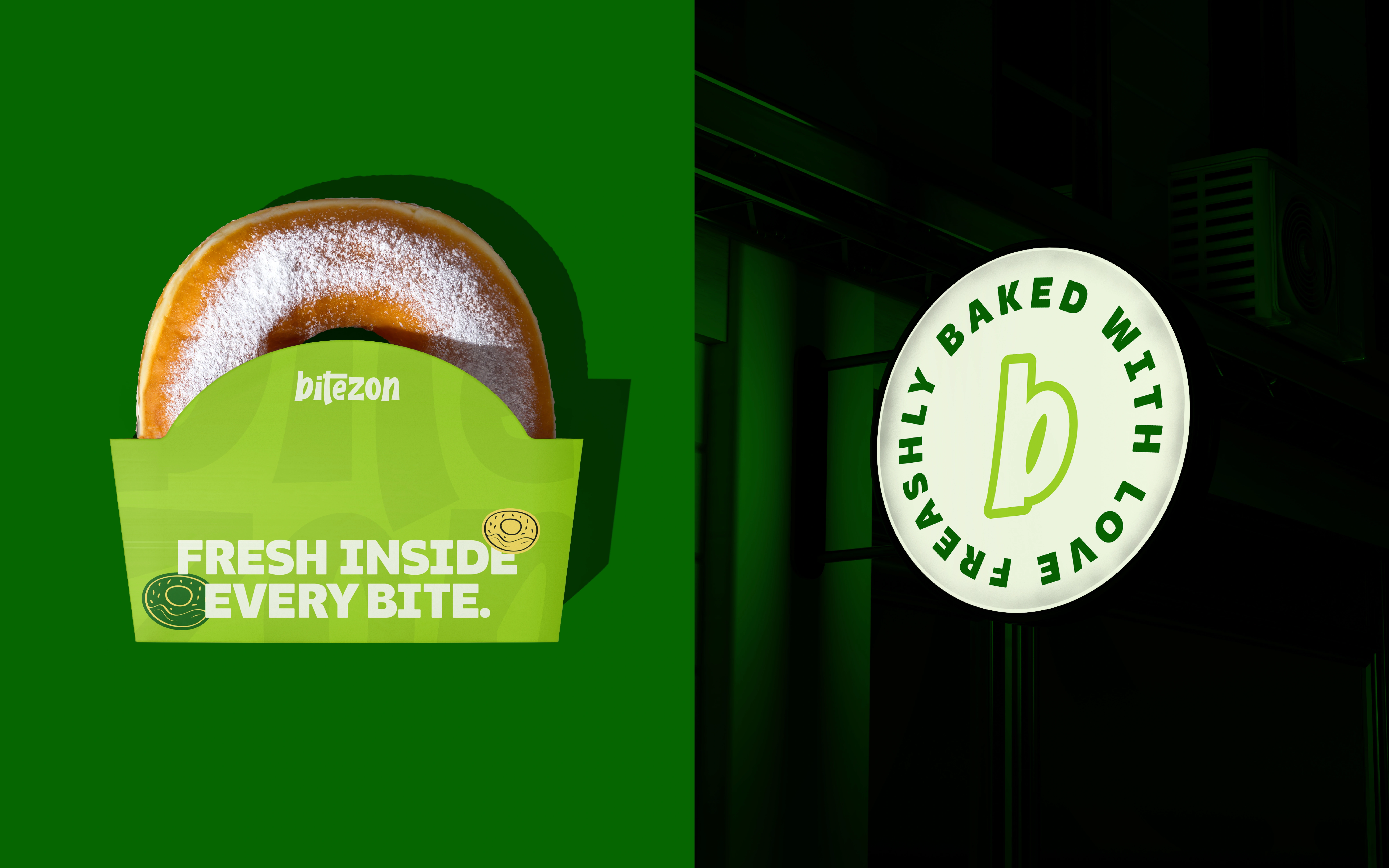
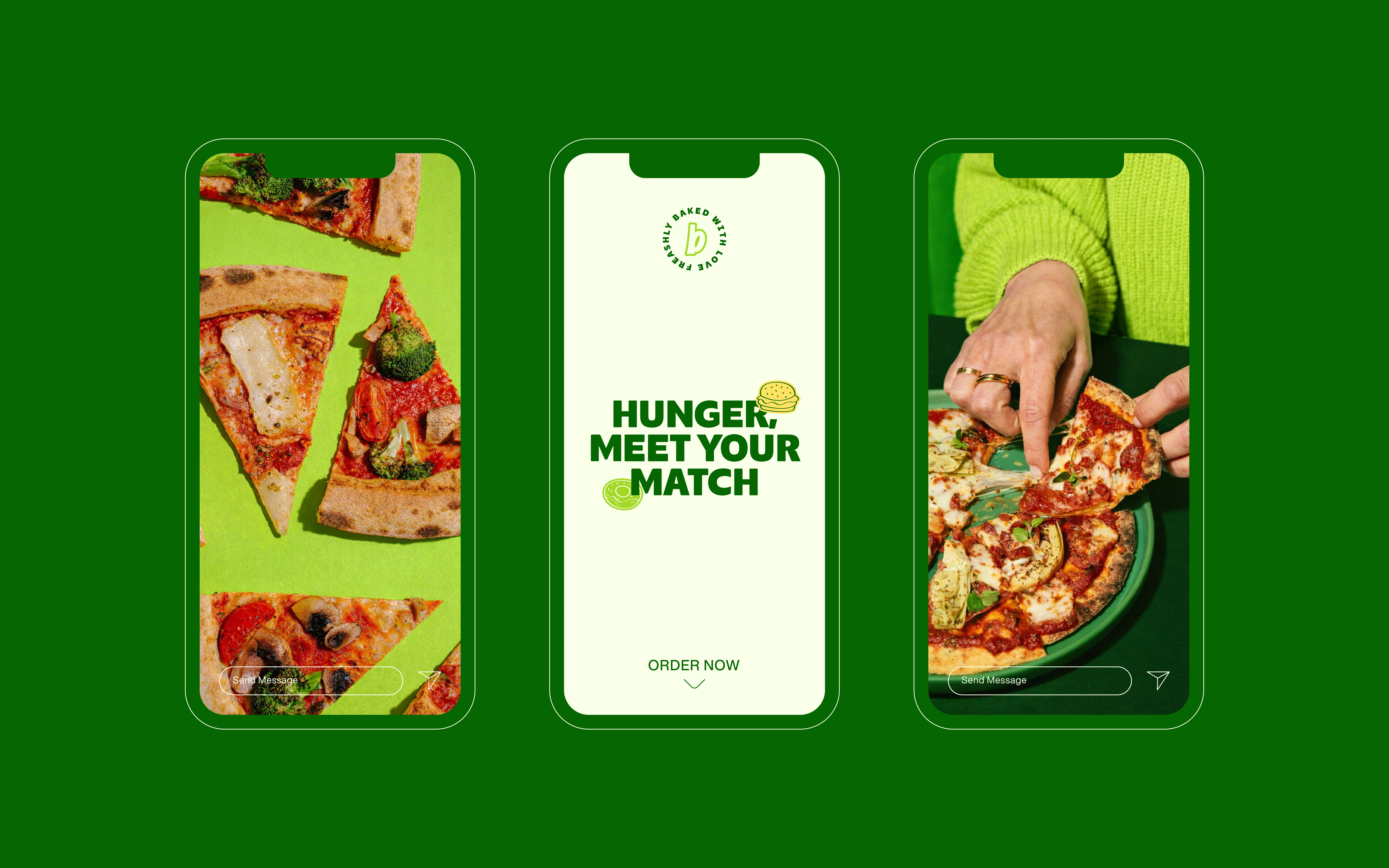
The design stacks the bite/zon lettering into a compact block. Thick rounded forms, a contrasting outline and lime packaging separate the name from deeper green surroundings. Motion views of the lettering construction connect the graphic asset with its packaging application.
WHY THESE DECISIONS MATTER
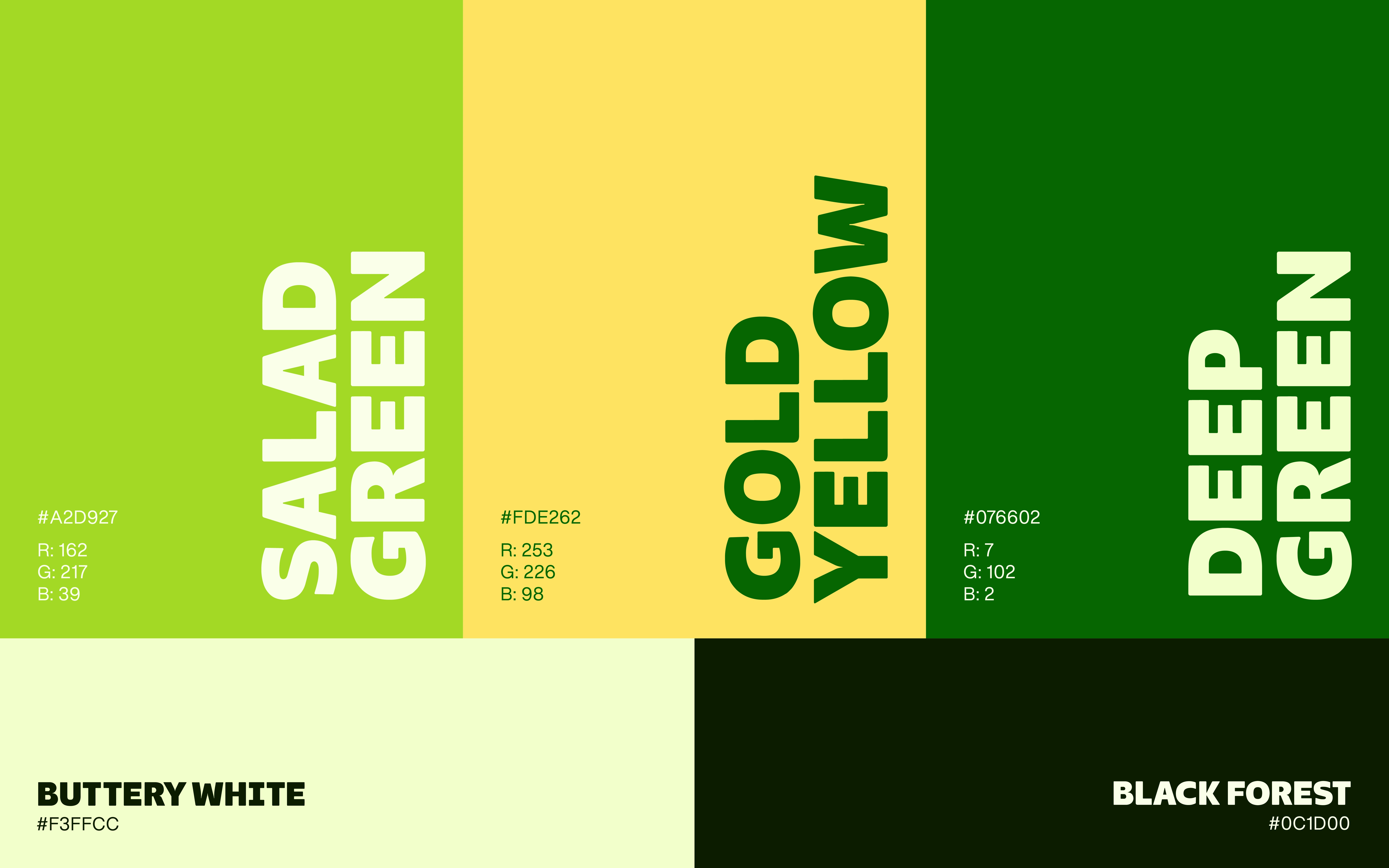
The stacked format makes better use of a narrow carton face. A concentrated colour family and repeated letterforms give packaging and motion content a connected brand language.
Need food branding, packaging or brand animation? Message me with your product category and delivery requirements.
1 like · 7 views · Oct 16, 2026
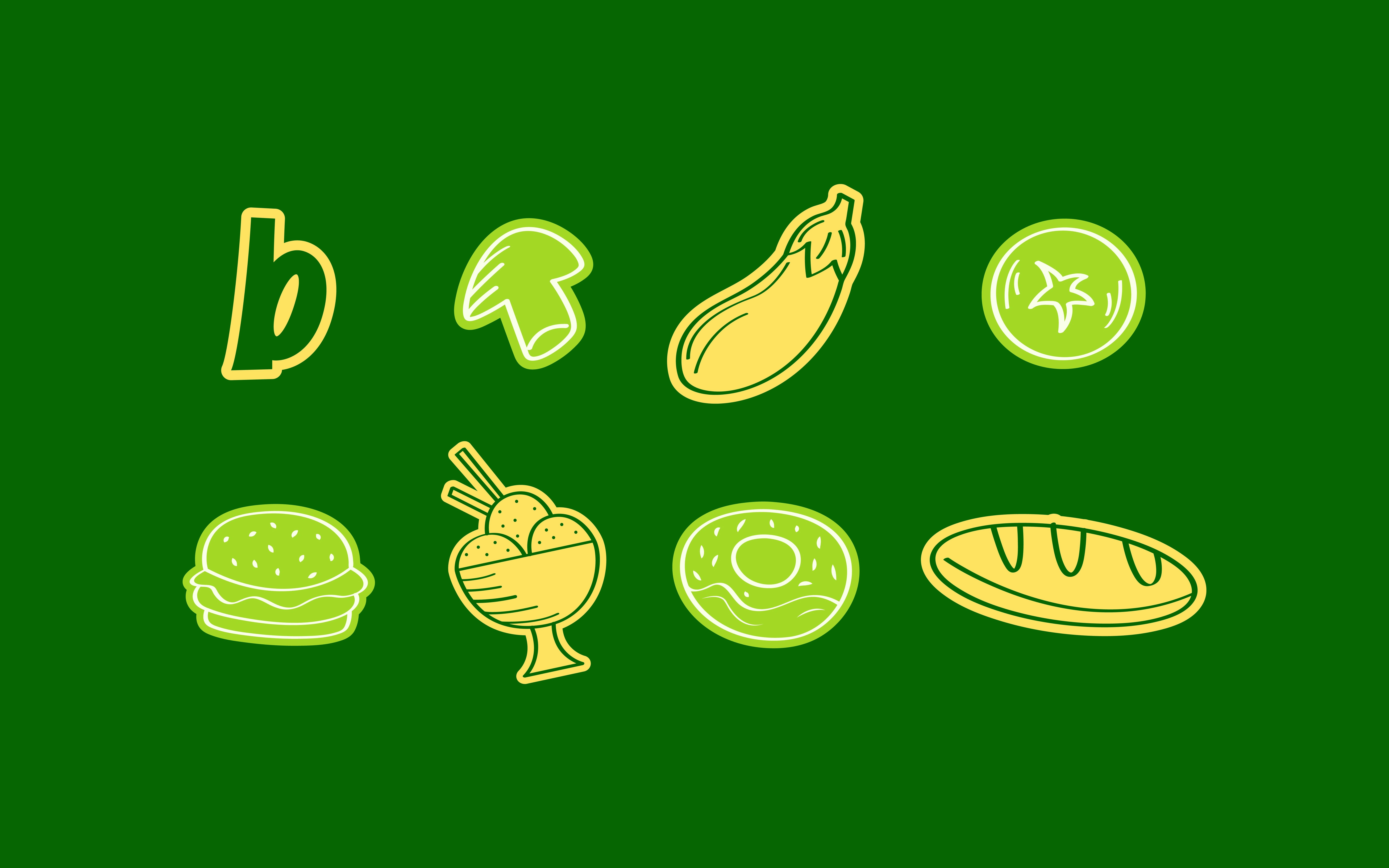
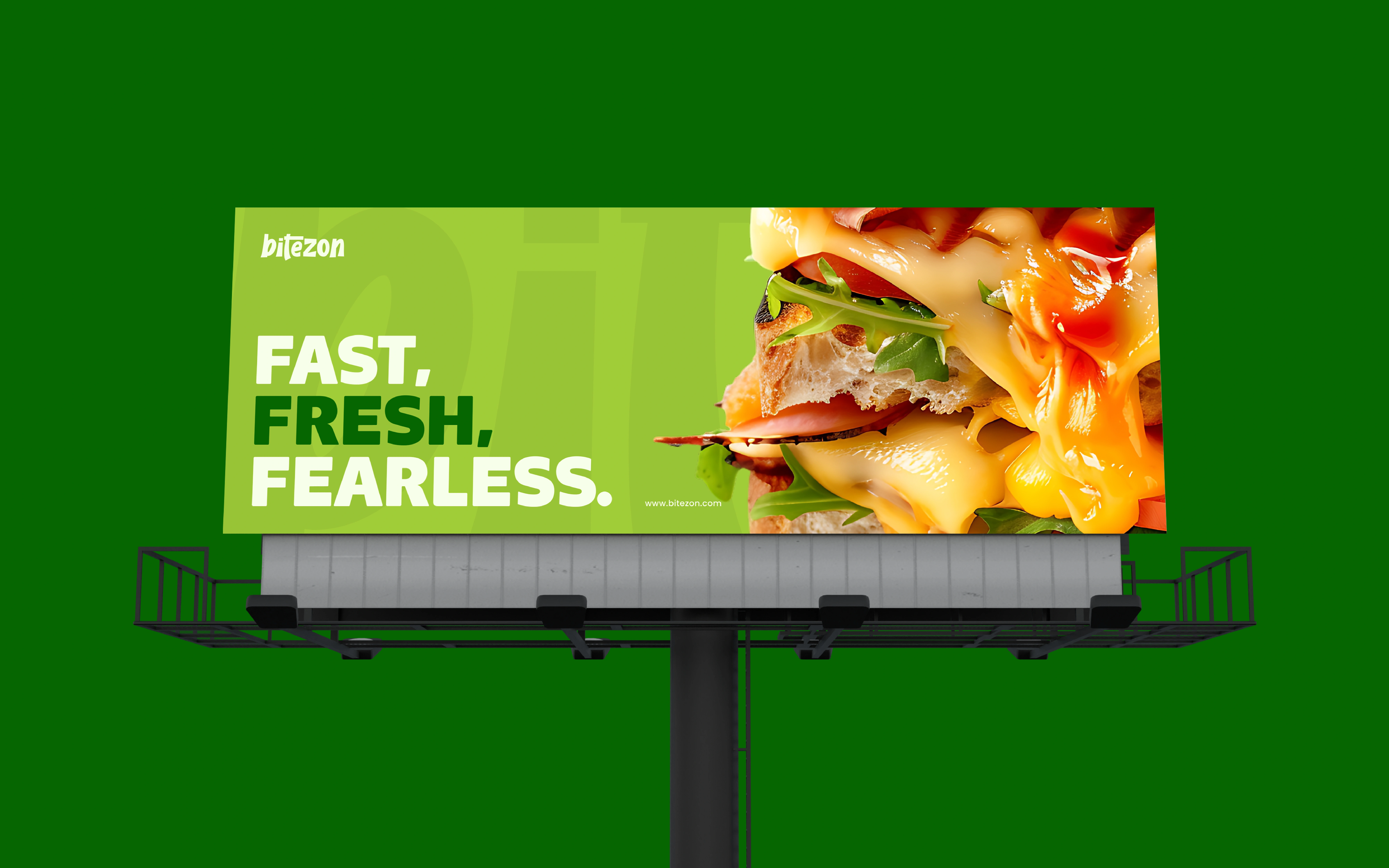
Food branding and packaging using stacked rounded lettering, outlined contrast and lime/deep-green colour to create a compact signature.


