
Visual Brand Identity & Packaging
© September 2025
CAFFORA — Cafe Branding & Packaging Design
THE DESIGN CHALLENGE
A cafe identity needs to convey an inviting atmosphere on small takeaway formats as well as broader brand imagery. The challenge is to connect warmth with a practical, repeatable packaging system.
THE DESIGN SOLUTION
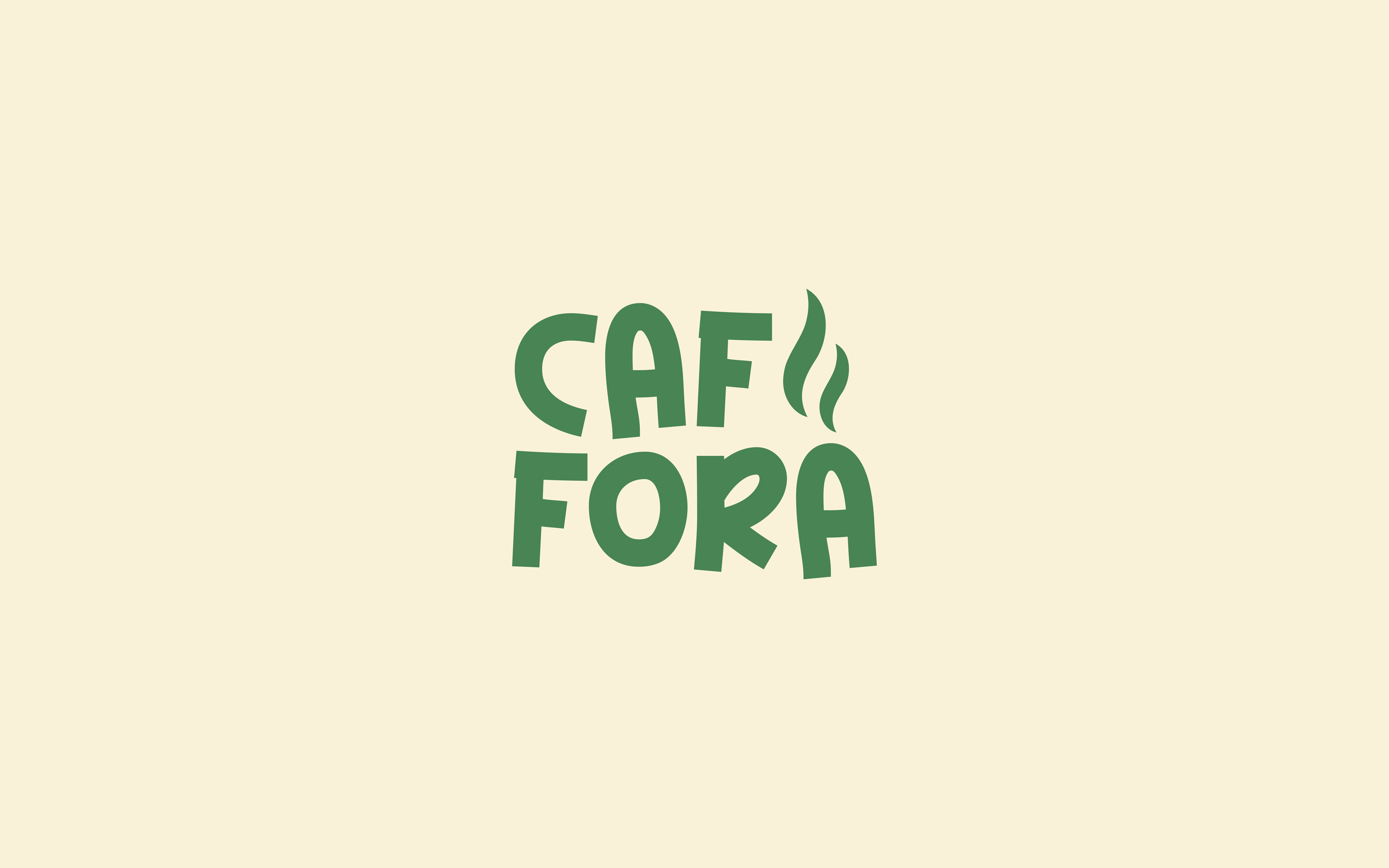
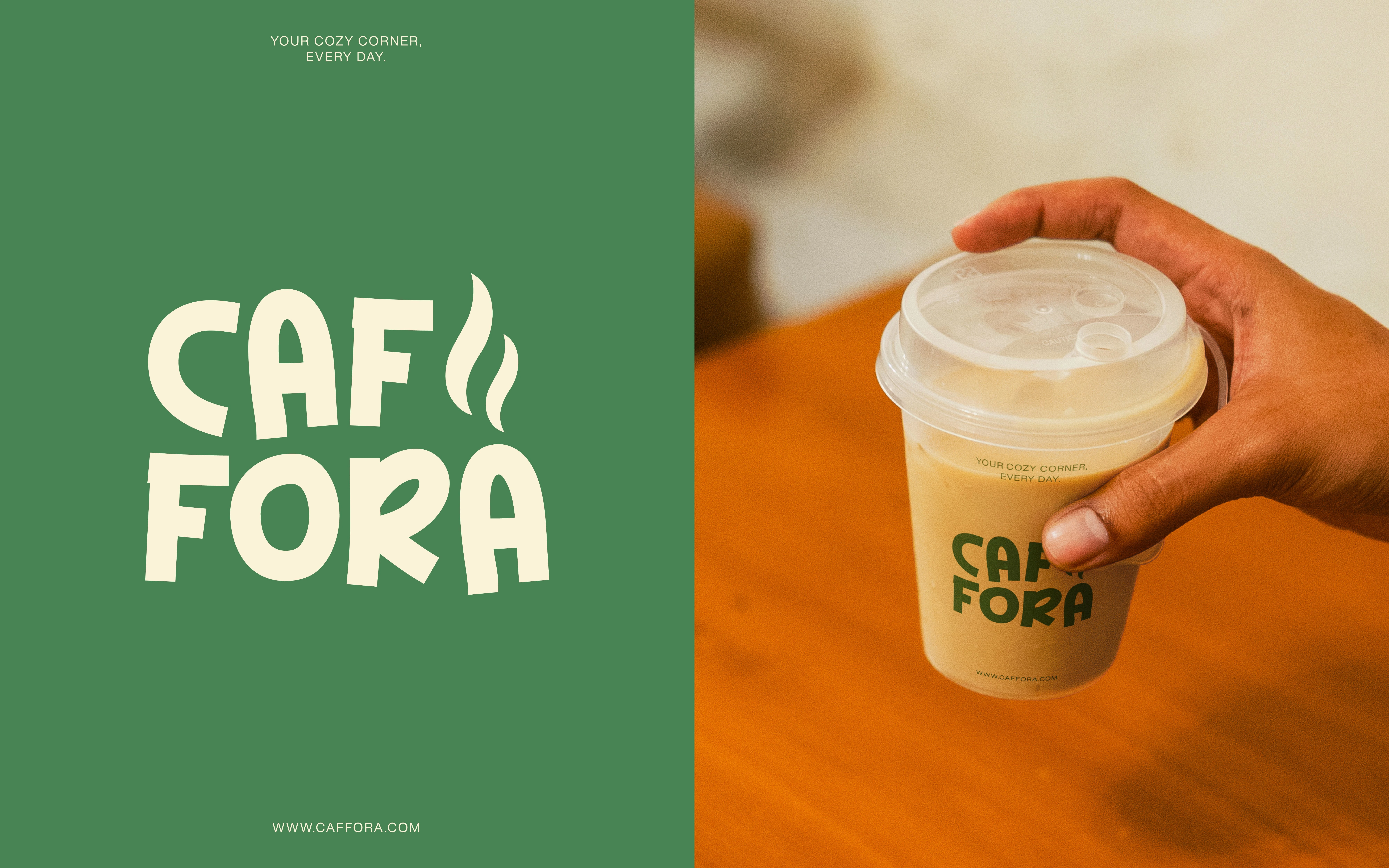
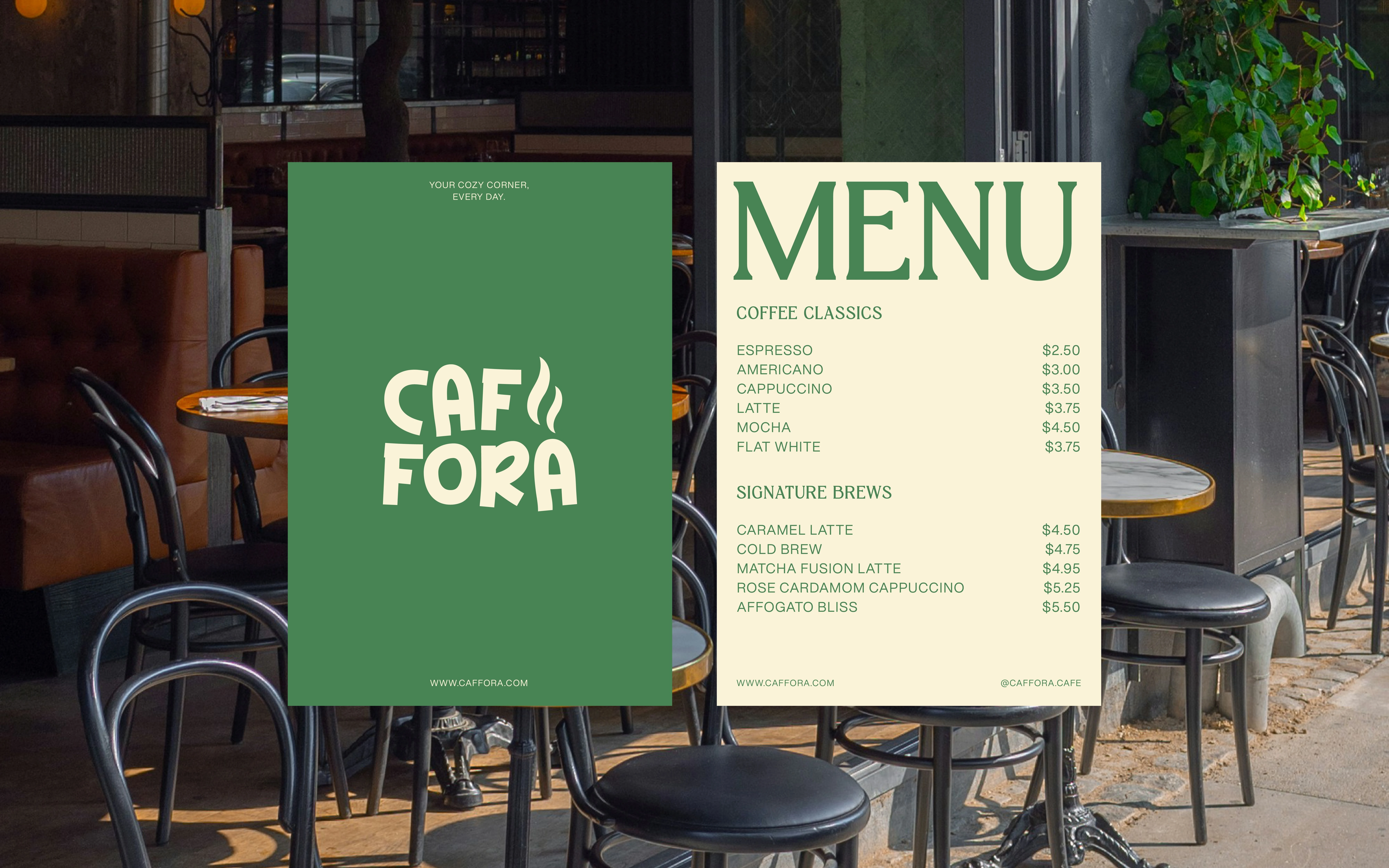
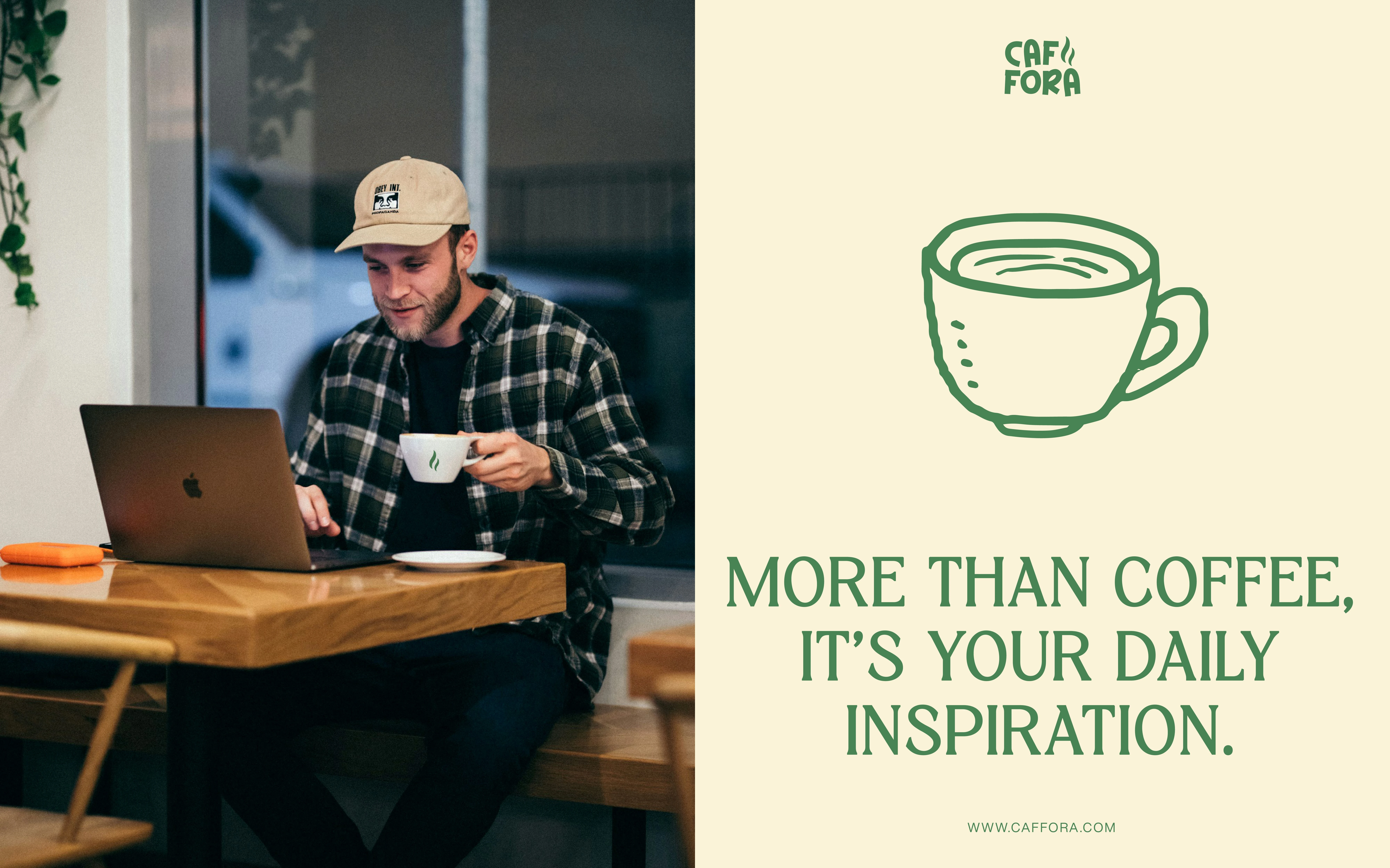
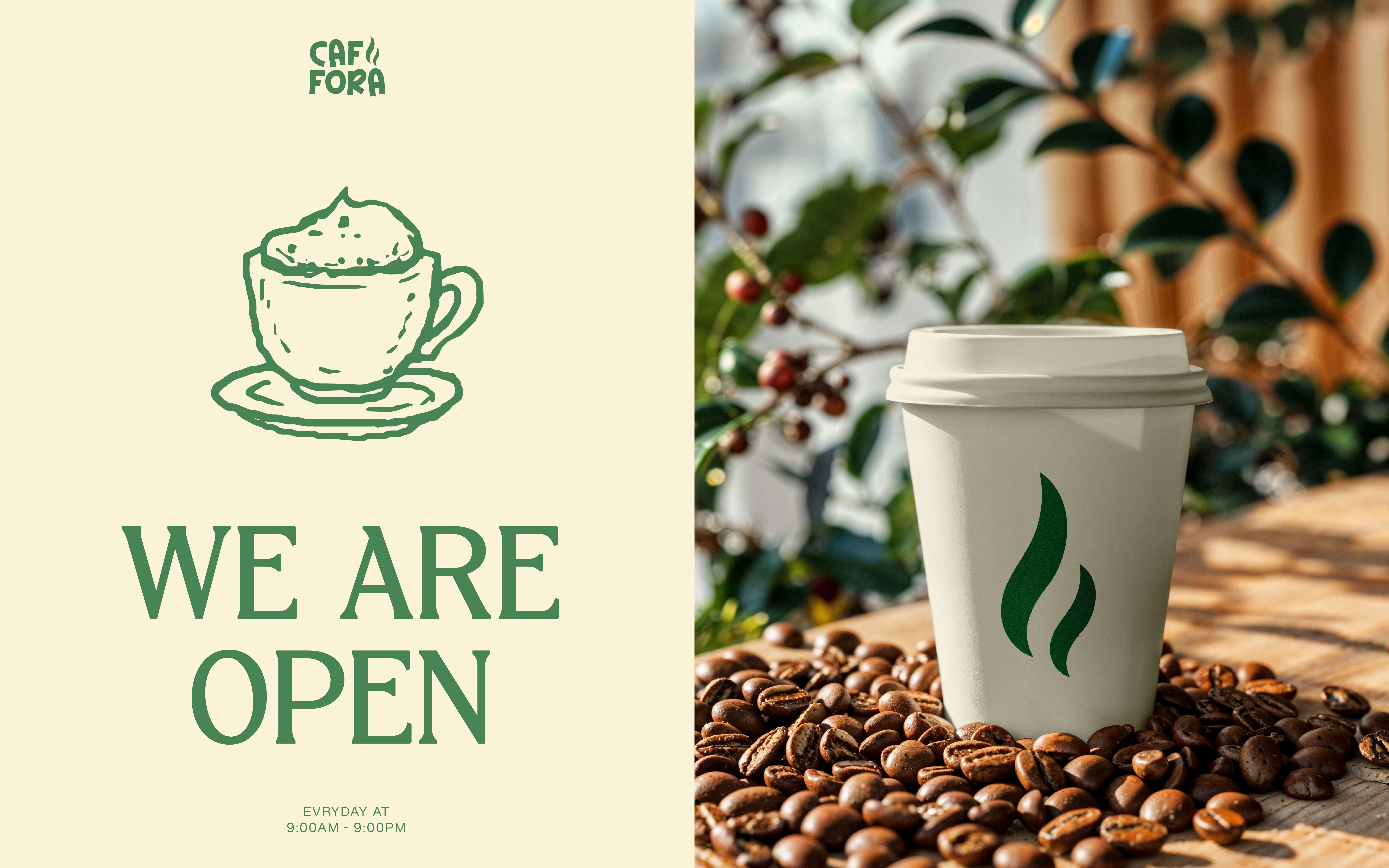
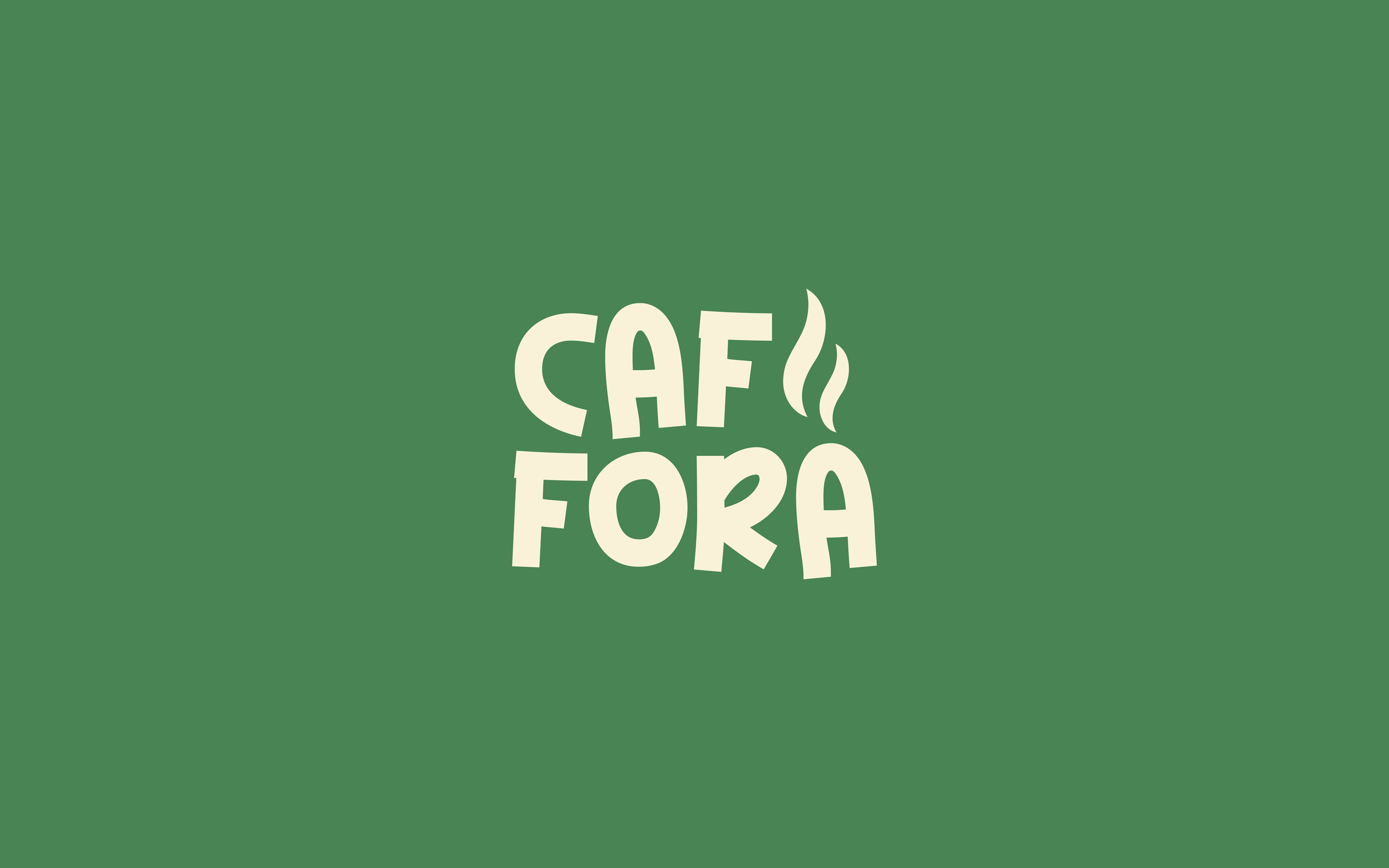
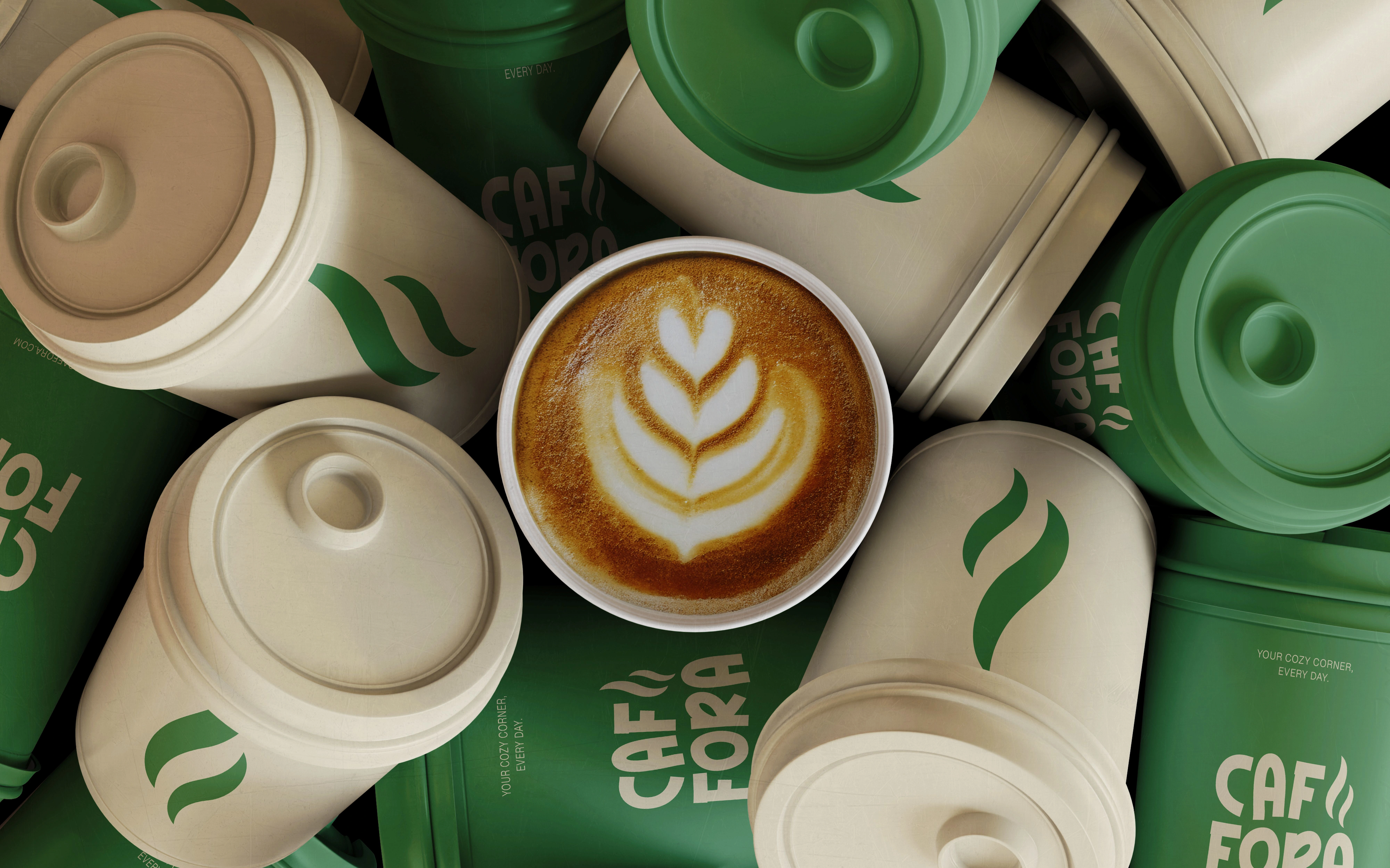
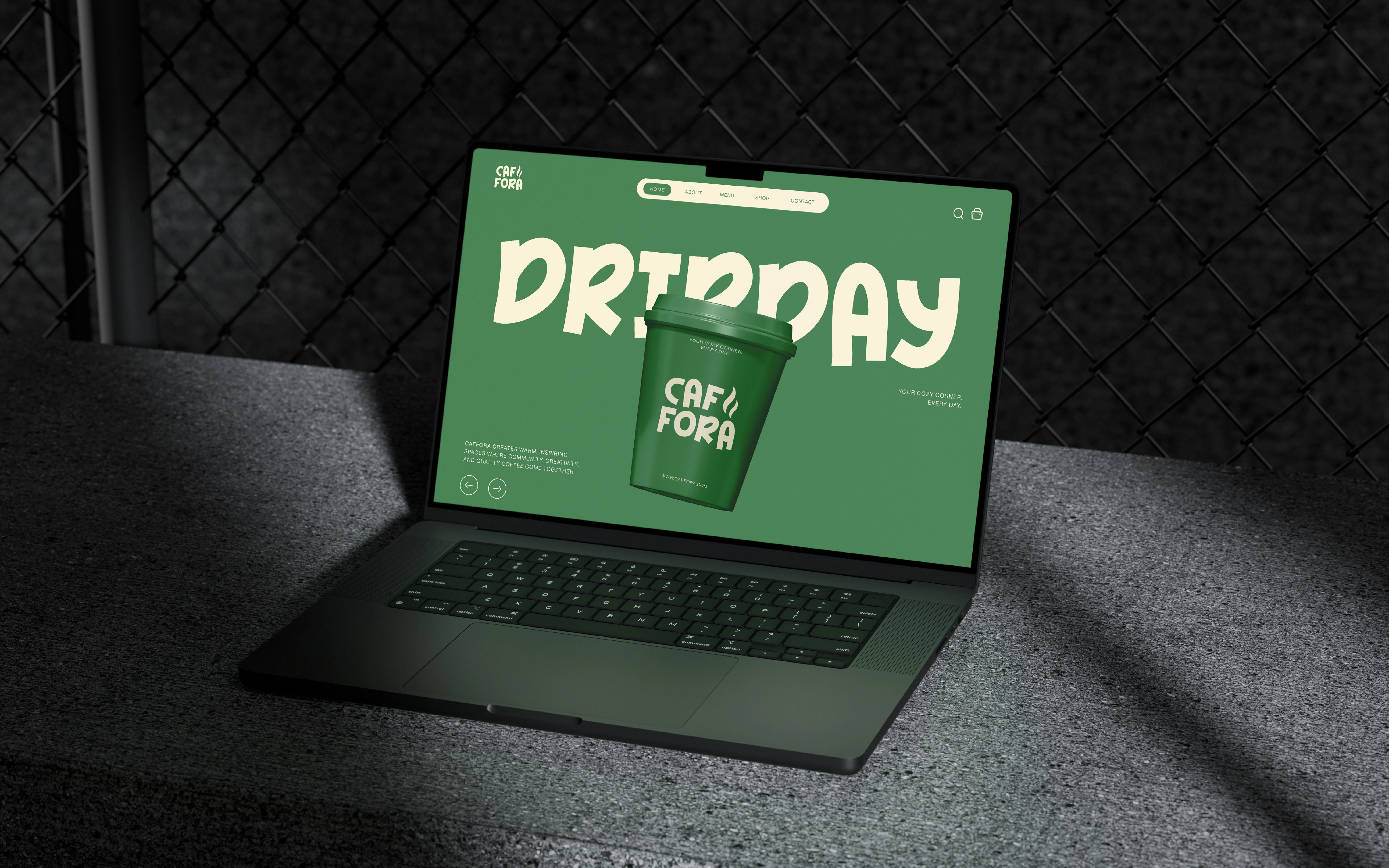
The identity builds a steam-like motif from two flowing shapes and pairs it with a stacked rounded wordmark. Green and warm cream reverse across cups and lids. Some applications lead with the name; others use the larger motif.
WHY THESE DECISIONS MATTER
The compact name fits the cup face, while the standalone motif provides another way to express the brand. Shared shapes and colour connect varied packaging into one recognisable family.
Need cafe branding or coffee packaging design? Message me with your brand direction, menu category and packaging formats.
© 2025
Copyright ©. All rights reserved.
1 like · 9 views · Oct 16, 2026
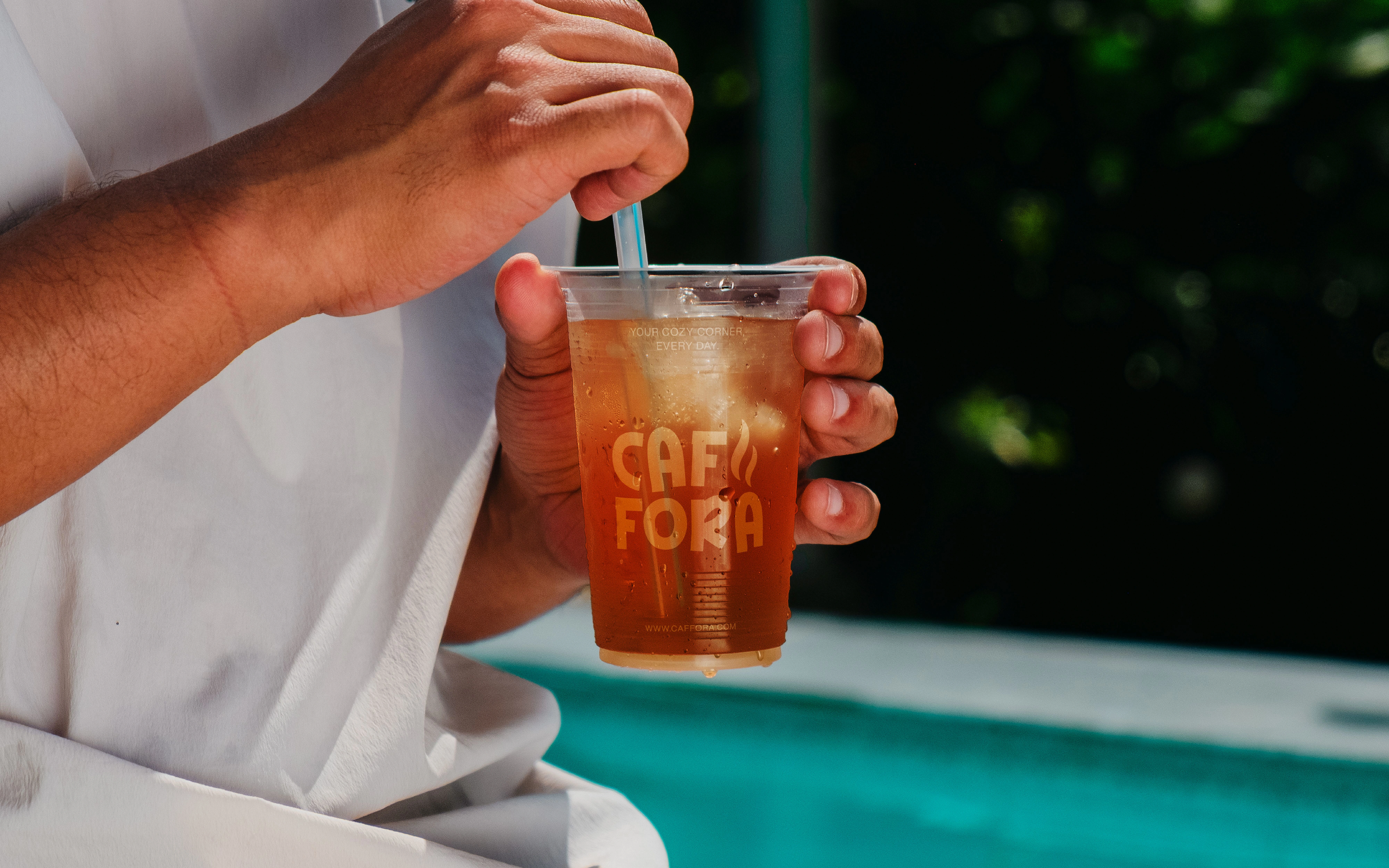
Cafe branding and packaging connecting a steam-like emblem, compact rounded wordmark and green/cream palette across takeaway applications.


