Built with Framer
NORVA | PDP and Branding for a clothing brand

Rafael Storck


The NORVA brand system in motion.
NORVA | PDP and Branding for a clothing brand
Store: A store built to take signups now and orders later.
One product page in Framer, mobile first, with a selector between the pieces. The name, expected price and first photo show without scrolling, and the join-the-list button comes right after color and size. With no sales yet, the page offers proof anyone can check: warranty, material and returns. The CMS uses Shopify's fields, so the waitlist becomes a cart without a redesign. The store is in Portuguese, for the people who will buy.
Store walkthrough, from home page to product page.
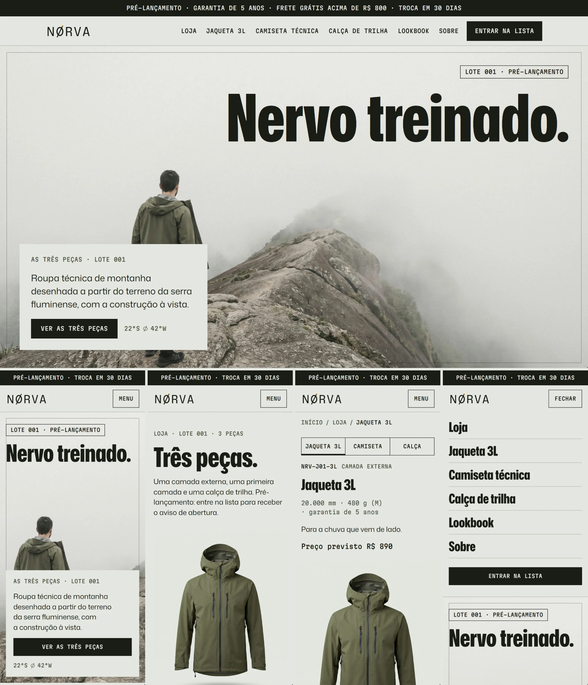
Store home page, built in Framer.
Amazon: The same plate, in Amazon's sizes.
A+ modules built on the brand's own titles, a Brand Story and a Brand Store with a home page and one page per piece. Laid out in Figma with the same library and product images as the store, so the listing reads as NØRVA inside the marketplace grid. Ready to upload when the brand opens its seller account.
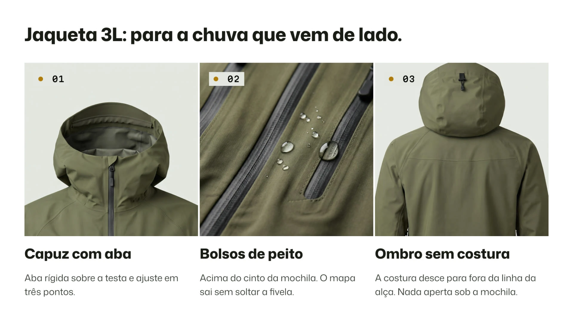
Amazon listing images for the Jacket.
Branding: A ring, a stroke and one ochre dot.
The logo is a ring crossed by a stroke that runs past the edge on both sides. The ochre marker where the stroke exits is the same dot that flags each callout on the plates, so the symbol still reads at tag size.
The ring, the stroke and the ochre dot, drawn in motion.
A palette and type with one job each.
Plate Paper is the ground, Ink carries text and logo, two mosses fill the plates and Nerve Ochre is the only accent. One sans handles titles and text, and a mono handles data only: codes, measurements and folios. Everything lives in a Figma library with variables, styles and components.
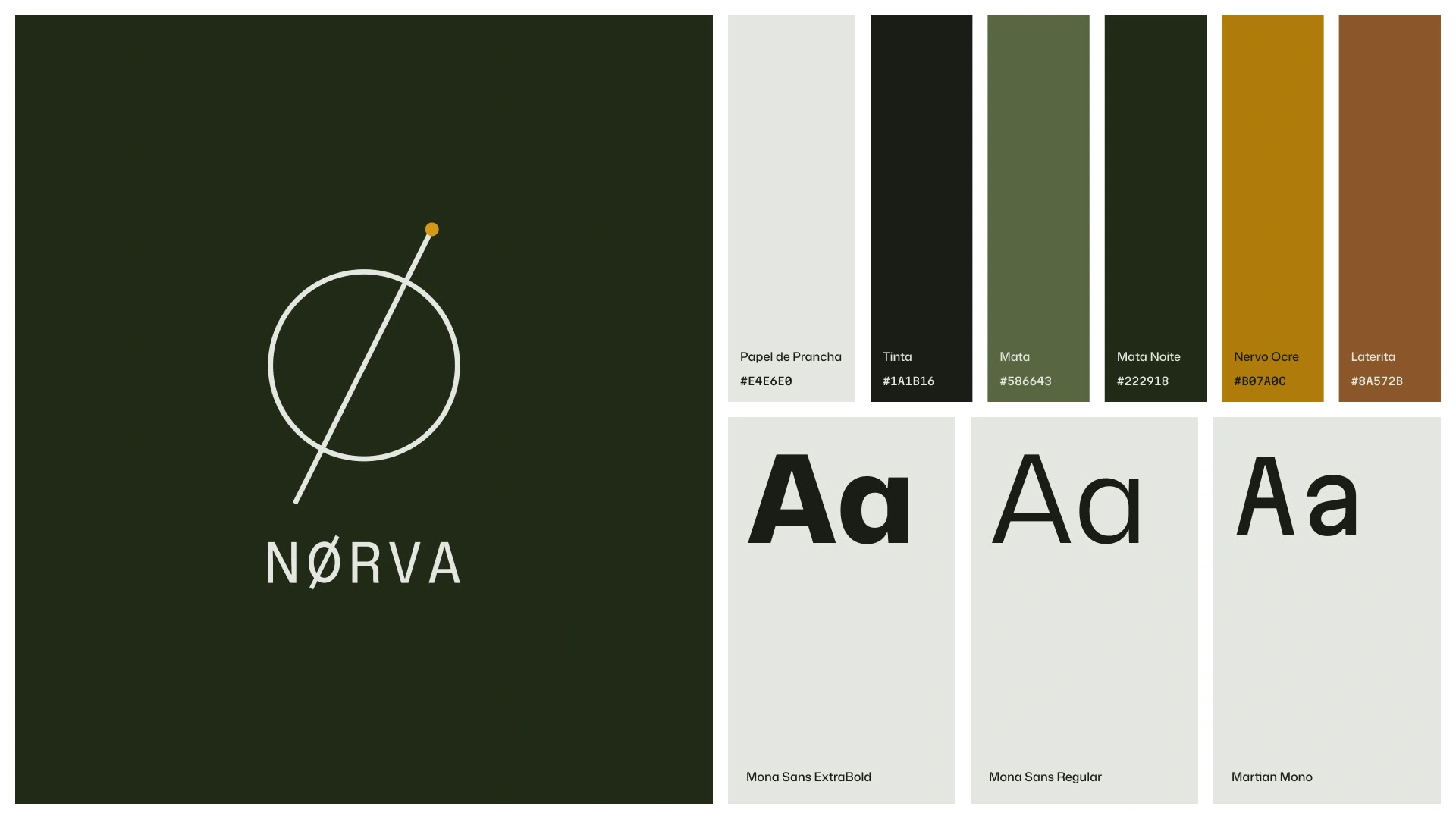
Color palette and typography.
The same drawing on every surface.
The box is a scene made in Magnific with no branding, then the vector logo placed by composition so the symbol stays exact. The system carries on to the hang tag and the woven label, with the product code and the numbered batch. Sign, stationery, patch and press kit follow it.
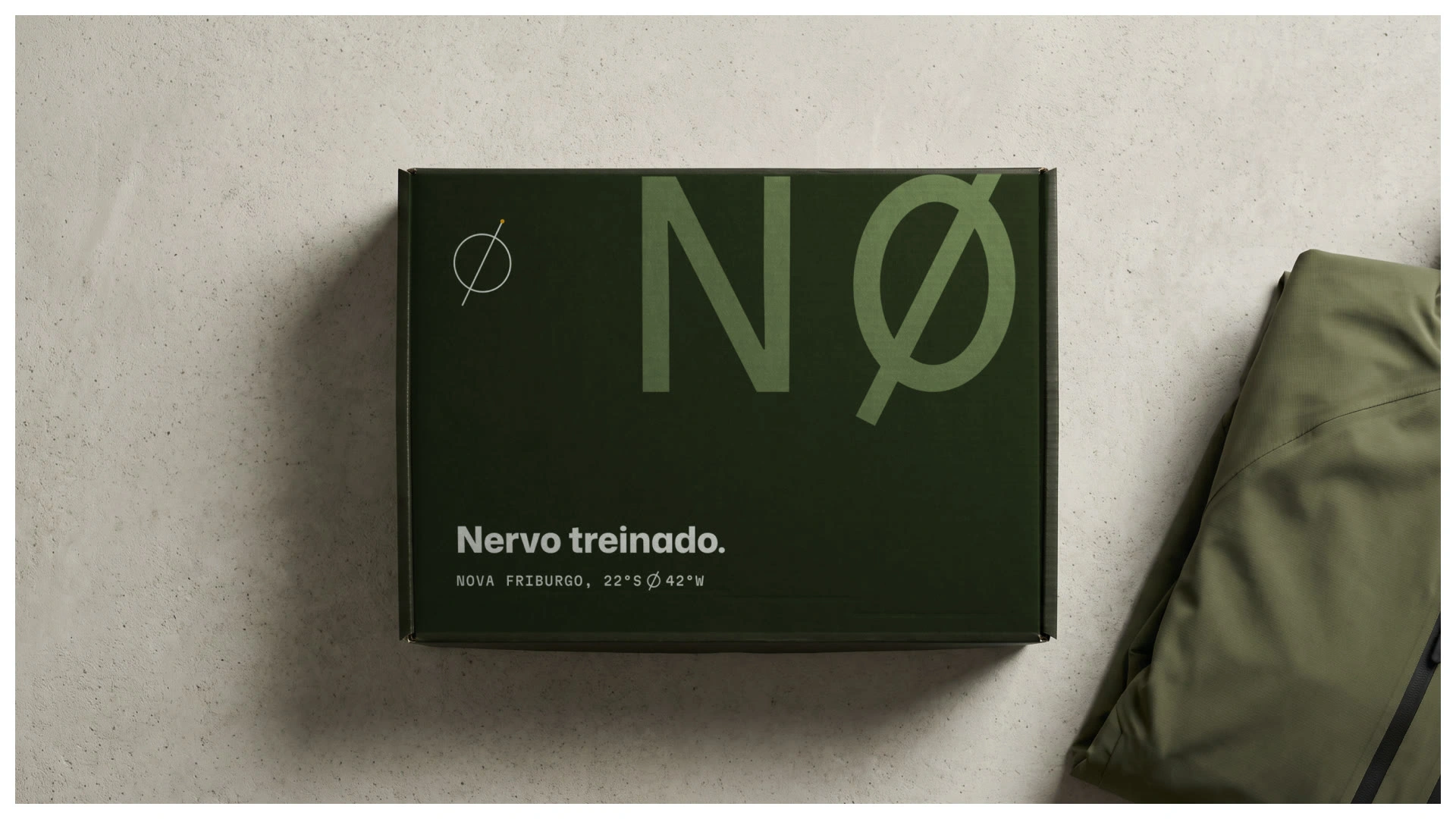
The shipping box with the symbol and tagline.
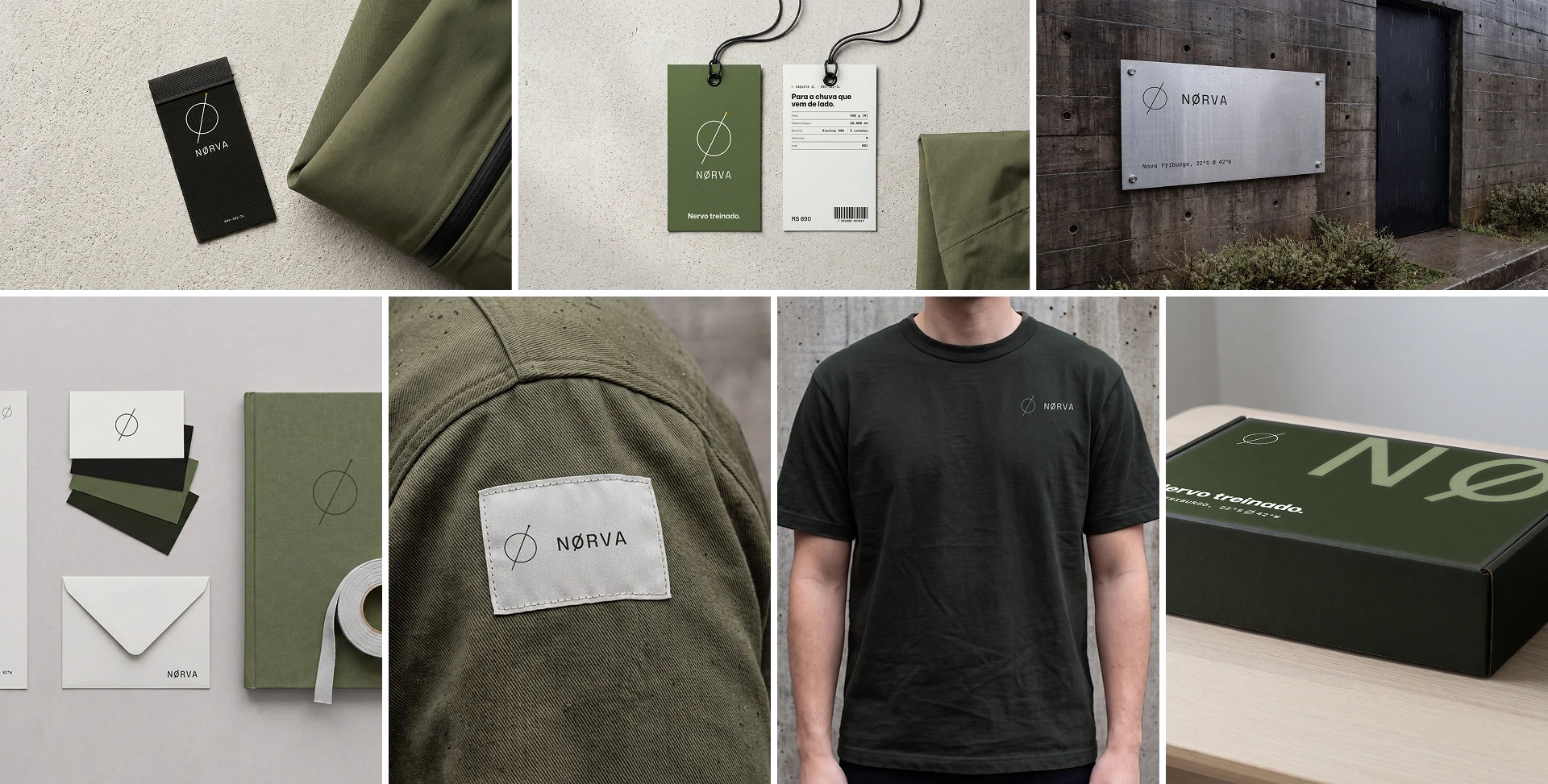
Tags, signage, stationery and patch.
Product: Product images made without a photo shoot.
Every piece has a main image on white, the details that explain it and a spec sheet. With no sewn sample yet, the reference was the technical drawing. Every image from Magnific was checked against it pocket by pocket, and the ones that got a detail wrong went back. The same structure makes the line read as one range.
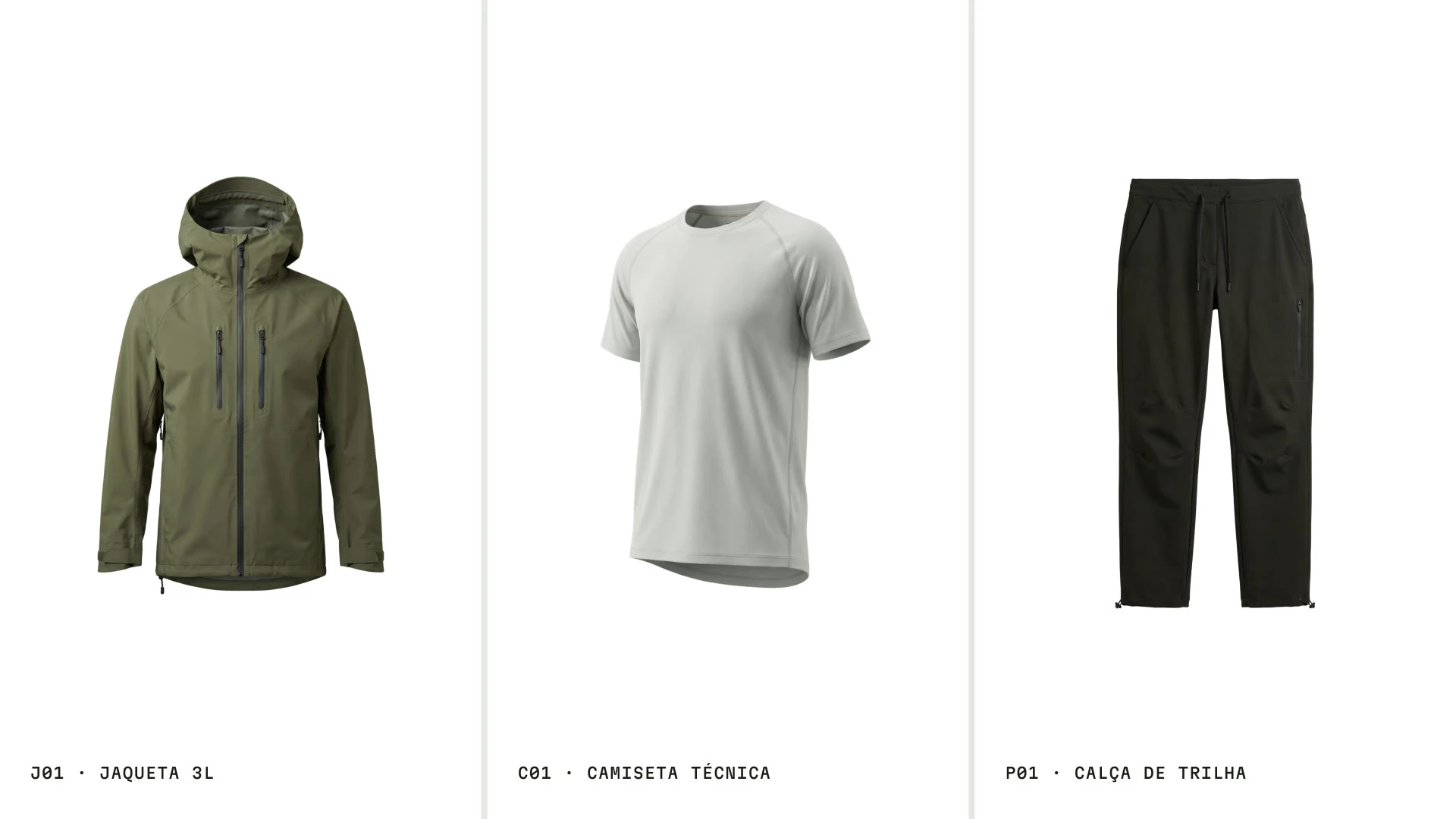
The full range on white.
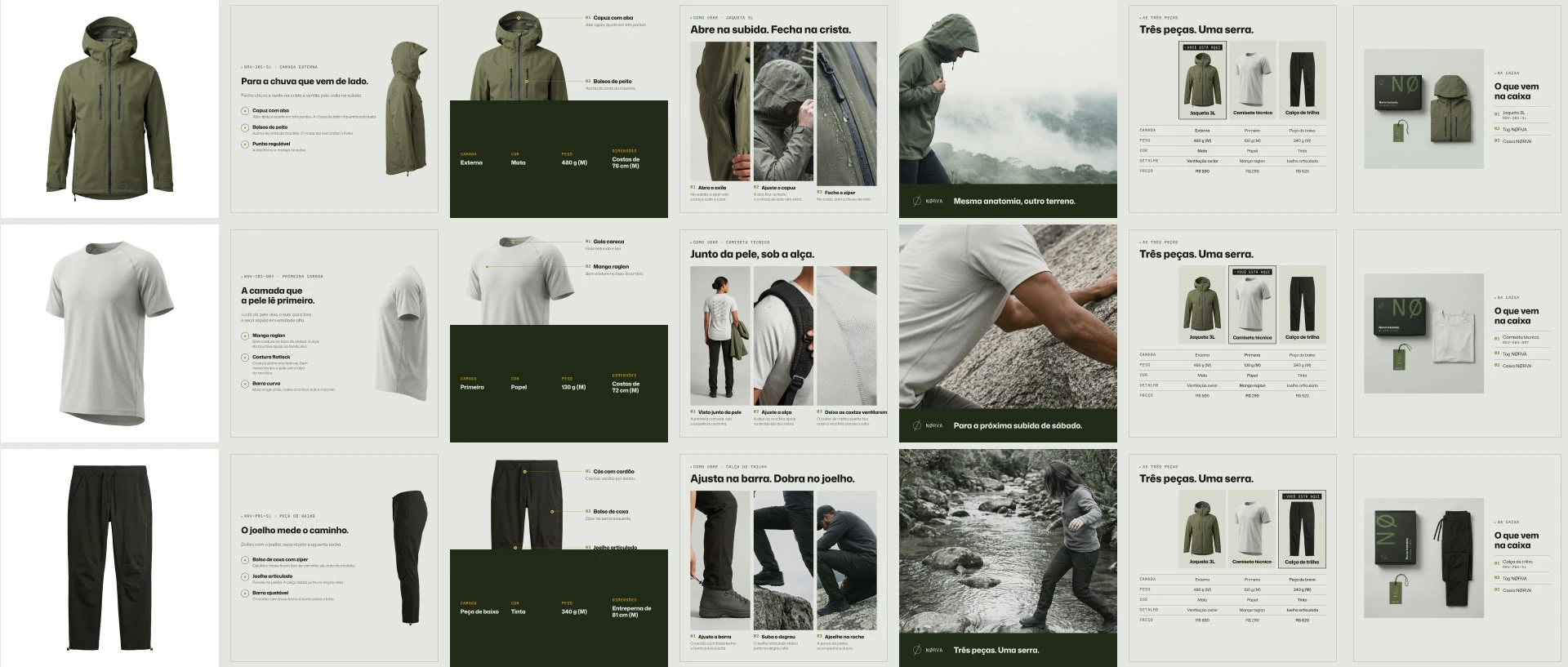
Listing images for each piece.
Same anatomy, different terrain.
One idea runs the launch campaign, with the piece, the policies and the spec as different openings. Scenes in real terrain show how each piece moves. I avoided the lone hiker on a summit at sunset.
Campaign scenes in motion.
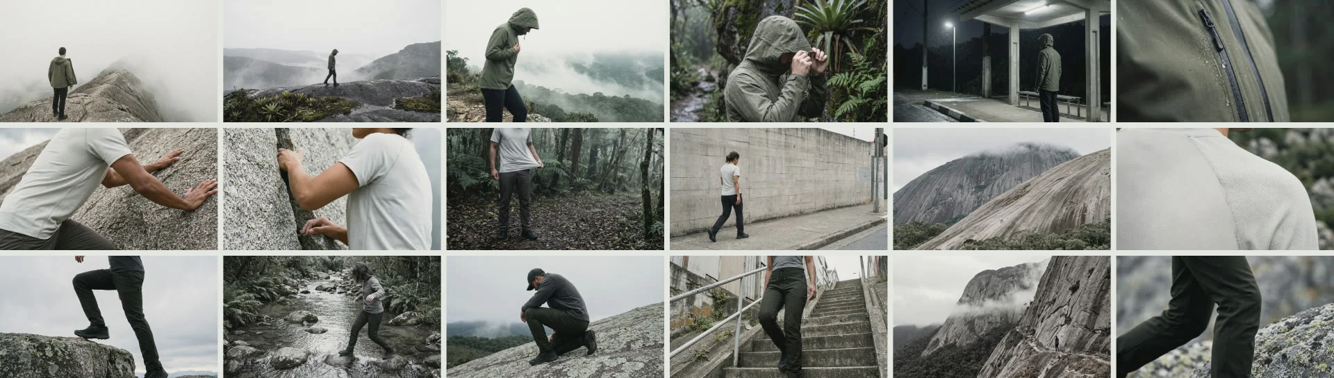
Campaign scenes across trails and rock faces.
Ads and out-of-home, from one idea.
The campaign becomes static ads in different formats, plus a bus stop mockup. A lookbook and a launch email, laid out in Figma with the brand library, close the launch.
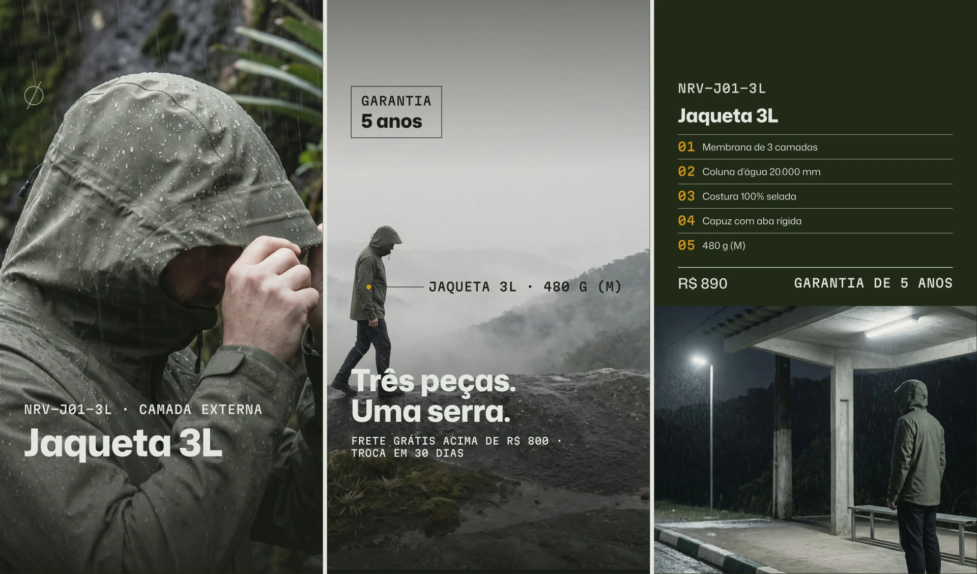
Static ads built from the campaign.
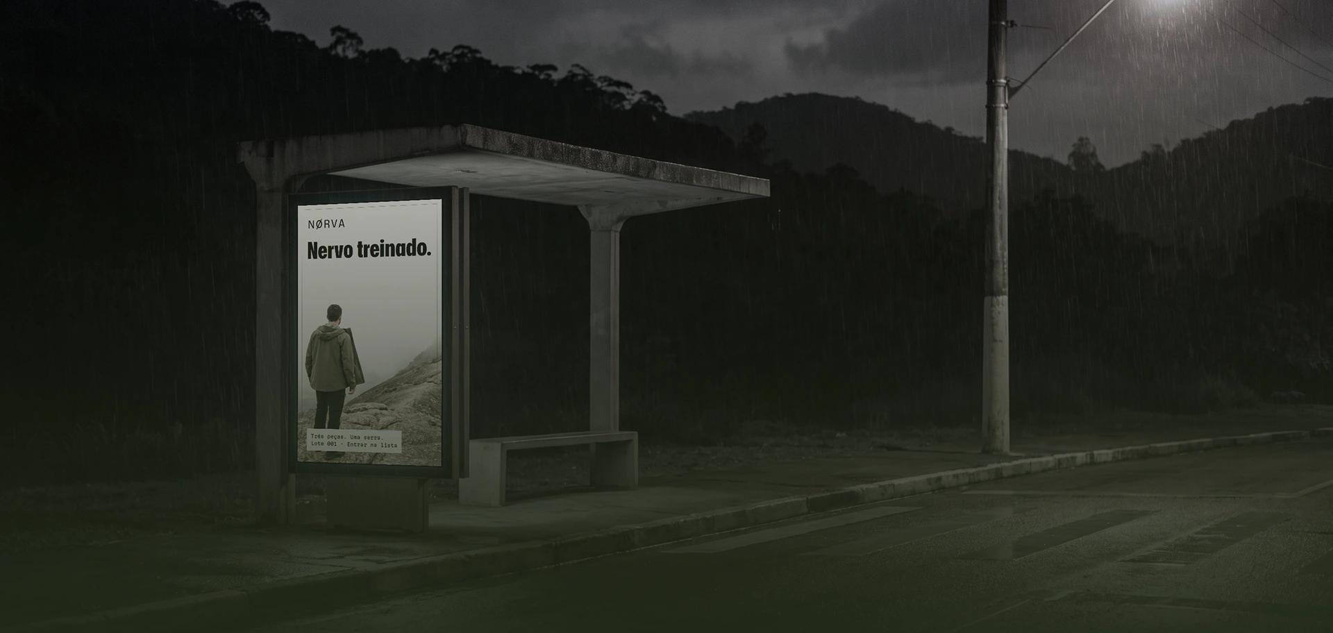
Out-of-home poster at a bus shelter.
Built to sell, not just to look good.
Like this project
Posted Nov 3, 2026
A Shopify store built in Framer, Amazon A+ and brand identity for a clothing brand. Built to sell, not just to look good.
Likes
1
Views
3