Design System: Radcom CMS Design System
Hussein Shirvani
Type
UI/UX Design & Design System Development
Challenge
Radcom’s CMS, used by thousands of clients, had grown inconsistently over time due to contributions from different developers. This led to usability issues and a lack of visual consistency.
Approach
Researched leading design systems (Material Design, IBM Carbon, Fluent) to establish best practices
Contributed to Foundations (color, typography, spacing) and primitive Components (buttons, inputs, forms)
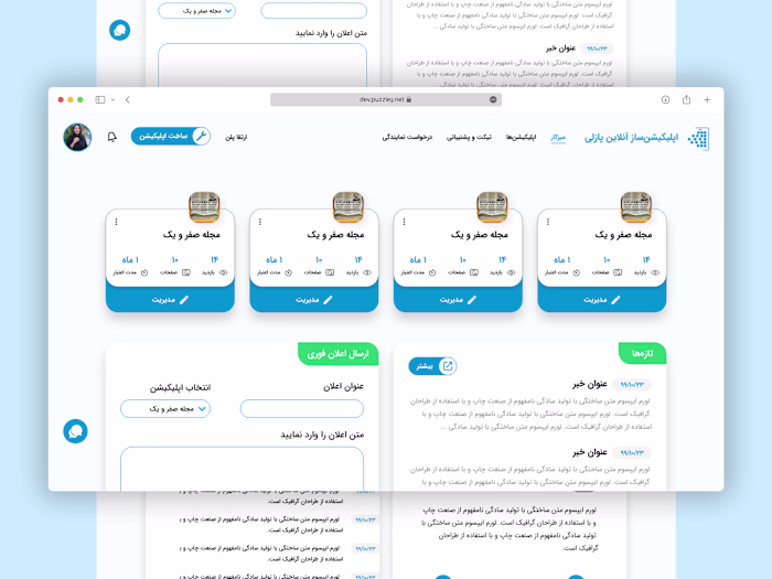
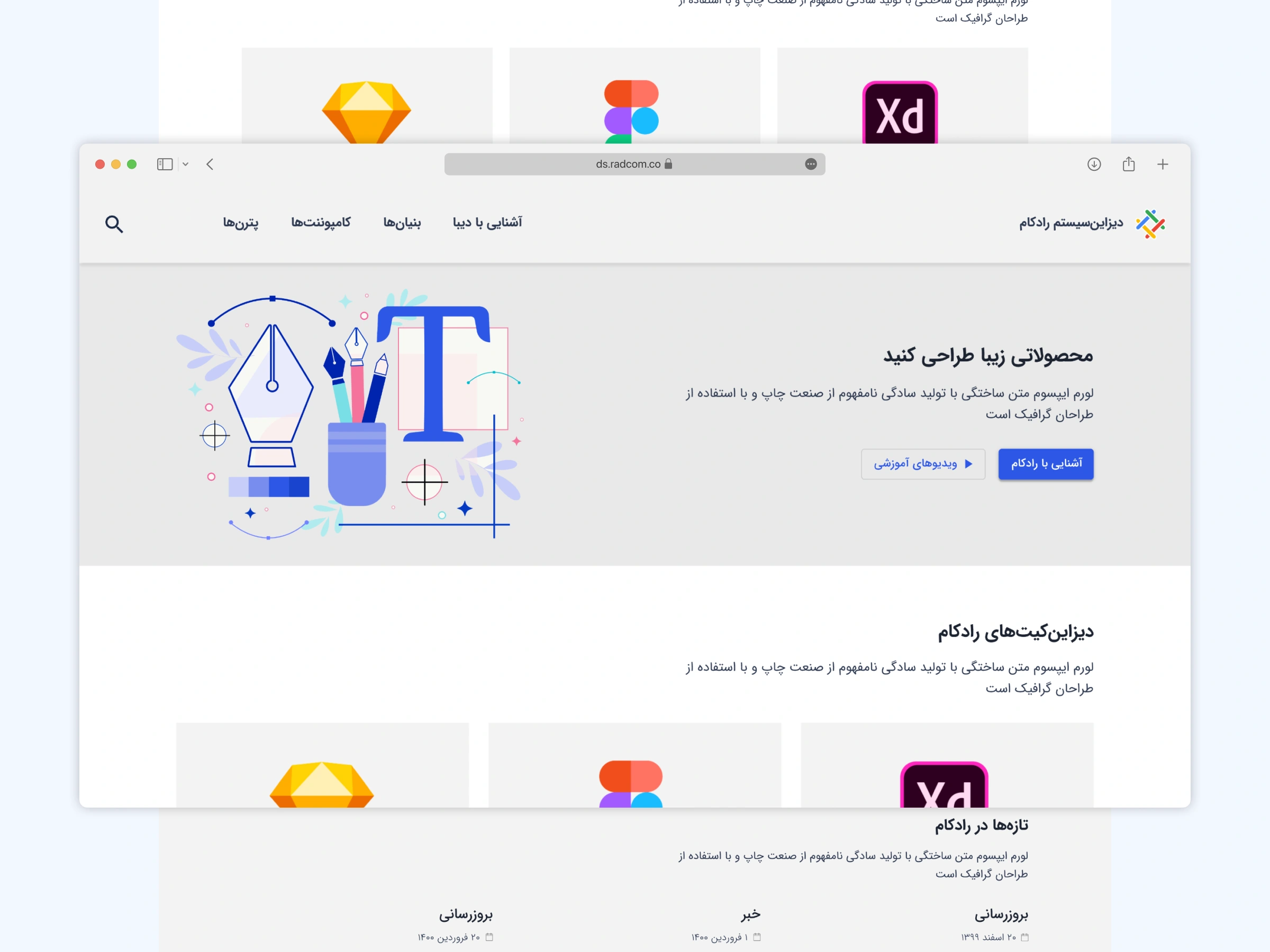
Designed the showcase website, highlighting how the system would support consistency, scalability, and efficiency across Radcom’s platforms
Impact
Established the foundation of Radcom’s first design system
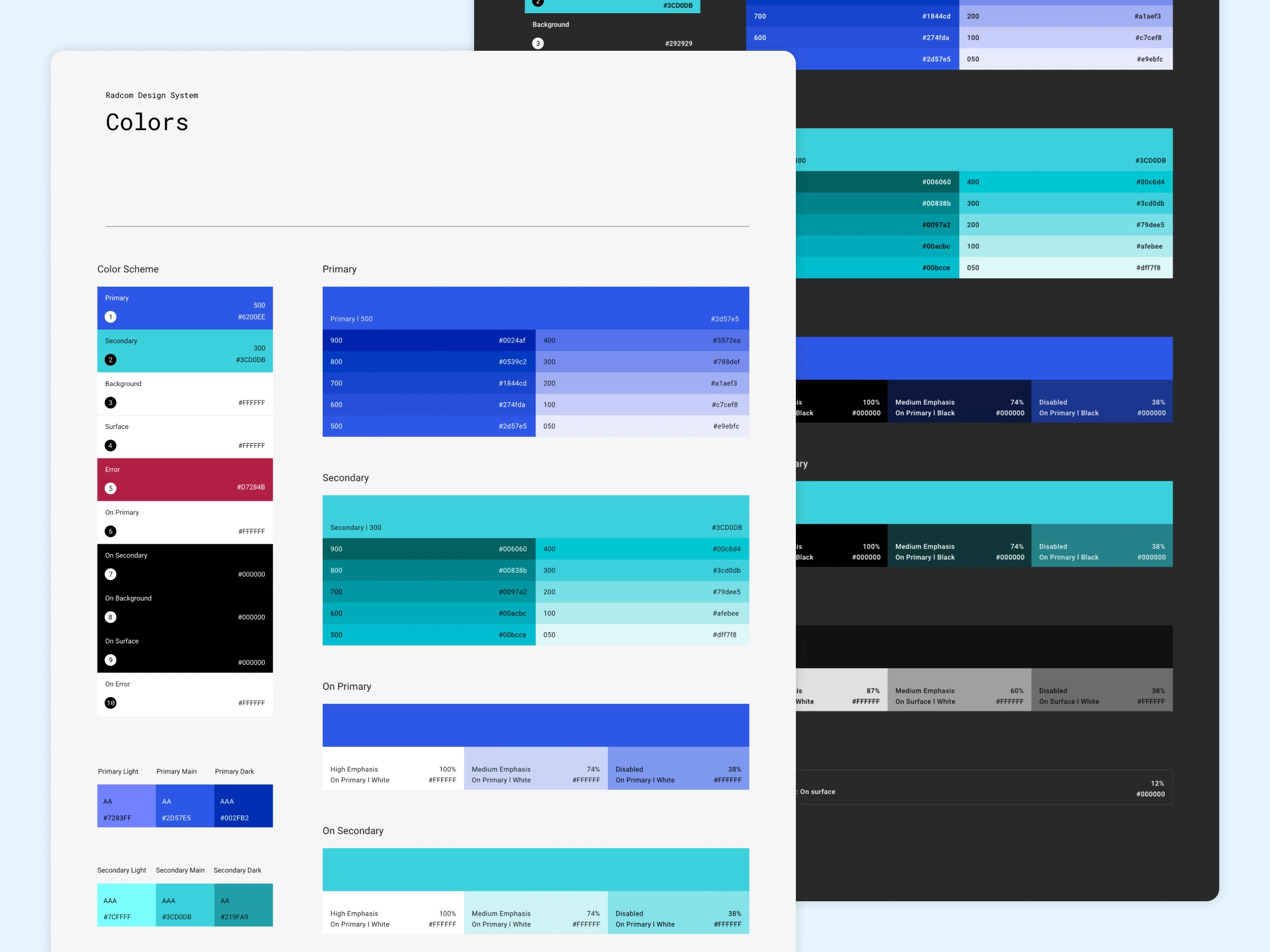
Radcom Design System Color Palette
As part of the Radcom Design System, I designed a comprehensive color palette to ensure consistency, accessibility, and flexibility across the CMS. This required balancing the system’s existing visual identity with modern design principles.
Key Considerations
Accessibility & Readability
Ensured sufficient color contrast to meet WCAG accessibility standards.
Prioritized text readability on various backgrounds for both light and dark modes.
Consistency with CMS Branding
Selected primary and secondary colors closely aligned with the CMS’s established visual identity.
Scalability & Versatility
Developed a wide range of shades and tints to adapt to different design scenarios.
Included accent colors optimized for both light and dark themes.
Outcome
The resulting color palette forms the foundation of the Radcom Design System, offering a flexible, accessible, and visually cohesive framework for future designs.
Like this project
Posted Sep 8, 2025
Helped build Radcom’s first design system—foundations, components, and showcase site—driving scalable, consistent design across its CMS.
Likes
0
Views
5
Timeline
Jun 1, 2021 - Sep 1, 2021