Branding & Packaging for Le Pain Parfait
For Le Pain Parfait, I designed a branding and packaging system that reflects the bakery’s commitment to authentic, traditional French baking. The logo and packaging feature simple, one-line illustrations that symbolize the purity and simplicity of the products offered. In contrast to modern bakeries that often overcomplicate their offerings, Le Pain Parfait celebrates the artistry of breadmaking in its most honest form. The minimalistic design elements, paired with warm tones and refined typography, convey a sense of elegance and heritage while making the products feel approachable and genuine.
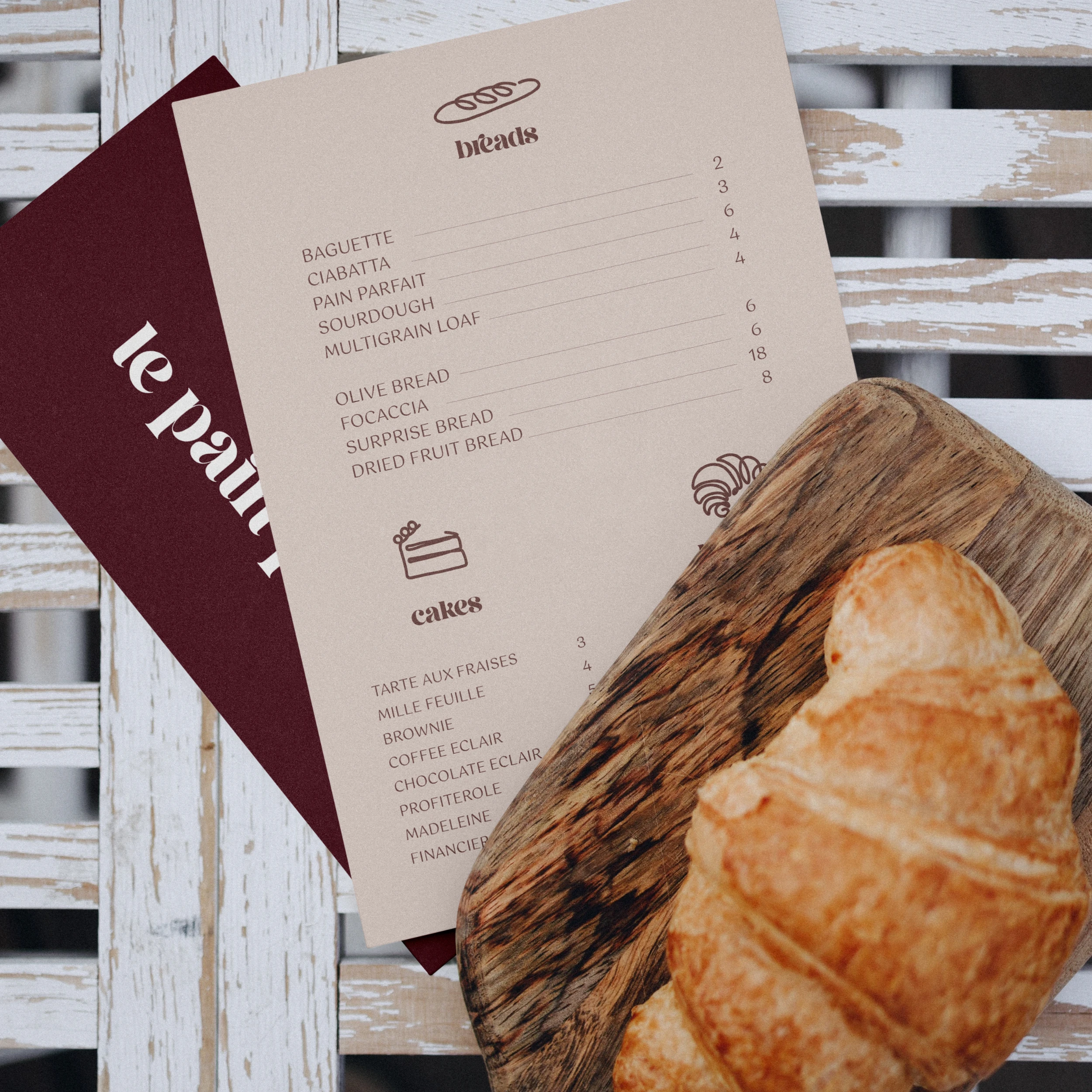
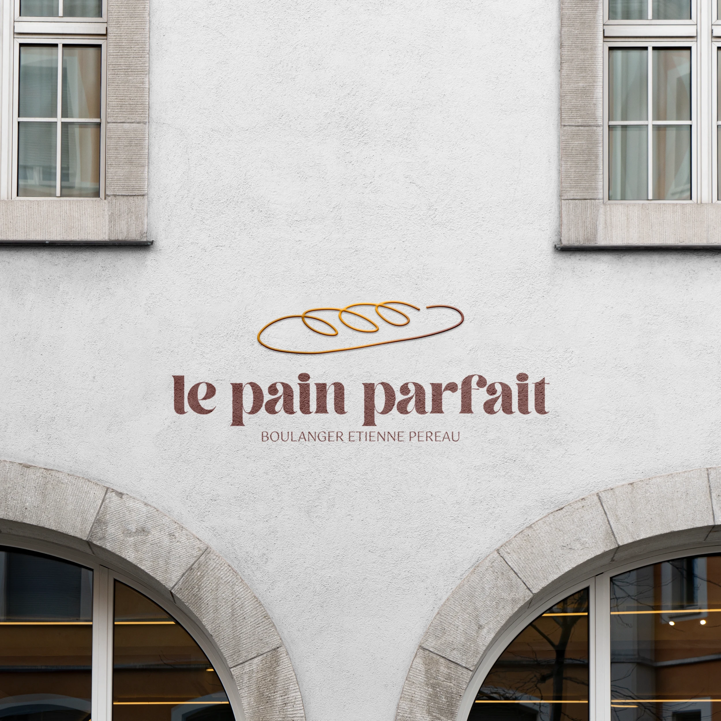
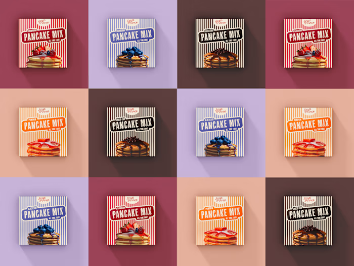
The packaging follows this philosophy, with clean lines and understated visuals that emphasize the quality and care behind each loaf, pastry, or cake. From the branding on the storefront to the individual product boxes, the visual identity brings out the bakery's core values—tradition, simplicity, and authenticity—while still feeling modern and fresh. Whether it's the perfectly baked croissant or a beautifully boxed loaf of bread, every design element speaks to Le Pain Parfait's pursuit of excellence in French baking.
Like this project
Posted Oct 20, 2024
Simple, elegant branding for Le Pain Parfait, highlighting the focus on authentic, traditional French baking with clean and minimal designs.

