Social Media Design, Creative Direction, Deck Design │ Sqwishful

Michelle Han



About the Project
Sqwishful makes plastic-free, zero-waste kitchen cleaning essentials. Their products are plant-powered, compostable, and built for people who care as much about what they're cleaning with as what they're cleaning. The brand had a clear point of view, but its presence on social media hadn't caught up: content felt scattered across formats, with no consistent visual system tying promotions, climate news, lifestyle content, and memes together.
Process & Goals
The brand needed more presence on social media, but the deeper problem was consistency, the brand's visual language wasn't tied together across posts, photography, or presentation materials. The goal was to build a design system: a color palette and typographic hierarchy flexible enough to carry promotions, climate news, memes, and lifestyle content, while still reading as one brand. That system also needed to extend cleanly into photography and the pitch deck, so every touchpoint reinforced the same visual logic.
Creative Support
Social Media Design
Social Media Management
Creative Direction & Production (Lifestyle Photoshoot)
Graphic Design
Presentation/Deck Design
Results
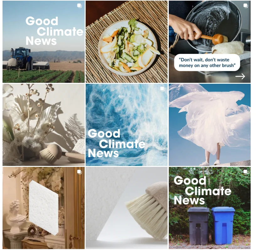
I designed a modular set of Instagram templates built around a consistent type hierarchy and color system, so content pillars like promotions, climate news, and memes are instantly distinguishable by layout and color weight while still feeling like the same brand.
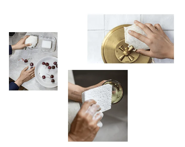
On set in Joshua Tree, I creative directed and produced lifestyle photography around negative space and natural light, a minimal composition that let the product stay the visual anchor without competing with the desert backdrop.
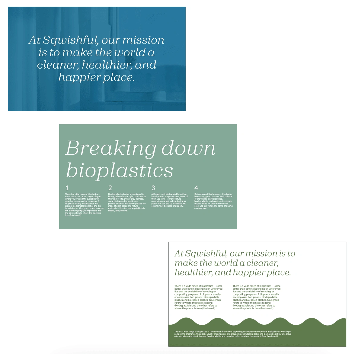
That same restraint carried into the presentation deck: a simplified grid, consistent type scale, and a muted, warm palette that matched the brand's identity and the timing of its packaging refresh.
CLEAN | POSITIVE | MODERN
Like this project
Posted Jun 7, 2024
Built a cohesive visual system for a sustainable brand: social templates, lifestyle shoot, and a deck refresh all grounded in a minimal and clean look and feel.