Health Aura: Wellness Brand Identity and Digital System

Ali Shayan


A health and wellness identity designed for a category that mostly looks the same: soft blues, stock photography of someone jogging at sunrise, and nothing you would recognise a week later.
Health brands are seen in daylight, on lanyards, on signage, on a phone at 11pm. The system had to hold in all of it.

Logo on brand texture
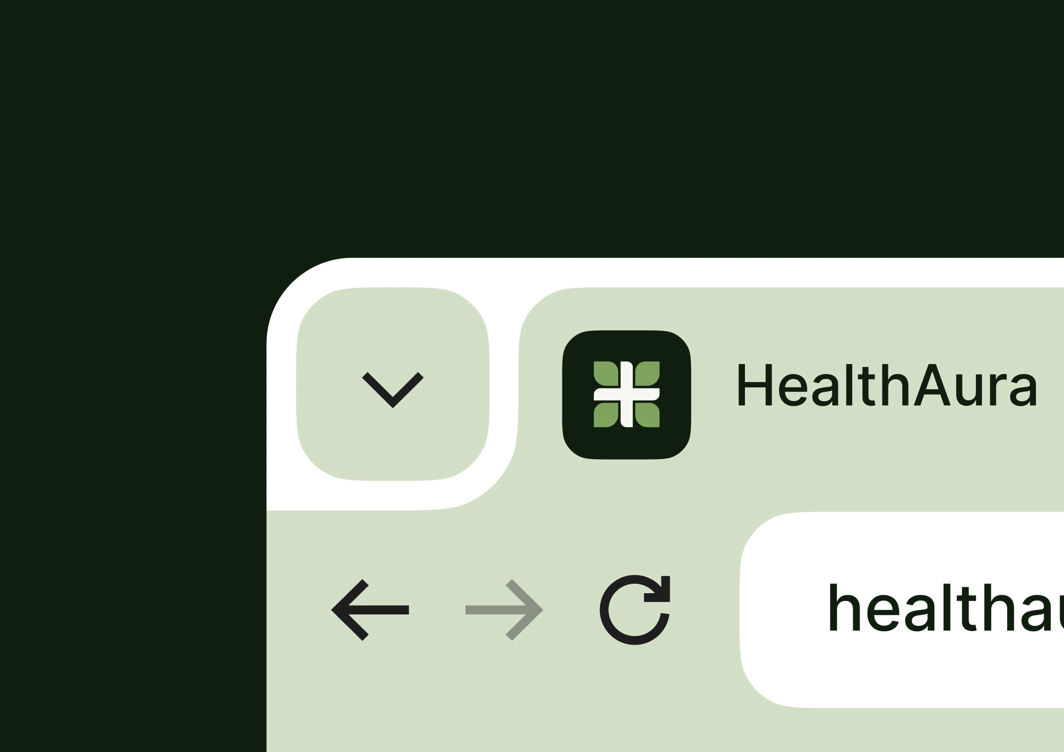
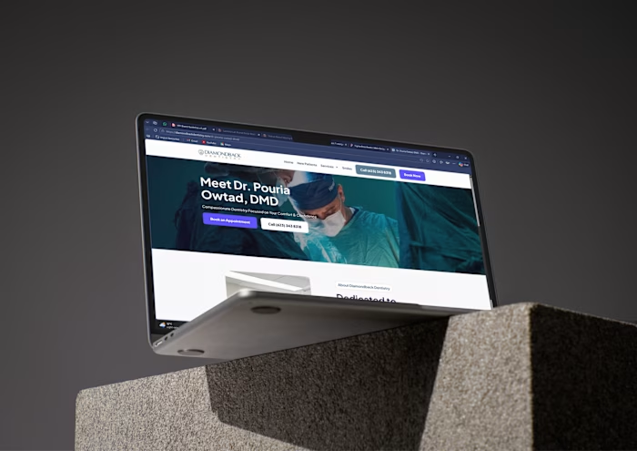
Health Aura browser interface
The digital application keeps the interface quiet so the content carries the weight, with a type scale that stays readable at the sizes people actually use rather than the sizes that look good in a presentation.
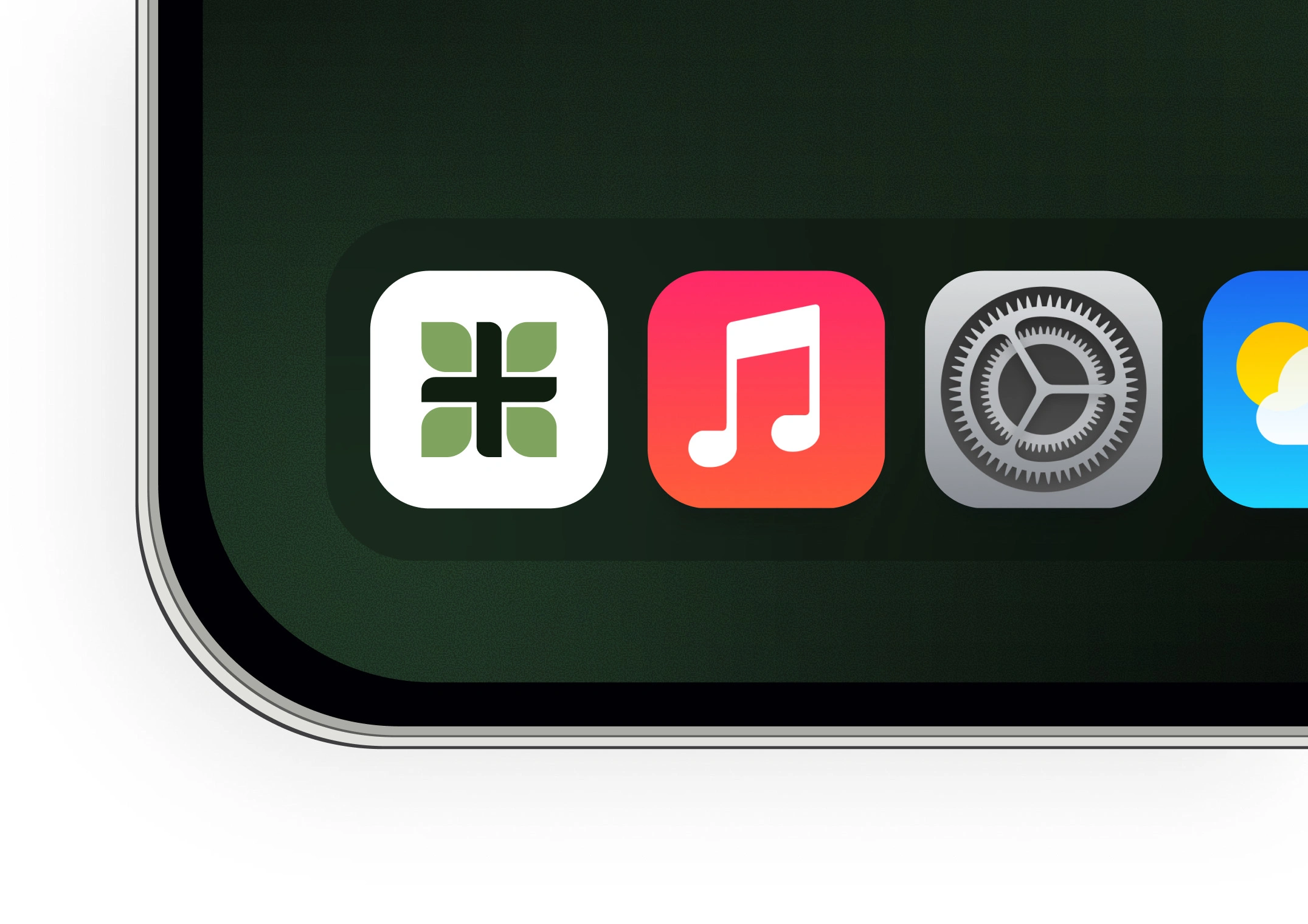
App icon on the home screen
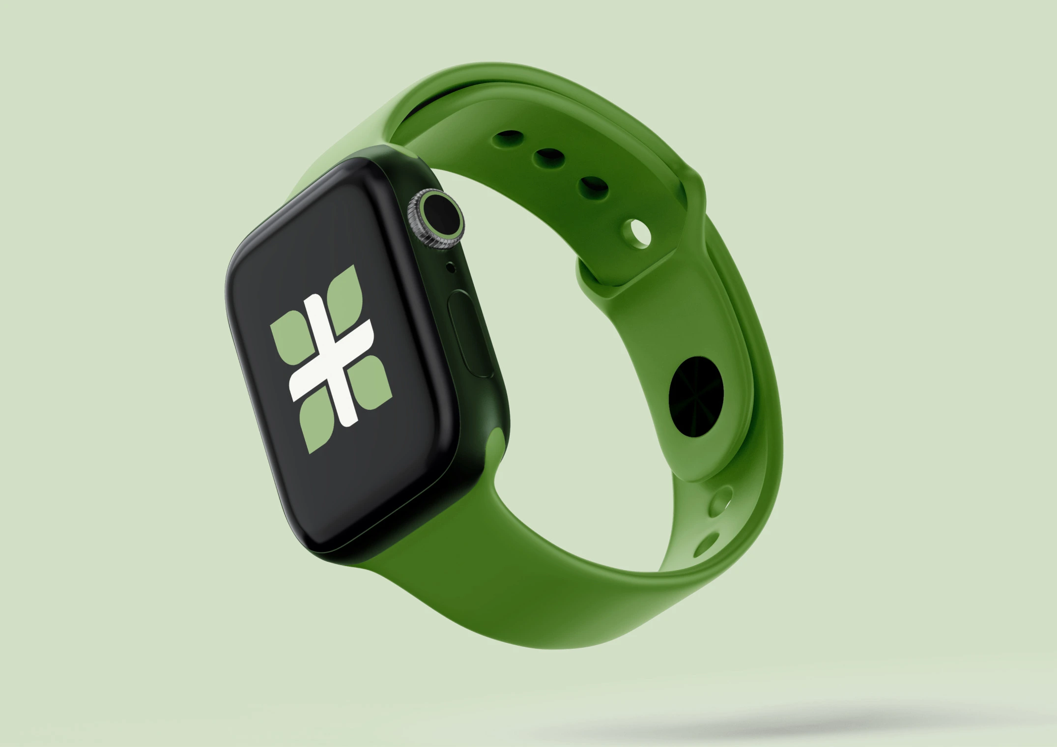
Watch face
The mark had to survive being very small and very fast. An app icon among thirty others, a watch face glanced at mid-run.
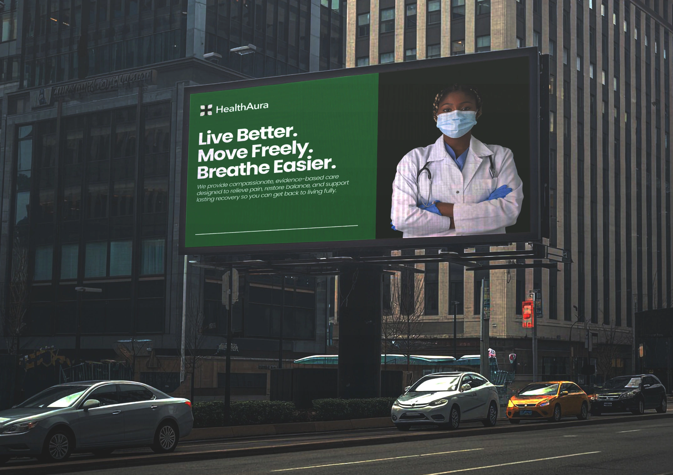
Billboard
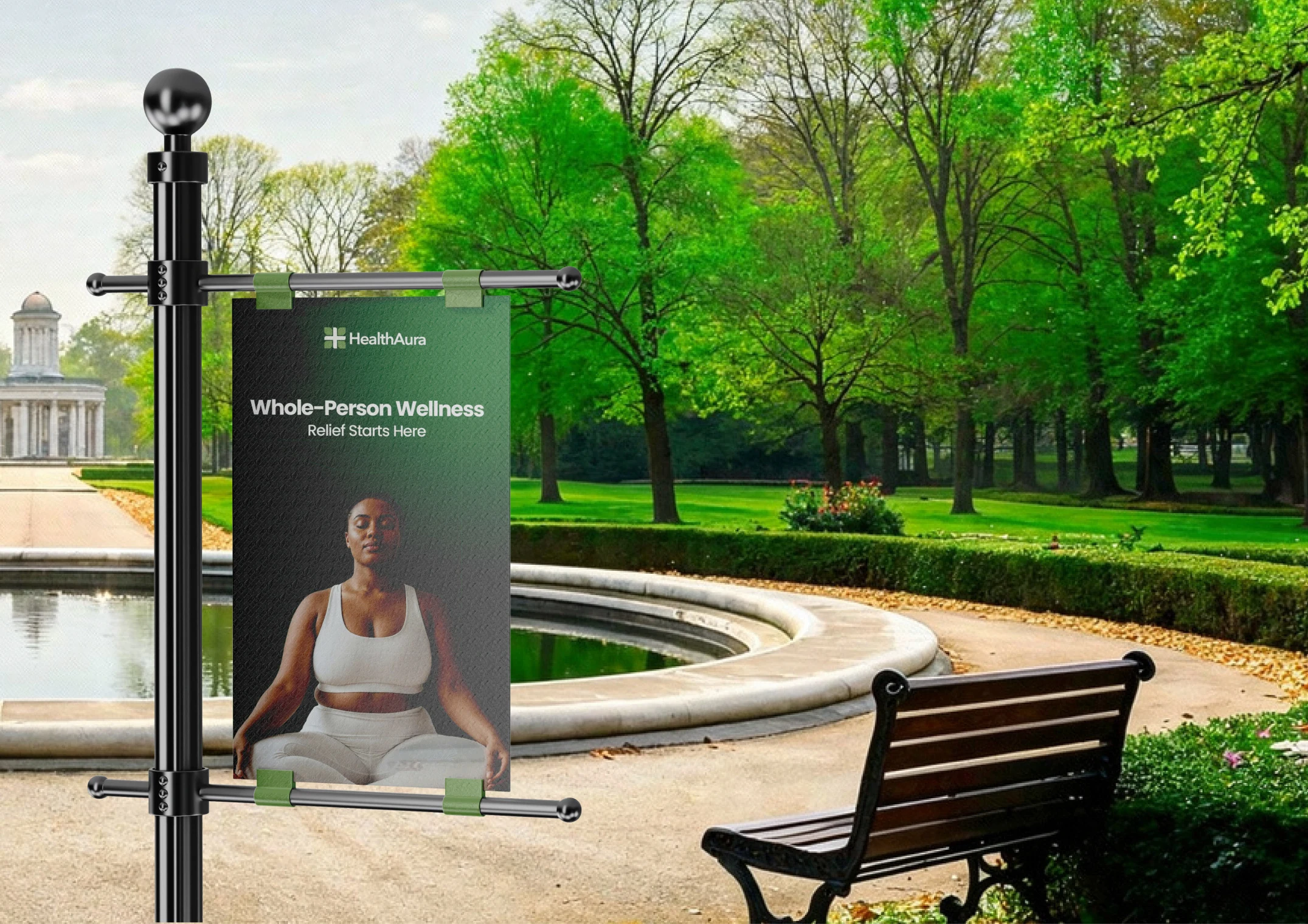
Park banner
And then the opposite test. If a mark does not survive a billboard it will not survive a favicon either, and most identities are only ever checked at one end of that range.
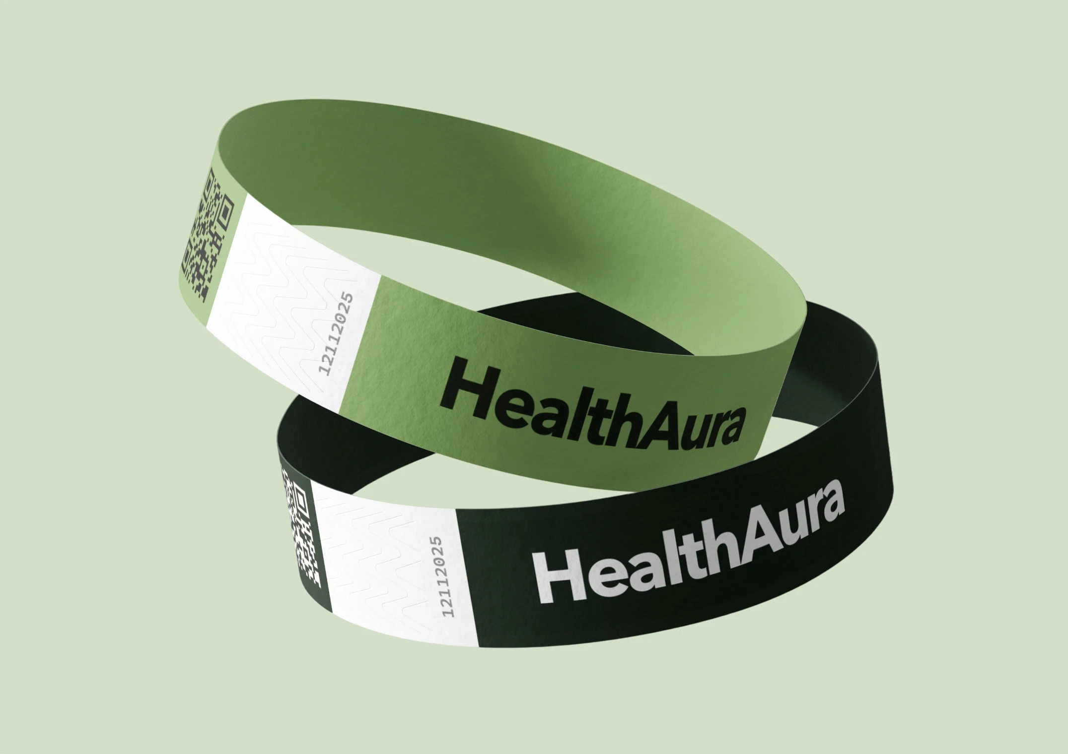
Lanyard
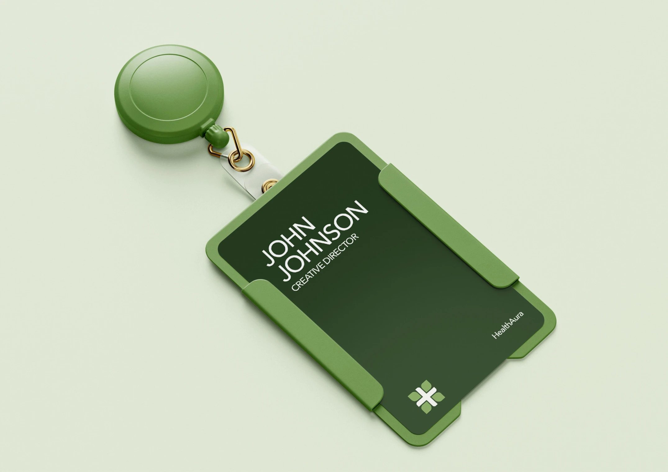
Badge holder

Scrubs
Uniform and staff identification are the most seen applications in any health setting, and are almost always an afterthought ordered from a supplier catalogue. Designed here as part of the system.
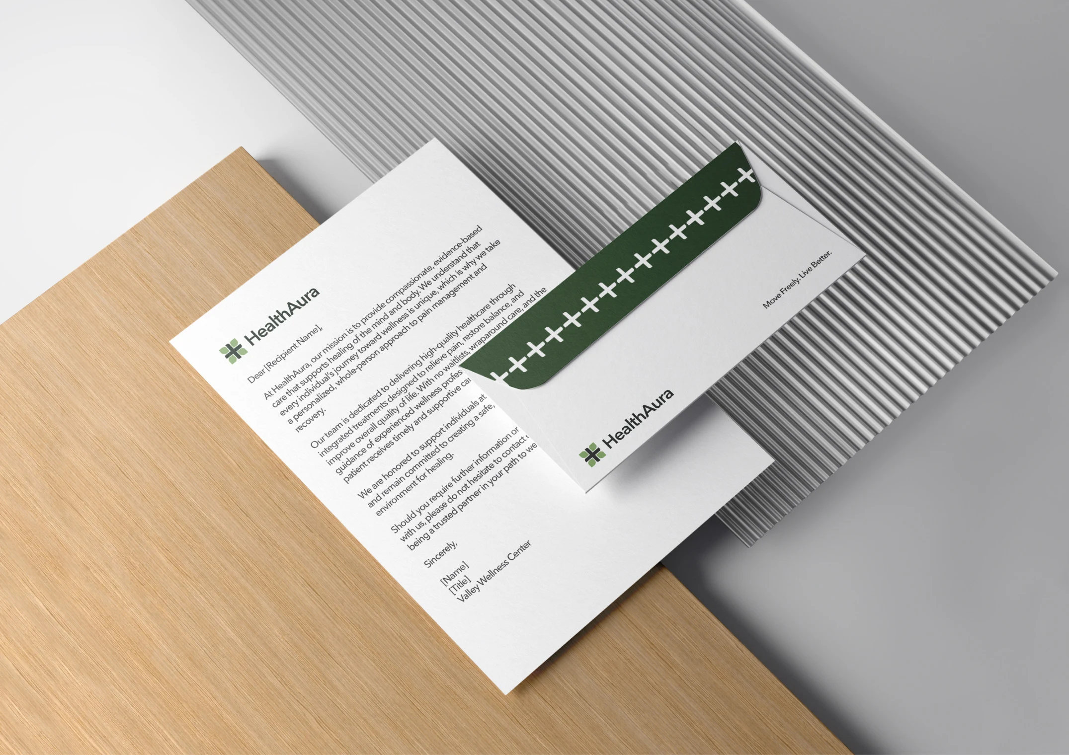
Letterhead
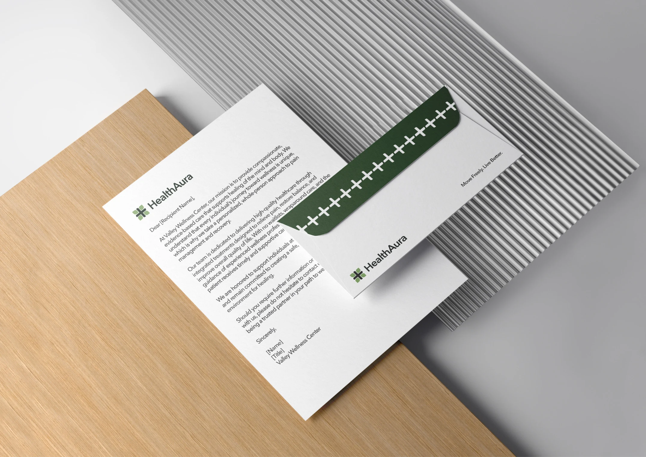
Letterhead, alternate
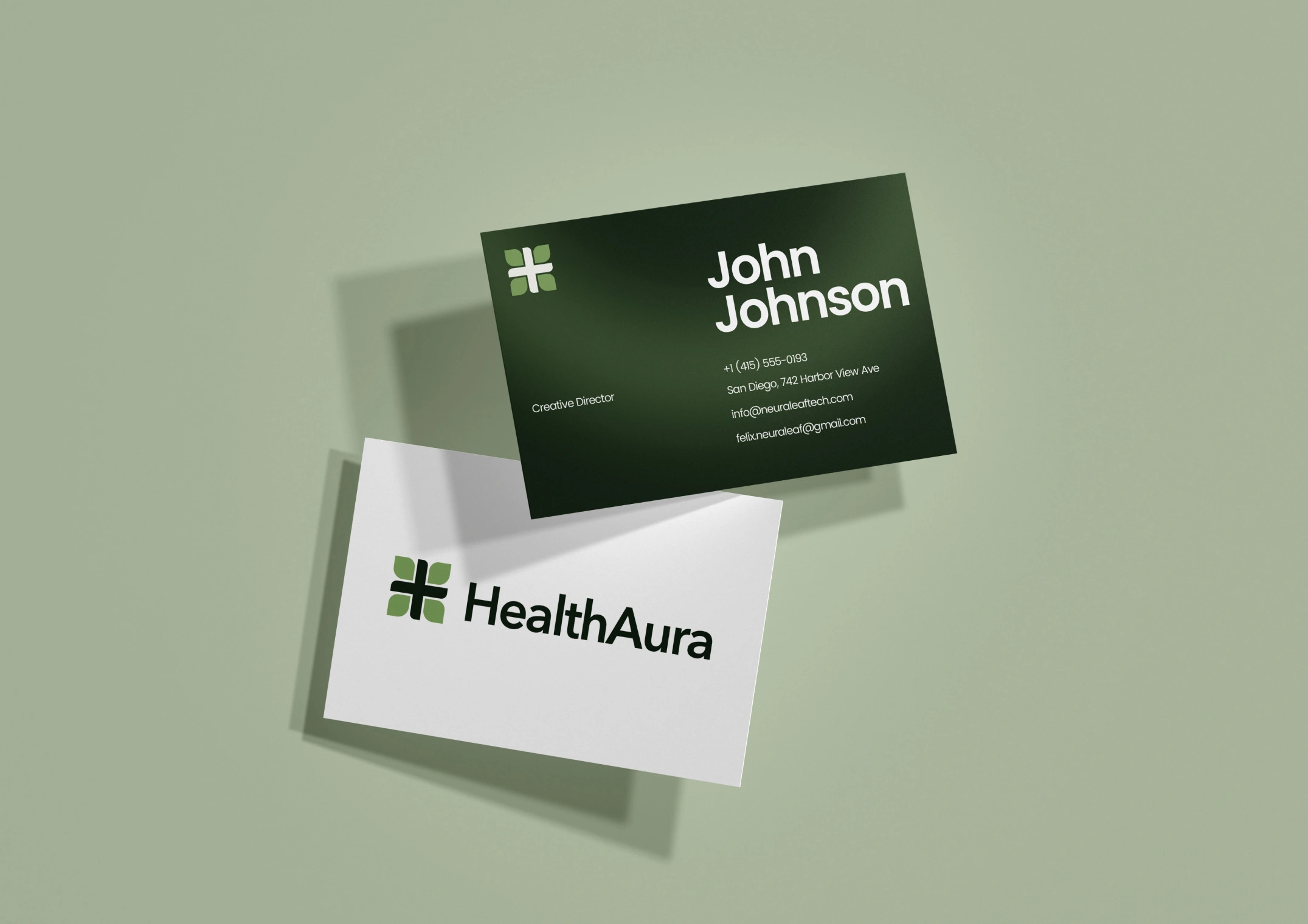
Business cards
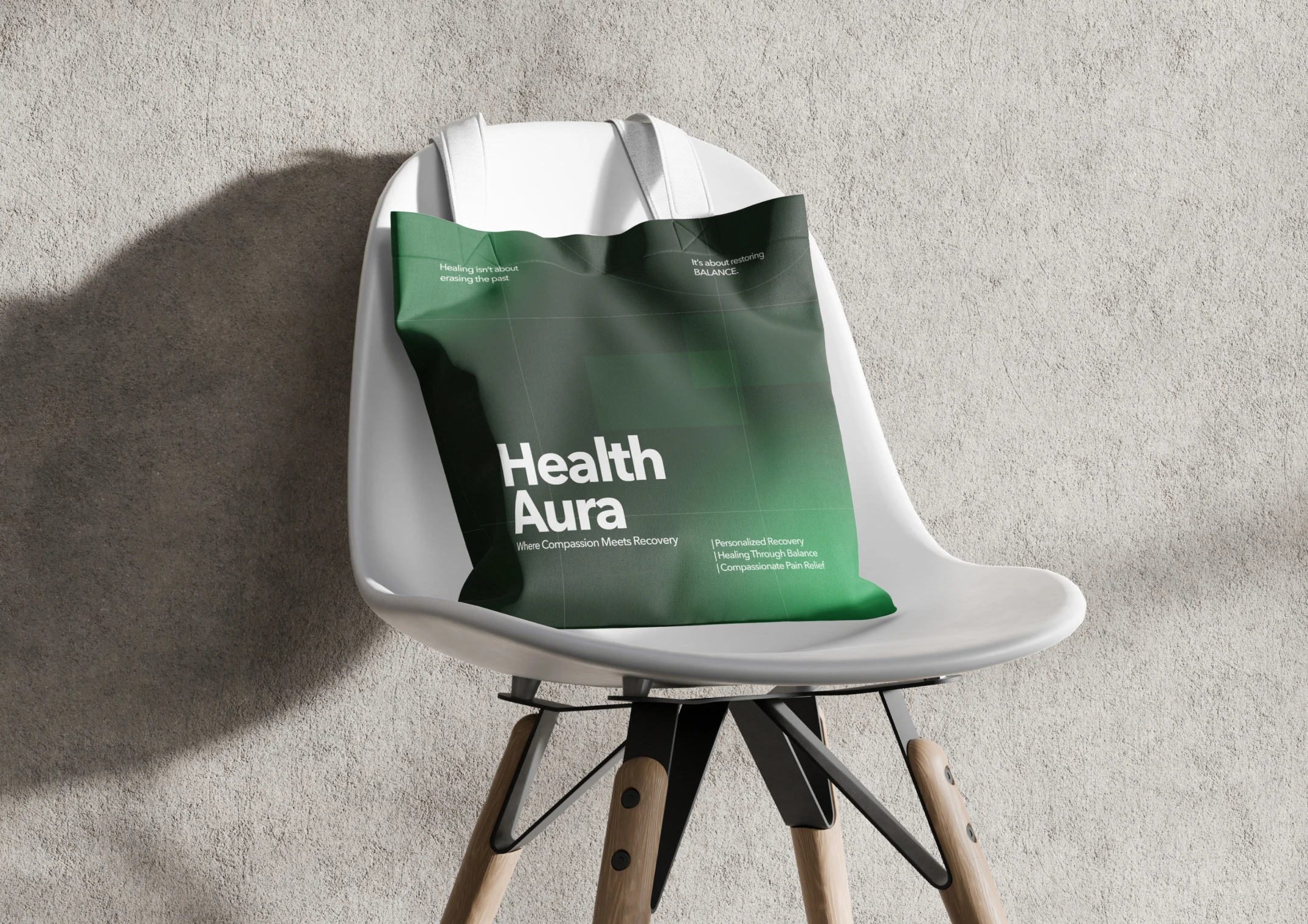
Tote bag
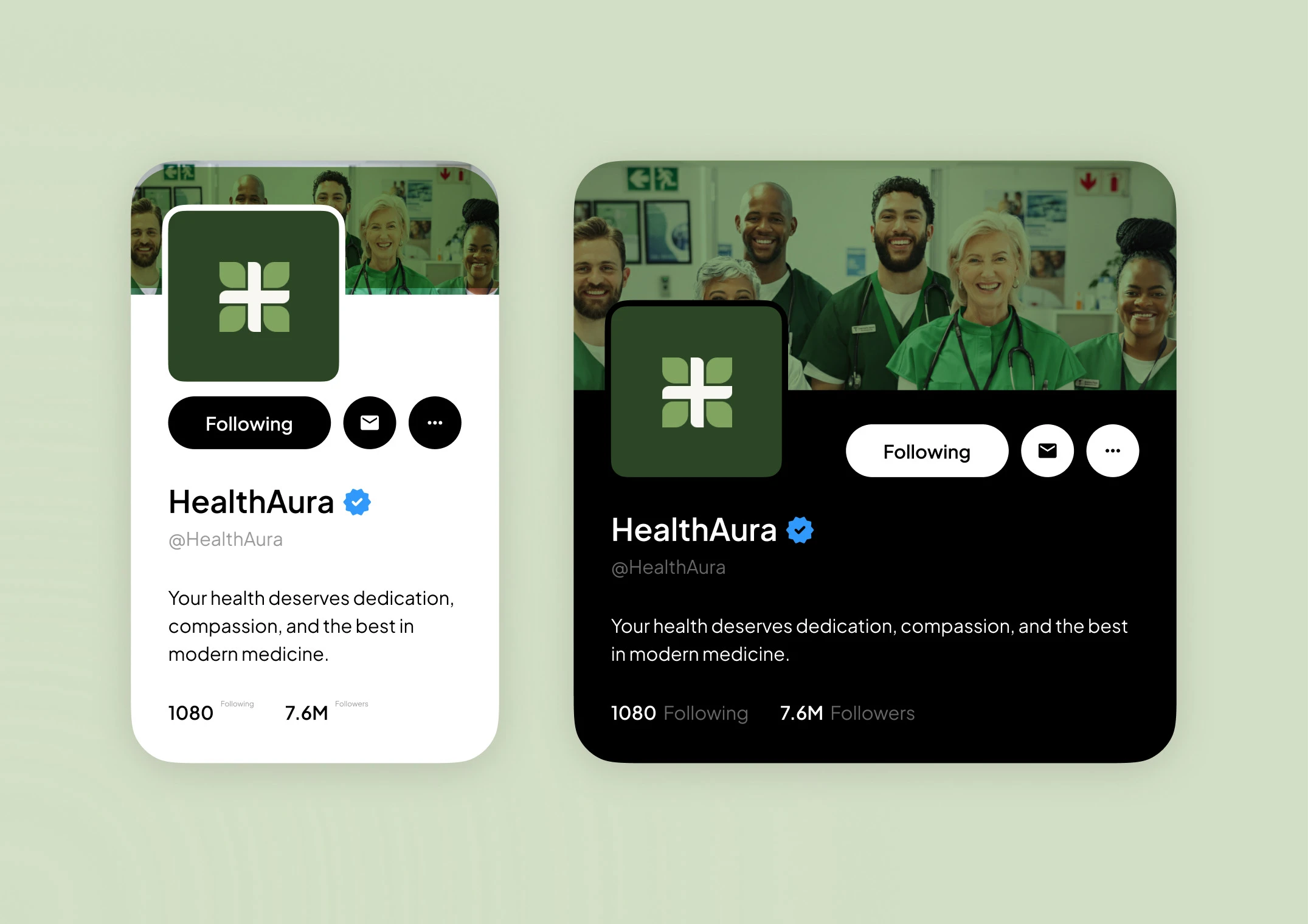
Social profiles
Stationery, merchandise and social all run off the same defined colour roles and spacing rules, so the brand stays consistent whether it is being applied by me or by a print shop three years from now.
Like this project
Posted Aug 18, 2026
Brand identity and digital system for a health and wellness business, built to hold from a billboard down to a favicon.