

About the project
Orvel is an independent brand and digital studio in London and Lisbon. This is a self-initiated concept identity, built from the studio's own website: the wordmark, symbol, colour, type and voice all come from it.
Orvel opening
Orvel studio
The idea
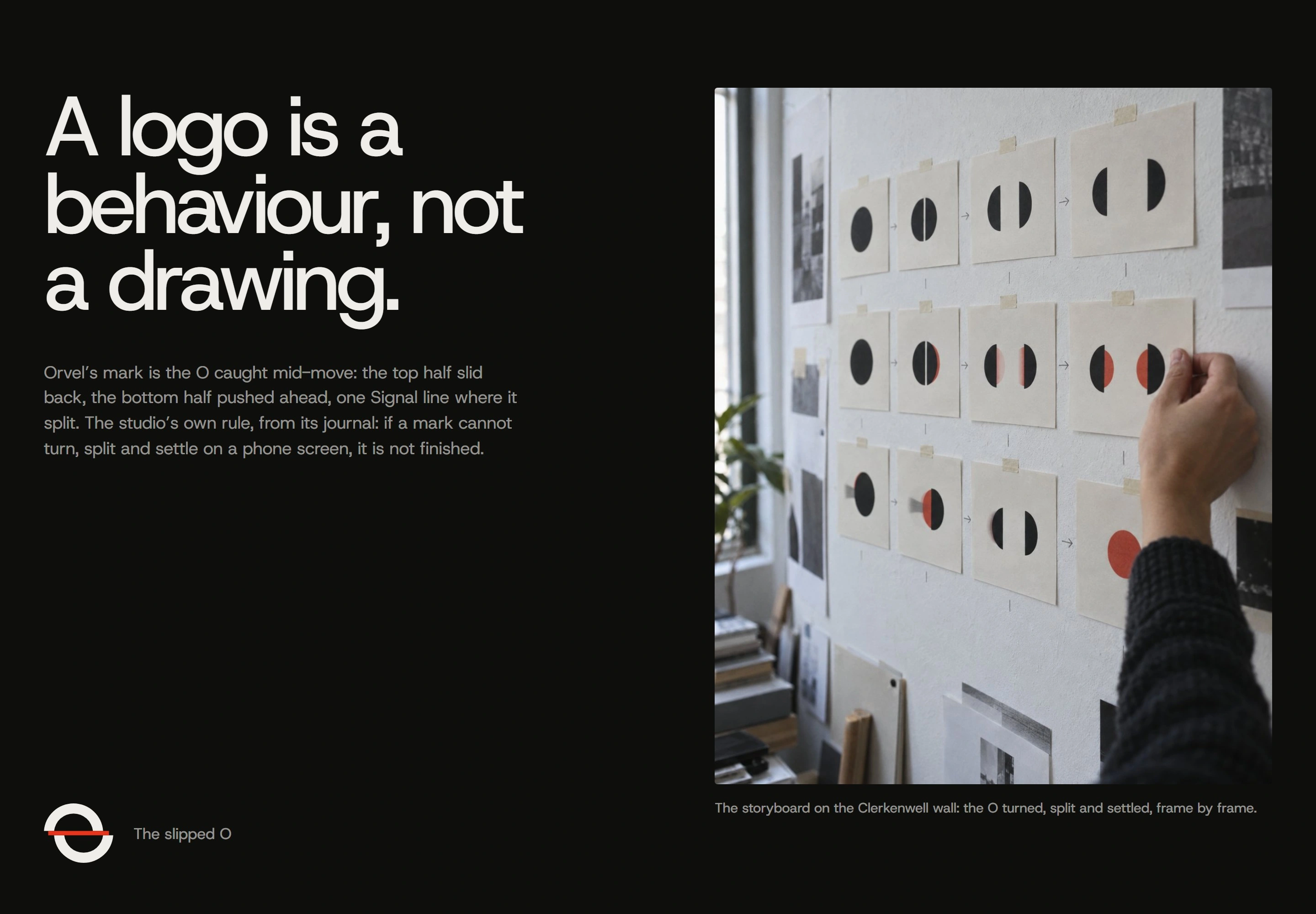
The studio says things should smear with motion and settle sharp. The identity takes that literally: type rises and settles, and the team's portraits arrive with a vertical smear and land sharp.
The team
The mark
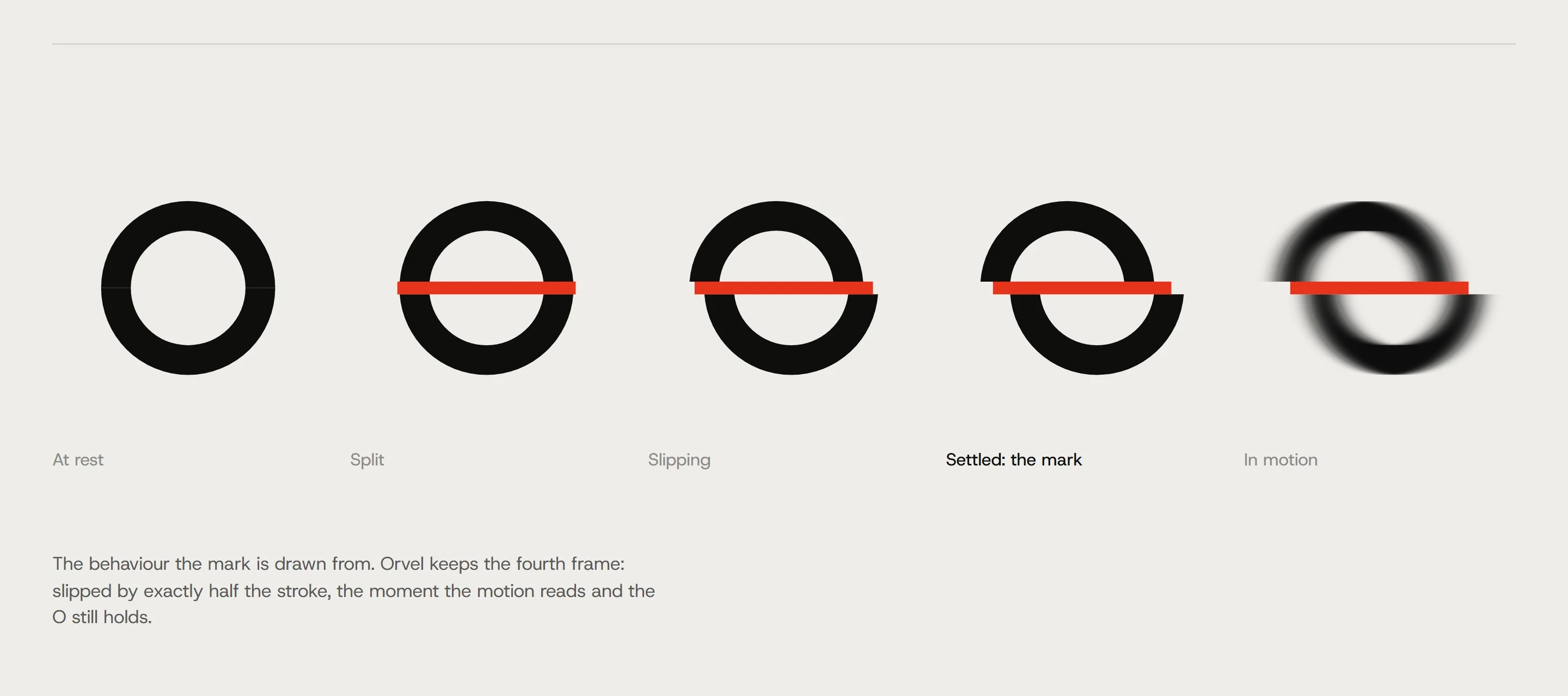
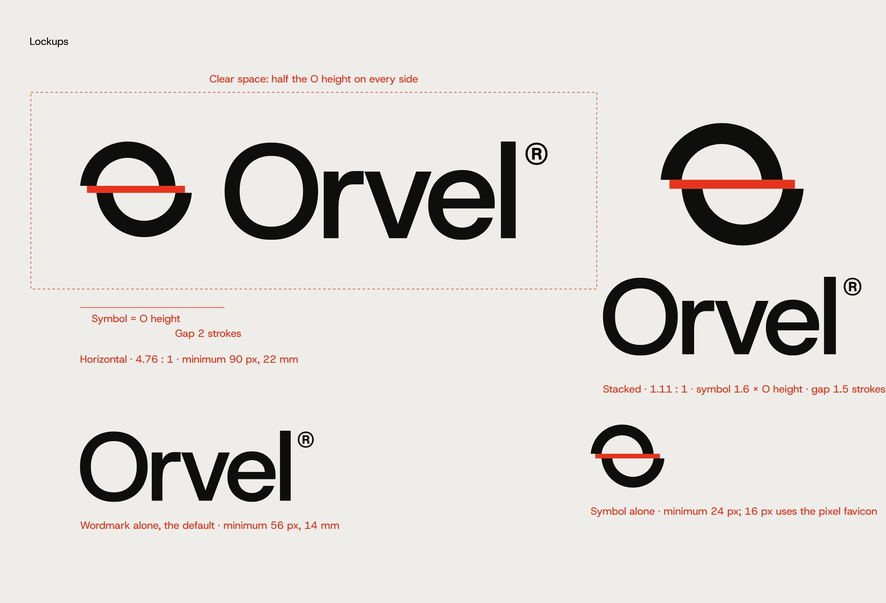
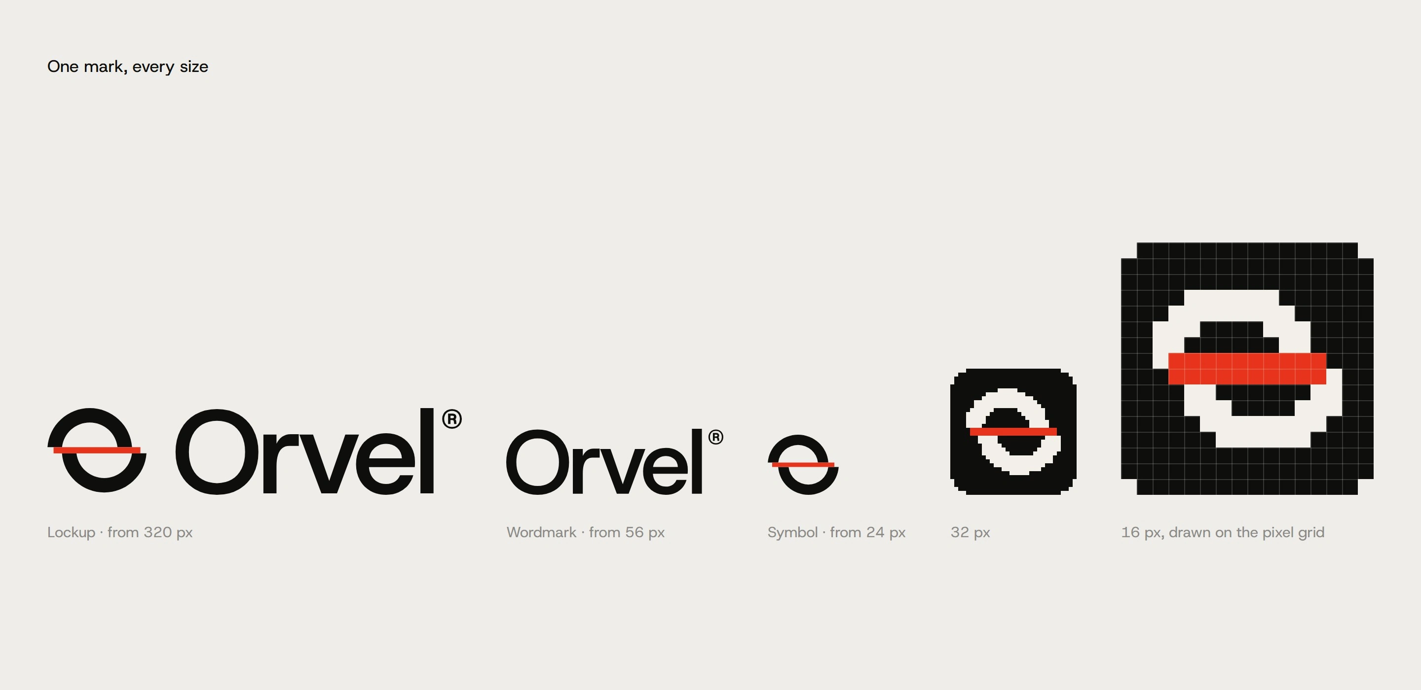
The symbol is the O caught mid-move: the top half slid back, the bottom half pushed ahead, and a line where it split. The lockups, favicon and construction all come from the same geometry.
The mark
Construction
Logo board
Logo board
Logo board
Logo board
Logo board
The system
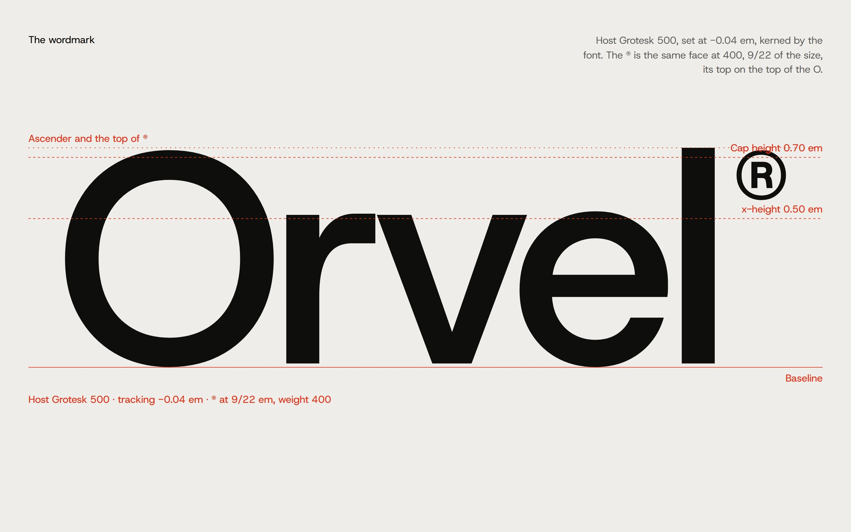
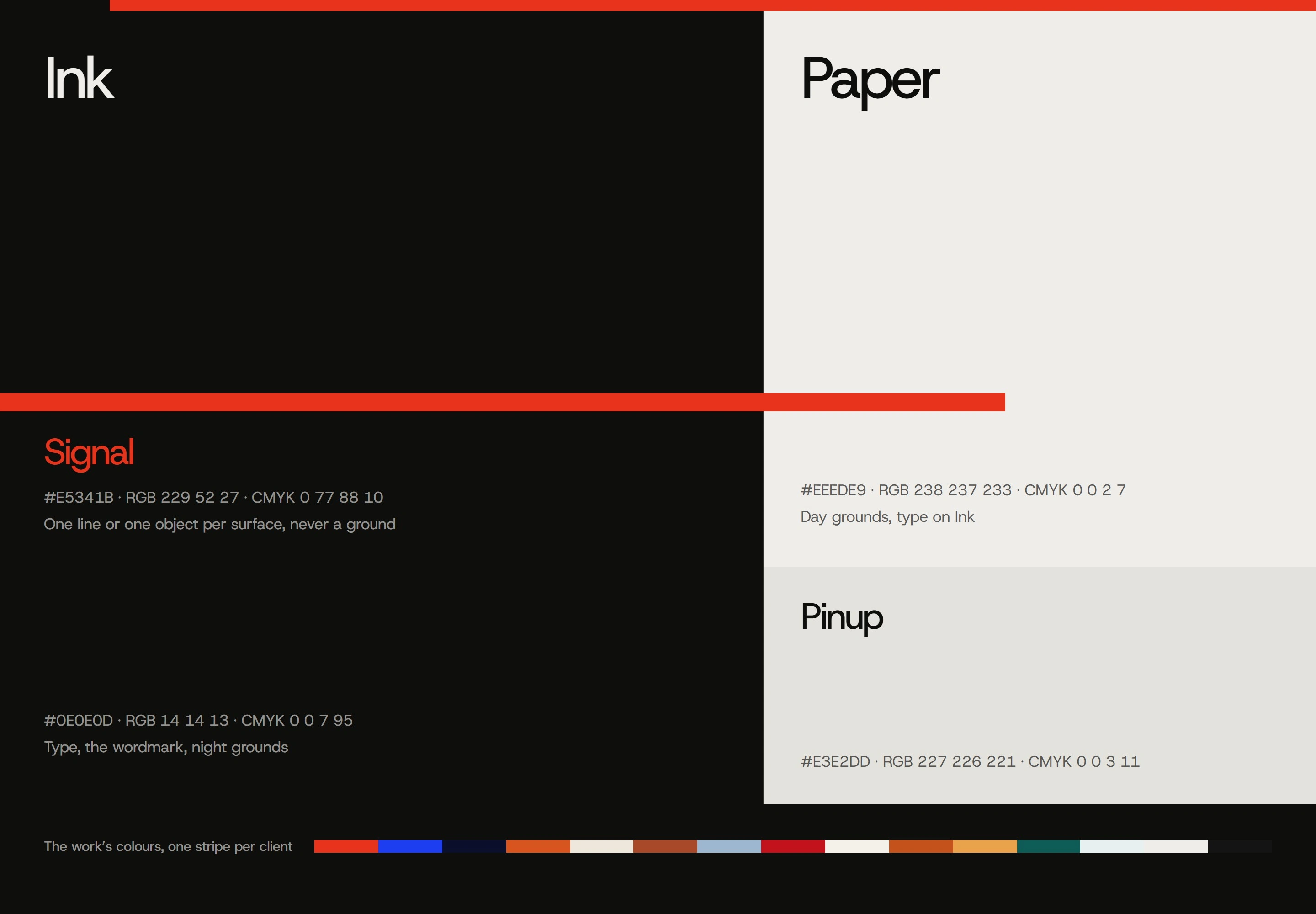
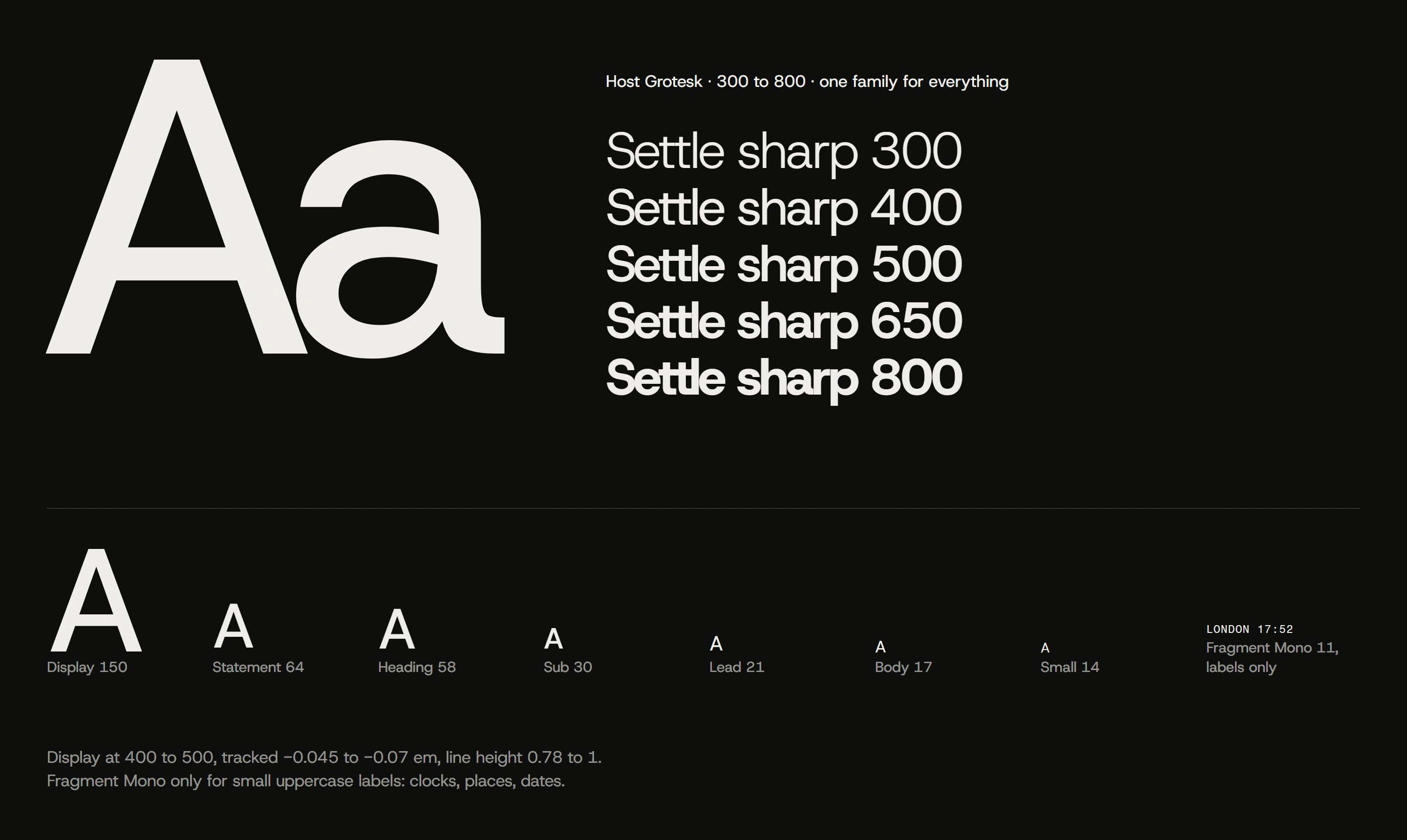
Ink, Paper and Signal red carry the identity, with Signal kept as the accent. Host Grotesk sets everything, large and tight, and the motion follows one rule: move, smear, settle.
Statement
System board

System board
System board
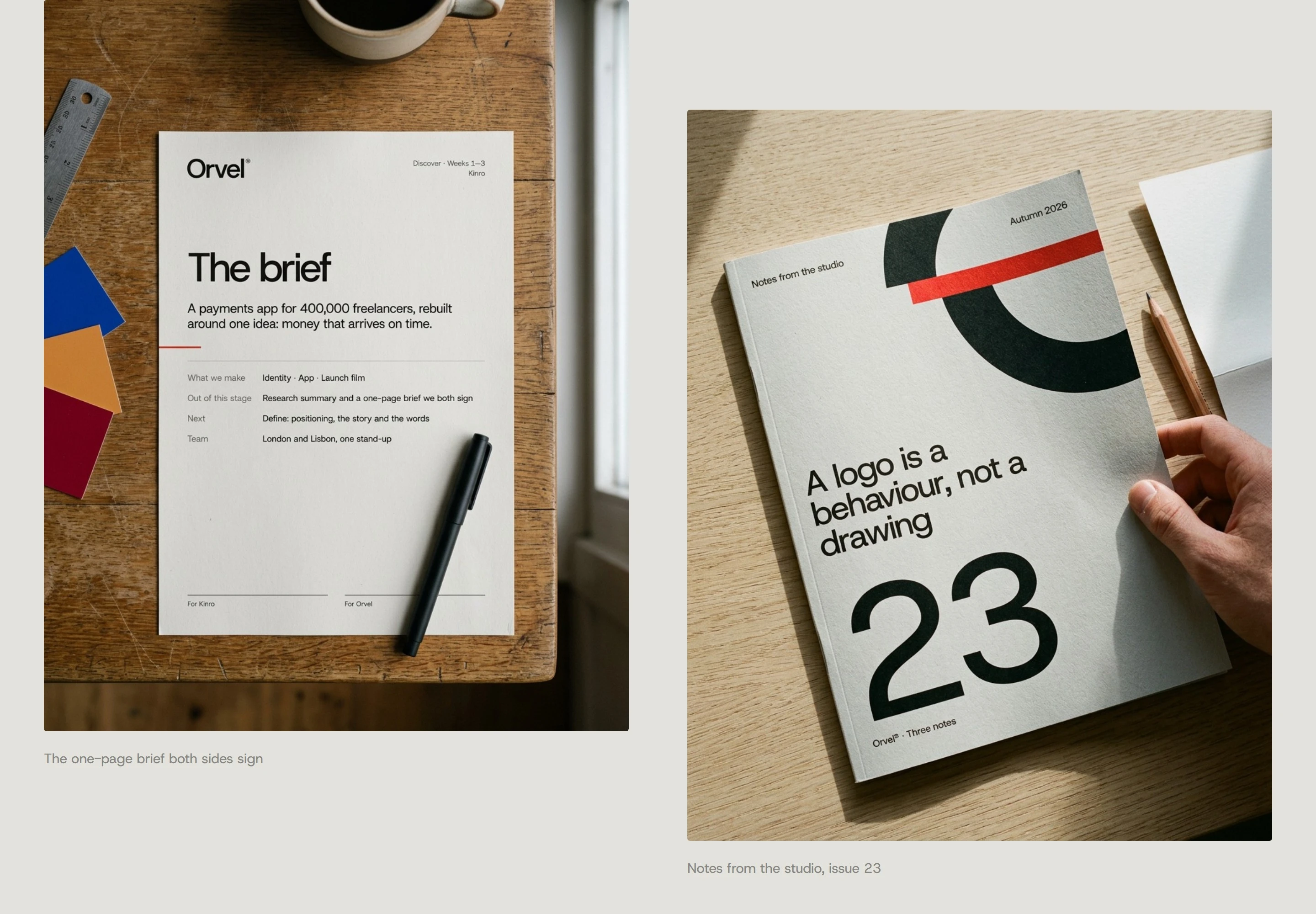
Studio
In the world
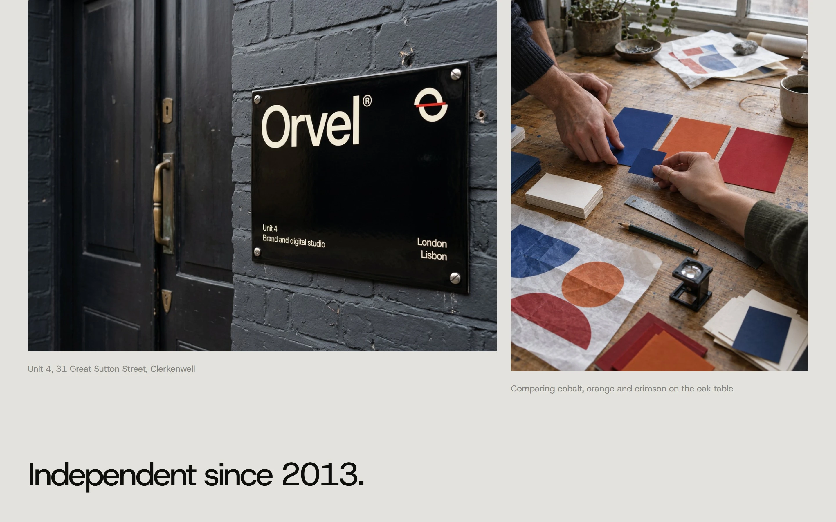
London and Lisbon in the same hour, the studio's print and objects, the website on desktop and phone, and social stories, all behaving the same way.
Same hour
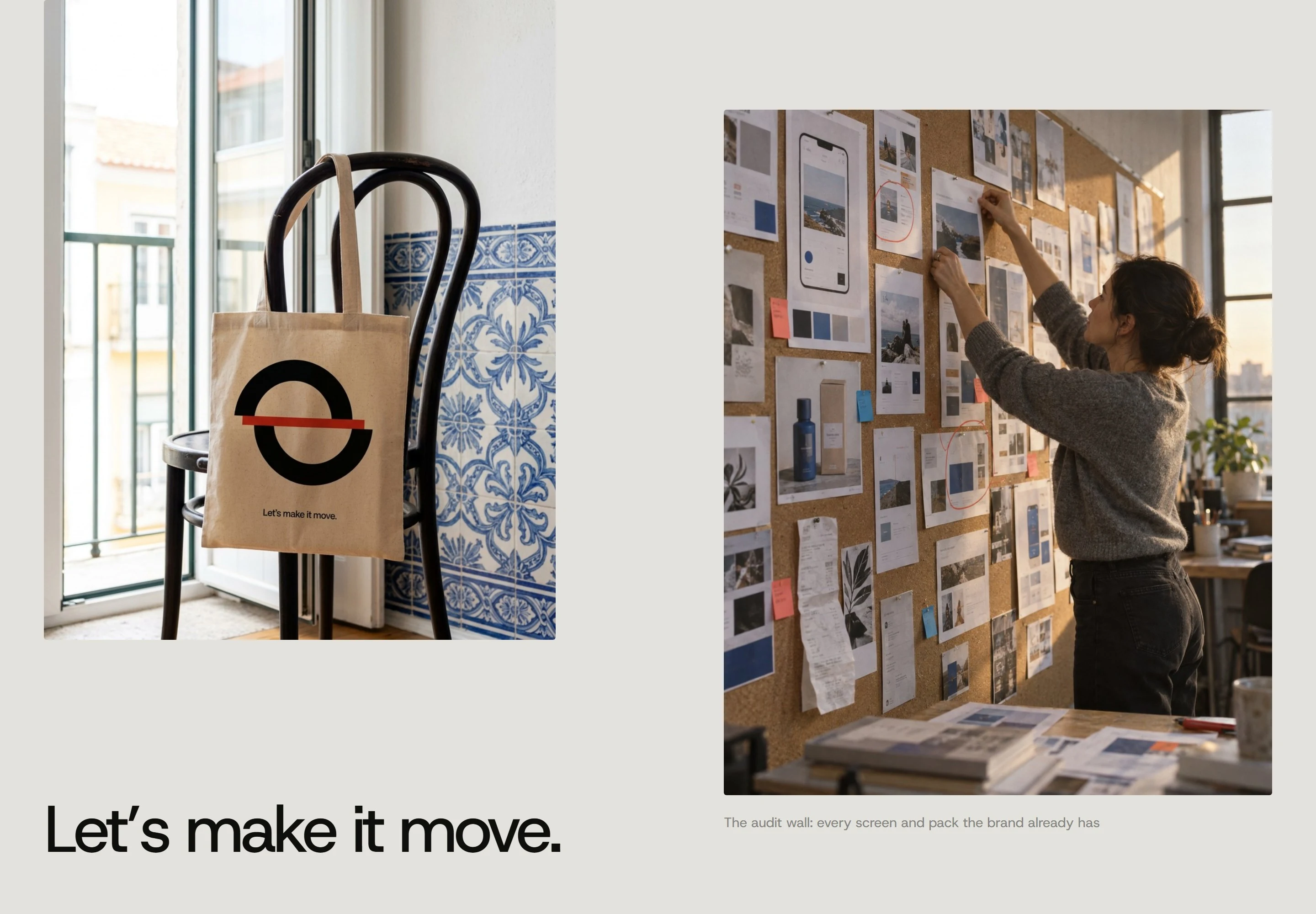
Applications
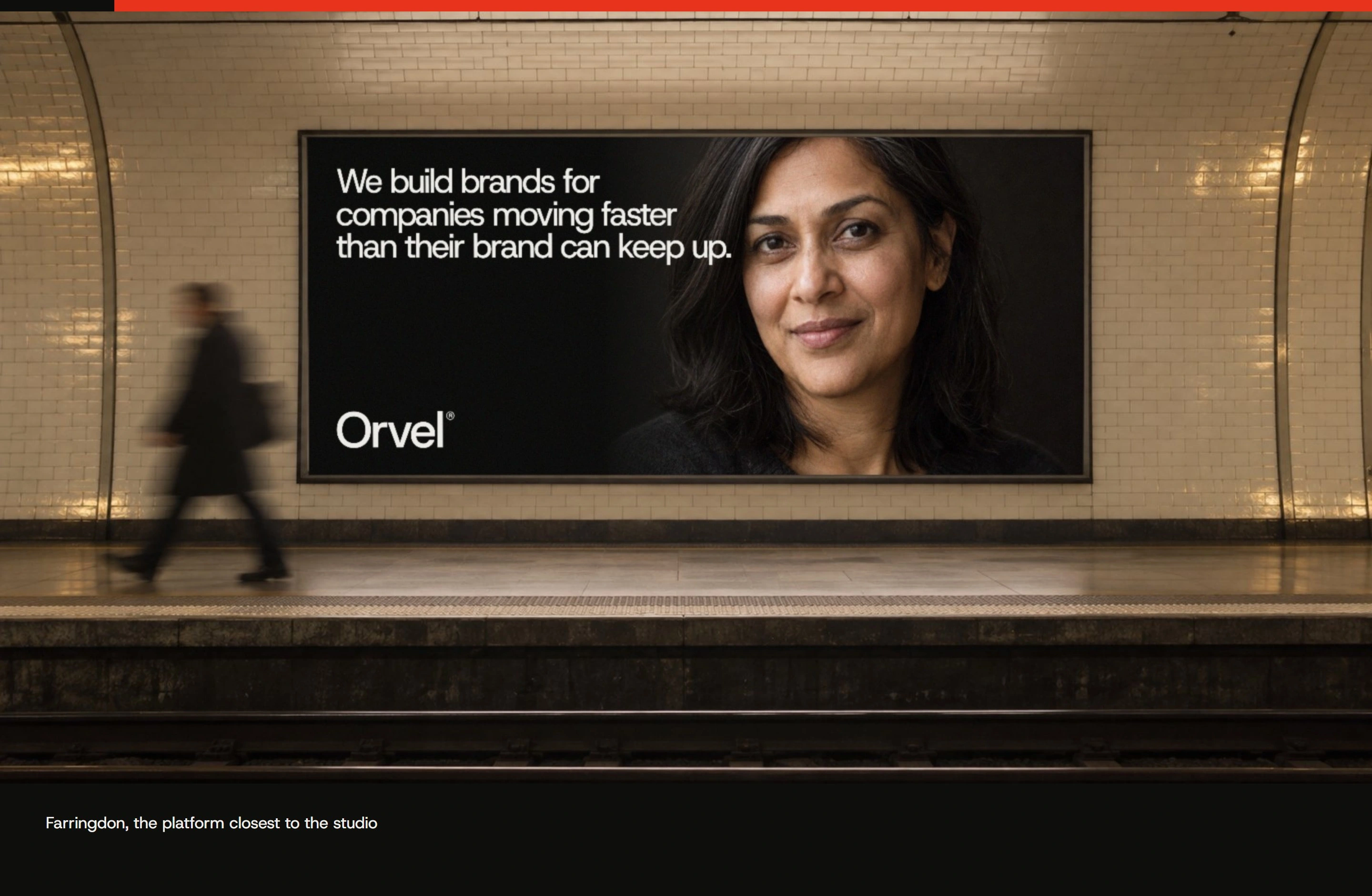
Applications
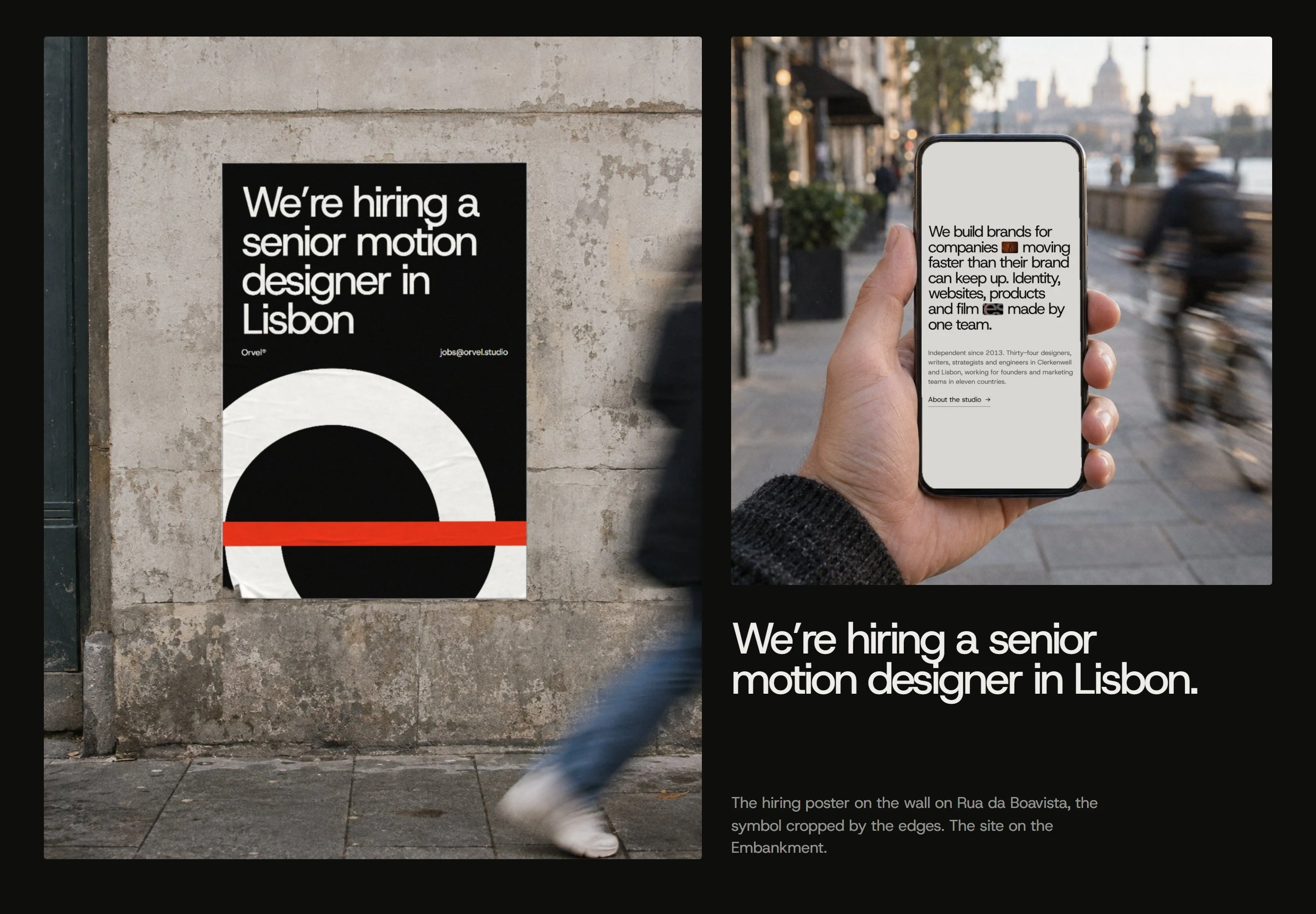
Applications
Website
Stories
Close
0 likes · 0 views · Nov 16, 2026
Self-initiated concept identity for Orvel, a London and Lisbon studio: the O caught mid-move, smearing with motion, settling sharp.

