
The practice
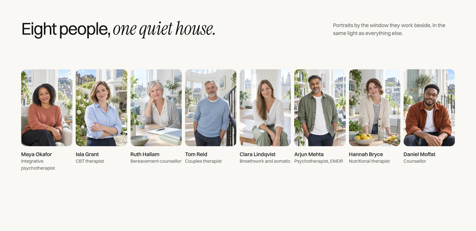
Stillroom is a therapy and wellbeing practice in a Georgian house in Stockbridge, Edinburgh. This is a self-initiated identity built only from its website: the logo, type, palette, photography, voice and motion all come from the site.
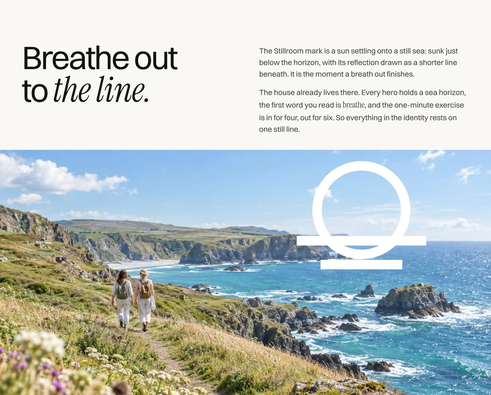
The idea: breathe out to the line
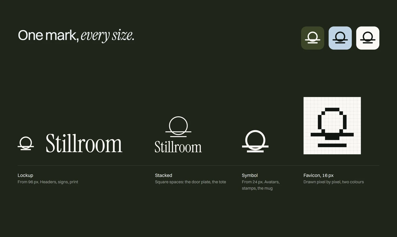
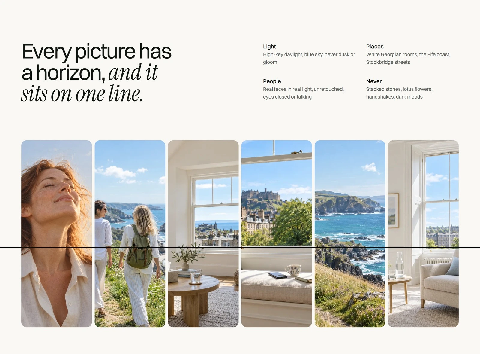
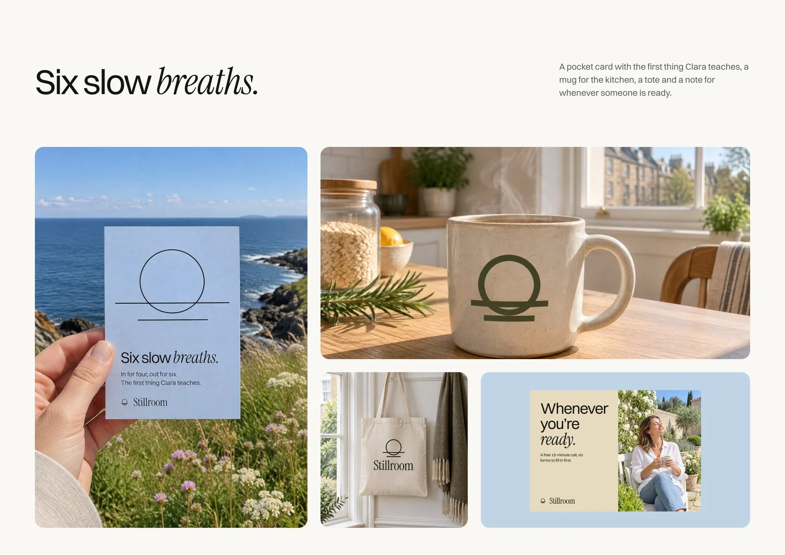
The site's icon is a sun settling onto a still sea, just below the horizon, with a shorter reflection underneath. It is the moment a breath out ends. Every hero photo on the site has a sea horizon and the one-minute exercise is in for four, out for six, so the identity rests on one still line.
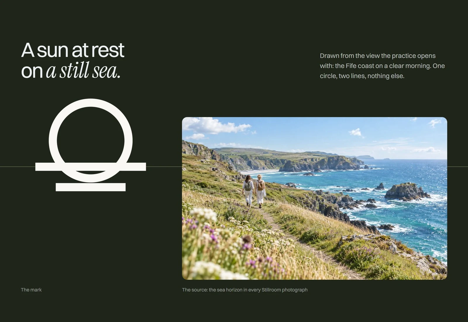
The mark
The symbol is drawn on a 24 unit grid: a ring of 6.5, a stroke of 1.4, a horizon of 19 and a reflection of 12. The lockup follows the site header exactly, and a hand-drawn 16 px favicon keeps the line crisp at the smallest size.
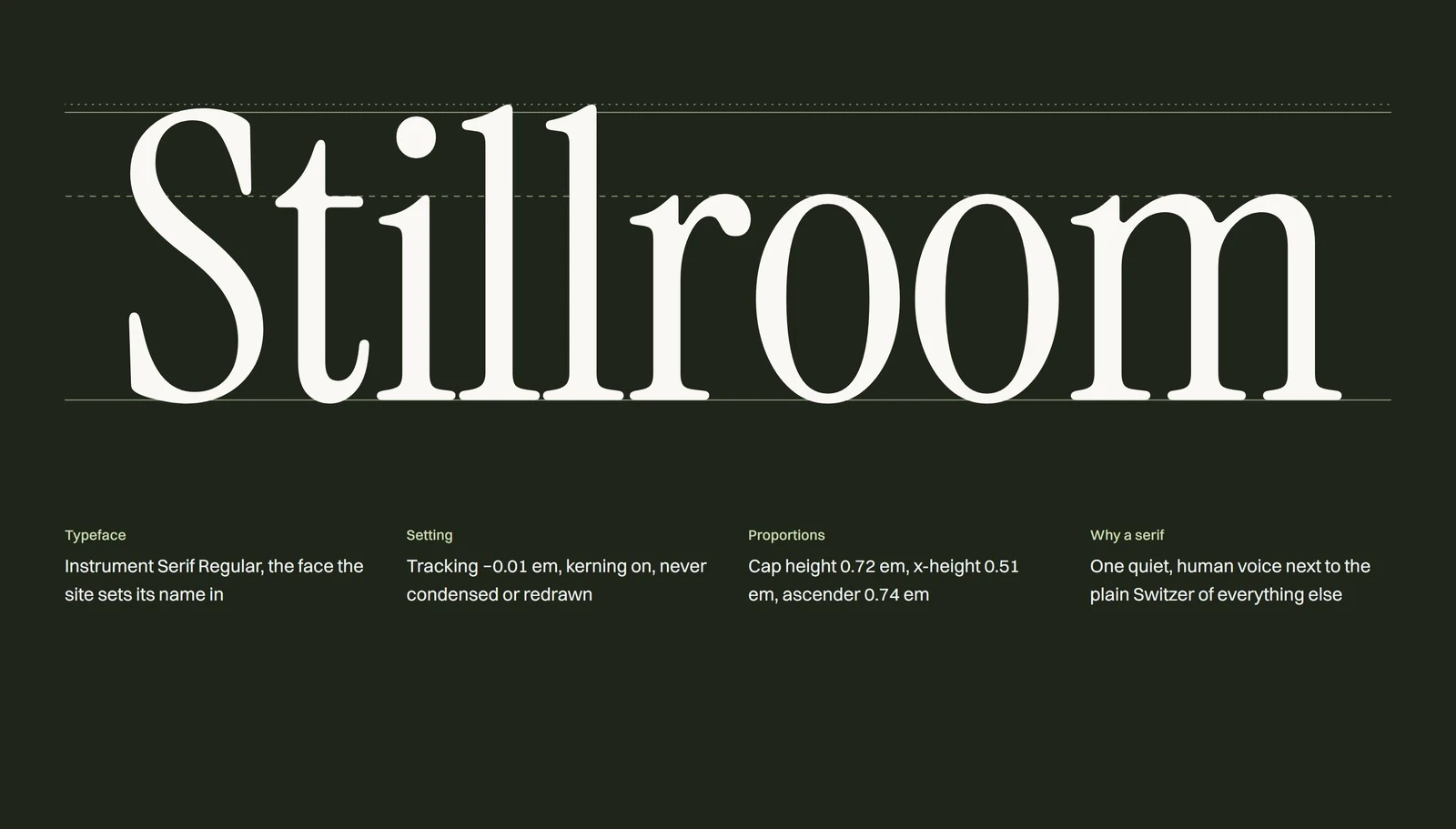
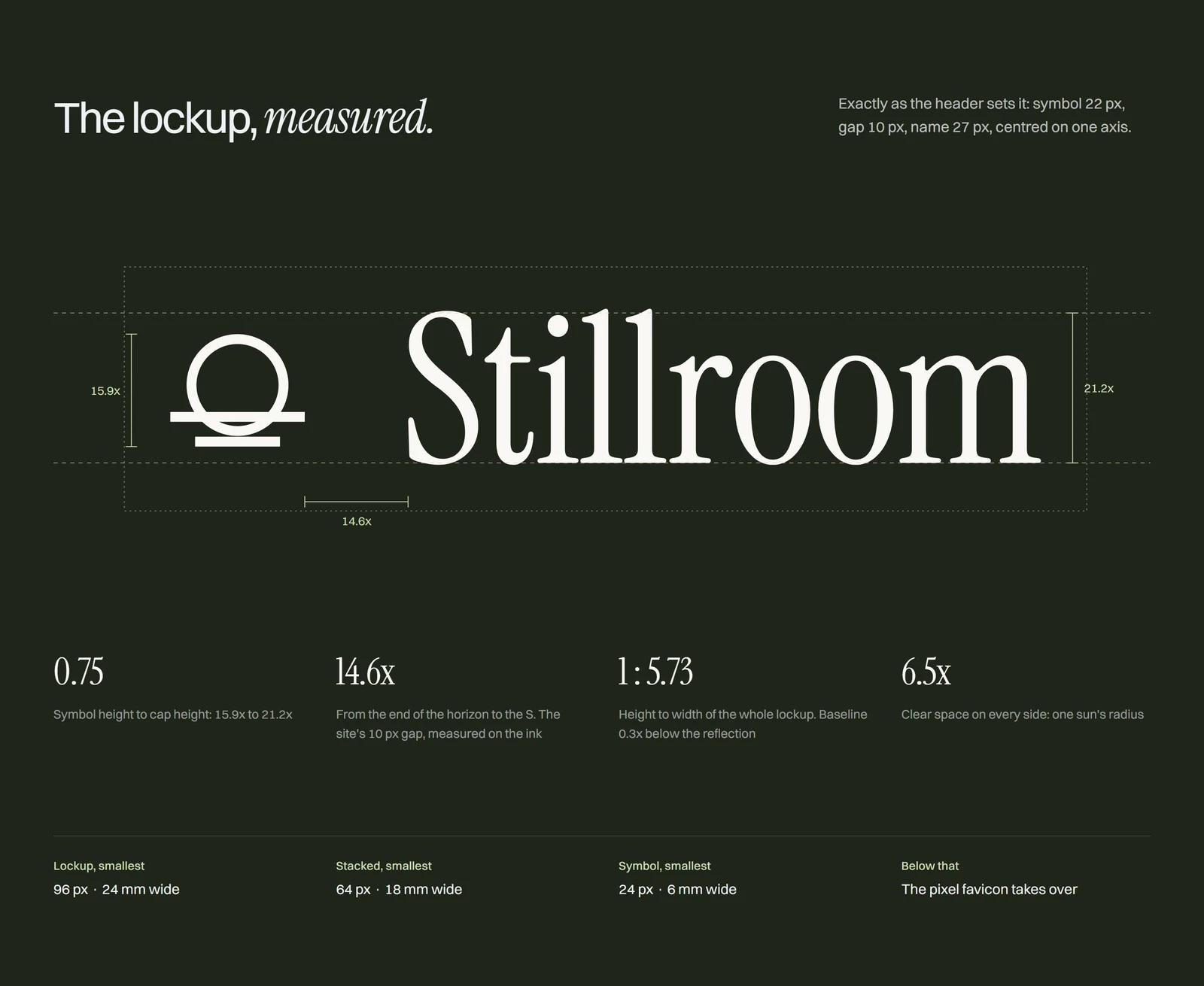
Colour and type
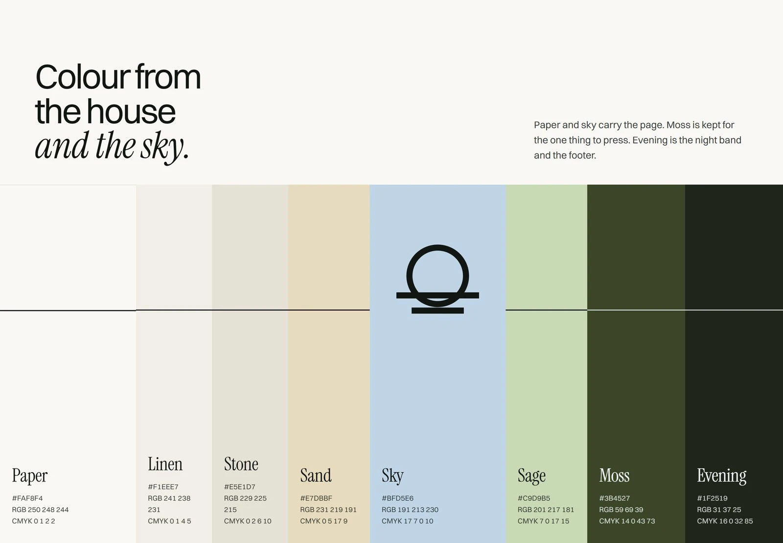
Paper, Linen and Sky make a daylight ground. Moss is kept for the one thing to press, and Evening for night bands. Instrument Serif sets the name and one italic phrase per headline; Switzer carries everything else at a tight -0.045em.
In the world
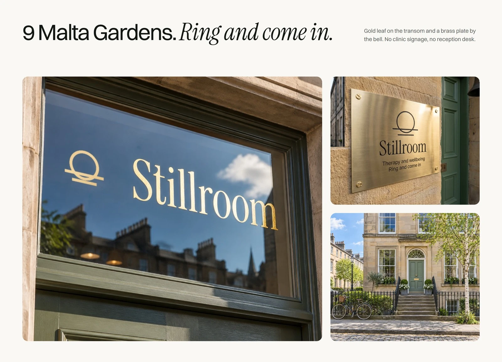
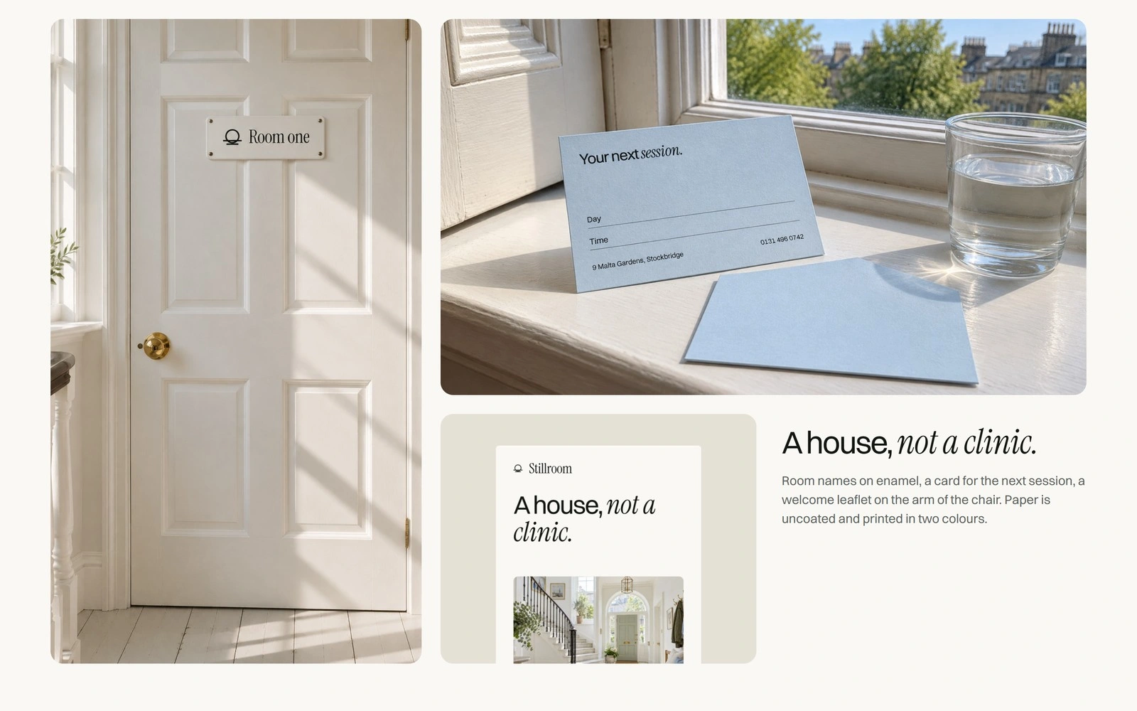
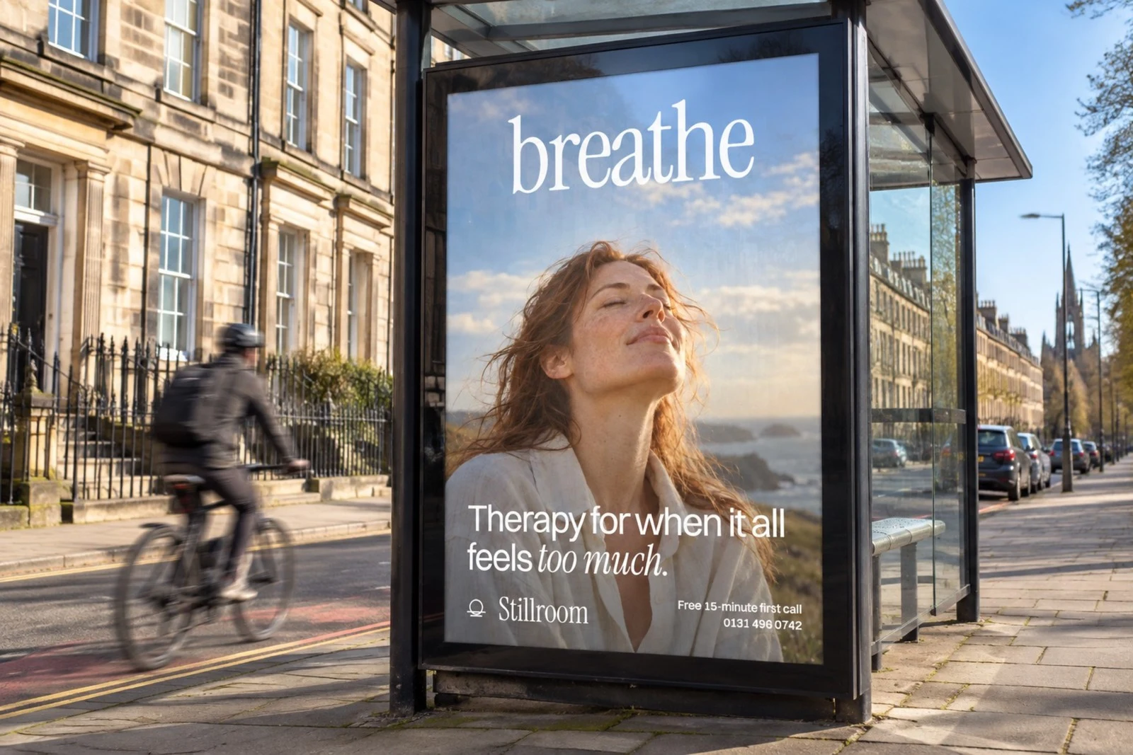
The line carries into the door's gold leaf transom, the room sign, appointment cards, leaflets, a bus shelter, take-home pieces, social stories and the site, and every loop moves at the pace of a breath.
0 likes · 0 views · Nov 16, 2026
A self-initiated identity for an Edinburgh therapy practice, built on one still line: the sun settling onto the sea as a breath out ends.