Wouessi's Tender Platform
Eric Yam
Wouessi's Tender Platform
June 2025 - July 2025
Overview
At Wouessi Inc., a Toronto-based fintech and digital solutions firm, I led the design of a tender discovery portal a platform to connect thousands of businesses with procurement opportunities.
I owned the end-to-end product experience: research, system architecture, and high-fidelity execution, delivering a scalable MVP.
Role
Product Designer
Team
Design Lead, Designer
Duration
6 Weeks

Problem
Current State of Tenders in Toronto
Tender discovery platforms in Toronto are outdated, unintuitive, and largely ignored by businesses. Tender users (58% are 50+ years old) struggle with navigation, and struggles with technology.
We saw an opportunity to improve this experience using AI. But introducing advanced tools in a space dominated by less receptive users to AI came with a challenge: how do you add AI-powered features without overwhelming them?
And with a growing and expanding partnerships ...
How might we help users seamlessly discover and book tenders leveraging AI tools?
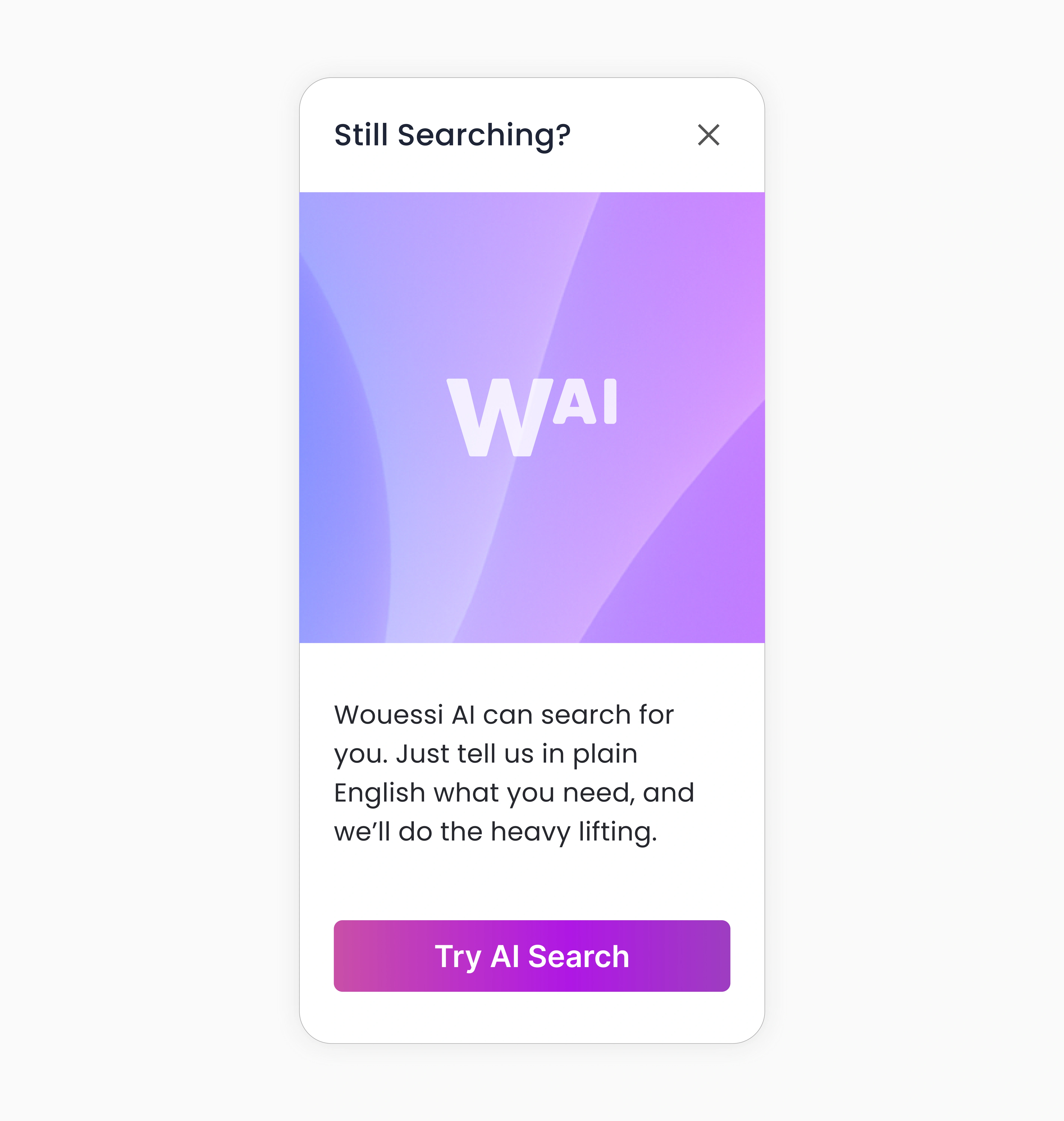
AI Search
Why AI Search Matters
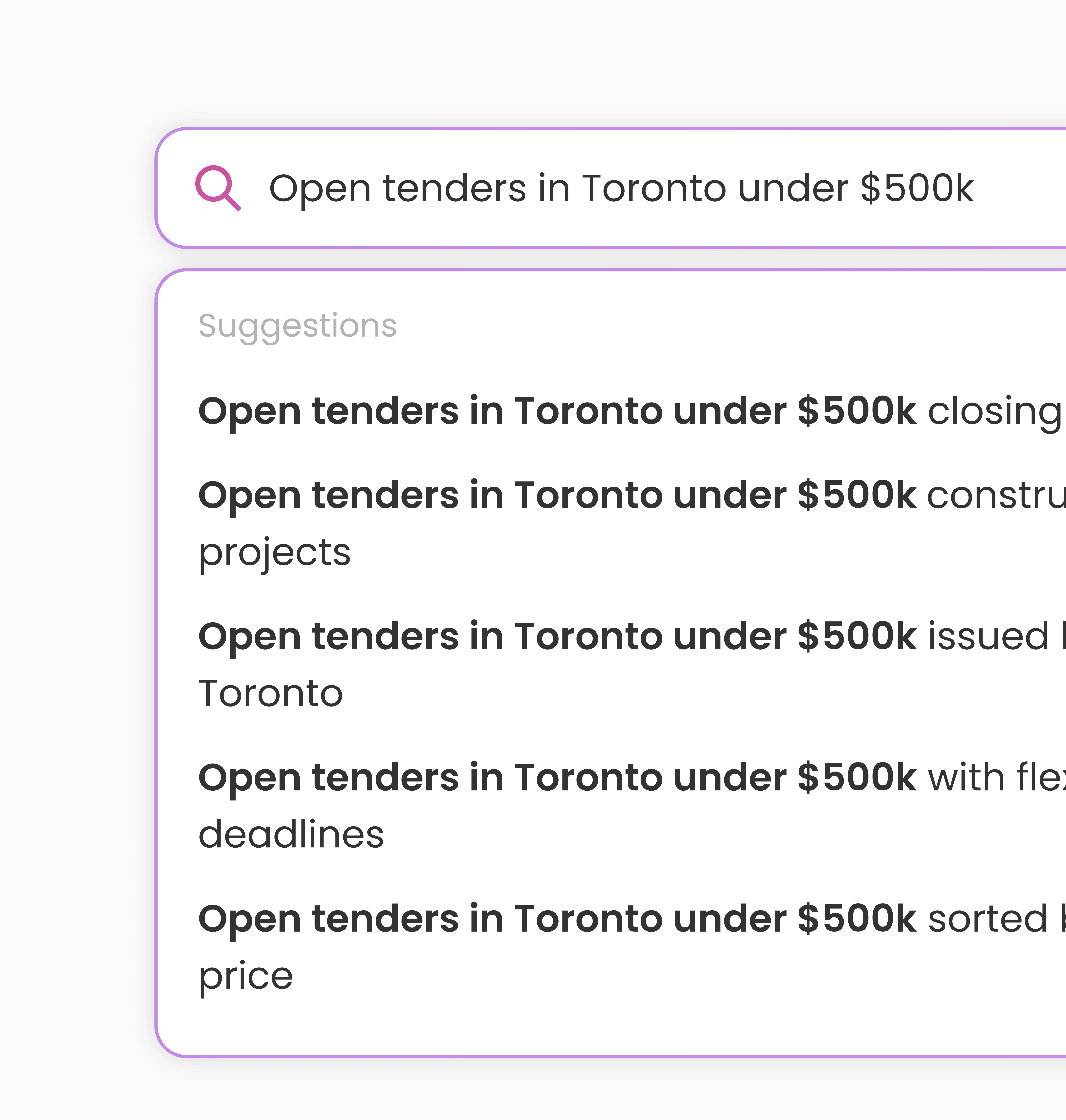
Search was the biggest bottleneck for discovery. If vendors can’t find tenders, they leave. An estimated 25% of searches will end without users clicking any results and so we want to direct users towards the best available tender. And by creating AI search, it promises a better experience by allowing natural queries (e.g., “IT services for a team of 4”) and interpreting intent.
The challenge: introducing this to a demographic unfamiliar, and less receptive to AI-driven solutions.
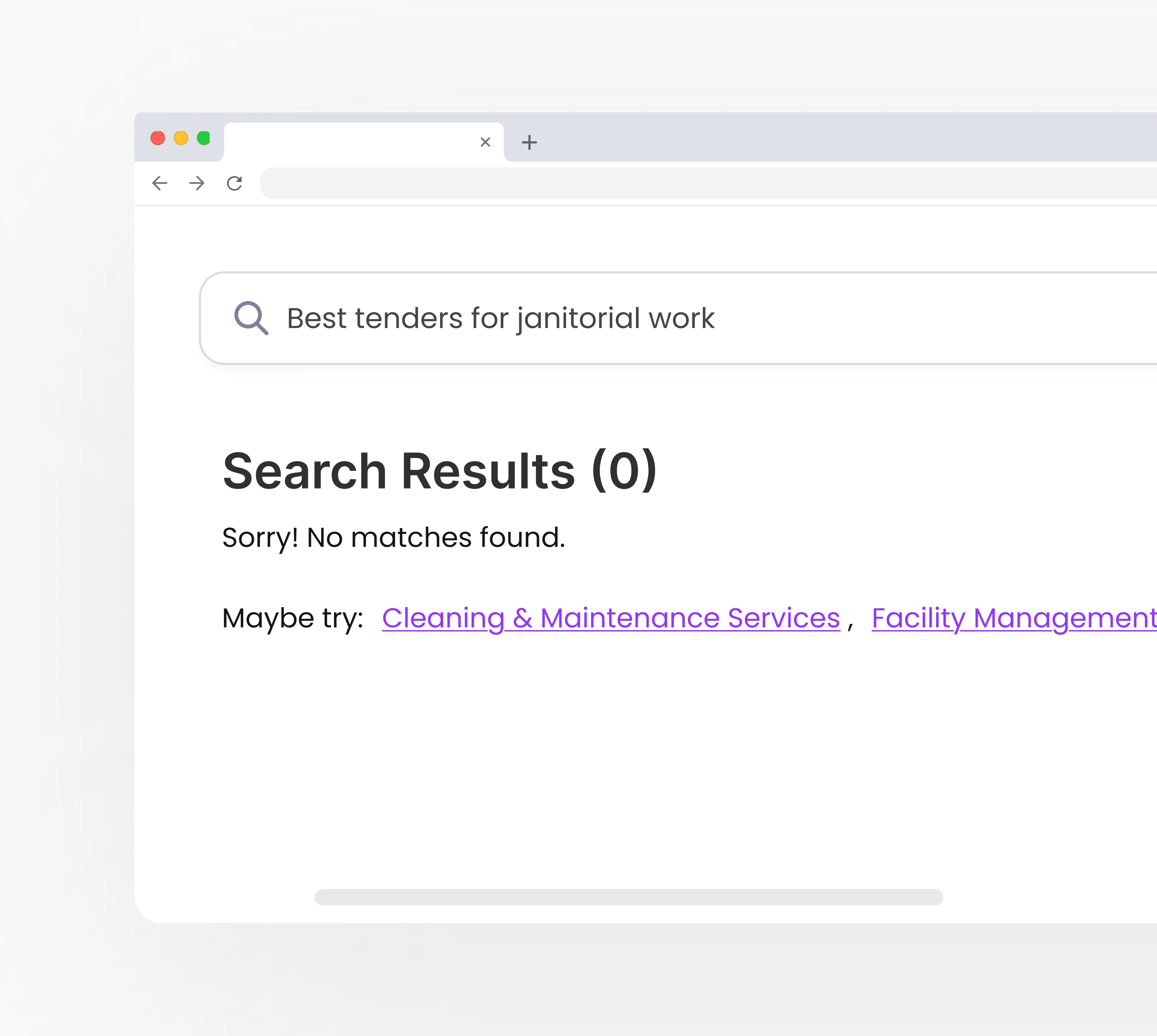
25% of searches lead to no results Users often abandon the platform after multiple failed searches
AI Search helps users find tenders 2x faster & reduce no-results searches Makes search easier with natural queries
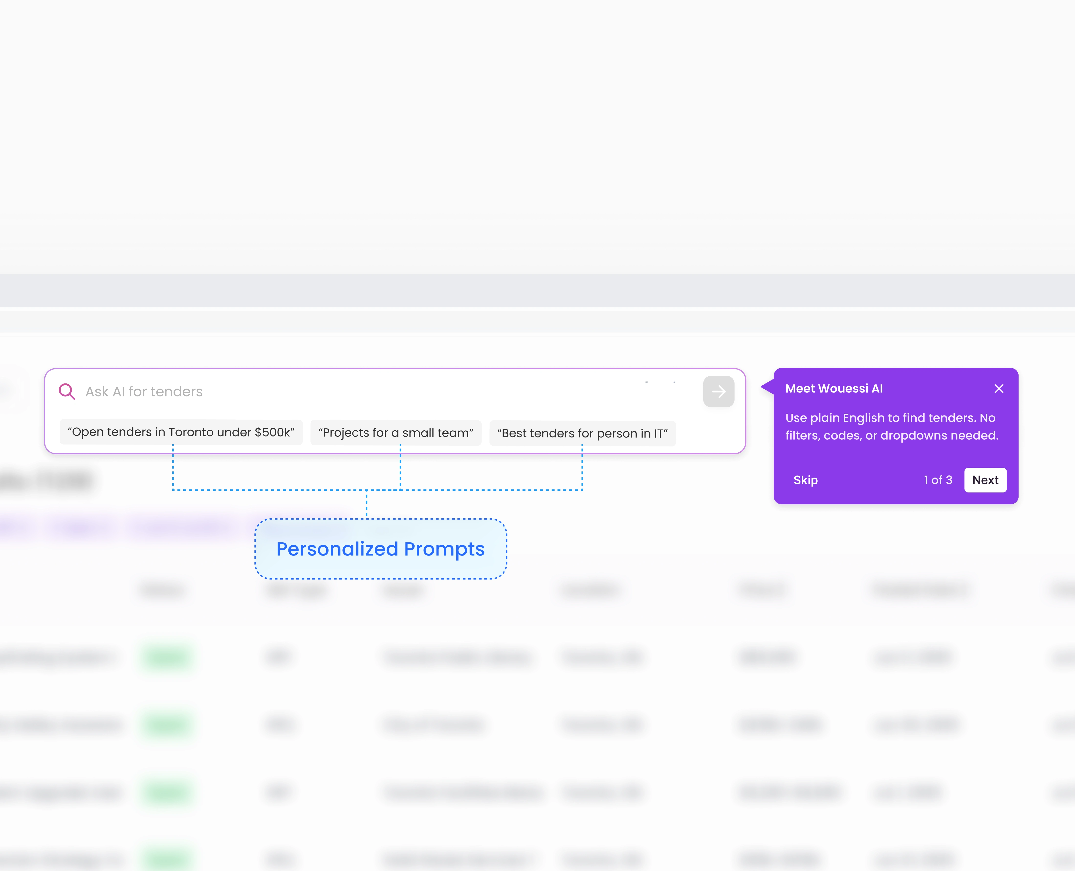
Designing to Educate
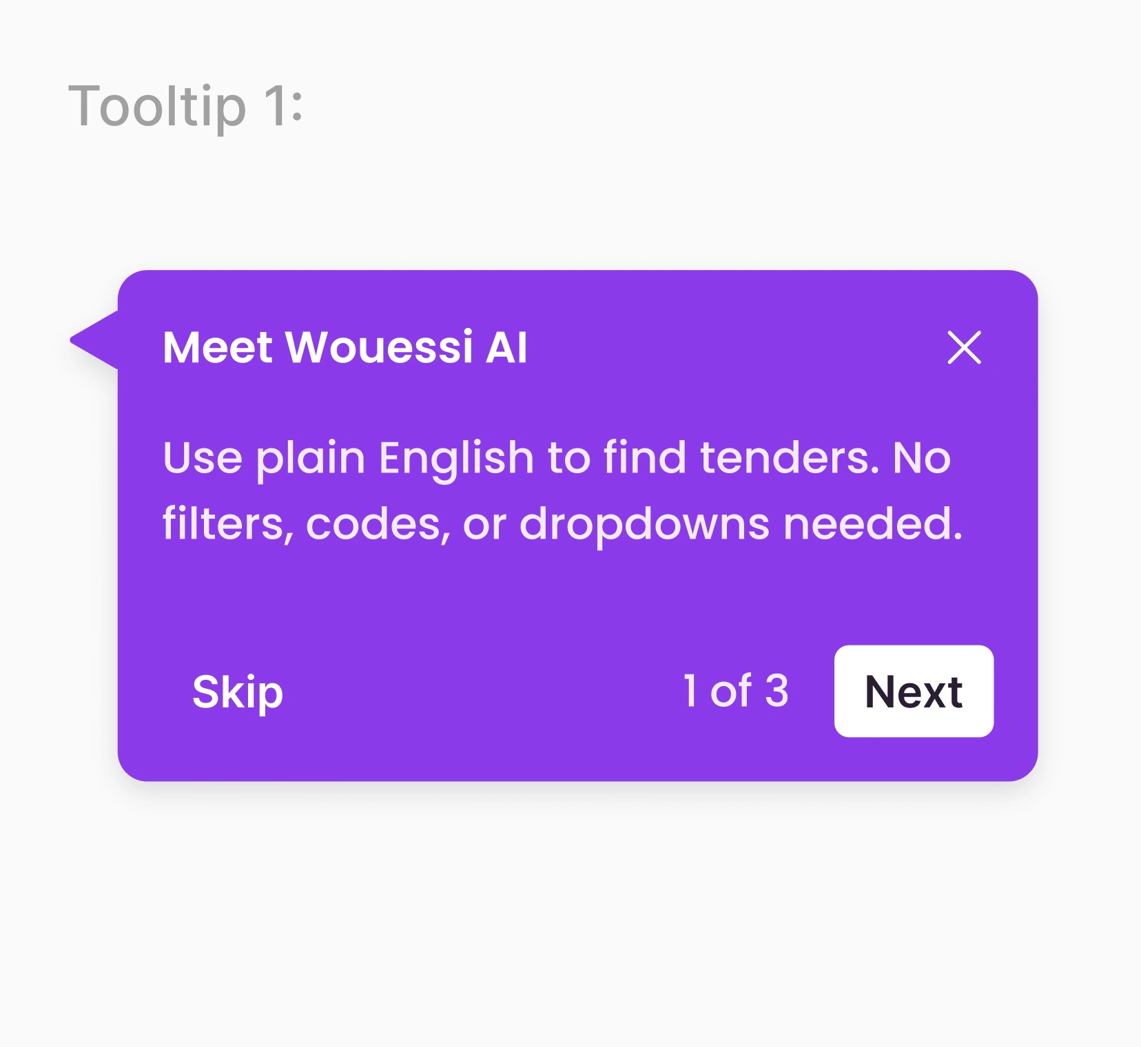
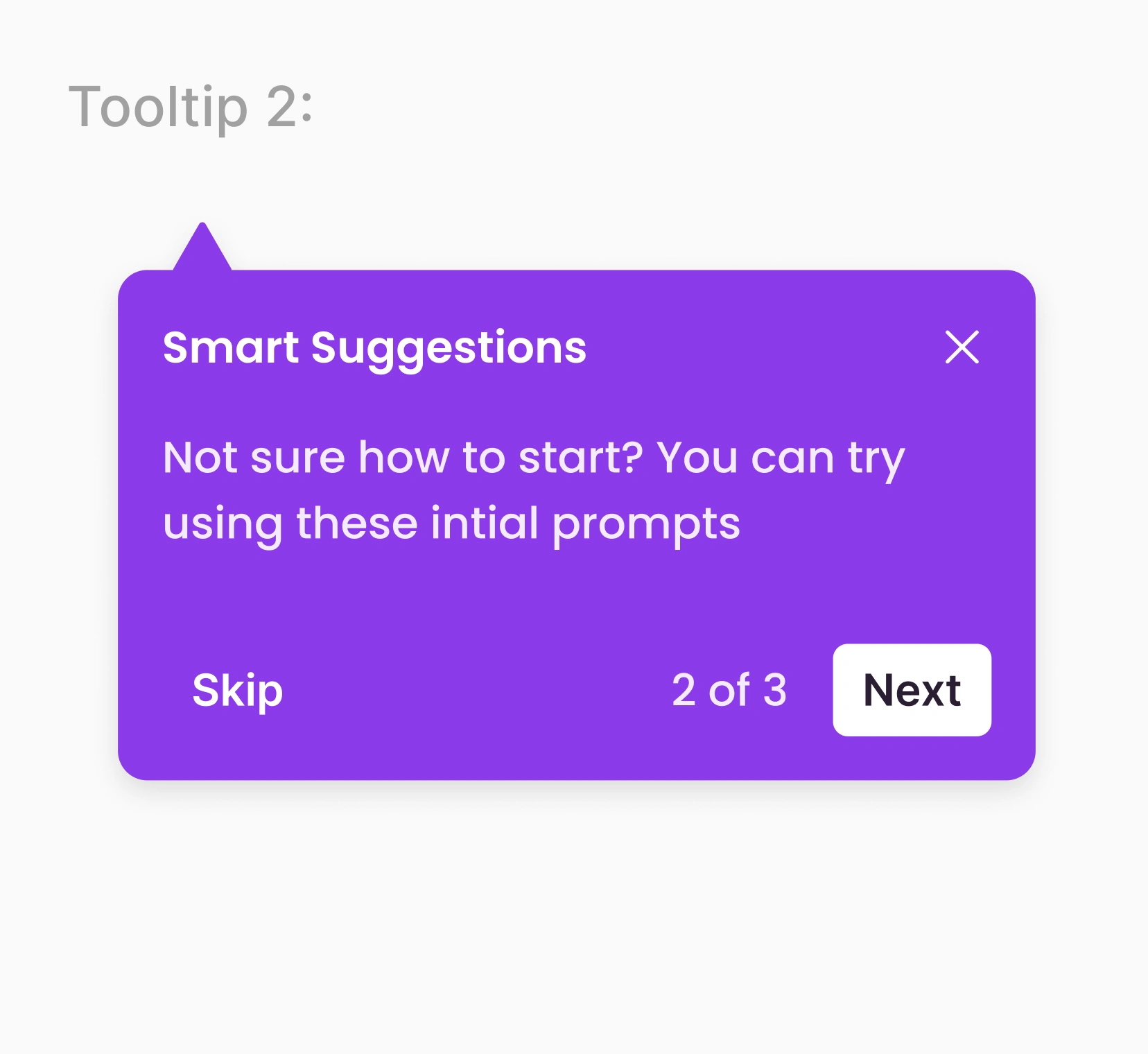
To help solve the unfamiliarity with users, we focused on progressive onboarding through clarity and guidance. Tooltips explained the feature in plain language and pre-generated prompts showed what they can type. Using what we knew about the user’s previous clicks and context, the AI suggested relevant templates.
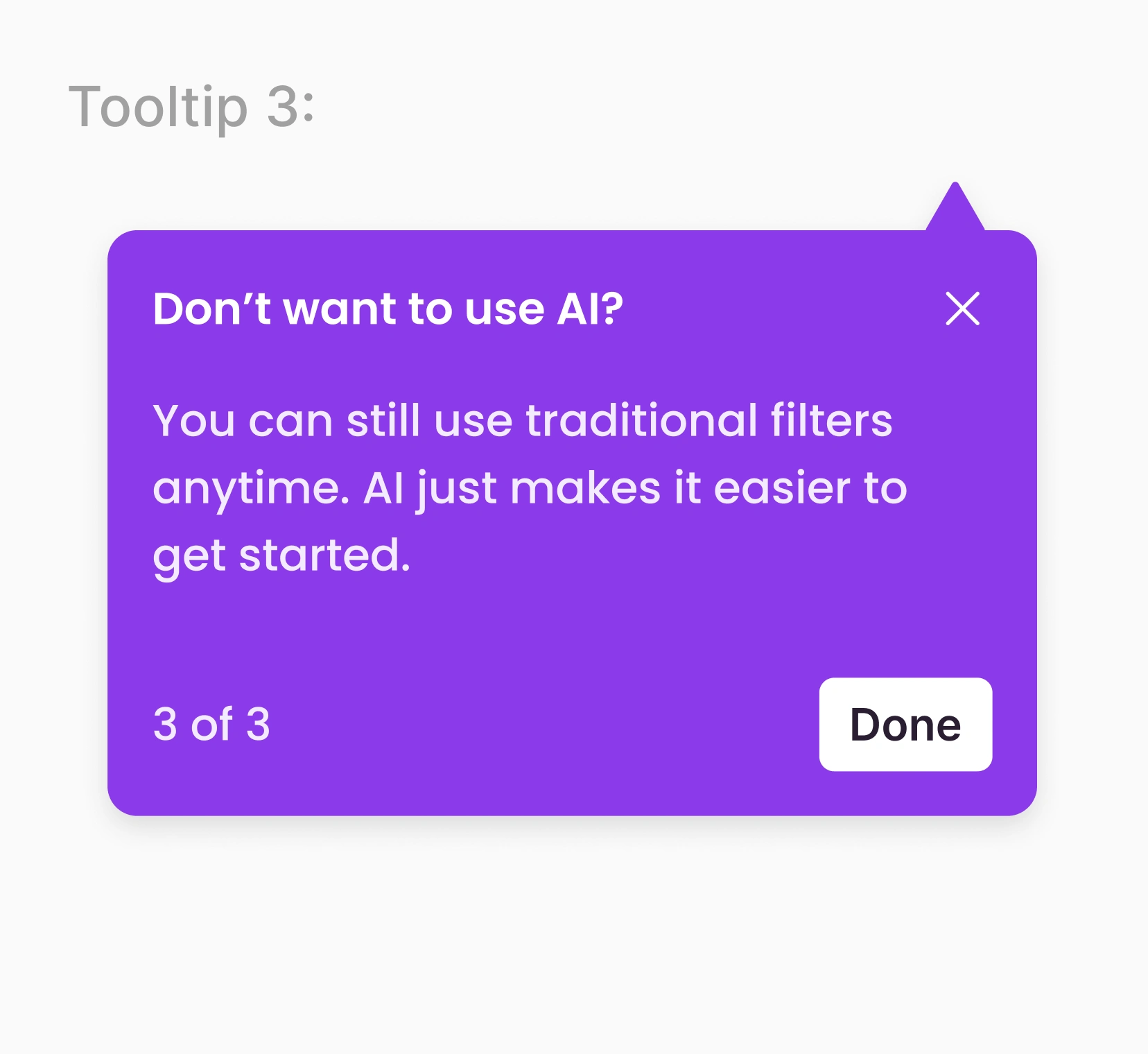
Validating Assumptions Through Research
We found inconsistencies with completion rate with the AI feature. Signaled through our quantitative data and so I found root causes from qualitative data. A/B tested a few options and we developed these tooltips off of most user questions, pain points and what had the best completion rates.
Tooltip increased satisfaction by 30% Observed pain points and created tooltips based off of them.
Iterated completion rate from 35%-68% Conducted A/B testing to validate our assumptions
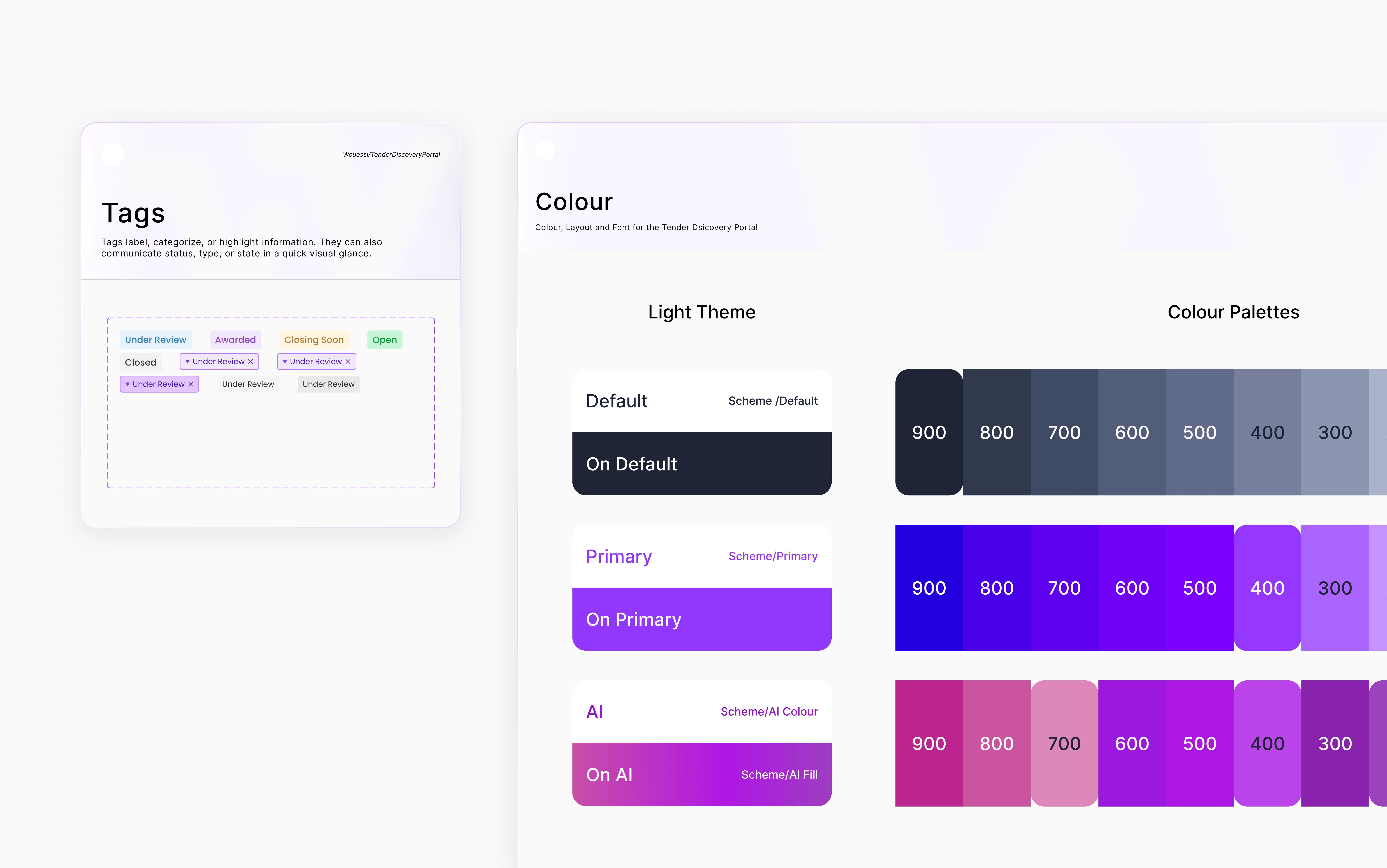
Cards
Increasing AI Search Adoption
When I was user-testing, one of the biggest challenges I anticipated was user confidence and adoption for AI search. Around 50% of our vendors were either unfamiliar with or hesitant to use AI search.
We knew the feature could improve discovery, but releasing it without context would provide no value. My goal became clear; Make AI Search approachable, relevant, and worth trying for users who didn’t yet see its potential.
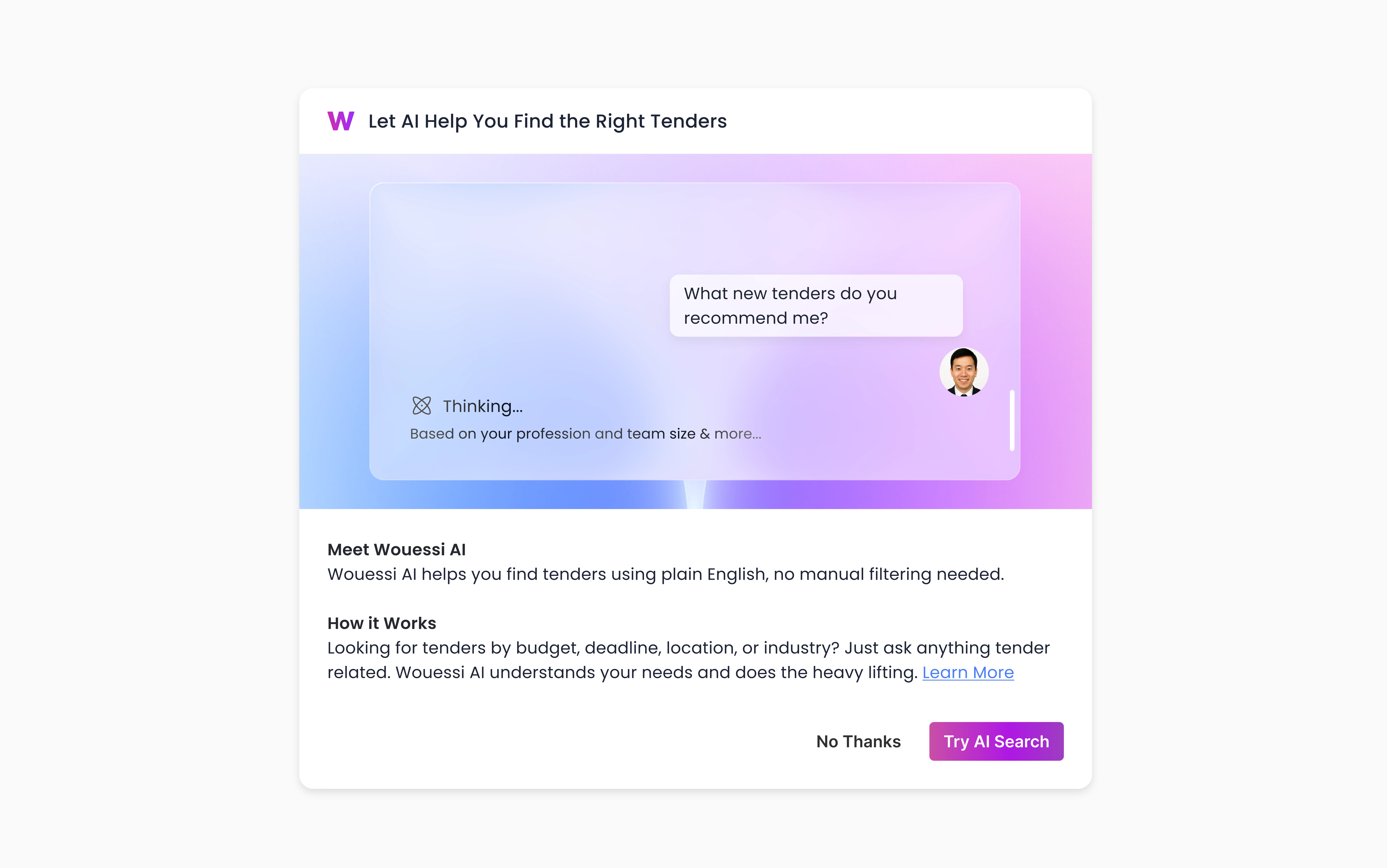
First Attempt: Introducing the Feature
Our first approach was a simple pop-up card that introduced AI Search. It was visual, informative, and offered a quick way for users to learn more about the feature.
However, data revealed low conversion and engagement. We concluded after interviews that users didn’t feel AI Search addressed a present problem. It appeared as an extra feature rather than a solution to their immediate need.
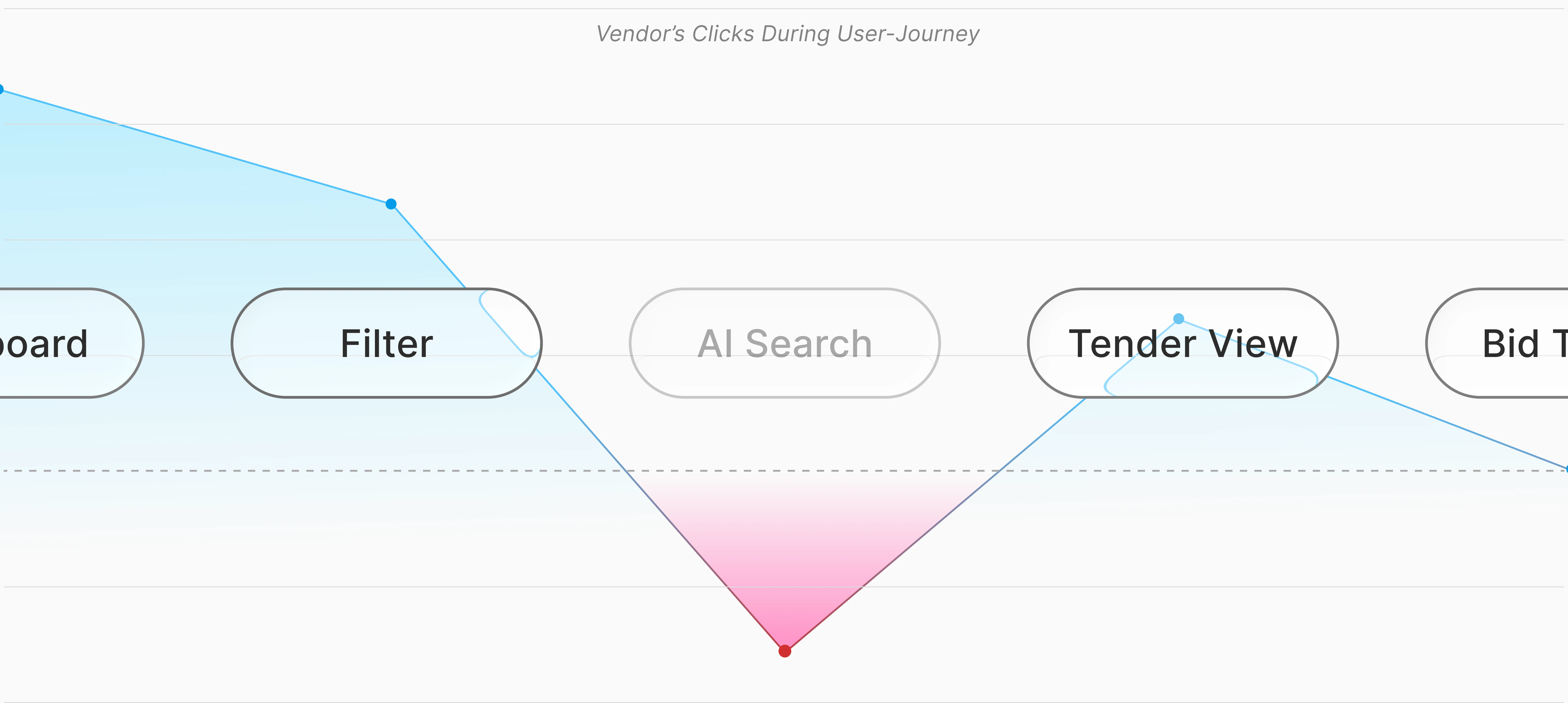
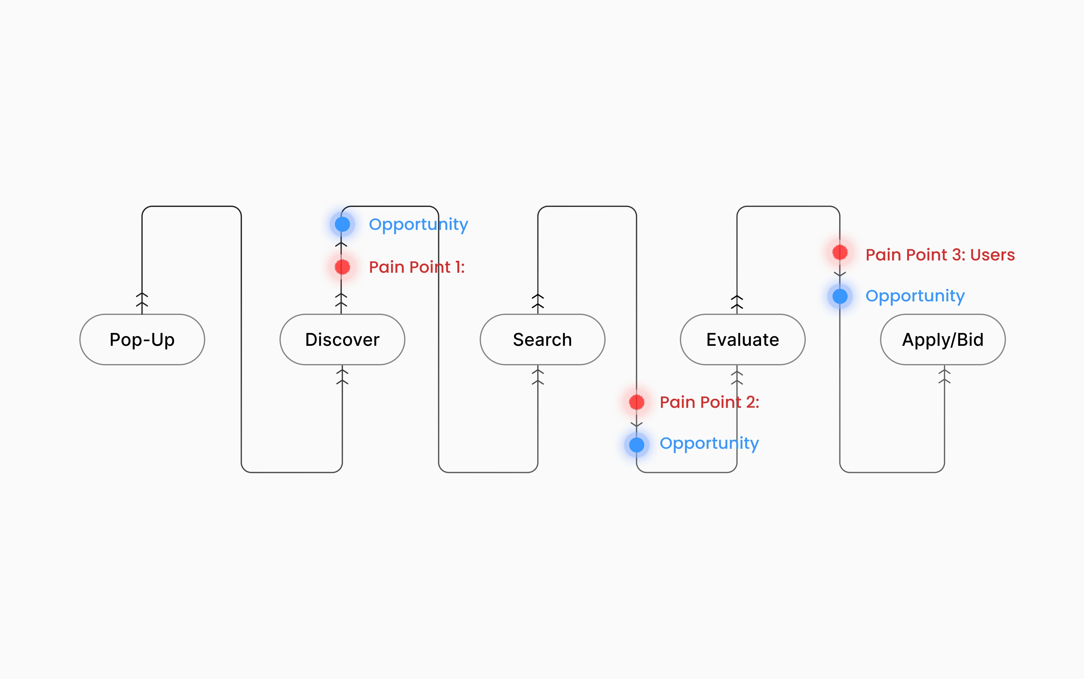
Revisit the Journey to Rethink Our Approach
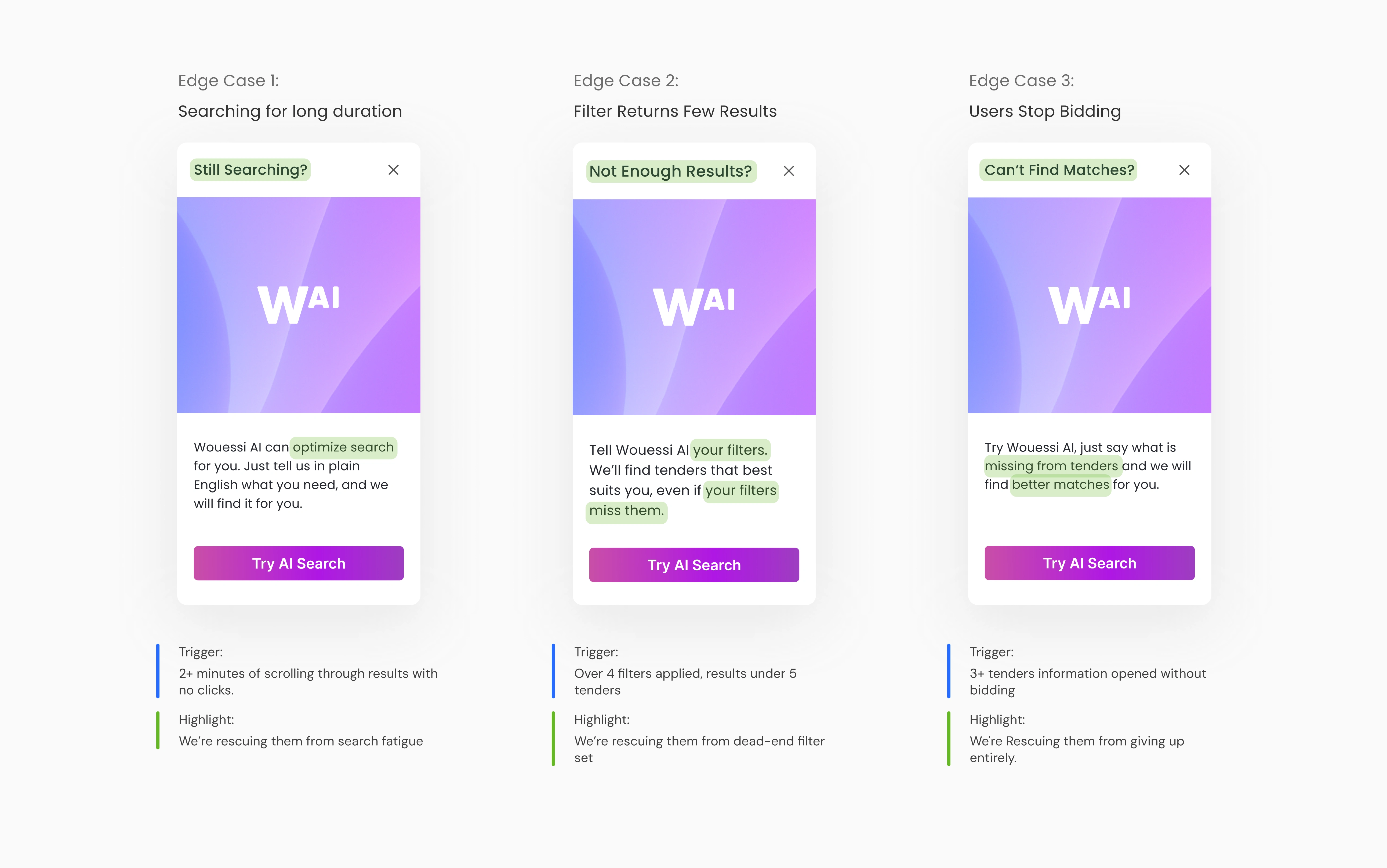
I decided to work backwards. Revisiting the end-to-end vendor journey, I analyzed moments where users struggled to stay on the happy path. These became key decision points where guidance could feel timely rather than intrusive.
I pivoted my approach leaning into these pain points. I identified the three biggest ones and learned how we can utilize understanding users' emotions to uncover opportunities to support them.
Iterating the Experience: Contextual Nudges
To test our assumptions, we developed non-invasive cards during certain points of the journey. Contextual because it wouldn't show for users within the happy path but appears only for users who have friction within their flow; the people benefitting the most to try AI search.
And instead of scrapping the initial pop-up entirely our research shared that users recognized the similar color themed and CTA which overall lessened cognitive load, and reduced time reading by 25%.
These cards dynamically matched real user situations. During internal testing, these contextual cards increased AI search engagement by 35% and situationally helped the users best suited to try AI search.
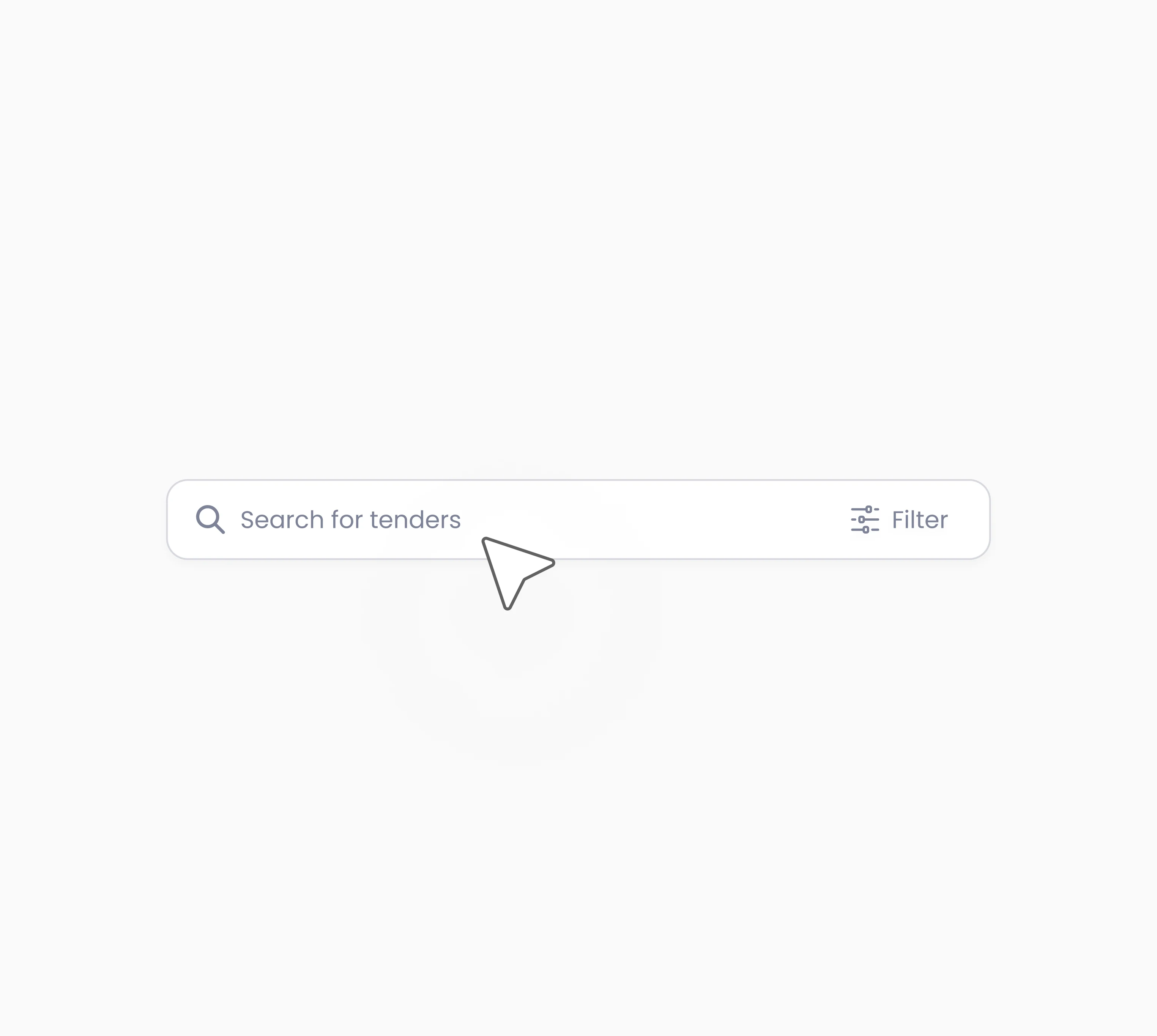
Filters & Manual Search
Why Manual Search Still Matters
While AI-powered search promises efficiency and easier searching, our research shows that manual search will remain the primary discovery method for vendors; at least in the early stages of adoption.
To design a seamless experience, we focused on what users value in manual search and how to reduce cognitive load.
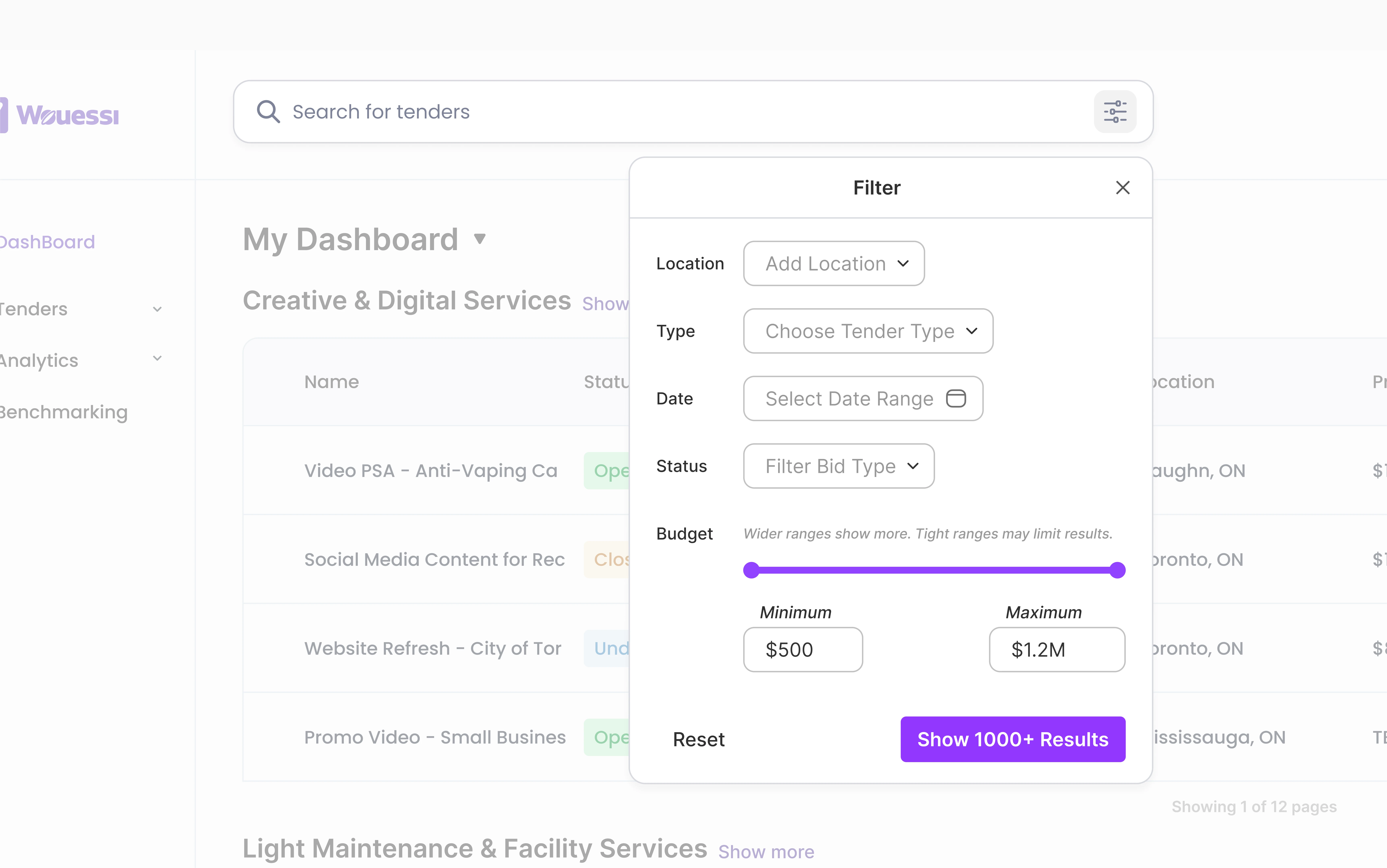
Keep Filtering Streamlined
Most of our vendors only utilize a handful of filters when searching. Instead of cluttering it, we focused on the current five most essential filters which account for roughly 95% of usage.
Prioritizing what matters to users and simplifying the layout to make it feel fast and approachable.
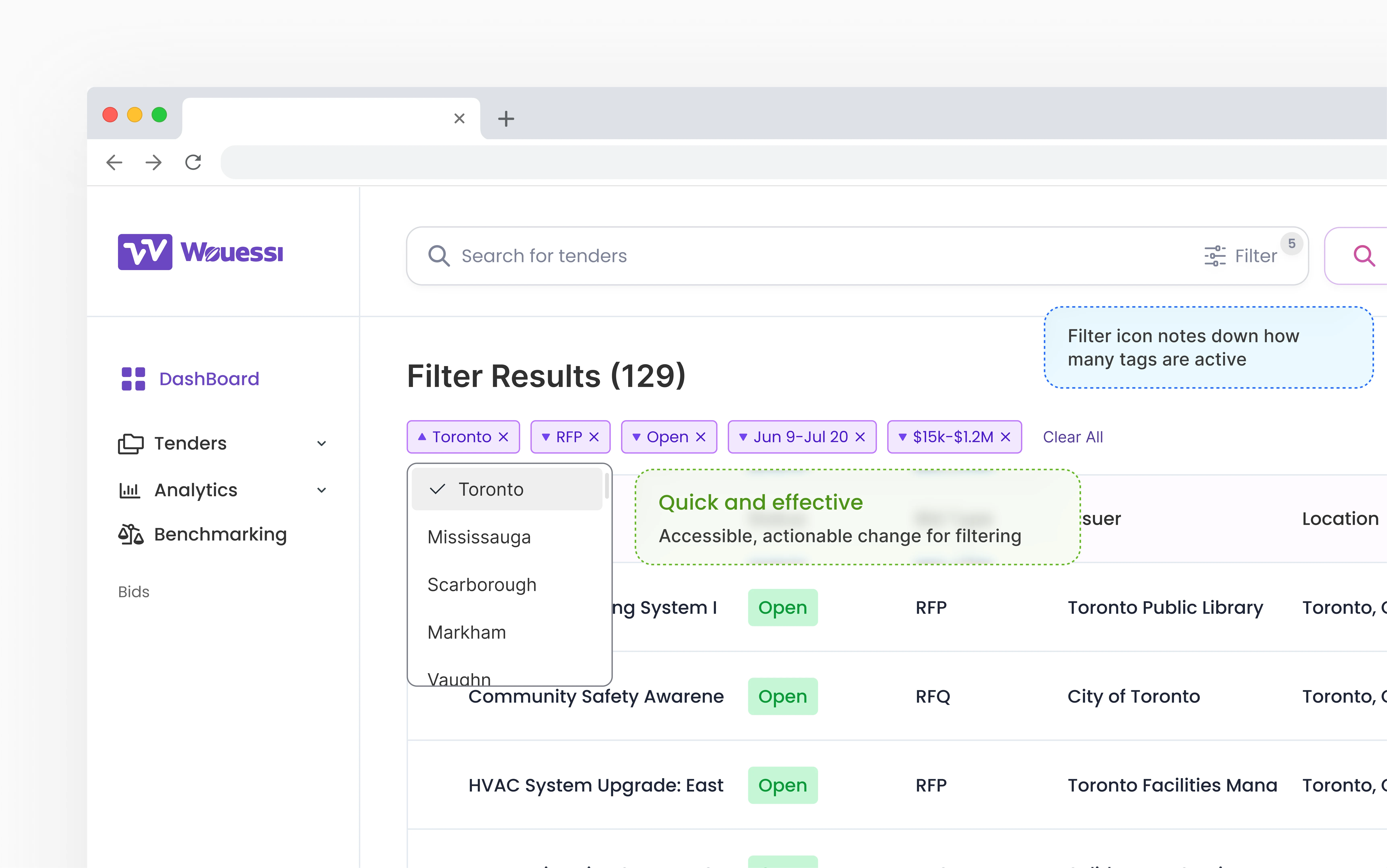
Search Results Tags
We noticed users adjust their search quite frequently. Our flow may contain too much clicking if small adjustments are needed. So, we developed tags to reduce the amount of total clicks needed to filter.
These tags allow users to make small refinements like removing/changing content without starting over from the filter icon. This design saves users an average of 30% in time.
Blending Manual and AI Search
While manual search provides control and AI search offers speed and personalization, the fact is, they offer a very similar purpose ultimately helping users search and find bids.
Because of that, I designed them look and feel like a cohesive experience. Kind of like a light switch (or toggle)... showing that similar relations between two features.
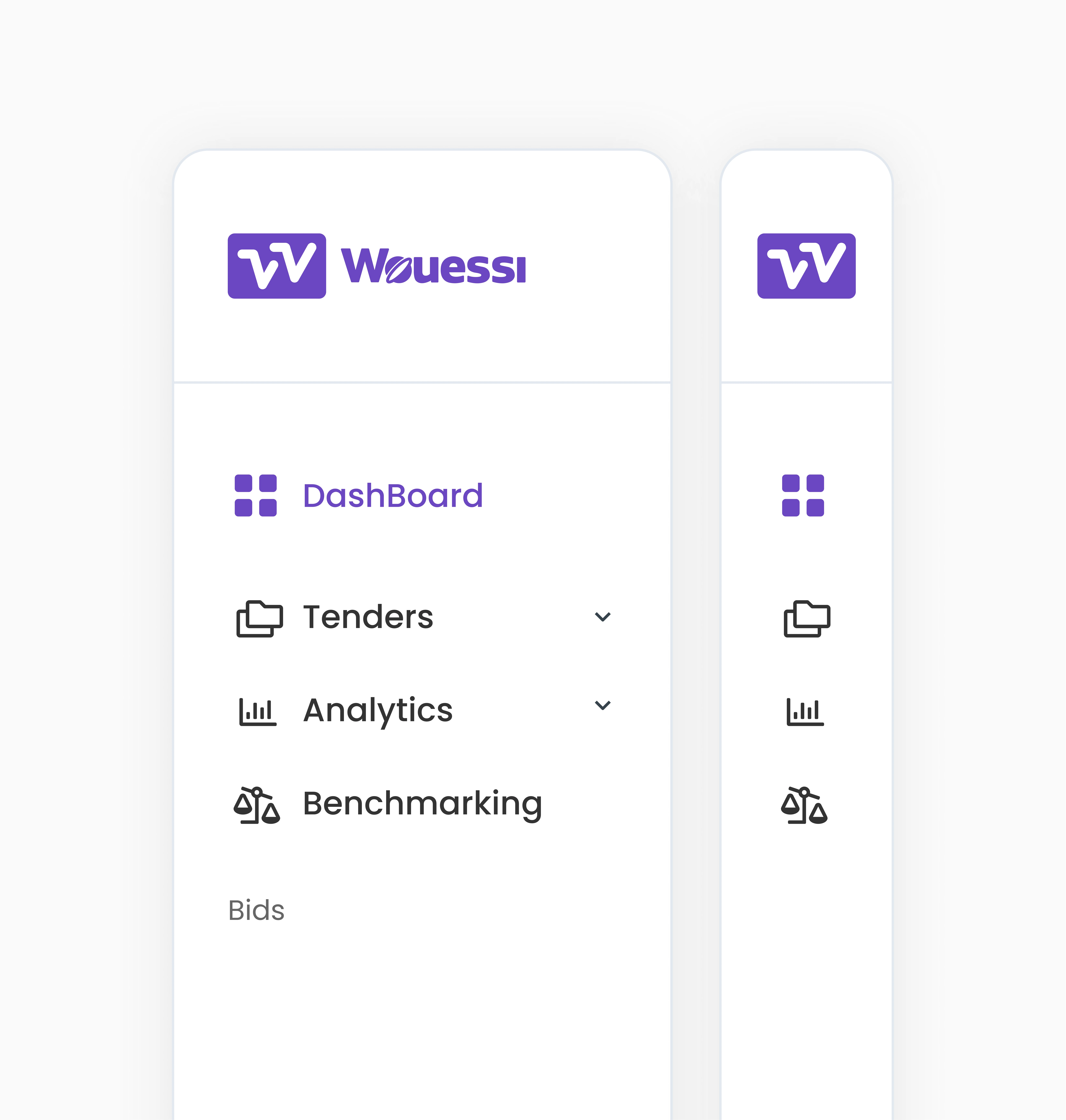
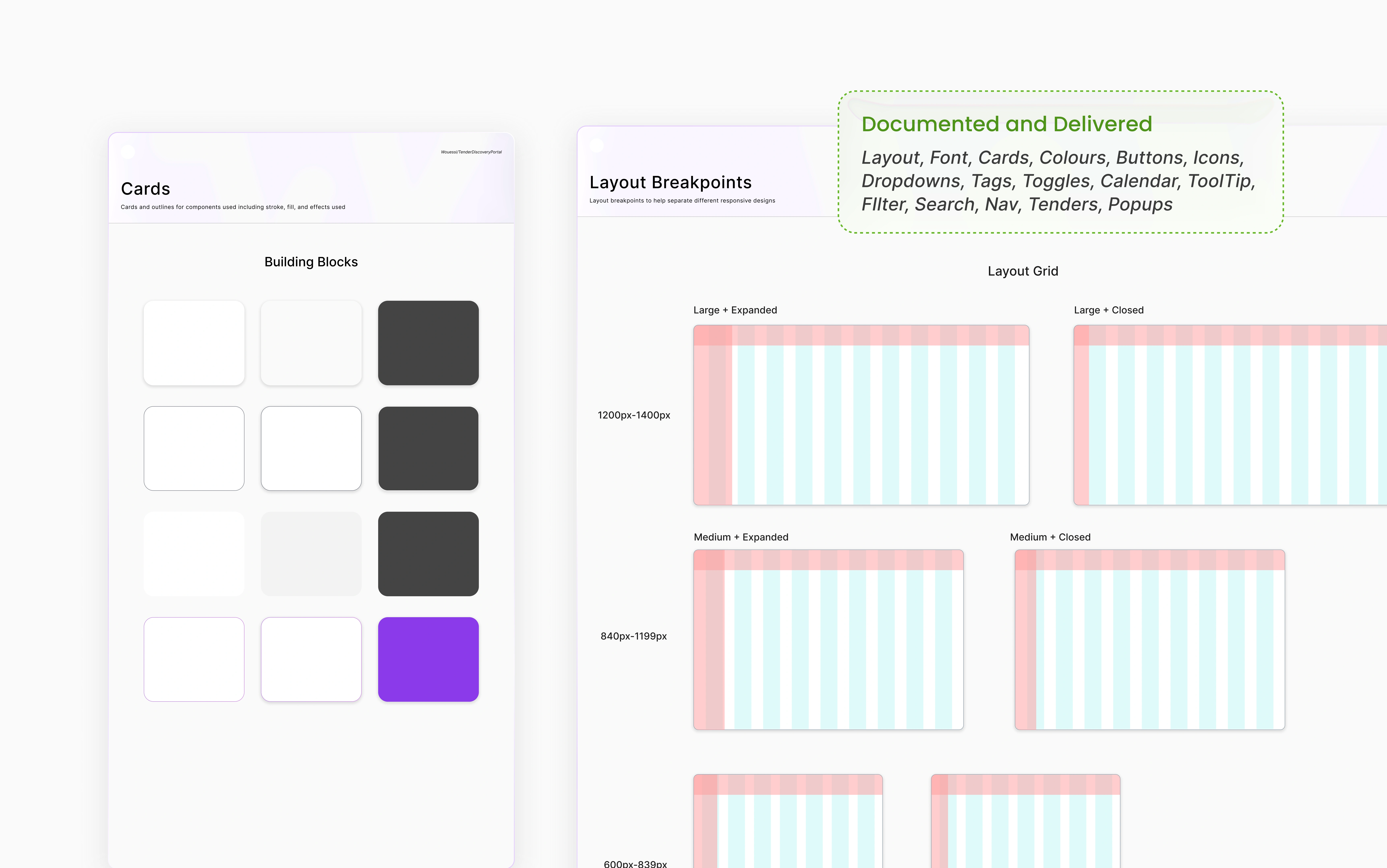
Visual Systems
Ground up
Reimagined the design system for the platform, taking inspiration from Material Design to create a scalable and intuitive foundation. Built a cohesive set of reusable components with clear guidelines to ensure consistency across every screen.
Outcome
Impact and Wins
40%
Time on Task
Through reiterations, we developed a user-flow that reduced time on task by 40% with decisions to create less clicking and faster discovery.
35%
Increase in click-throughs
After refining the rollout with timing and nudging strategies, clicks on AI-driven search results increased by 35% during internal research.
200%
Handoff to Dev
Successfully documented and delivered full scope (home page) + full design system, scalable components, and extra features for AI search (Pop-ups + edge case conversions).
Reflection
Key Learning and Takeaways
Although this was a short project, I think the constant exposure to short deadline projects has really improved my sprints, setting roadmap, KPIs and projection for projects has been a contributor factor to that success for me as freelancer and I hope that I can constantly improve and learn more in each freelance opportunity as I did in this one.
“Copying” is not Copying
My curiosity always pulls me back to looking at apps I use every day. I love working backward, breaking down product strategies. That habit played a big role in this project, helping me shape features and strategies that ended up driving strong user satisfaction and stakeholder approval. I’ve realized that “copying” isn’t really copying, it’s about adapting smart strategies to your users’ needs and making them uniquely yours.
Opportunities Through Conversation
Sometimes you really just have to ask. On this project, I shifted roles three different times, starting in marketing, moving into front-end, and eventually into product design. None of those transitions were formally planned; they happened because I was curious, spoke up, and asked leadership if I could help in different areas. Don't be afraid of rejection and clarify where you want to grow; I believe eventually you will get opportunities.
Thanks for stopping by!
Like this project
Posted May 31, 2026
Led design for a tender discovery portal to connect businesses with procurement opportunities.
Likes
0
Views
1