Astarta Capital - 3D Landing Page
Anton Zalis
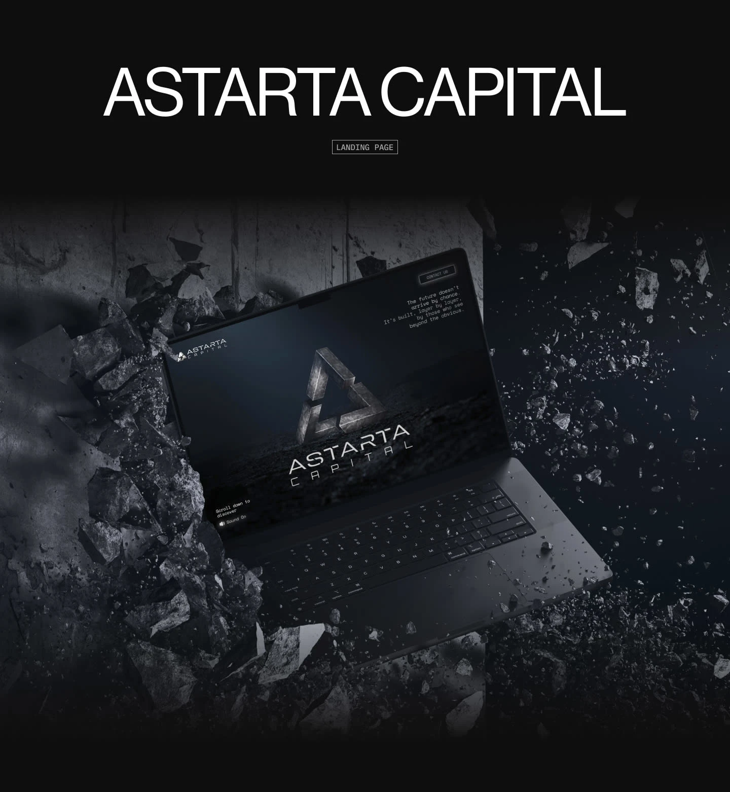
The Vision
Astarta Capital operates in markets defined by uncertainty, scale, and long-term conviction. The website needed to communicate authority, clarity, and confidence without falling into the usual venture capital clichés. This wasn’t about looking friendly or trendy. It was about presence.
The goal was simple: when someone lands on the page, they should immediately understand that Astarta is disciplined, intentional, and operating several layers deeper than most.
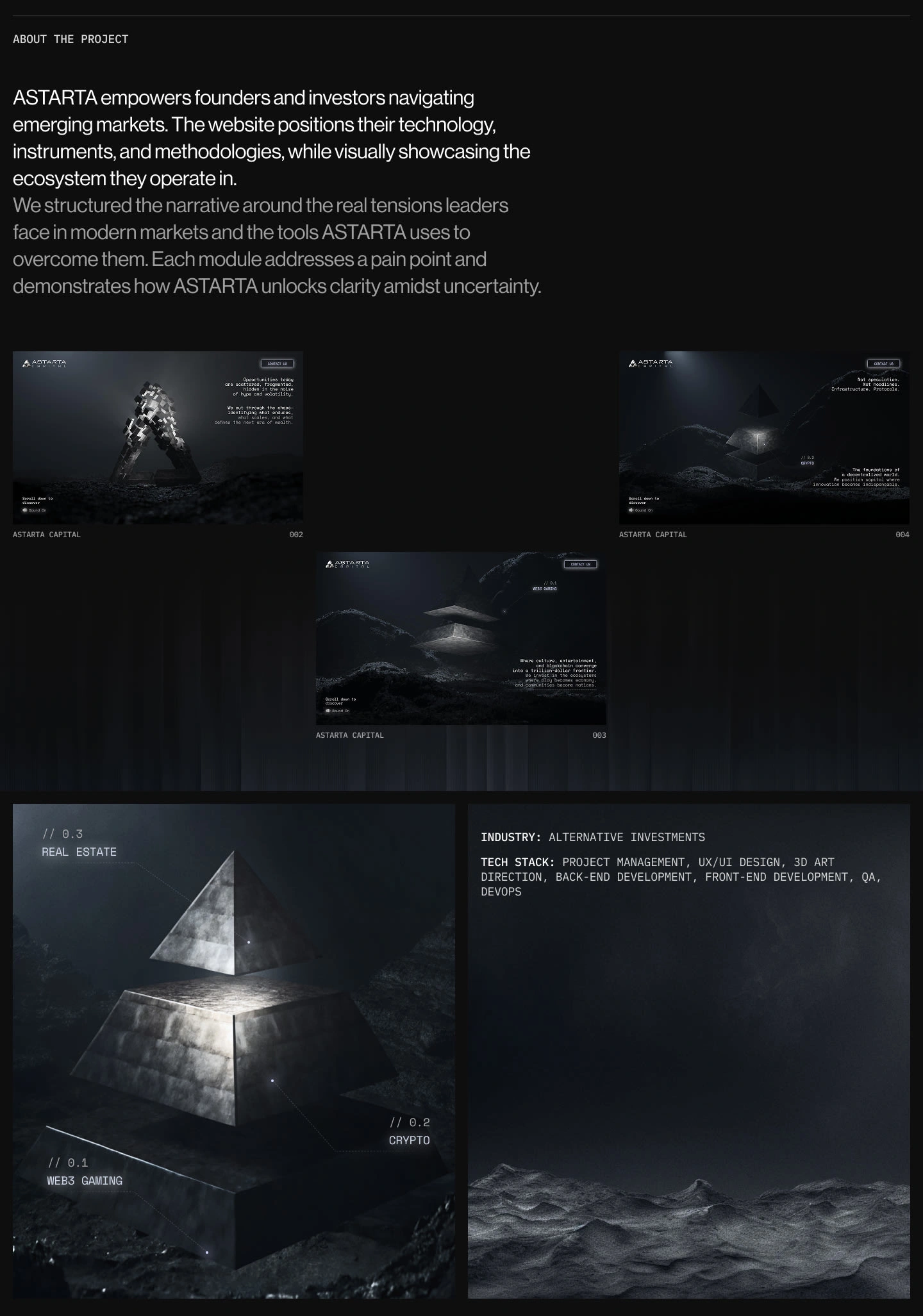
Design & Experience Highlights
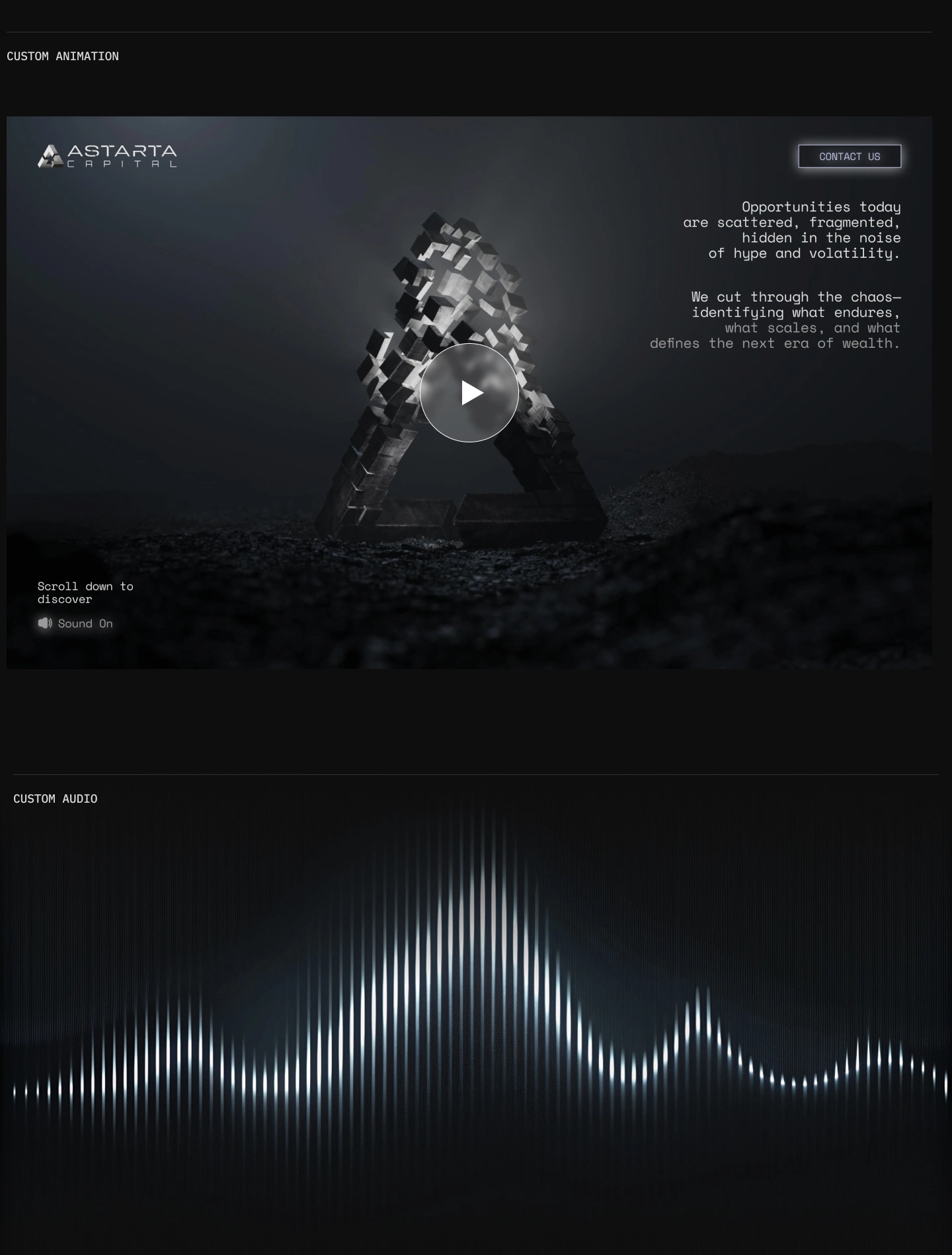
Cinematic hero section with custom 3D animation
Minimal, high-impact copy that prioritizes clarity over volume
Carefully paced scroll narrative that builds confidence, not noise
Custom sound design to deepen immersion without overwhelming
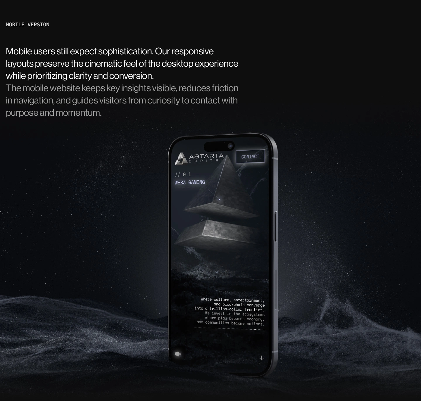
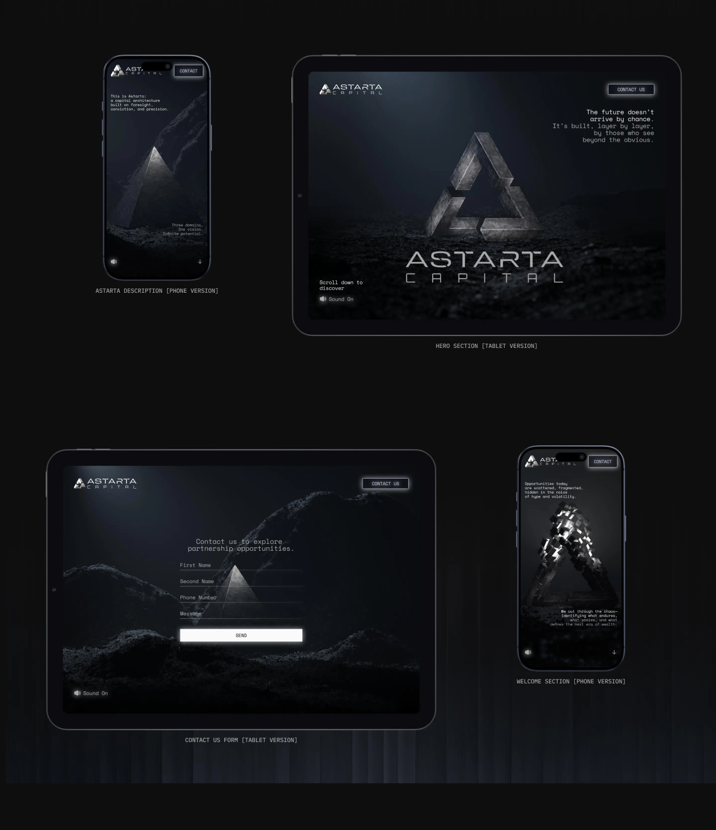
Fully responsive layouts that preserve sophistication on mobile
Mobile was treated as a first-class experience. The design maintains its weight and atmosphere while guiding users smoothly from curiosity to contact.
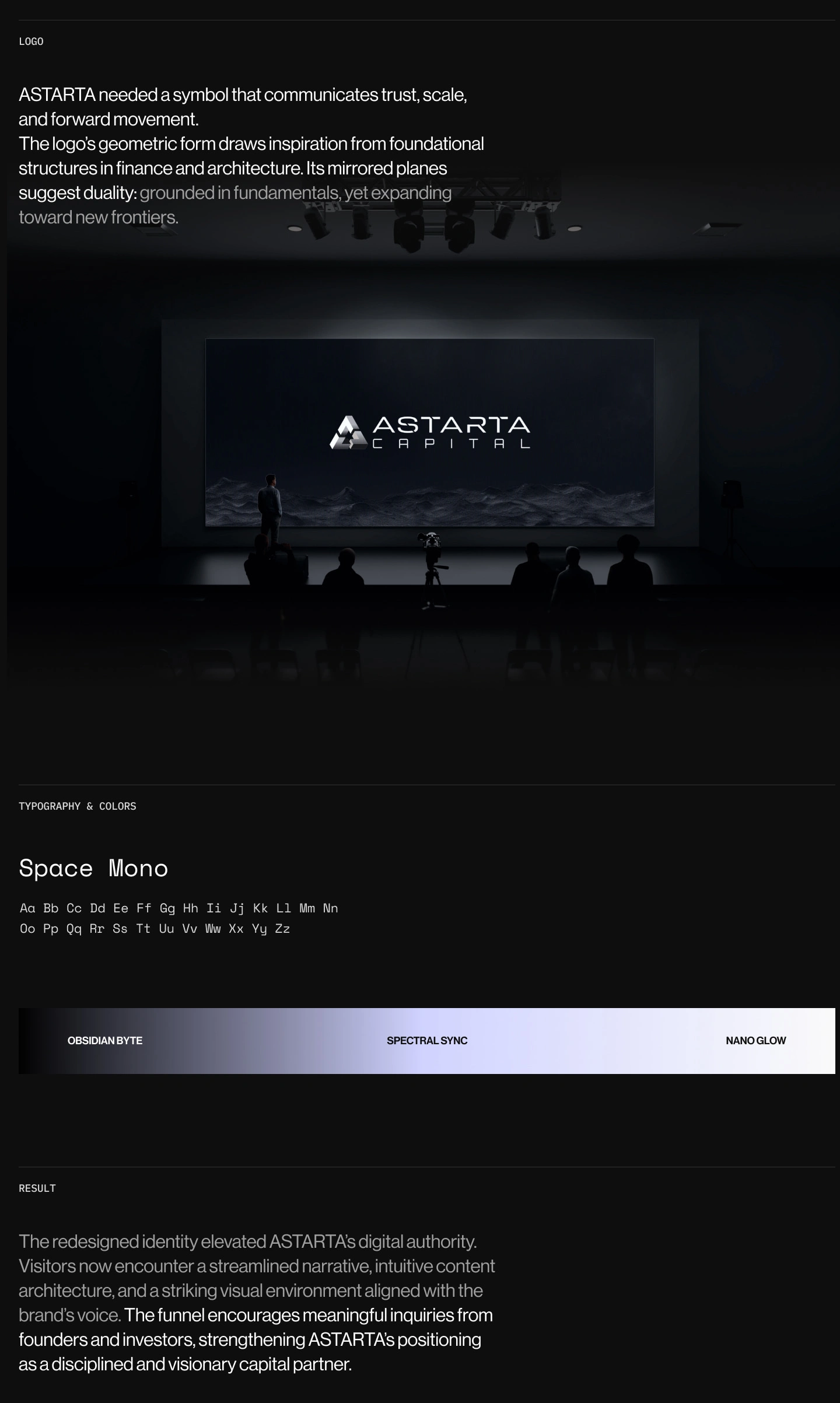
Brand & Identity
The logo was designed as a geometric symbol of trust, structure, and forward motion. Inspired by foundational forms in architecture and finance, its mirrored planes suggest duality: grounded fundamentals paired with expansion into new frontiers.
Typography and color choices reinforce this tone. A restrained mono typeface paired with a dark, mineral-inspired palette creates a sense of permanence, focus, and authority.
The Result
The final product is a landing experience that feels composed, disciplined, and intentional. It positions Astarta Capital as a serious, forward-looking partner rather than a loud participant in the investment space.
The redesigned identity and website strengthen digital authority, improve narrative clarity, and create a strong foundation for future expansion across new markets, products, and platforms.
Like this project
Posted Jan 26, 2026
Astarta Capital is a cinematic, high-authority landing experience that combines disciplined branding, custom 3D visuals, and restrained storytelling
Likes
1
Views
13