PAVE - Brand Idenity

ENG SOON TAN


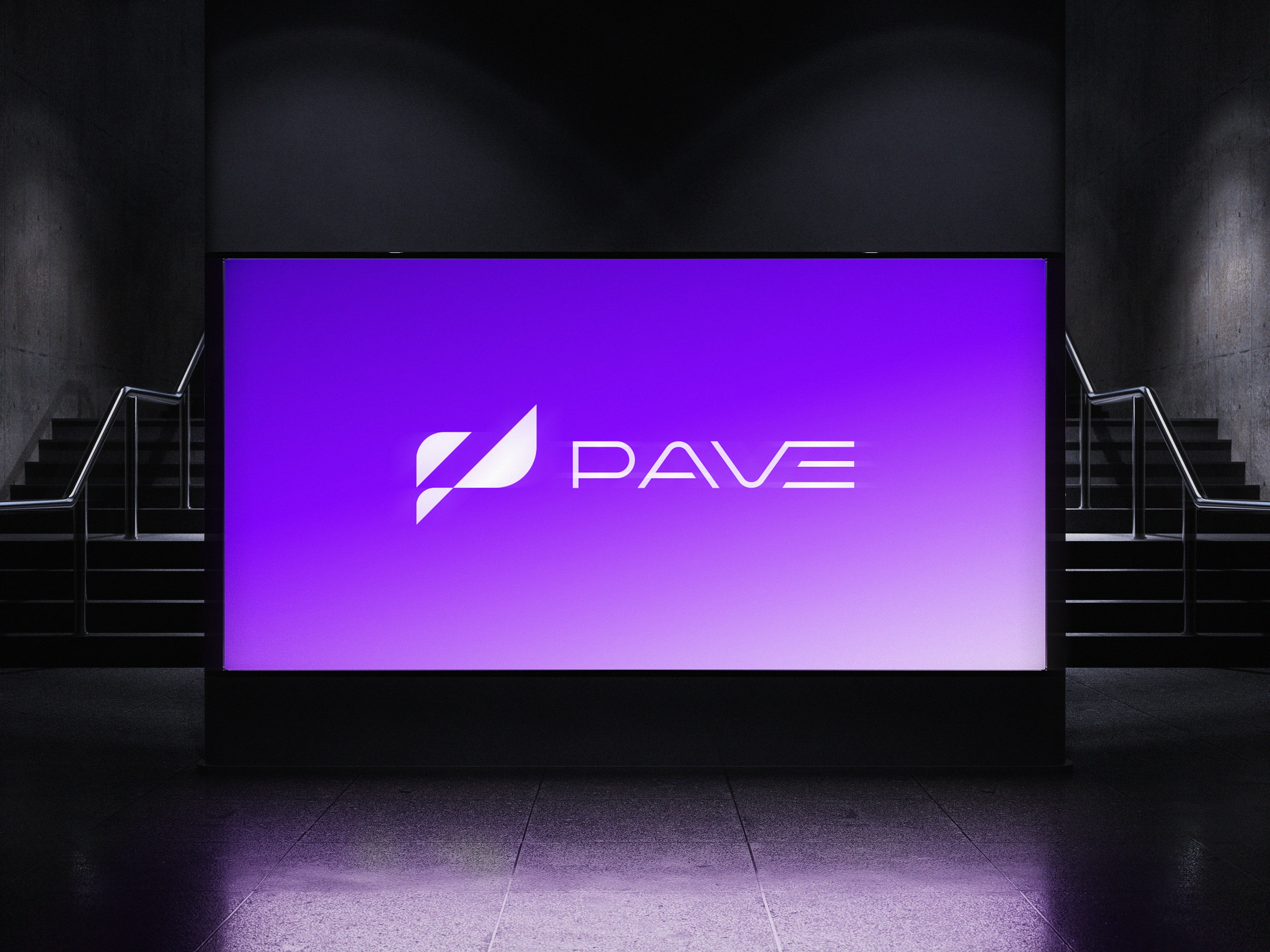
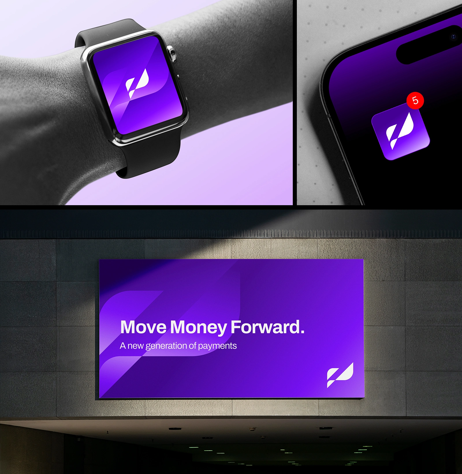
PAVE — Payments that move with you.
A modern digital payment platform designed to make everyday payments, transfers and shared expenses feel effortless.
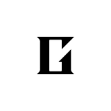
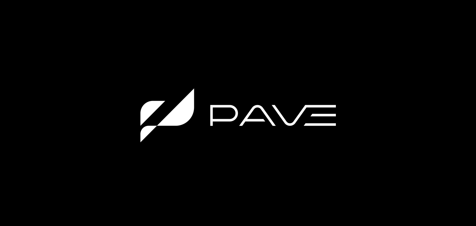
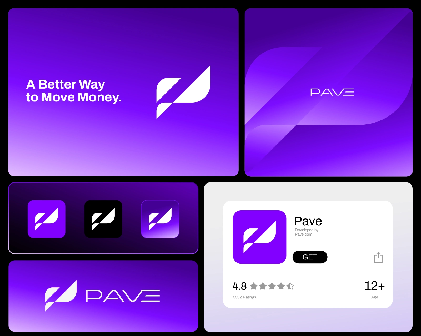
Creating a path / moving forward, while the P mark can become a visual representation of two payment flows intersecting.
Industry: Fintech / Digital Payments
Product: Mobile payment & digital wallet app
Personality: Confident, progressive, simple, trustworthy
Positioning: Modern alternative to traditional banking/payment experiences

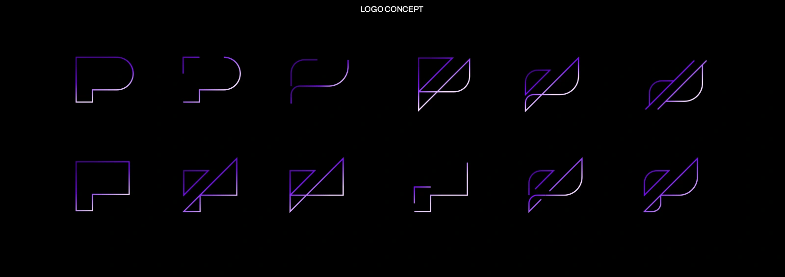
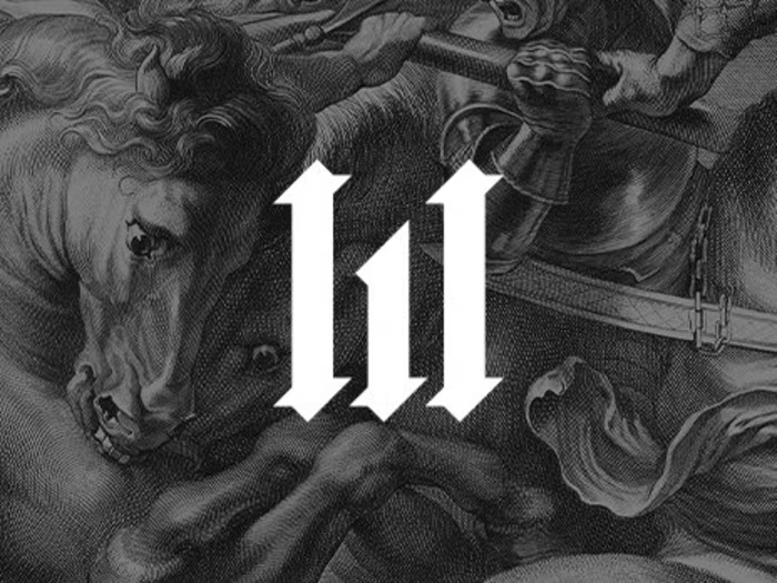
The P mark represents movement and connection within a financial ecosystem. Two directional forms intersect to create a continuous path, symbolizing money moving seamlessly between people, businesses and platforms.
P → Path → Payment → Progress
Thanks for viewing!
Gridmason - Brand identity and visual design studio.
╔╗→ Brand built with structure
╚╝→ Available for commission
Instagram
©2026 GRIDMASON
Like this project
Posted Aug 31, 2026
Designed PAVE, a digital payment platform with a unique visual identity for seamless financial transactions.
Likes
0
Views
1
Clients
PAVE