Enhancing User Experience For An Online Grocery Store
About Mercadona
Mercadona is a Spanish family-owned supermarket chain.
About the project
I redesigned the user interface to deliver maximum usability as well as accessibility to the users.
Main identified problems
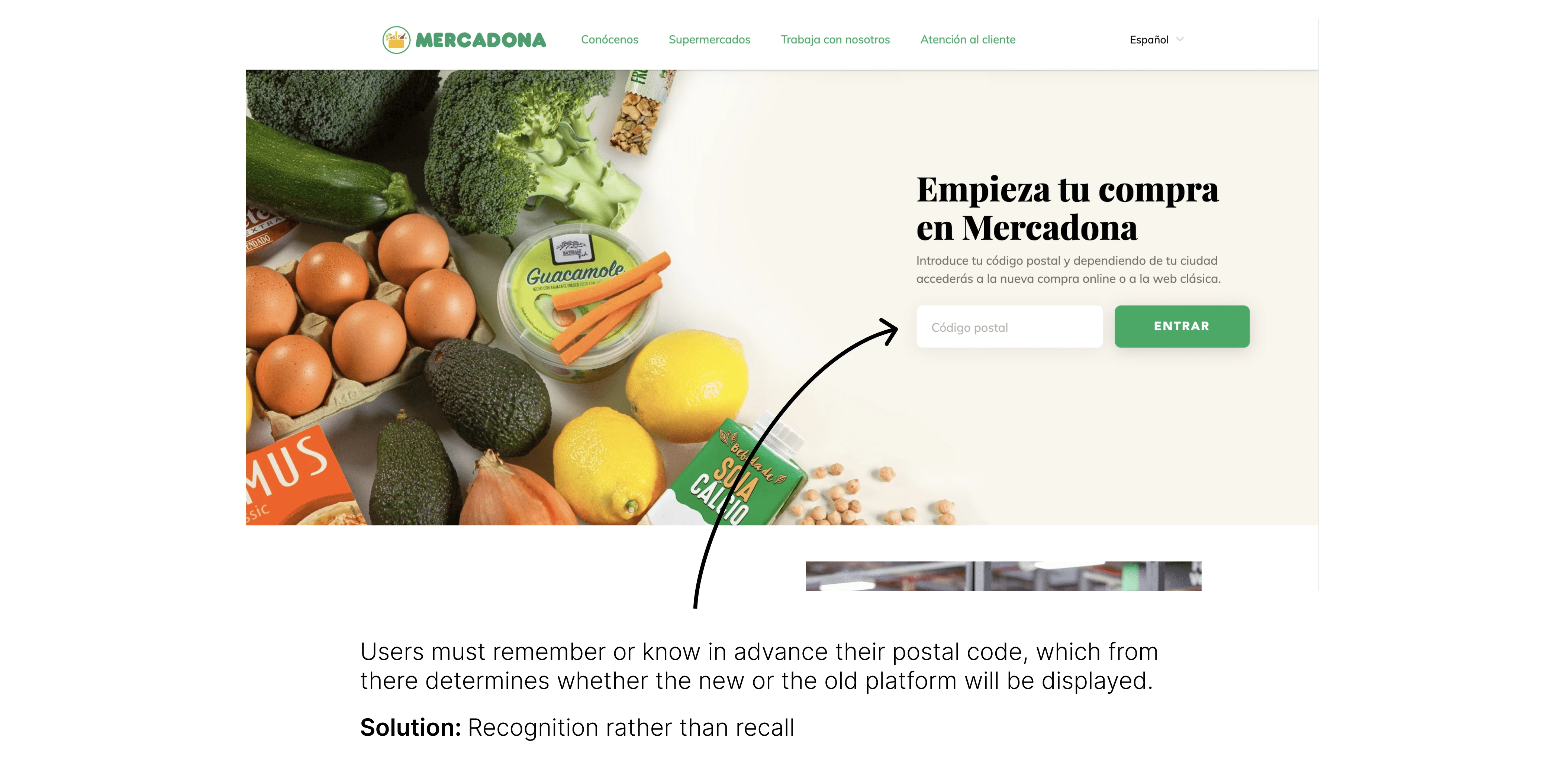
Users are required to enter their postal code or register as a client within the platform in order to consult the catalog and browse the products.
Lack of integration of the old website with the current one.
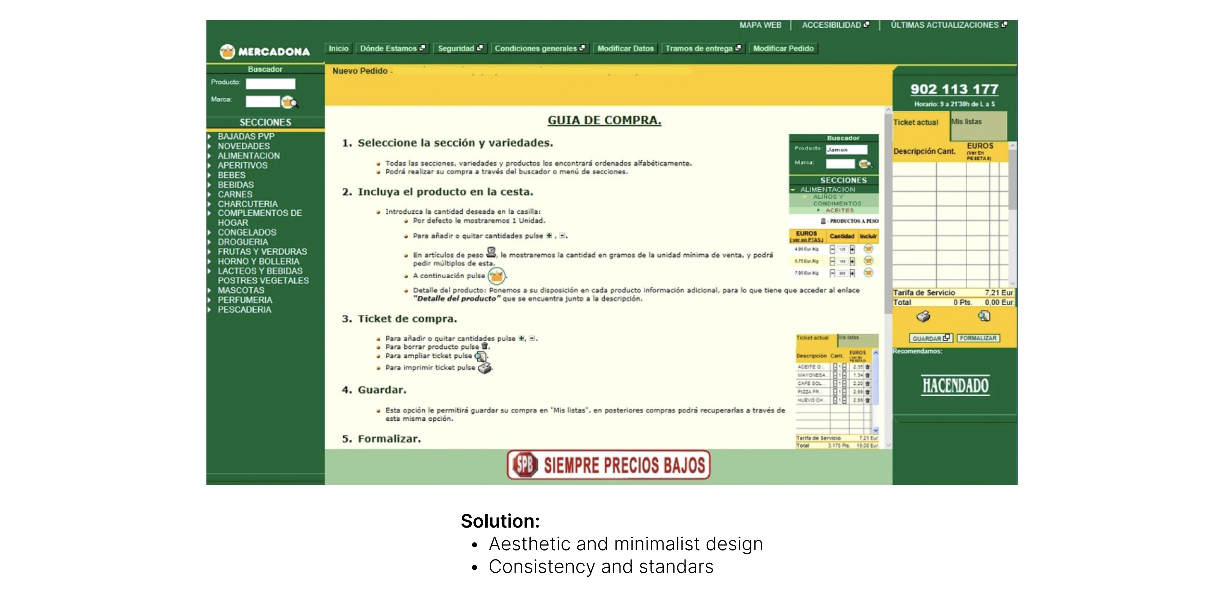
Poor usability on the old website, difficulty in finding and identifying the products.
Platform once logged-in
Confusing and archaic navigation.
There are too many elements and little understanding of what the main functions would be or where the user should give direct attention.
An explanation of how to make your purchase on something that should already be understood by itself without the need for a guide is a sign that the platform by itself is complicated to use.
Although you can see the products section, we still do not see images or the direct or general catalog of the products.
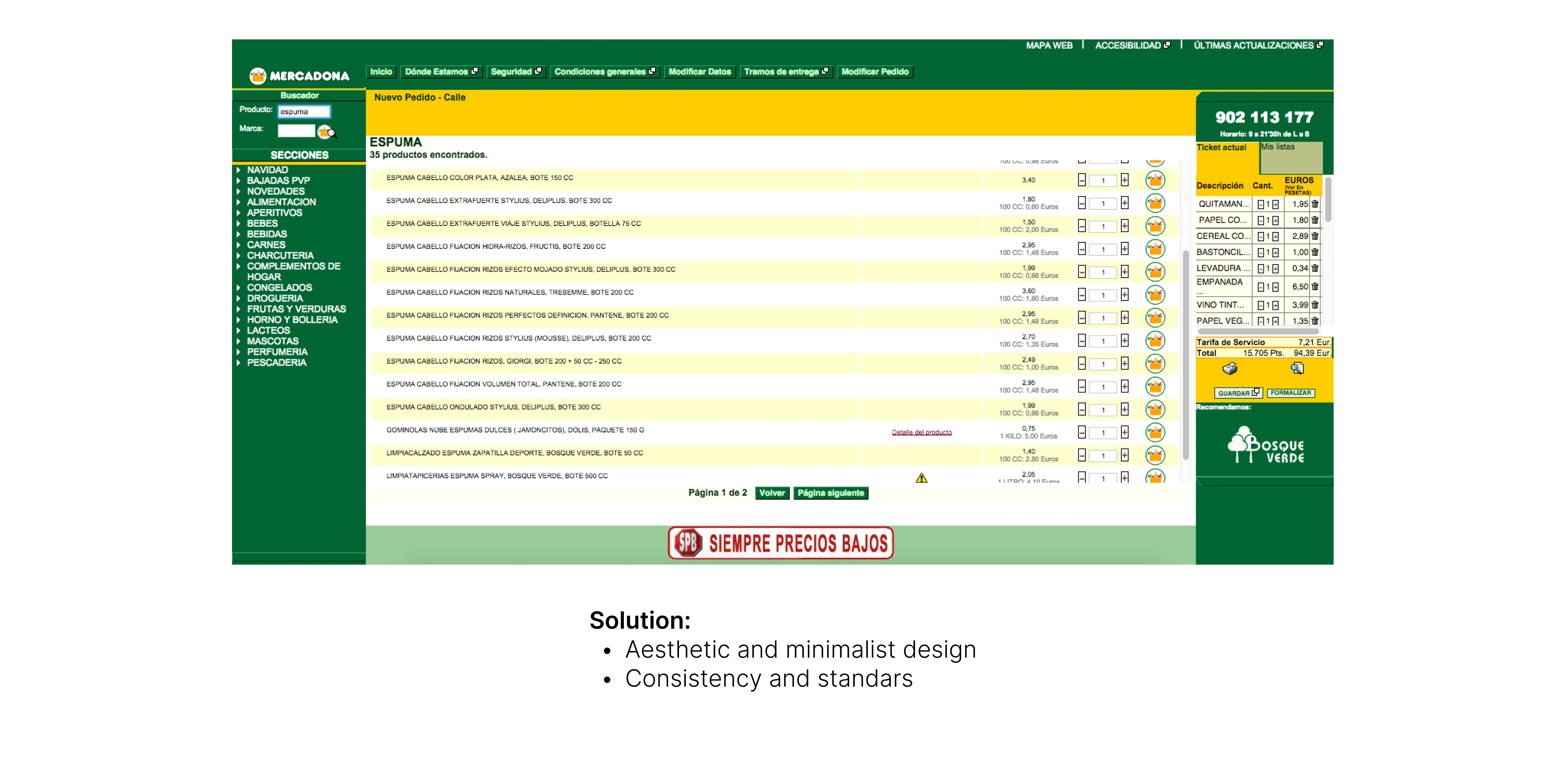
Old Platform
There is little hierarchy in the texts.
Not all articles have a description.
There are no pictures of the product.
How do I know if I am choosing the correct product?
Confusing iconography.
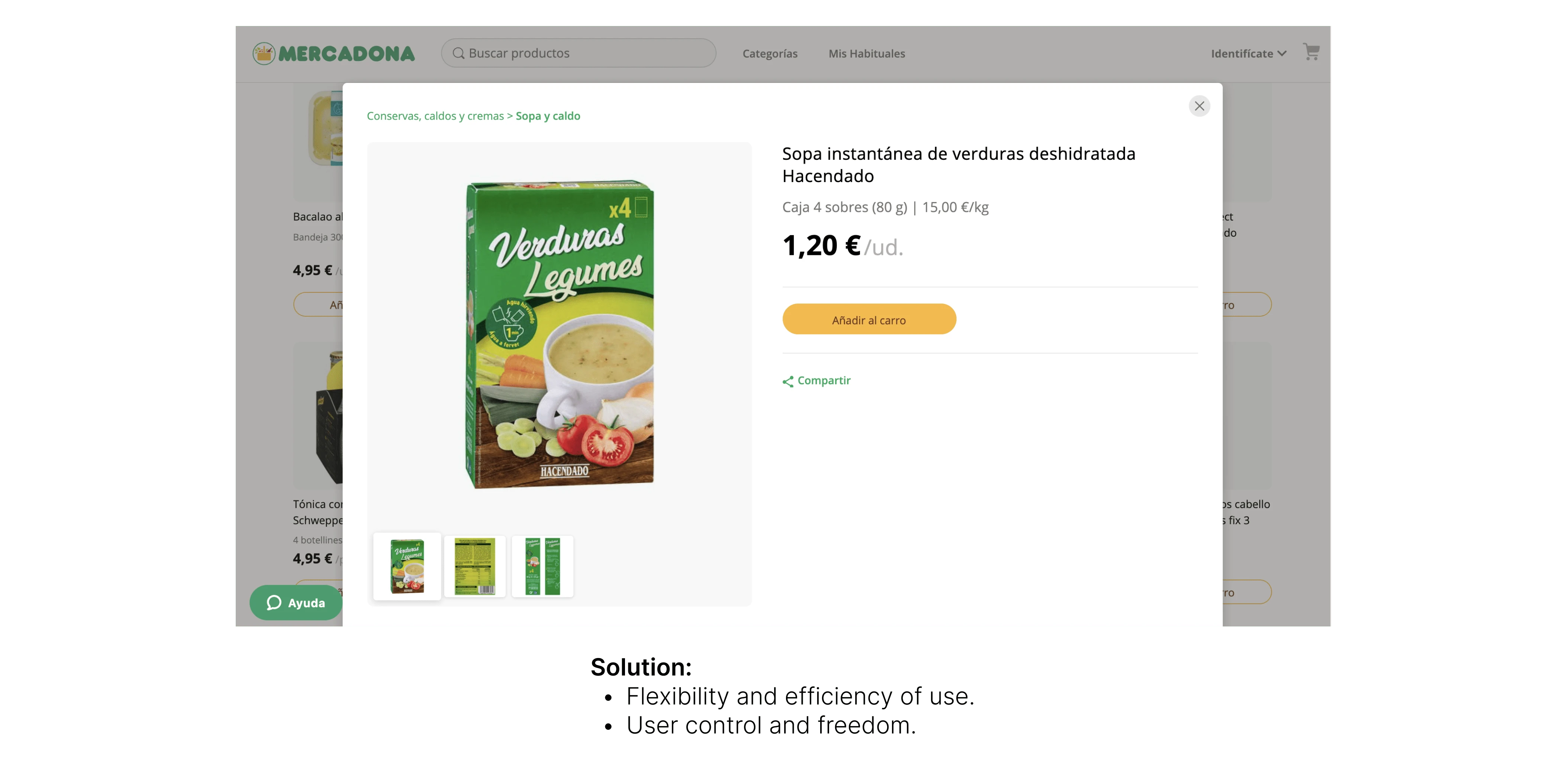
Current Platform
Lack of product description and although it has a picture of the product, it is better to provide a brief description of the selected product.
There is no possibility of adding more than one item to the cart.
There are no evaluations or comments by customers about the products.
Objectives for the redesign
Help users enter the Mercadona platform quickly and easily.
Ensure that users can make their purchases online in a few simple steps, without complications.
Help users know if the products they plan to purchase have good comments from other users.
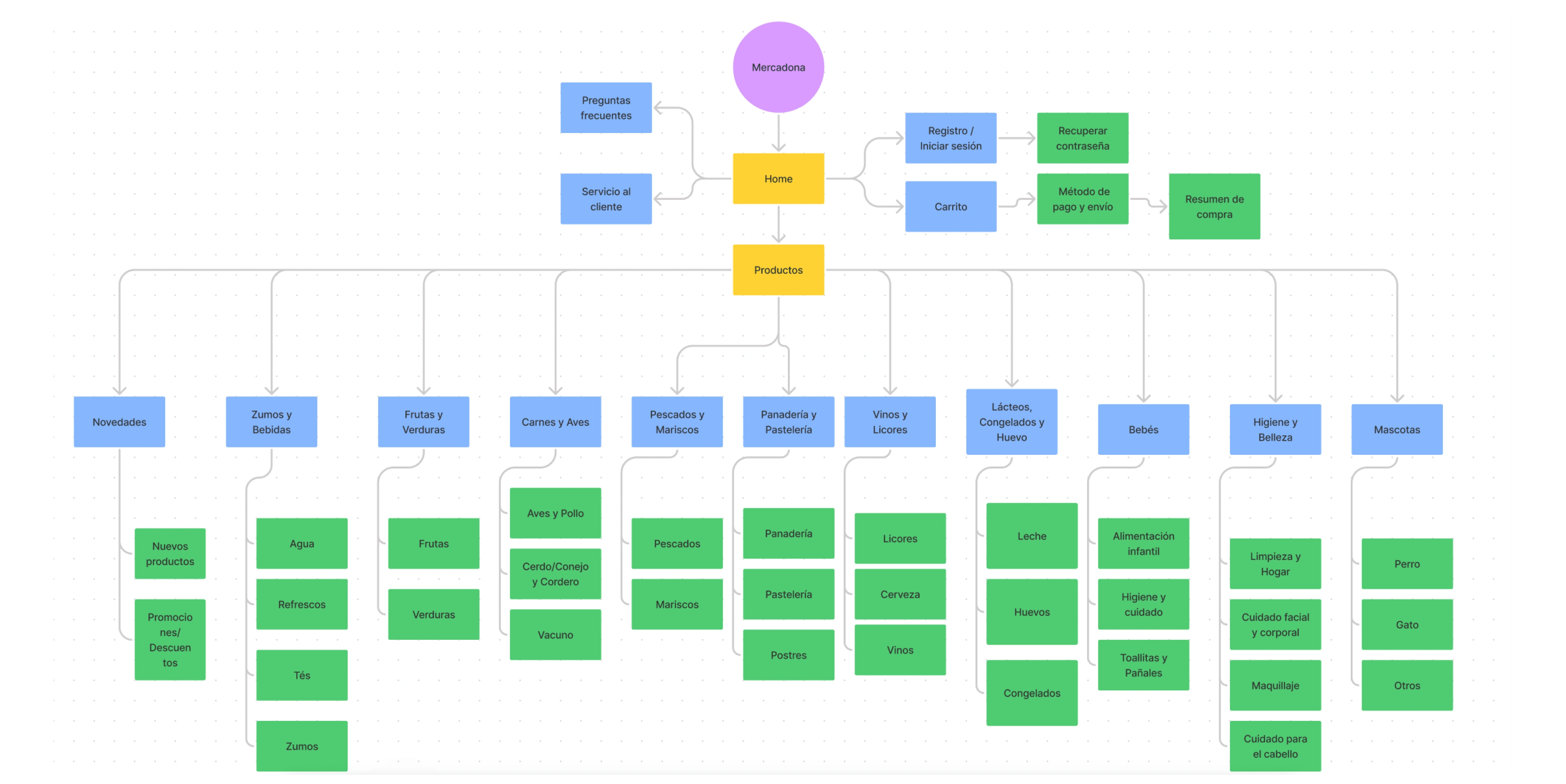
Navigation
Solution
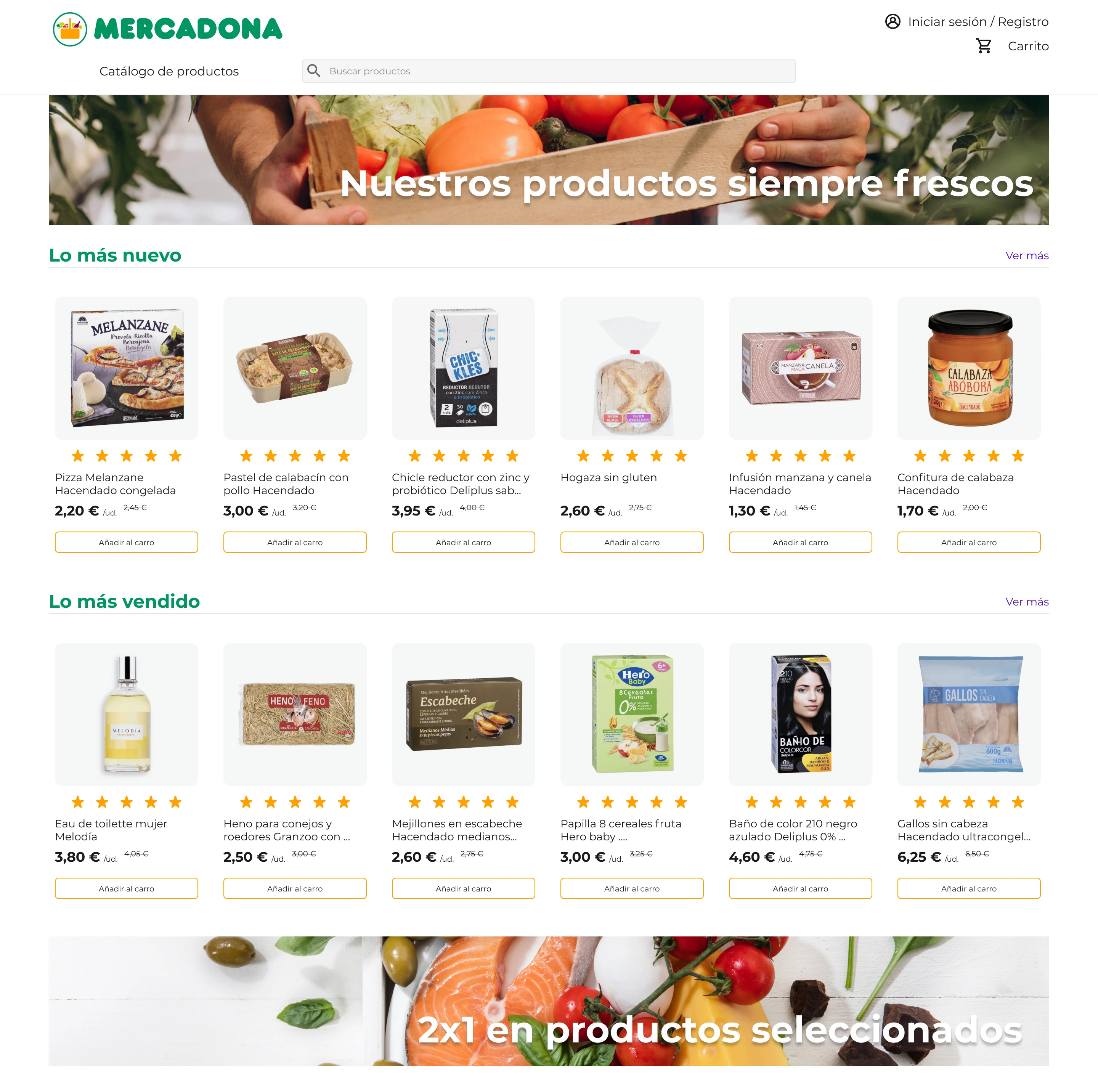
Product Listing Page
Before, users had to type their postal code in order to look at the products of Mercadona.
Now, once you enter Mercadona's site, you can see the catalog of products without the need to type a postal code or log in.
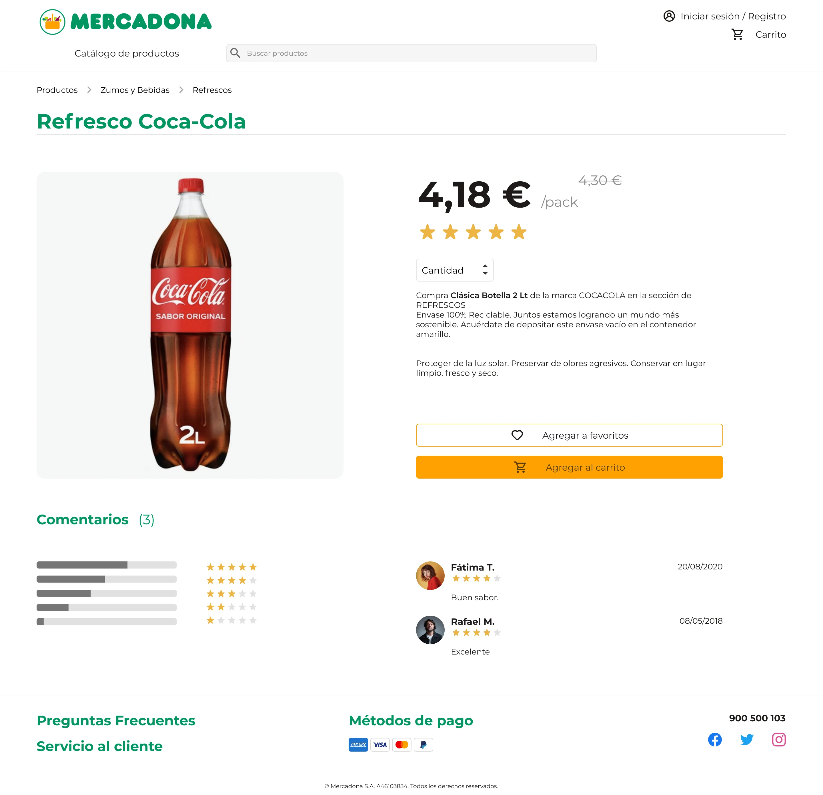
Product Detail Page
Removed modals from their current website and added a full page to look more in detail at a particular product.
Users can add more than one item to their carts and even save it as a favorite for future purchases.
Users can now leave comments and rate the products that they have previously bought.
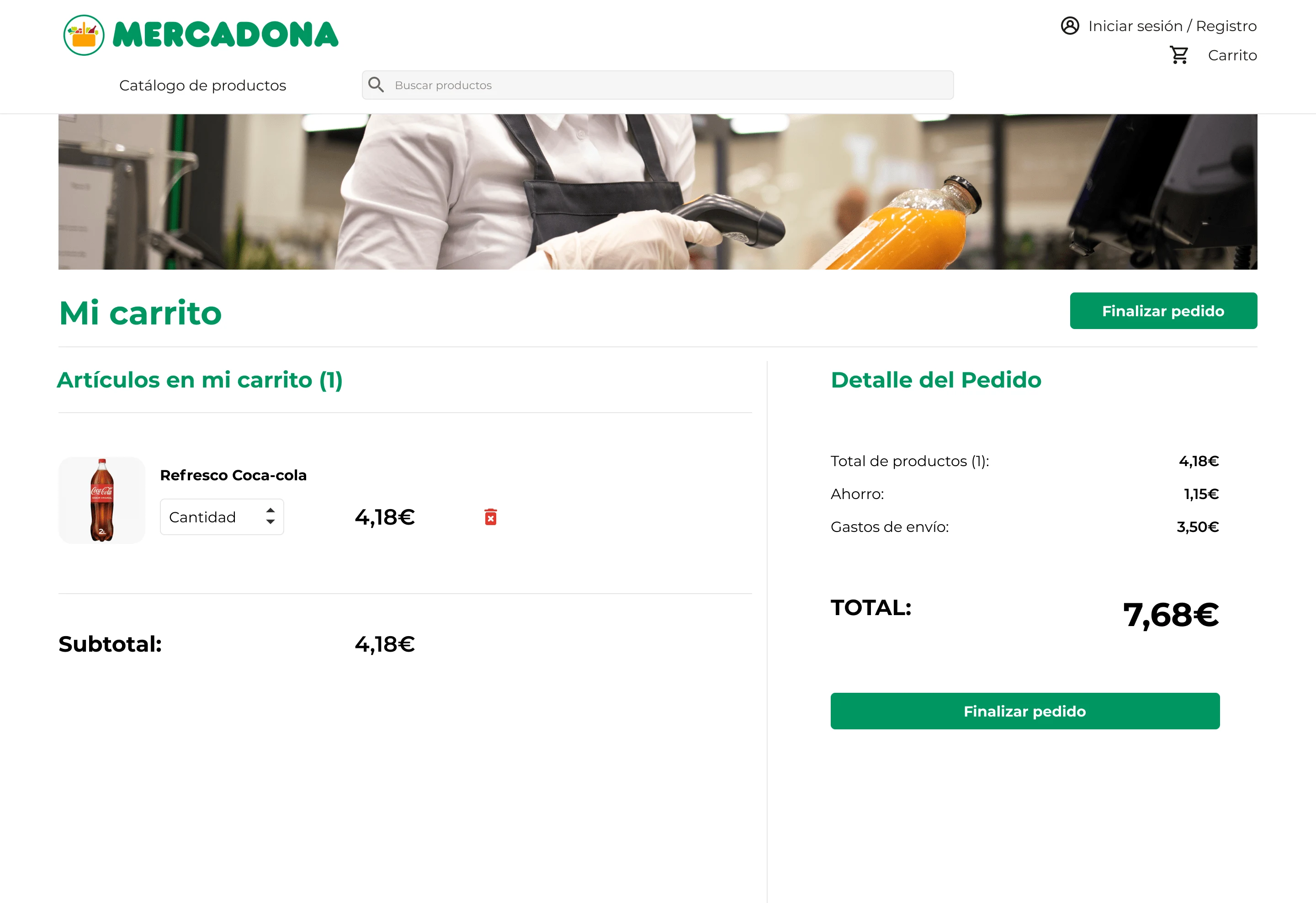
Checkout Page
Before checking out, users can look at a summary of the products that they have added to their carts.
They can add quantity or remove products.
Like this project
Posted Apr 29, 2024
Transforming Mercadona's Digital Presence for Seamless Shopping and Enhanced User Control
Likes
0
Views
2


