Building Vo 2.0
Vo is the name the design team gave to our design system. It was derived from Voyance.
Vo is the name the design team gave to our design system. It was derived from Voyance.
I joined Voyance in September 2020 as a product designer, and there was no existing design system then.
Vo 1.0
There were two core products when I joined, and because there was no design system, we were all working in silos. The designers handling different features or even products would decide what size of buttons to use for their projects or what shades of blue to use; everything was inconsistent - typography, colours, alerts and modals. The logo was the only consistent thing, but its size and position across different products varied.
These inconsistencies were terrible for the business in the branding sense and also worse for engineering. This meant they had to build new components each time a designer came up with a new one without checking if it already existed on another product.
It was a mess. There was a severe user experience inconsistency across the different platforms and products.
The head of designer and I spent the next couple of months building out Vo 1.0. We created a library and also worked with the frontend department to build these components and make them reusable.
One key thing we discovered, asides from how consistent our product started looking, was the time it took to build our new products. It was easier for designers to reuse existing components without creating new ones and for the front-end developers to use components from their code library.
The design system is not perfect. It is not a destination but a journey. Because of this, we constantly added, removed and edited the design system based on research, feedback and usability.

Why did we need a Vo 2.0?
Months had passed since Vo 1.0, the Head of Design I worked with had left, of which I became the Head of Design. I was working to refine the Design System alongside an Associate Product Designer.
I realised two mistakes we made while creating the first version of our design system.
We did not include the front-end developers during the design phase. We had only handed it over to them to code - this made us come up with components there were not usable in the live product.
We did not include the brand designers and marketing managers - who mostly set the tone for marketing. This made us come up with styles that did not fit well into the existing marketing structure and materials.
Research
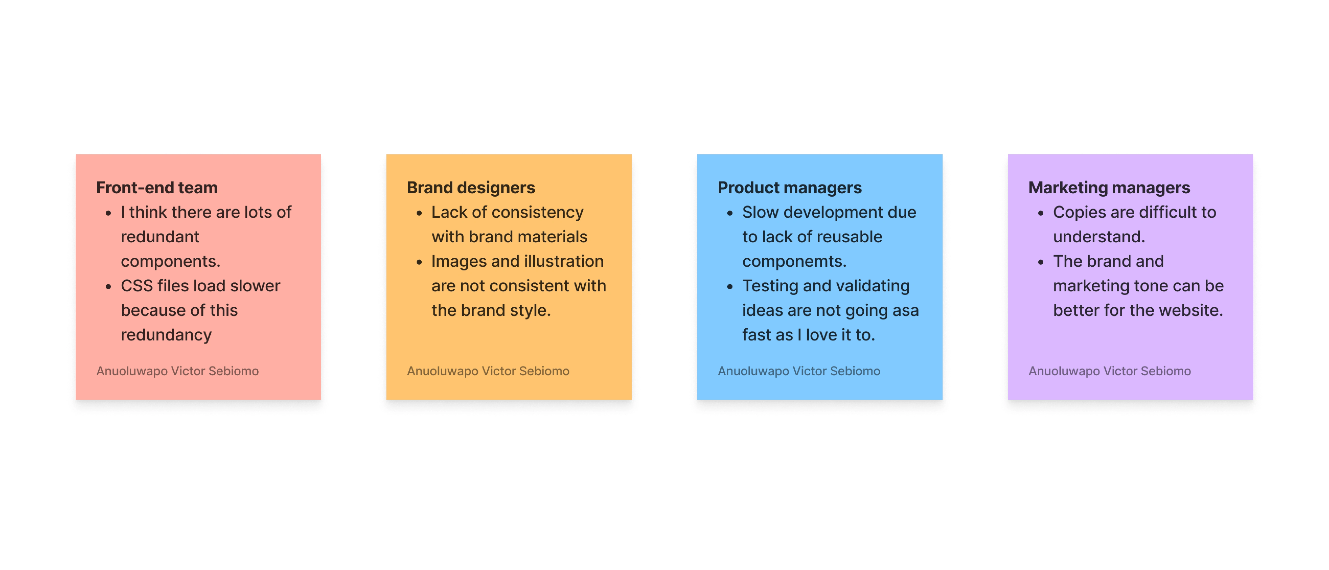
I wanted us to have a Design System that worked for our internal teams and end users. To better understand the problem, I worked with one of our Associate Product Designers - Aderinsola to conduct interviews with our internal teams - frontend developers, brand designers, product managers and marketing managers.
We observed a few common themes across our findings.
Vo 1.0 was inconsistent. Our colours, typography, grid, components, and guidelines. This had terrible effects on the user experience and the brand image. Users cannot trust an inconsistent brand.
Another common theme was that a lot of components were useless. The former head of design and I had just gone ahead to build many components and have our front-end developers code them. This made our CSS file heavy, affecting our loading speed and time.
The goal
After analysing the results of our research, we all agreed that we wanted to make Vo 2.0 more consistent and remove components that were not useful.
Our high-level goals were to:
Create a structured and guided way to build our products.
Speed up our design and development processes using ready-to-use components from the design system and code library.
Improve consistency with our users, so we can quickly gain their trust.
Create continuity for future hires if our designers or engineers leave.
Building a design system would always be a work in progress. All teams must dedicate themselves to continually refining and making updates to make this happen. This required a lot of planning, but we knew it was worth it long term.
The Process
Figma is the design tool used at Voyance. Its design system feature makes it easy for the design and engineering teams to collaborate. This was a huge time saver.
However, a considerable challenge was that the new components did not fit with the existing design in some places. This required us to go through each design to ensure that there were no odd-looking pages and to redesign anyone we found.
We employed an atomic approach, meaning components were built on top of each other so that changes to the smallest and most fundamental unit affect the larger members.
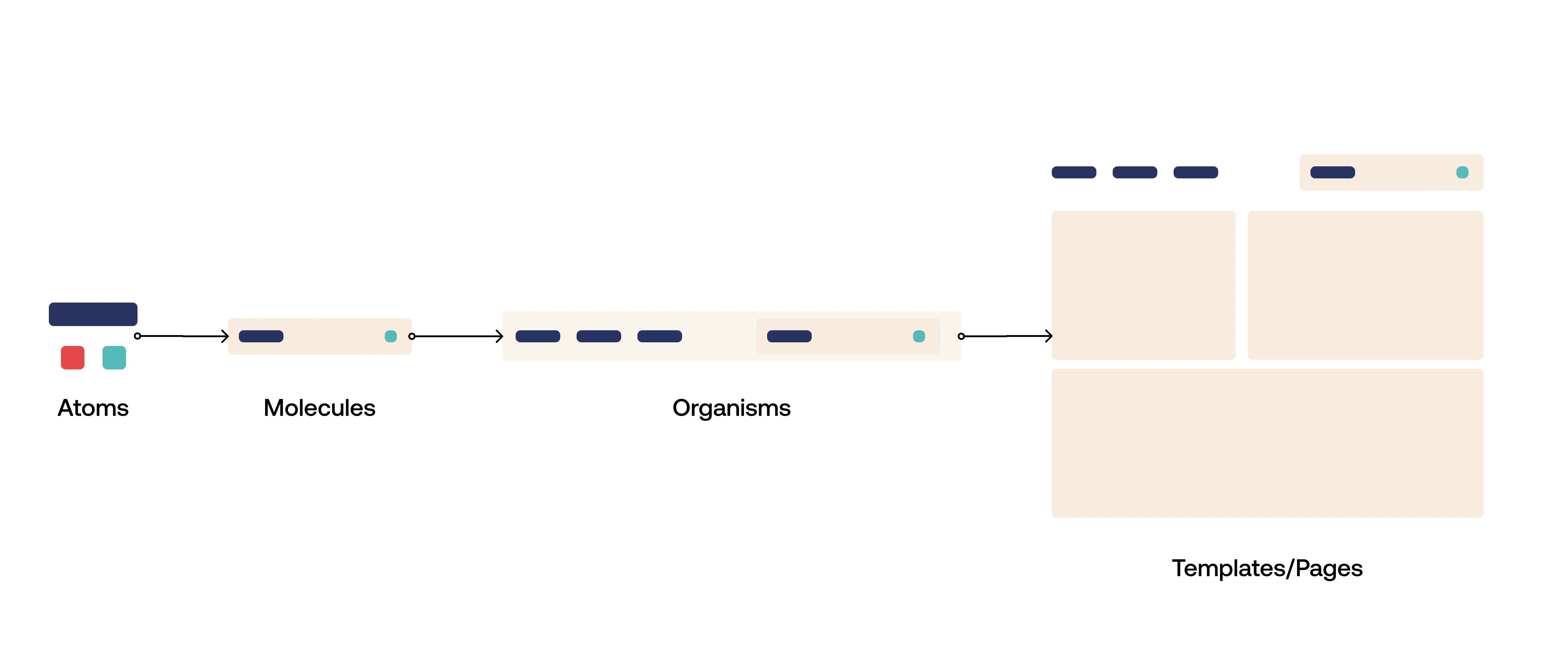
Atomic design is a methodology composed of five distinct stages working together to create more deliberately and hierarchically. The five stages of atomic design are:
Atoms
Molecules
Organisms
Templates
Pages
UI Audit and Inventory
We began to audit our existing design system. We wanted to understand what aspects of our design systems needed to be updated or overhauled. This involved two designers, two front-end engineers, and a few marketing designers. We divided into two groups: one team would audit the existing design system, while the other would create an inventory of patterns and components used across all products.
We began by going through each product to identify the patterns used by all products in the company. We then categorised these patterns into components based on how they were used across all products. These categories included: colour palettes, typefaces and font families, layout grids, typography styles and sizes, image assets (such as photos), and graphic elements (such as illustrations).
With this inventory in hand, we reviewed each product to see if there was anything else worth considering for improving or updating—such as creating a new pattern or component from scratch.
Working in a distributed team is not an easy task. However, with the help of Notion, we were able to make it easier and more productive for everyone involved.
We were able to share files, set up meetings and keep track of progress throughout the project. We could also easily collaborate with other team members from across the globe!
Presenting to the bigger team
We had an apparent goal when redesigning our design system: get everyone on board. We wanted to ensure that everyone understood the reasons for the redesign and how it would benefit their workflows and processes.
I took a step back and allowed the associate designer who had worked with me to make a company-wide presentation. We also ensured that we gave a progress report at the end of each month. This allowed teams to be updated on the changes that had been made.
By involving other teams from the start, we strived to promote understanding and inspire a sense of co-ownership throughout the process.
As expected, the engineering team were worried about the workload of rebuilding existing products with the new features, but we assured them that we would move at their pace and would not bombard them with so many tasks at once.
We began by breaking each feature into a task list and assigning them to different team members. We also decided to limit each team member's role to ensure they felt they had enough input and autonomy.
As part of this process, we discussed how we wanted to approach each task and what kind of feedback we'd be looking for from our engineers. This ensured that everyone understood their responsibilities and goals before starting work on any given feature.
Curating our colour system
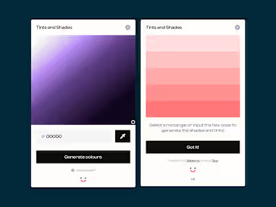
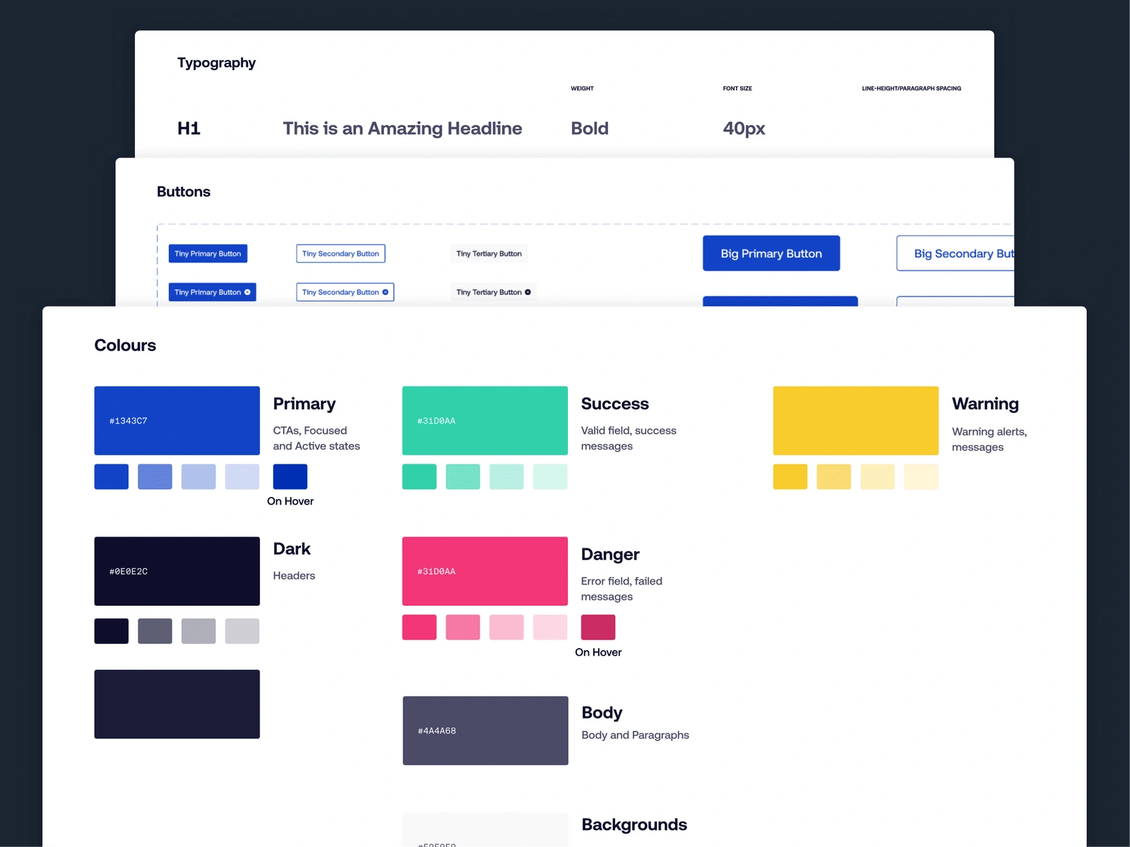
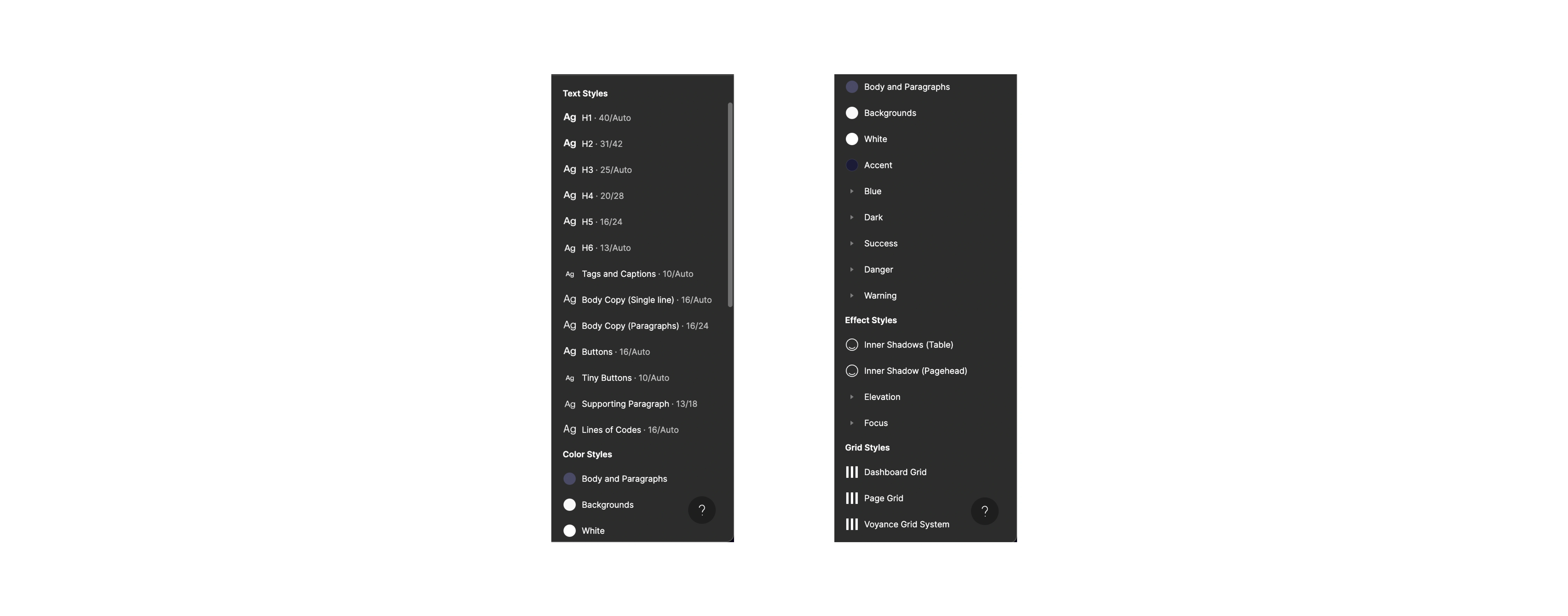
We observed that the current design system had a lot of colours, and the availability of so many options made it difficult to be consistent. A designer would use Blue-700 and 800 interchangeably just because they looked similar. We reduced the variations of colours from 9 to a maximum of 5. We added new variations if we needed to.
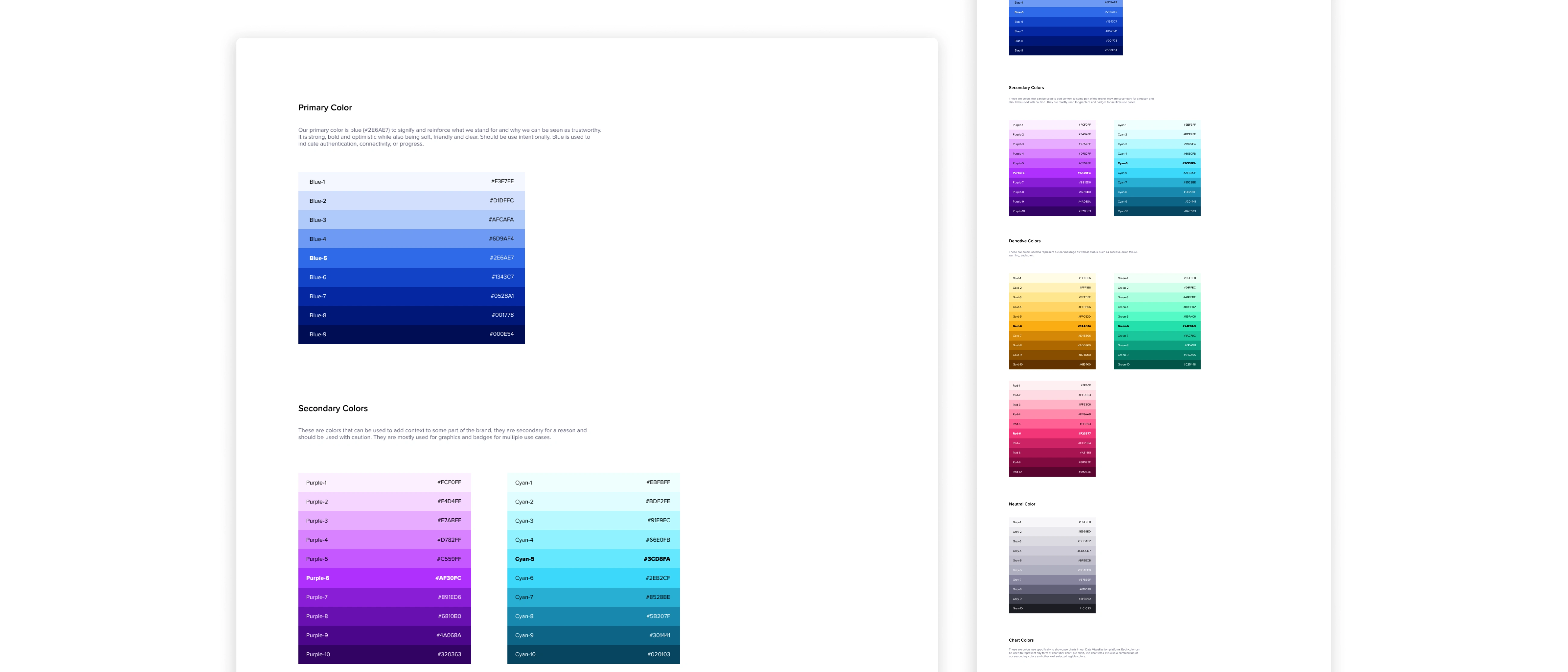
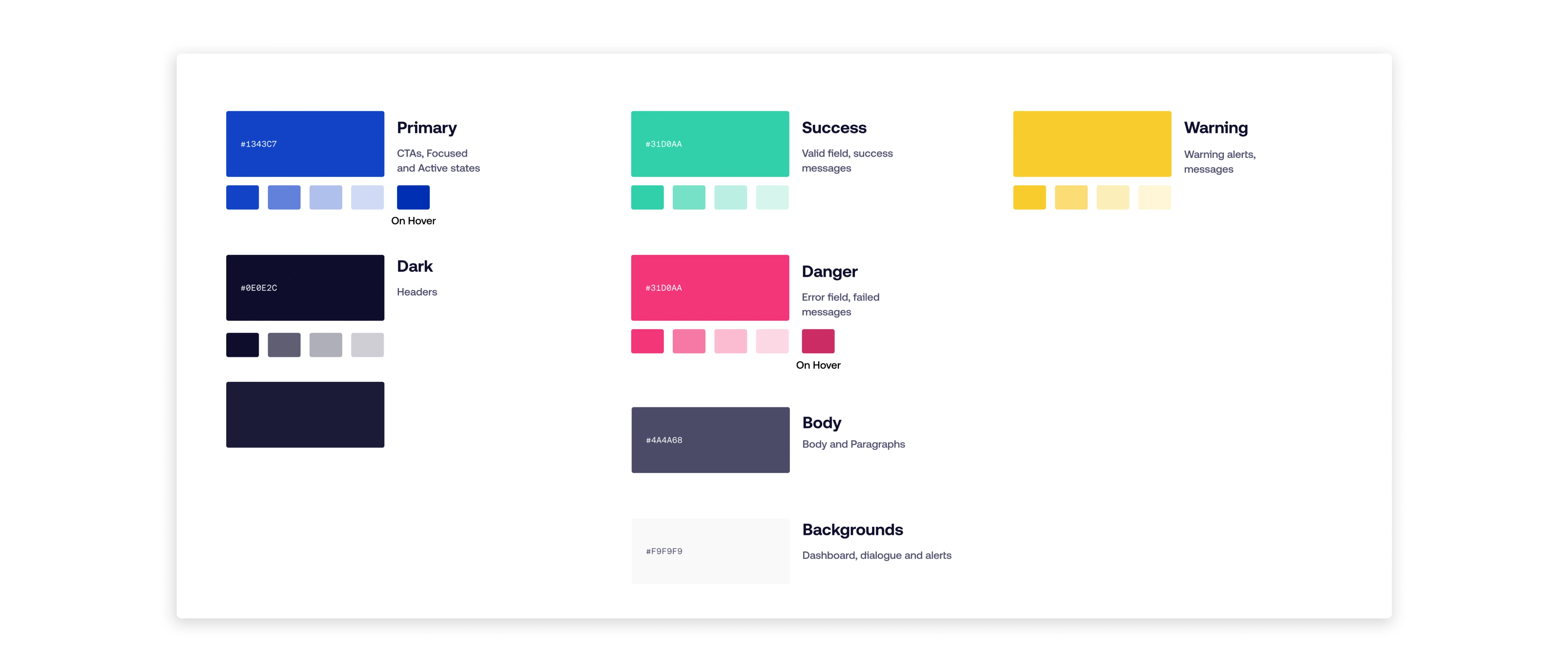
Our initial design was poor in contrast. This made some text unreadable, especially for smaller texts. We needed to improve on this.
We evaluated the combination of text and background colours using WCA guidelines. Higher contrast makes texts more legible and helps create a more robust visual hierarchy. We also improved colour accessibility so users who have difficulties with specific colours can use our products much more easily.
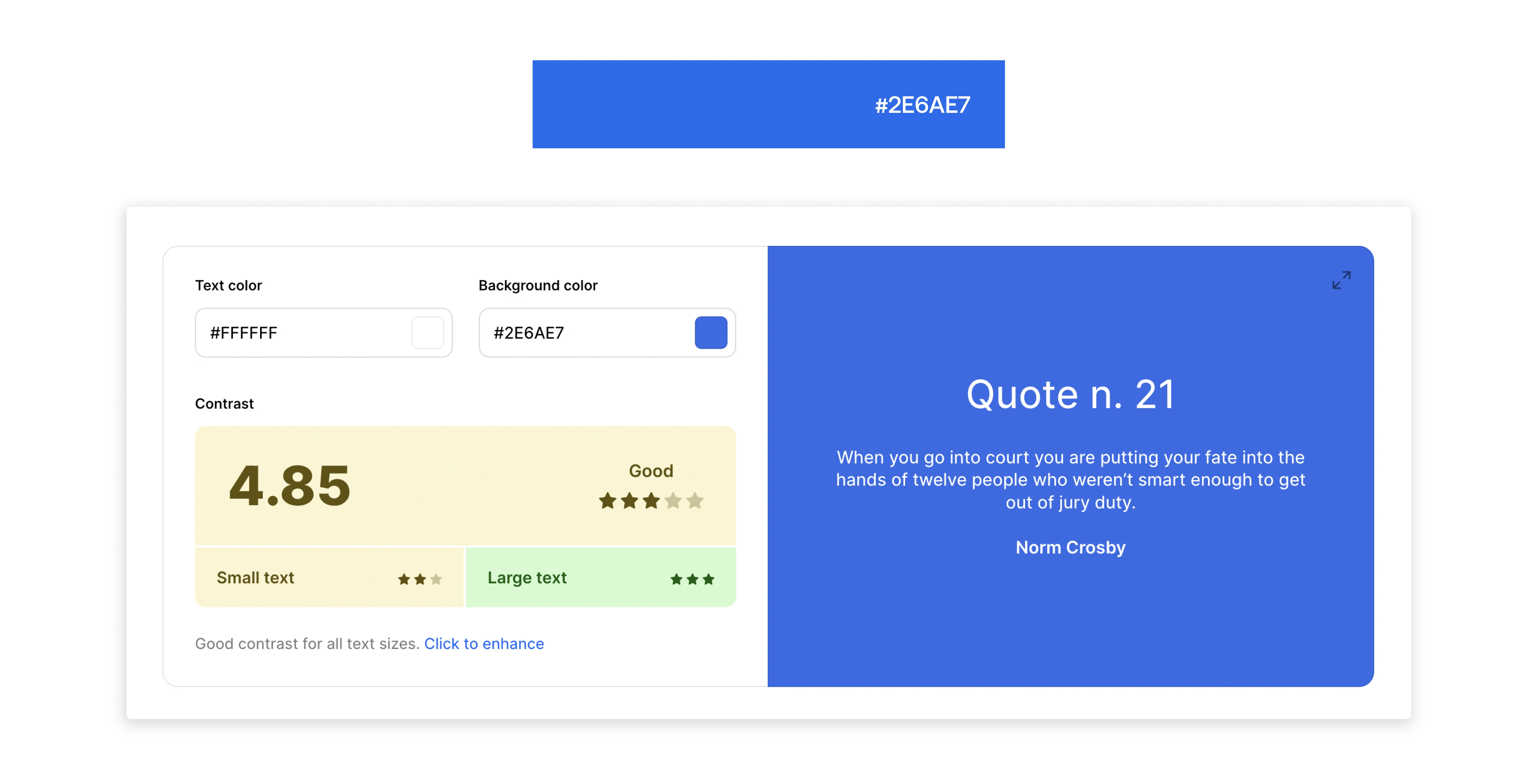
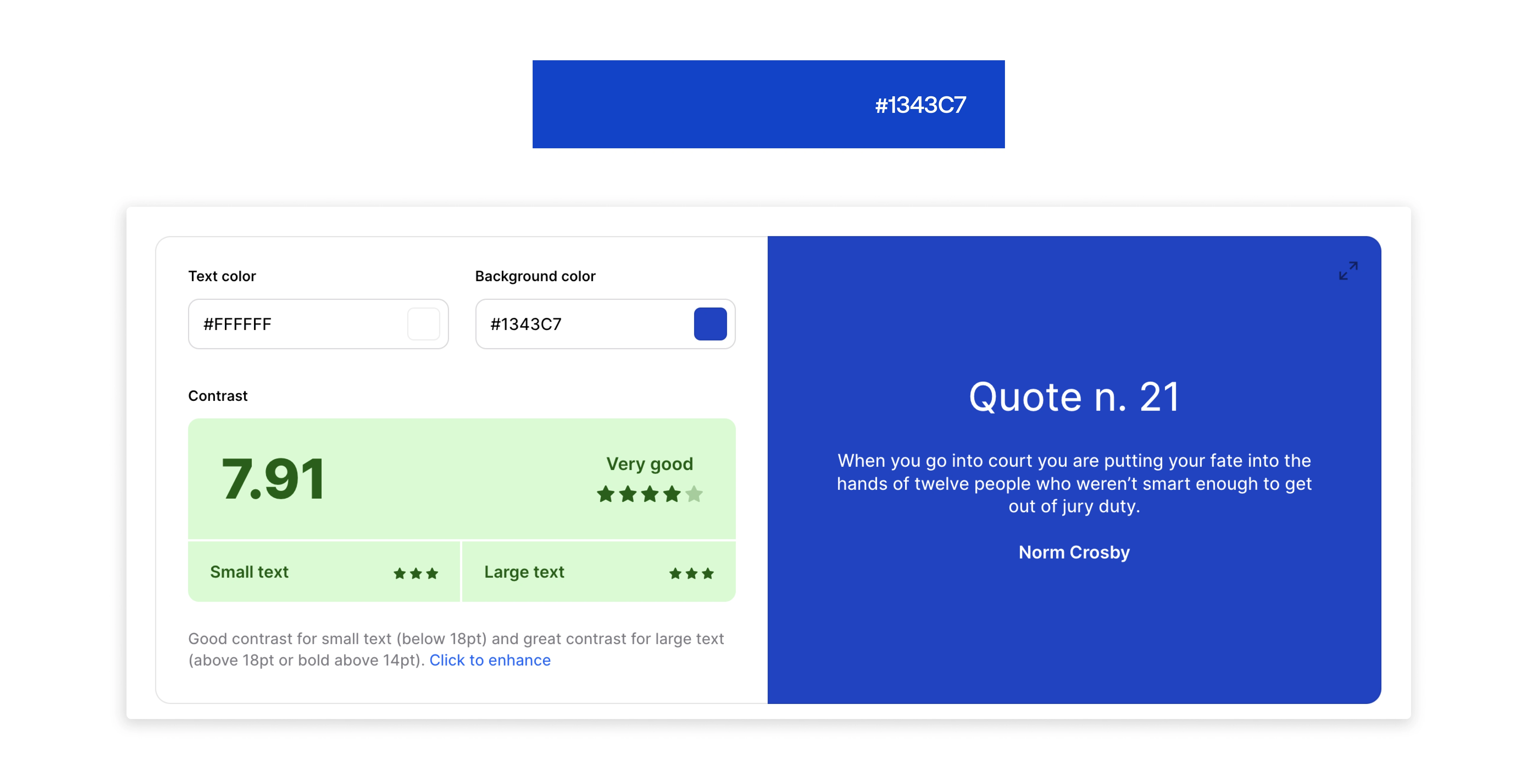
We also covered all states - hover, focus, active, error and disabled.
Working with our brand designers also helped to ensure that the new colours aligned with what they could work it.
Improving the typography
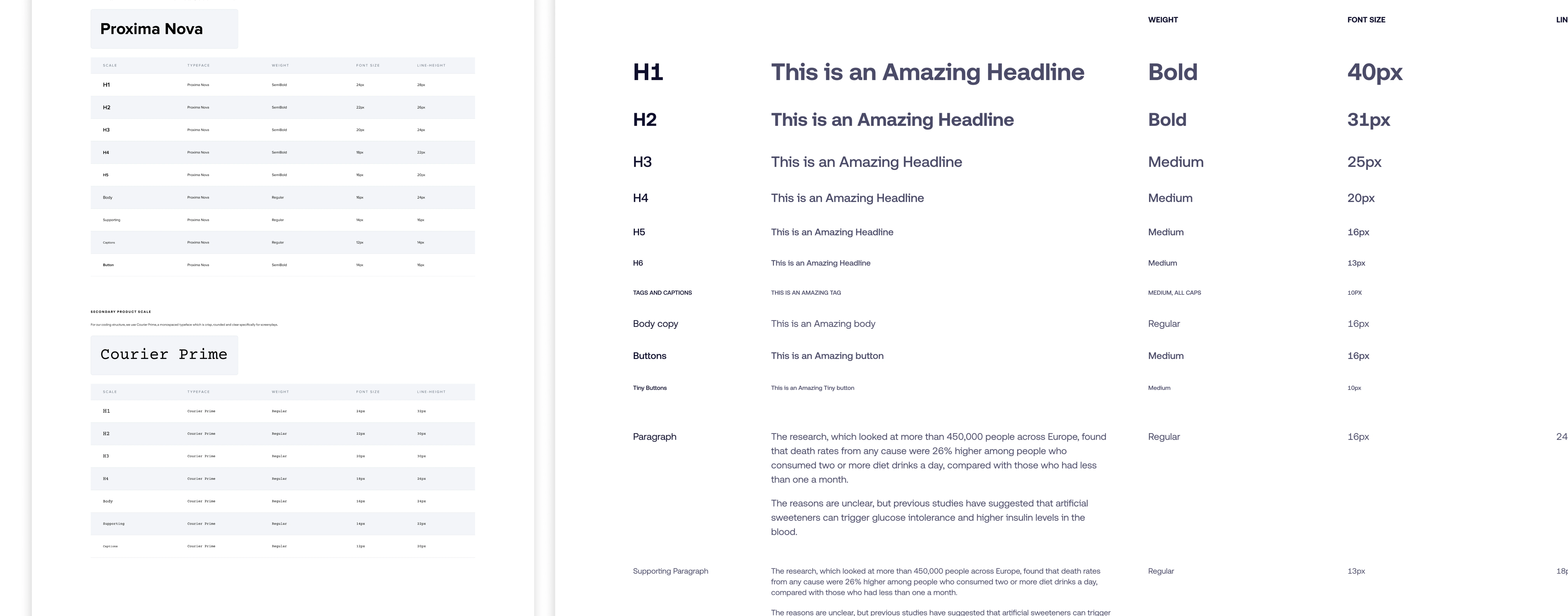
Vol. 1.0 uses Proxima Nova as its primary font and Courier Prime as secondary. While Proxima Nova performed well at larger sizes, it appeared inconsistent at smaller sizes. This was more obvious when the font was paired with an icon.
I began to research different font foundry. I downloaded trial versions of fonts just to find which to settle with. We opted for Aeonik Pro as the primary font and Aeonik Mono as the secondary font.
This was an easy decision because the font looked well balanced on larger and smaller sizes. It was legible enough to be read on different screen sizes. It also did not have any characters that appeared odd.
We introduced a type scale based on the base font-size - 16px. This helped to improve visual hierarchy and readability.
Aeonik Pro passed the all-caps texts for tags. Even at the smaller size, it still appeared readable.
Buttons
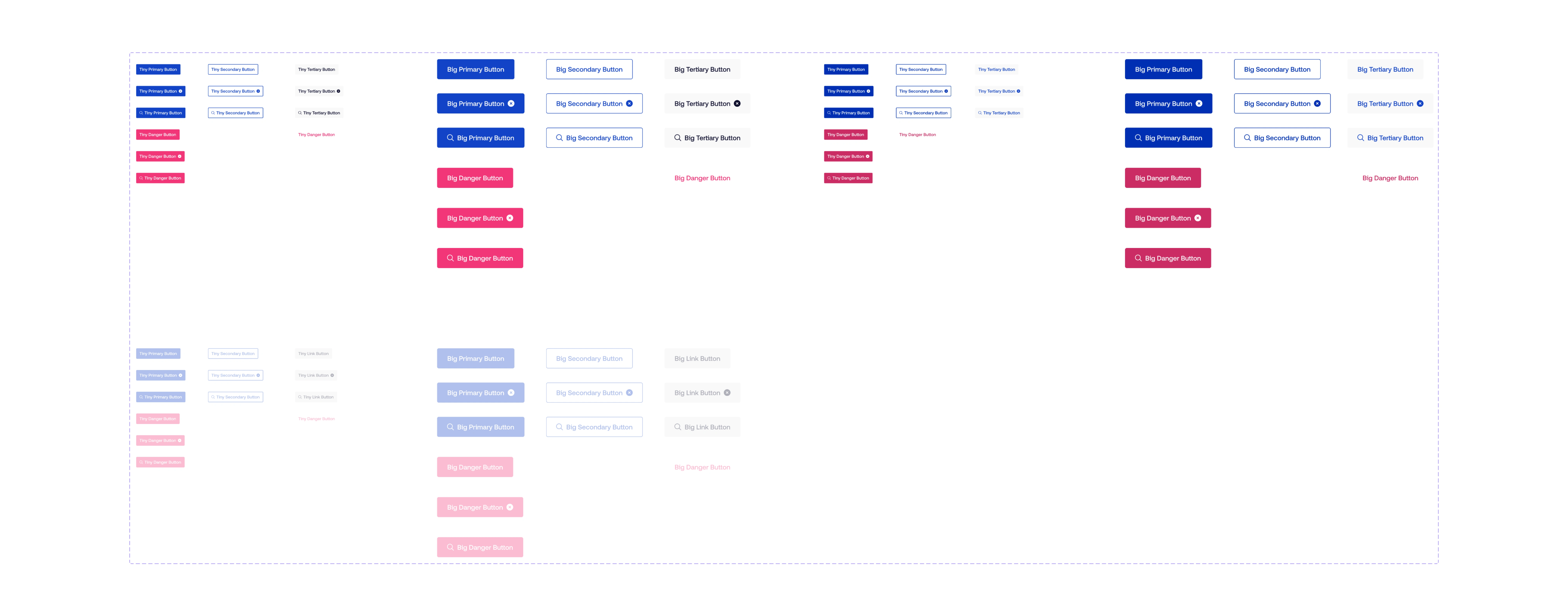
Vo 1.0 had three button sizes, but we only used two. We dropped one of the buttons we rarely used. We ensured the buttons were not too big or too small for smaller screens.
Also, because we had improved our colour system, the buttons had more contrast and were easy to read.
Grids and spacing
These were two things we got right off the bat. It is a 24-column grid that enables us to arrange components and design elements more effectively on our dashboards. We designed two grid systems for two different use cases, and although both had 24 colours, the margins varied.
Spacings were in multiples of 8px, as it is easier to scale up a d build more responsive interfaces.
Iconography
The current icons worked, but we needed a richer library that could fit into all our contexts.
Nomenclature
The current way of naming components worked for everyone. It was clear and descriptive. We decided to continue with the existing nomenclature.
Copy and Language
Our users' interactions with our product improved significantly because of our brand tone guides. We worked with our technical writers, product managers and marketing managers to ensure that all copies were clear and concise. Our copy made it easier for users to understand what we had to offer. This helped them interact with our products more effectively and respond in the most beneficial way.
Lots of tiny fixes
We had four core values that guided us through our journey: usability, accessibility, speed, and continuity.
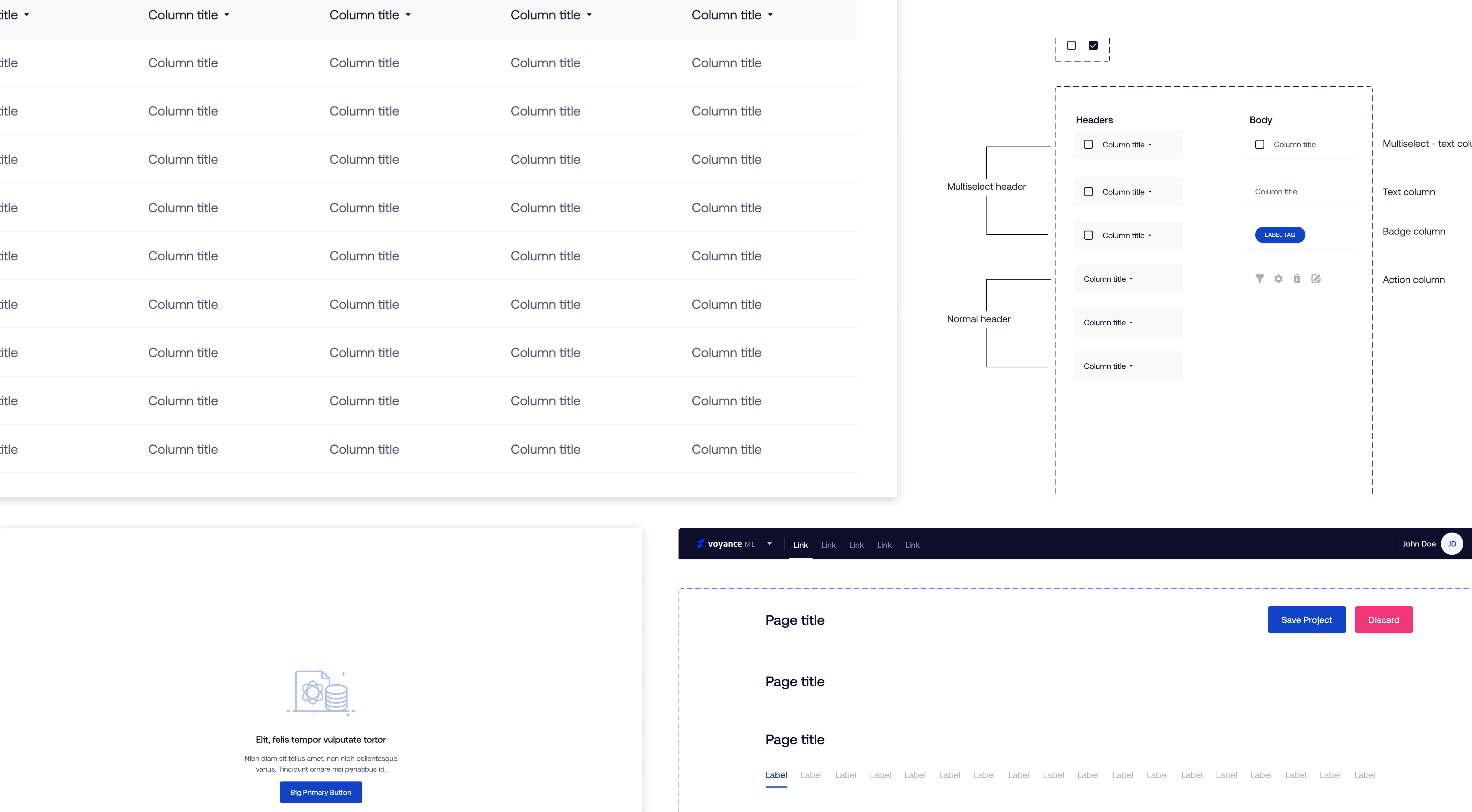
Because of this, we made many tiny fixes to our tables, modals, alerts and forms while improving our processes and ensuring consistency.
Organisation
The atomic model helped us to develop a more dynamic system. This meant that changes to one component would be automatically applied to all instances of that component.
Aesthetics
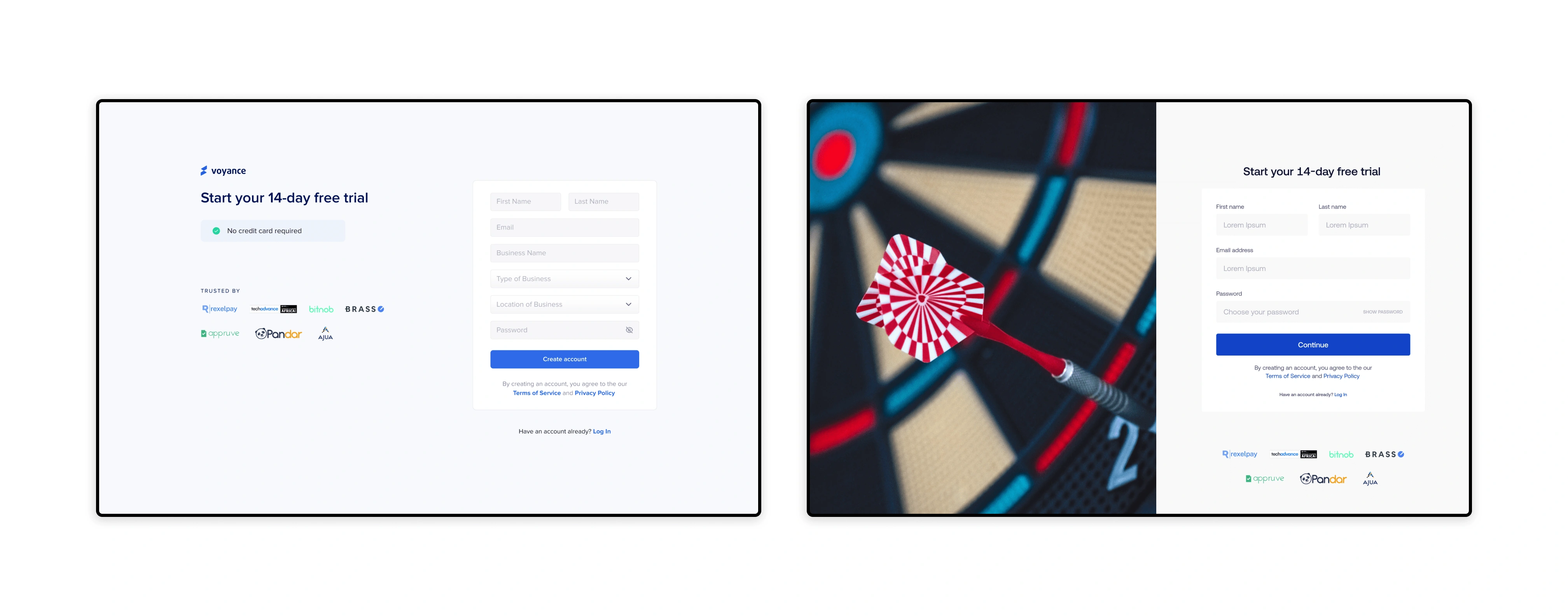
We have made many improvements in the look of our products and website. We can now create a clean, minimalistic design with more contrast and better readability. This gives our users a better experience.
Impact
The entire project was time-consuming and challenging but was worth it internally and how the brand is perceived externally.
It was easier for developers to sync with the design team when discussing implementations. Developers could focus on more critical tasks like high-level development and not granular UI components such as colours, spacing, etc.
The design team could also work faster by dragging and dropping already made components. These also allowed the design team to quickly created prototypes that can be used to test ideas and validate hypotheses.
Documentation
There is a document shared company-wide where new hires can learn more about the design system and for existing staff to track changes to the design system.
The designers and frontend developers easily access Vo 2.0 on Figma.
What next?
"Design systems are living systems that require a dedicated team actively involved in their growth and maintenance". Since we are still a growing team, the teams involved in the redesign would be responsible for its management until we can set up a dedicated team.
We would continue to grow our components, building more complex features.
As the team continues to grow, we will hire a full-time illustrator. We would be able to add a section for illustrations and animations.
We will continue encouraging all the teams to adopt and contribute to the documentation.
Learnings
Designing the new design system was not an easy task. It was much more challenging because our company is entirely remote. I had to learn how to bring all the teams across the company together to achieve a goal. It was also challenging to convince the top-level management about the need for the redesign. I had to learn to address their concerns on time and resources by carrying them along throughout the entire process. I was glad they could finally see the result for the internal teams, our users, and the business.
Curating our colour palette was a bit of work as I had to ensure that the colours worked for our brand and met WCA guidelines so our users could have a better experience.
Like this project
Posted Nov 16, 2022
Vo is the name the design team gave to our design system. It was derived from Voyance.
Likes
0
Views
11


