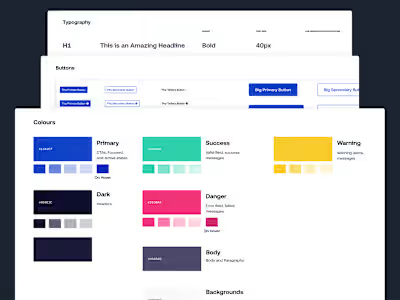
Dojah Webapp
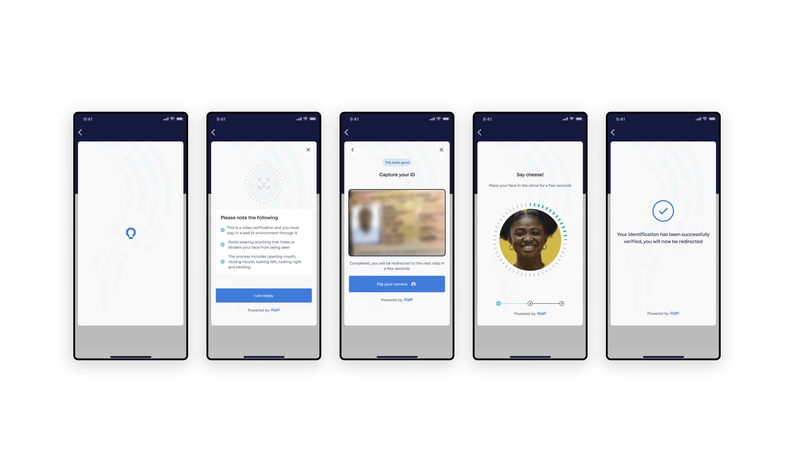
Dojah easily converts prospective customers into active customers through seamless identification, verification, and data authentication.
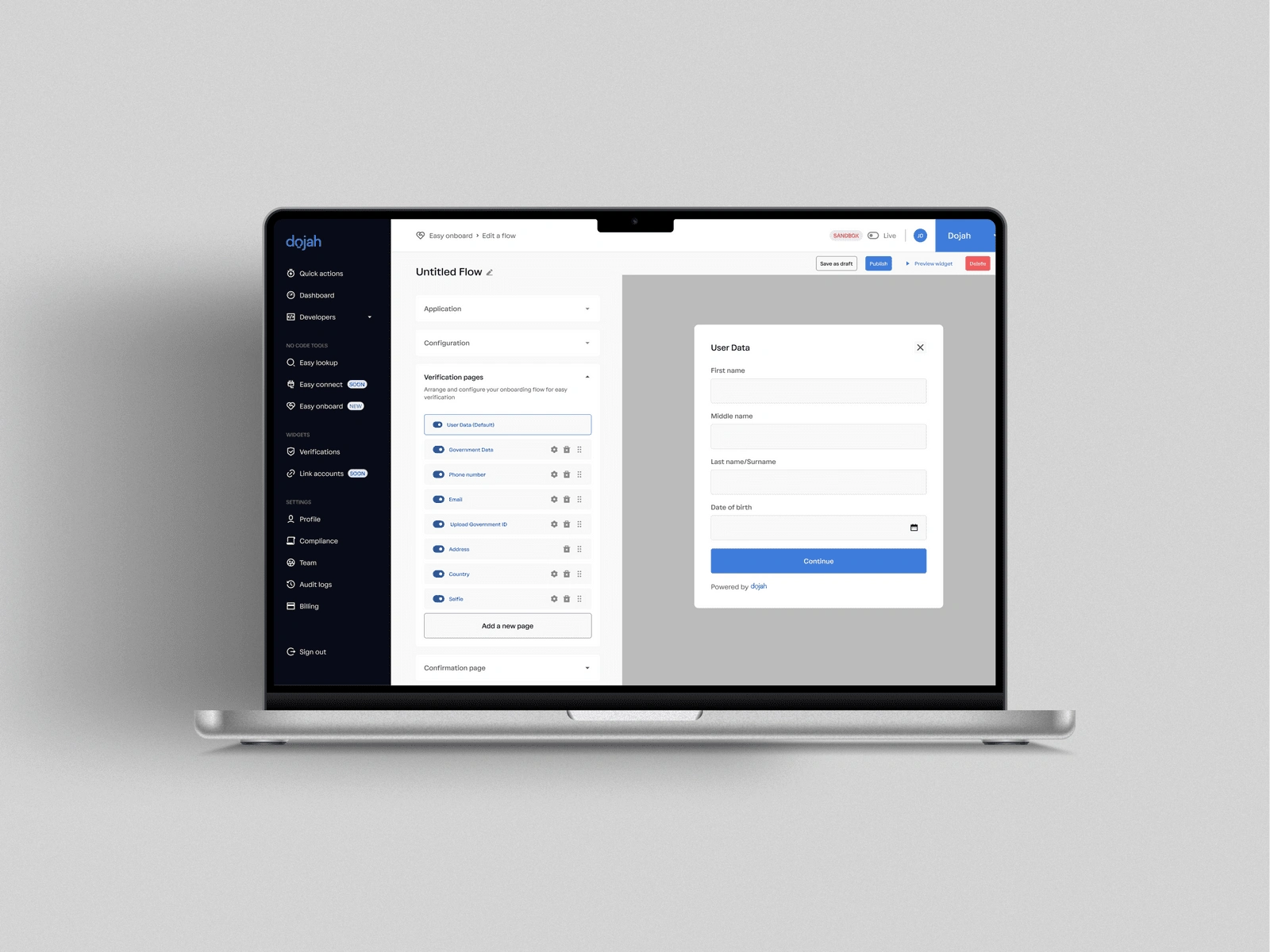
Dojah is Africa's first end-to-end onboarding platform, helping businesses onboard verified Africans to their services.
My role
I initially led the redesign of the first version of the web application between June 2021 and July 2022 before handing it over to the in-house design team. The redesign was mainly focused on the visual design and not so much on the experience.
May 2022 - I joined the team again to redesign the current application, focusing on the visuals (as a result of a rebrand) and the experience.
I worked alongside the Head of Product/Growth, Product managers, and Frontend and Backend engineers.
The challenge
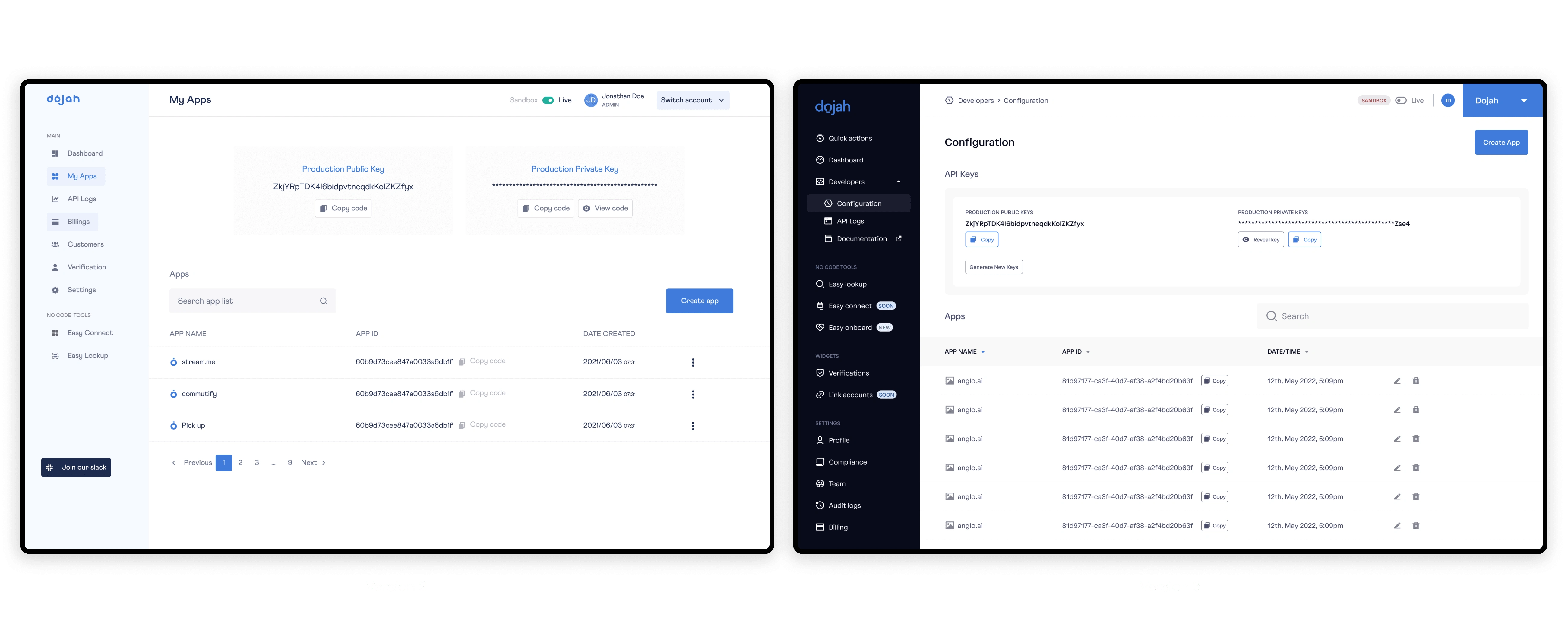
The feedback from the users showed the application was not optimised for analysis and that it was difficult to access the application's functional pages. Also, the new application needed to reflect the rebrand. Both challenges require a complete overhaul of the application - building flows that are easy to navigate and building analytics that is easy to understand.
A significant challenge not related to design was the time constraints. We had four months to build the new experience with all teams working remotely.
Success criteria
It is essential to have metrics to measure the success of a project. Together with the product manager and the Head of Product, we listed the following success criteria:
We needed to reduce the time it takes for companies to complete the onboarding and compliance process by more than half.
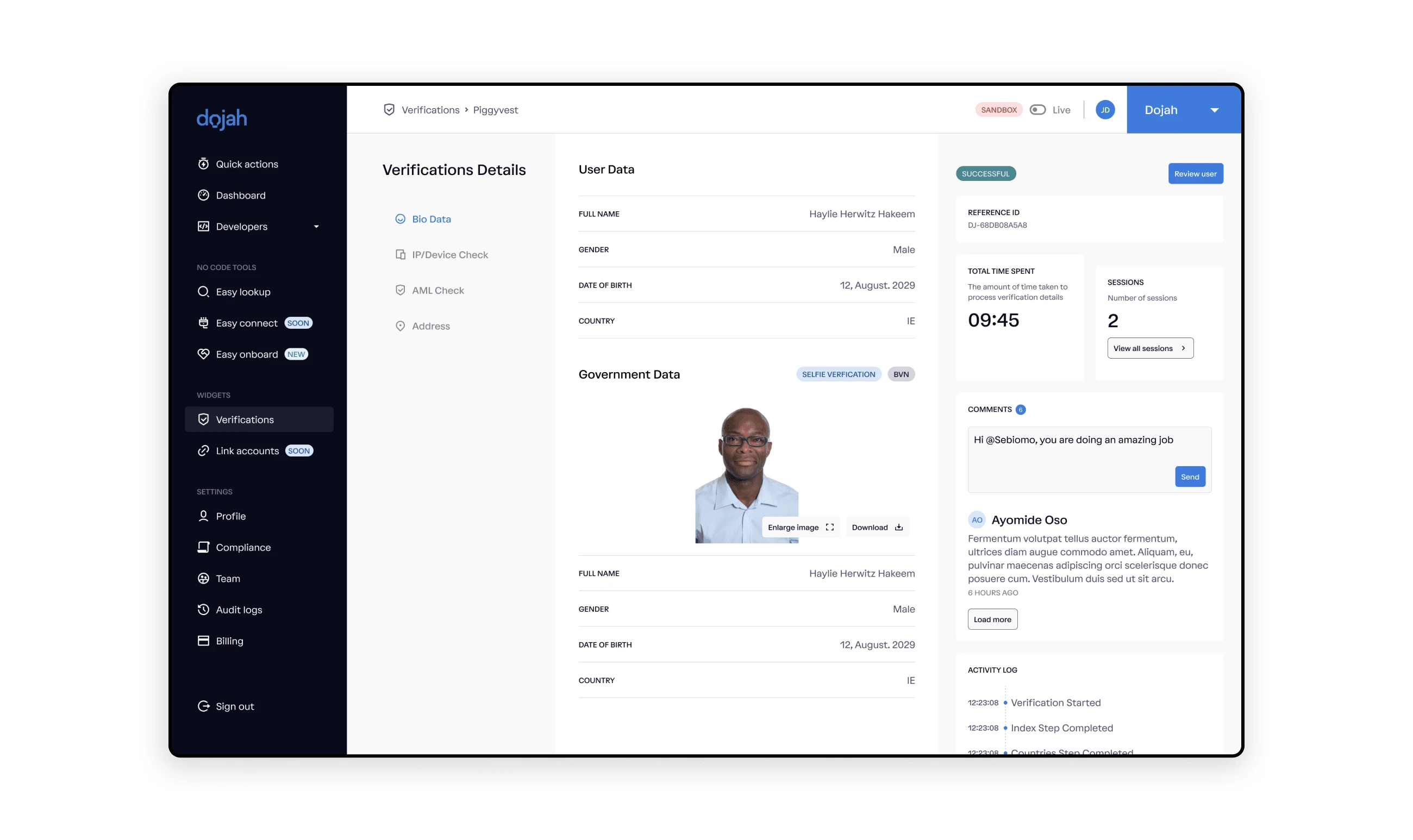
We needed to make it easier to perform critical tasks such as Easy Lookup, Identity Checks, creating Onboarding Widgets and viewing lists of Verifications already carried out.
The process
After carefully reviewing all the results, data from the research and feedback from existing users, I set a meeting with the rest of the team to present my result and possible solutions. All the information I had pointed to one thing - the web application had a poor Information Architecture, which caused users to find it challenging to visit functional pages and carry out their tasks.
Improving the Information Architecture
I observed that users found it challenging to locate some features of the web application because of how information was arranged, which invariably affected the navigation system on the web application.
Customer Support often got many calls when users could not find these features. For example - a common complaint was that product keys were missing on the app, but the keys were grouped under apps instead of developers' tools.
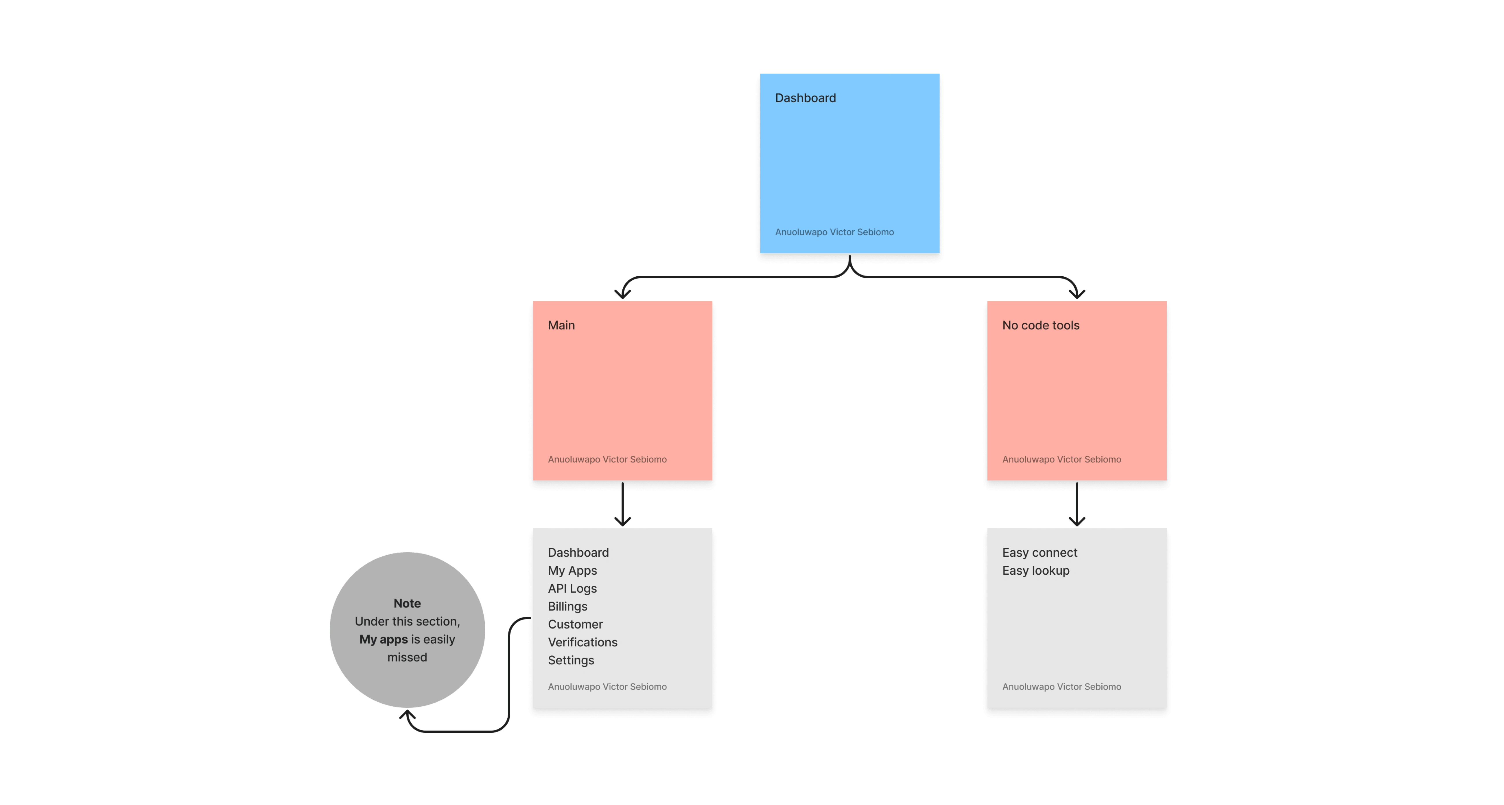
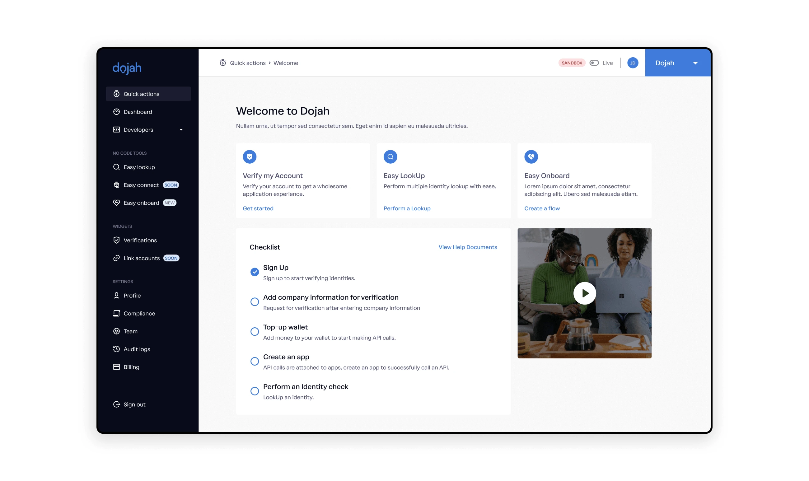
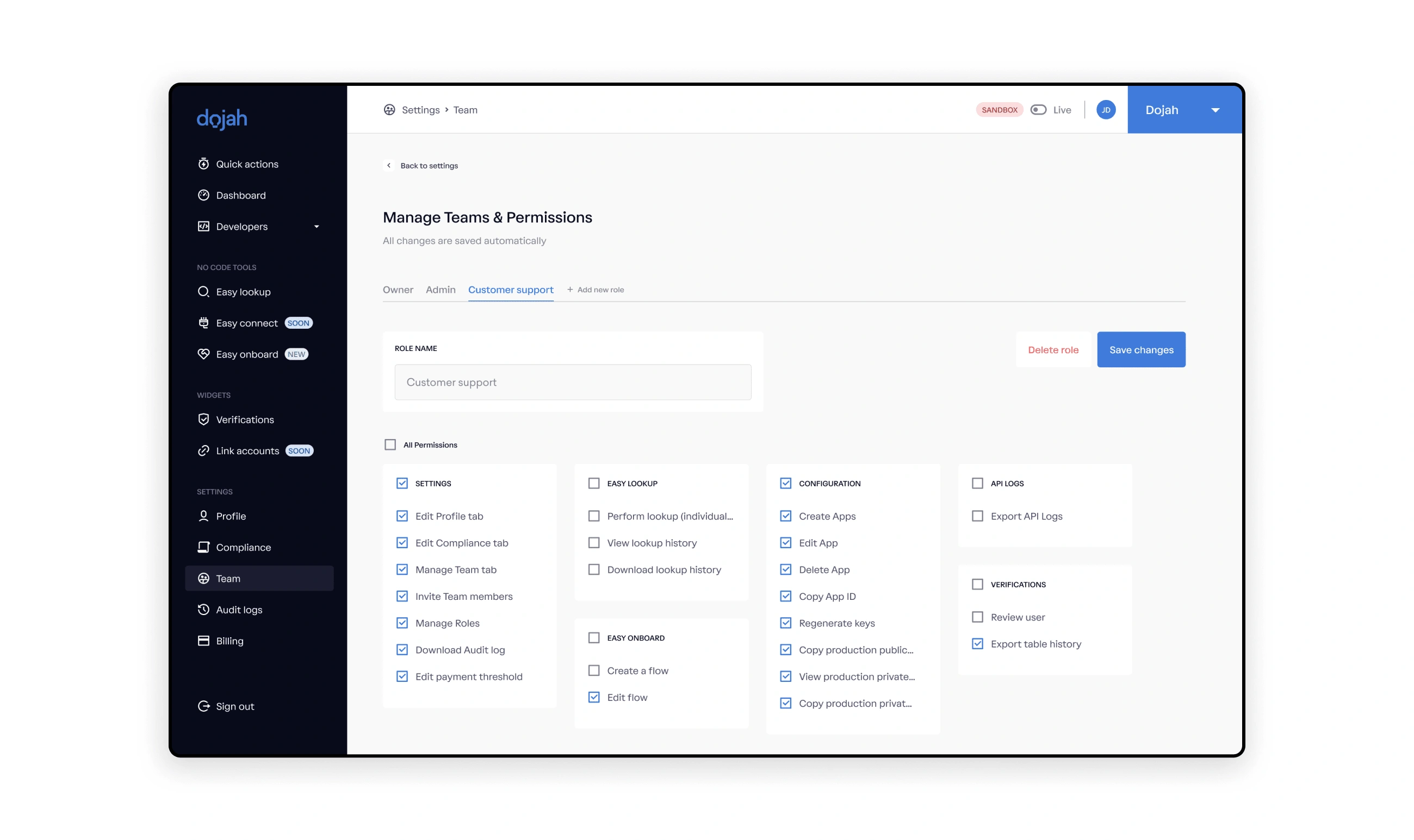
After spending some time trying to rework the information architecture, I grouped all the pages on the web application into four categories - Main, No code tools, Widgets and Settings.
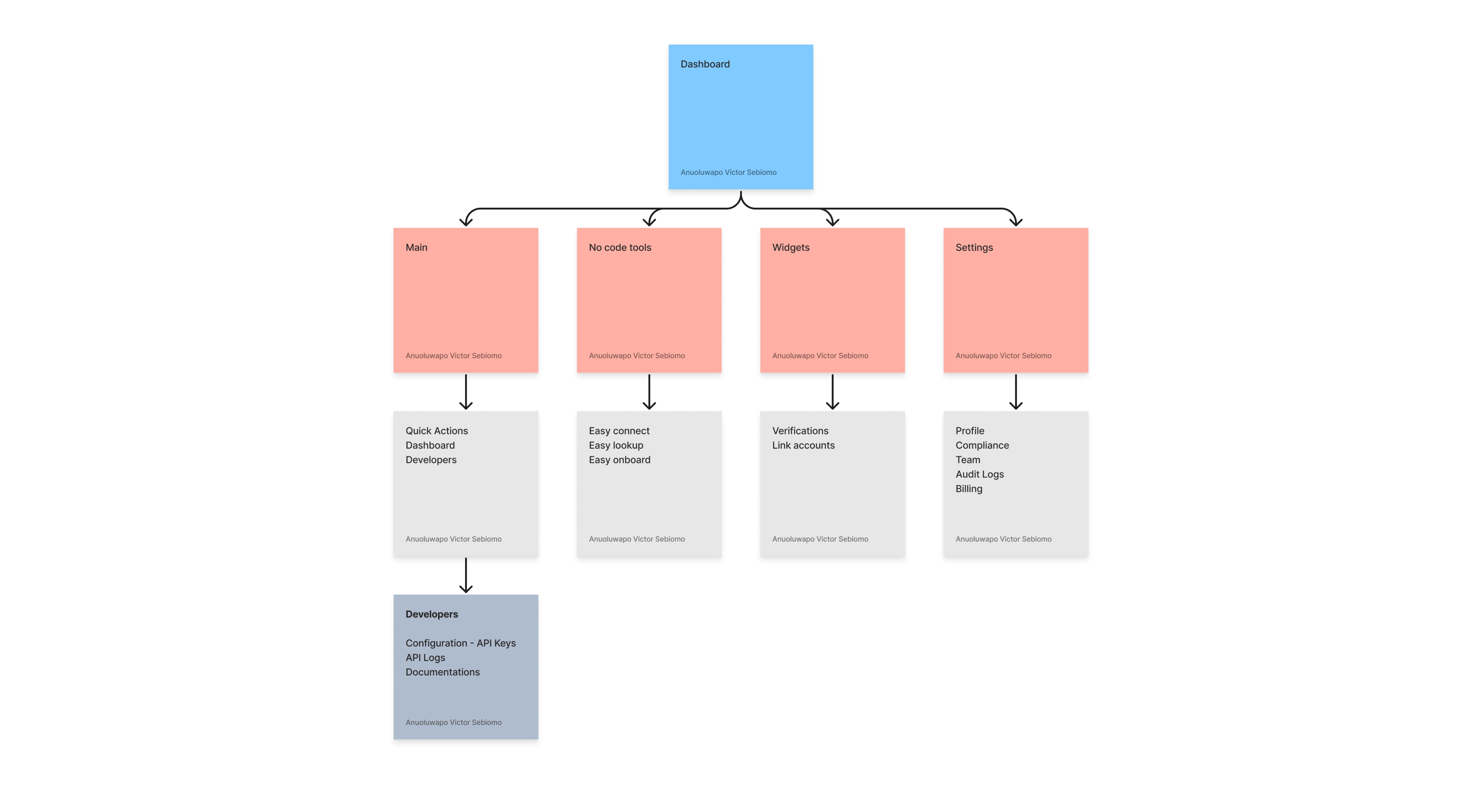
It is vital to place the right features under the right group to aid the visibility of each component.
It is just like visiting a library. You would expect to find a book on physics in the science section and not the languages section.
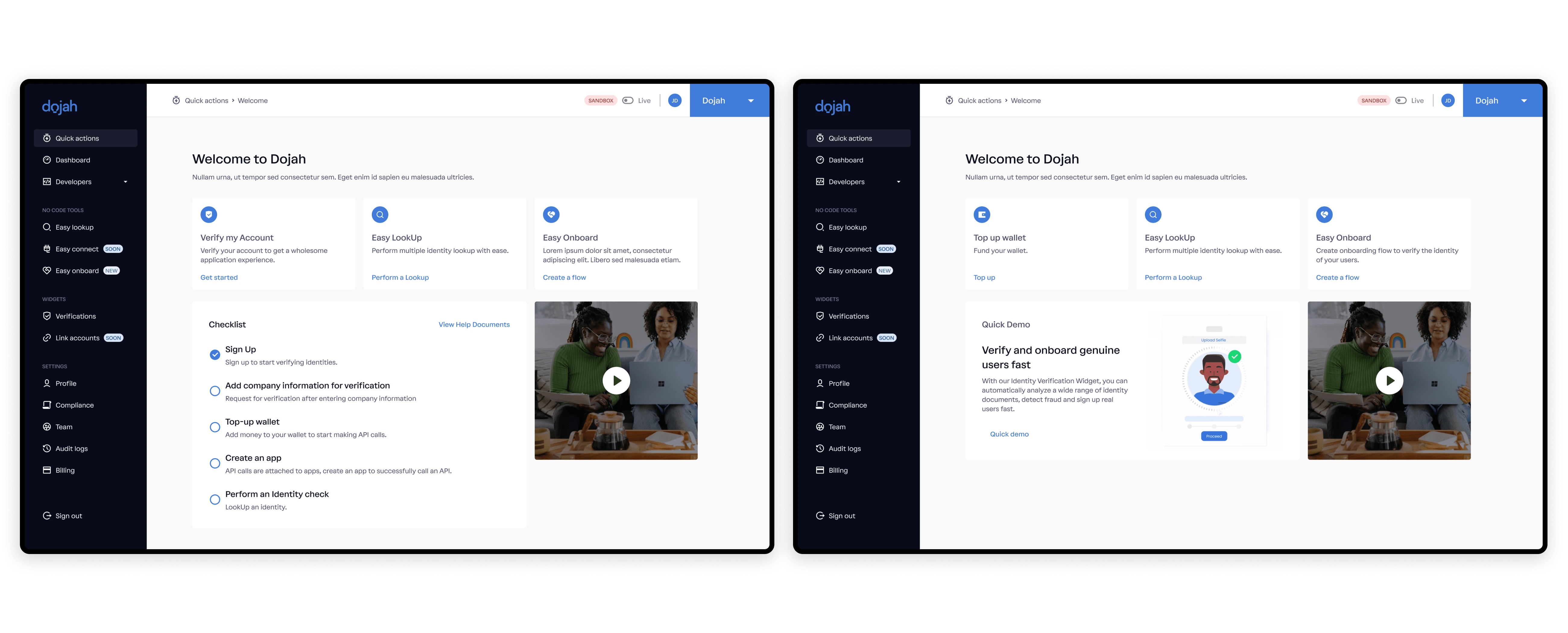
Introducing Quick Actions
Users ignored important tasks after onboarding, such as completing their verification process. This information is vital as they are a legal requirement. We needed a way to remind the users to complete the steps.
The product manager suggested adding a page titled Quick Actions. It would help new and existing users quickly access features with minimal clicks. It would also allow new users to complete a to-do list that includes getting these legal documents.
Missing APIs
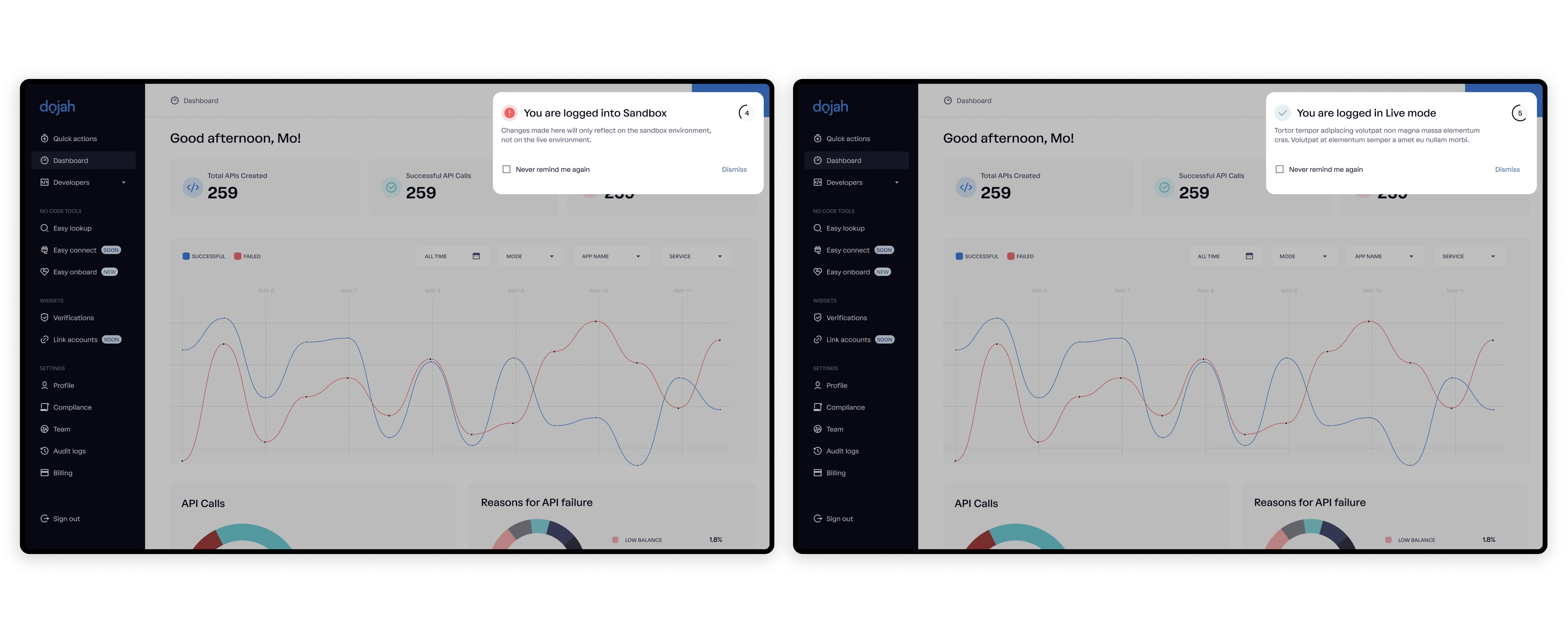
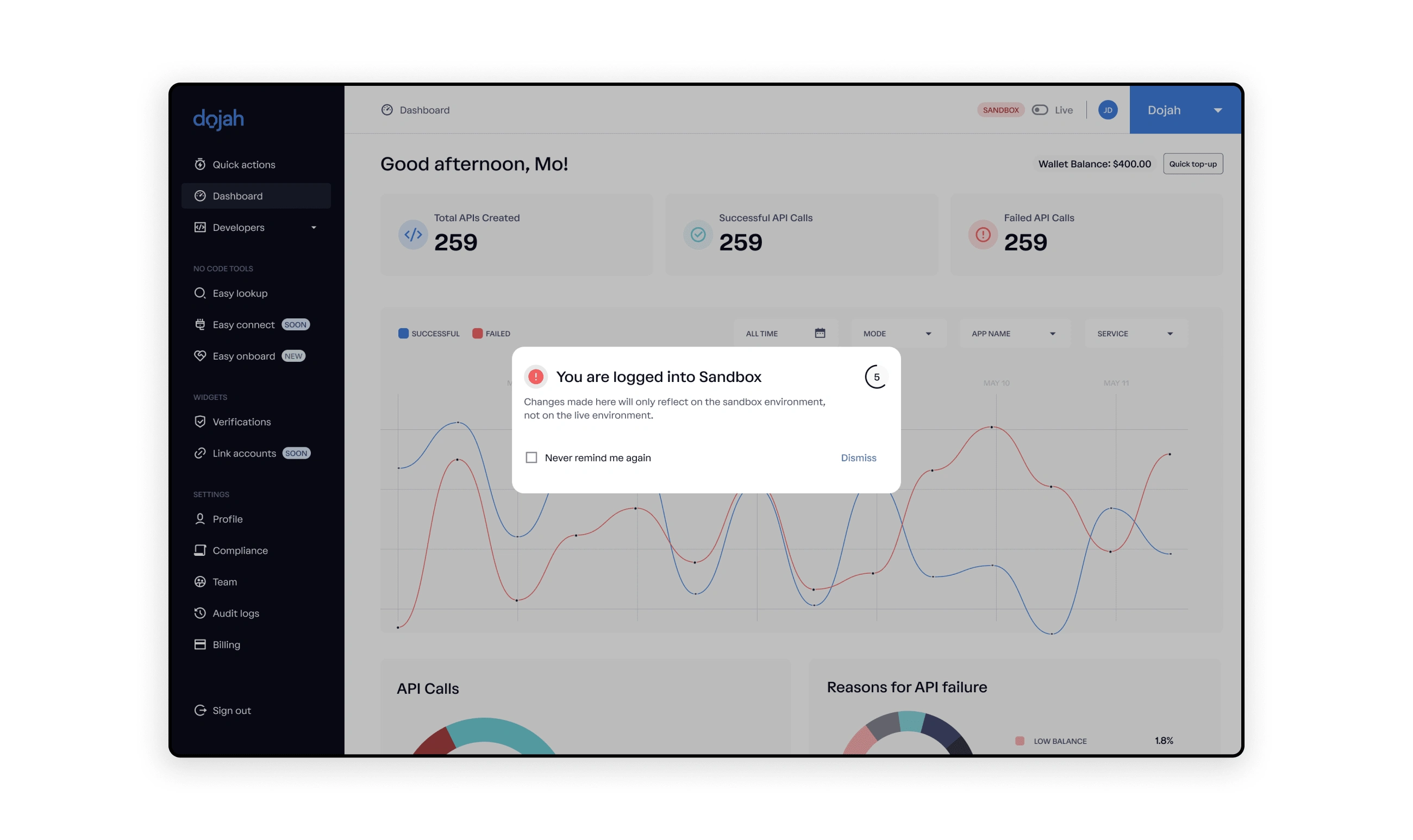
Typical feedback from Customer Support was that users called to complain about discrepancies in the number of their APIs and wallet balances. The problem was that users often forgot to toggle between "Sandbox" and "Live" on their dashboard. It did not seem like a big issue for the team, but I thought that solving this would save the Customer Support team the constant calls.
I solved this by introducing a simple modal with a five seconds countdown; the modal can also be dismissed. I included the flexibility of choosing whether to "Never be reminded" for users who might find this feature annoying.
The modal reminds the users of the environment they logged in to. As simple as this looked, the number of calls to Customer Support dropped.
Improving the Filter
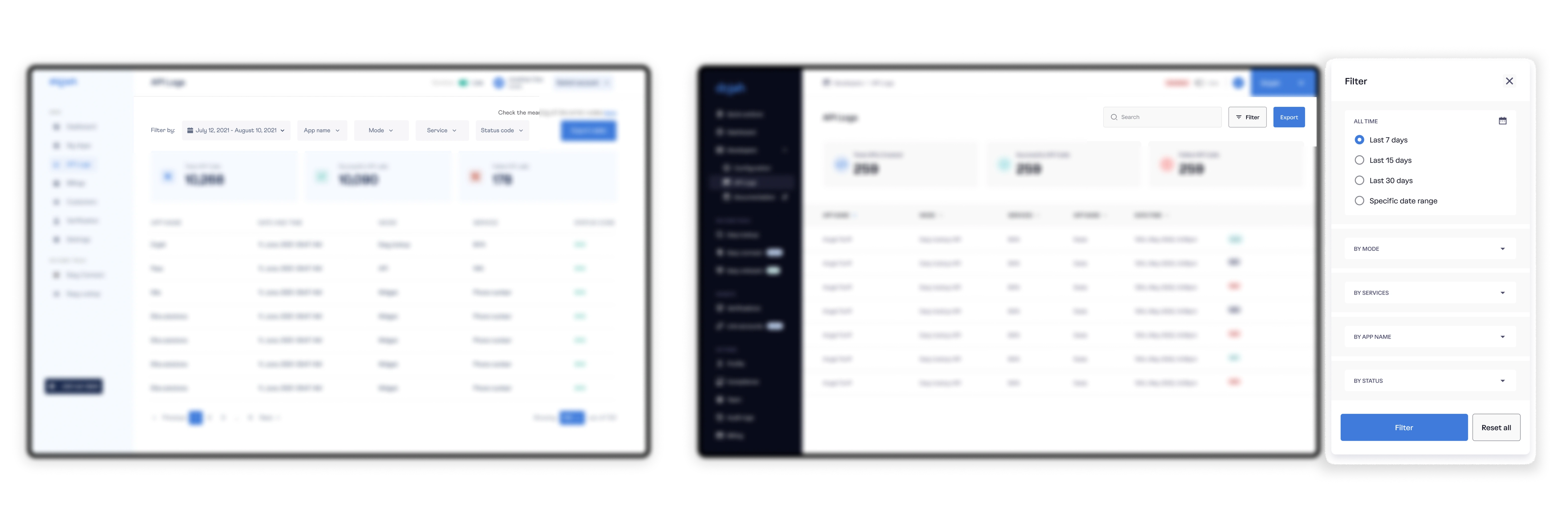
Filters are a common and essential feature for a functioning application. The current filter worked just fine but would not scale. I reworked the filter feature by collapsing it into a single modal. This would ensure that it would scale successfully should the need arise.
Easy Lookup
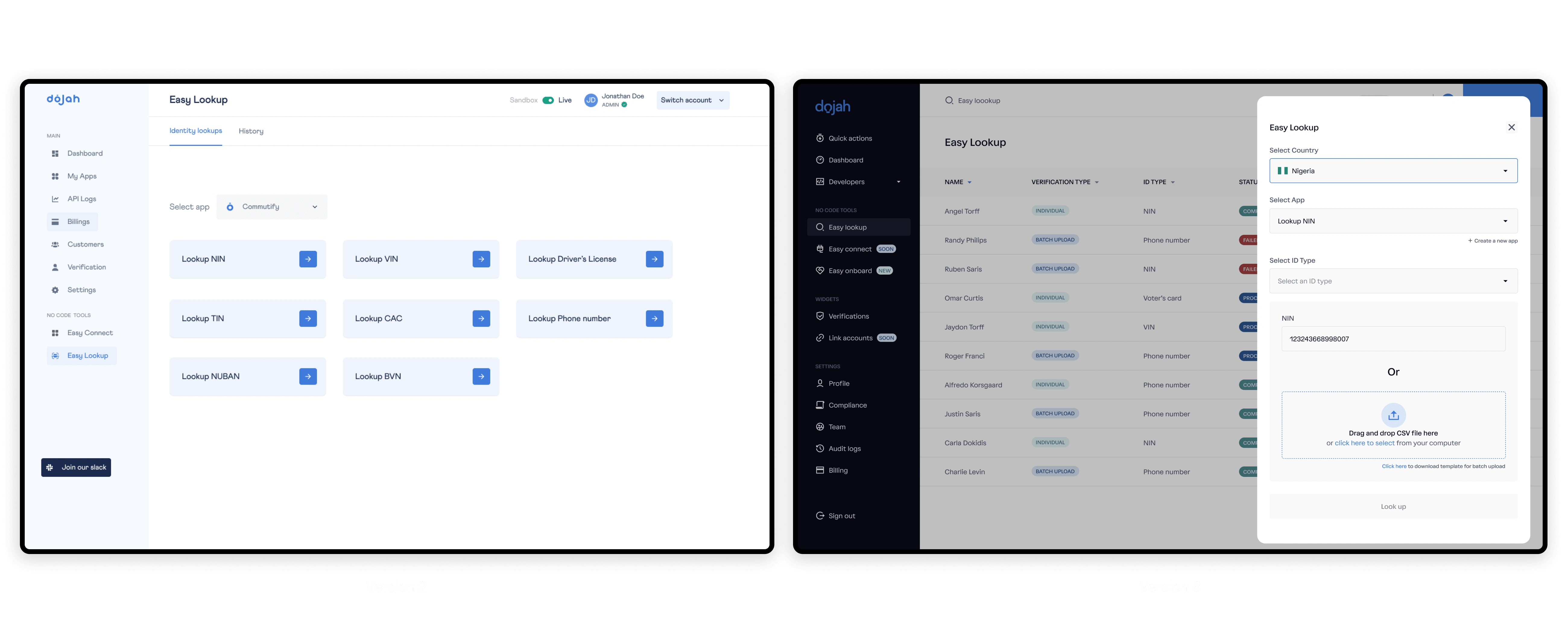
Easy Lookup is a feature that allows businesses to look up details of their customers by using regulatory IDs. The current flow for performing Easy Lookup was a hassle and needed a better experience.
I reworked the flow to a more compact flow that is easy to navigate.
Improving how results are displayed
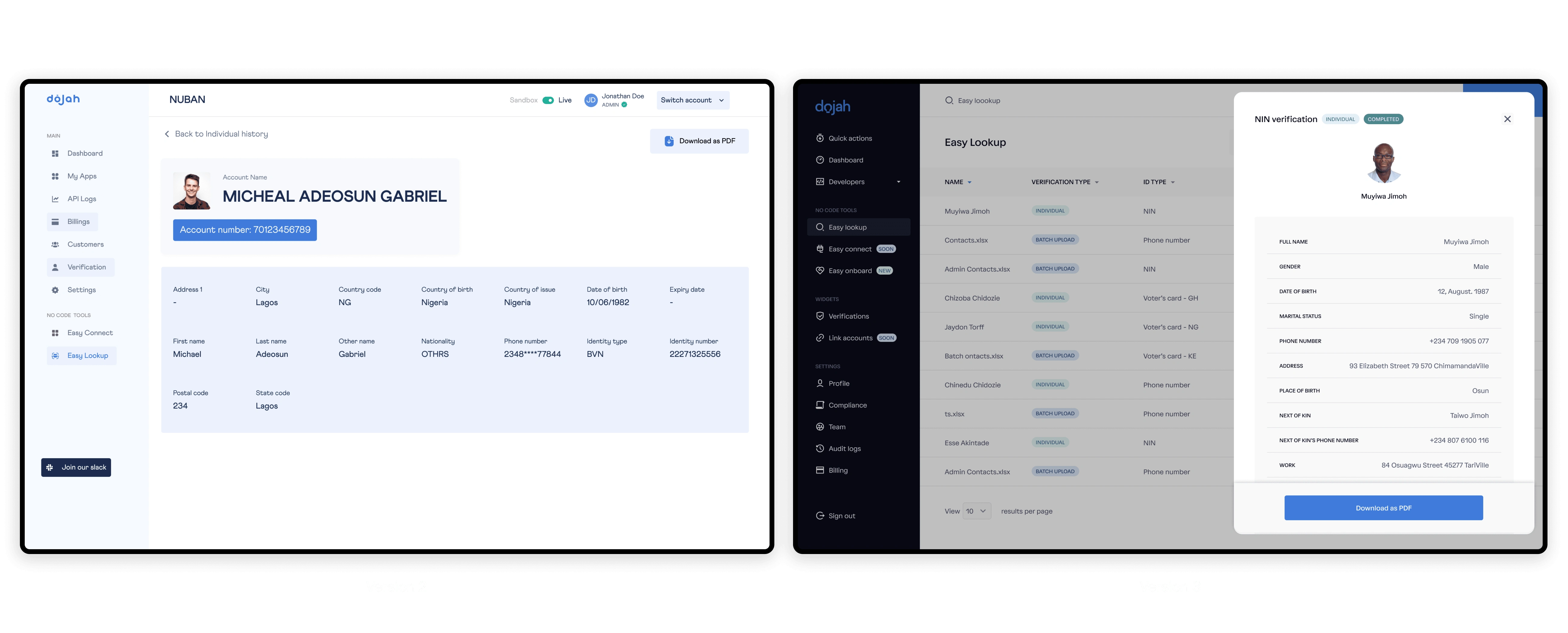
Results were displayed in a problematic way to read or scan through. Results were optimised and redesigned so they could be read or glanced through in a more natural eye motion.
New Look, who this?
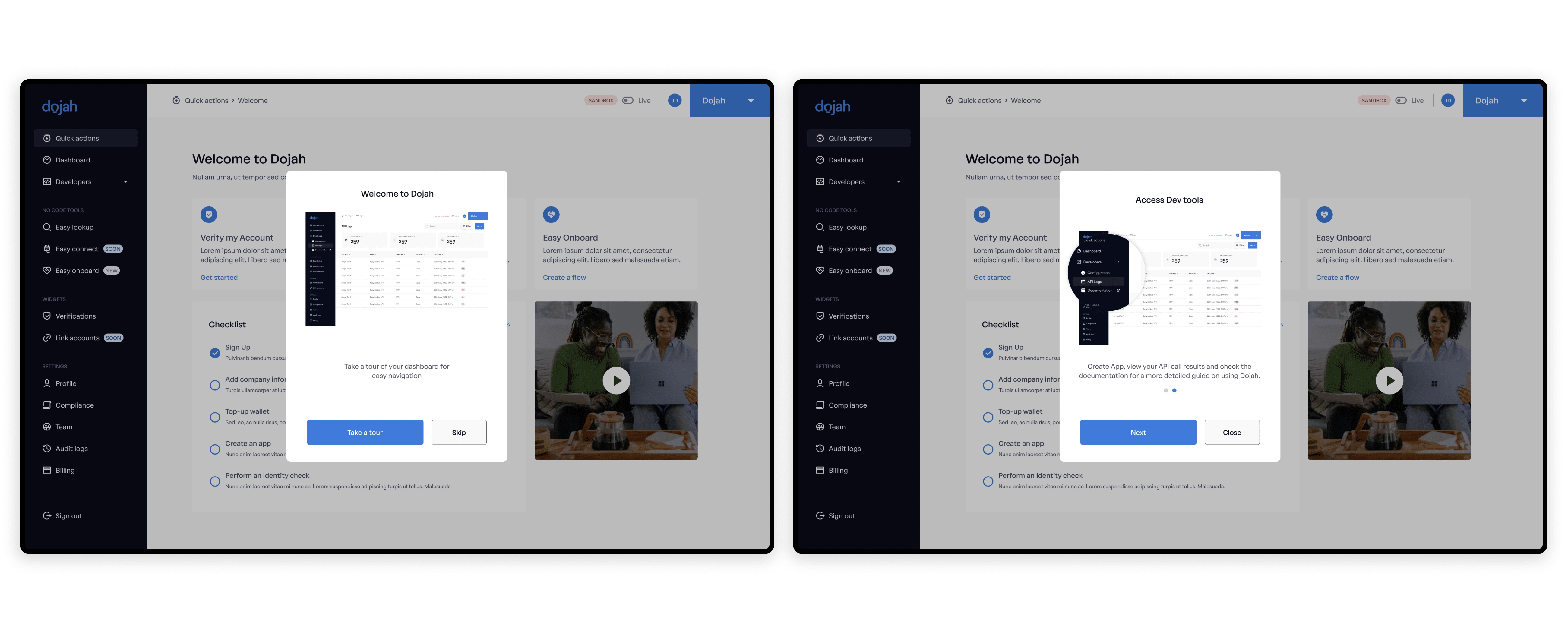
We wanted to inform existing users of the changes on their dashboard. I introduced a one-time welcome screen to let the users know their dashboard has changed. In addition, the marketing team also sent out marketing emails on the launch day to inform existing users of the change.
Testing
The team ran a couple of internal tests and some tests with a few existing users. Most of the feedback was positive, but some work had to be done in the engineering department to ensure that the filter, graphs, analytics, and widget worked seamlessly.
Launch
The team launched the new UI on the 20th of August 2022. Although most of the design work is done, the engineering team is still doing a few cleanups to ensure that the application works faster. The product managers are also developing new and perfect existing features based on the latest feedback.
Impact
The team is still gathering information on the impact. I will update this section as soon as I have enough information.
The information in this case study is my own and does not reflect the views of Dojah. I have intentionally omitted confidential data where necessary.
Like this project
Posted Nov 16, 2022
Dojah easily converts prospective customers into active customers through seamless identification, verification, and data authentication.
Likes
0
Views
4


