Built with Framer
Birches Health - Website Redesign & Framer Development
Nik ✌️
Birches Health - Website Redesign & Framer Development
Redesigning a healthcare website that helps people overcome addiction, rebuilt entirely in Framer.
1. Project Overview
Client: Birches Health
Industry: Mental Health & Teletherapy
Timeline: 2 weeks
Role: Product Designer & Framer Developer
Collaboration: Worked directly with the Founder, Product Manager, and core team
Tools: Figma · Framer · Notion · Loom · Google Meet
Scope:
Complete redesign and development of Birches Health’s main website - rethinking structure, visual tone, and responsiveness while aligning with the brand’s mission to make virtual addiction recovery accessible and human.
2. The Challenge
When Birches Health first approached me, their website was built directly inside Framer - a simple, functional setup made by the internal team.
But it lacked structure, hierarchy, and emotion. The visuals didn’t reflect the warmth or trust that a mental health company needed to convey. Layouts were inconsistent, responsiveness was off, and the design language didn’t match their growing credibility.
Core Pain Points:
Disconnected design language and cluttered layout
Poor responsiveness and accessibility
Inconsistent brand use across pages
Lack of clear flow to key actions (like “Start Assessment”)
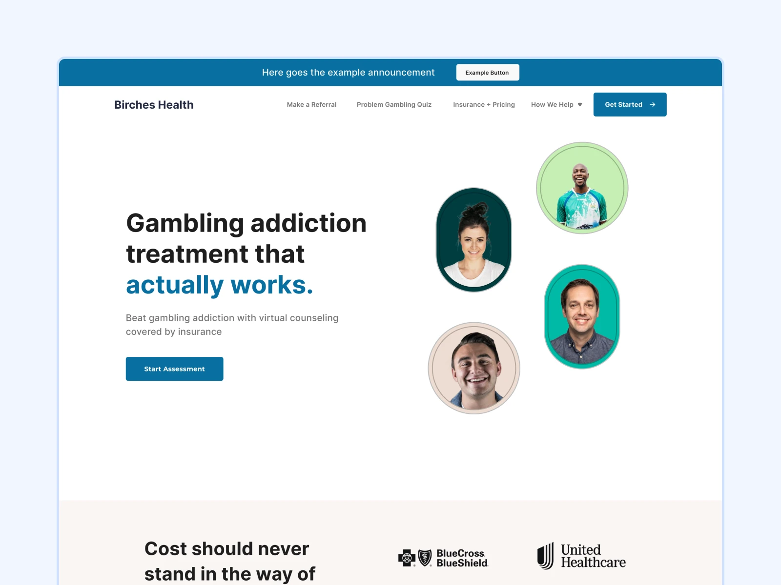
Birches Health wanted a full redesign that would feel professional yet empathetic, and a Framer rebuild that would perform better and scale easily.
3. The Approach
My goal was to reimagine Birches Health’s digital presence - turning a functional website into a calm, trustworthy, and conversion-focused experience.
I started with a clean visual system in Figma, building from the ground up:
Defined a consistent grid and spacing system.
Refined typography and hierarchy for healthcare readability.
Used soft yet confident colors aligned with their existing palette.
Simplified content to lead users naturally to assessments and therapy calls.
Once approved, the designs were rebuilt from scratch in Framer, optimized for speed, accessibility, and ease of iteration.
4. The Design Process
🎨 Hero Exploration
To find the right tone for the brand, I designed three different hero section variations - each exploring a distinct mix of imagery, layout, and call-to-action balance.
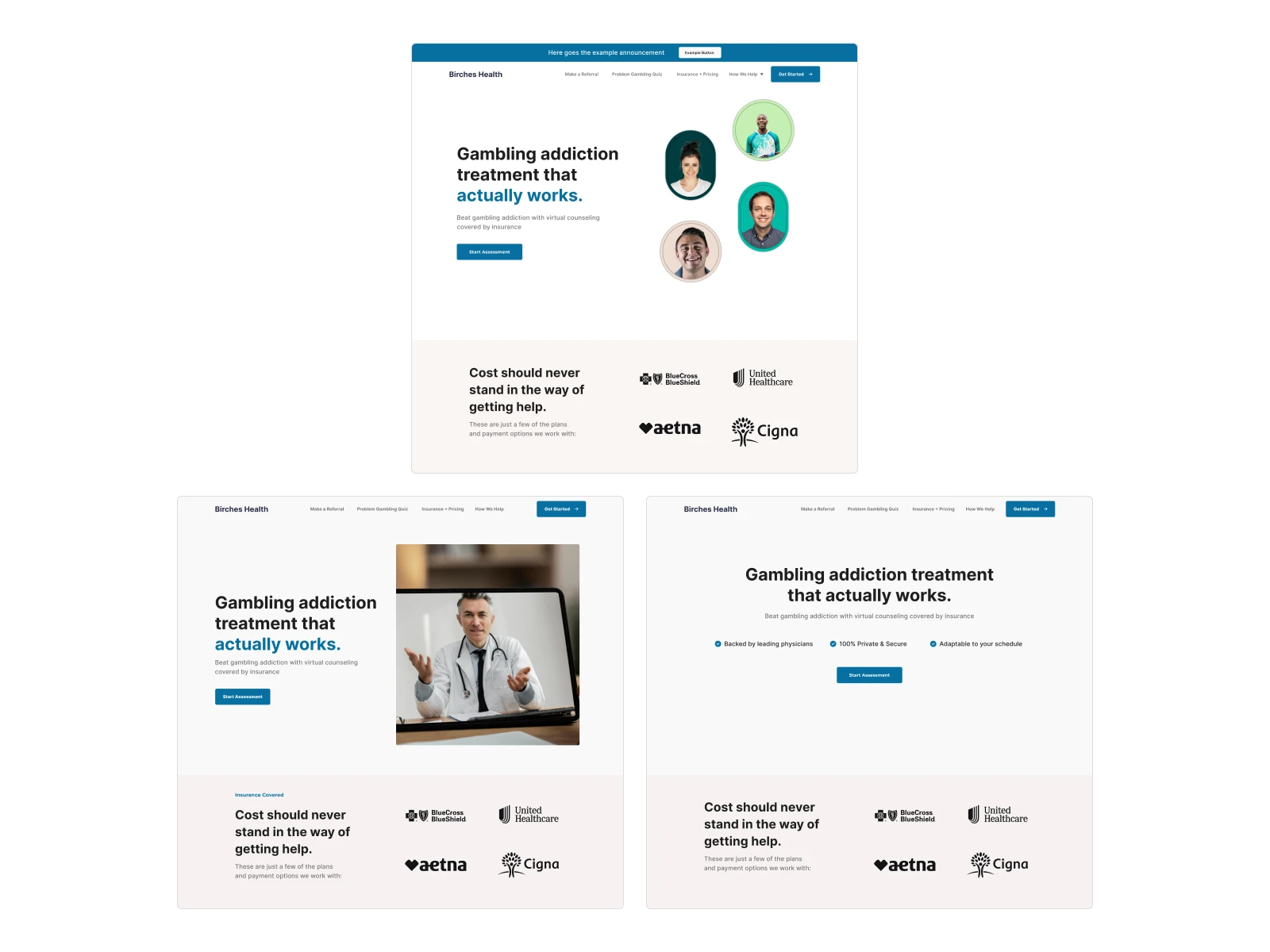
"We tested multiple directions - from personality-driven visuals to minimal, professional hero designs. The first version struck the perfect balance of trust and engagement."
💡 Solution Section Exploration
I also experimented with three solution section styles, refining iconography, copy tone, and illustration approach.
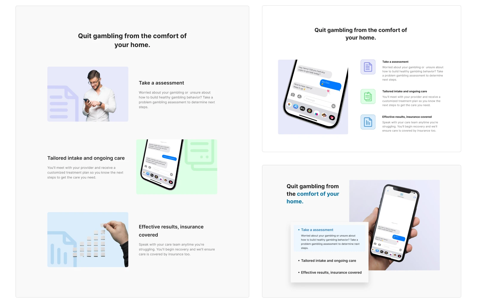
“These iterations helped shape the brand’s storytelling - shifting from generic healthcare visuals to a more relatable, everyday tone.”
🧩 Custom Visual Assets
To keep the experience light and human, I designed custom illustrated thumbnails for categories like gaming, sports betting, crypto, and more - giving the site subtle personality while staying medical-grade professional.

5. The Solution
The final website featured:
A warm, minimalist interface that reflected safety and trust.
Improved flow with clearer CTAs for assessments and coverage.
Smooth Framer interactions and responsive behavior across devices.
Modular sections for easy duplication and scaling of new pages.
The site went live within two weeks, fully redesigned and rebuilt - instantly improving navigation, load time, and content structure.
6. The Continuation
Months after the launch, the collaboration grew stronger.
Birches Health invited me to join as a retainer designer, helping maintain and expand the platform with new content and pages.
I’ve since:
Designed and developed new pages like the Press Page and Partner Pages.
Redesigned their blog system, improving structure and typography for long-form content.
Collaborated with the internal team to align with their evolving brand visuals and maintain consistency across the growing site.
“What started as a simple redesign evolved into an ongoing partnership - helping Birches Health grow their online presence and extend their brand voice.”
7. Impact & Reflection
The redesign didn’t just change visuals - it improved how Birches Health communicated care online.
Their website became more approachable, structured, and reflective of the organization’s mission.
This project marked the beginning of my long-term journey with Birches Health - shaping how digital healthcare brands can look more human, one pixel at a time.
💙
Like this project
Posted Jun 21, 2023
Redesigning a healthcare website that helps people overcome addiction, rebuilt entirely in Framer.
Likes
2
Views
76
Timeline
May 31, 2023 - Ongoing
Clients
Birches Health