
About the project
Amble is a self-initiated concept identity for a maker of everyday sneakers, runners and trail shoes, designed in Portland and made by two family factories in Elche, Spain. Everything in it is read from the brand's own site: the wordmark, the type, the palette and the way it moves.
The idea
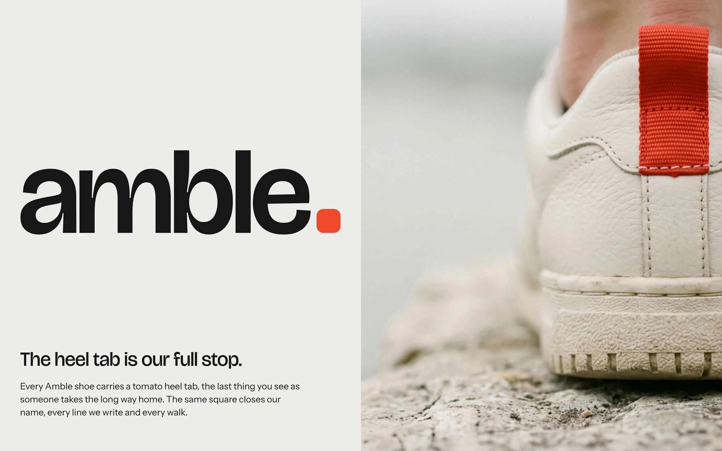
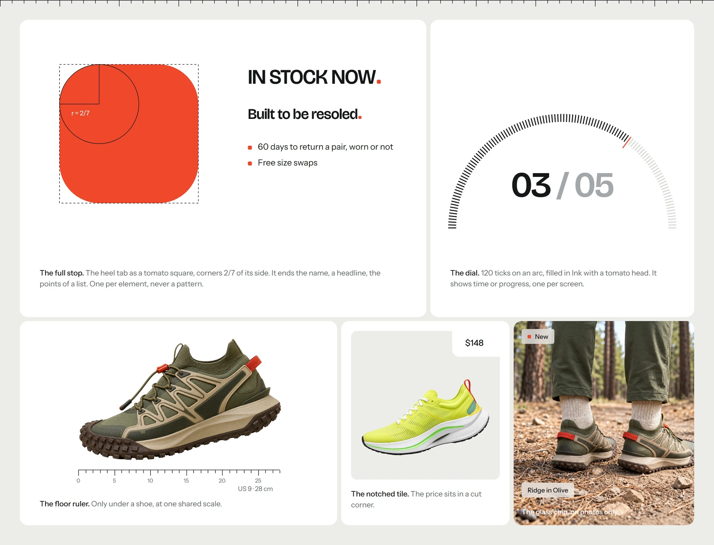
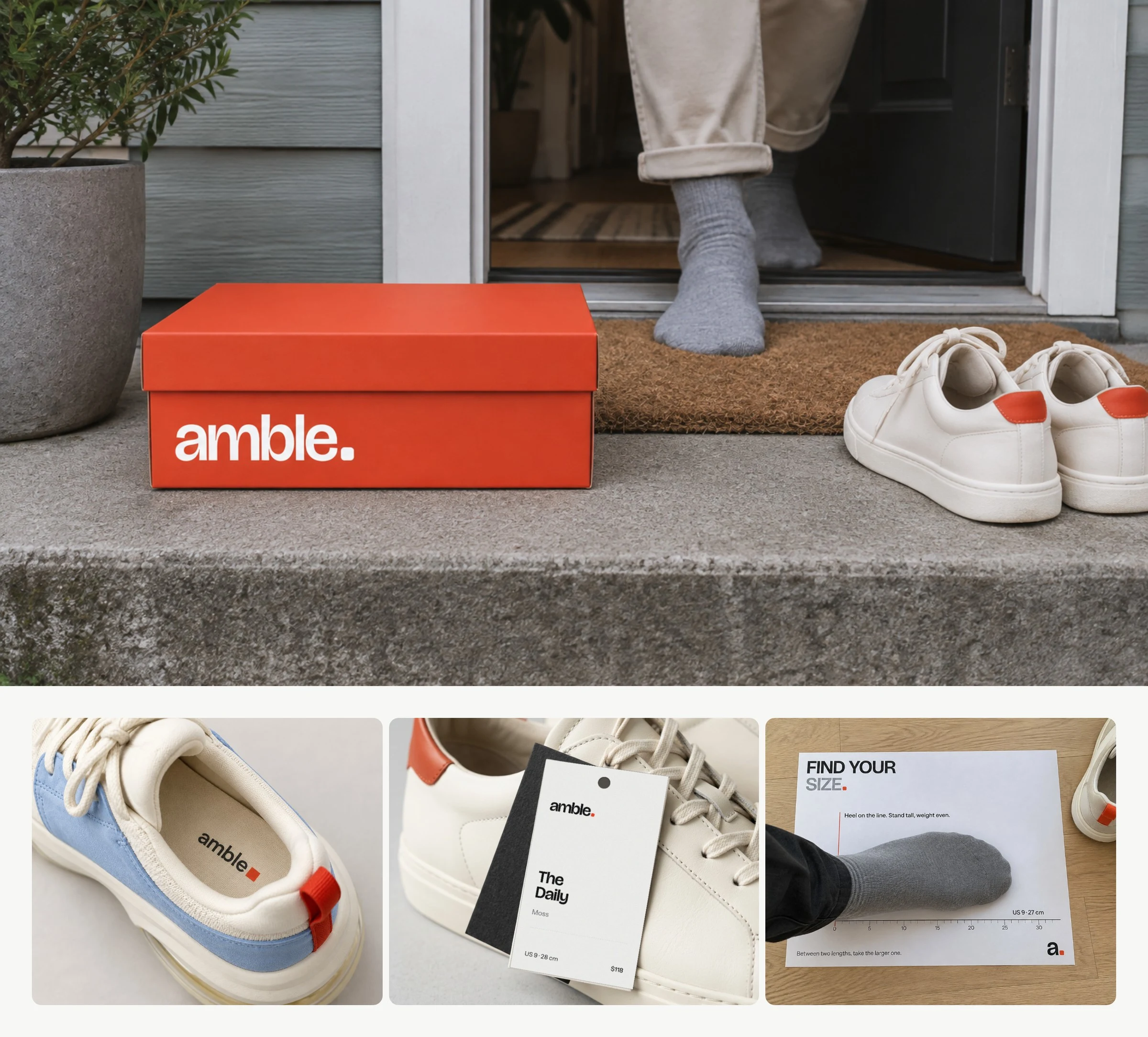
The heel tab is the full stop. Every Amble shoe carries a tomato heel tab, the last thing you see as someone takes the long way home. The same rounded square closes the name, every headline and every list point, and in motion it steps along the floor ruler.
The system
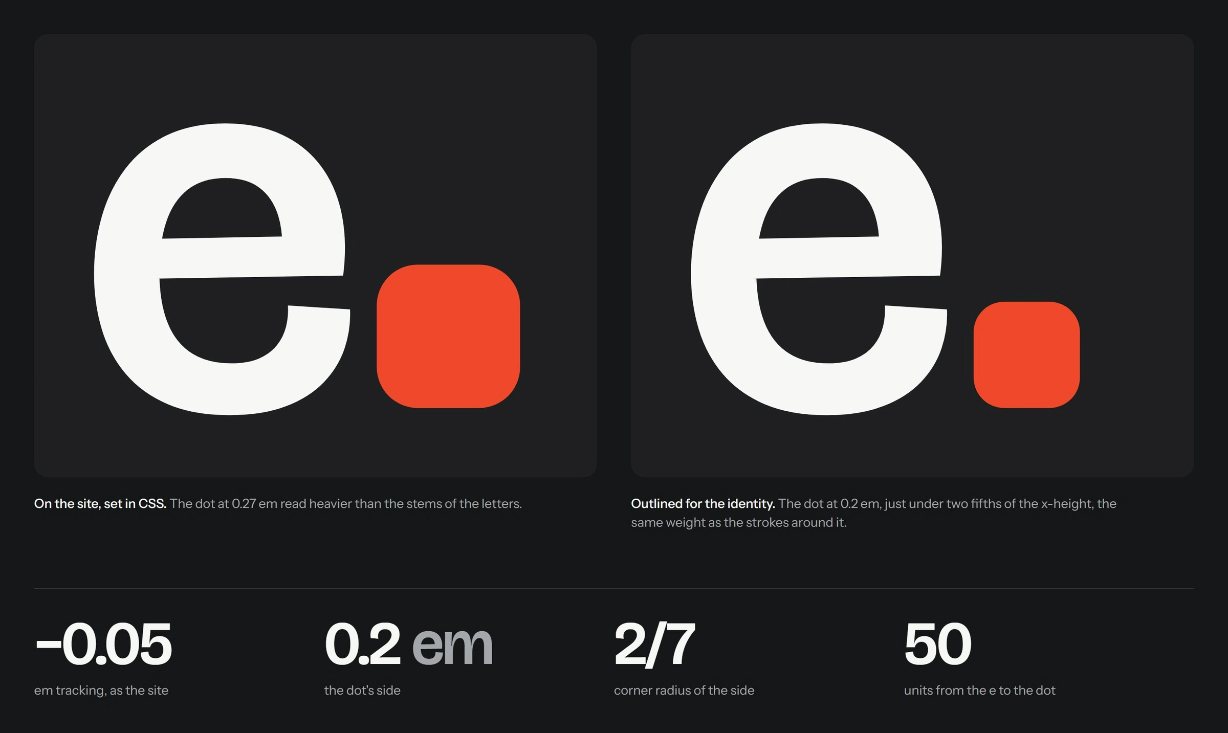
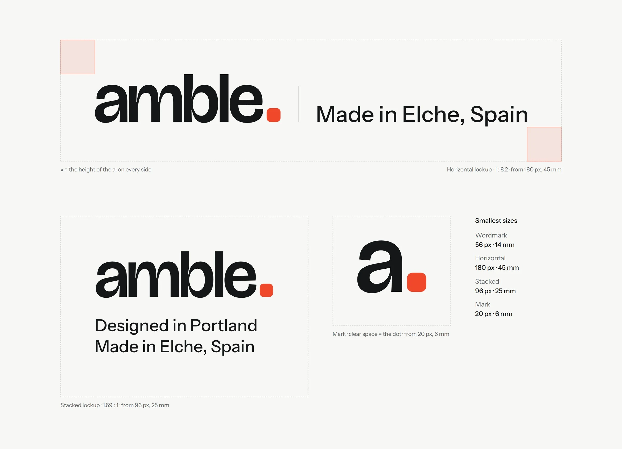
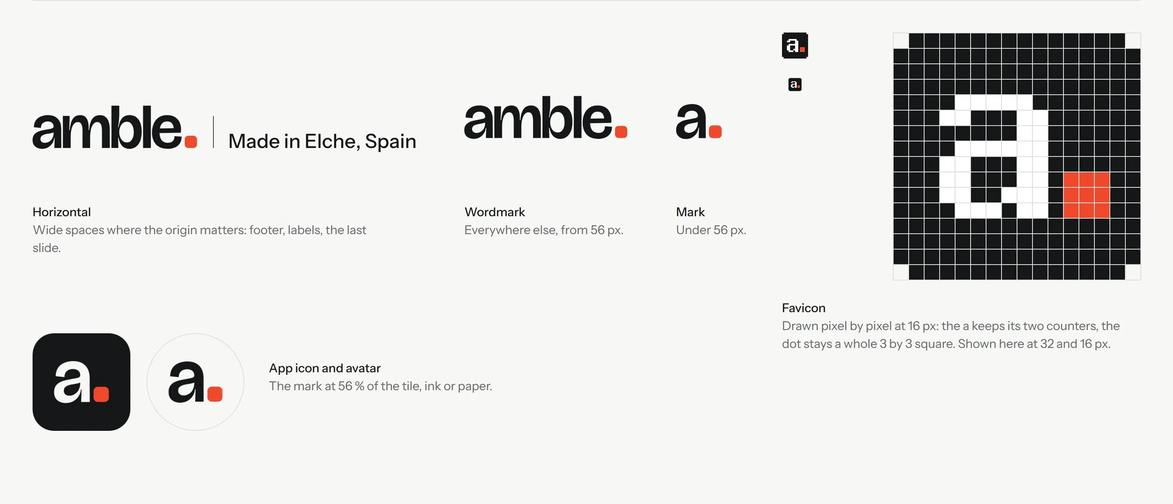
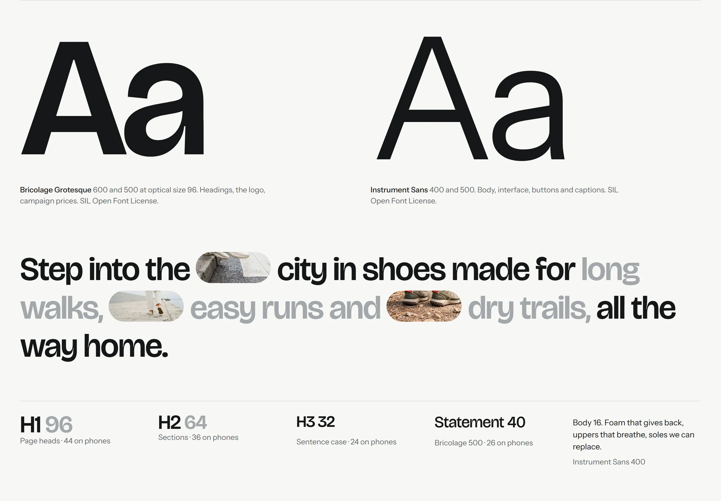
A lowercase wordmark in Bricolage Grotesque 600 with a 0.2 em full stop. Uppercase two-tone headings in Ink and Mist, Instrument Sans for everything else. A neutral world of Paper, Studio and Ink with Tomato kept under 3 percent, so the colour lives in the shoe. The devices: the fitted model name, the floor ruler, the dial, glass chips and photo pills.
The world
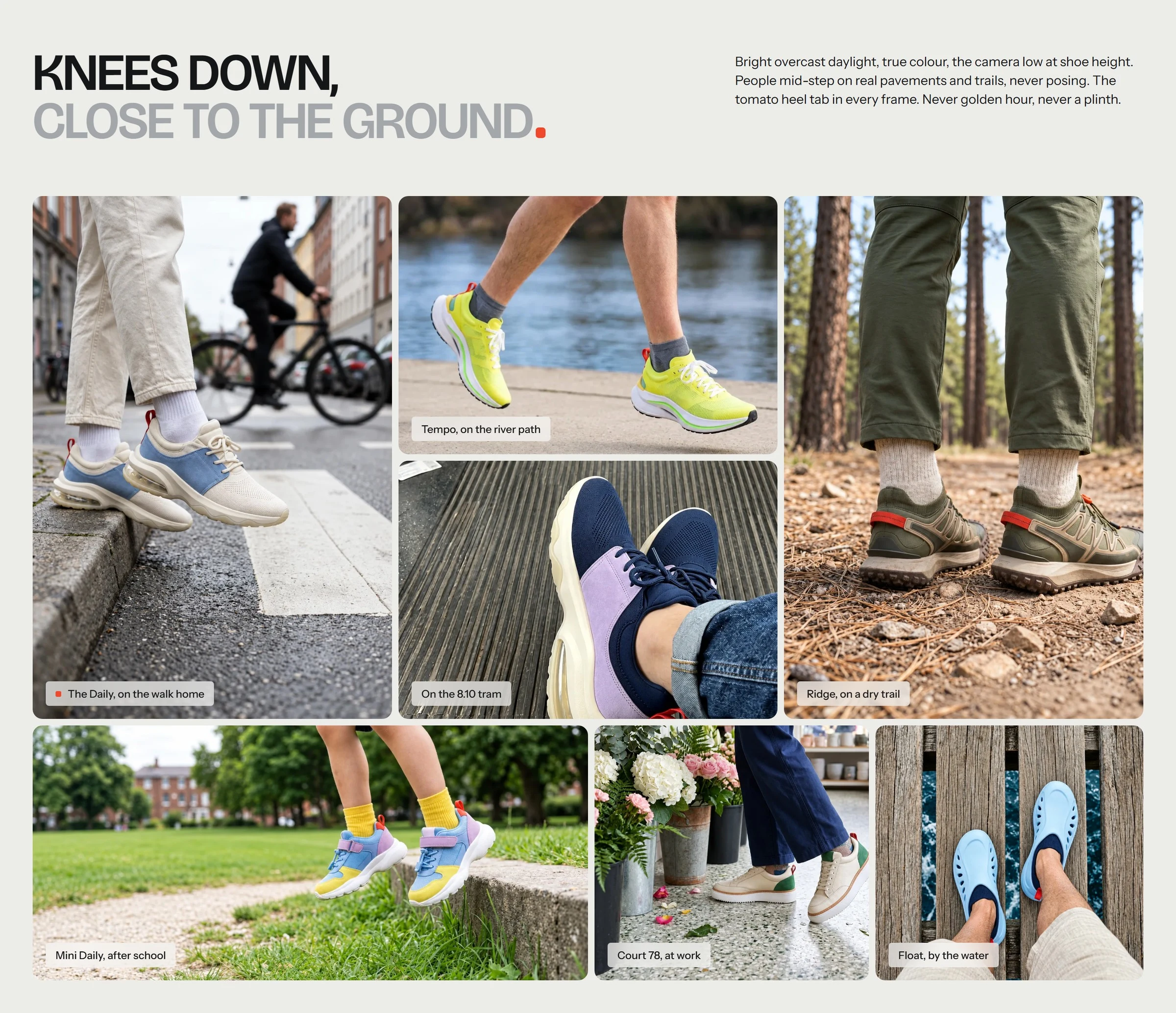
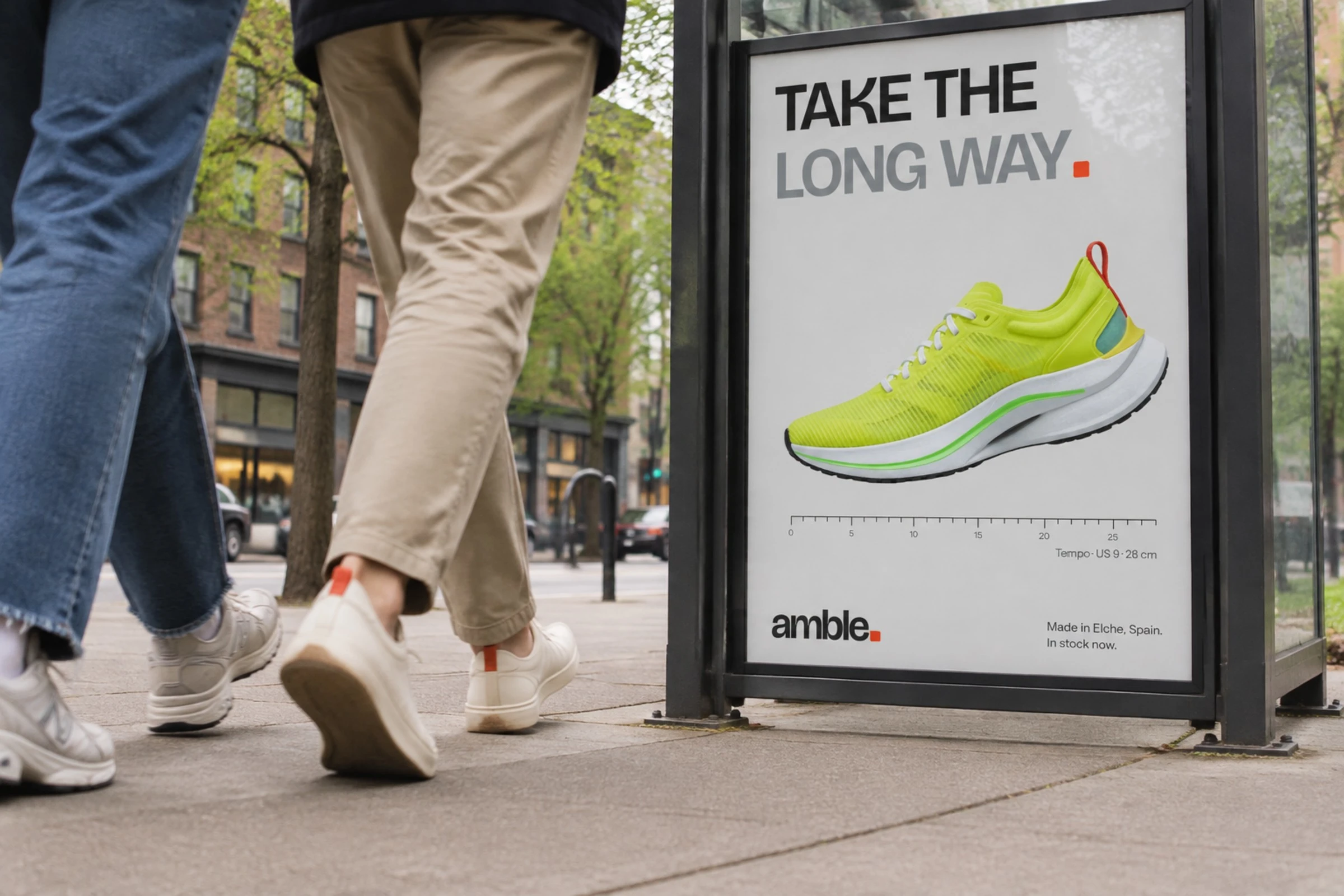
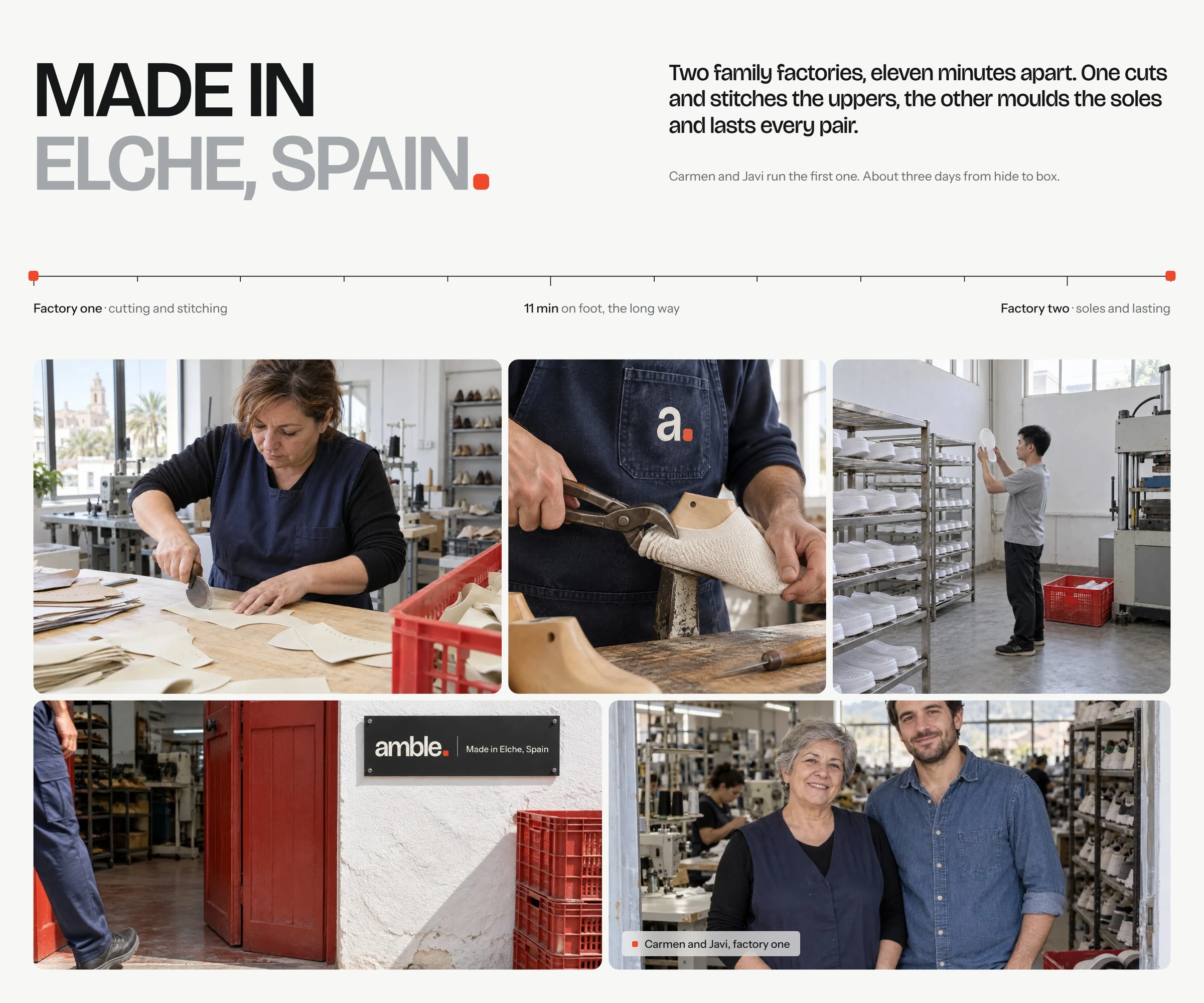
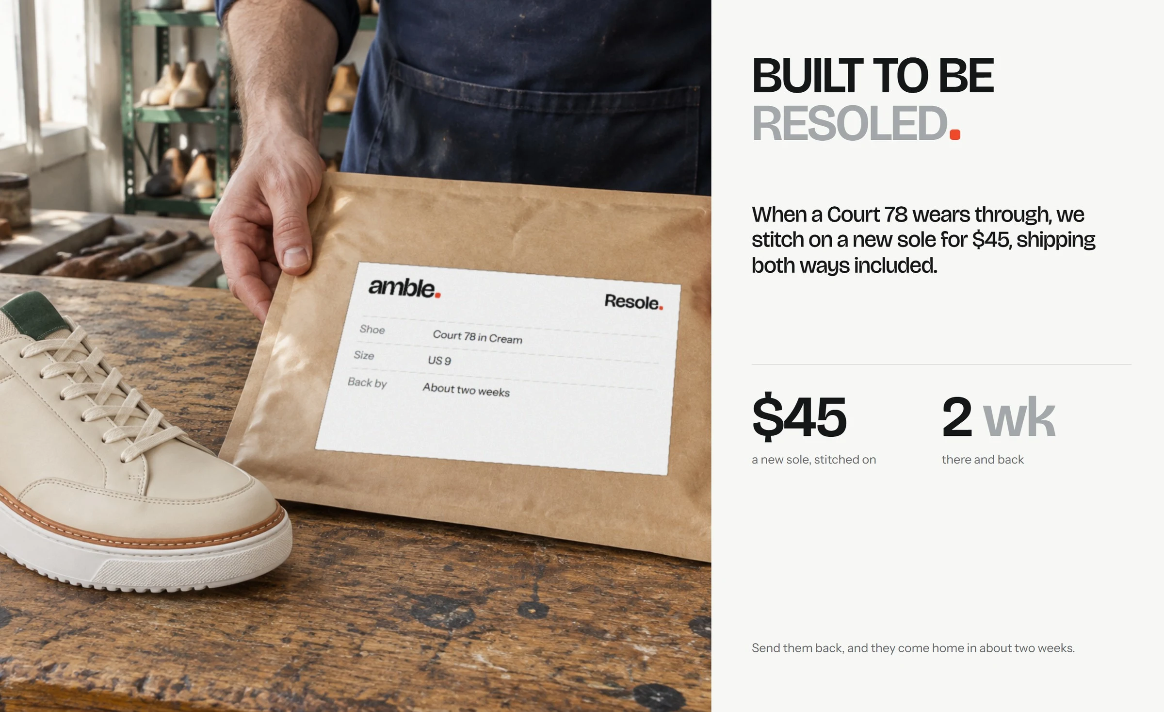
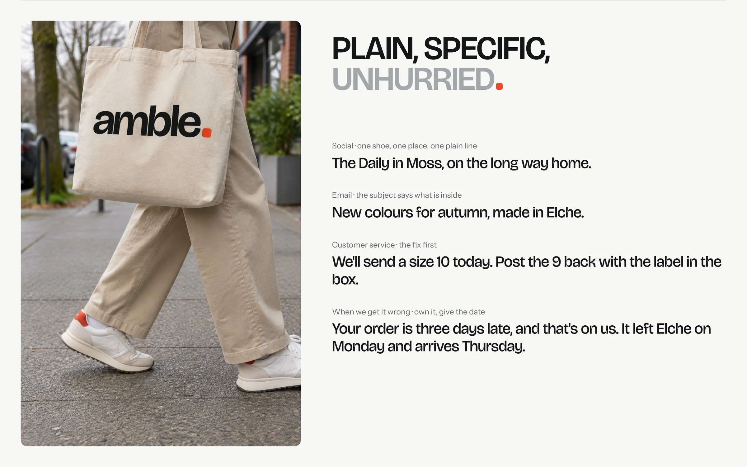
Photography stays knees down and close to the ground, in bright overcast daylight with the heel tab in frame. The identity runs through the shop, the shoebox, the resole service, insoles, totes, street posters and social.
The motion
The brand moves like a step: tip onto the toe, out to the left, in from the right, 700 ms on one ease. Eight loops show the mark being built, the colourways cycling, the step itself and the site in use.
0 likes · 0 views · Nov 16, 2026
Self-initiated identity for Amble, a concept sneaker brand. The heel tab is the full stop: one tomato square closes the name, the headlines and every step.

