
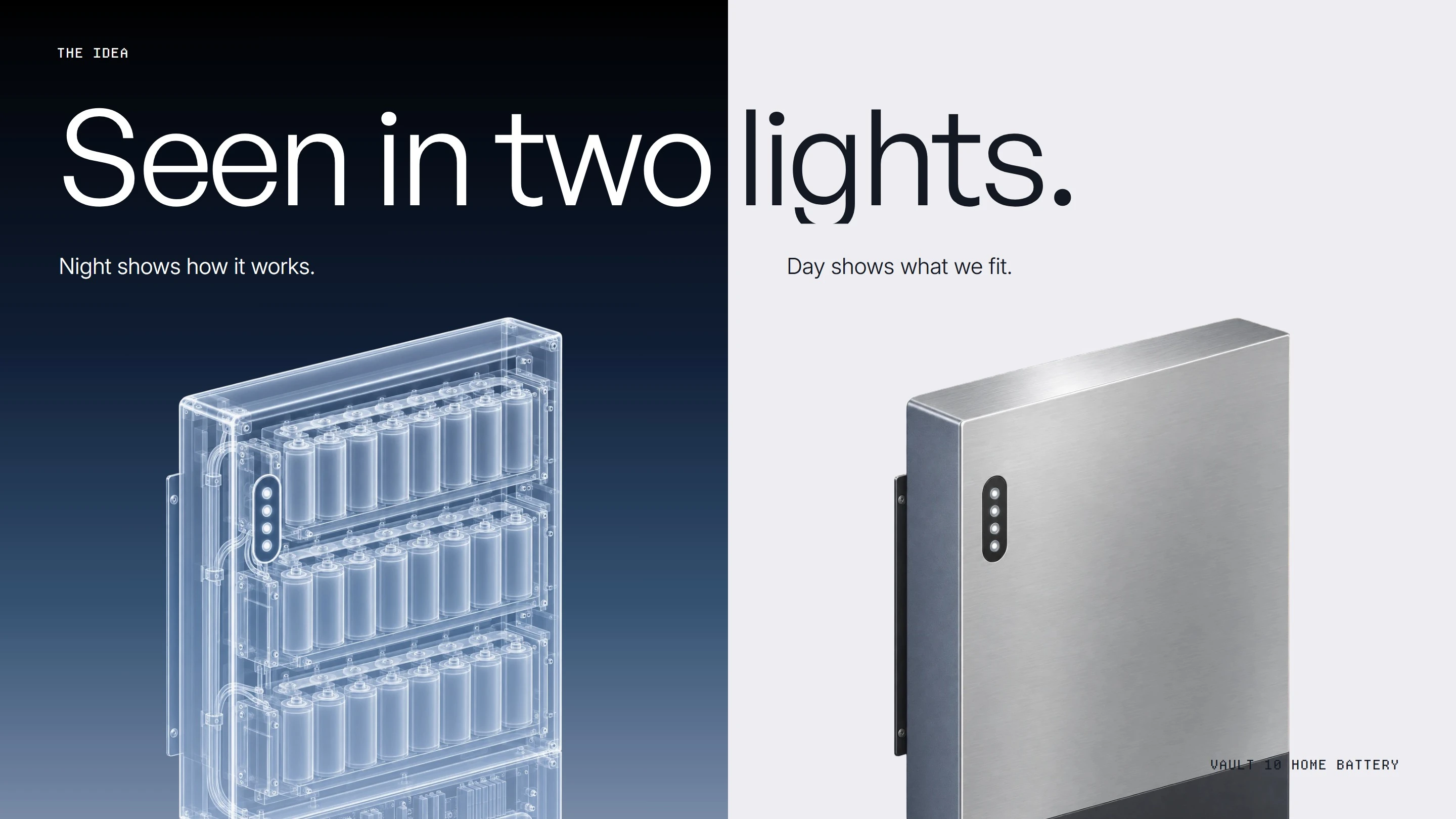
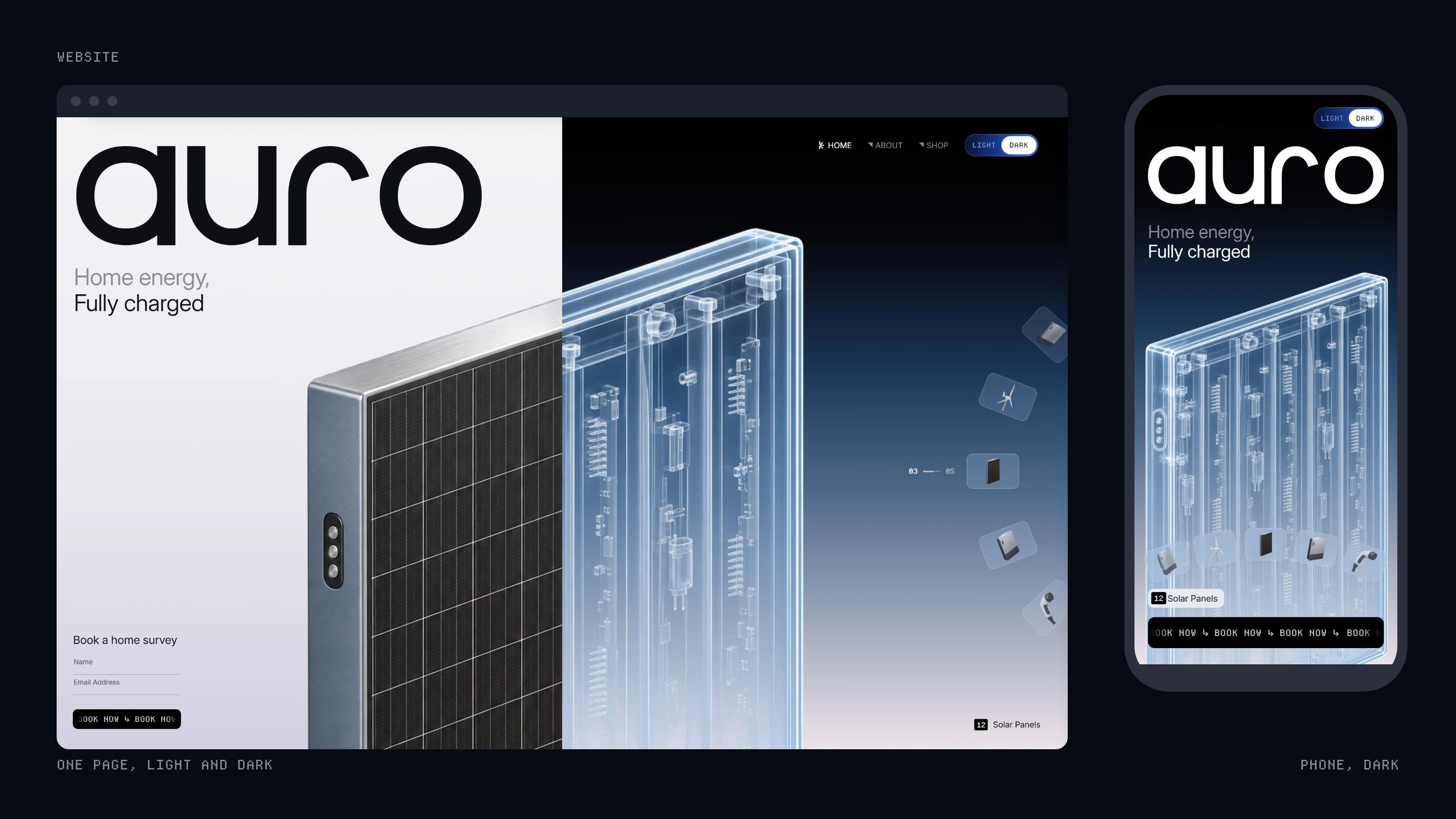
auro is a home-energy installer in Bristol: solar panels, batteries, EV chargers and heat pumps, surveyed, designed and fitted by one employed team under one warranty. This is a self-initiated concept identity for a fictional company, built from its own website and one idea: seen in two lights. By day you see what auro fits, by night how it works.
The mark
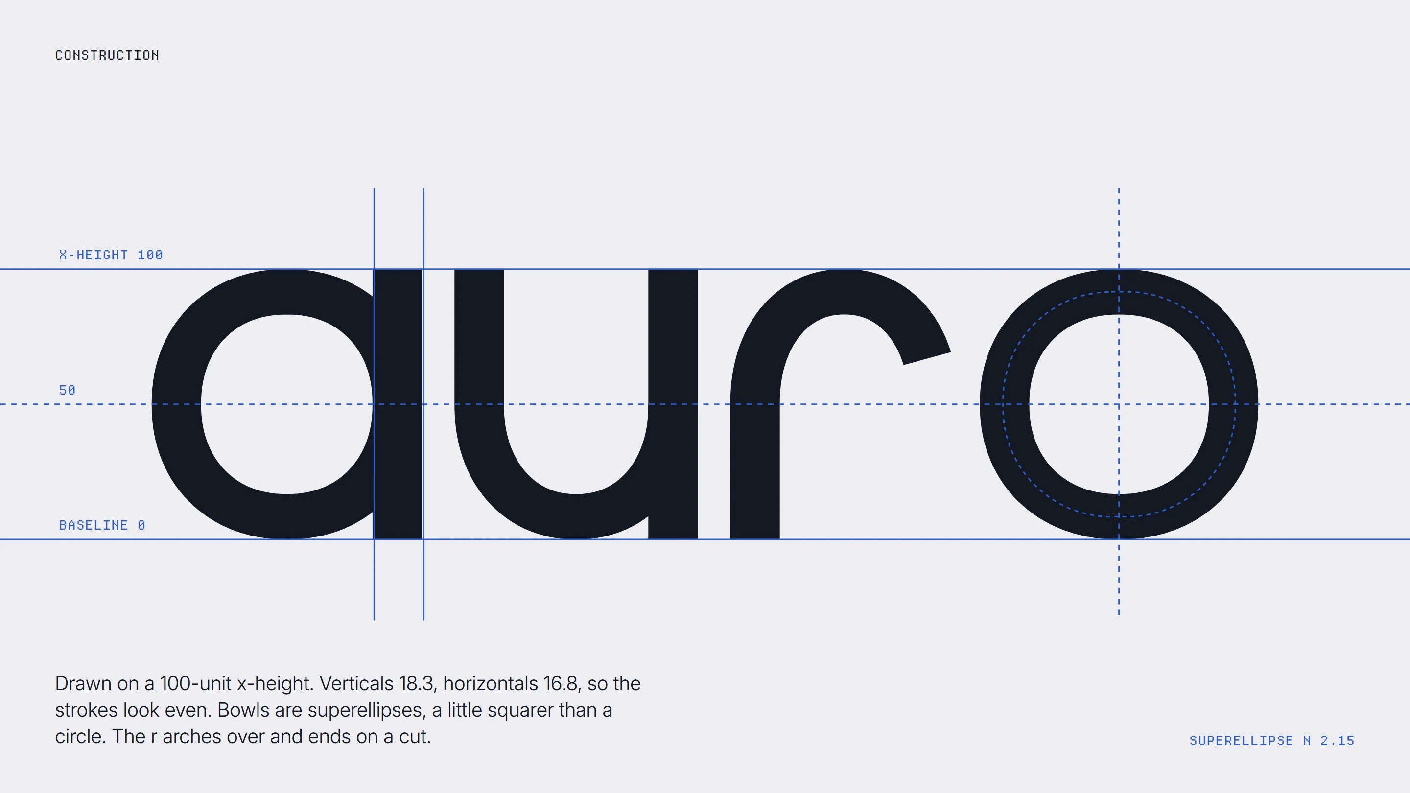
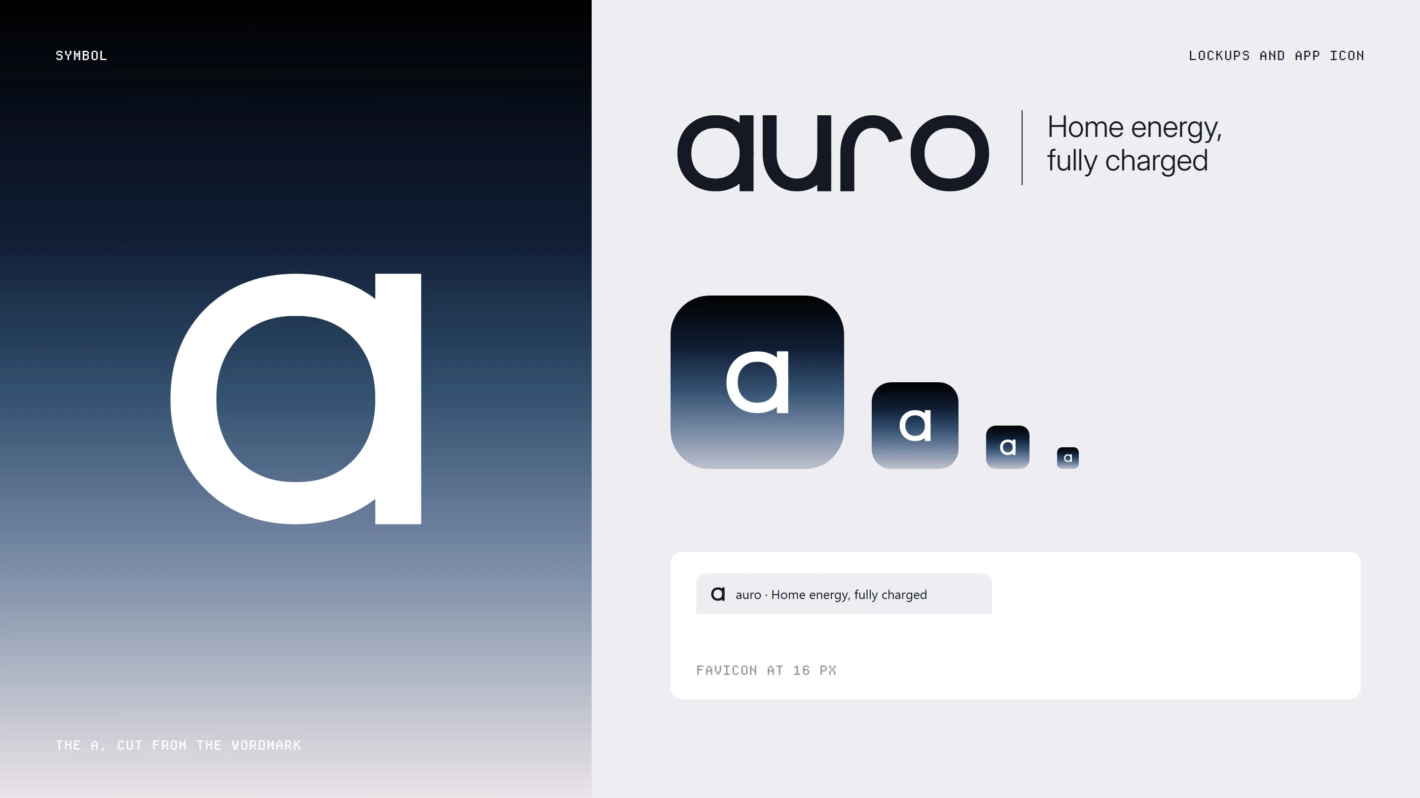
The wordmark is the site's own: a drawn monoline logotype on a 100 unit x-height, verticals 18.3 and horizontals 16.8 so the strokes read even, bowls drawn as superellipses so they sit squarer than a circle, and an r that arches over to a cut. The a alone is the symbol and the app icon.
Colour and type
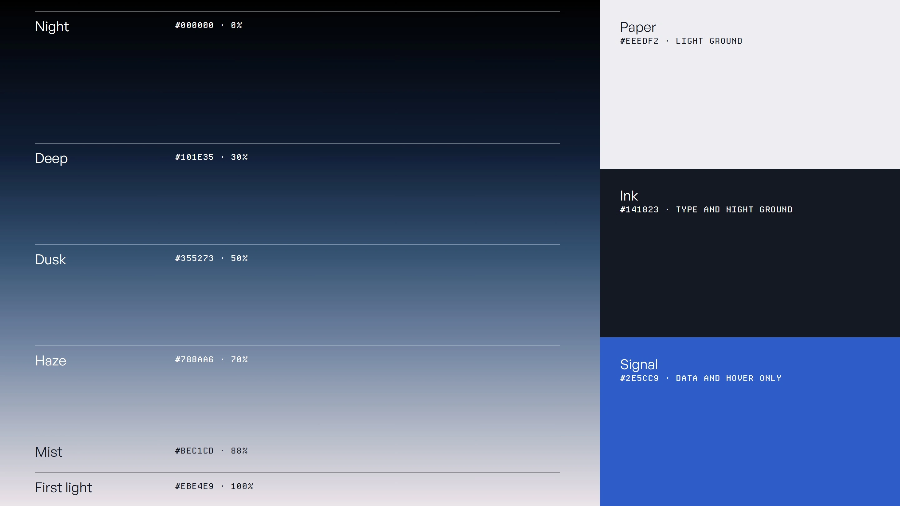
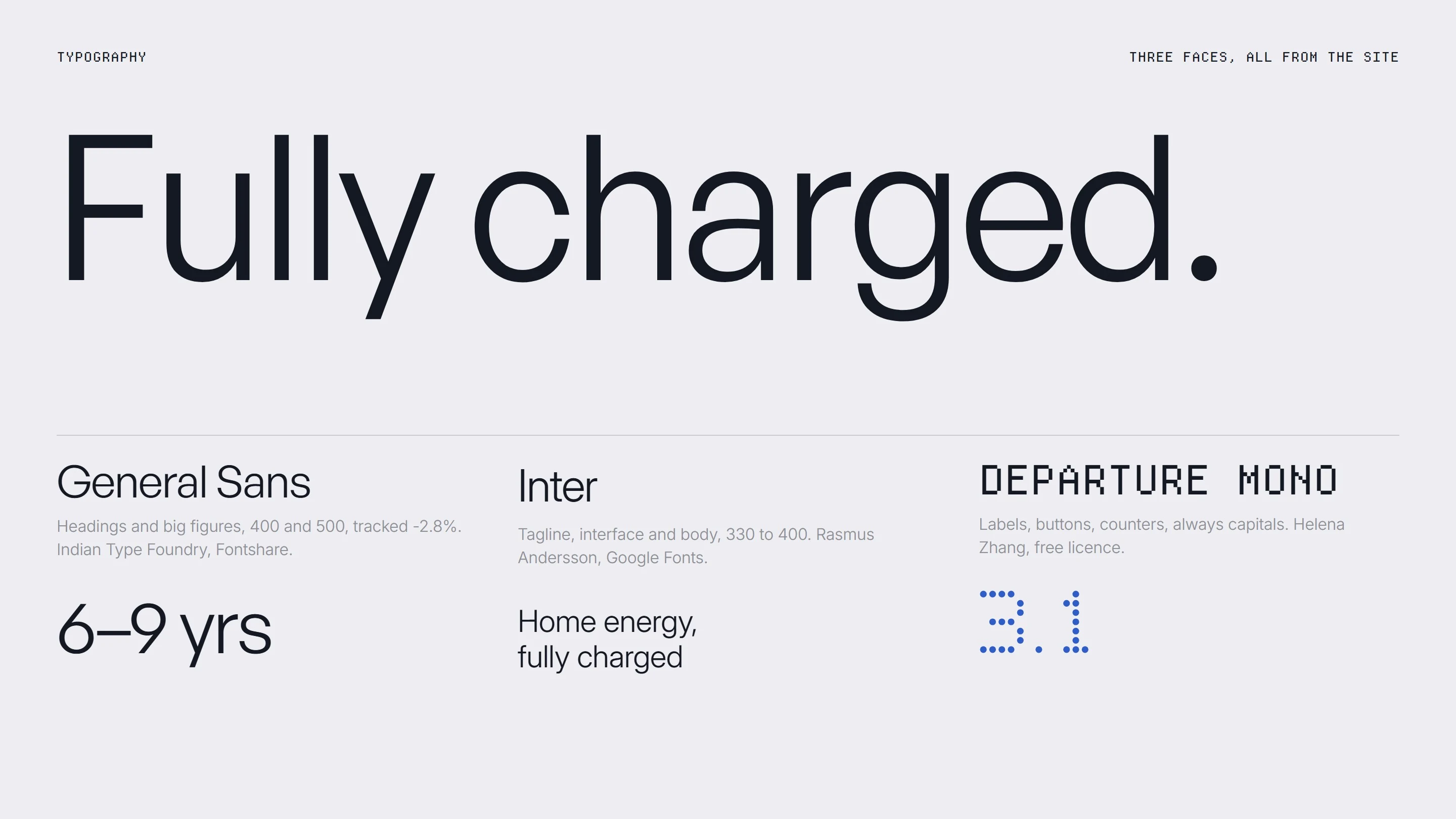
The palette is the sky from night to first light, with Paper, Ink and one Signal blue kept for data and hover. Three faces, all from the site: General Sans for headings and figures, Inter for the tagline and body, Departure Mono for labels and counters.
Photography and products
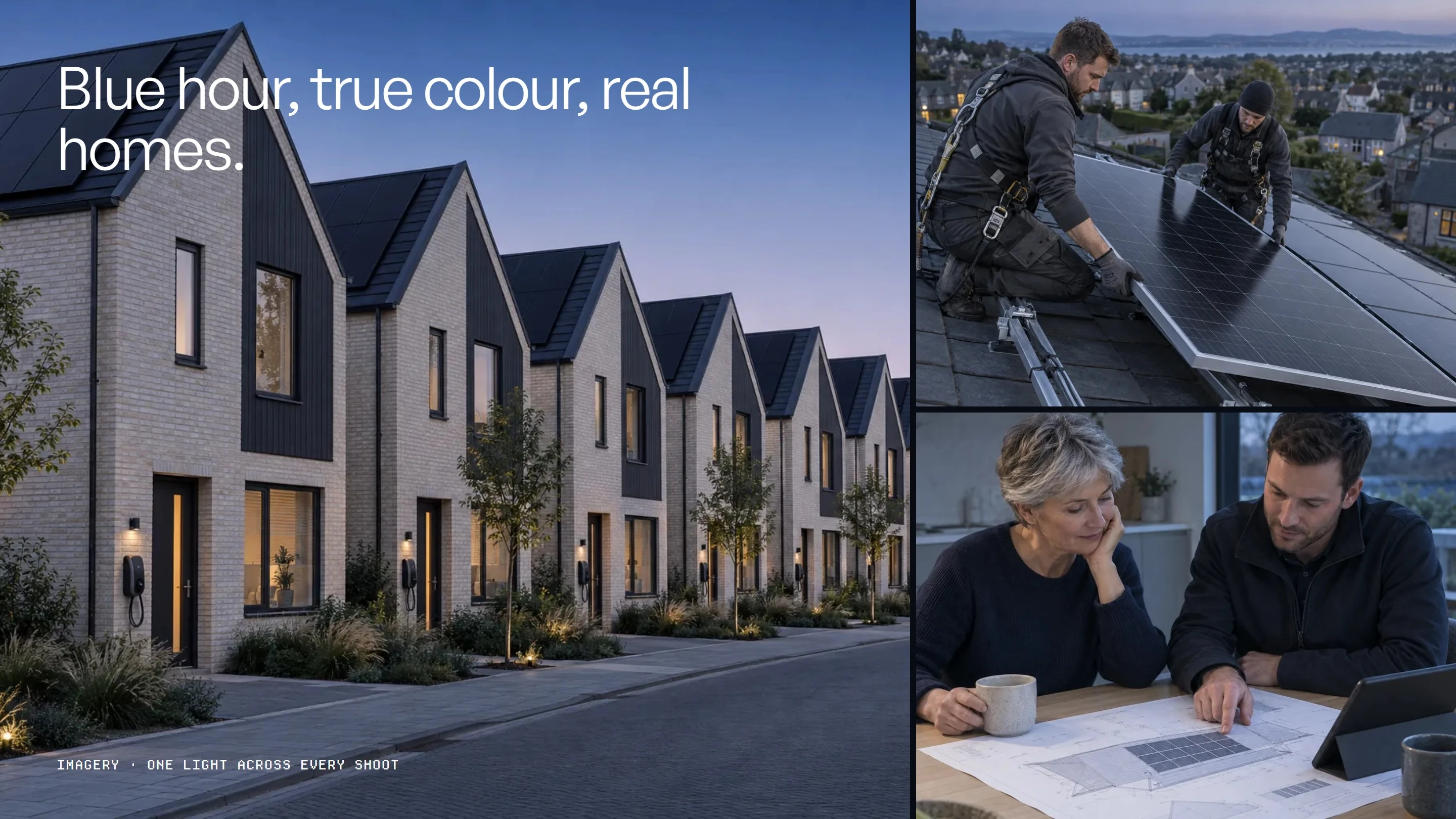
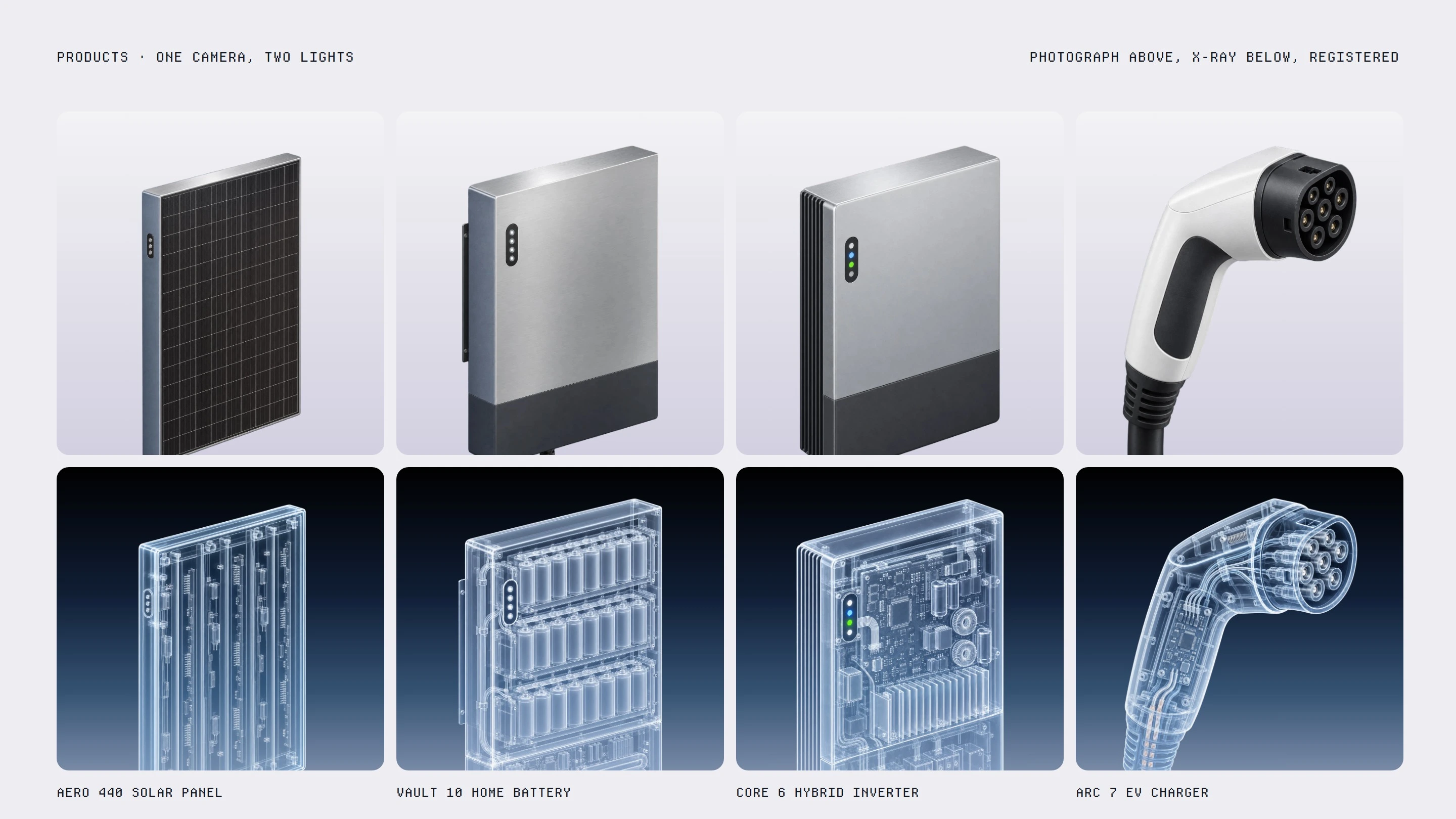
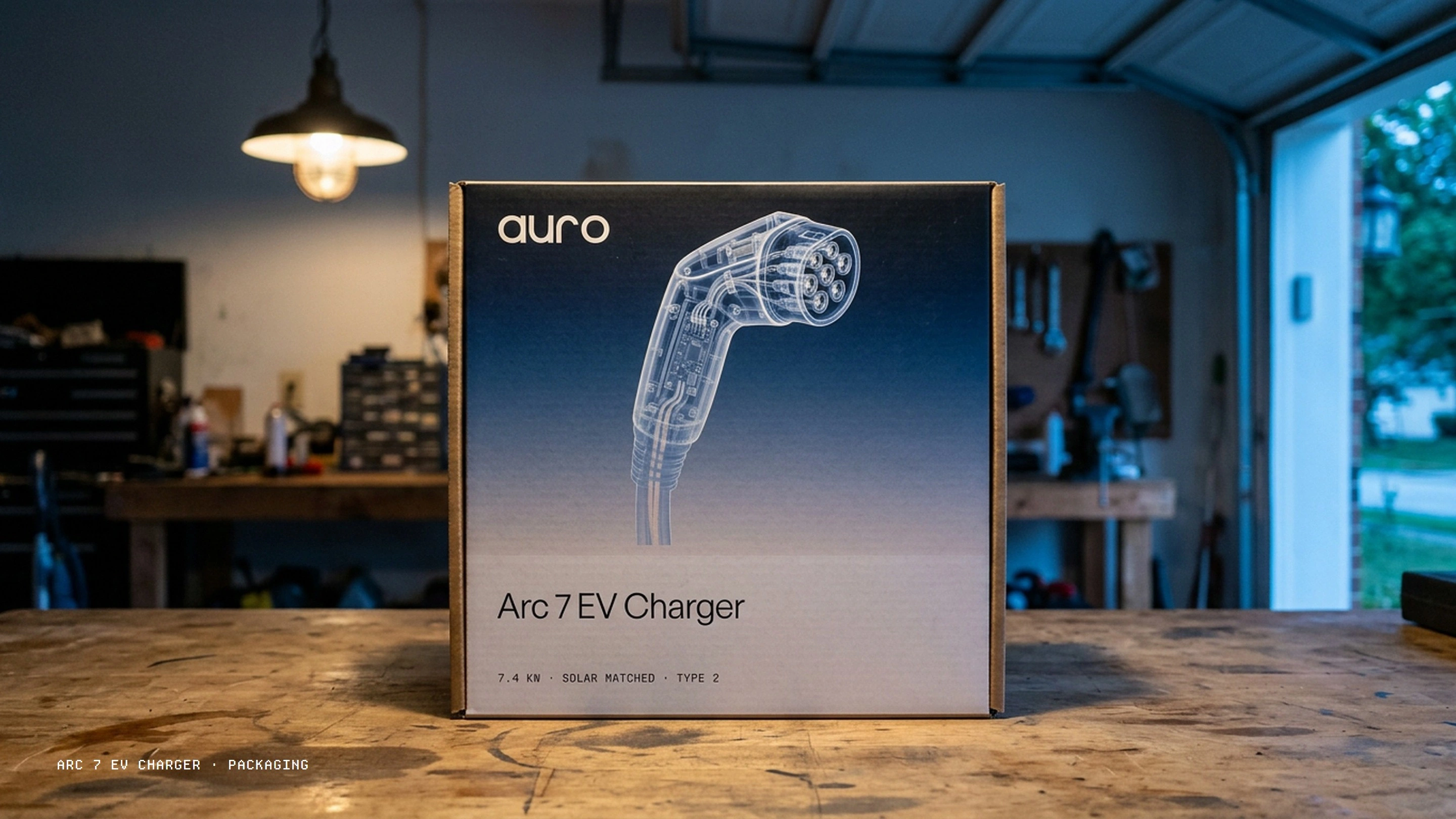
Blue hour, true colour, real homes and real engineers in the South West. Every product is shown twice on one camera: the photograph by day and the X-ray by night.
In the world
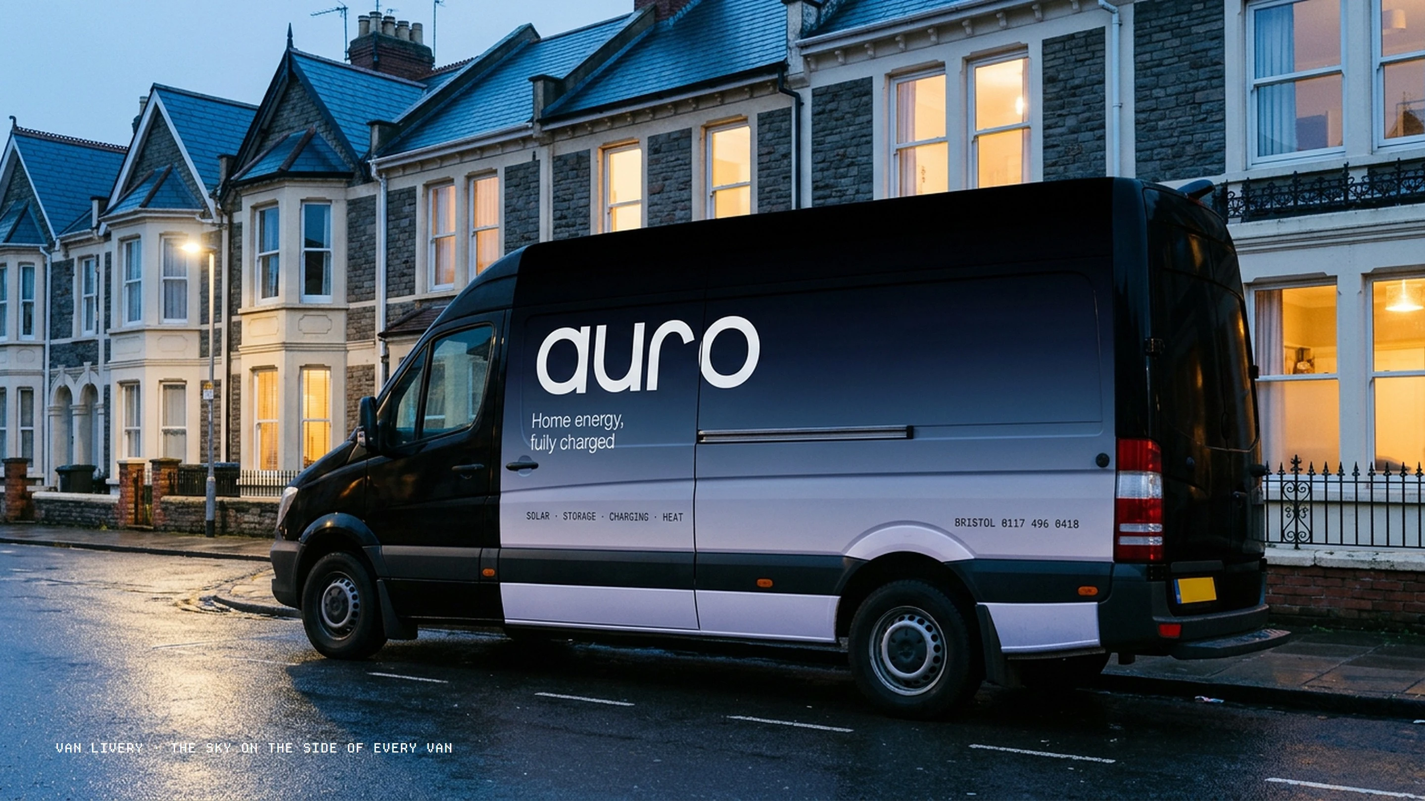
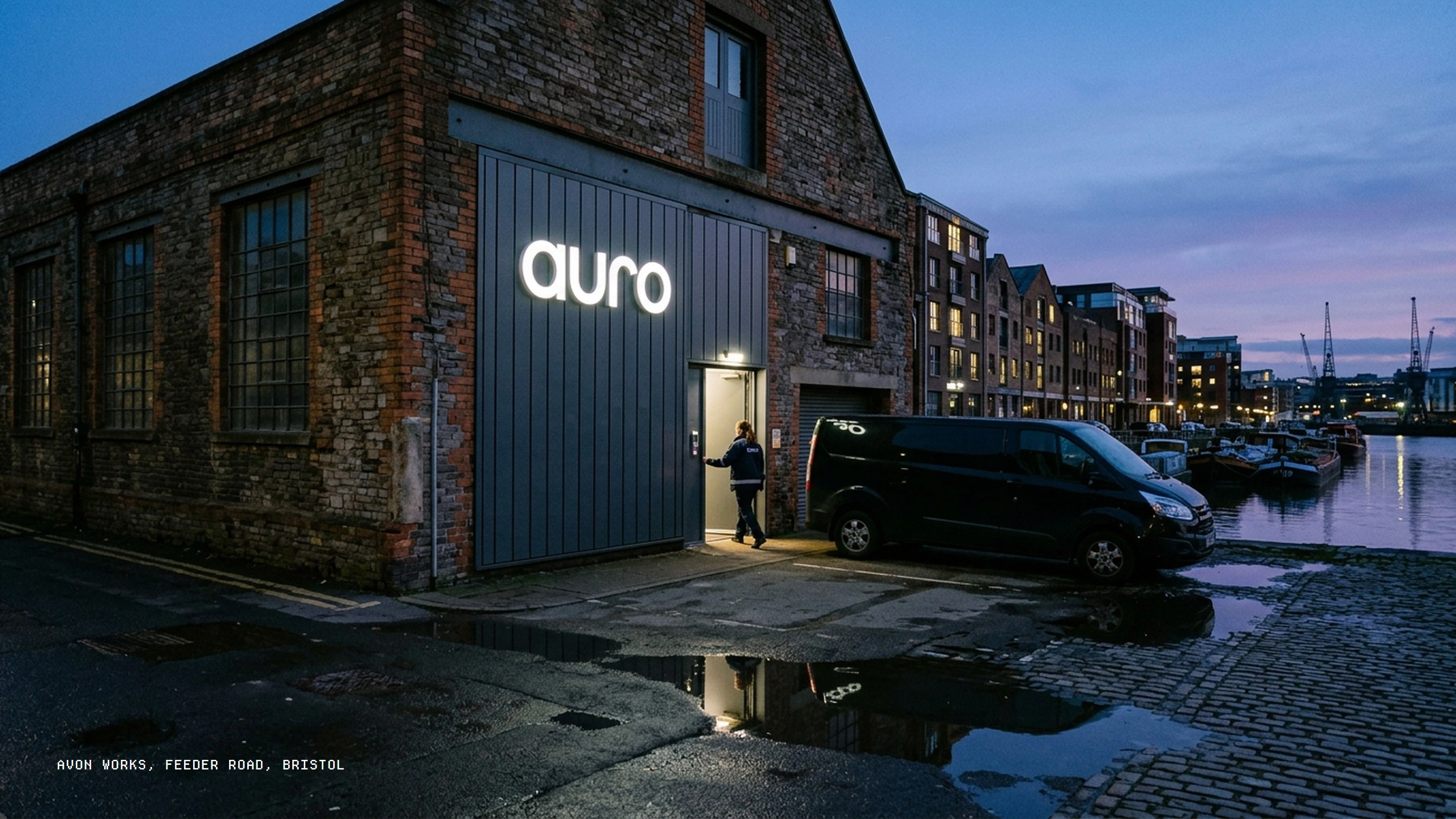
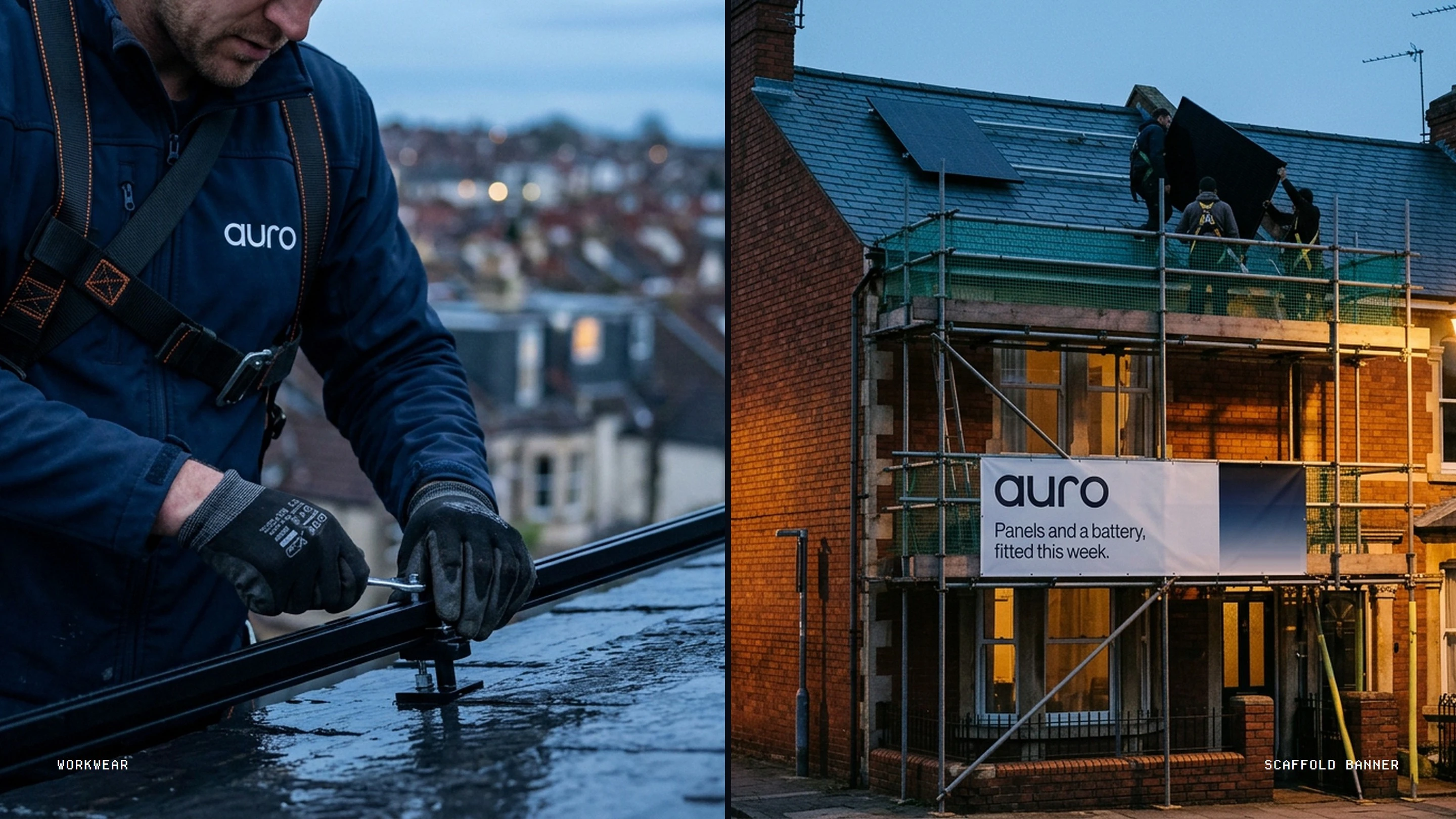
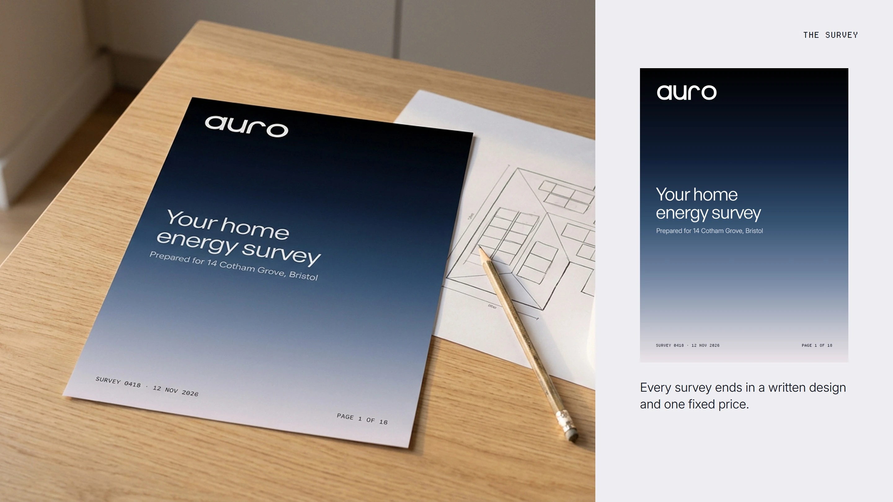
The system runs across the van, the Avon Works unit, workwear on the roof, the home survey, the Arc 7 box, the website and social.
Voice
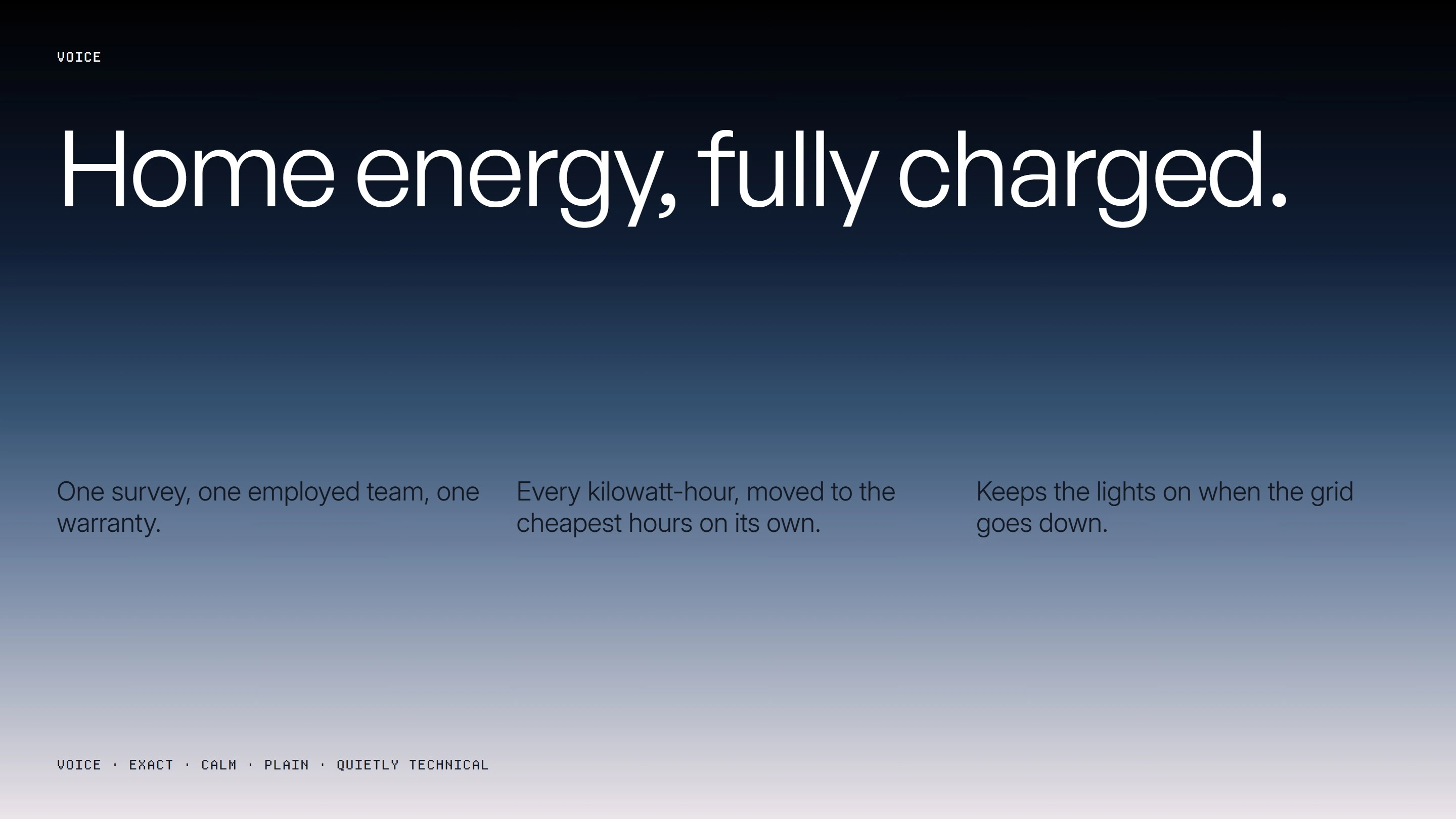
Home energy, fully charged. Exact, calm, plain and quietly technical, with motion that always travels top to bottom, the way morning comes down a wall.
0 likes · 0 views · Nov 16, 2026
Self-initiated concept identity for auro, a fictional Bristol home-energy installer, built from its own website: home energy seen in two lights.

