UX & UI | Department of Education

Problem
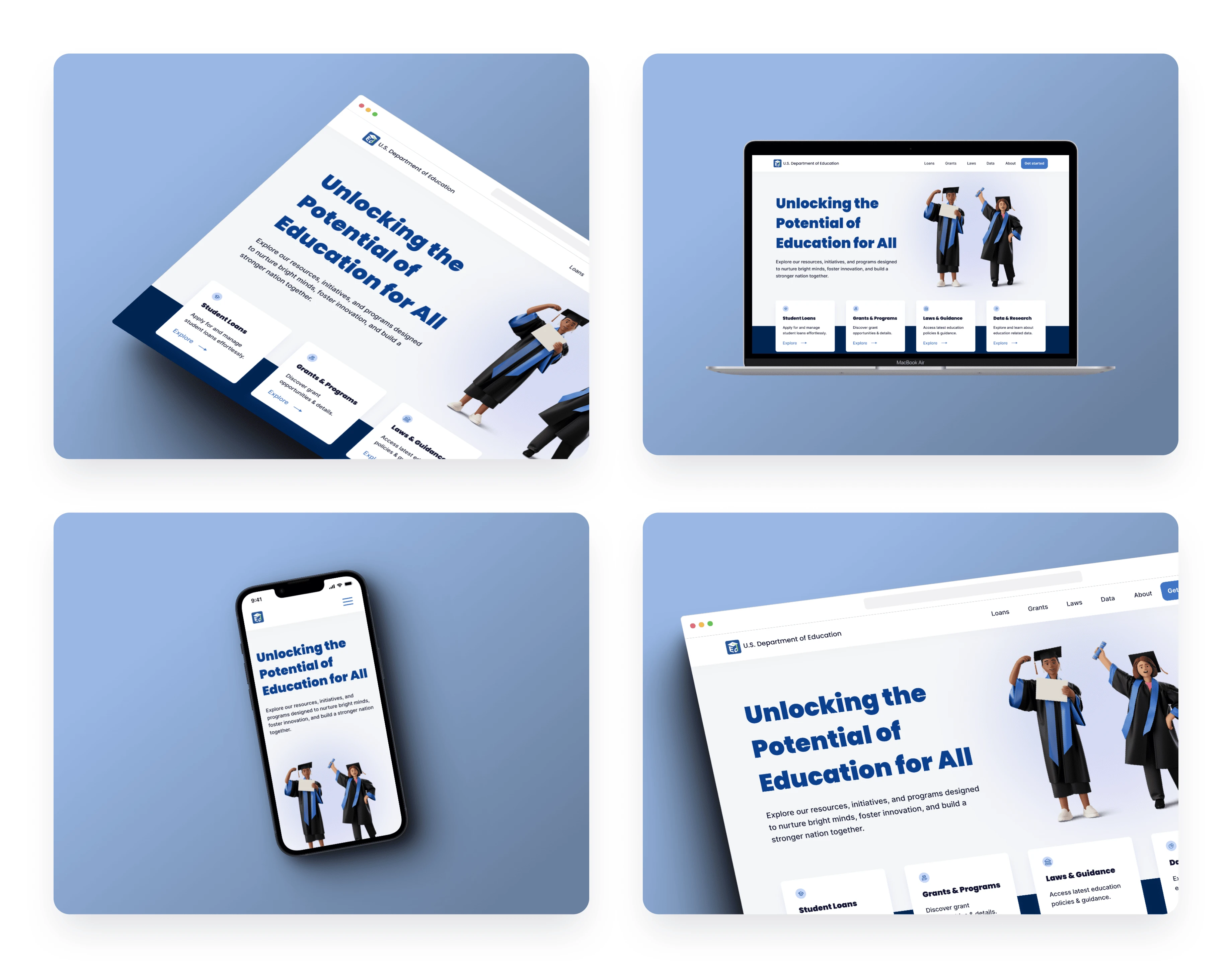
The U.S. Department of Education (DoE) website needed a comprehensive redesign to address multiple usability issues, including disorganized content, unclear links, a confusing utilities menu, and inadequate responsiveness, which hindered users' ability to find information about college loans and resulted in a subpar user experience.
Solution
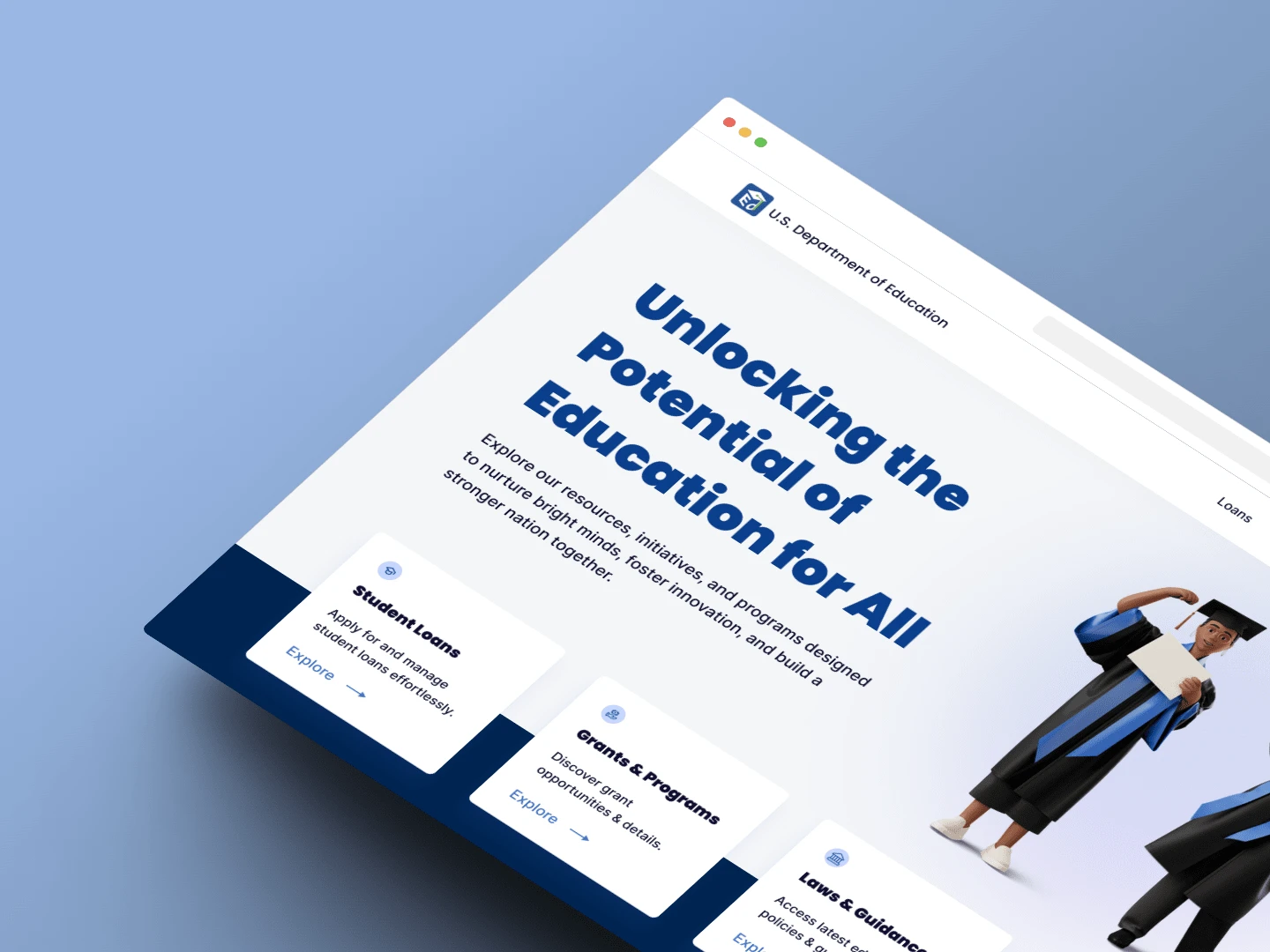
To address these user pain points, the DoE website will be redesigned with responsive web design principles to provide an enhanced user experience that prioritizes usability, accessibility, and user satisfaction.
Challenges & Pain Points
Through usability testing, it was discovered that the existing DoE website lacked an organizational hierarchy, making it difficult for users to locate and access relevant information efficiently.
Users also expressed frustration with the lack of clear indications for clickable links, as they appeared as plain text, causing confusion.
Additionally, the website's long page length and the layout of the utilities menu were cited as sources of user confusion.
Approach
To address these challenges, the layout of the DoE website was redesigned with a clear organizational hierarchy. The design emphasized clear navigation, intuitive labelling, and a user-friendly interface to enable users to easily find the information they needed.
Usability testing was conducted throughout the process to gather feedback and refine the design based on user needs.
Key Improvements
Key Improvements
Differentiation of Links: Links were differentiated from the rest of the content by using a clear blue color, while the remaining website text was kept in black. Additionally, a line was added beneath the links to further emphasize their clickability.
Clear Link Indications: Special icons were introduced to indicate the type of link. An arrow icon was added for internal links, indicating that they would take users to another page within the same website. For external links, a new tab icon was incorporated to convey that clicking on those links would open a new browser tab.
Carousel Implementation: To address the issue of long page length, carousels were employed, allowing users to swipe and navigate through the content cards. This reduced the amount of vertical scrolling required and made it easier for users to find the desired information.
Utilities Menu Optimization: In the mobile version, the utilities menu was positioned above the mobile hamburger menu, occupying excessive screen space. To address this, a floating action button (FAB) was introduced, located at the bottom corner of the screen. This implementation ensured that the utilities menu took up minimal space and remained readily accessible whenever needed.
Results & Impact
The redesigned DoE website now provides a modern and user-centric platform that caters to the needs of diverse users across various devices. By prioritizing user needs and addressing pain points, the new design enhances accessibility and navigation, allowing users to locate information more efficiently.
Through the implementation of responsive design principles, the website now offers an enhanced user experience, promoting usability and user satisfaction. The incorporation of clear link indications, carousels, and an optimized utilities menu has streamlined the user journey and improved overall navigation.
By placing users at the forefront of the design process, this project successfully transformed the DoE website into a user-centric platform that prioritizes accessibility, usability, and user satisfaction.

Like this project
Posted Jul 23, 2023
This project aimed to redesign and update the U.S. Department of Education website to improve usability and enhance responsiveness.
Likes
0
Views
6


