App Redesign for Improved Store Selection
Michelle Walstra
Client Overview
Famous Brands, a South African fast-food conglomerate that operates over 2,800 franchises nationally
Users were spending too much time on the home screen, often selecting a store that would not be able to serve them.
The bounce rate on checkout decreased by 14.55% as a result of users choosing the right store. The average time on the home screen also decreased by 3.16%
Research
“I am overwhelmed by the options”
Users were not happy with the home screen of the app and we noticed this in the following:
Exploring the Problem Space
To validate the problem and understand the ‘why’, I set up in-person usability tests with some of our demographic and below are the findings I presented to the broader product team:
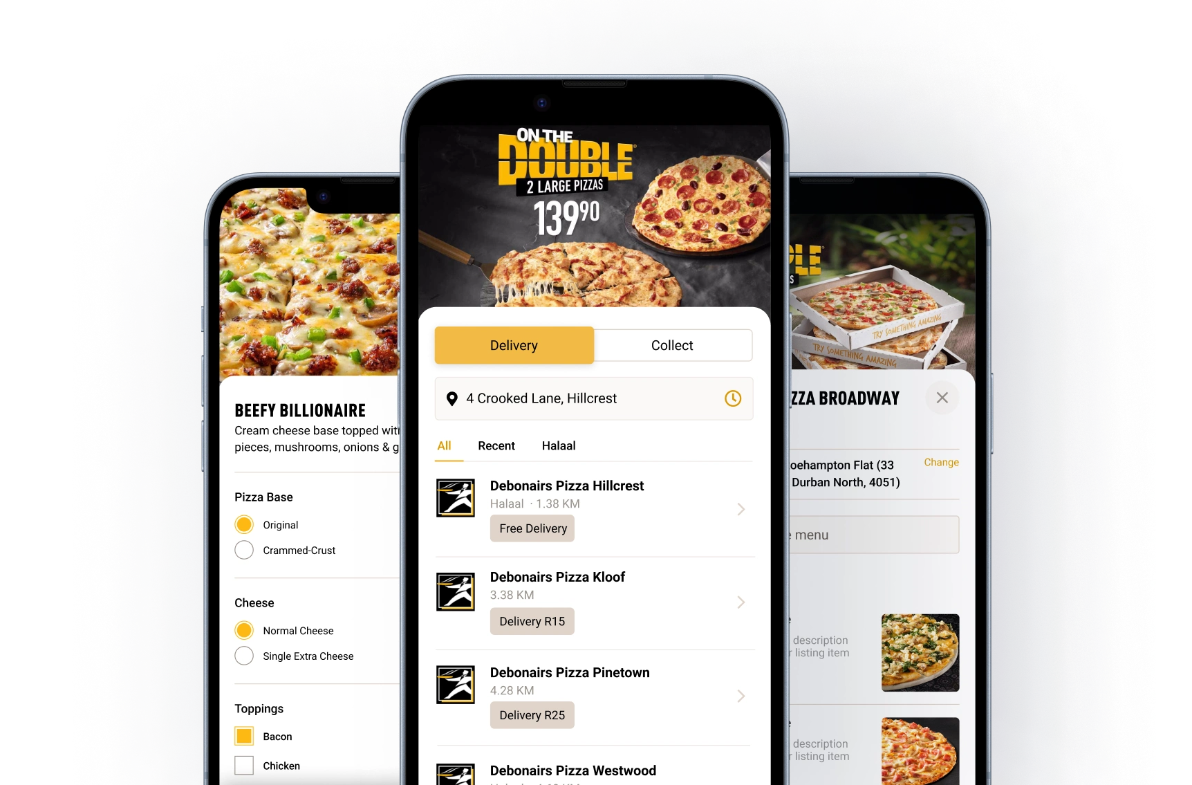
Every branch in a 10km radius was being shown, regardless of whether they could deliver to them. Each listing also had too much irrelevant information.
Users weren’t aware they needed to choose a store to start an order. Some users opened the hamburger menu, hoping to find a link to the menu.
Business Constraints
The client was B2B (Famous Brands sold fast-food franchises to franchisees) but the app was B2C (customer ordering food from on franchise) so we needed to balance the user needs with the following business constraints:
💼Franchisees always wanted their store to show on the home screen, even if they weren’t able to deliver
🍕Stores had different menu items, so we needed the user to choose a store first
Design
The time it takes to make a decision increases with the number and complexity of choices.
Fewer store options lead to shorter page visits, aligning with Hick's law that more choices increase decision time. The apparent fix was to streamline store choices, enhancing relevance and reducing cognitive overload. Previously, the app overwhelmed users with 15+ stores, many irrelevant.
The path forward? Show only what truly matters.
➖ Removed delivery info block and introduced a delivery toggle at the top of the screen
➕ Added store distance from location, so the user understood how the listings were sorted
➕ Added arrow pattern to listing to guide the user on what to do next (choose a store)
➖ Hid irrelevant stores behind a ‘View More Results’ and only showed stores that could deliver
Addressing Complexity
What seemed like a simple solution became significantly more complex when we realized there were 12 potential states we needed to cater for.
After many (and I mean many) collaboration sessions between myself, the product owner and the lead developer, I put together this flow diagram of the relevant states and what design would be shown.
Engineering Handoff
With the states enumerated and UI components designed I started on the developer handoff:
🎥Created Loom videos for devs to watch asynchronously that explain each component and how it works.
✍️Wrote acceptance criteria that covered empty states, assets, validation and error scenarios.
🖥️Designed end-to-end Figma prototypes for engineering and QA to reference
🤝Led a project kick-off meeting where I explained the why and the what - I left the how up to them.
🎨Created a style fixes branch once the work is in review to tweak CSS to achieve pixel perfection.
Following best practices, we documented initial metrics and defined clear targets for success to measure our improvements against. Below are the outcomes that resulted from the design changes we implemented:
⬇️Bounce rate on checkout decreased by 14.55%
⬇️Average time on screen decreased by 3.16%
In addition, we monitored the frequency of keywords in user reviews and there was a significant decline in store selection complaints.
Just because a design element is common doesn't guarantee user intuition. Test, then trust.
Share recordings from user interviews when presenting to fast-track stakeholder buy-in
Basic, high-level usability testing pointed us to big improvements, showing small efforts can lead to major insights
A subtle UI change led to a substantial improvement in user satisfaction, highlighting how changes don’t have to be grand to be impactful.
Like this project
Posted Aug 6, 2025
Redesigned app to improve store selection, reducing bounce rate and time on screen.
Likes
0
Views
7
Clients
Famous Brands