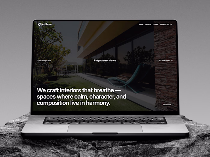
Real estate website for a real estate realtor
Nzau Ng'emu
This case study is an inside look at how I solved certain recurring problems with real estate websites. Alongside this, I also set out to answer 3 questions.
Before I began designing this website, I went deep into research and found that most solo realtor websites suffer from several problems:
Low conversion rates.
Agents globally hate sites that are slow, and poorly optimized for search.
Lead capture failure: agents get traffic but not usable leads.
Search & listing UX is shallow: Most websites ship generic filters and gallery sliders but fail to present the data that matters (Lease type, property type, neighborhood amenities, transparent fees).
After my exposure to these problems, I was left with several questions:
How can I improve the conversion rates for Musyii?
Can a solo realtor's portfolio and marketplace website compete with the bug firms whilst staying memorable?
Can I improve the UX whilst saving the visitors' time?
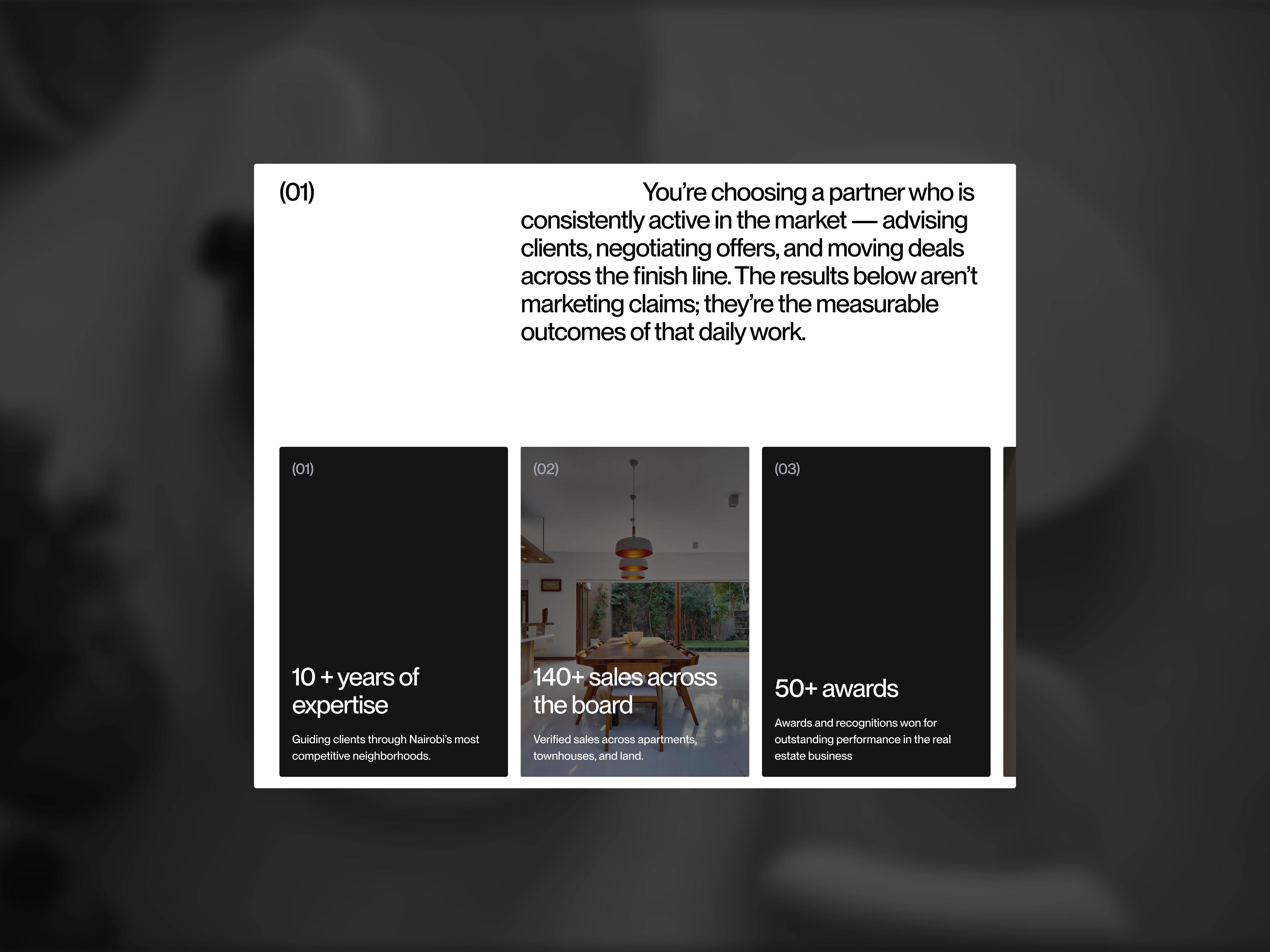
Social proof section of the website
How I solved these problems.
1: Conversion rates
Hicks law states that the more choices you give a user, the longer it takes them to make a decision.
Most real estate websites, provide too many options to the user which ends up overwhelming them. To counter this, I only gave the user one CTA per section. I also used the CTAs sparingly.
This decision was aimed at reducing the cognitive load and 'force' them to make the only obvious decision.
2: Agents globally hate sites that are slow, and poorly optimized for search.
I optimized the images by reducing their size and mainly using jpeg/jpg, where possible. This helped with the loading.
For the videos, I did not embed them in their native format (.mp4), instead, I hoisted them online and used the link. This ensured the site did not have to struggle with loading very large assets.
To help with search and SEO, I added optimized alt tags, responsive breakpoints, proper text hierarchy, and proper color contrast.
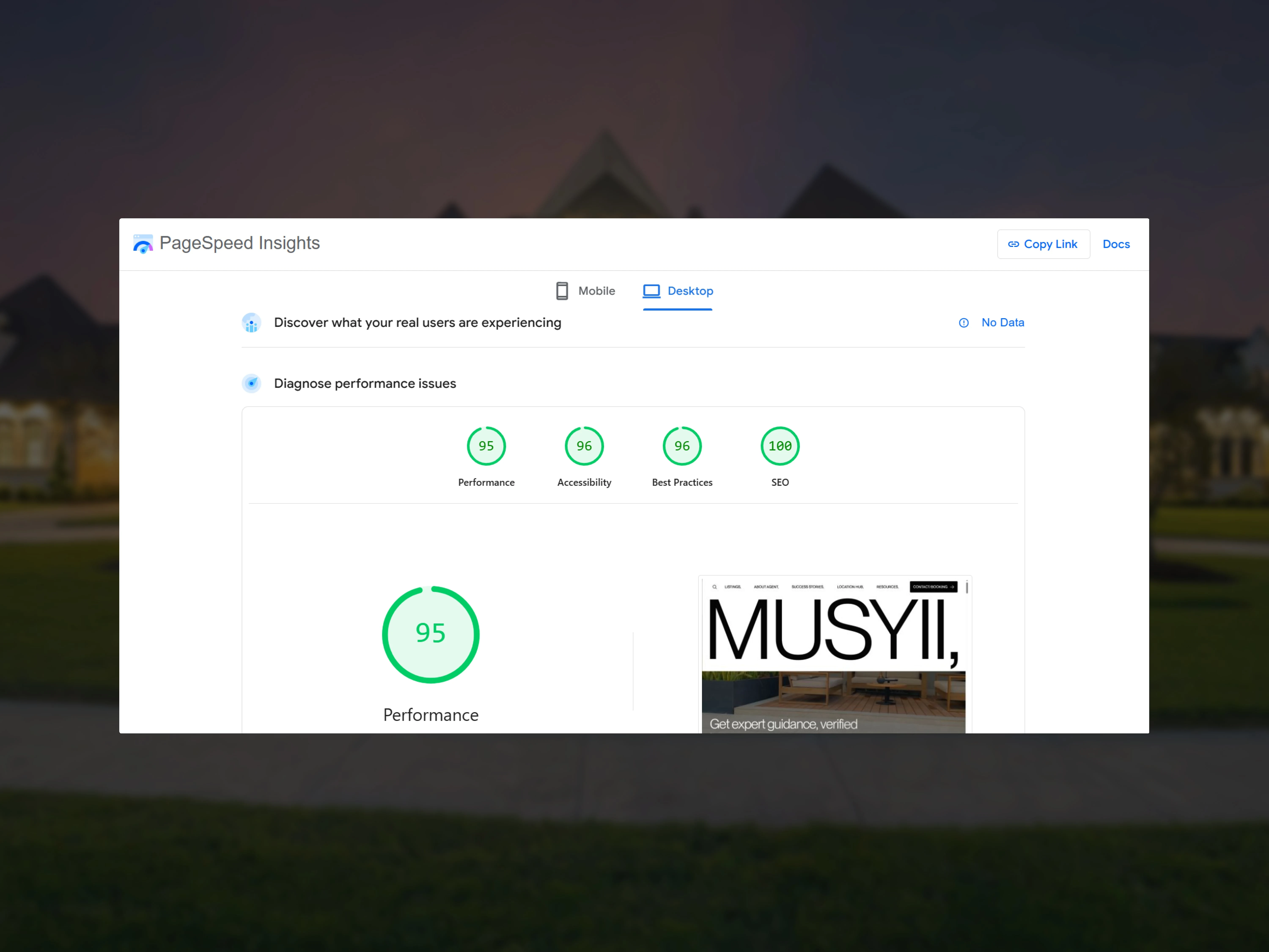
PageSpeed Insights metrics from the website on performance, accessibility, best practices, and SEO
3: Lead capture failure: agents get traffic but not usable leads.
During research, I realized that sending leads offsite to book meetings introduced friction. This friction in turn leads to drop offs.
Thus, I introduced in-site meeting booking via Cal.
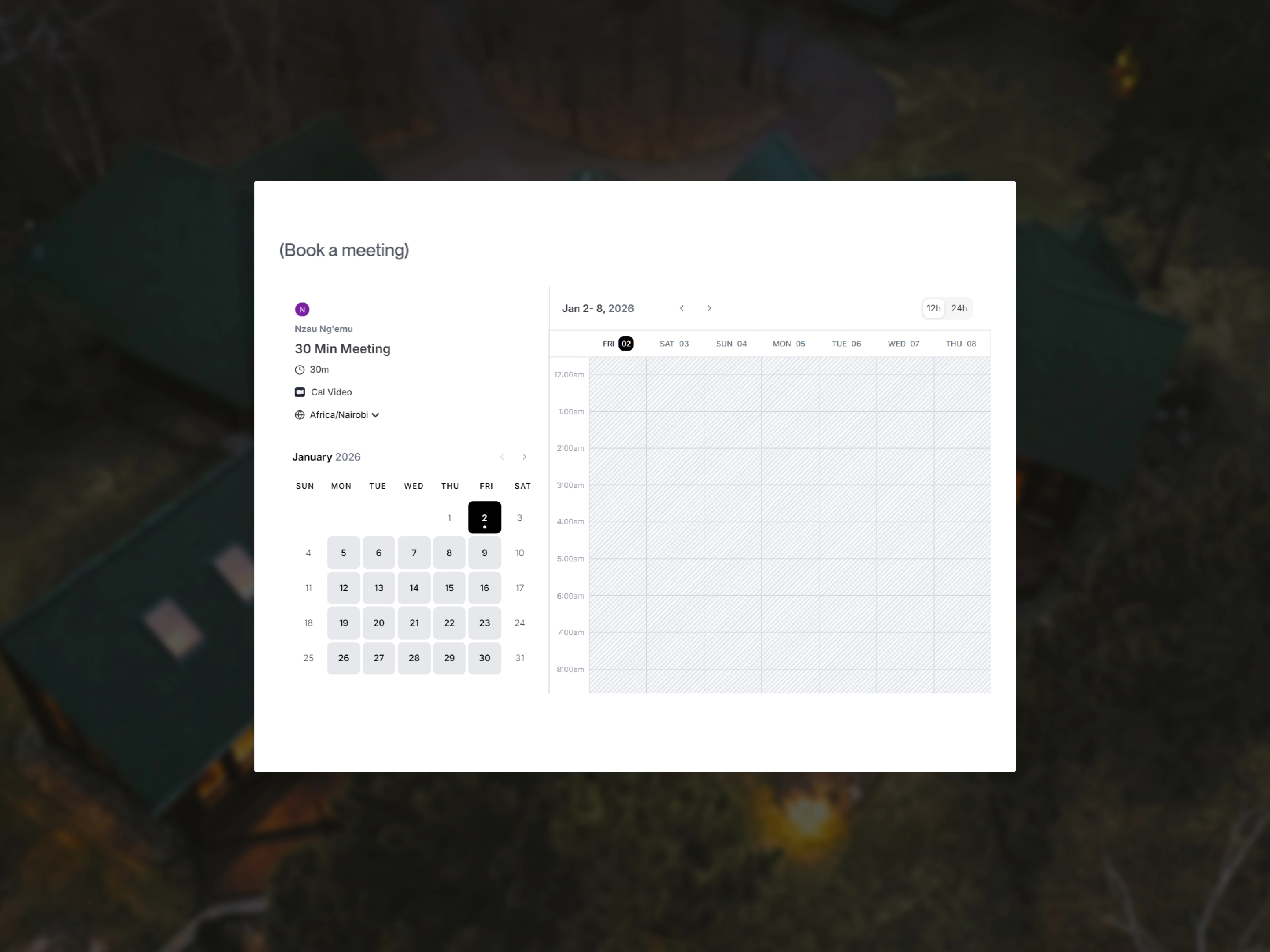
In-site meeting booking via Cal
4: Search & listing UX is shallow:
Most websites ship generic filters and gallery sliders but fail to present the data that matters (Lease type, property type, neighborhood amenities, transparent fees).
For this, I went the opposite way and presented the user with all the data that they would require to make a decision and implemented property type and location based filtering.
I also added site wide search
Were the 3 questions answered? Yes
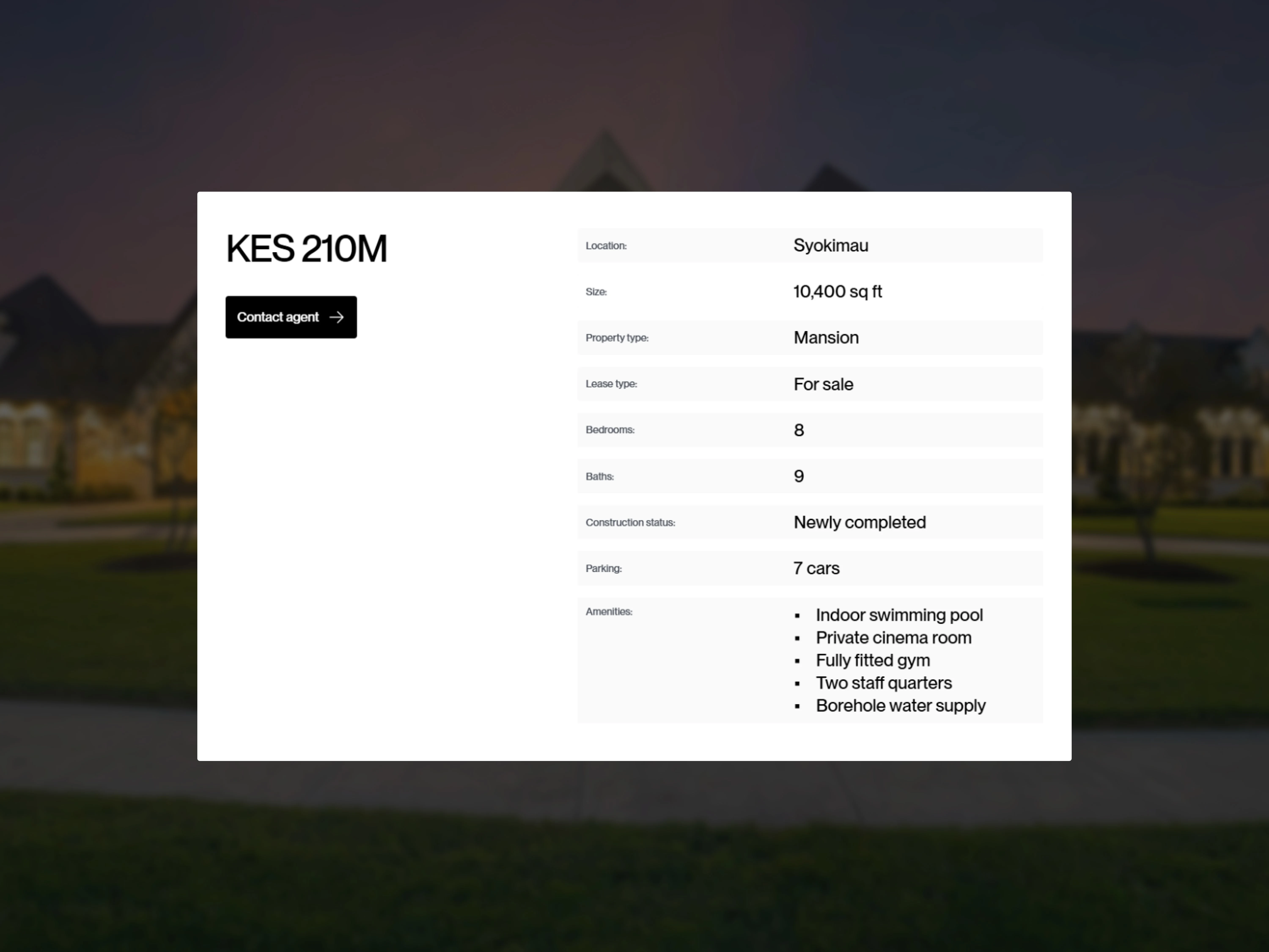
Property listing details
The footer animation
Preview the full project: https://musyii.framer.website/
Ready to work together?
Like this project
Posted Jan 2, 2026
I designed a real estate website for Kenyan based realtor with improved UX and better conversion
Likes
0
Views
16