Swiss-Inspired Framer Template for Architecture Studios
Nzau Ng'emu
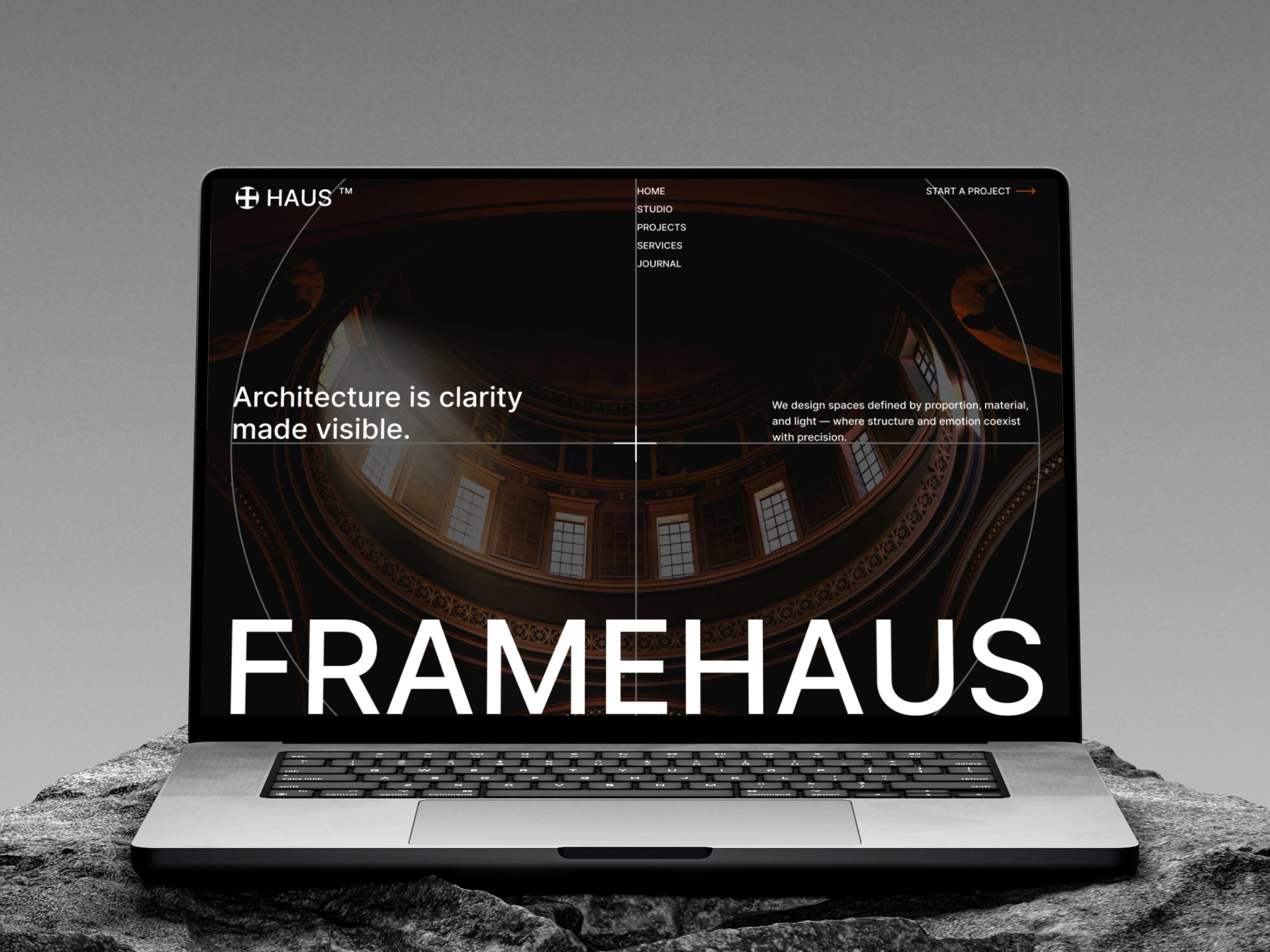
Framehaus — A Swiss-Inspired Framer website for an architecture studio
Overview
Framehaus is a premium Framer template designed for architecture studios that care more about clarity, restraint, and credibility than visual noise.
Most architecture websites try to impress. Framehaus does the opposite — it earns trust quietly. The goal wasn’t to be flashy. It was to feel considered, the same way good architecture does.
This project covered design direction, layout system, CMS structure, and Framer implementation.
The problem
Architecture studios face a recurring issue online:
Their work is strong, but their websites feel generic
Templates are either too creative or too corporate
Content-heavy projects become hard to maintain without breaking layout consistency
Most Framer templates optimize for speed of setup, not longevity. For architecture firms, that’s a mismatch — their work evolves slowly, and their websites should age well.
The objective
Design a Framer template that:
Feels editorial, calm, and architectural
Handles image-heavy projects without visual chaos
Uses CMS intelligently, not excessively
Can scale from a small studio to a growing practice
Prioritizes typography and structure over decoration
In short: a template that architects wouldn’t outgrow in six months.
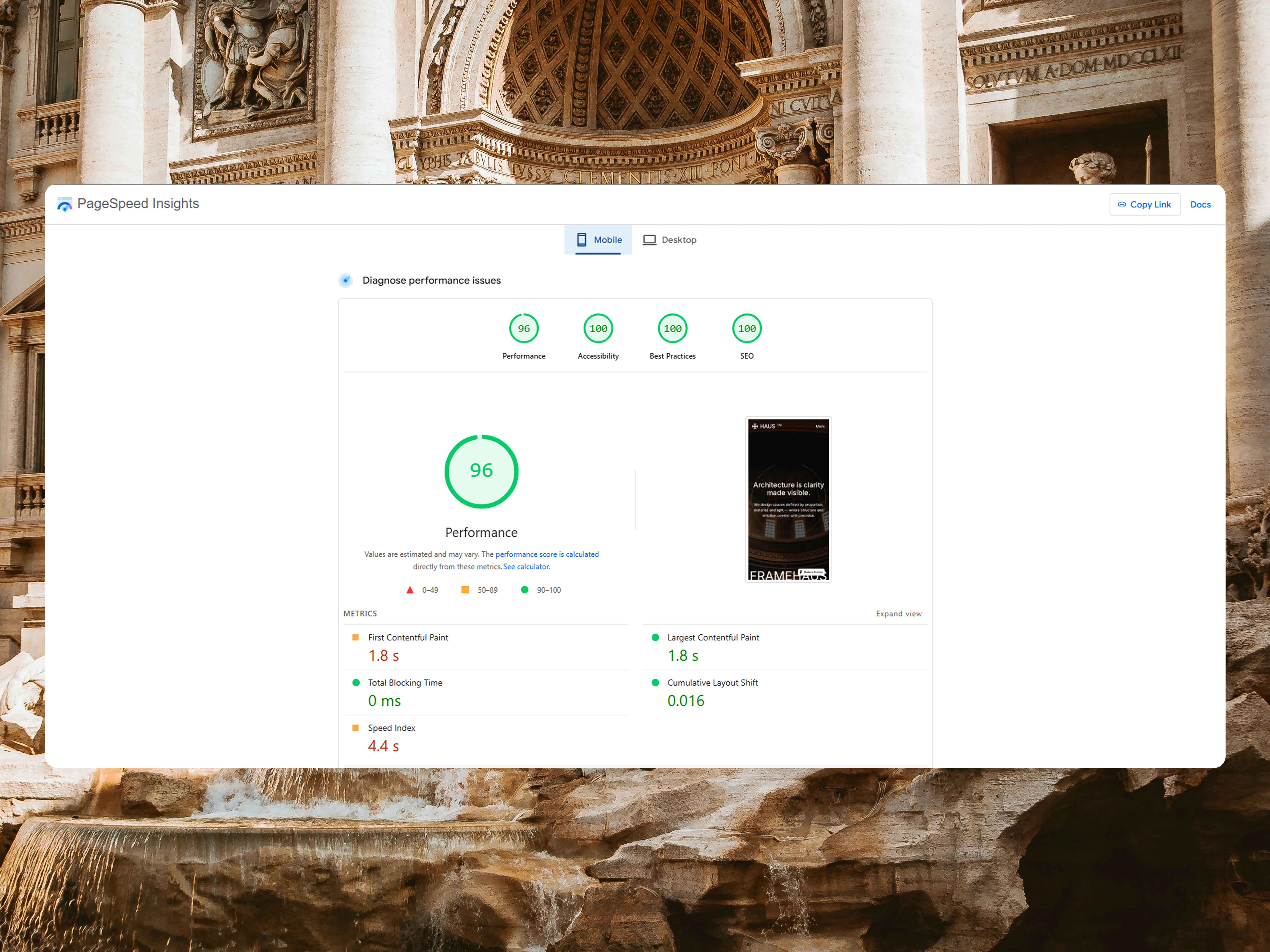
Page speed insights on performance, accessibility, best practices and SEO
Design approach
The visual direction was rooted in Swiss design principles:
Strong typographic hierarchy
Modular grid system
Intentional whitespace
Minimal color usage
Instead of relying on animations or visual tricks, the design uses layout discipline to guide attention. Every section exists for a reason. If it didn’t add clarity, it was removed.
Typography was treated as a primary design element, not a secondary choice. Line lengths, spacing, and scale were adjusted to reduce fatigue — especially on long project descriptions.
Structure & layout
Framehaus is built around a modular system, not fixed pages.
Key layout decisions:
Reusable sections to maintain consistency
Clear separation between editorial content and visual galleries
Predictable reading flow across all pages
This makes it easy for studios to add content without accidentally “breaking” the design — a common issue with flexible tools like Framer.
CMS & content strategy
CMS was used where it actually adds value:
Projects are fully CMS-driven
Each project has its own dedicated page with extended write-ups
Image galleries are structured for both storytelling and performance
Instead of bloating the CMS with unnecessary fields, the focus was on content clarity — what architects actually need to say, not what templates usually force them to fill.
Implementation in Framer
The template was built entirely in Framer with:
Responsive layouts across all breakpoints
Clean component structure for easy customization
SEO-friendly page hierarchy
Performance-conscious image handling
The goal wasn’t to show off Framer features, but to stay out of the way and let the work speak.
The result
Framehaus delivers a website foundation that feels:
Calm instead of busy
Professional without being cold
Flexible without being fragile
It’s designed for studios that value substance over trends and want a site that reflects how they actually work.
Final thoughts
Framehaus isn’t for everyone — and that’s intentional.
It’s for architecture studios that care about restraint, structure, and long-term clarity. The kind that understand good design doesn’t ask for attention — it earns
Let's start working on your next project
Like this project
Posted Dec 15, 2025
Swiss-inspired Framer template for architecture studios prioritizing clarity, structure, and professionalism.
Likes
0
Views
28
Timeline
Nov 15, 2025 - Ongoing