Zooey's Treats & Goodies
Joane Fides

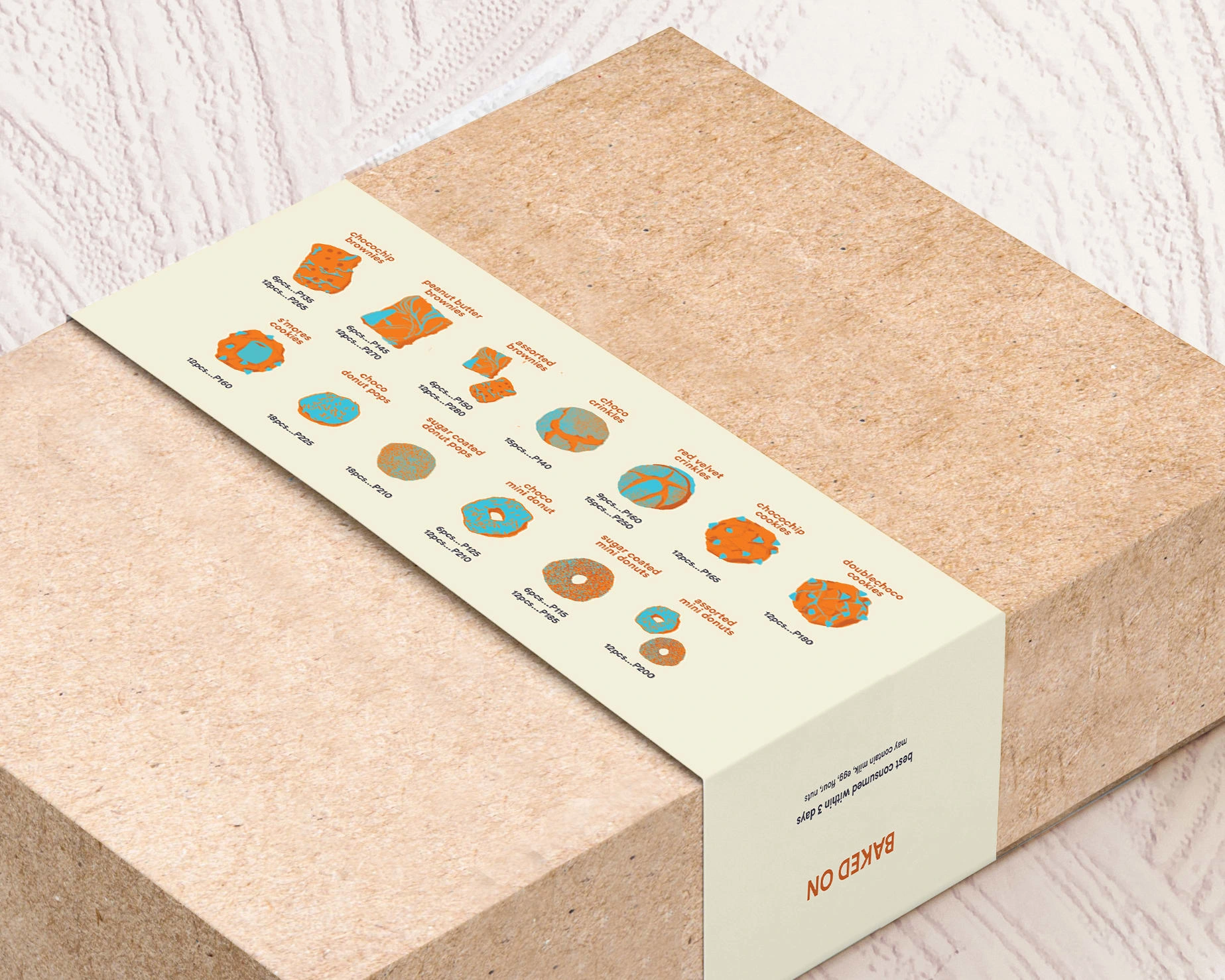
The client wanted a vibrant yet retro look that would target young consumers with its friendly yet trendy atmosphere. The colors used were one of the vital parts of the brand conceptualization and creation, emphasizing the youthful, cute, and fun vibe.
In order to create an impressive logo mark, I created a stylized logotype and an illustrated mascot. The logotype can be seen as continuous script letterings signifying the "gooeyness" and tasty treats the bakeshop has to offer. I decided to change the original z to a different font type to keep the emphasis in between the word––particularly from o to y. The double O's also signify a pair of fun-looking eyes looking down at the words treats & goodies, an action we often do when we find some tasty food we'd like to try. Pengooey, on the other hand, follows the store's theme of friendliness, uniqueness, and fun.
Tip: Try to keep this description brief and under 150 words by highlighting the best parts of this project— recruiters don’t spend much time reading detailed descriptions! 💪
Like this project
Posted Sep 28, 2022
A trendy bakery catering to the youth and those young at heart.