Supplier Spend Dashboard: Elevating Procurement Insights
Ram Sharma
Supplier Spend Dashboard offer you a tailor-made solution to enhance your procurement strategy and optimize supplier relationships.
Key Performance Indicators (KPIs):
Total Spend Value (in millions):
Number of Suppliers:
Number of Contracts:
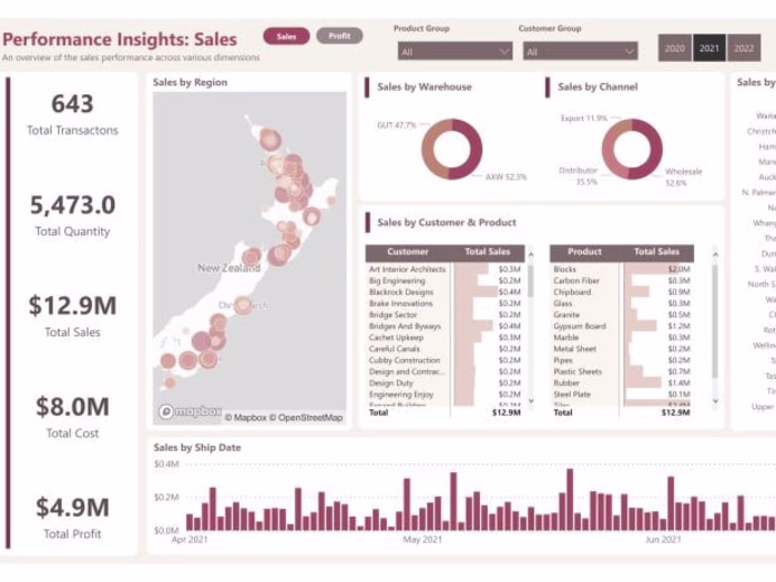
Tabular Summary Table:
The intelligently sorted tabular summary table showcases Spend Details by each supplier, highlighting our commitment to prioritizing high-impact relationships.
Geo Map Visualization:
Visualize Supplier Spend by Location through an interactive geo map, providing a spatial understanding of procurement distribution, a feature that has consistently driven success in our previous projects.
Additional Visualizations:
Spend by Country (Horizontal Bar Graph):
Supplier Spend by Commodity Categories:
Spend Value by Vendor Payment Terms:
Filters:
Harness the power of flexible filters, including Reporting Date (Scroller), Status (Active/Inactive), Supplier Name, Category 1 (Commodity Category), Category 2, and Initiative Name, all of which have proven to be invaluable in refining data access.
A robust search field filter ensures quick and precise access to specific supplier details, a feature that enhances user experience and efficiency.
Like this project
Posted Jan 6, 2024
Supplier Spend Dashboard, tailored from sample data success, elevates procurement insights with real-time KPIs, intuitive visualizations, and flexible filters!