Built with Framer
Fravity AI Landing Page Redesign
Aravind Solaiappan
Verified
Fravity AI - Website Redesign in Framer
About the project:
Fravity AI, a copilot for investigations and operations teams, was preparing to go to market. Their old site, built with Cursor AI, was too text-heavy and lacked visual appeal. They approached me to redesign the site for clarity, engagement, and brand trust.
Old Site
The old site was functional but it overwhelmed users with text. With no brand guidelines in place, the goal was to explore new directions that balanced modern SaaS aesthetics with Fravity’s mission.
Old Fravity AI Website
They wanted to redesign with some visuals about how it helps in the operations. They didn't have any brand guidelines, so they are open to exploring some options.
Design Exploration
I proposed two creative directions:
Direction 1: Teal accents (from logo), grid layout, outlined sections, and dithered images.
Direction 2: A modern SaaS look with a refined purple accent and structured layout.
Design Direction 1
Design Direction 2
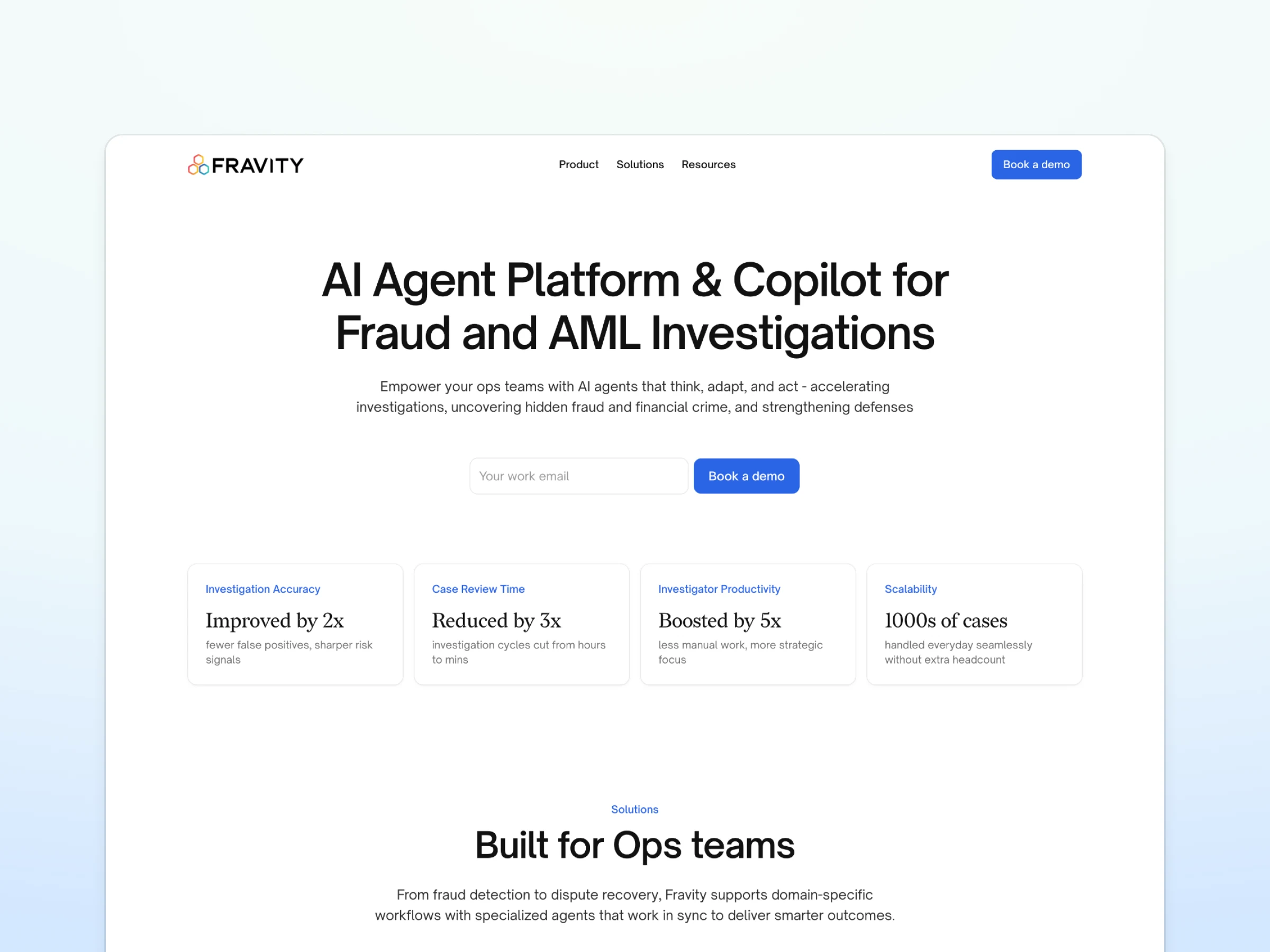
Final Design
The client chose Direction 2 but opted for a blue accent and a simplified hero section without illustration. The result: a modern, responsive site that’s clean, visual, and market-ready.

Full Landing Page
Preview the site:
Like this project
Posted Oct 3, 2025
Redesigned Fravity AI’s landing page in Framer, transforming a text-heavy site into a modern, market-ready SaaS design.
Likes
1
Views
17
Timeline
Aug 29, 2025 - Sep 28, 2025
Clients
Fravity