Johannesburg 2032
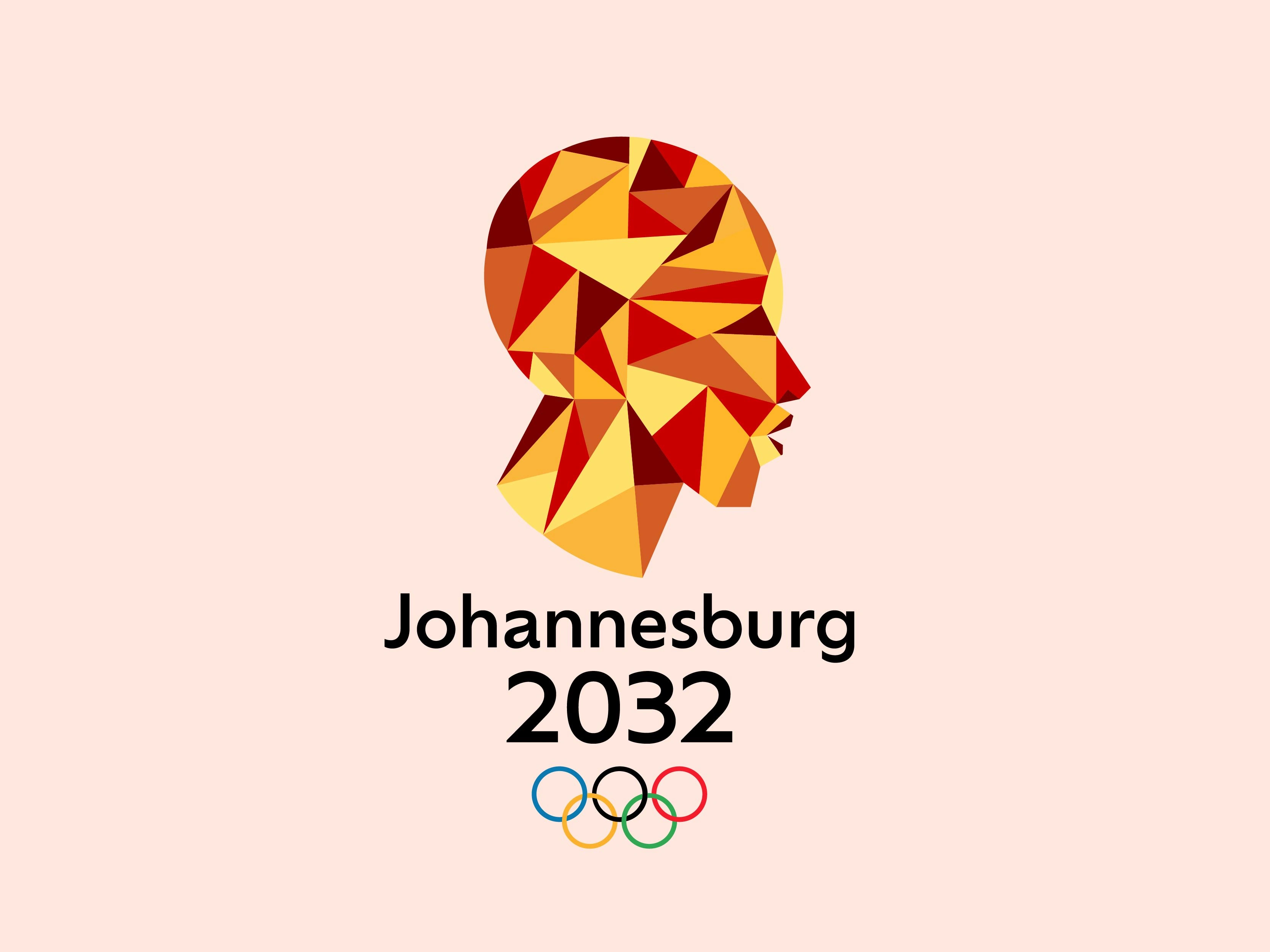
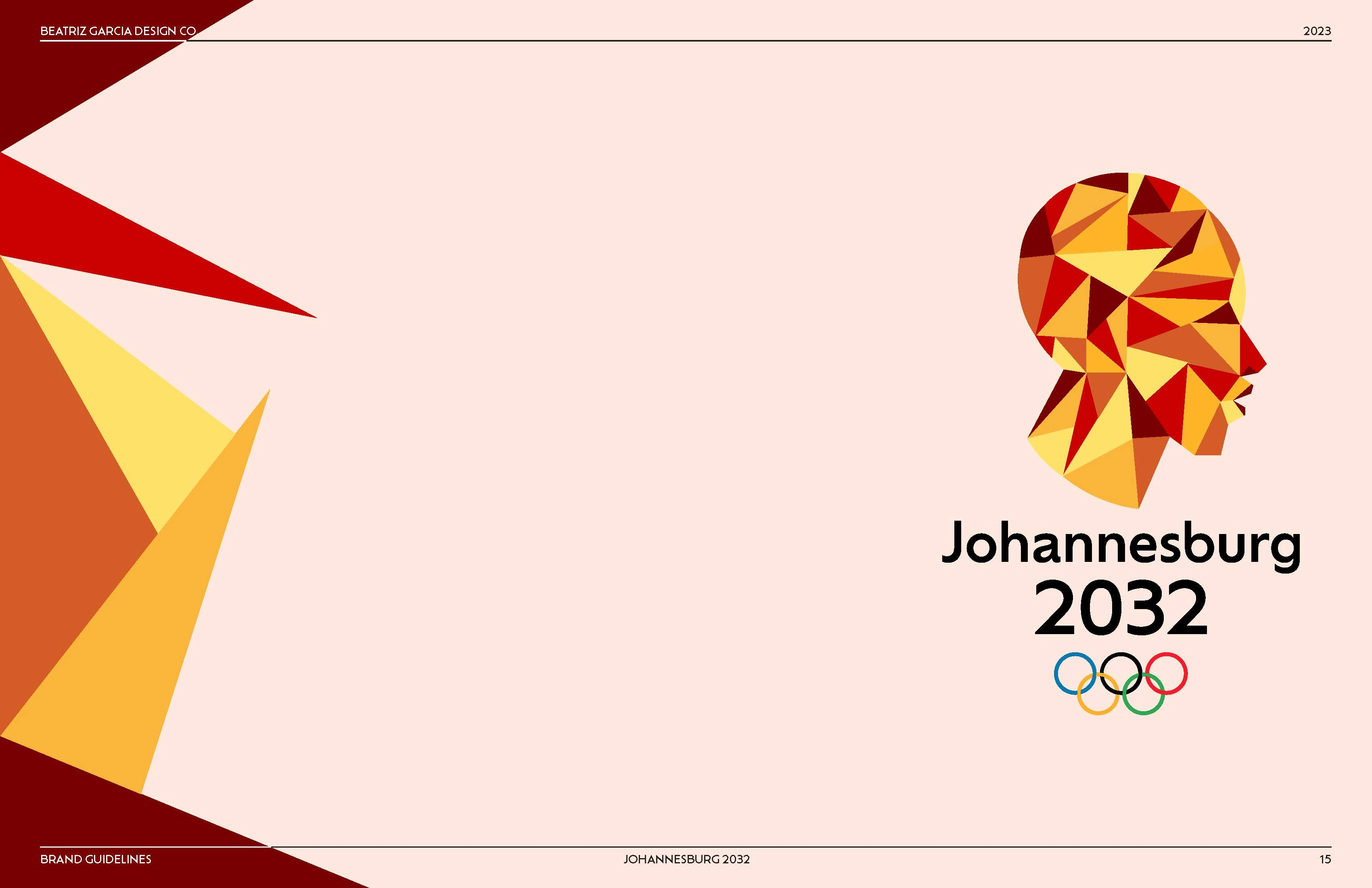
Primary Logo
Project Overview
Johannesburg 2032 is an experimental branding project for the Olympics of 2032. The goal of the visual identity is to represent Johannesburg's culture and inclusiveness within its branding using a warm and bright color palette.
Deliverables
Brand Research
Brand Identity
Brand Collateral
Brand Guidelines
Brand Strategy & Creative Direction
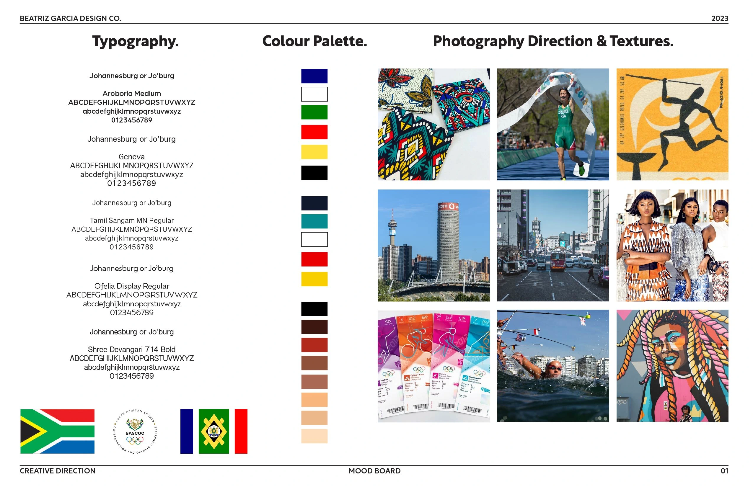
Original Mood Board
At the beginning of our initial research, we compared past Olympic logos from various countries and analyzed how they best represented themselves.
Johannesburg is a city located in South Africa. The first two color palettes represent the colors of the flag of both the country and the city where the Olympic games are to be held.
Johannesburg is known for its growth in the industrial industry. But they are also known for their art community, which is where the third color palette comes into play.
We noticed that most of the past Olympic logos are either very detailed or fairly simple and digestible. We decided to go for a somewhat simple and digestible approach.
Initial Concept
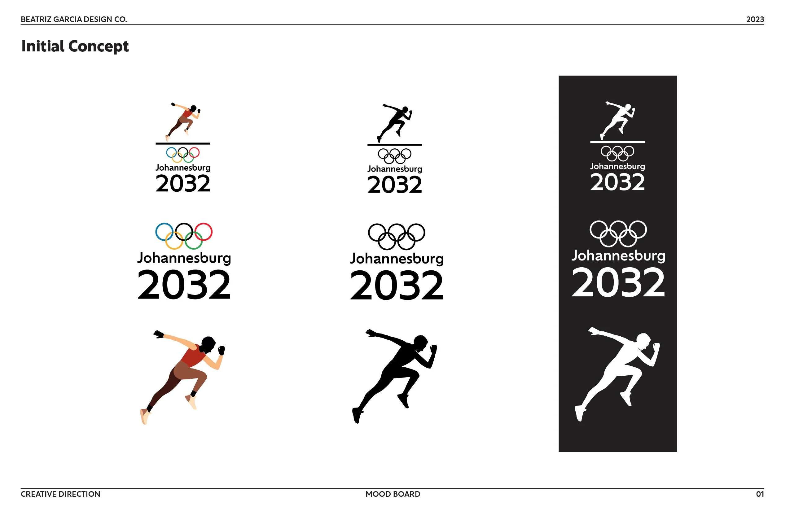
Original Logo Concept
Our initial concept was a bit busy and didn't align with the creative direction we were going for. So we went back to the drawing board and came up with something new using the same color palette.
New Concept
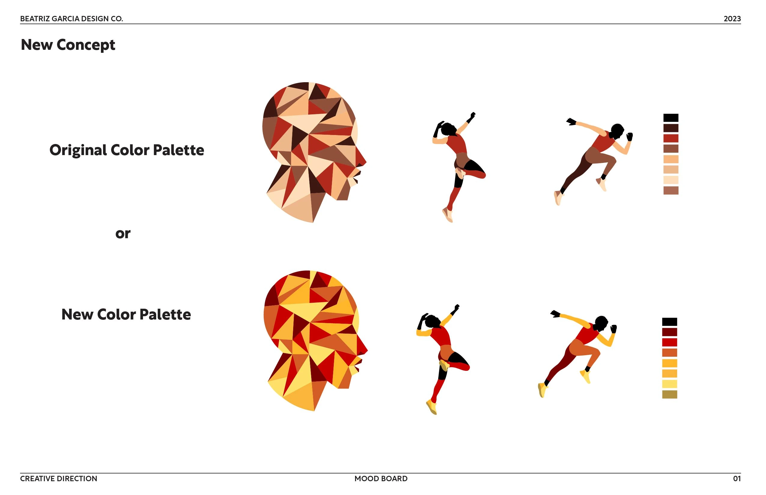
New Concept & Color Palette Options
We decided to use the original icon of the original logo design as icons for the different sports that will participate in the Olympic games.
Afterwards, we decided to simplify the logo's icon by reducing it to just the head with an artistic twist. If you refer back to our original mood board, you will notice that we included the pattern elements from the mural artwork along with the designs observed in the fashion trends of Johannesburg.
Although we initially liked our first choice of color palette, we felt that the colors were a bit dull and did not evoke much excitement related to the Olympic games. Therefore, we decided to go with a brighter and warmer color palette that will better represent Johannesburg.
Brand Identity Guidelines
After creating the logo variations and committing to a color palette, we worked on collateral and brand guidelines.


Like this project
Posted Jan 3, 2024
Johannesburg 2032 is a Branding Project designed to represent the city where the next Olympics are to be held. The design must be responsive and cohesive!
