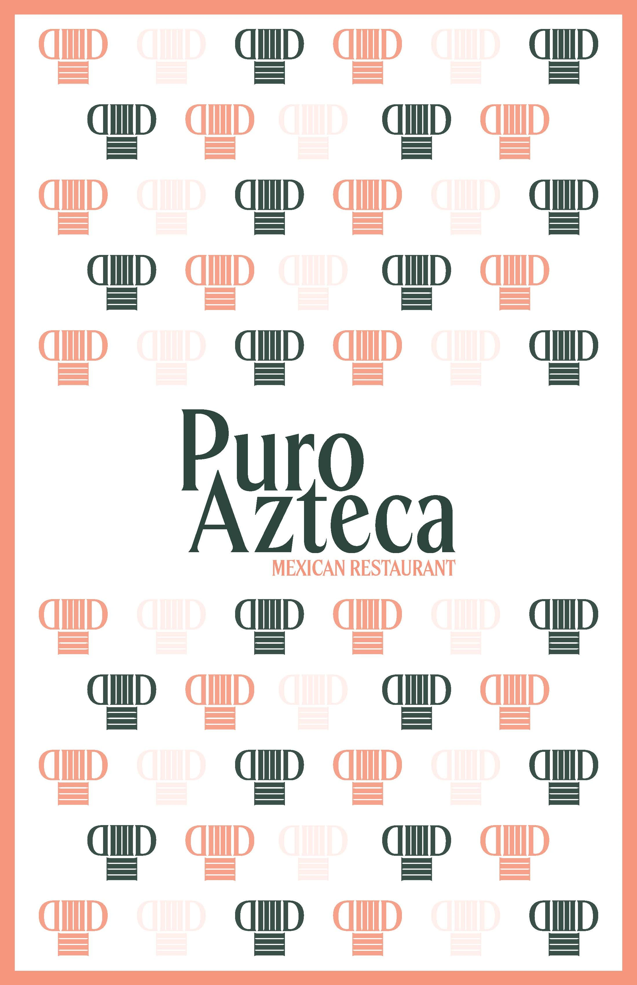
Puro Azteca Mexican Restaurant
Beatriz Garcia
Project Overview
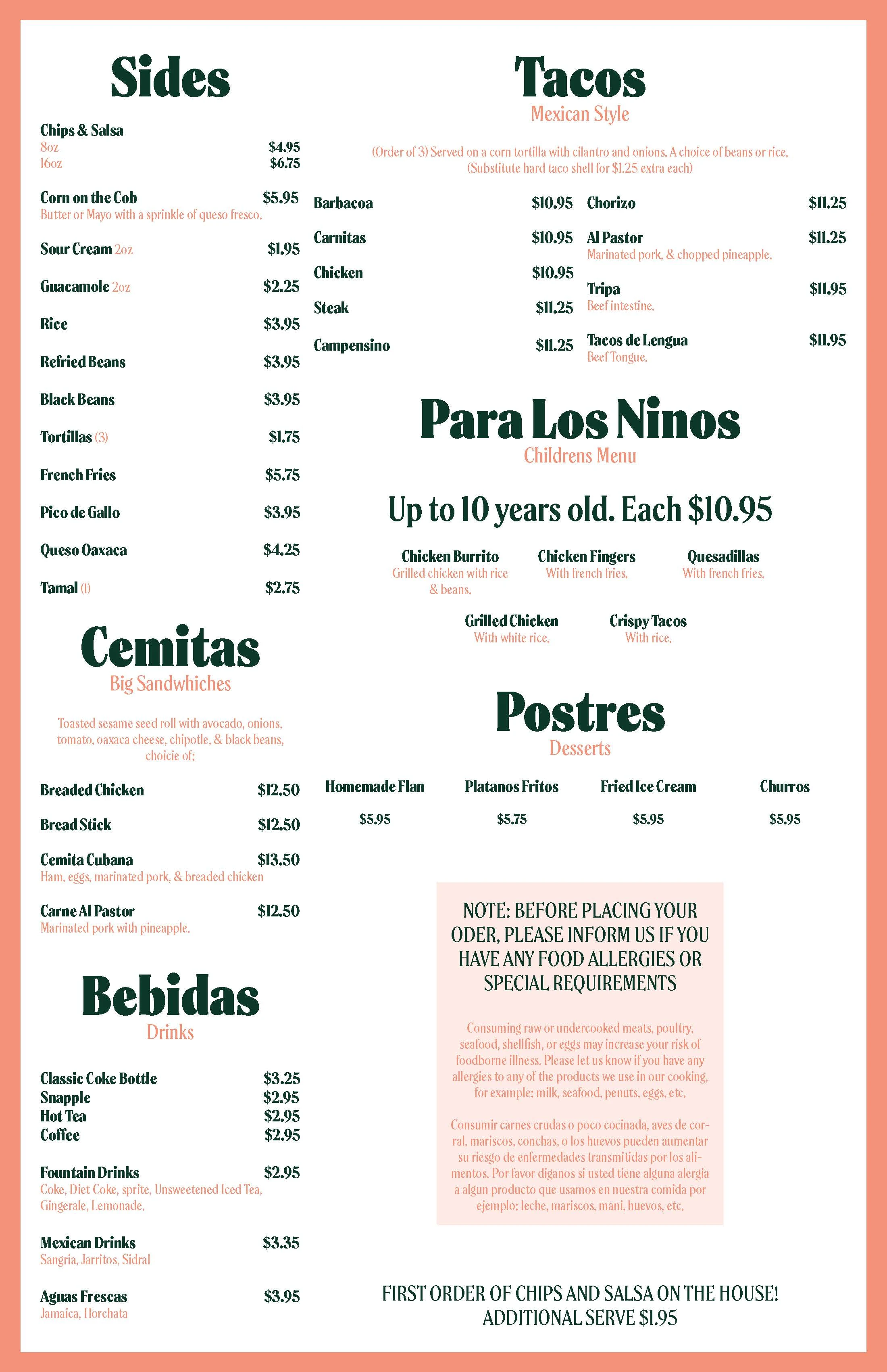
Puro Azteca Mexican Restaurant is an experimental menu re-design project. This project was challenged to only use one typeface and use all of the font variations to create the design. The designer was also tasked to create a logo for the restaurant and a brand pattern using type to use in the menu.
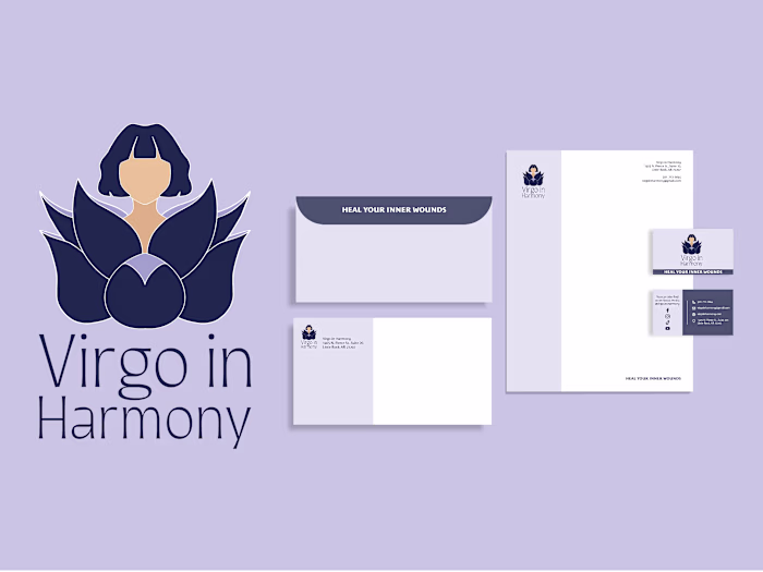
Deliverables
Logo Design
Brand Pattern
Icon
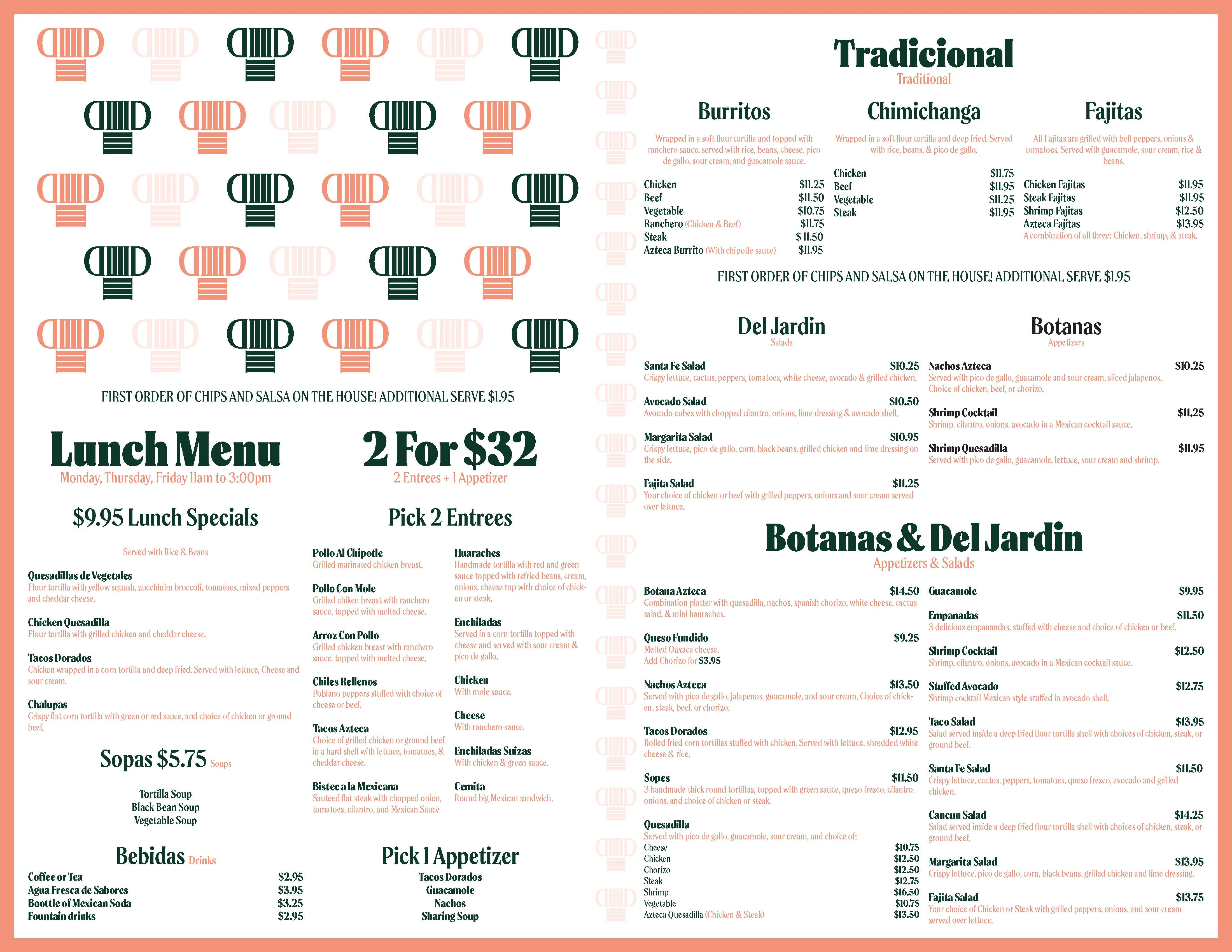
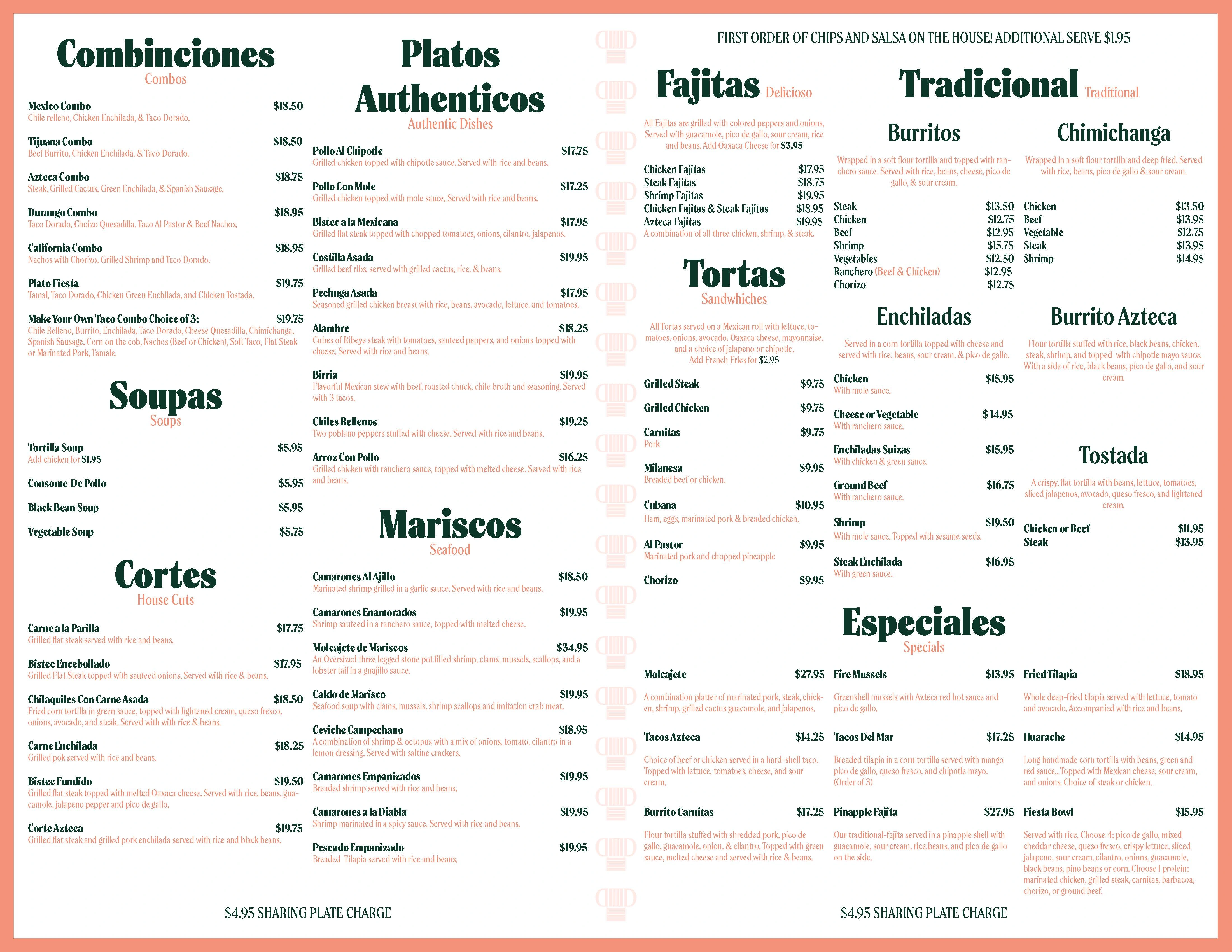
Menu Design
The Process
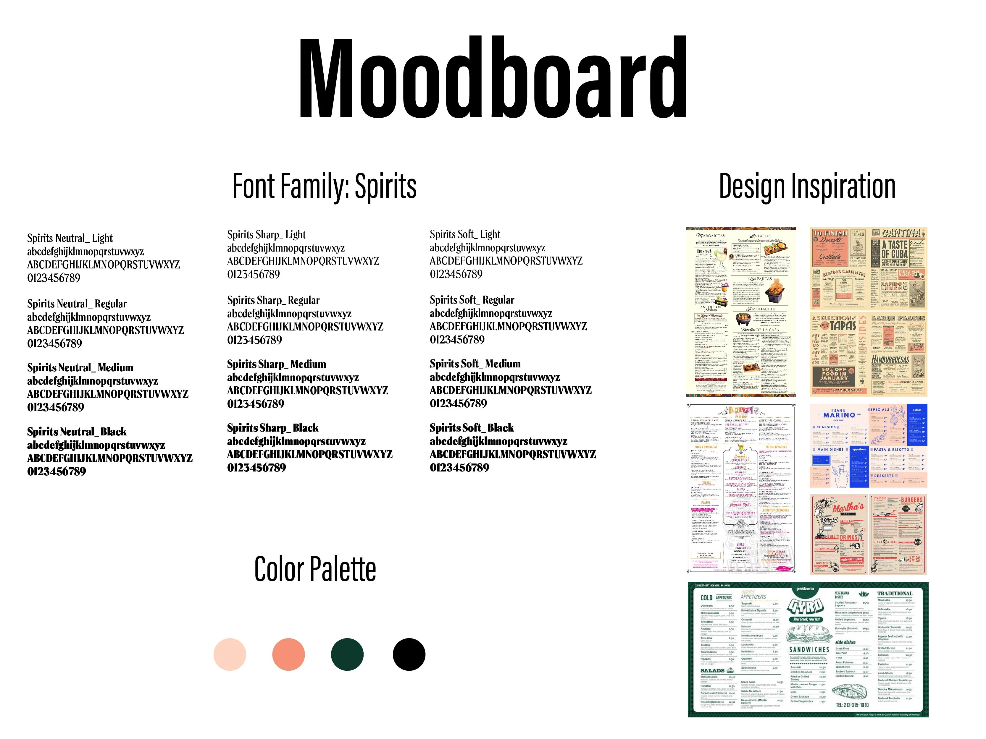
Typography: We decided to redesign the menu of a Mexican restaurant, for which we chose a typeface called "Spirits". We selected this typeface because it has character and is consistent with the design of menus found in many LatinX-owned restaurants.
Color Palette: As per the design brief, we were restricted to using only 4-5 colors for this project. We decided to avoid the conventional Mexican flag colors that are often used in traditional designs and instead opted for a color palette that is playful and welcoming.
Inspiration: According to our research, menu design in the Hispanic restaurant industry
The Concept(s)
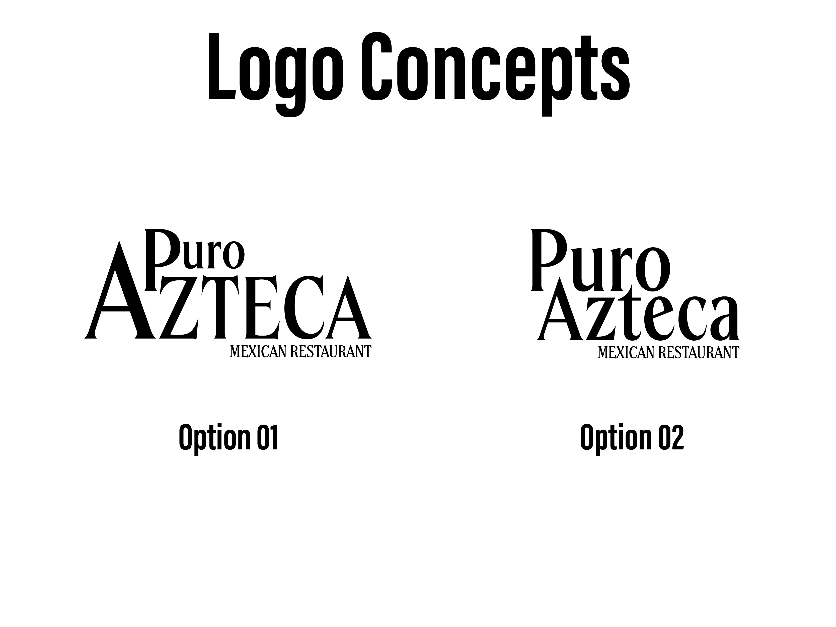
2 logo concepts
Option 01: The first design option was supposed to represent the Aztec pyramids. However, the placement of the text was misleading the order of the name of the restaurant.
Option 02: The second design option is simpler and less busy.
Icon Design
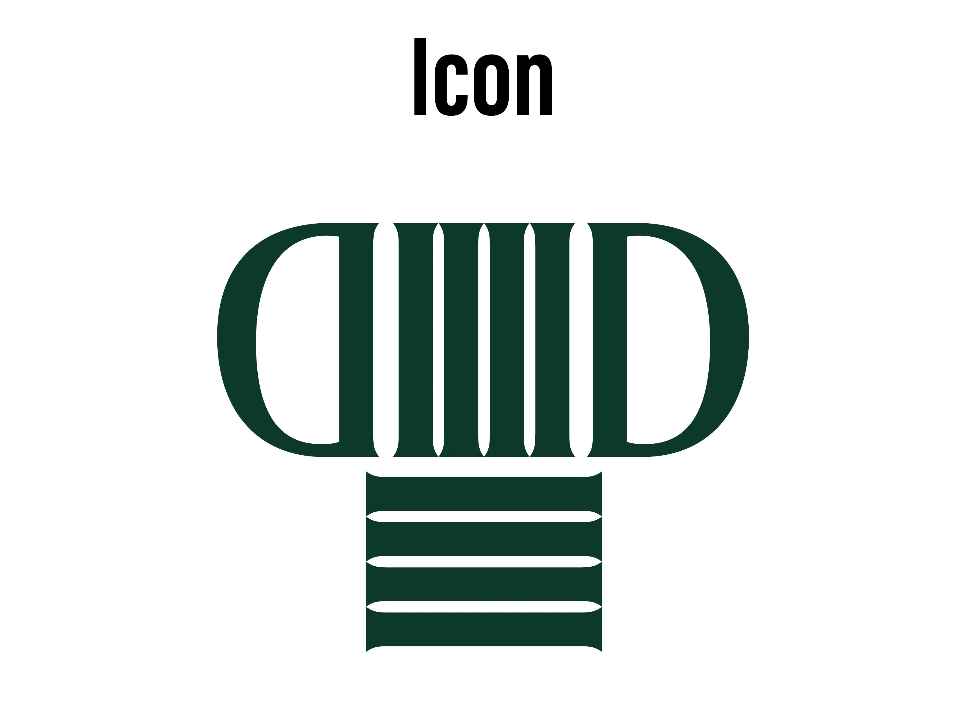
Icon:
The Menu Design
Like this project
Posted Jan 23, 2024
Puro Azteca is a project that experiments with menu design. The challenge was to use a limited color palette and text only to create the final product.
Likes
0
Views
5