
Self-initiated project
Packaging
Brand Identity
茶叶. Tea leaves.
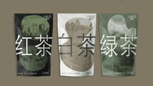
CHĀYĒ is a self-initiated packaging project for a fictional premium tea brand rooted in Chinese tea culture. The name is a stylised romanisation of 茶叶, the Chinese word for tea leaves. It tells you instantly where it comes from and who it's made for, without a single line of marketing copy.
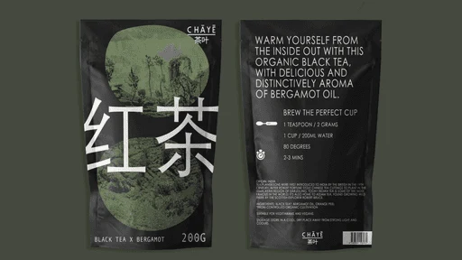
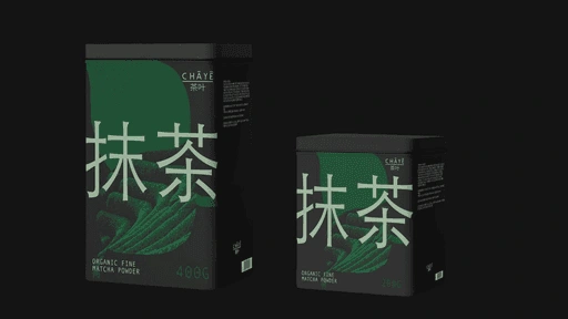
The packaging system works around one central tension: massive, almost typographically aggressive Chinese characters set against organic, amorphous landscape photography of misty mountains, tea gardens and dense canopy. The shape that acts as the image window is neither a circle nor a square. It's something looser and more alive, referencing the natural, unhurried world the tea comes from. Three variants, three landscapes, three teas. Black, white, sage green. Nothing more.
The result is packaging that feels both deeply rooted in its cultural origin and entirely contemporary.
0 likes · 9 views · Oct 2, 2026
Packaging project for a fictional premium tea brand (CHĀYĒ), combining bold Chinese characters with landscape photography.

