Feed and Data Analysis Mobile App for Swimmers
Project Overview
The pool Swim Analysis feature is a complete redesign of the previous feed and analysis feature. Targeted at all types of swimmers, it offers a clear and easy-to-understand data visualization to tell swimmer stories, and a more intuitive design to digest swimming data.
Context
As the social aspect of the FORM Swim App, it is very important for it to tell a compelling story for all types of swimmers. In the previous design, visually it didn’t tell a personalized story for every swim other than laying out data text. Although we can capture lots of data that tells the story through numbers when users tap into the feed tile, the feed tile itself is telling a very weak story without attracting users into looking into the detail of other people’s swims. In short, it caused a very low engagement rate in the app.
Another problem with the previous design is the amount of data being thrown into users’ faces, for someone who doesn’t have that much urge to look into swim data, such as fitness swimmers, the previous design shows too much data, it is overwhelming. And the complexity of switching among the different categories of data. To solve these problems, we decided to redesign the pool swim feed and details screens.
User Problems & Business Problems
All swimmers need to create a connection with their swims in app so that they can easily digest their swim data in a logical way.
FORM app is seeing a very low engagement rate, in order to create a stronger community, the social aspect of FORM app needs to be engaging.
Process
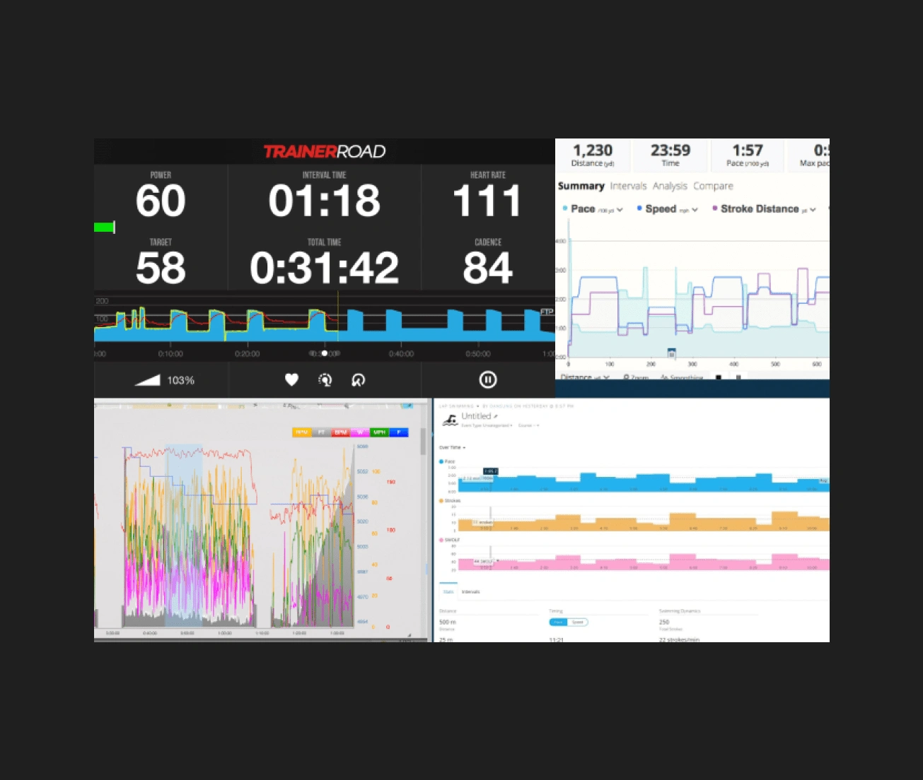
Competitor analysis: To find out how competitors are showing users their swim data, I looked through different competitor apps such as TrainerRoad, TrainingPeaks, and Garmin. All of which are strong competitors in their fields. A common thing I noticed is that all of their graphs look very complicated, and the cognitive load is massive for users.
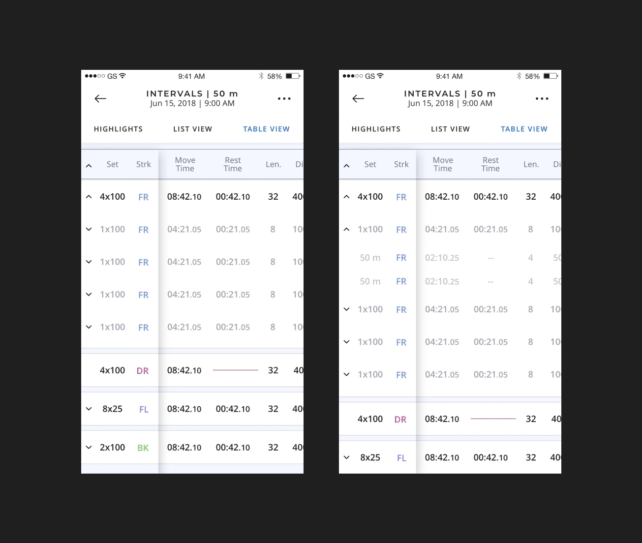
Understand how swimmers swim: Based on the swimmer, a swim can be very different. For triathletes and competitive swimmers, their swims usually follow a plan, breaking into sets, each set includes several intervals, while each interval includes several lengths.
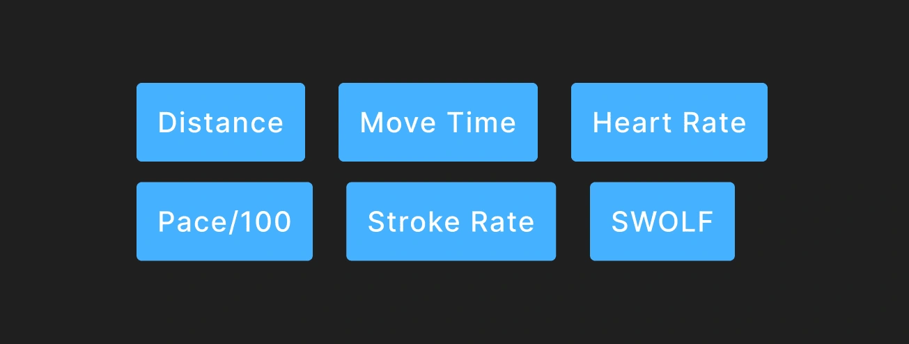
Understand what metrics swimmers care about
Solution
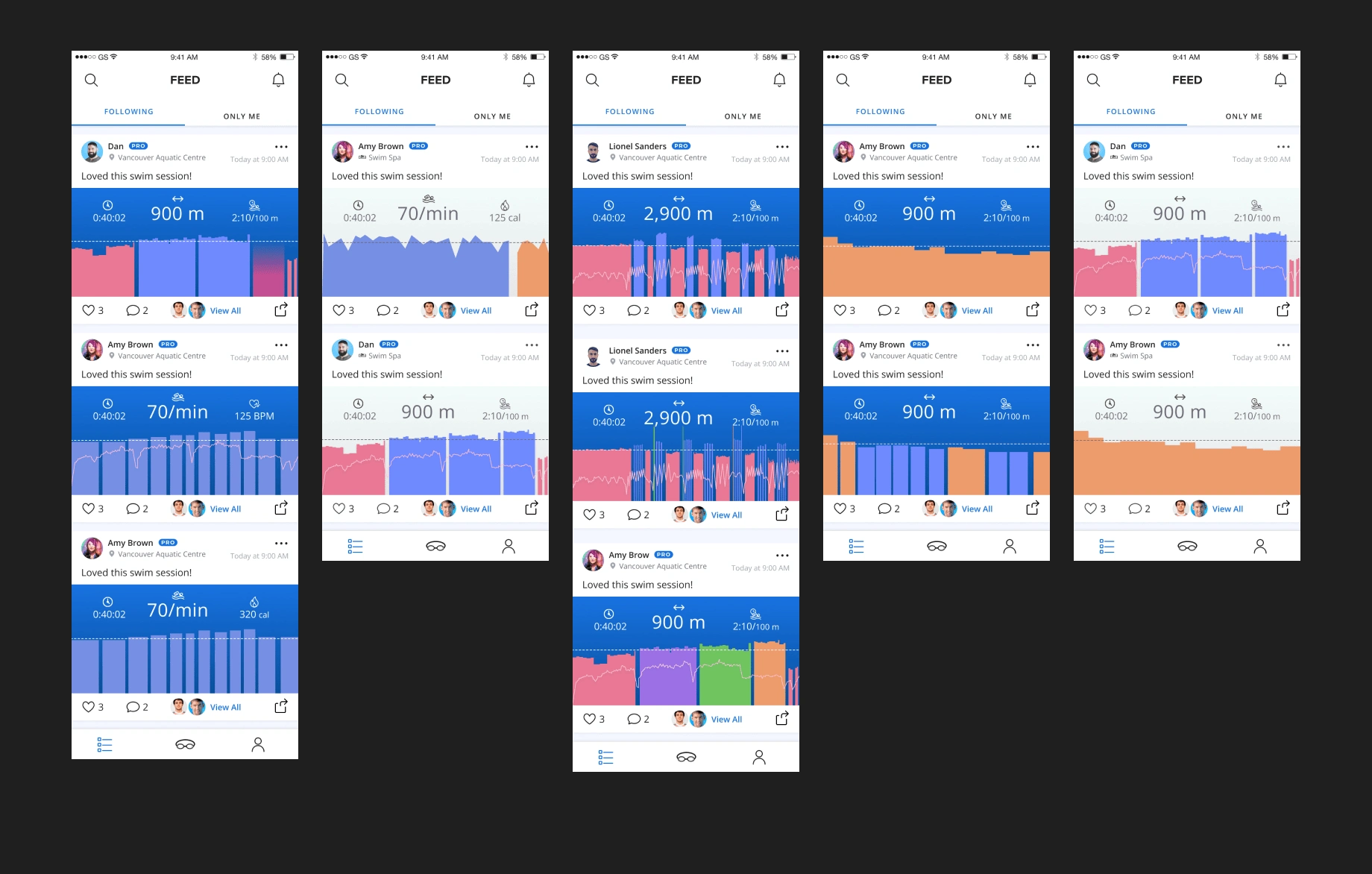
The final design of the feed feature followed up on the last design, where it still shows the comprehensive story of a swim, using colours and overlay to illustrate. The feed tile will also contain different scenarios based on the nature of a swim. If it’s an interval, it will be the most complicated as it has the most amount of data. If it’s a lap swim, it will be a lot simpler and requires the less cognitive load to understand the graph.
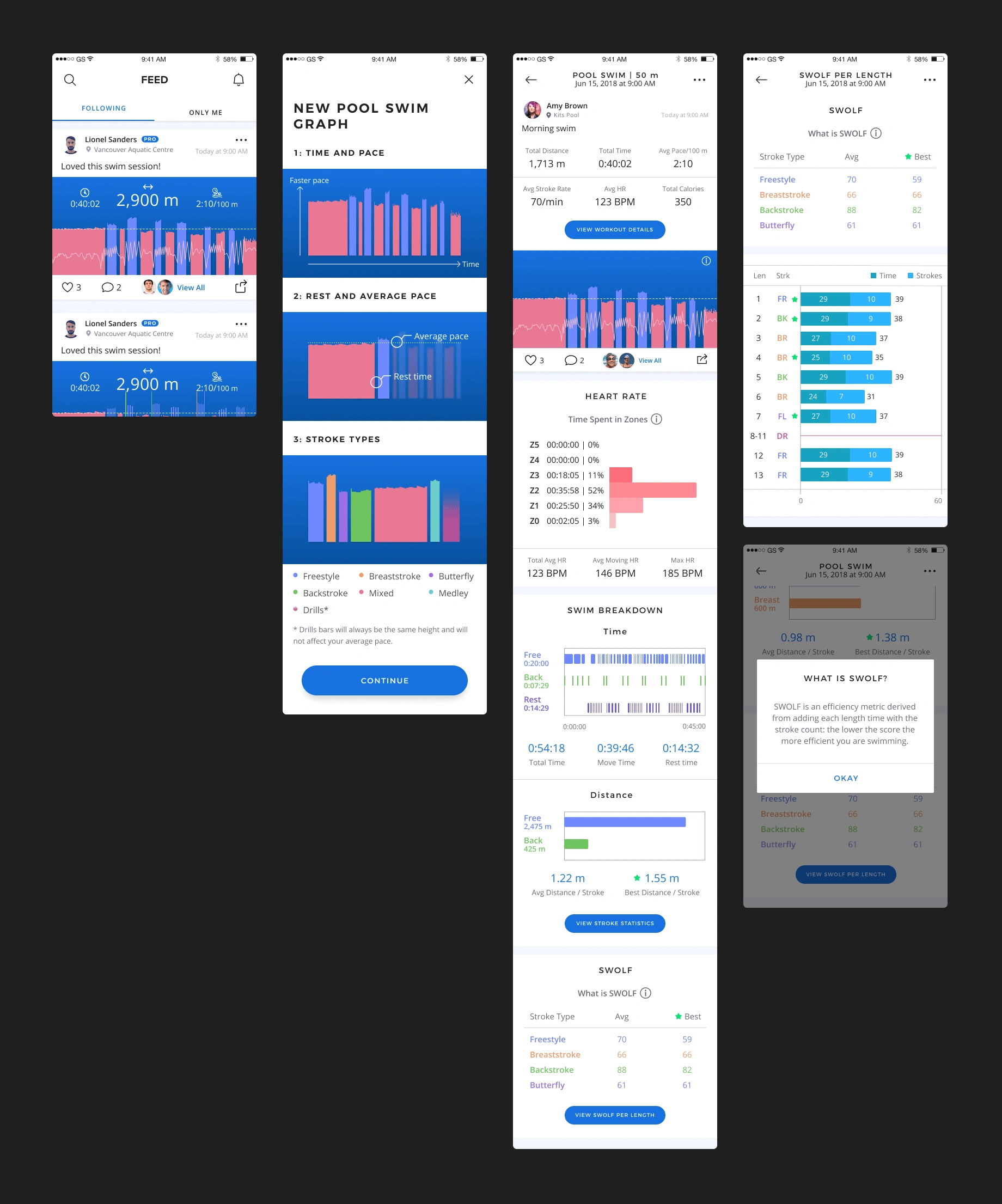
To break down the heavy cognitive load of understanding data, and prioritize the most important data, we designed the data analysis screens to be multiple layers.
Like this project
Posted Sep 30, 2024
iOS and Android app designed for swimmers
Likes
0
Views
3


