Make Analytics Easier - Brand Identity & Website

Jorge Sousa


Make Analytics Easier is an initiative by CUX, focused on reshaping the public perception of data analytics - making it more accessible, human, and enjoyable.
Make Analytics Easer was designed to support business growth by building a strong expert presence, while fostering an engaged community around the value and impact of data-driven thinking.
✨ Client's Desire
This community aimed to transform the perception of analytics from something overly technical and boring into a valuable, engaging, and even fun part of business and marketing strategy.
🎯 Target Audience
The campaign targeted marketers and entrepreneurs - especially those early in their analytics journey - interested in using data to grow their businesses.
🧩 Key Elements of the Project
Webinar Series
A series of engaging, conversational webinars, each episode featuring specialists discussing how analytics can drive marketing, boost sales, and inspire smarter business decisions.
Landing Page
A dedicated platform for the campaign: users could subscribe to upcoming webinars, browse past episodes and read through blog articles.
Community Platform
A knowledge-sharing hub for analytics enthusiasts with expert resources, discussion threads, helping CUX grow a community of passionate, like-minded data fans.
🎙️ Tone of Voice
Friendly, approachable, and people-first - focused on demystifying analytics while emphasizing its value. The campaign leaned into storytelling, relatability, and the human factor behind the numbers.
The Graphical Direction
To establish a clear visual direction for the brand identity, I developed two contrasting stylescapes, each representing a unique take on the brand’s tone and positioning.
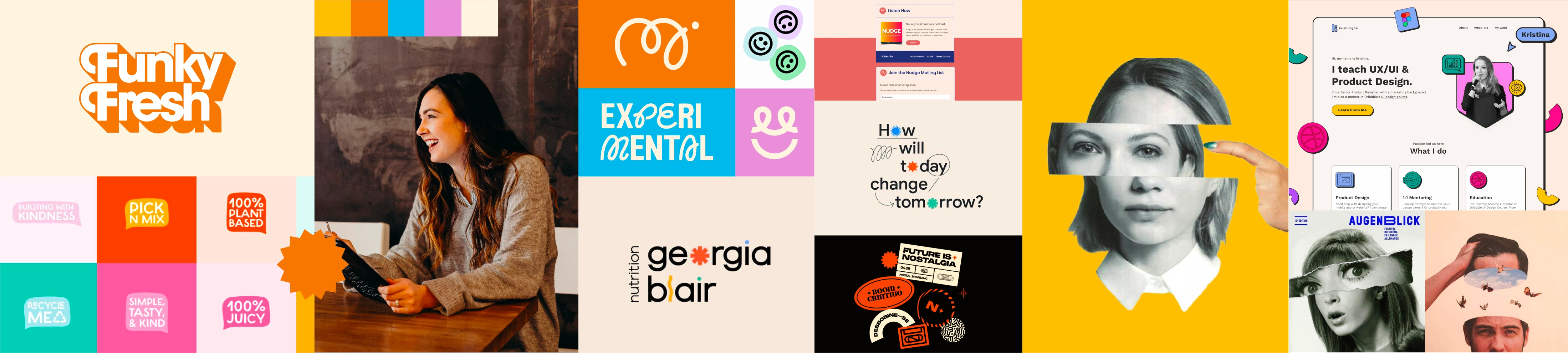
Stylescape 1 - playful and easygoing (chosen direction)
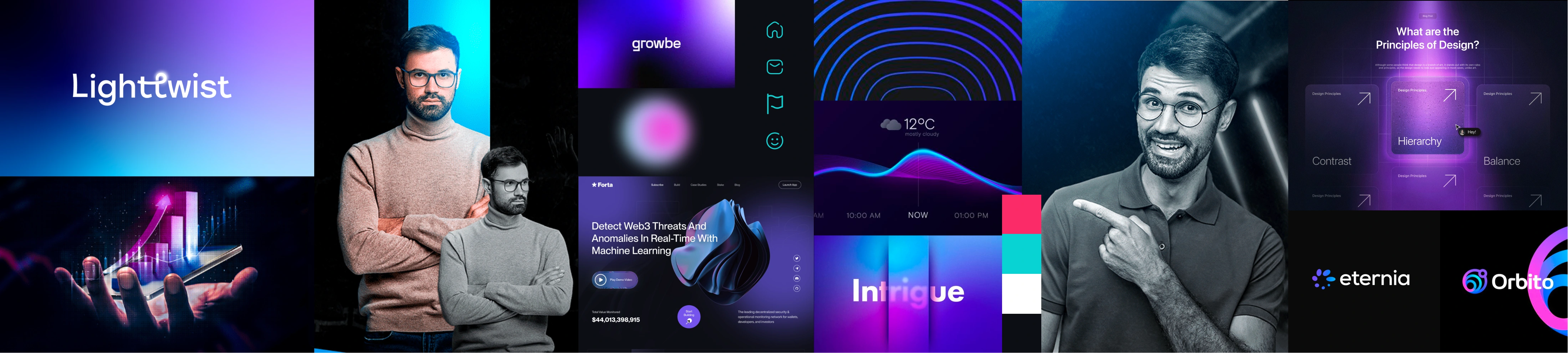
Stylescape 2 - modern and tech-driven
Color Palette
The color palette captures the dual personality of Make Analytics Easier - blending energy with clarity. A bold black anchors the visual identity, while soft cream provides a clean, open backdrop. Vibrant accents like orange, cyan, pink, and golden yellow inject personality, creativity, and warmth into the brand. This combination allows the identity to feel both professional and playful, reflecting the project’s goal of making analytics more approachable and engaging.
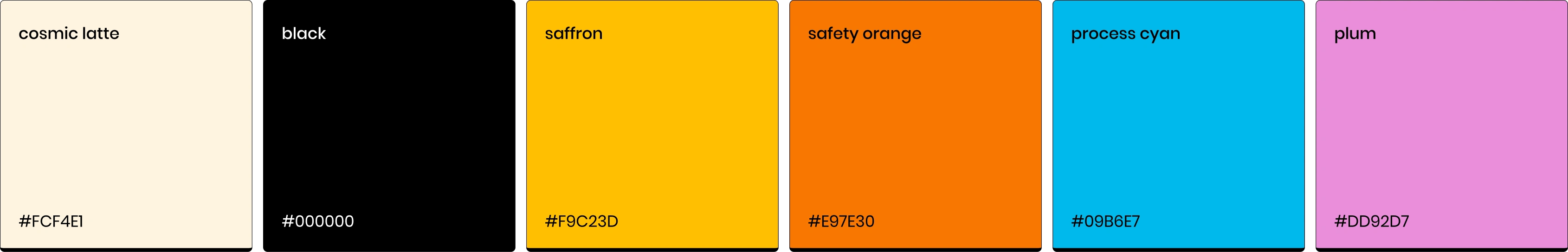
Color Palette
Typography
The typography is set in Poppins, a geometric sans-serif that reinforces the brand’s approachable and modern feel. Its clean, rounded letterforms strike a balance between professionalism and friendliness, perfectly aligning with the project’s goal of making analytics feel simple, human, and accessible.
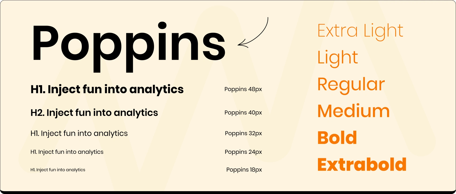
Typography
Usage of typography together with graphical elements
Logotype
The Make Analytics Easier logotype is a custom wordmark based on the Poppins typeface, reimagined to reflect the brand’s core message. By blending clean geometric forms with playful, sketch-inspired modifications - like the trendline-shaped “m” and the expressive “a” & "e" - the logotype strikes a balance between structure and spontaneity. It visually embodies the idea that even in the world of rigid, technical data, there’s room for creativity, approachability, and fun.

Logotype
Logotype - Color Combinations

Logomark

Support Elements
The supporting elements bring an extra layer of personality to the brand. A mix of bold, colorful shapes and playful scribbles injects movement, warmth, and spontaneity—balancing the structure of data with a sense of creativity and human touch. These elements help reinforce the idea that analytics can be vibrant, approachable, and fun.

Brand Shapes
Application of the Shapes & Scribbles
Brand Applications
The visual identity was extended into key brand applications to support both community-building and promotion. Custom graphics and illustrations were designed for the Circle.so platform, adapting the visual system to headers, banners, and interface elements to create a cohesive and engaging space.
Banners for Circle Platform
Social Media Posts
Website
The project also involved designing the website for the community, including layouts for both the homepage and the community landing page. I created designs that maintain consistency with the visual identity—combining custom graphical elements, playful shapes, and a clean layout to guide users through the platform’s purpose, benefits, and ways to engage. The content was tailored to both introduce new users to the concept and provide a clear path to join the community.
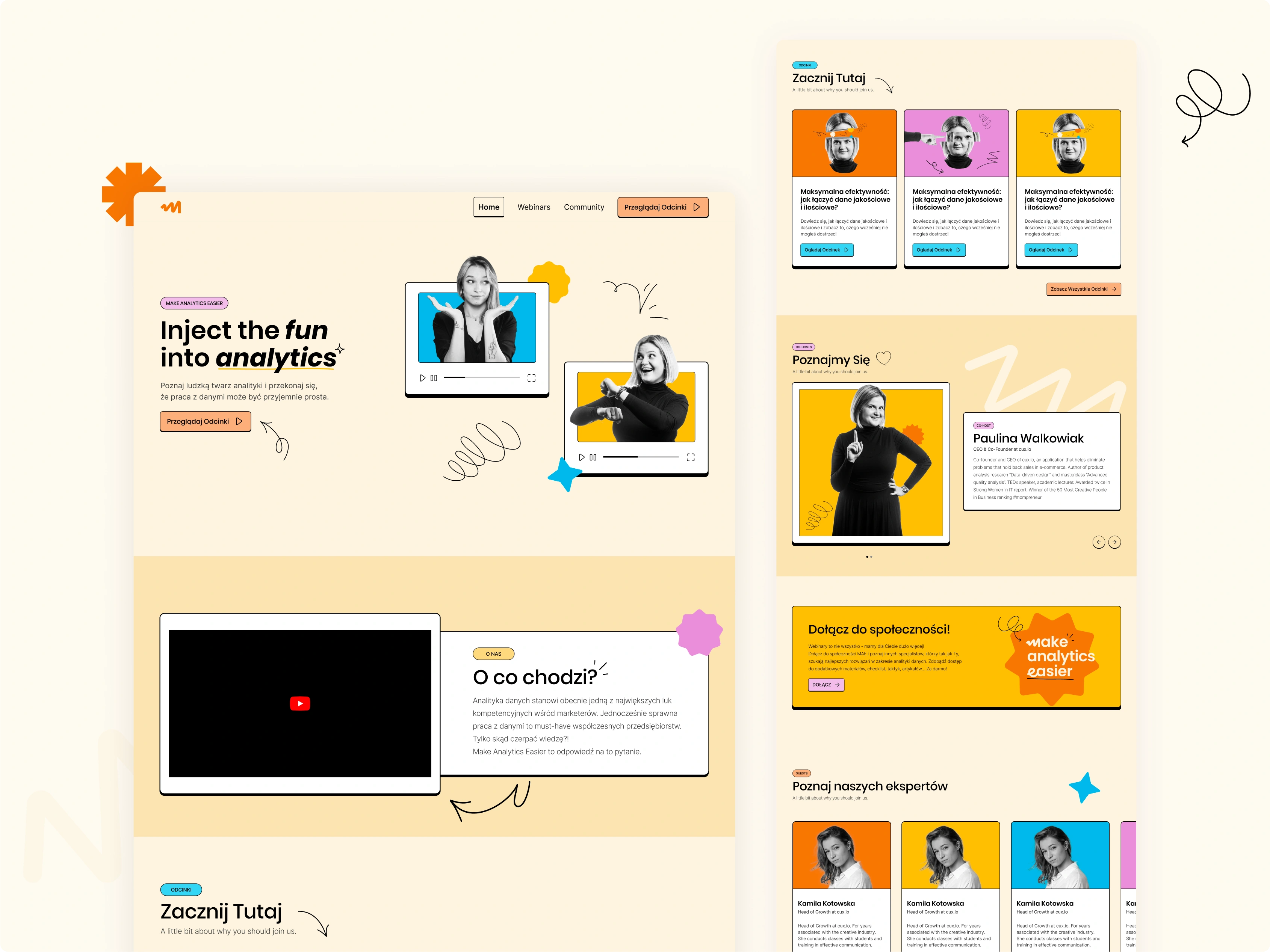
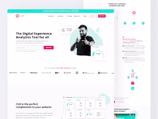
Homepage
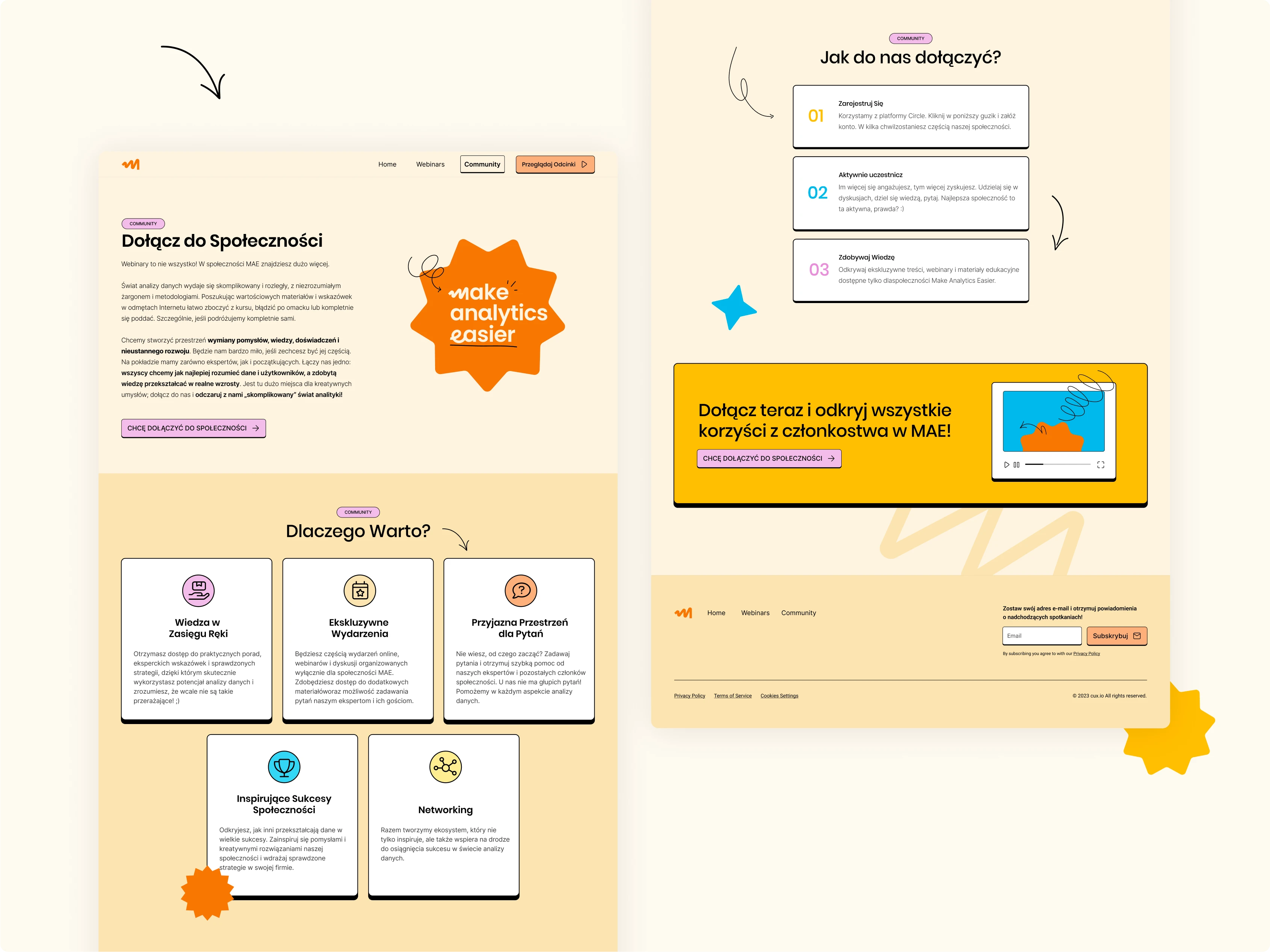
Comunnity Page
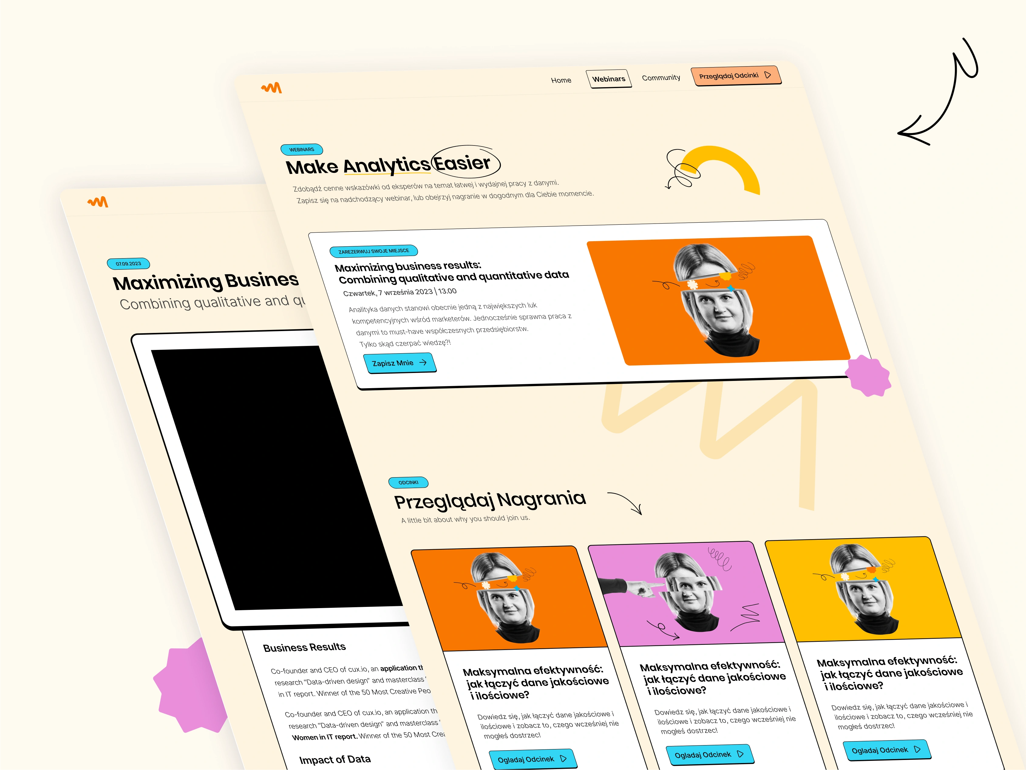
Webinars and Blog Page.
You can explore the live website at makeanalyticseasier.com.
Like this project
Posted May 28, 2025
Brand identity, visuals, and website design for a community-led project focused on making data analytics more accessible, engaging, and fun.


Valueships - AI SaaS Pricing Trends Social Media Posts
CUX - Website Homepage Redesign

Valueships - Ebook Covers Design
Kama Kotowska - Landing Page Design