Teleprompter.com Redesign
Gergő Bartha

BACKGROUND
Teleprompter.com is one of the App Store's fastest-growing teleprompter apps, with over 5 million downloads across iOS, Android, and web. Its users range from solo content creators filming YouTube and TikTok videos to professionals delivering speeches, recording podcasts, and hosting video interviews. The app's core promise is making anyone look confident and prepared on camera, which made the friction in the existing recording experience all the more critical to fix.
THE PROBLEM
Teleprompter.com had grown visually inconsistent and cluttered across multiple app iterations. Each screen had developed its own inconsistencies, controls lacked hierarchy, and the overall experience fell short of what users expect from a top-ranked App Store app. I was tasked with systematically reviewing each screen and rethinking both usability and visual quality across iOS, Android, and web.
SCOPE OF OWNERSHIP
Led the redesign end-to-end: research, concept, prototyping, and handoff
Owned all UX, UI, and interaction decisions; aligned weekly with the product manager, developers, and CEO
Rebuilt the Figma component library from scratch as part of the redesign
Prioritised improvements using App Store reviews, crash data, and direct user feedback
PROCESS
Audit & Discovery
Mapped every existing screen, flagged inconsistencies, and reviewed 50+ App Store reviews to understand what users were genuinely struggling with.
→ Needed to separate aesthetic complaints from genuine usability failures before making any changes.
Competitive benchmarking
Evaluated competitor apps through sustained hands-on use.
→ Understanding conventions helped decide where to follow norms and where to deliberately break them.
Problem framing
Distilled findings into core failure points and shared them with the team.
→ Aligning on the core issues early kept the scope focused and ensured design and development were working toward the same goal.
Component-first design
Rebuilt the UI in components before designing any screens.
→ Building the component library first meant every screen was assembled from pieces that already worked in isolation — which made inconsistencies visible early and kept the handoff clean.
Prototyping & validation
Built interactive prototypes for the 3 highest-risk flows and tested them with existing users.
→ Testing with real users at this stage surfaced genuine friction points and allowed iteration before development began.
Handoff & QA
Annotated every spec with states, edge cases, and interaction intent. Stayed involved through QA to catch drift.
→ The design handoff is still a design decision, since what you document determines what actually ships.
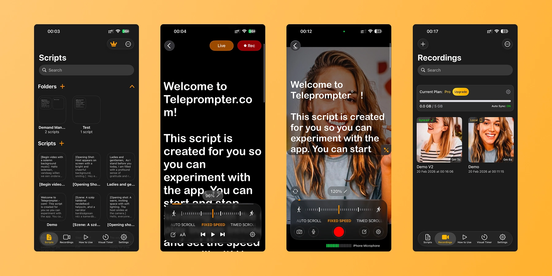
Home / Scripts
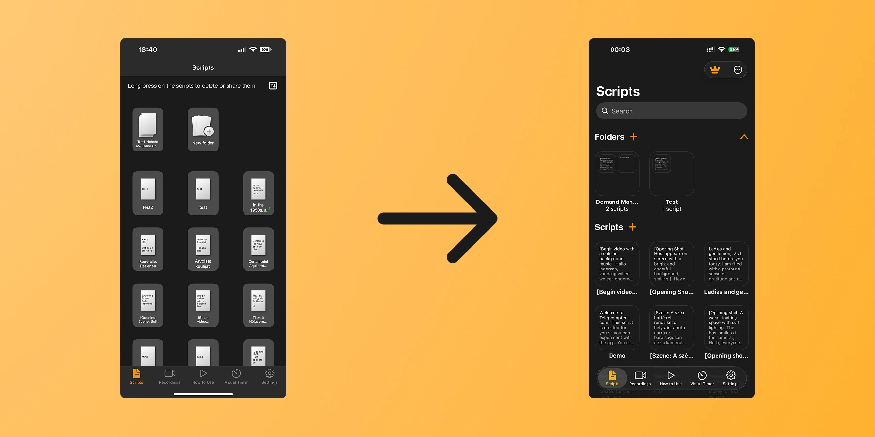
The original Scripts screen presented scripts as a grid of tiny document thumbnails, visually noisy and nearly impossible to identify at a glance. There was no search, no folder structure, and a persistent instructional label at the top suggested the interactions weren't self-evident.
The redesign kept the grid as the default layout while adding a list view toggle for users who prefer a more scannable format. A search bar and collapsible folder groupings were introduced so scripts can be organised by project or topic, and each entry now shows enough content to identify it immediately, reducing the time spent searching before a session.
Player / Teleprompter
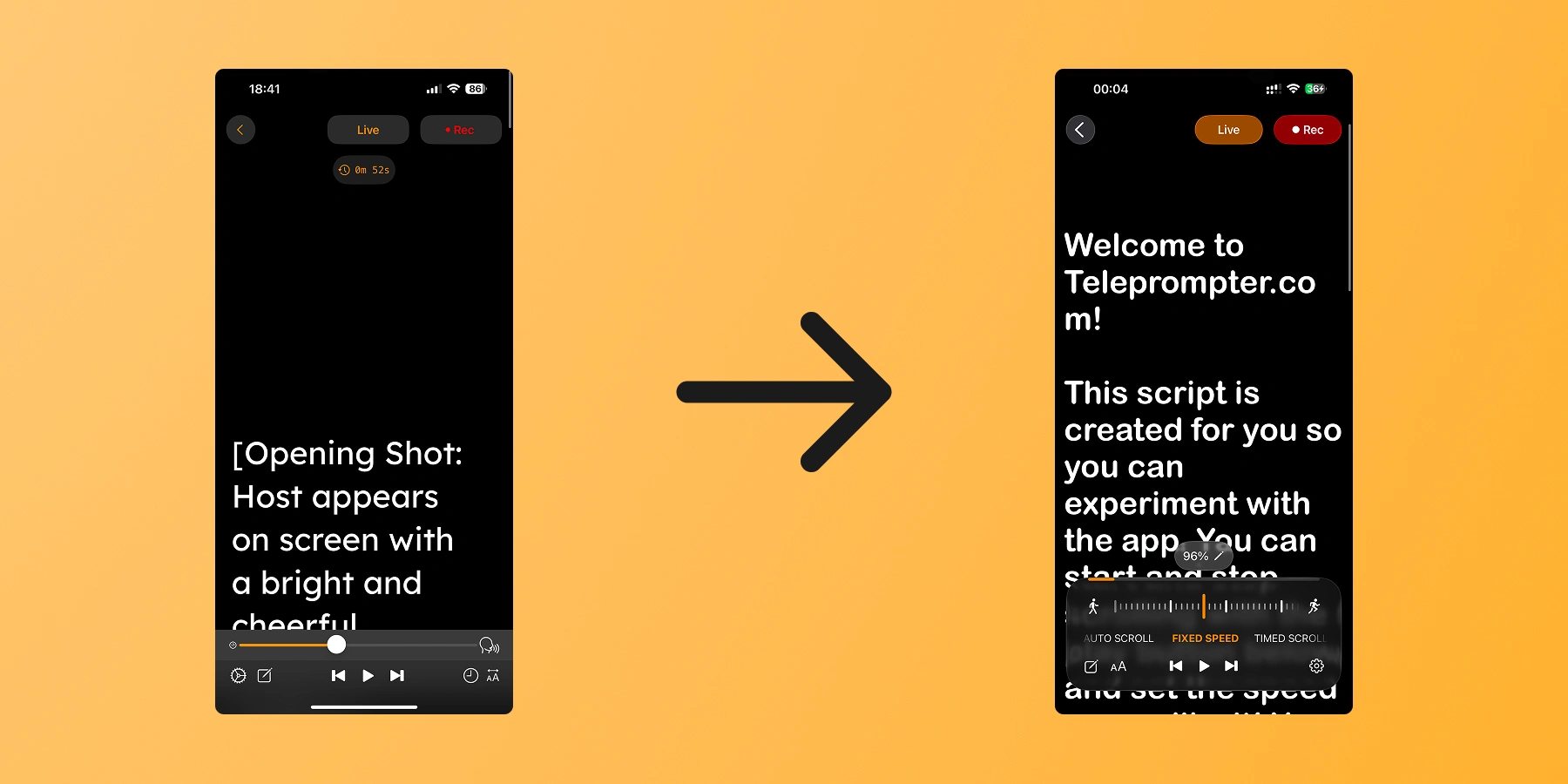
The app supported three scroll modes: auto-scroll (driven by speech recognition), fixed speed, and timed scrolling. The problem was that switching between them was unclear, and the speed slider sat adjacent to the auto-scroll icon in a way that made them look like they were part of the same control when they weren't. Users either didn't know other modes existed or struggled to discover how to activate them.
The solution was a horizontal mode switcher, similar to the camera mode selector in the iOS Camera app, where tapping slides between options in a way that already feels familiar. Contextual controls then appear based on the active mode: the speed slider is only shown for fixed speed, the timer only for timed scrolling. This kept the interface compact while making each mode's controls immediately obvious.
Video Recording
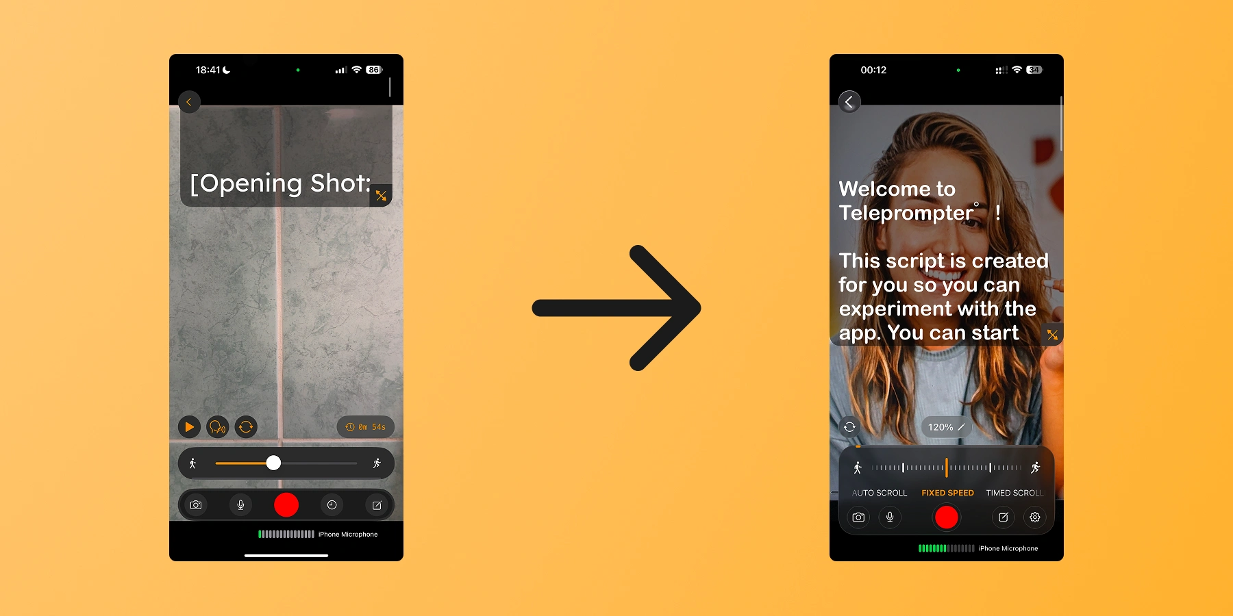
The recording screen had the same core problem as the player: three scroll modes available, with no clear way to discover or switch between them. The speed slider and the auto-scroll icon were placed close together here too, causing the same visual confusion about what belonged to what.
Since both screens share the same recording modes and are used back to back in the same flow, they were redesigned as a combined task. The same mode switcher pattern was carried across, so the interaction feels consistent whether the user is practicing with the teleprompter or recording with the camera.
The Recordings screen was a plain thumbnail grid that hadn't been touched while the rest of the app evolved. Visually it felt disconnected from the other screens, and the recording cards themselves were functional but not particularly considered in terms of presentation.
The main goal here was consistency. Bringing the layout in line with the redesigned Home/Scripts page made the app feel cohesive as a whole rather than a collection of separate screens. The recording cards were also reworked to feel more polished, giving the content the same level of visual care applied elsewhere.
The four screens rolled out gradually between April and September 2025, each shipping as it was ready. By the end of the cycle, the app had a consistent visual language from opening a script to reviewing the final take. The structural changes to navigation hierarchy and control layout were the core of the work, and seeing them hold up in production across millions of sessions was a strong validation that getting the fundamentals right matters more than surface-level polish.
Post-launch
App Store review sentiment was monitored weekly alongside the completion rate and setup time metrics. It added a qualitative layer to the numbers and helped track how the changes were resonating with users over time — not just whether they shipped, but whether they held.
CHECK OUT MY OTHER WORKS
Designed a native mobile app from scratch for A24 Assistance, a Romanian roadside assistance and vehicle recovery service.
Like this project
Posted Feb 23, 2026
Redesigned the core recording experience for Teleprompter.com, one of the App Store's fastest-growing teleprompter apps.
Likes
0
Views
5
Timeline
Apr 1, 2025 - Sep 30, 2025