Guarnieri Brand Identity and Packaging Redesign

Daniel Todeschini


🇺🇸
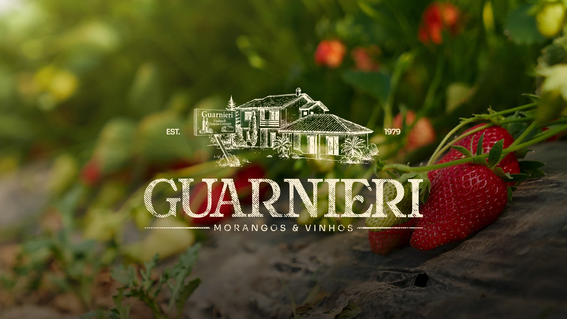
Guarnieri Strawberries & Wines is a brand rooted in land, tradition, and the hard work of a family that puts true care into everything they produce. A simple and authentic story filled with meaning, carrying the flavor and dedication of those who live the fields every day.
When I began the project, my goal was to turn that essence into visual identity. I explored their routine, origins, the grandfather’s wine, the local recognition, and the care behind every hand-picked strawberry. Every element of the brand was crafted to reflect this truth, from the illustrated farmhouse to the colors inspired by ripe strawberries and handcrafted wine.
The result is a brand that honors its roots while presenting itself with more strength, clarity, and personality. An identity that embraces, represents, and prepares Guarnieri for the future without losing what matters most: its family essence.
🇺🇸
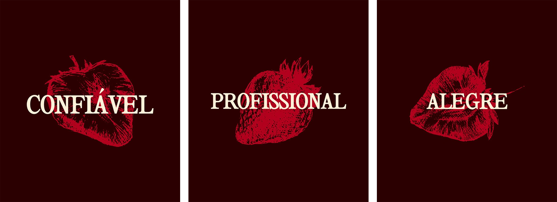
The three pillars of Guarnieri Strawberries & Wines capture what the brand stands for: trust, joy and professionalism. Trust built through years of family work and products made with genuine dedication. Joy expressed in the freshness of the strawberries and in the moments their wine helps celebrate. Professionalism reflected in the care given to every detail, even as a warm and humble family brand.
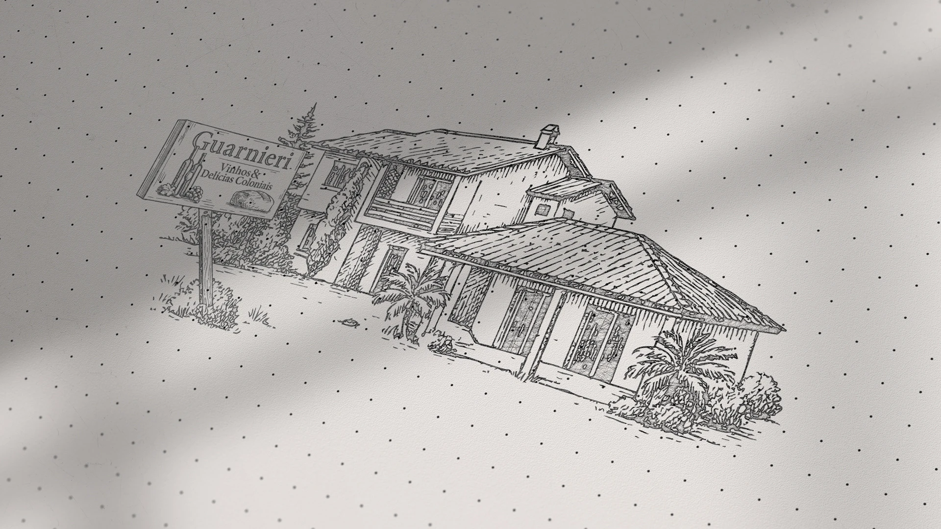
The house in the logo brings all these values together. It represents the origins, the land where everything began, the place that holds the family’s history and the daily work that sustains the quality people already recognize. It is not just an illustration, but the heart of Guarnieri.
Together, the pillars and the house form a visual identity that communicates authenticity, tradition and closeness. A brand that grows without losing its roots and carries in its design the same care found in everything they produce.
🇺🇸
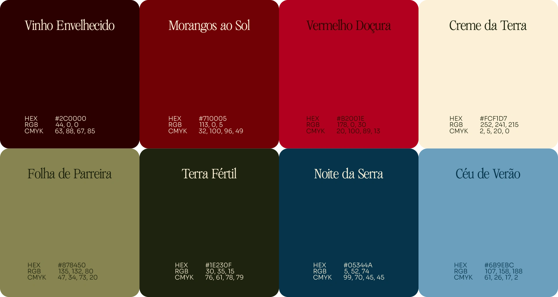
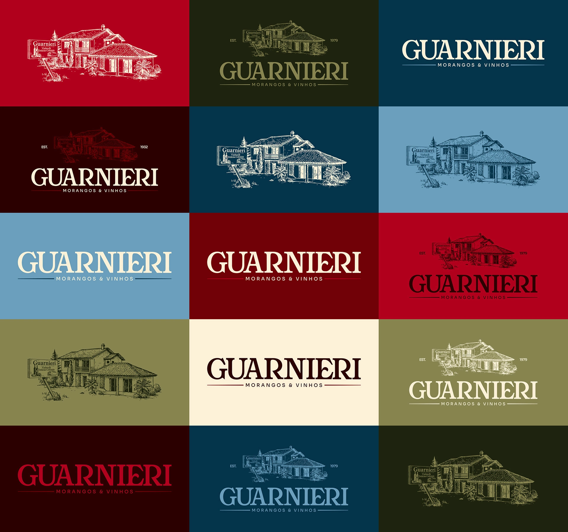
Guarnieri’s color palette is born directly from the brand’s story. The red tones represent the heart of the business: ripe strawberries, handcrafted wine and the family tradition that has lasted for generations. These colors bring warmth, flavor and emotional memory, reinforcing the authenticity that defines the Guarnieri name.
The earthy tones ground the identity in its origins. They evoke the soil, the fields and the daily work that sustains everything the brand stands for. This foundation brings closeness, naturalness and truth, creating a welcoming contrast with the richer tones of the palette.
To balance everything, the green and blue hues introduce lightness, freshness and visual breathing room. They recall the climate of the countryside, the harvest environment and the calm rhythm of rural life. Together, these colors build a visual identity that is vibrant, meaningful and deeply connected to Guarnieri’s essence.
🇺🇸
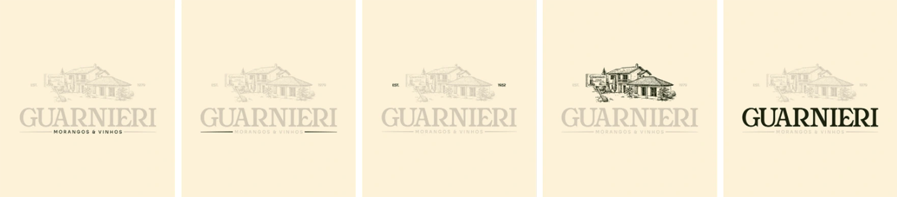
The construction of the Guarnieri logo began with the brand’s own story. The illustrated house is more than a graphic symbol, it represents the family’s roots, the land where everything started and the tradition passed through generations. The hand-drawn line reinforces this sense of memory and authenticity, bringing a human touch that connects the identity to Guarnieri’s rural and family essence.
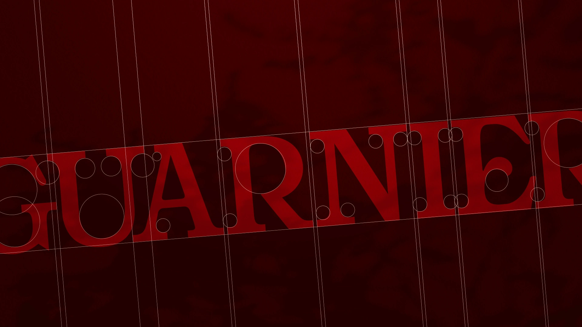
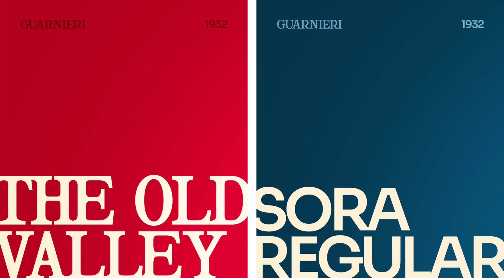
The typography chosen for “GUARNIERI” was created to express strength and professionalism. Bold, elegant and full of character, it highlights the family name and honors the path they built over the years. “Strawberries & Wines” appears in a softer, more functional typeface, balancing the composition and clearly defining the brand’s segment in a simple and accessible way.
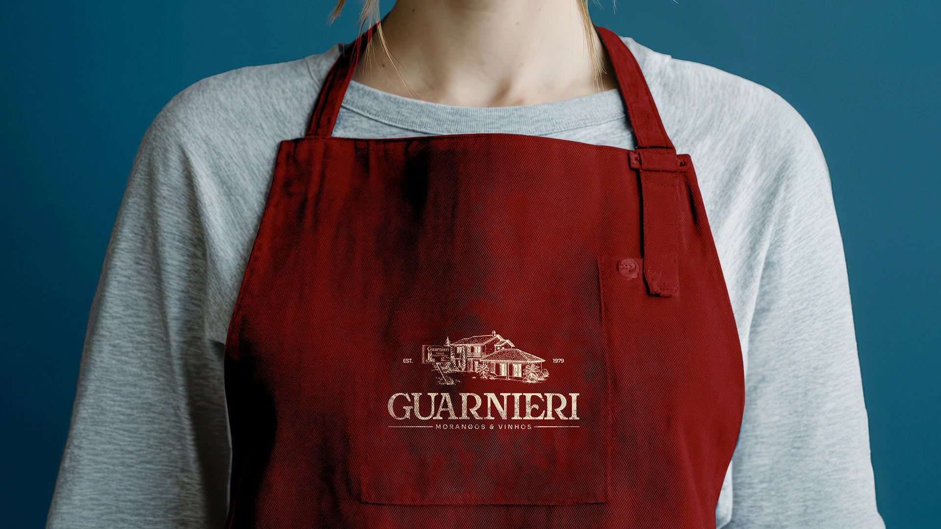
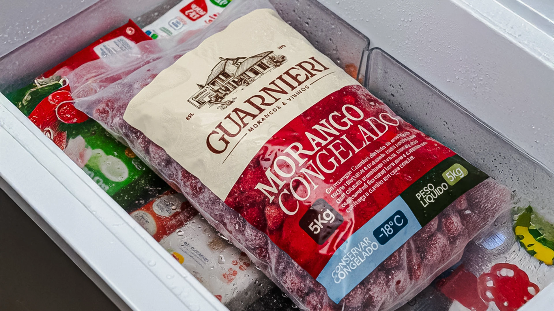
To complete the design, elements such as “EST. 1979” and the line under the tagline reinforce the brand’s longevity and structure. Each detail was crafted to add meaning and create an identity that respects the past, elevates the present and prepares Guarnieri for the future. The result is a logo that is solid, emotional and genuine, carrying the family’s soul in every stroke.

🇺🇸
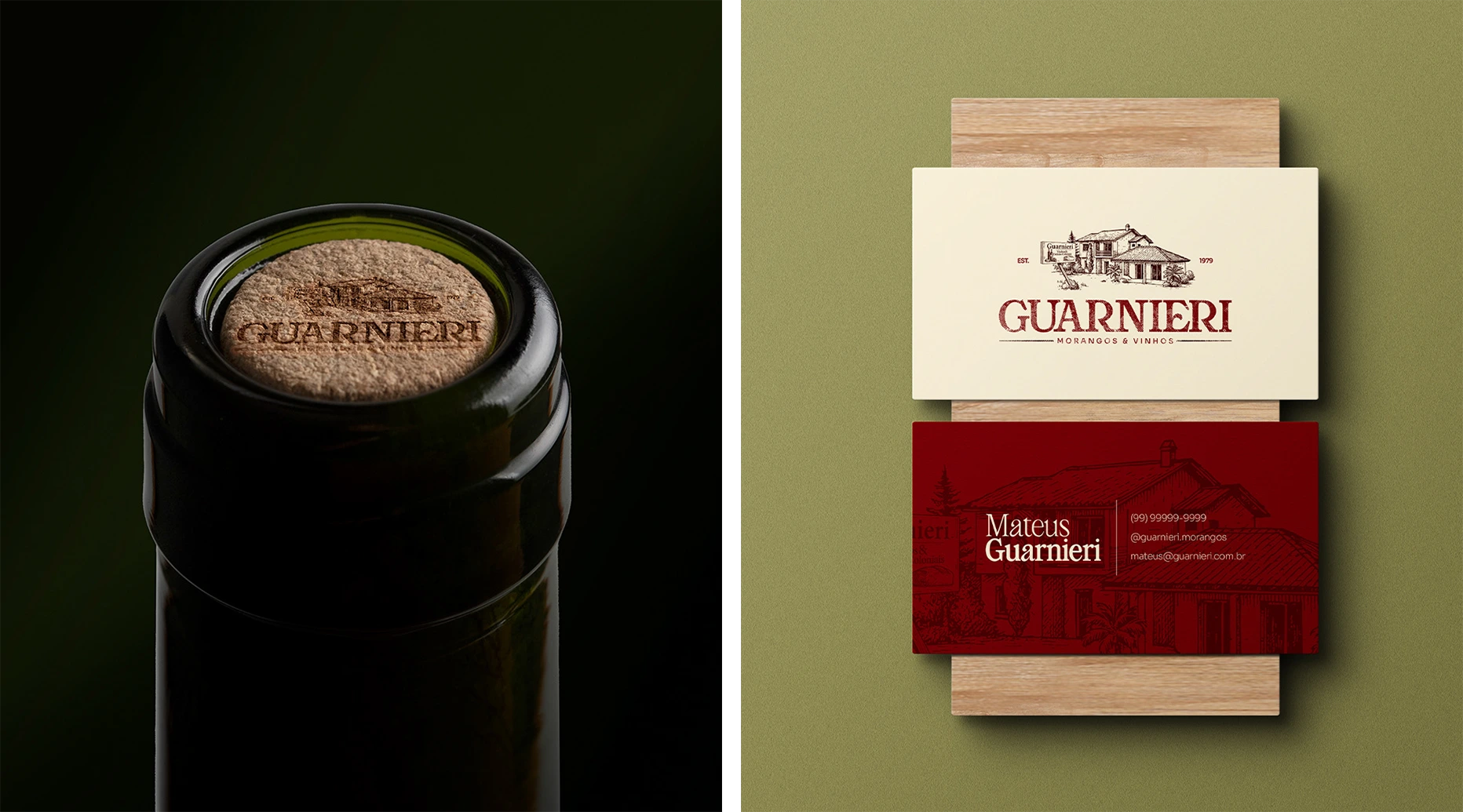
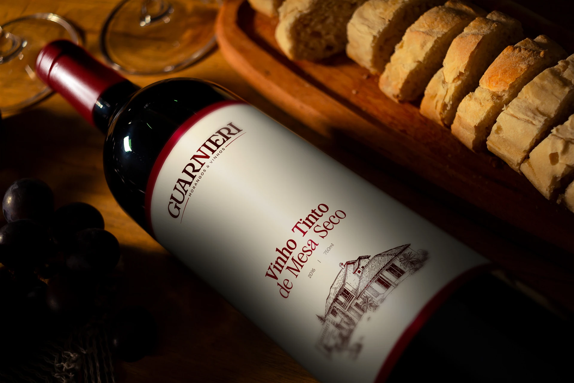
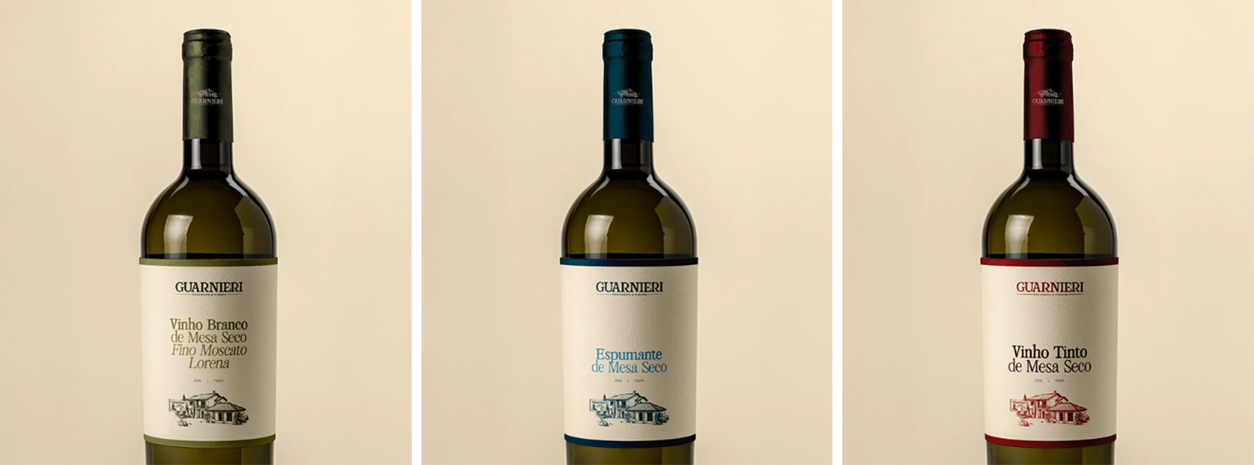
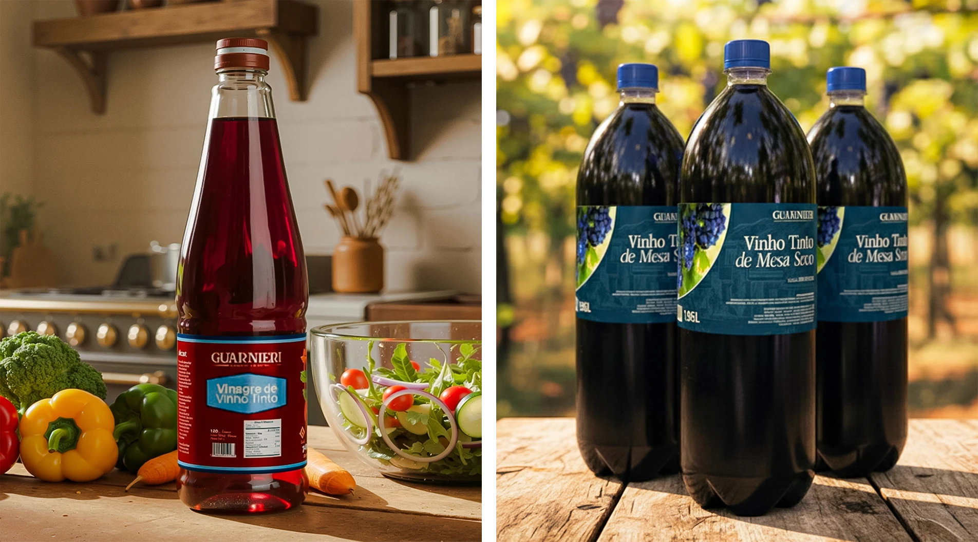
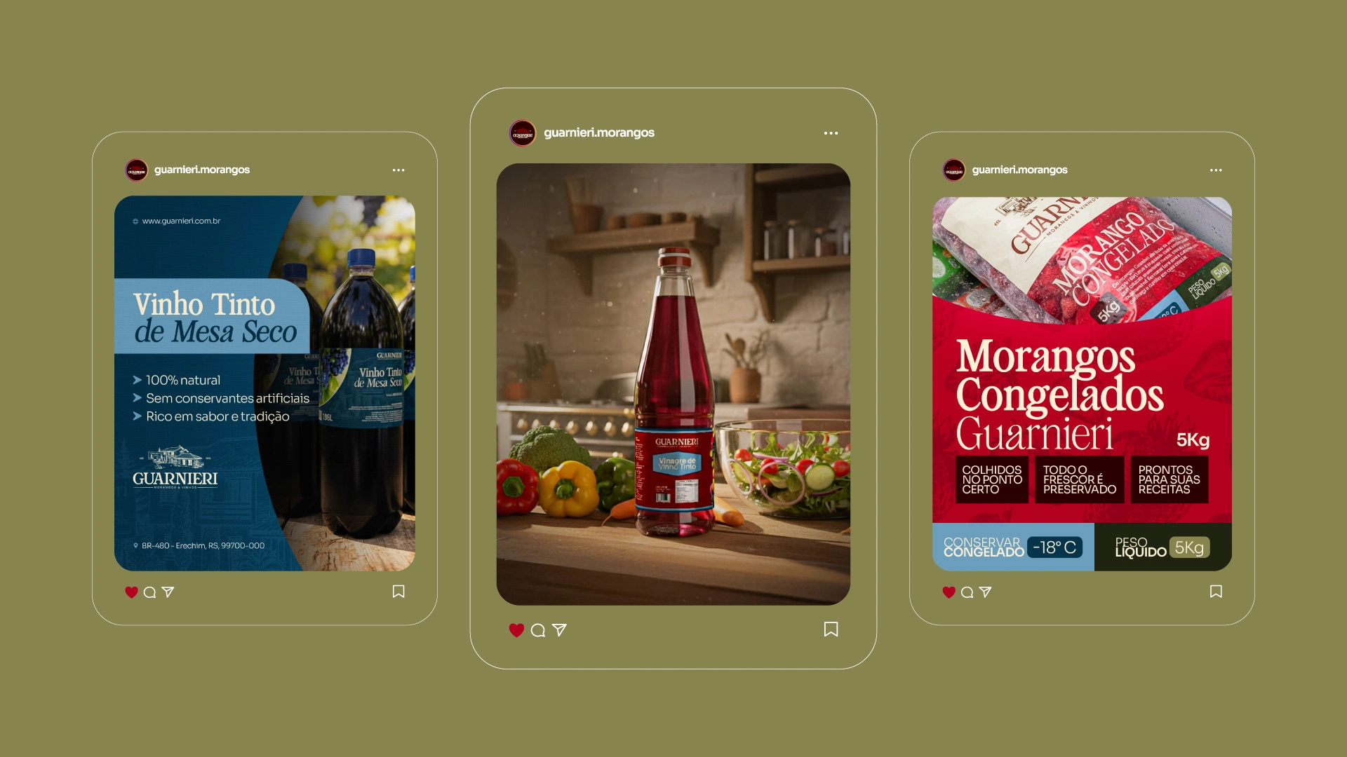
The new wine packaging for Guarnieri was created to give the product more strength and identity. The goal was to modernize the label while keeping the family essence alive, bringing the brand’s history and care directly onto the bottle.
The house illustration appears as the central element, creating an immediate connection to the brand’s roots. The colors, typography and layout reinforce quality, tradition and simplicity, the core traits of Guarnieri’s way of producing.
With this update, the bottles gain presence, recognition and personality. These labels tell where the wine comes from and show, through design, the same care found in the production process.

Like this project
Posted Jul 21, 2026
Designed a visual identity and modernized packaging for Guarnieri Strawberries & Wines.
Likes
1
Views
4
Timeline
Sep 17, 2025 - Oct 23, 2025