Tecnoagro Brand Identity Redesign

Daniel Todeschini


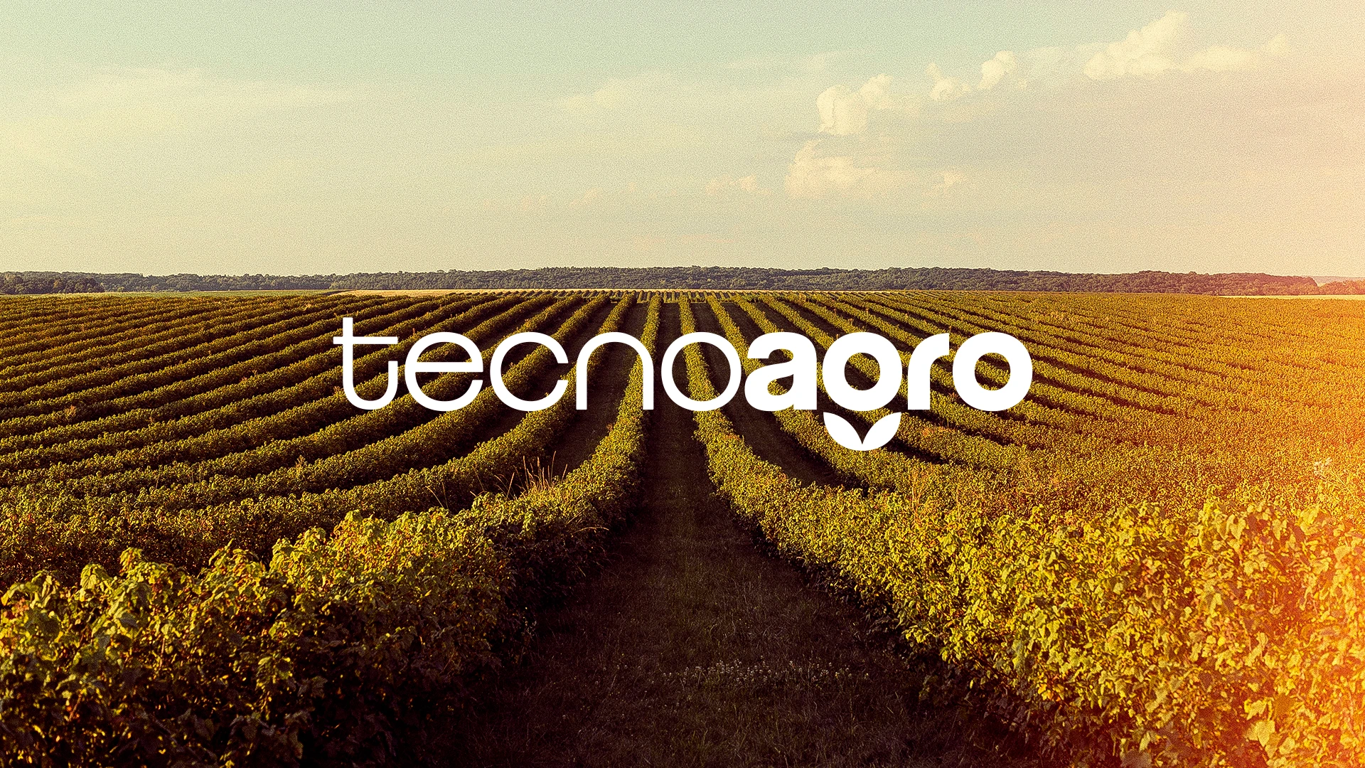
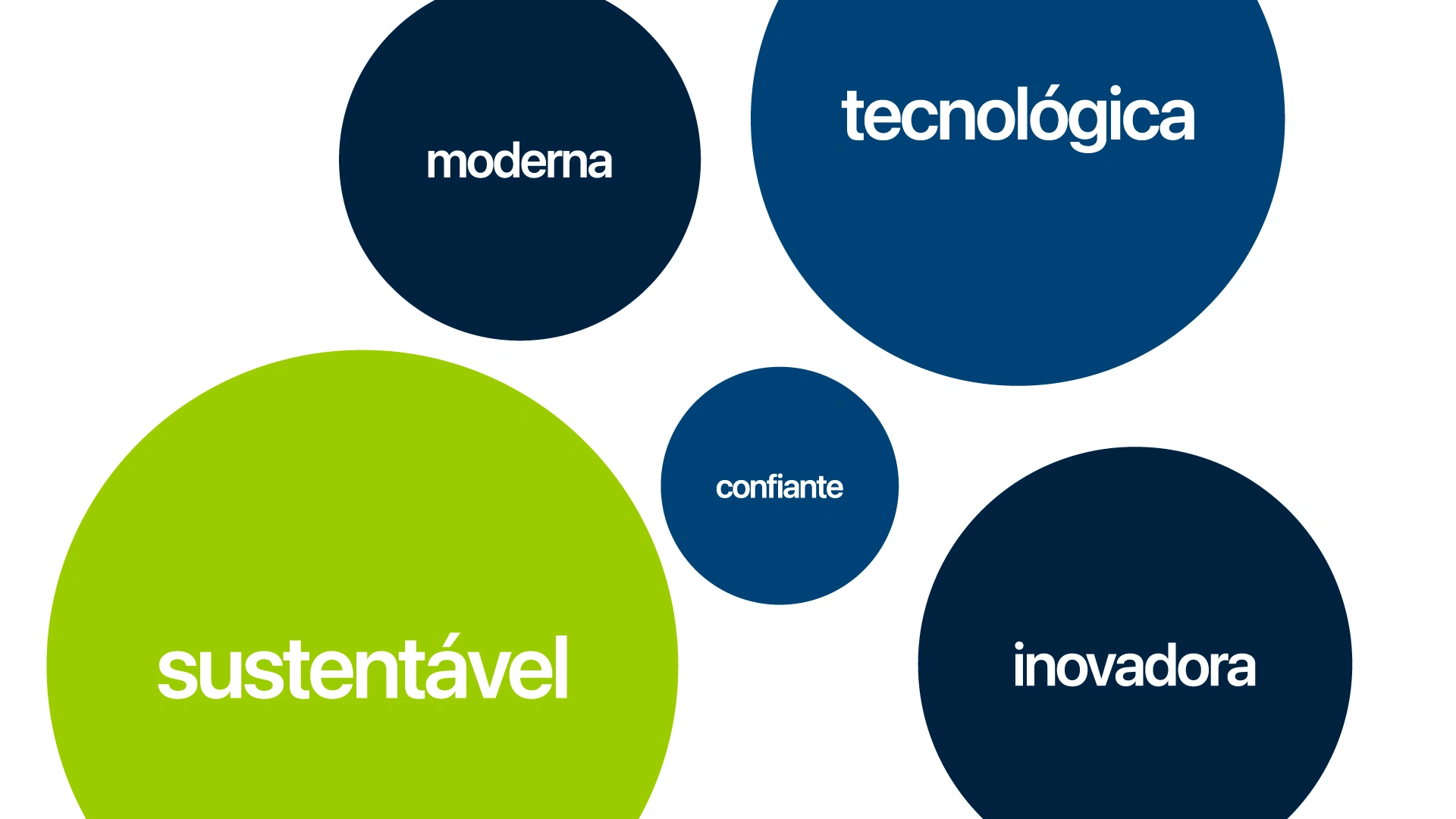
Tecnoagro connects the countryside to innovation. It values tradition and production but believes the future of agribusiness lies in technology, sustainability, and intelligence. It’s a modern, accessible, and human brand that respects its roots while cultivating the future, growing alongside those who drive Brazil forward: the rural producers.
Mission
Offer sustainable technological solutions that boost productivity in the field, respecting nature and valuing rural producers.
Vision
To be a national reference in innovation for agribusiness, promoting a smarter, more efficient, and environmentally responsible future.
Values
Innovation with purpose, sustainability, valuing the producer, transparency, and efficiency.

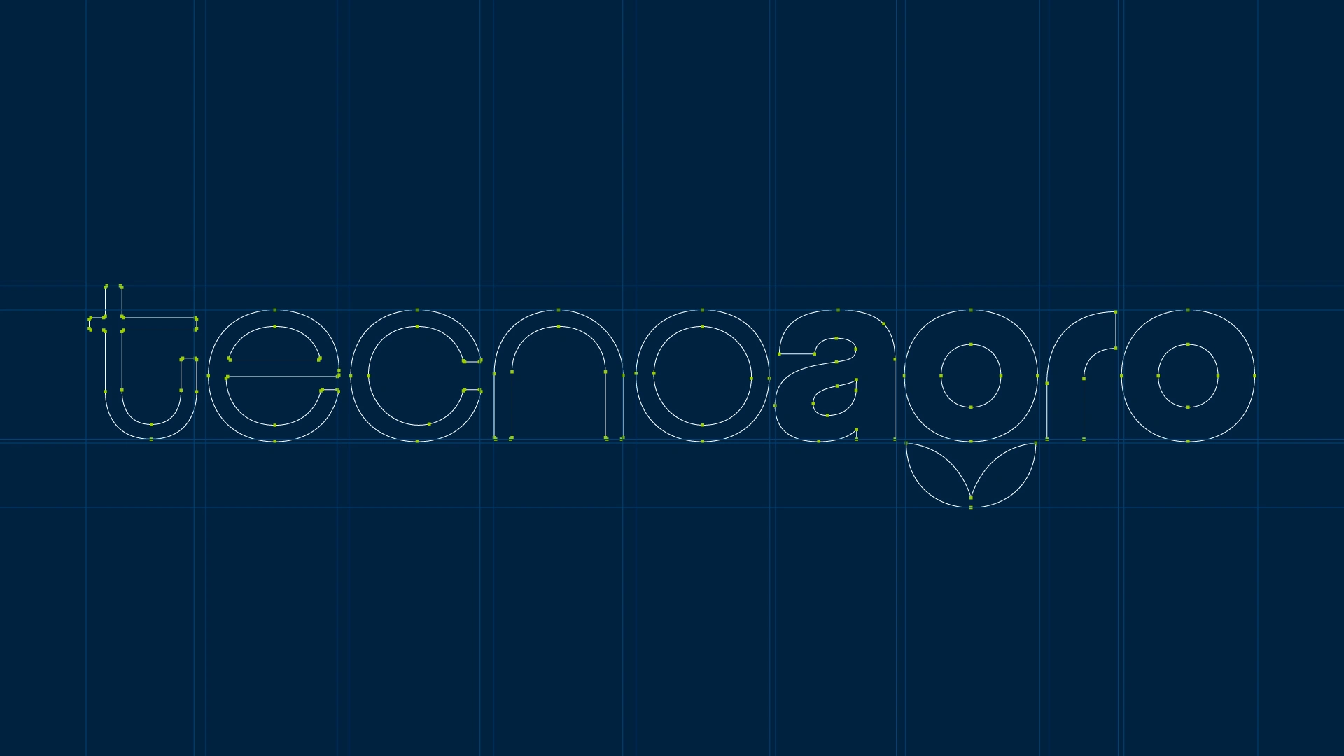
Graphic Construction
The use of lowercase letters conveys modernity, simplicity, and technology, reinforcing a brand that is accessible and connected to the future. The rounded and geometric shapes ensure balance, readability, and a friendly appearance, representing the union between technological precision and natural fluidity.
In the composition, the word “agro” appears in bold to highlight the strength, essence, and protagonism of the agricultural sector, while “tecno” uses a lighter weight, conveying lightness, innovation, and technology.
The letter “A” in “agro” was carefully redesigned, adjusting its shape and curvature. The original version of the typeface was too rounded, causing visual discomfort and reducing readability, especially from a distance. This adjustment brought more stability, clarity, and personality to the brand.
The leaf integrated into the “g” is not just a decorative element, but a structural part of the typography. It symbolizes sustainability, environmental care, and conscious growth. At the same time, the “g” itself can be used as an isolated element, functioning as an icon or seal, strengthening Tecnoagro’s visual identity in different applications.

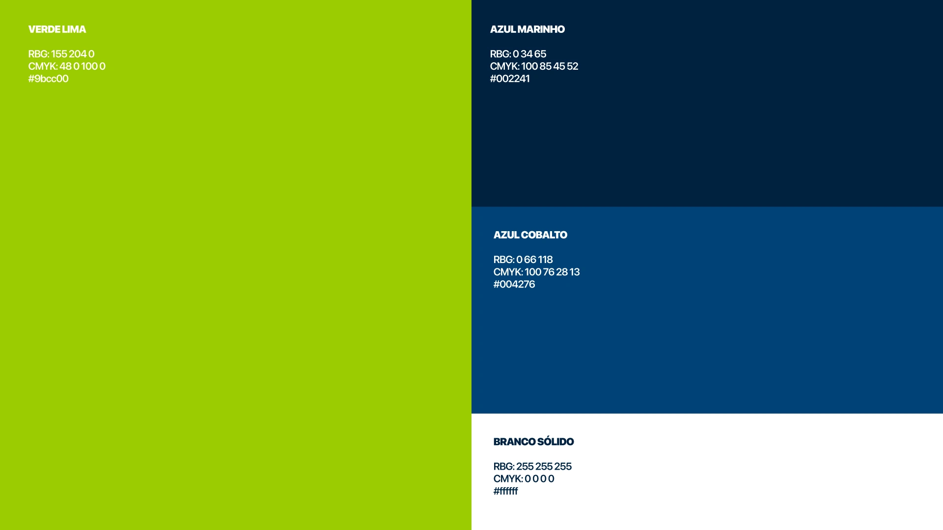
Tecnoagro’s color palette reflects the brand’s core values. Lime Green represents nature, the countryside, and growth, symbolizing sustainability and innovation. Navy Blue conveys technology, trust, and solidity, reinforcing the brand’s credibility. Cobalt Blue brings modernity, dynamism, and balance, connecting technology to the human side. Finally, Solid White stands for clarity, transparency, and simplicity, reflecting Tecnoagro’s integrity and lightness in communication.
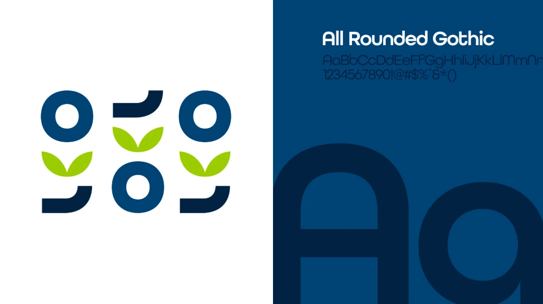
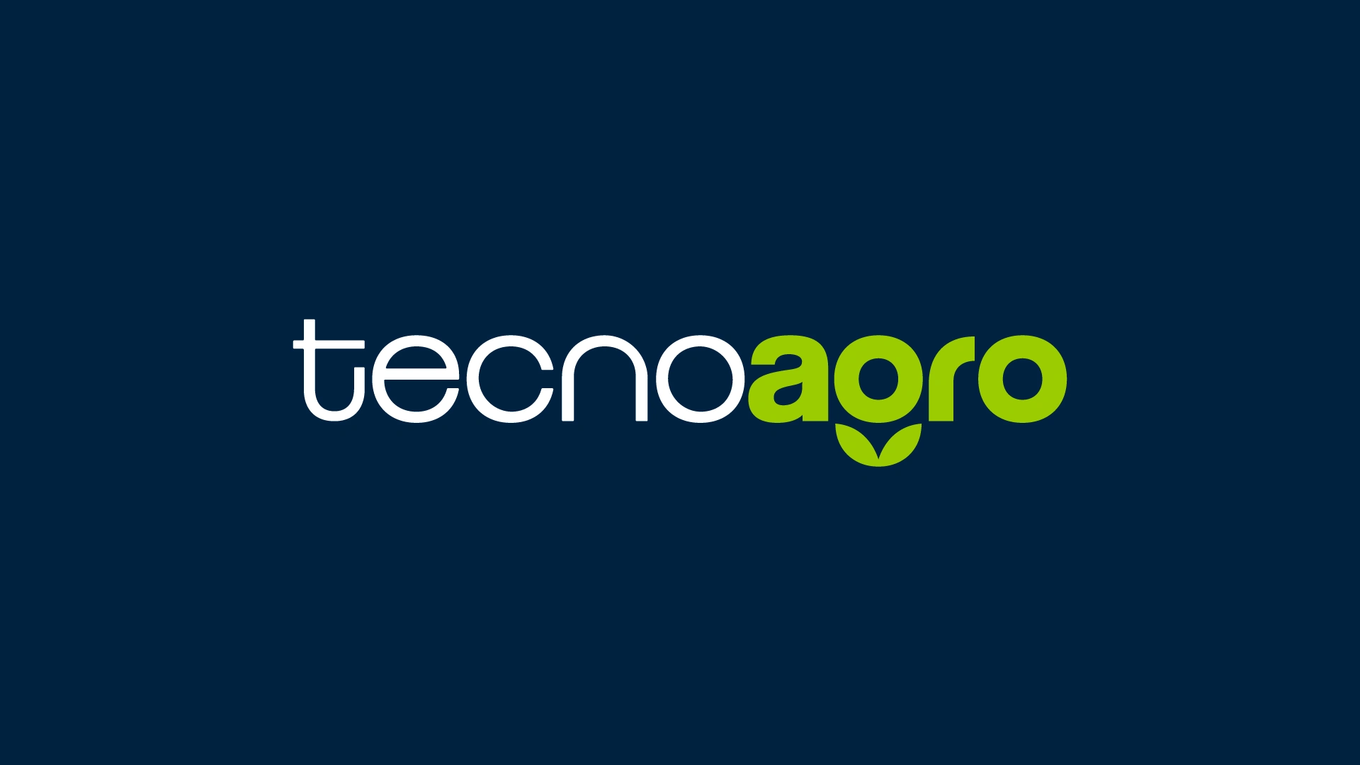
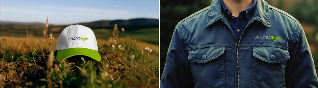
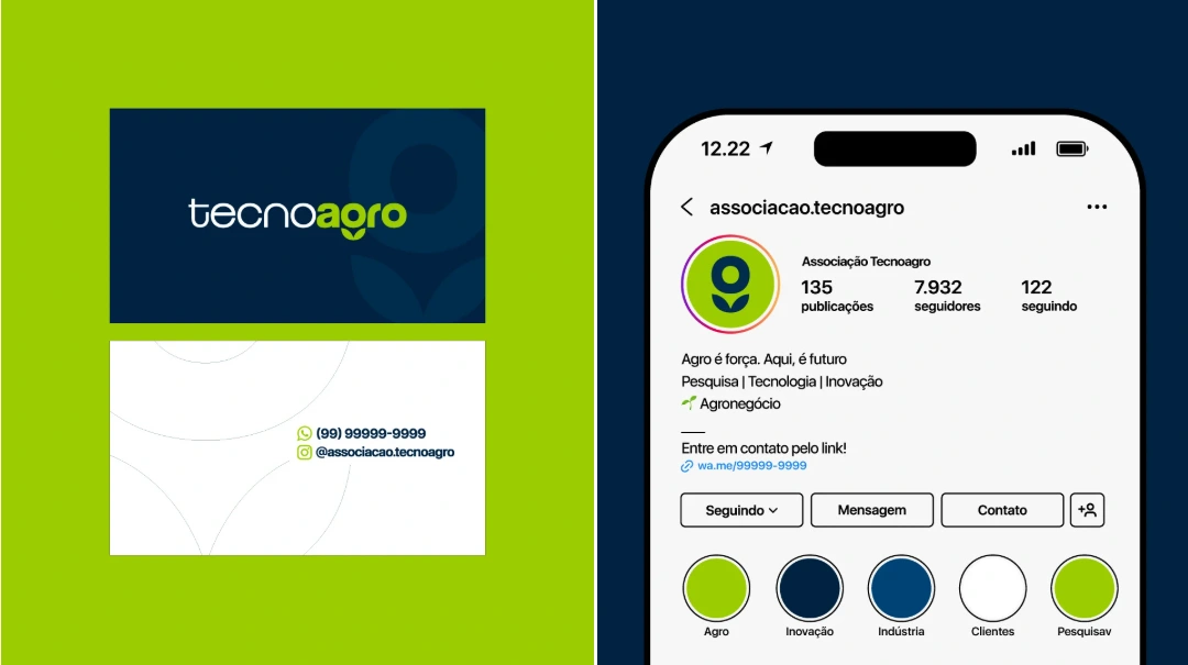
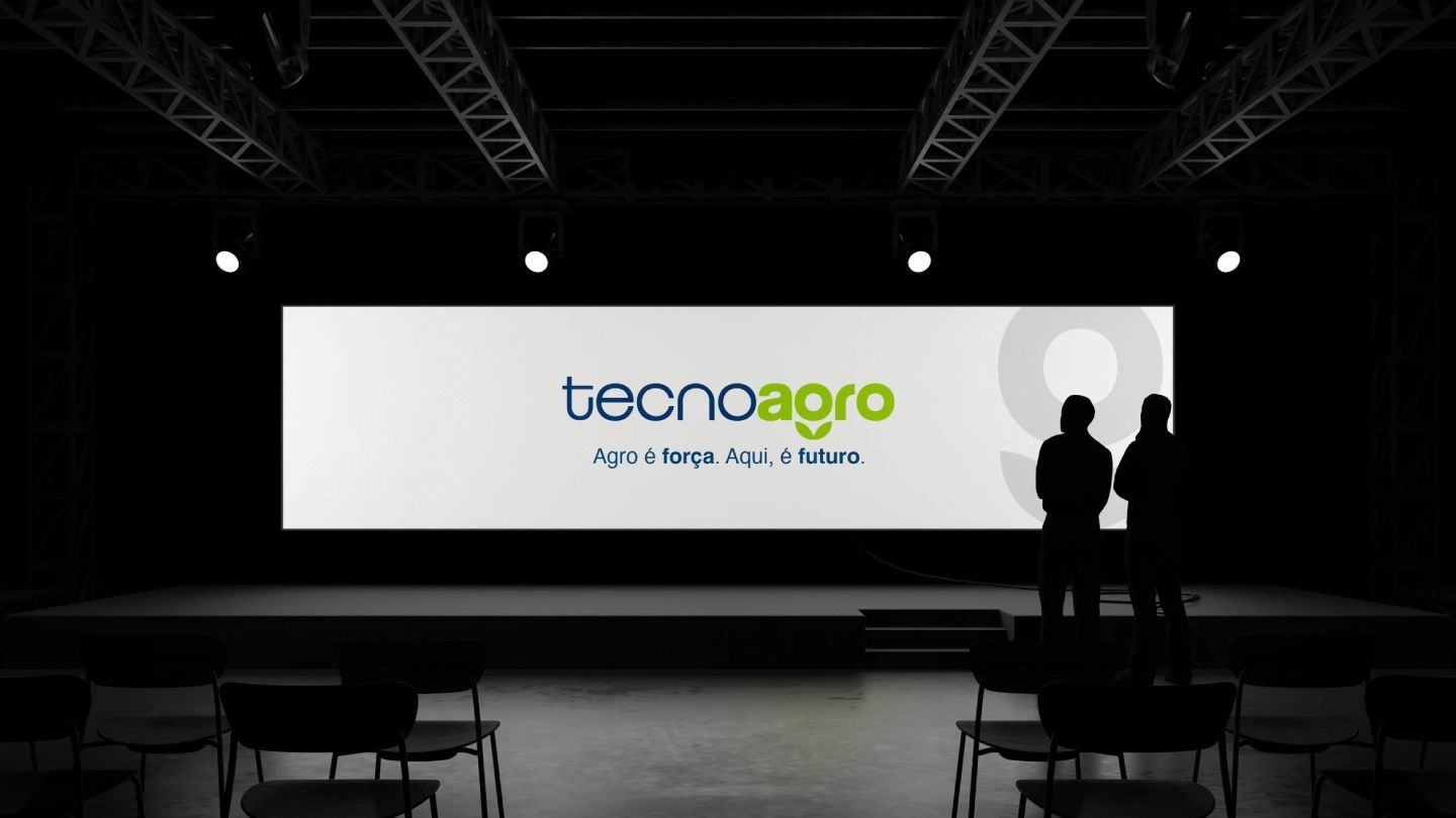
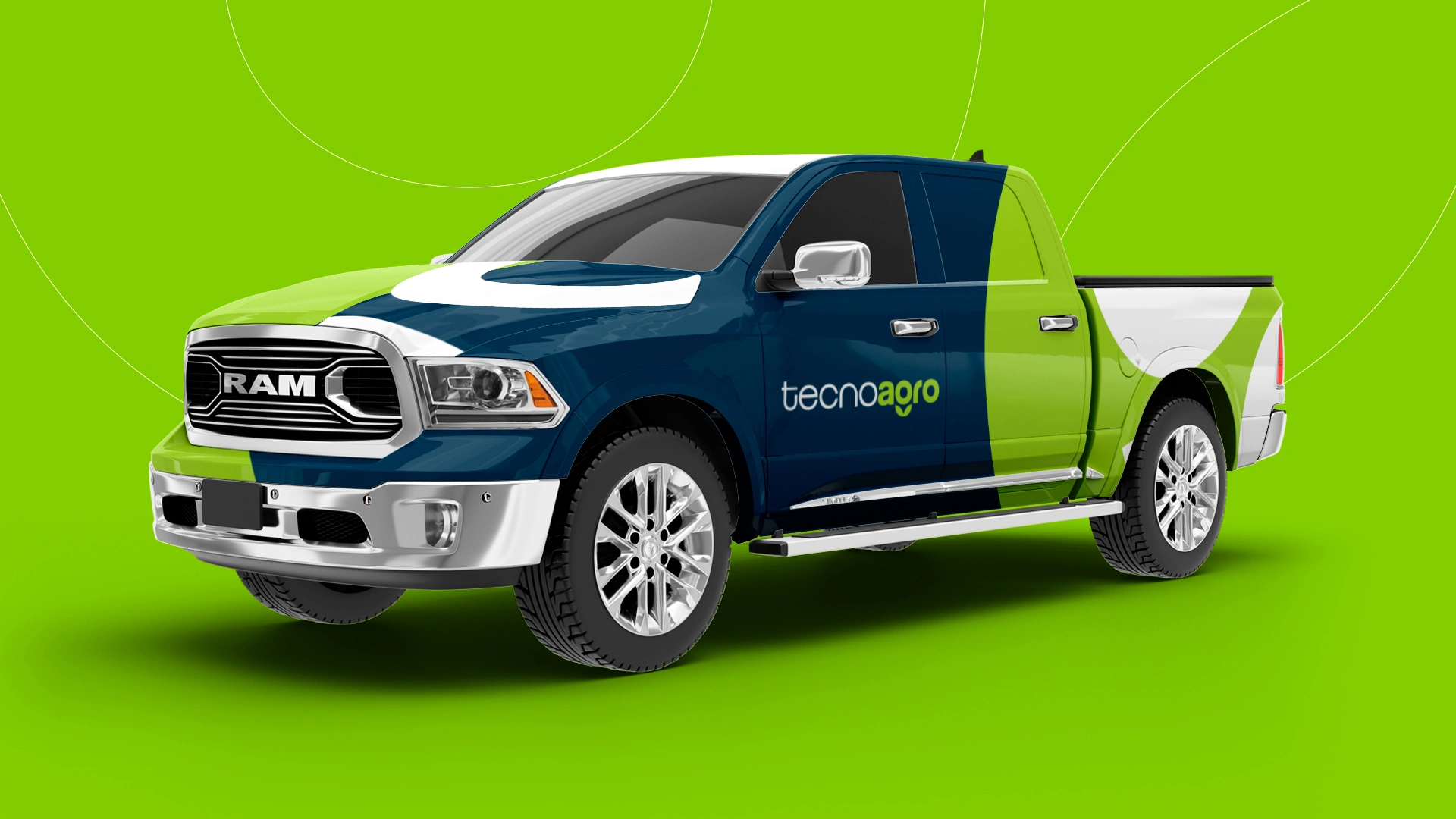
Tecnoagro’s brand was developed to represent the connection between agriculture, technology, and sustainability. Every detail carries purpose, reflecting a modern, accessible company committed to the conscious growth of agribusiness. Now, see how this identity comes to life across different touchpoints.



Like this project
Posted Aug 18, 2026
Redesigned Tecnoagro's brand, focusing on modernity, readability, and sustainability.