Most AI dashboards look powerful

Mahin Rahman

Most AI dashboards look powerful on paper but feel overwhelming the moment you open them.
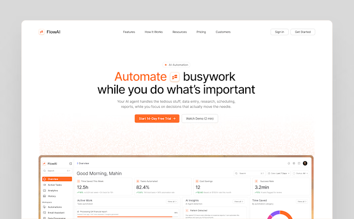
For FlowAI I designed a dark mode AI agent dashboard that gives users complete visibility.
The biggest challenge was information density. This dashboard carries a lot of data — stat cards, two charts, an activity feed table, a donut chart, and a live activity log. The goal was to make all of it feel calm and easy to scan.
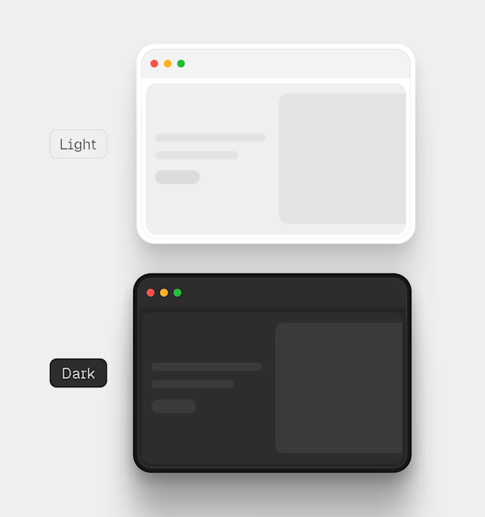
The dark background does the heavy lifting by naturally separating cards without heavy borders. Orange #F97316 is used sparingly — only on the most important data points — so the user's eye always knows where to go first. The sidebar is clean and hierarchical so users always know where they are and where to go next.
The result is a dashboard that feels like a control center — not a data dump.
Built entirely in Figma 🧡
Like this project
Posted Feb 23, 2026
Most AI dashboards look powerful on paper but feel overwhelming the moment you open them. For FlowAI I designed a dark mode AI agent dashboard that gives use...
Likes
0
Views
12