Nelson-Atkins Museum
Brian White
OVERVIEW
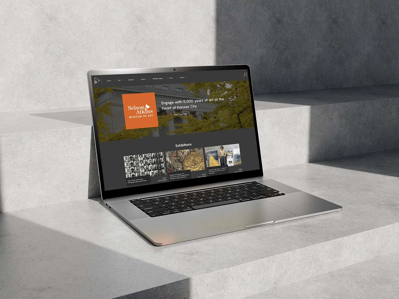
The Nelson-Atkins Museum needed a website that made exploring art, exhibits, and programs intuitive—on both desktop and mobile. I led the redesign of the user experience, information architecture, and scalable design system, creating flexible templates and content modules that adapt to any type of program or exhibit. The result: a modern, mobile-first site that engages visitors and makes discovering the museum’s offerings effortless.
Art Direction by Christi DeLaroy and Development by Rachel Rolon of the Nelson.
CHALLENGE
The Nelson-Atkins Museum’s website had become difficult to navigate, with a confusing hierarchy and an overwhelming number of outdated pages. Visitors struggled to find what they needed—whether that was exhibit information, class registration, or festival details. The museum needed a more intuitive, flexible, and mobile-friendly experience that could scale across diverse types of content.
My project approach and deliverables
My Role
I was hired to lead the user experience design for the new site. My focus was on creating a streamlined information architecture, designing scalable systems, and ensuring the site worked seamlessly across desktop and mobile.
The Process
Information Architecture – I restructured the site’s hierarchy, removing outdated content and clarifying paths so users could easily find events, exhibits, and resources.
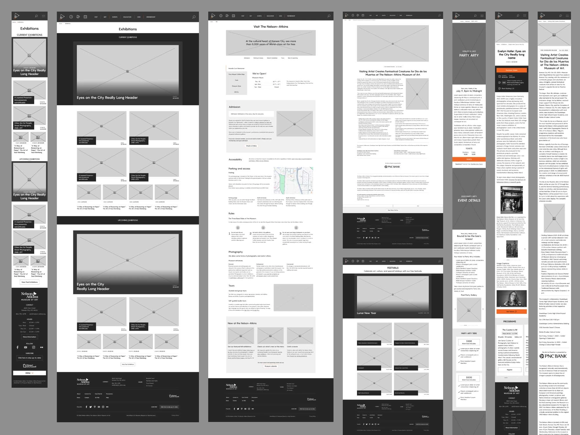
Wireframing – Using Figma, I built wireframes for the entire site architecture. These visual maps showed how simplified navigation would improve the browsing experience.
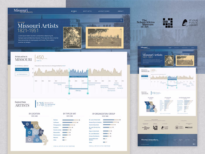
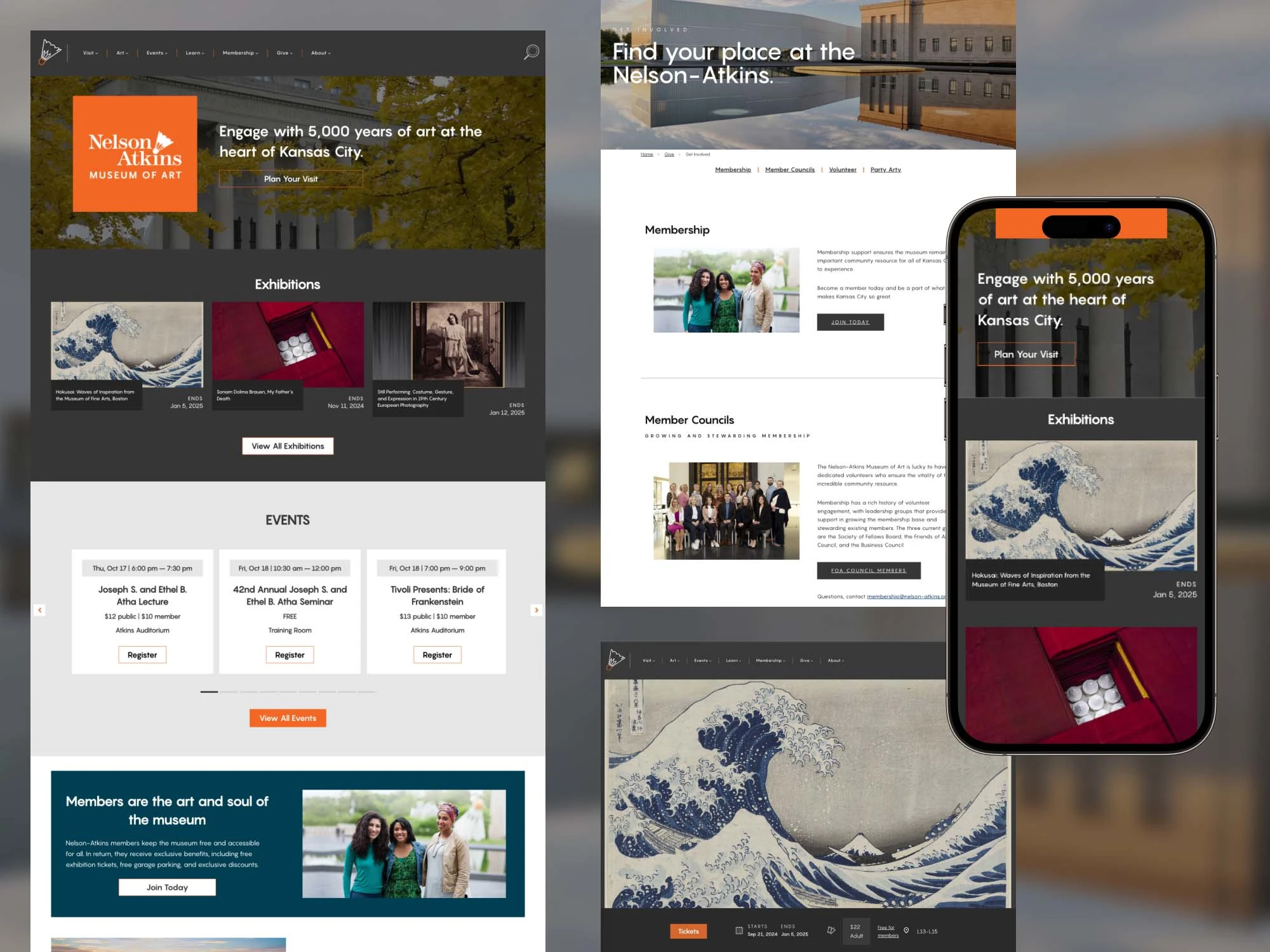
Design System – I created a flexible, reusable design system with over 10 unique master templates. These allowed the museum to showcase everything from featured exhibits to educational programs in a consistent, user-friendly way.
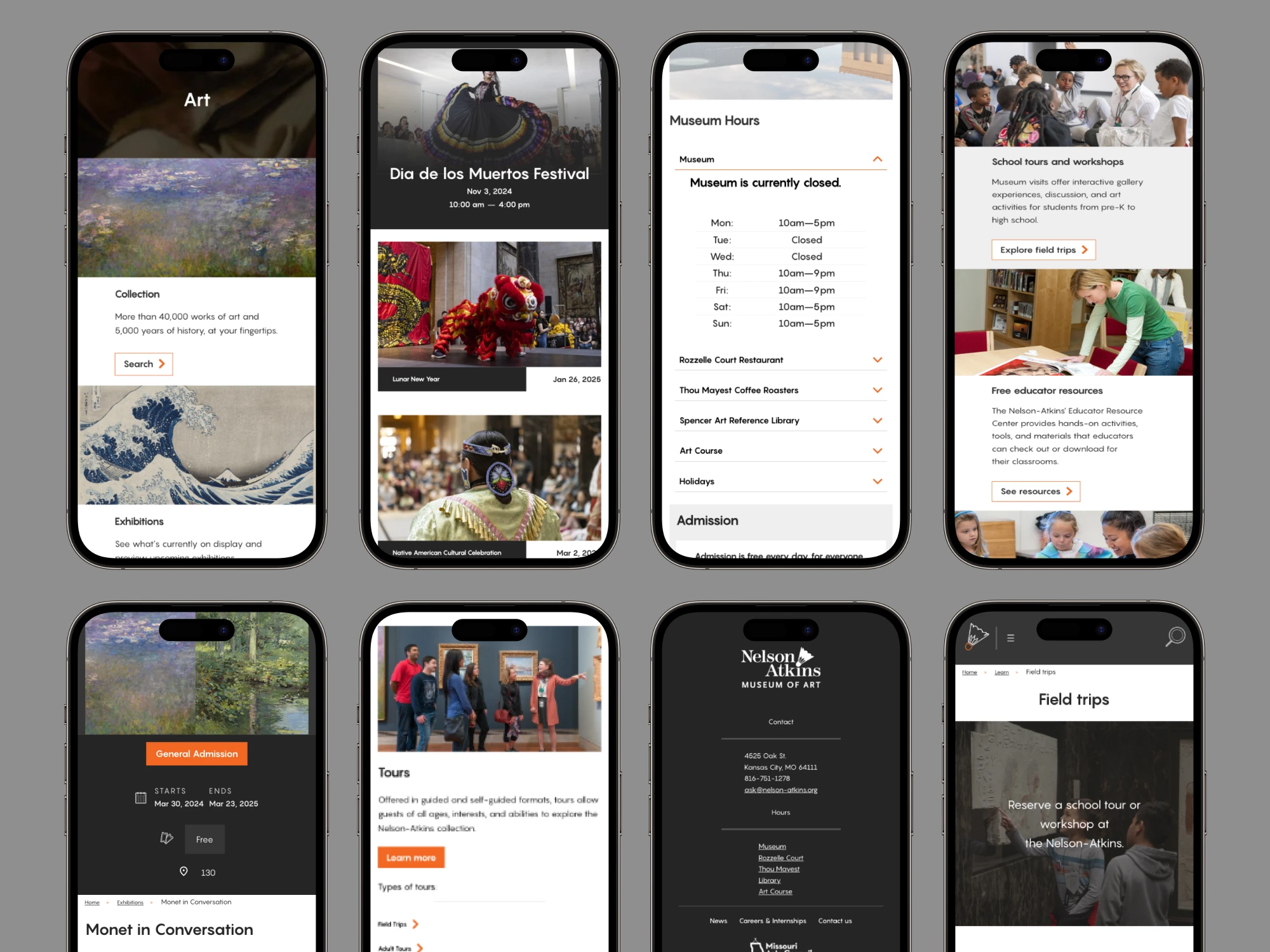
Mobile-First Focus – The mobile experience was prioritized, ensuring that every template and module adapted gracefully to smaller screens.
Image & Exhibit Modules – As the project expanded, I designed over 50 custom modules to support online exhibits, image galleries, and creative storytelling content.
Wireframe base templates
Low-fidelity wireframes helped visualize smoother navigation and user flows. Our wireframes were to scale and utilized the same brand fonts to visualize the spacing and line-height.
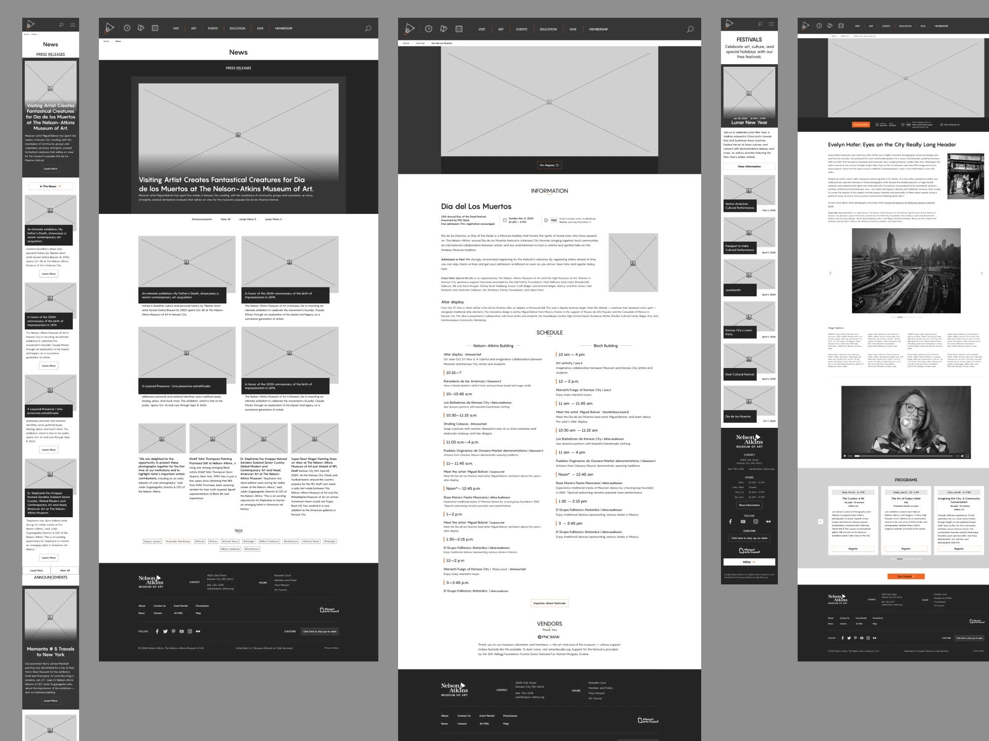
Wireframe System
My main job was to recreate the site for 3 different proposed age groups and genders. The goal was an easier user experience and navigational structure on a very large site.
DESIGN SYSTEM FOUNDATION
A scalable system of templates and modules ensures consistency across the site.
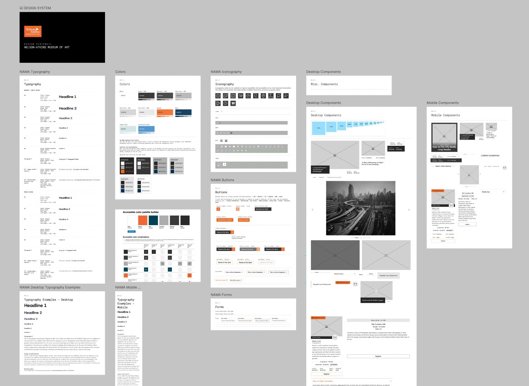
Flexible Modules
Over 50 modules created for diverse needs—exhibits, age-based classes, online festivals, and more.
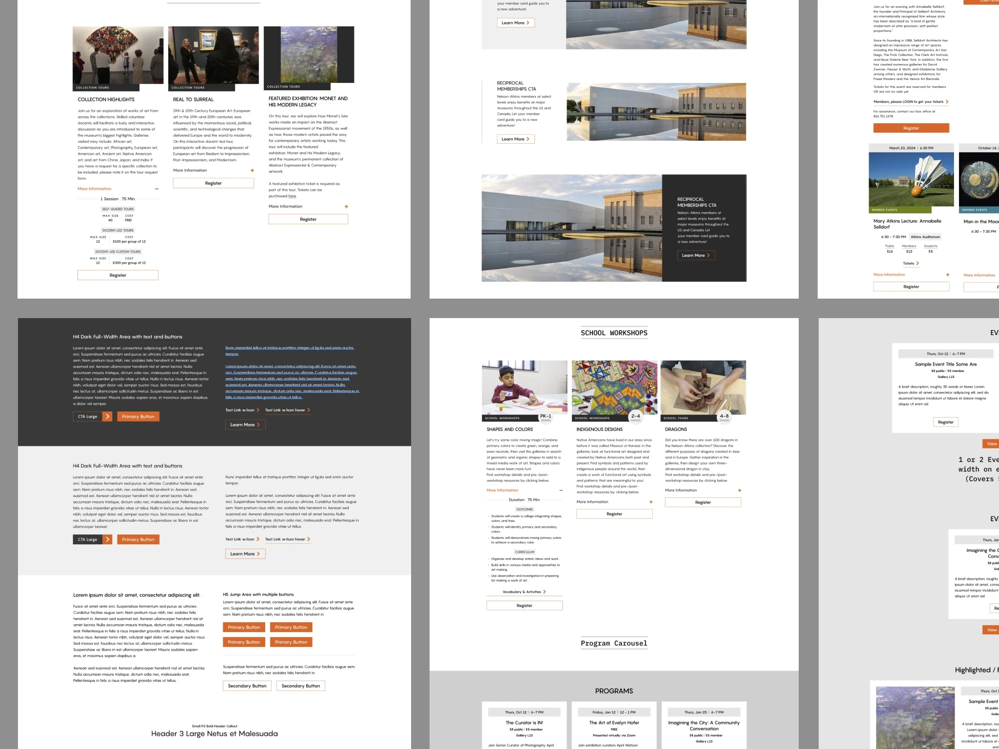
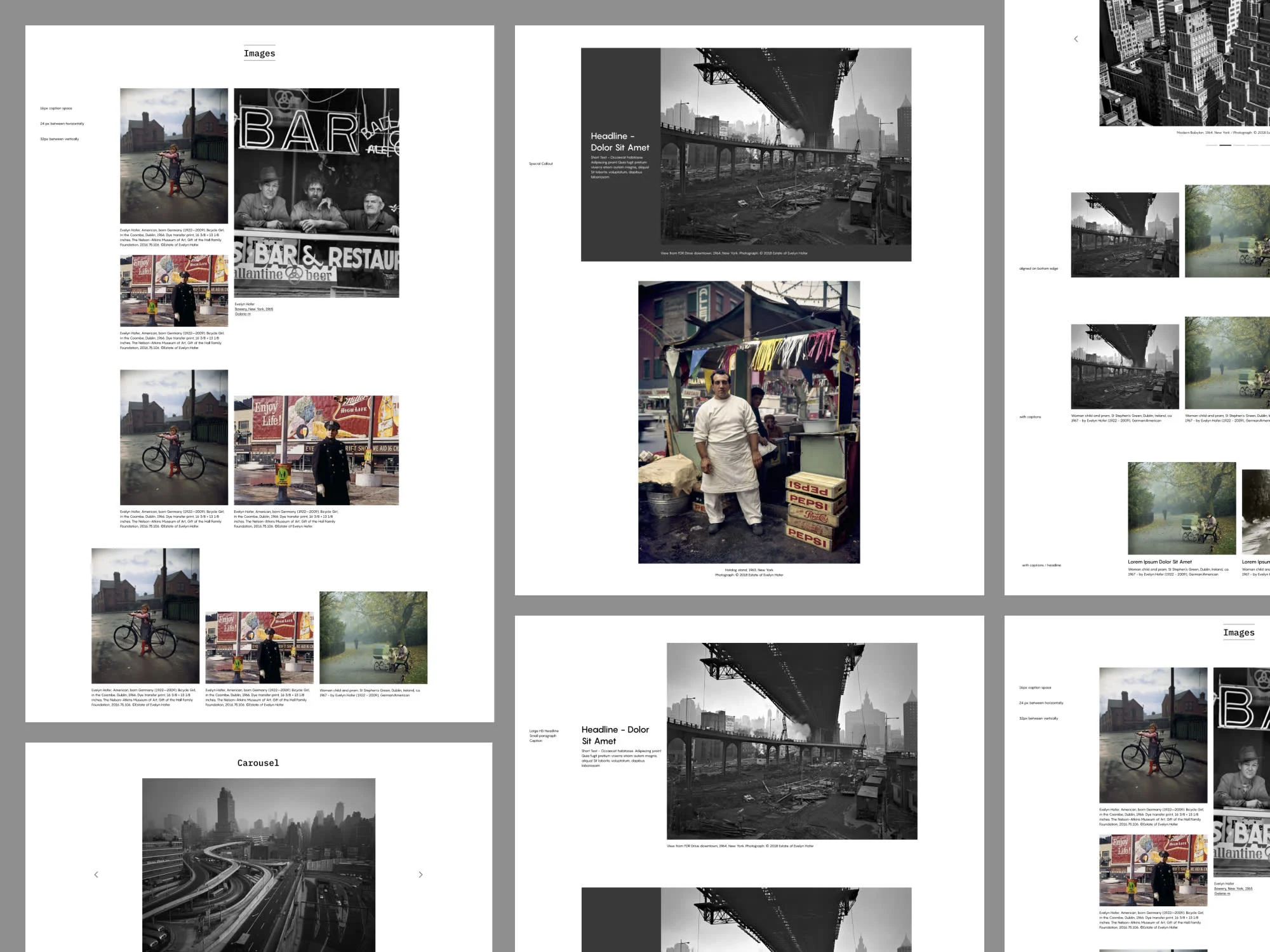
IMAGE MODULES
The image modules had so many variables as the content couldn't be cropped and had many different aspect ratios.
MOBILE FIRST EXPERIENCE
Every page was designed to adapt gracefully to mobile, where most visitors access the site.
ABOUT PAGE
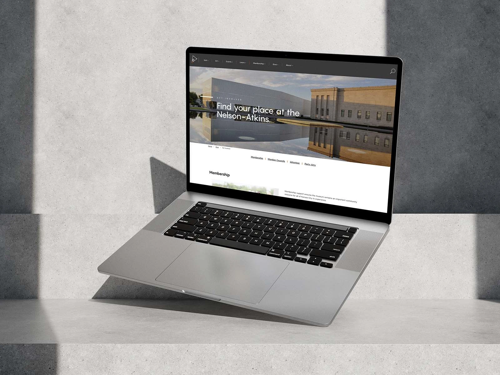
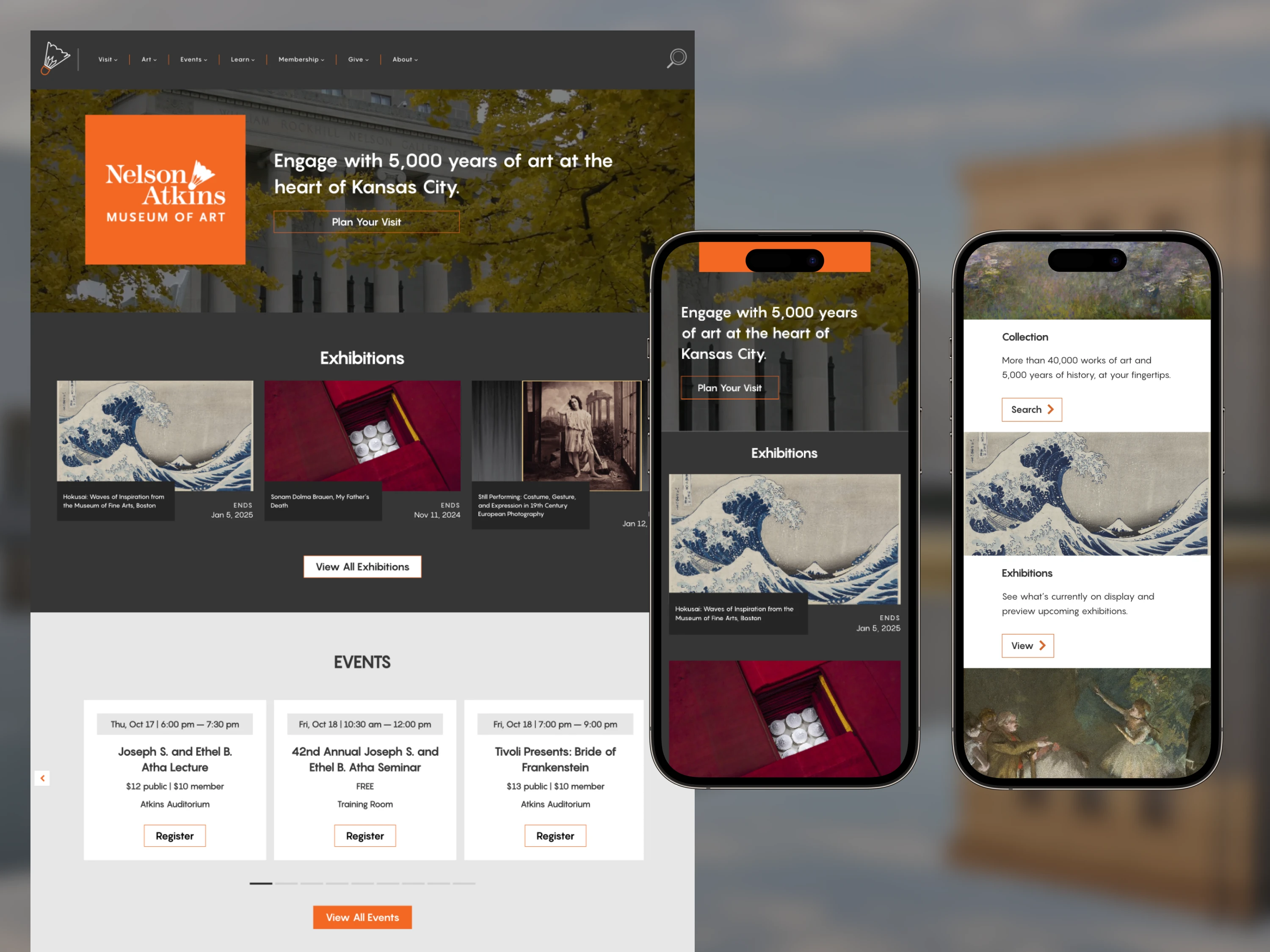
HOME AND MEMBERSHIP
The homepage was built to be a jump area to almost any section of the site easily - especially donor areas.
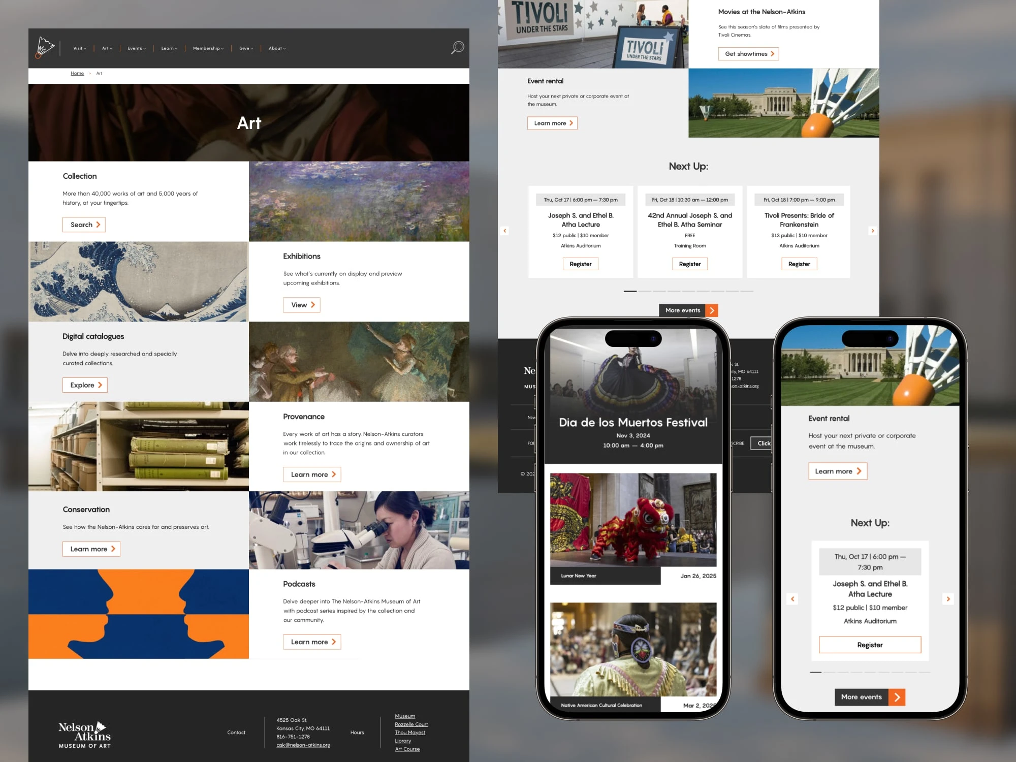
ARCHIVES, FESTIVALS and EVENTS
A dynamic scalable system worked great for events, classes, festivals, and special donor events.
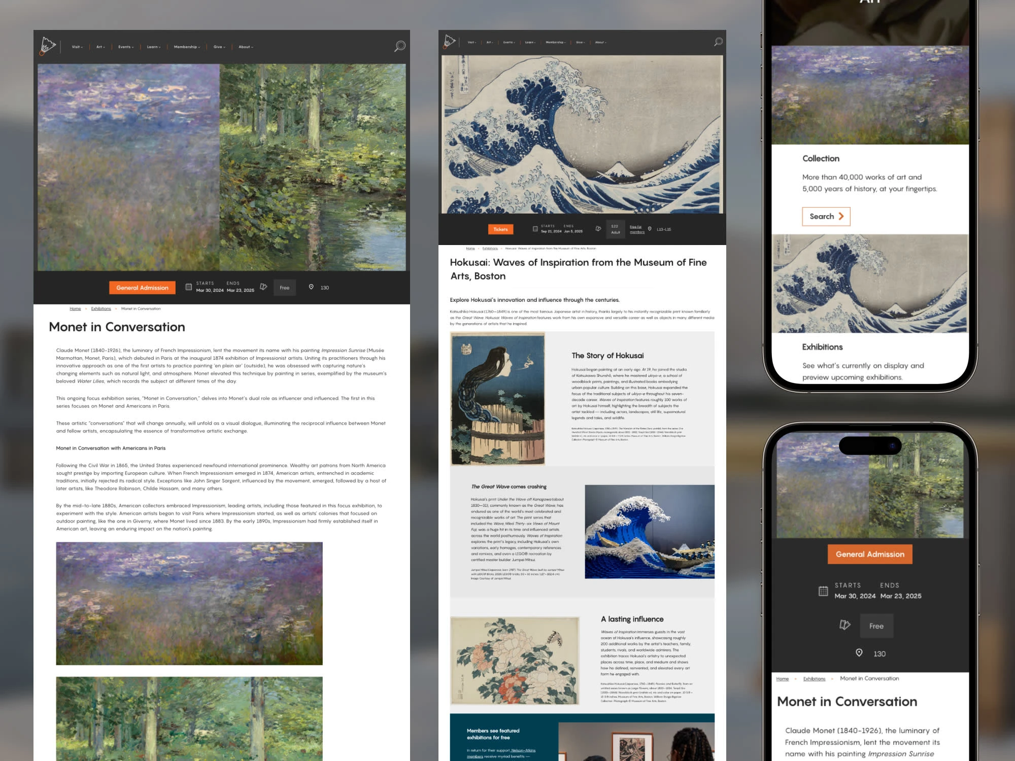
EXHIBITIONS
Exhibitions needed to be easy to swap out and build the archive out.
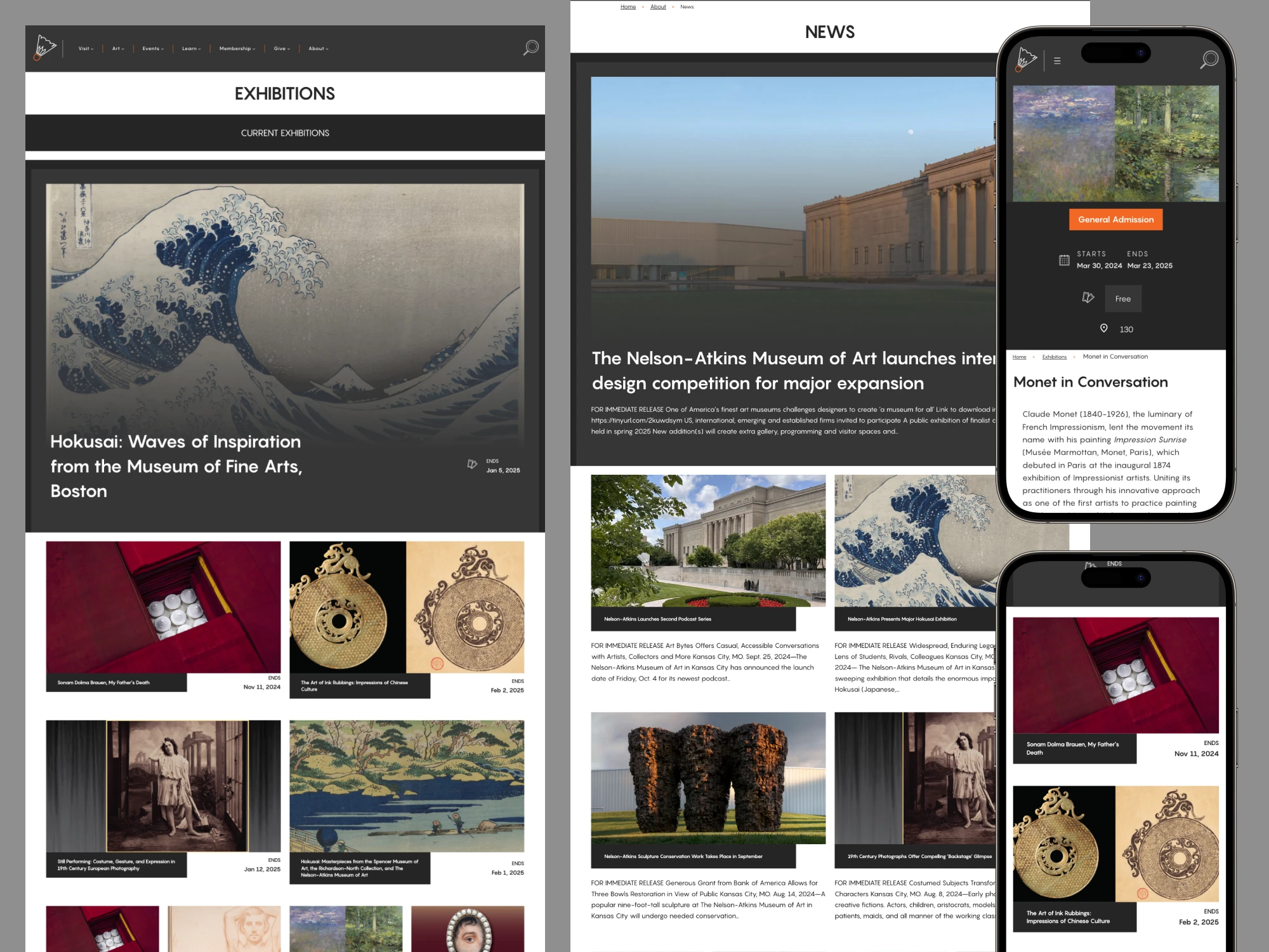
Variations between exhibitions needed a modular setup between different artists.
"Brian was great at communicating. He gave us regular updates halfway through each sprint. After Brian finished his work, a lot of people commented on how clean the designs were. It was a good refresh for our website; we updated a lot of technical things on it and improved the overall UX. We did additional user tests, and users ended up navigating the site much easier. Overall, our entire team was pleased with Brian’s work. Having a UX designer like him was a great experience. It made my life as a developer easier." – R. Rolon - Team Lead / Senior Developer
RESULTS
The new site launched with a modern, scalable design system that empowered the museum to create engaging pages without sacrificing usability.
Early analytics show:
Increase in monthly users
Higher engagement rates (ROI numbers forthcoming)
Significant reduction in drop-off rates
What started as a UX consulting role evolved into a full design system buildout. The result is a digital platform that brings the museum’s collections, classes, and events to life—online and on mobile—while making it effortless for visitors to explore.
Like this project
Posted Oct 17, 2025
The Nelson-Atkins Museum needed a website that made exploring art, exhibits, and programs intuitive—on both desktop and mobile.