Designing formsy from scratch
To comply with my non-disclosure agreement, I have omitted and obfuscated confidential information in this case study. All information in this case study is my own and does not necessarily reflect the views of Qliqsoft.
June 2021 - Aug 2021 • B2B2C/SaaS
My responsibility:
to create the Information architecture and the user workfow
to build the tool from MVP
to create the branding & identity
Building Formsy, the No-code tool for creating surveys inside email
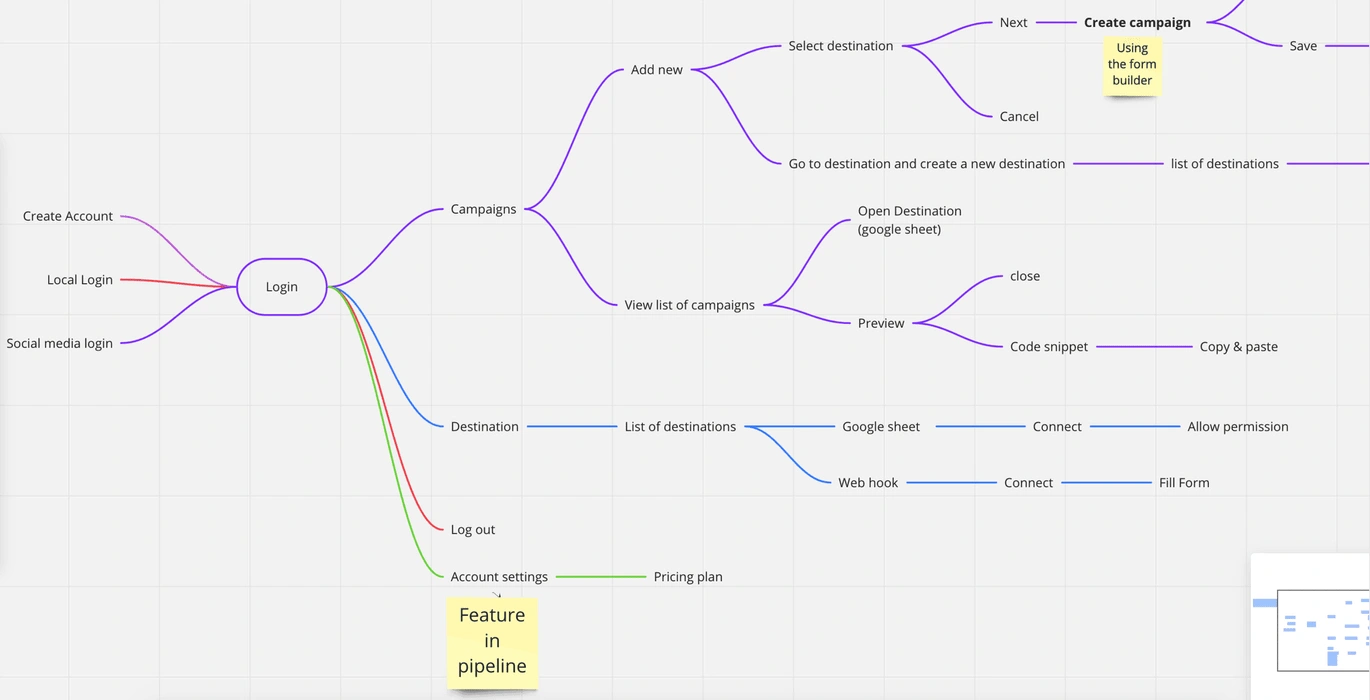
Userflow in Miro tool
Problems
⛔ The web app was built by developers without due design process
⛔ User Interface looked bland without proper branding
⛔ As a first time user and no knowledge about creating surveys, I struggled to understand the navigation
Solutions
✅ Regular brainstorming session and created design strategies
✅ Designed the brand identity and applied to the product
✅ Redesigned the information architecture and the navigations. Breadcrumbs added for ease of use.
Strategy
Branding & Identity Design
Improving the User flow, revising the information architecture
Redesign the User Interface
Usability Testing & Iteration
My Role
Started with a brainstorming with the founders & stakeholders and understood about the product and the value it brings to the users. The color and fonts were experimented and finalized.
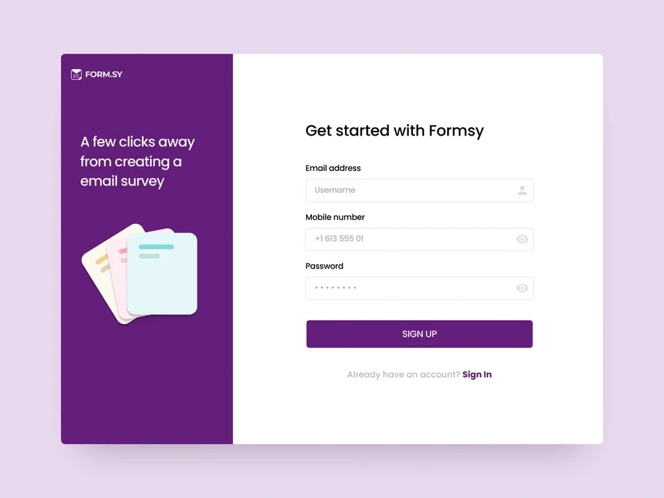
Final Screens
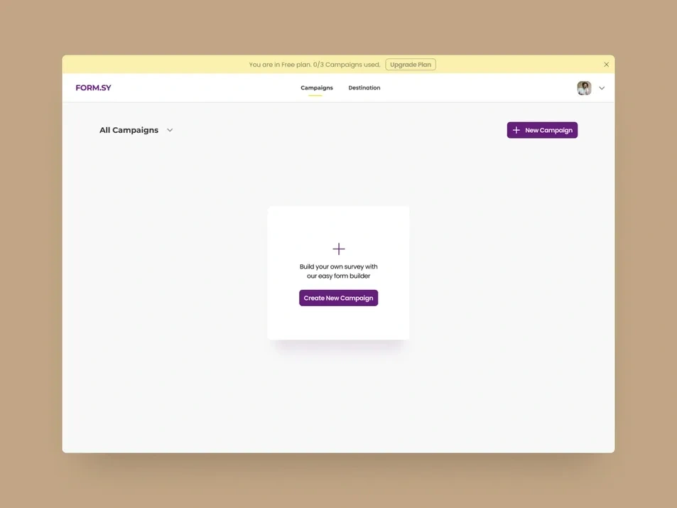
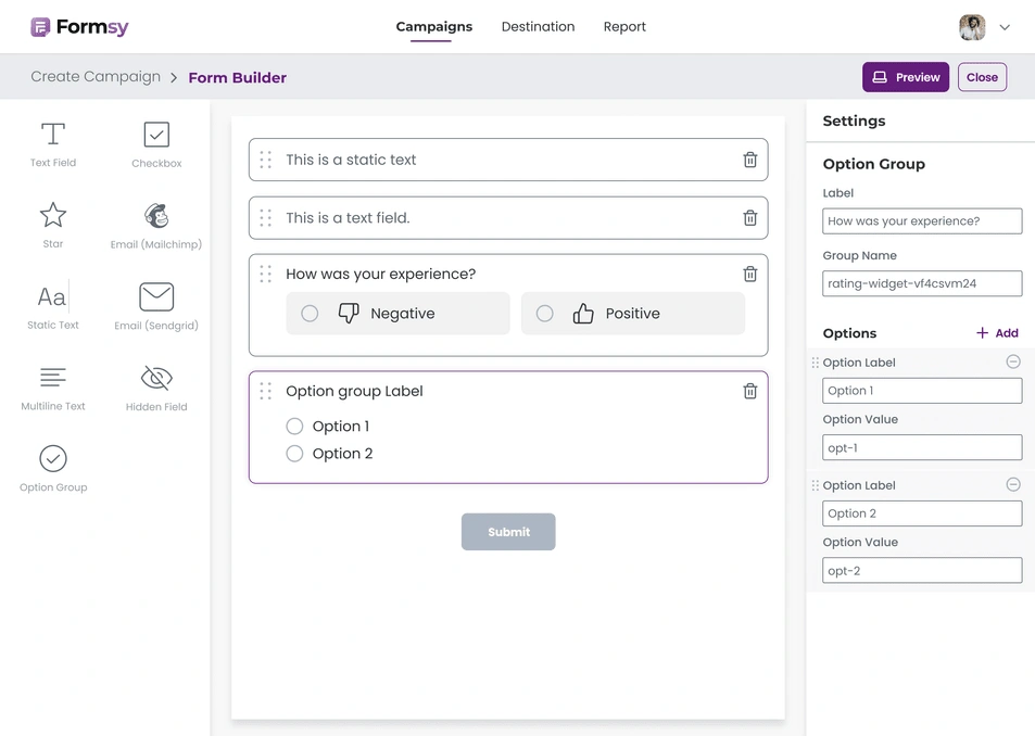
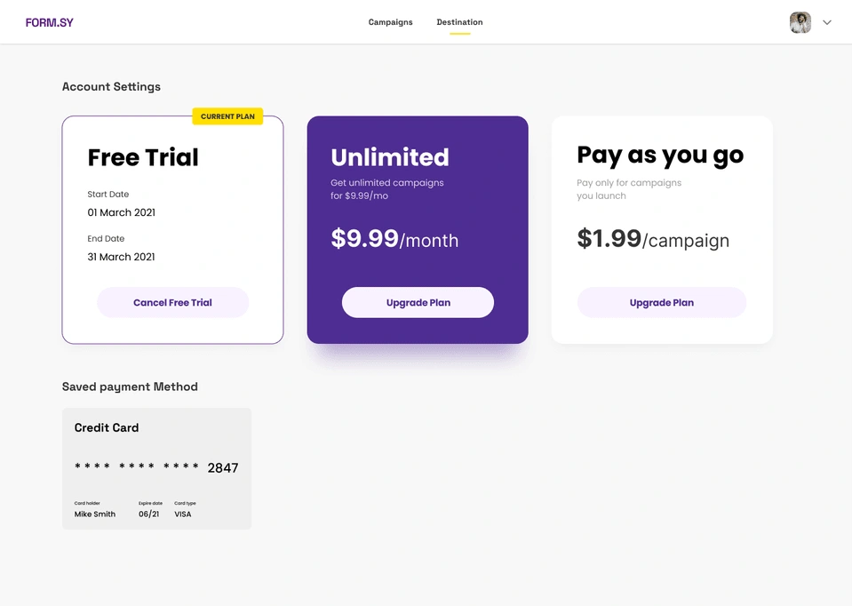
Competitive Analysis
Analysed the navigation, workflows, interactions and UI design from other survey apps like Retently, Survicator, tally and more.
Like this project
Posted Aug 7, 2023
Building Formsy, the No-code tool for creating surveys inside email
Likes
0
Views
8

