Built with Jitter
Creative Presentation Design for a Modern Pizza Brand

Umar Tanveer


Creative Presentation Design for a Modern Pizza Brand
This is a creative presentation design project built around a simple idea: make every pizza flavor feel like its own visual experience.
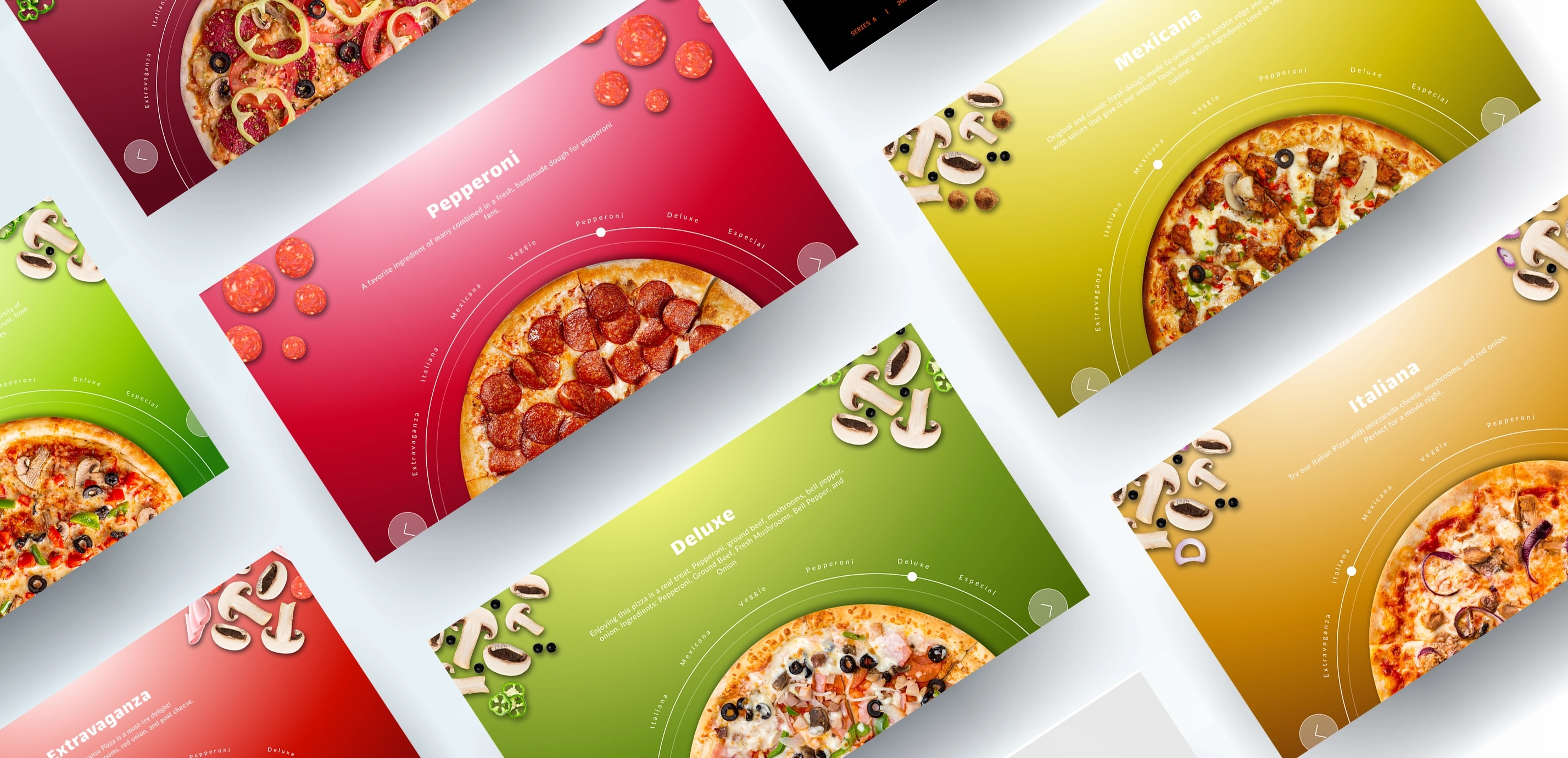
The presentation was designed to introduce and showcase a collection of pizza flavors through bold imagery, expressive typography, and dynamic slide compositions. Each flavor receives its own visual moment, allowing the audience to quickly understand the personality and appeal of the different offerings.
The goal was to create a presentation that feels appetizing, energetic, and premium, while maintaining a cohesive visual identity across the entire deck.
Tools: Figma & Jitter
The Concept:
Instead of presenting the pizza menu as a conventional list of products, I treated each flavor as a featured character within the presentation.
Every flavor gets its own visual treatment while following the same overall design language. This creates enough variation to keep the audience engaged without losing consistency.
The presentation moves through the flavors as a visual journey, with each slide introducing a different combination of ingredients, imagery, and personality.
Featured Pizza Flavors:
🍕 Extravaganza
A timeless classic built around simplicity.
The Extravaganza slide focuses on the fresh, recognizable combination of tomato, mozzarella, and basil. The design uses a clean visual approach to reflect the straightforward character of this classic flavor.
🍕 Pepperoni
Bold, familiar, and instantly recognizable.
The Pepperoni presentation focuses on the rich visual texture of melted cheese and pepperoni. Strong imagery and confident typography give the slide a more energetic personality.
🍕 Italiana
A richer and more indulgent option.
The Italiana slide uses a warmer, more dramatic visual direction to communicate the smoky and savory character of the flavor. The composition gives the ingredients enough prominence to create an immediate appetite appeal.
🍕 Veggie
Fresh, colorful, and vibrant.
The Veggie flavor introduces more visual variety through its combination of fresh ingredients. The presentation uses imagery and composition to communicate freshness while keeping the overall design aligned with the rest of the deck.
🍕 Especial
Simple, indulgent, and universally appealing.
The Especial slide puts the focus on one of pizza's most recognizable elements — melted cheese. The visual treatment emphasizes texture and richness while keeping the composition clean and focused.
🍕 Mexicana
For the more adventurous side of the menu, the signature flavor introduces a stronger and more expressive visual personality.
The slide uses a more energetic composition to differentiate the flavor while still following the presentation's established design system.
Designing Each Flavor as Its Own Experience:
One of the key decisions in the project was to avoid making every flavor slide look identical.
Instead, I created a flexible visual system that allowed each pizza to have its own personality.
The imagery, scale, positioning, and supporting elements could change from slide to slide, while the underlying typography, spacing, and visual language remained consistent.
This approach gives the presentation a sense of movement and makes discovering each flavor feel more engaging.
Visual Storytelling:
This structure makes the deck easy to follow while allowing the pizza flavors to become the visual centerpiece.
Rather than overwhelming the audience with information, each slide communicates one primary idea and allows the visuals to do much of the storytelling.
Design Direction:
The visual direction combines:
Large-scale food photography
Bold typography
Editorial-inspired layouts
Strong visual hierarchy
Dynamic compositions
Intentional negative space
Product-focused imagery
Consistent spacing and alignment
The result is a presentation that feels modern, playful, and highly visual without becoming overly complicated.
Typography & Layout:
Typography was used as both an information tool and a visual element.
Large headlines create immediate impact, while smaller supporting text provides context without competing with the food imagery.
The layouts intentionally vary throughout the deck to avoid a repetitive template feel. Some slides give the pizza almost the entire stage, while others balance the product with supporting information.
Creating a Consistent Flavor System:
Although every pizza has a different personality, the deck needed to feel like one unified presentation.
I created consistency through:
Typography
A defined hierarchy keeps headings, descriptions, and supporting information recognizable.
Layout
A flexible grid maintains alignment while allowing creative compositions.
Imagery
Product photography remains the primary visual focus throughout the deck.
Spacing
Consistent spacing creates breathing room and prevents the presentation from feeling crowded.
Visual Rhythm
Alternating between image-heavy and information-focused slides keeps the audience engaged.
My Role:
Presentation Designer
I was responsible for the visual design and presentation system, including:
Presentation art direction
Slide design
Flavor presentation layouts
Typography
Visual hierarchy
Image composition
The Outcome:
The final presentation turns a collection of pizza flavors into a cohesive visual story.
Instead of simply showing a menu, the deck gives each flavor its own moment — helping the audience explore the products while experiencing a consistent and memorable brand aesthetic.
The result is a presentation that demonstrates how food, branding, and presentation design can work together to create an engaging visual experience.
Like this project
Posted Aug 24, 2026
Creative pizza presentation design in Figma, showcasing distinct flavors through bold visuals, engaging storytelling, and a cohesive food brand experience.
Likes
1
Views
5
Timeline
Aug 13, 2026 - Aug 24, 2026